Tuesday, 20 December 2016

Heidegger on the significance of drawing

Somatic drawing

There has been a long ongoing debate concerning the respective validity of art and science as ways of knowing. C. P. Snow called this the ‘two cultures’ divide and stated that the division between scientific understanding and the humanities was highly problematic.
My own problem with trying to equate art with science has been how to articulate what ‘knowledge’ is for an artist. For scientists knowledge has to be measurable, any form of truth has to have some form of correspondence in ‘nature’ or ‘reality’. In the social sciences it feels as if everything is located in what I would call ‘propositional’ truths and over the last 40 years of teaching I have seen an influx of social science theory come into the art educational field to support a growing theoretical umbrella that has been constructed around art and its processes. But what sort of ‘knowing’ am I involved in as an artist? I don't think of myself as having to prove anything. I make art out of some sort of personal necessity that has as much to do with hands that need to be busy as a mind that needs to think about what is going on. 

I’m also very aware that many of my peers are now involved with PhD study and that the college I work for is now entering a new phase, one that will see far more emphasis on research. From what I have seen, practice based research in the PhD area seems to still hold scientific or propositional knowledge as paradigms against which art practice should be measured. The idea that art practice should be grounded in theory is central to most BA Fine Art curricula and there is an almost tacit agreement that this is vital to a student’s holistic awareness of their developing art practice.

Making or drawing for me opens out an understanding as it is done. It’s not an illustration of a concept about the world, it is a type of knowledge that arrives. However I would argue that this is in parallel with the type of knowledge that arrives when I am in and experience the world itself. I’m often amazed at what arrives out of my mouth when I speak, as Yates said when asked about his poetry, ‘I made it out of a mouthful of air’. Images arrive out of doing something, and then afterwards you begin to think about what they might be about. But how can this be written about?

Heidegger put it this way, ‘…it becomes manifest only through the work, because it lies originally in the work.’ Tom McGuirk's paper ‘Heidegger’s Rift: The Epistemological Significance of Drawing’ available to download at: https://www.materialthinking.org/sites/default/files/papers/TomMcGuirk.pdf 
provides an interesting starting point in terms of how you might begin to think about these issues.

Tom McGuirk's paper focuses on Martin Heidegger’s discussion in ‘The Origin of the Work of Art’ of an observation of Albrecht Dürer’s: “… art lies hidden within nature; he who can wrest it from her, has it”. 

Without trying to go over what McGuirk very adequately covers in the paper, my own observation on this, is that as we are an inseparable part of nature, wrestling something from nature suggesting that first of all you have to get out of nature and escape it, before you can then go back and pull more things out of it. Not I suspect a good thing to be doing. 

In 'The Origin of the Work of Art’ Heidegger analyses the meaning of the act of drawing. He sees it as a way to 'tear out' some form of understanding from the world, but also in the making of the drawing, an artist is a form-giver, and it is only, states, Heidegger in this that the human being can learn the greatness of Being. Heidegger also opposes the ‘truth as correspondence’ model of Western epistemology, truth in Greek philosophy he argues being a revelation of what was not known but now is. 

I see this as an argument for the way a drawing can be a becoming, something that arrises out of its making, out of a confluence of materials and their handling, a process rather than an understanding. 

Somatic drawing

The images of mine I have used to illustrate this post are again on that art / science cusp. I have had to undertake a lot of research into what have been called the 'other senses', those that tell us that we are hungry, off balance, in pain or itchy. The body has its own representational system of corporeal awareness and I have been trying to look into various ways to represent that. The seeming impossibility of using visual representations to make us aware of invisible inner body representations being what interests me. 

See also: 


Thursday, 15 December 2016

Louise Lawler: Modern Art Oxford

Louise Lawler

I have mentioned Louise Lawler’s work before in reference to ‘tracing’. She is in a very good exhibition in Oxford at the moment;

KALEIDOSCOPE: The Vanished Reality - Modern Art Oxford - until 31 December 2016

If you are interested in that interface between drawing and photography Lawler’s work is very interesting, especially if you are also thinking of how the use of vector graphic packages can extend the way you think about scale.


Over the last 30 years, Louise Lawler has been making photographs that depict views of objects and artworks in their everyday working environments, shifting the emphasis from the subject itself to vantage points, framing devices and the modes of distribution that affect the reception of an artwork. Lawler is showing a group of ‘tracings’. Traced directly from her photographs, and made in collaboration with the artist and children’s book illustrator Jon Buller, the ‘tracings’ are black-and-white line drawings that are converted to a vector graphic and printed on a vinyl that is adhered directly to the wall. Each edition exists as an adaptable digital file that can be printed at any size. The largest work in the show is Pollock and Tureen (traced) (1984 / 2013), a ‘tracing’ of Lawler’s photograph Pollock and Tureen from 1984. The original work is a medium-sized photograph, just under a metre wide, of a decorative piece of porcelain placed on a shelf beneath the expressive splatters of a Pollock painting. Pollock and Tureen (traced) has been enlarged to almost ten metres to occupy a substantial section of one of the gallery walls. At this scale, many of the lines in the vector drawing start to behave less predictably, often taking on a form of their own when viewed up close. Viewed from afar, the picture again coheres into a recognisable image. Each ‘tracing’ becomes both a representation of a previous artwork by Lawler and a wall based installation in a particular space.
The fine art use of what used to be ‘graphic design’ techniques is becoming more and more prevalent and these techniques are tailor made for enlarging work to different sizes in order to respond to the changes in scale needed when moving an idea between different sites.
So if you are near Oxford over Xmas why not pop in for a look?

Exhibition view

See also:

Louise Lawler
 Some initial thoughts on her use of tracing

The Bézier Curve Thoughts on the maths behind drawing software programs such as 'Illustrator'


Painting by numbers A children's book illustrator is used to sort out and clarify the flat forms used for this process


Friday, 9 December 2016

Deanna Petherbridge at the Whitworth


The Whitworth Gallery in Manchester is hosting a solo show of pen and ink drawings from across Deanna Petherbridge’s 45-year career.
For those of you interested in artists that have drawing at the centre of their practice this is a must see show. I’m particularly interested as like myself, she always uses pen and ink to draw with.

See Petherbridge talking about her work here


Petherbridge in her studio

This text (below) is pasted directly from the Whitworth website:
Since the 1960s, Deanna Petherbridge has pioneered critical thinking on drawing and its place in art and architecture.
Travelling extensively through Europe, India, the Middle East and Far East, her detailed monochrome drawings are inspired by diverse landscapes, cities and cultures: from mathematical patterns of Islamic design, to rustic Umbrian dwellings and Manchester’s industrial cast-iron structures. Detailed geometric studies or free inventions in brush and wash, her distinctive works deal with the impact of colonialism, industrialisation and warfare. Her passionate condemnation of present conflicts is expressed in the 2016 triptych The Destruction of the City of Homs.
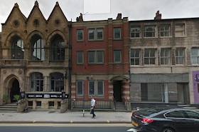
This exhibition brings together over 40 works from across her career, including the Manchester Suite a collection of drawings made during her six-month residency at Manchester Art Gallery in 1982. Her studies of the city’s Victorian architecture during its first wave of regeneration in the 1980s led to a consideration of the resonance of history in cities, places and landscapes, a central theme of the exhibition.
From 1995-2001 Petherbridge was Professor of Drawing at the Royal College of Art where she set up the Centre for Drawing Research, the first doctoral programme in drawing in the UK. She has curated numerous exhibitions including The Primacy of Drawing: An Artist’s View in 1991, which led to the publication of her acclaimed book The Primacy of Drawing: Histories and Theories of Practice in 2010.
This exhibition coincides with the publication of a major new monograph, Deanna Petherbridge: Drawing and Dialogue, by Circa Press available from December 2016 in our bookshop.
Exhibition open: 2 December 2016 – 4 June 2017
See also:

Sunday, 4 December 2016

Pop expressionist surrealism

Daniel Martin Diaz

Coming from a generation of artists that grew up with Modernism it is still sometimes hard to accept the world of post-post Modernism. I become more and more aware of new/old art movements, forged out of different combinations of what has gone before. Minimalist Expressionism, Conceptual Pop, Post Industrial Pointalism, New Abstract Symbolists and in this case Pop Expressionist Surrealism. Every movement comes with a pre-packaged history, in this case everything from Bruegel and Bosch to Warhol and Basquiat.  
For me this is the ultimate in consumer culture, a sort of pick and mix shop, whereby you simply put various ingredients together and there you have it, whether this is an exotic smoothie or a new painting. I ought to hate it, I was brought up to look for authenticity and the hard won image, but it now feels to me that this type of work is in fact more reflective of where we culturally are than any other. If art is to be seen as a commodity then it ought to be made in the same way all other commodities are. In a time of maximum consumer choice, the more a consumer can pick and mix the various elements (in this case the artist is him or herself the consumer as well) the better.  When I look at this sort of work I also feel the awful weight of dense theoretical contexts lifted and art making revealed for what it is, a type of shameless enjoyment and entertainment. No more and no less. 

Gary Panter

However within the mix of the artists that are seen as belonging to this new Pop expressionist surrealism movement are some of the people that I have followed for several years and I have seen these artists as people that have developed 'hard won' imagery and have a unique take on the world. It may just be that what is happening is that the worlds of 'popular' or as it used to be termed 'low' culture and 'high' or 'elite' culture have now become totally mixed. All cultures are both popular and unique to whoever engages with them. When I talk to people about music, they seem to enjoy the Beatles as much as Beethoven, and Steve Reich as much as Dizzee Rascal. 
The individual is now the key mover. You don't need to be qualified to make choices, lists of the best music, art, films etc. pervade the web, it seems that everyone is happy to let others know of their choices for these things, and then they just need to validate those choices by getting others to 'like' them. However we tend to 'like' what we already know, or which confirms our world view. Trust our instincts or rely on reason? I get the sense that we are moving into a time of making decisions based on emotional gut reaction, whether this is good or bad will remain to be seen, whatever the outcome the old order of Modernism has gone and the codes of aesthetic measurement that went alongside it are now outdated as well. New codes, ones that acknowledge plagiarism and appropriation over authenticity and formal invention will need to be learnt. But learnt by who? I suspect if you think you need to think about these things you are already 'past it'. Academia rages about plagiarism but people sitting on computers and fingering their mobiles world wide simply cut and paste and get on with their lives. 

Here is a nice easy primer/manifesto for Pop expressionist surrealism.

See also:


Tuesday, 22 November 2016

The grid as a cage or trap

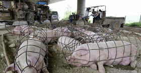
The grid as a cage or trap is something that I have long been fascinated by. A cage or trap can easily be read as a 3D drawing and a 2D grid can just as easily be read as a cage or trap. Look at these images of cages and traps below, they are already iconic forms, you don't need to do anything with them, as they have such a powerful image presence. Because of this many artists have made use of the associations grids have with cages and traps.  


Above 3D cages and traps, below 2D perspective grids, they have a very clear visual relationship.


An early example of the perspective grid being used to define a space for humans

Sir Edwin Henry Landseer, the Victorian painter, depicted animals and people behind the bars of a cage several times. The image below is though of special interest as it plays with the flatness of the painting. An image that was probably itself gridded to transfer it to canvas, is seen through a totally flat grid, (the bars of the cage) and the only intimation of space outside of the frame are the few objects placed on the shelf like space right at the bottom of the image. The objects are squeezed into the space behind the grid, the lion on the right hardly has space to exist, by giving the observer a few spatial clues such as atmospheric perspective and shadow play, Landseer tries to construct a believable space, but the flat grid works against this and we are somewhat disturbed by the 'dispute' between what is depicted and the underlying technicalities of how the space is made. 


Mr. Van Amburgh, as He Appeared with His Animals: Sir Edwin Landseer 1847


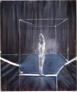
Francis Bacon used the cage format to suggest that his figures were trapped or caged in some sort of existential dilemma. The recent exhibition at the Tate Liverpool was titled 'Invisible Rooms' which is another way to think about what the perspective frame represents. 


Francis Bacon

He must have been aware of historical precedents such as the way Durer used perspective frames and the grid to measure his figures, however it is also likely that Bacon had looked at the example of Giacometti, who used the grid of measurement as a way to frame his images. He also of course looked at Eadweard Muybridge, who used grids in the backgrounds of his photographs in order to establish a frame of reference. 


Giacometti

Eadweard Muybridge


The perspective grid is often used in how to draw books to help students get an idea of how to set a body in space and when measuring by hand or with a plumb line you are in effect building an invisible perspective grid around the image as you try to measure what's there and how it is related to the space that it sits in.  


Using a plumb line and horizontal straight in a how to draw manual

Bacon and Giacometti both used the idea of the frame to express something beyond the fact that it can be used to measure a spatial volume. The frame is as much a trap or a cage, and in occupying this dual position it is able to also express emotion and conceptual questioning. 

A figure boxed in a how to draw book

Both Mona Hatoum and Louise Bourgeois have used the cage to express their feelings for the way that space or place can be both somewhere to live in and to be trapped by.  


Louise Bourgeois

Mona Hatoum

The issues that underly the use of traps and nets were beautifully articulated in Alfred Gell's famous essay 'Vogel's Net: Traps as Artworks and Artworks as Traps' which I have dealt with in detail in an earlier post.

As the grid becomes a trap, it traps not only the animal inside it, but also the mind of the trapper.

The grid is a powerful image and it runs through many areas of art practice. I shall no doubt return again to the subject, but if you want to read through some older posts there are links to them below and all refer to grids and how they can be used within drawing.

The grid 1
The grid 2
The grid 3
The grid 4


Mona Hatoum

Monday, 14 November 2016

Drawing Futures


There is a really interesting new book on drawing available free online, ‘Drawing Futures: Speculations in Contemporary Drawing for Art and Architecture’.

The book examines how the act of drawing still plays a central role as a vehicle for speculation. In particular the book discusses how drawing is changing in relation to new technologies for the production and dissemination of ideas.


Wednesday, 9 November 2016

Fine Art animation now


The Oriel Davies Gallery in Cardiff has been hosting a series of exhibitions and events to celebrate contemporary animation as being at the forefront of artistic and creative innovation. The gallery is showcasing a wide range of approaches to what is essentially moving drawing and after coming back from Berlin after seeing the large William Kentridge exhibition, I do feel that animation is one of today's key areas of drawing practice. Parts & Labour, which is part of Move It, explores animation as something that is ‘made’ – whether physically, digitally, or both. The introduction of the animated gif allows any simple set of images to be inserted into places where previously you would have put a still photographic image. Gifs allow you to use very little computer memory to animate a series of stills, this means you can drop these animations into a wide range of other programs. This trick when working with them is to think about circular visual narratives.


Dave Peel: Ice-cream


Dave Peel is an ex LCA student who went to Goldsmiths and he is making some very interesting animated gifs.

Dave Peel: animated gif

What Dave is doing is tapping into a very different aesthetic to the one we normally associate with drawing. His work is really an extension of collage, everything now of course generated directly on a computer, scissors and cut paper, now a distant ancestor. 

Of course you don't need new technology to make animation work. William Kentridge is a wonderful example of an artist using traditional drawing techniques to create animations. 


William Kentridge

Francis Alys has used traditional animation techniques to reflect on the interrelationships between rich and poor in modern city life. 

Francis Alys

Len Lye


There is a long history of fine artists using animation to get their ideas across, perhaps the most well known early pioneer was Len Lye. 


Mark Leckey

Mark Leckey was a recent Turner Prize winner with 'Made in heaven' a 3D animated recreation of a work by Jeff Koons.  Leckey uses his own room as a background for the animation, suggesting that the public profile of this very famous and very expensive work has been made very private, but then of course it is sent back out into public exhibition again. The work suggests that nothing is actually private, the reflective surfaces of Koons work perhaps acting as some sort of surveillance, in this case giving us 360 degree views of Leckey's flat.  

Some other artists using a range of animation techniques that you might find interesting.

Inger Lise Hansen House An animation of still images, exploring the breakdown of a house.

David Theobald Walking Holiday inGrindewald, An interesting take on the relationship between still life and landscape imagery, plus a range of his approaches to different genres and stereotypes.

Jordan Baseman Nasty Piece of Stuff, a speeded up photomontage, expressing the speed and energy of the city.

Katie Goodwin In Between Inception Animated images made from cuttings made from waste found footage from the 'cutting room floor' of Christopher Nolan's ‘Inception’. A more conceptual piece that references abstract animation and the process of film making itself.

Chris Shepherd World Stare OutCompetition, A drawn animation playing with the conventions of the genre. In this case the lack of animation reflects the fact that the protagonists are meant to remain still.

Lois Rowe and Patrick Rowan Filter, A montage and complex cutting sequence that reflects upon the repetitive nature of factory work in Asia.

Tadasu Takamine God Bless America, Traditional ‘claymation’ animation techniques laid over live footage to create a disorientated, disjointed commentary on the US.

James Lowne Our Relationships WillBecome Radiant, A meditation on nature using crude 3D animation techniques.

Jan Švankmajer is always worth looking at. Faust, Alice, Flora, and Food.

And everyone should be aware of the Quay Brothers. Švankmajer and the Quay Brothers carry on the Surrealist tradition into animation.
The easy accessibility and use of 3D modelling software and other computer based tools means that more and more artists are turning to this area to output their work and as drawing students working in the 21st century, you ought to consider the possibilities this area of work offers. 

Perhaps the real issue about using animation is the fact that the images move. We are hard wired to take an interest in movement, just watch how a very young baby can be captivated by an animation sequence. I have used very basic animation techniques myself to make animated gifs, and these have allowed me to deal with condensed allegorical narratives, in this case the stupidity of shifting your own mess onto others, they will just throw it straight back at you.


The boundaries between different types of practice are constantly shifting and Rachel Goodyear, an artist who made her reputation through drawing is now working in animation and performance. See:  
Goodyear uses animation in a variety of ways, sometimes she puts her work into photoframes as in Girl with a bird in her mouth, and at other times she uses back projection.


Rachael Goodyear: Dancing Devils (Back projection)

Animation is not just about how to animate, it is also about the physical presence of the work in the space where it is encountered. It may be projected, on screen, sent to mobile phones, seen on a bank of monitors inserted into an installation or inserted into a cinema pre-main feature slot. Whatever the realisation, it will be as important to test this out as it would be to test out the qualities of the animation itself.

See also:

Earlier post on drawing and film.

Video games as an art form

Computer animation

http://www.moveit.org.uk

http://www.animateprojects.org/films/by_date/2016/pig

https://hinemizushima.com/video-lake-monsters-music-by-they-might-be-giants


Friday, 4 November 2016

Mark Riddington at 18 East Parade

Check out Mark Riddington’s exhibition at 18 East Parade. ‘A Ghost of a Faded Engraving’
Mark Riddington’s work references astronomy, prehistory, and the occult. He works in dyed plaster, concrete and clay, often referencing astronomical phenomena, and celestial bodies, all of which are key issues when thinking about the history of drawing.
Stars are points in space and when we look at them we see patterns. If we could stare at the stars all night we would see that they trace linear paths across the sky. Riddington dyes plaster to create blocks of blackness, these are cut through with lines infilled in white.


By restricting the image to just one line we can concentrate on the quality of the line and at the same time focus on the work's concept.  Making the blocks out of concrete heightens the objectness of the support, and by incising the line into the concrete, the issue of surface/ground is again questioned, the line now being part of the ground, rather than something placed on it.  The precision of the line's curve suggests the geometry of the event, the fact that it is just a fragment of a much larger circle, suggesting that the work is referring to something that is itself a fragment of a much larger, perhaps universal concept. 


Stars and their movements were vital to the positioning of temples, this image below is of a stone inserted into the doorway of a temple dedicated to the God Ninlil, and is thousands of years old. The technique used is white inlay, in black stone.


Riddington's work allows us to think about some of the central issues of Modernism, (abstraction, painting as object, use of materials) and yet link these to age old concerns, (the sky as a realm of the gods, the occult, astrology etc). 

This post is also a reminder that it is also important to keep an eye of what is happening in the smaller art spaces in Leeds. This exhibition is promoted by 'Set the Controls for the Heart of the Sun', an organisation as art students you should be aware of  because they also have studio spaces as well as operating a curatorial umbrella. 

 till 
18 East Parade: LS1 2BH