Tuesday, 29 November 2022

The Embodied diagrams of Nicholas Gansterer

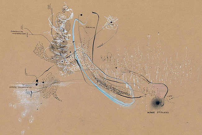
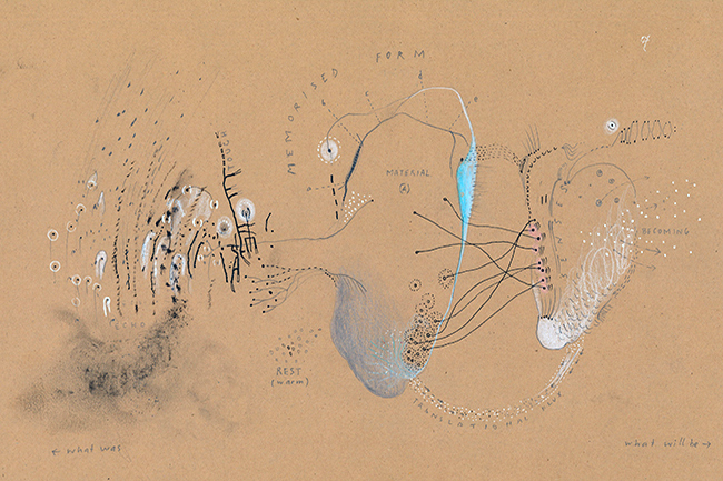
Nicholas Gansterer: Choreo-graphic embodied diagam

I'm always looking for artists that help me to validate my own practice, not so much trying to find artists that do work that looks like mine, but to find artists that think or operate in ways that confirm to me that the path I am on is worthwhile and also that the issues I'm trying to communicate are communicable. Nicholas Gansterer is one of those artists. I have pointed out his work before when looking at that space that drawing can occupy between art, geometry, emotion and science, but as I have for a while now been looking at ways to visualise interoceptual sensations and the awareness of somatic events, his work has seemed even more relevant to me recently.  


I have been fascinated by diagrams for many years and have put up several blog posts about how I think they can be considered as art practice. The examples above demonstrate how his thinking embraces both the annotated diagram and what I am beginning to think of as a type of image schema. 
Gansterer is also like myself very interested in how we record and document the perceived world around us and has made work both in relation to external perception and interoception. For instance he travels a lot by train and has attempted to draw the fragments of fleeting images that slip past as you gaze out of the train window. He has this to say about 'Training':

A series of drawings depicting "minutes of in-between-ness" – fleeting moments of fragmentary memory when travelling by train. The state of moving fast through the landscape triggers constantly the imagination. The continuous (and impossible) attempt to draw and get hold of some details of situations or objects flashing by – that which is seen but gone already.

The changing velocity and the permanent micro movements, the wiggle and waggle of the cars or almost falling asleep while drawing have an effect also on the scribbling and unfinished character of the drawings.


From 'Training'

You begin to realise that he doesn't waste time, even a train journey becomes an idea bank. He is constantly interrogating what it is to be in this world and to be perceiving it. As students you are always told keep a small sketchbook with you and be constantly recording scraps of information as you travel through the world but how many times does it remain in our pockets because we don't think there is anything worth drawing? The reality is that there is always something worth drawing, but it is our job as artists to pick out what that is. 

The most interesting aspect of Gansterer's work for myself was the 4 year research project he undertook Choreo-graphic Figures: Deviations from the Line*. In particular his drawings entitled, 'Choreo-graphic figures: Embodied diagrams' helped me to understand how my own collaborative work looking at interoception could be mapped out or understood in a more embodied format. His web-page that presents the work done points to 'shared figures of thought, speech, and movement'.


In his work drawing is conceived as a translational bodily process.  My understanding of this being that as an extension of the body, a pencil extends my fingers, instead of my fingers just being able to leave marks by scratching lines in the sand, a pencil or charcoal stick or any other drawing implement, allows me to leave a wider variety of traces of my body's movement, especially those movements controlled by my embodied thoughts.  He uses the term embodied diagrams to extend the notion of scoring, which I have interpreted as a sort of musical score, something that can be looked at by others and 'played' or followed as an idea or imaginative prompt.  The central issue is how to translate and visualise thought processes, both conscious and subconscious, Gansterer describing the resultant drawings as epistemic objects for the reader.


Gansterer has developed a cartography for the diagrammatic (re-)presentation of embodied knowledge(s) and in doing so he demonstrates how it is possible to visualise the interrelationship of ourselves and the world. In a similar way to myself he has tried to depict both interoceptive and perceptual experiences, but he has been much happier to annotate the resultant images, whilst I have always steered away from using words because I have always felt that they control the understanding in a way that removes a drawing's ability to be open to interpretation. 
Gansterer’s diagrams however are conceived in such a way that the annotations and the drawing are both part of the analysis of the situation, the one cannot exist without the other, and some recent drawings of my own have suggested to myself that perhaps I should not be so wary of words; after all I use them all the time to write this blog. 


Nicholas Gansterer: Choreo-graphic embodied diagams

My own recent images in comparison feel I think too 'arty' or too aware of fine art conventions, but as I'm so entangled into the process I shall have to ask some of my own collaborators whether or not this is the case. You can make decisions yourself, these are two drawings trying to communicate the interoceptual sensations of stomach pain and a breathing restriction. 

stomach pain

breathing restriction

Both the drawings above are images derived directly from my own personal experiences of inside the body happenings and they are attempts to visualise the feelings that I had at the time. These can be compared with the two drawings below of things seen, or perceptual experiences, one of a wheatfield  drawn during the summer when walking in West Wittering and the other drawn recently of some barriers that were erected to keep the public away from a building site that I often walk past on my way to work. 

Wheatfield West Wittering

Barriers on the edge of a building site

I have begun to understand 'feelings' as being central to the issue of how the body 'talks' to us, I have therefore begun to use emotive colour as an indicator of the feeling tone that I am trying to communicate. Because I am more and more aware of interconnecting 'fields' of action and the nature of vibration as an underlying force behind all things experienced, my perceptual drawings have become much more about rhythmic encounters than records of facts and my next series of images are going to be about how the two processes of internal and external awareness are brought together. In order to do that I'm carefully making my way through 'The Strange Order Of Things' by Antonio Damasio, a book that is helping me think about how image schema have evolved in different ways at different times and how the nervous system has evolved to cope with the body's evolutionary path. As I read I am beginning to see my interoceptual experiences as belonging to a much older evolutionary root and therefore being subject to being understood much more intuitively than perceptual experiences. 


*Choreo-graphic Figures: Deviations from the Line (2014-2018) was a collaborative artistic research project by artist Nikolaus Gansterer , writer Emma Cocker, dancer Mariella Greil and other guest collaborators.  

See also:

Drawing: Analogue and digital processes Why I use certain visualising processes 

Tuesday, 22 November 2022

Elizabeth Peyton and Watteau

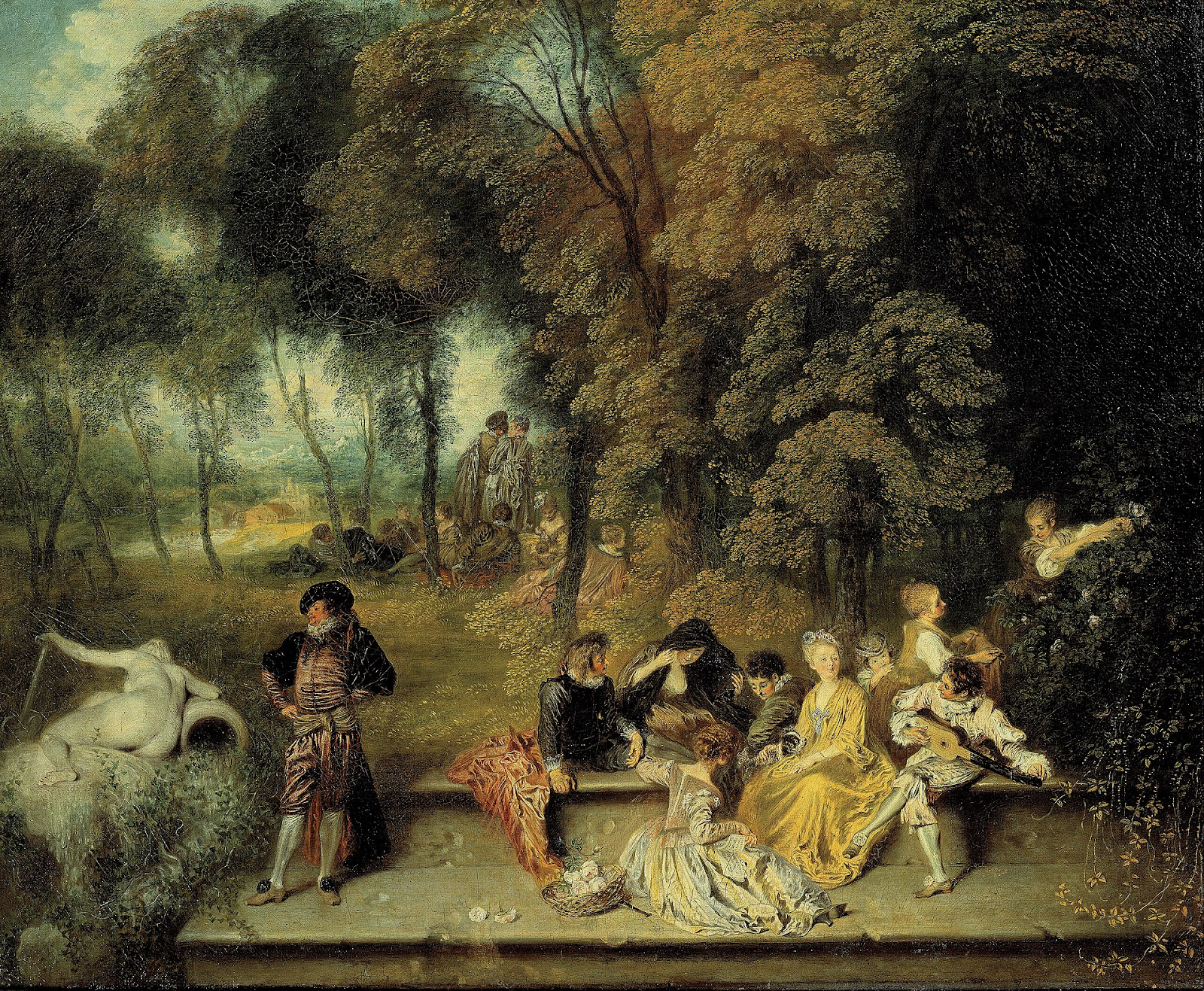
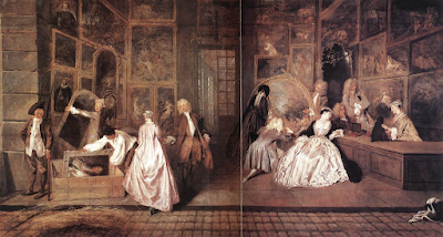
Watteau: The pleasures of love

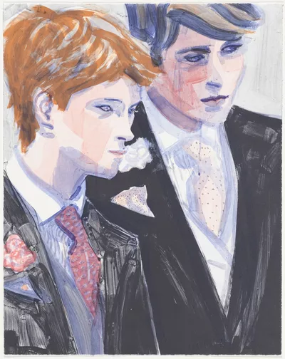
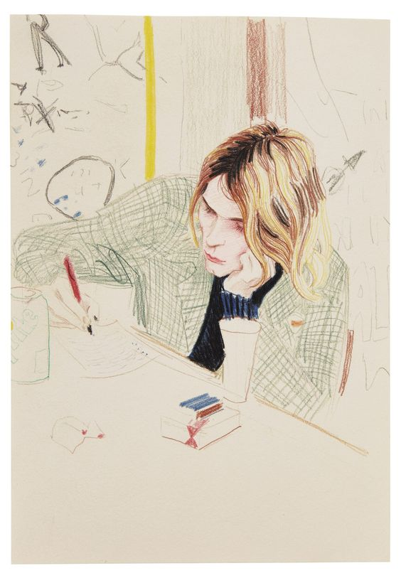
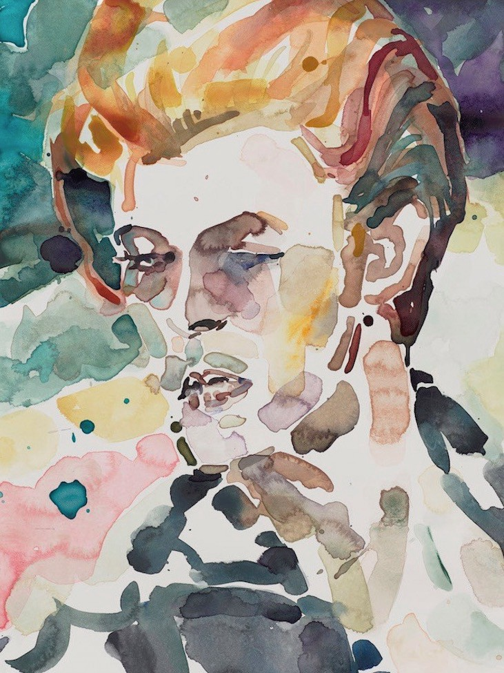
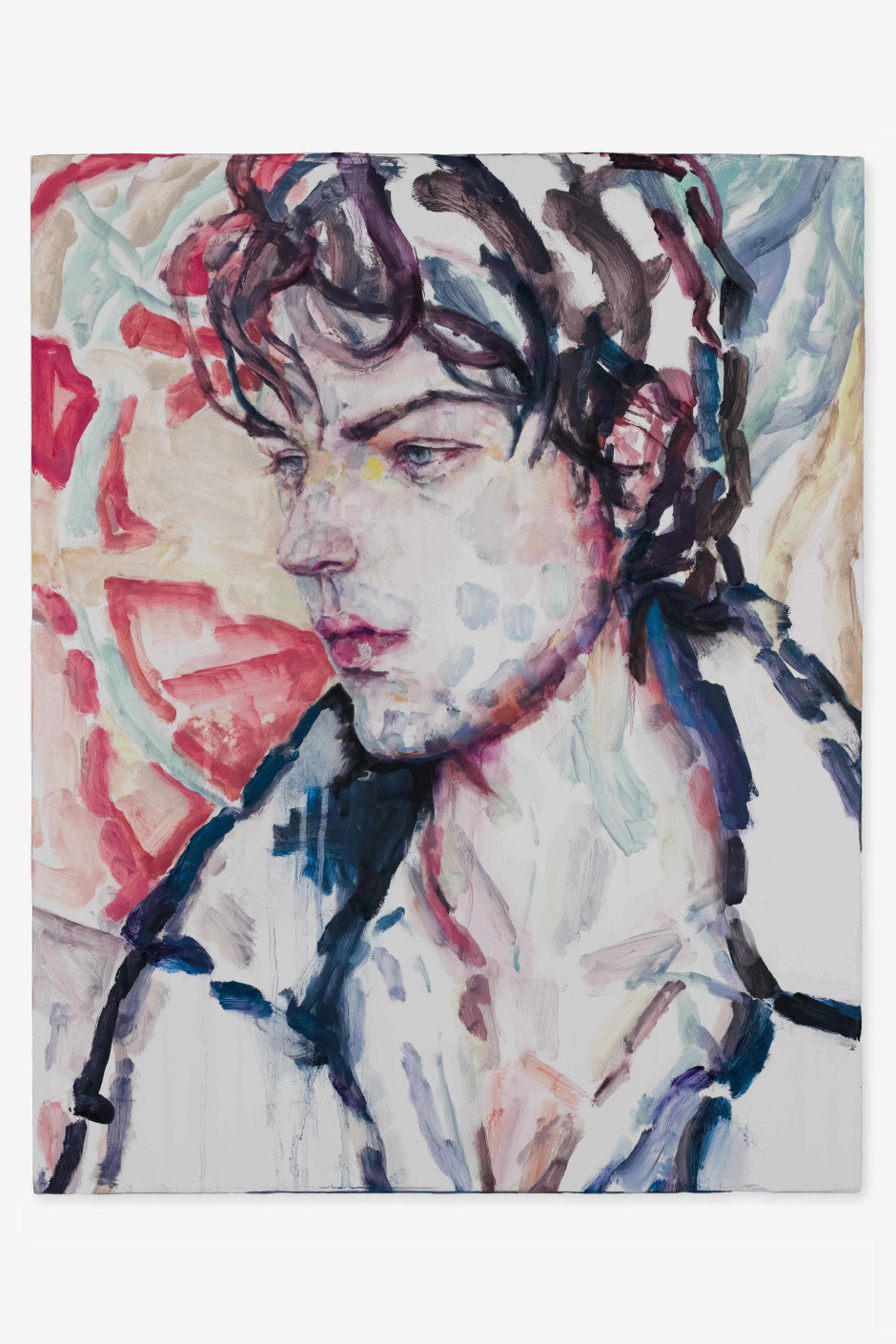
Elizabeth Peyton began like so many young girls by idolising certain pop stars, but instead of just putting posters up she made paintings of them. The 1980s upsurge in celebrity culture meant that the mainstream media was flooded by images of these new society doyennes, and Peyton was in the right place at the right time to be painting them. She modernised portraiture for the MTV generation, as a type of accessible documentation of fashionable celebrity lives. In a current time of selfies and celebrities engaging in and with nearly every aspect of the media this seems a bit simplistic but at the time she had clearly hit the 'what society wants from an artist' button. She very quickly therefore became a celebrity artist herself, and she was able to stylise and idealise her new and growing circle of friends, that also included newly glamorous artists, to which she would add more pop stars, trendy people from European monarchies and characters from literary fiction that seemed to somehow fit in, or who would have if they had been alive. Peyton's portraits and the lifestyles they depict, were an early forebear or warning of today's social media lifestyles where it begins to feel as if we are all worthy of celebrity status and if we don't have enough 'likes' we sulk.

Elizabeth Peyton

Elizabeth Peyton

Elizabeth Peyton

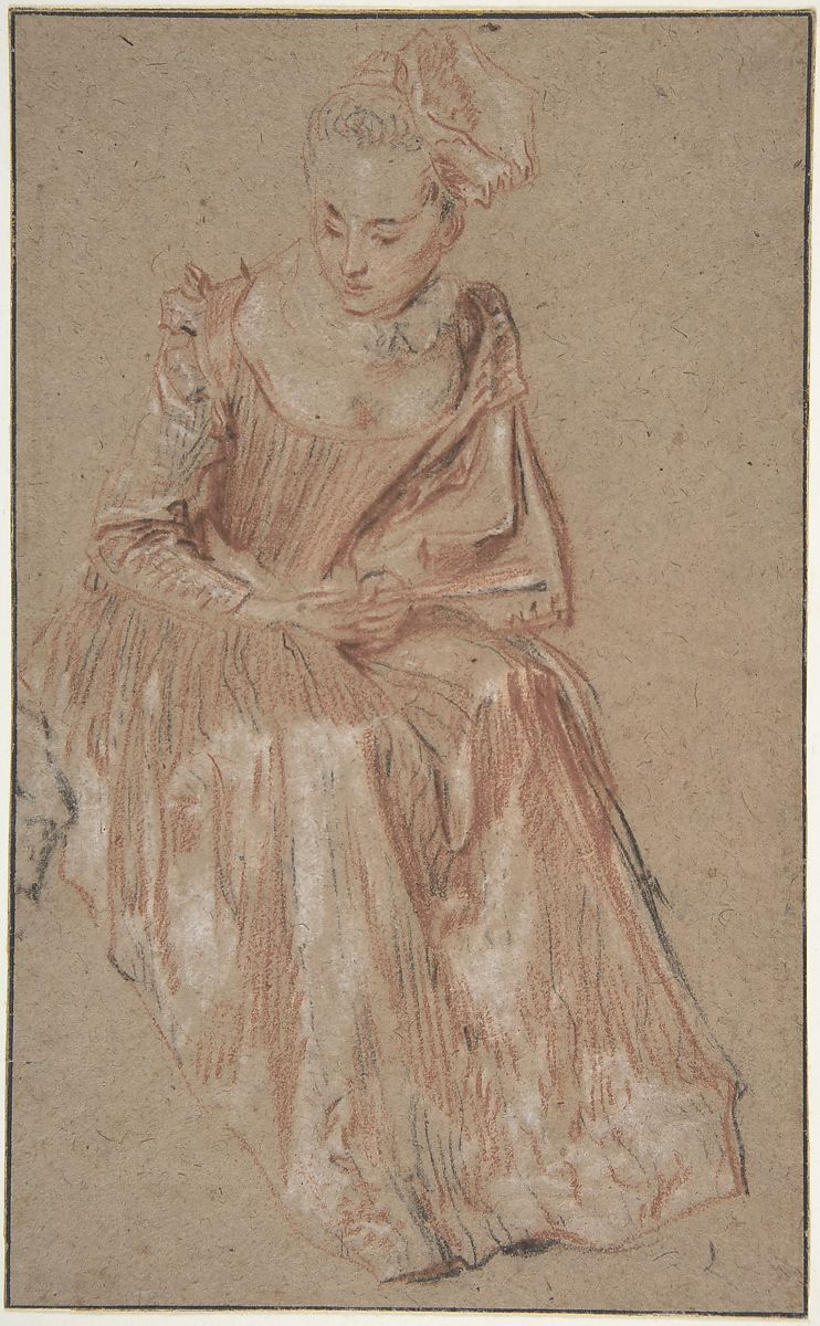
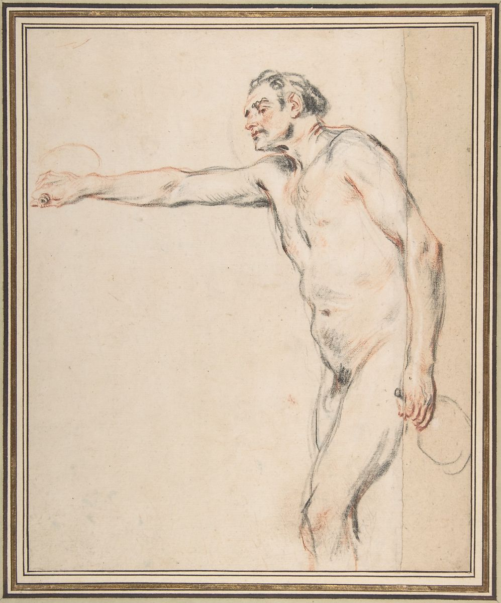
Elizabeth Peyton also makes intimate portraits of her friends, and these in her exhibitions hang alongside people that we associate with the shaping of contemporary culture, as well as historical personalities that still seem to have relevance to the cultural scene. Her drawings and paintings are distinguished by a certain fragility and transparency and especially by the melancholy mood of her chosen subjects and their body postures. There is also a similar melancholia in the work of the early 18th century French painter Watteau and the more I look at Peyton's work the more I am reminded of Watteau as a painter of transitional states; of people set into liminal spaces that evoke feelings of melancholy. He also managed to visualise a society's pent up eroticism, relations between people are suggested by small gestures and body postures that intimate something else is going on internally, that people's minds are suffused by a never ending series of unresolved actions and unfulfilled desires. You sense that the people in his paintings have lost direction, they drift through landscapes that surround them rather than these being spaces for action and direct physical relationships with others. 

Watteau

Watteau

Watteau

Peyton's subjects often stare blankly into space, or they inhabit the same space as other humans but make little attempt at making emotional contact. It is as if the air has been sucked out of their world. They are often 'unfinished' or at least incomplete. Peyton avoiding the work of completion, as if she has herself become like her sitters bored with the effort. Her portraits are of people existing, but not savouring their existence. Watteau's sitters are in a similar way trapped in a society of manners, destined to play out their days whilst time slips by and the real events that are shaping the world take place somewhere else. Just as many people in our current society would rather ignore the reality of wars and global warming, the people in Watteau's world also ignore the realities of the day. Whilst they engage in small talk and the refinement of gesture, the world around them has witnessed the War of Spanish Succession; France and Britain have exhausted themselves and their armies by fighting battles across vast stretches of mainland Europe; Philip V, has now been recognised as King of Spain, but Spain has itself during this time lost much of its empire. Spain and Britain have just signed a 30-year contract in which Britain is to have a monopoly in supplying Spain with slaves for the Americas. The Austrians who were alarmed by Ottoman expansion have declared war on Turkey and have defeated the Ottomans at the Battle of Peterwardein and Prussia is the new rising European power and begins to dominate the other German states. However for the people in Watteau's world, none of these issues seems to affect them. 

Watteau

Watteau's paintings of melancholic encounters, like Peyton's create a mood but do not employ narrative in the traditional sense. During Watteau’s lifetime, a new term, fête galante, was made up to describe them. Fête galante is a category of painting specially created by the French Academy in 1717 to describe his variations on the theme of the fête champêtre, which featured figures in ball dress or masquerade costumes disporting themselves wistfully in parkland settings, the simplicity of the event was however often contrived, as it was a very elegant form of entertainment, on occasions involving whole orchestras hidden in trees, with guests often wearing very expensive garments modelled on the dress codes of the rural working poor. It was an extreme form of decadence and a time when the rich had no actual interest in the lives of the poor, which were for them simply thought forms to be played with. 
It was a glamourised aristocratic form of entertainment, as in the case above, where rich patrons are looking at paintings in an art gallery that has strangely emerged from an ordinary street. Reality seem to float into art as exterior becomes interior or nature becomes transported into a romantic version of itself. 


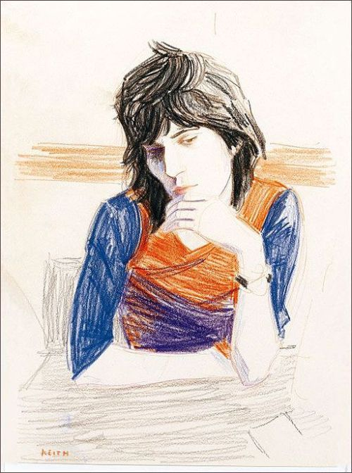
Elizabeth Peyton: Keith Richards

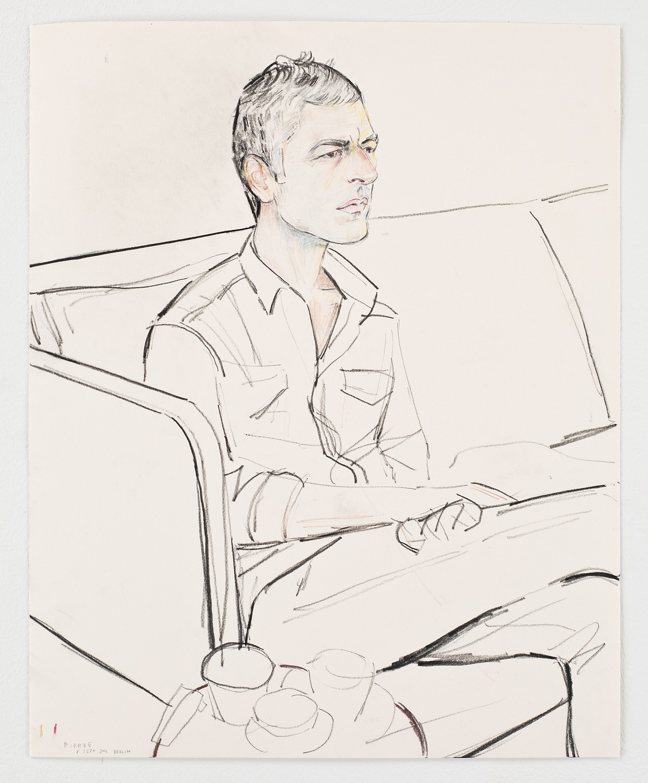
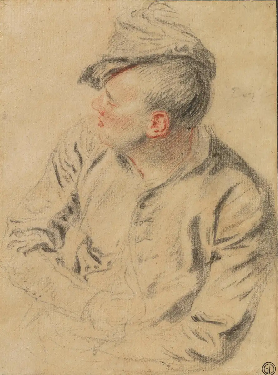
Peyton's drawing of a young fashionable Keith Richards above could be compared with the drawing of a young man by Watteau below. 

Watteau

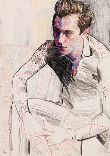
David

David, like so many of Peyton's male sitters has a 'far away' look about him, her watercolours and paintings in thin liquid oils sometimes break up these faces as a material metaphor for the fragile nature of her subjects' existences.  Some of David Hockney's early portraits have a similar feel to them, as he too was very aware of the short time left for the world of fashionable London that he then inhabited. 
Peyton often draws using oil paint, using a technique very close to watercolour in the thinness of the paint. Again it is in the 'unfinished' nature of the washed in surfaces that we see the almost ghosted nature of the subject. To be young and fashionable is such a fleeting thing, Peyton herself for a while once occupying a similar role within the art world. 
Watteau is a much more sensitive artist, he has a very high skill level that enables him to capture things that might be missed by a less accomplished draughtsman. Peyton works from photographs, so has the job of keeping the image alive or even giving it life, whilst Watteau has to capture everything he can as life passes in front of him. Both artists are concerned with capturing something about the fact that there are particular moments in life that linger in the mind like a sort of lassitude or uneasy awareness of the futility of it all. You might be famous or about to be, or you might be rich enough to not have to worry about where the next meal is coming from, but that doesn't inure you from that sense of melancholy, slight depression or feeling that life might not mean anything. Strangely, by making images of these feelings, the very feelings are dispersed. These feelings are worth preserving, they come across to us as being about a certain type of sensitivity, about a way of being in the world that relishes finesse and that appreciates melancholia as a feeling tone, a way of life that you can only aspire to if you are not having to live on the breadline or fight for every mouthful of food that you can get. Artists need to be alive to the full spectrum of human experiences and although this particular set of feeling tones are rarely seen as worth celebrating, they are central to our awareness of being in the world, and as such they are therefore important to record and in their recording, hopefully we can transcend and be alerted to do something about the situations that bring them into being. 

See also:

Tuesday, 15 November 2022

Drawing Grounds

I have posted several times on various drawing media and papers, but one area that is of vital importance to the final look and feel of a drawing is the ground preparation and this post is an attempt to begin to remedy this omission.

All painters are aware of the importance of their ground preparation and it is exactly the same for drawing. In fact many of the surface preparations are the same.

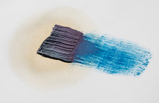
Oil based mark on unprimed paper

However before you begin priming any surface, you might want to consider whether or not the priming is going to support your idea. For instance in the image above you can see how on unprimed paper an oil based mark, such as from an oil stick or mark made with a brush using oil paint, will gradually separate itself out, the oil leaving the pigment as the paper absorbs the oil into itself. This capillary action is of course telling us about the nature of the paper and the nature of oils and pigments. The pigments are suspended in oil and the action of oil spreading out reveals this. It may be that this type of incident is vital to the material message that you want your work to communicate, and if so, you would be concentrating on the type of paper used and its ability to soak up oils, as well as of course on the makeup of the various oil based products that can be used for mark making. 
On the other hand you may want to investigate priming as a way to generate new ideas. By working across several different surfaces and grounds ideas sometimes emerge from the way the materials operate. But whether you have an idea of an effect you want to achieve, or whether you want to undertake a period of pure research and investigation of possibilities, you will need to use a surface of some sort and paper is for most drawers the one they begin with, so don't forget to check out previous posts on papers which can be accessed at the end of this post in the 'see also' section. 

Size

Sizing seals the support, which is why size is also called sealant. Basically size is a glue that seals the paper surface to reduce absorption. The surface sizing of watercolour paper helps watercolour sit on the surface rather than be absorbed into the fibres. This helps to preserve the luminosity of the pigments, whose reflective ability would be compromised by being partly absorbed into the mass of paper fibres.  

The same brush stroke on sized (left) and unsized (right) paper.

A size can be made from acrylic polymer, PVA, casein, (casein paints are ground in a solution of casein, which is a phosphoprotein of milk precipitated by heating with an acid or by lactic acid) or animal gelatine. The traditional size used by artists is rabbit skin glue, and it is the best if you are looking for a long lasting artefact, because it has a low acidic content. 

Primer

Before putting any paint on your surface you might want to use a primer. It is a glue that sticks well to your surface, better than your paint would. Then when your paint is applied, it sticks to the primer, so that it is well adhered, i.e. it isn't going to flake or crack off. Primers for acrylics are often called acrylic dispersion grounds and they are either acrylic gesso or acrylic primer and these new ones made by artist's suppliers such as Johnsons can fulfil the role of a size, primer and ground all in one. 

Gesso

Genuine Gesso is made of warmed animal glue and whiting. Gesso is a common preparation for a paper drawing base and has a range of qualities that make it very useful for surface control. You can sand back down into it and in doing so remove areas of drawing in a very subtle way, so that the drawing appears to emerge from the ground, or look as if it is sinking down into it. Genuine gesso is a hard, chalky surface built up by several thin layers. It is sensitive to water and will crack if used on a flexible surface, so to prevent cracking it must only be used on rigid substrates. Genuine gesso is extra-absorbent so it’s the best choice for painting in egg tempera or encaustic. Unless it states that it is traditional gesso, most things labelled gesso, are made with acrylic ground and are not as absorbent as true gesso, so if you can, test out both before making a decision as to which one is right for your particular approach. In drawings mixed with watercolour or dilute inks, the ability of gesso to absorb liquids again comes into its own and there is a deep, saturated look to liquids applied to true gesso surfaces that you cannot get on unprepared paper surfaces.  


Marks made on gessoed watercolour paper

The paper above was painted using a large brush that left brush strokes using an acrylic gesso. It was when dry lightly sanded to give it a grain and it was then drawn into with a sharp metal point, in order to scratch deep into the gessoed paper. A dilute black ink wash was then applied over the scratch marks and then a clean damp cloth was used to remove the ink from the surface so that it was left concentrated in the scratches. The wiping also enabled the surface to be 'softened' and a further layer of coloured watercolour was then applied and also wiped off. 

Watercolour over acrylic ground gesso.

In the image above you can see that the gesso was applied with a big brush in a straight downwards stroke and then put on slightly thicker using a palette knife using horizontal strokes. Watercolour was then applied with a large soft brush and partly removed using a dry cloth. 
 
Many acrylic primers were created to be similar to traditional gesso. You will therefore find various terms such as ‘true gesso’, ‘genuine gesso’ or ‘traditional gesso’, but to begin with just try them out and see what affects they help you achieve. All of them can be painted onto paper, and all of them can then be sanded, scratched into and variously distressed in order to give you textural control over a drawing's surface. 

If your surface needs to flex, Sinopia Casein Gesso can be used. It is very absorbent and is the next best thing to genuine gesso. You use it straight from the jar at room temperature. It is made with milk protein (casein) which is a binder in casein paints. It contains a small amount of linseed oil that has been emulsified so it can be thinned and cleaned up with water. But the oil content is actually quite minimal, just enough to make the gesso flexible and water insoluble after it has dried and cured – because it is minimal they say that the surface doesn’t need to be sized first to protect it from the oil. This also means it is not very absorbent, so intense watercolour or ink colours are harder to achieve. 

Once the gesso is applied it dries to the touch in a short amount of time so you can apply the second coat the same day when the first is touch dry, but no more than two coats a day. While the surface is stable enough for one additional layer, the oil content has to cure enough for subsequent layers to be applied. Because the recipe includes a linseed oil emulsion it will take four or five days for the surface to cure and become water insoluble. If you are working with aqueous wash techniques, which soak the surface with water, then you should wait for a complete cure. With less water or with oil techniques, the surface can be painted on after a few days.


A ground is the textured surface that all of your various drawing media have to respond to, whether these media are wet or dry. It’s the thing that you experience as 'touch'. Whether it is hard or soft, smooth or textured, absorbent or non-absorbent, coloured or white, it will directly effect the way that a mark sits on a surface.  Of course for a painter grounds are also vital, but sometimes the drawer can forget that the paper surface holds 50% of a drawing's textural potential. 

Some drawing media have grounds specially made for them, such as pastel and silverpoint. Transparent acrylic pastel primer is a ground that makes it possible to work in soft pastel on a wide variety of substrates: canvas, card, plastic, glass, paper, wood, ceramic or metal. It has a slightly gritty or toothy texture which will hold soft pastel grains. (You also have to think about fixative technology with pastel, so do follow the links at the end of the post for more thoughts on this). 

I have posted on silverpoint in the past and in order to get the metal to rub off on paper you need to apply a ground. My first use of a primer to do this was of ground-up cuttlefish mixed into gouache paint. But you can draw with a variety of metals as long as you consider the paper's surface preparation. Metalpoint drawings are made by dragging sharpened wires of soft metal (usually silver or lead, but sometimes gold) over a slightly toothy, textured surface. Particles of the metal wire are deposited on the surface, leaving ghostly grey lines which will tarnish over time to a warm brown tone. There is now a specially prepared commercial ground available, called 'Golden Silverpoint Ground' a milky acrylic ground that is designed for use on porous and flexible substrates. 

Detail from Lauren Amalia Redding, ‘De Donde Crece La Palma’ Silverpoint on panel

A good traditional ground is made from rabbit skin glue, bone ash, and pigment, but the rabbit skin glue must be kept at a constant temperature and several coats are required, this is why I used the gouache method. If you want to look at an artist that uses silverpoint grounds really well try Roy Eastland. He combines drawing on gesso grounds with scratching and sandpapering his images away, so that he gains full control of surface possibility. 

Roy Eastland

Roy Eastland

I particularly like Eastland's drawings of old toys such as the one above, the sanding back of the gesso allowing the images to ghost out of the ground, suggesting that they are emerging out of history. 

This post is simply an introduction to grounds and was prompted by the fact that several first year students are beginning to take more care over stretching papers and thinking about how they might use wooden frames to support taut drum like surfaces to draw on, but very few are exploring paper grounds and how they also affect mark making possibilities. 

See also:

Charcoal Includes a section on fixative and how to use it 
Sumi papers A reminder to explore what is out there in relation to possible surfaces to use
Tuesday, 8 November 2022

Video games as an art form

Walt Disney in front of a storyboard wall

Video games like animation often begin as drawings. Just as some artists use animation as their main communication channel, some artists use video games and video games like animations begin as storyboards. However a game storyboard is set out differently because you have different event levels or plot points that define the game world that you are devising. There will be structural issues related to how many levels and main characters or scenarios you want to develop. (A game doesn't have to have people in it) You may have more traditional animation storyboarding alongside structural diagrams, such as secondary event frames detailing dialogue, character meeting rules, or steps in a sequence. 

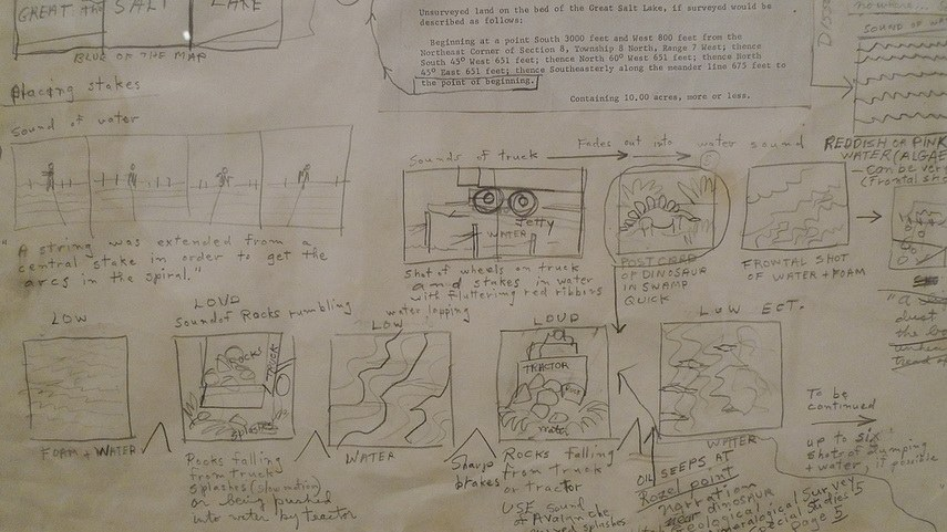
Back in the 1930s Webb Smith, an animator at Walt Disney Studios, started drawing rough sketches of frames needed for his animation drawings on different bits of paper, then he stuck them up on a wall to communicate a sequence of events. If you are wanting to undertake some visual storytelling, whether for a sequence of drawings or paintings, animation, graphic novel or in this case a game, this is a vital tool. Even sculptors such as Robert Smithson used storyboards to work out how their work would be communicated, in the case of Robert Smithson he carefully plotted out how a film of his work 'Spiral Jetty' would be made. If he was working now I'm pretty sure he would have considered the implications of making a game based on his sculptural work.

Notebook ideas for a storyboard of 'Spiral Jetty': Robert Smithson

Movie Treatment storyboard for Spiral Jetty


WALL-E storyboards

I'm interested in the Andrew Stanton directed WALL-E, because there is very little verbal dialogue, the character communicating mostly in mime using hand signals, facial expressions and body language. Even if you are not interested in animation, you can learn a lot about how to deal with non verbal communication by watching how character interaction with inanimate objects can be used to emotional effect. 
Wes Anderson is also an animation director who uses storyboarding to think with. He used the storyboard artist Jay Clarke for 'Isle of Dogs', asking Clarke to reference Akira Kurosawa films, for certain visual ideas such as silhouetted framing and dwarfing characters against a backdrop. If you look at the sequence below you can see how closely the storyboard artist has to work with an understanding of camera angle and the emotional impact of camera movement. 


Storyboarding roughs, worked up images and final animation

The interaction of human beings with non human others, such as cameras, is also something that is not mentioned enough in books on art theory. As an artist I am aware that unless I am very sensitive to these issues my work will be very poor. The skills that arrive with that of empathy with other forms of being are vital to our survival and all of these skills are used in storyboarding for games. 

Super Mario storyboard

Roller Rally storyboard concept

Design for a platform game

The art world has taken a while to accept that games can be developed as a fine art form, but over the last few years like photography and film making, video game design has become more and more accepted as an art form.  

Video games as contemporary art

Artists like Alan Butler have involved themselves directly with existing video games, in his case with 'Grand Theft Auto' a game that has detailed sections of real streets as a background against which the gameplay takes place. His work Down and Out in Los Santos (2016-ongoing) is a series of photographs that are created by exploiting a smartphone camera feature within the video game Grand Theft Auto V. Players of GTAV can take photos within the game environment. This operates in basically the same way as ‘real’ cameras do. Butler walks around a simulated three-dimensional space, finds a subject, points the camera, composes the shot and shoots it; which means that Butler is the author of the imagery.

Alan Butler: Photograph taken from Grand Theft Auto

Alan Butler talks about his work

Why video games are art

There are particular games that stand out as being personal expression. Papa y Yo a game designed by Vander Caballero, is centred on a young Brazilian boy, Quico, who while hiding from his abusive, alcoholic father, finds himself taken to a dream-like favela, where he meets a strange creature. The player, as Quico, can interact with the creature and manipulate the buildings of the favela in order to complete puzzles and progress in the game.

Papa y Yo

Sam Barlow the designer of 'Telling Lies' describes it as a "desktop thriller", where the player becomes involved in a drama that is played out through stored video clips and other information presented on a virtual computer desktop. It provides the player with numerous video segments that in the game's narrative, cover a two-year period. Like Janet Cardiff's audio walk pieces such as 'The Missing Voice: Case Study B' from 1999, this game involves you in a complex unravelling of an event. 


Sam Barlow storyboarding Telling Lies.

Scenes from 'Telling Lies' 

Steve Gaynor, Karla Zimonja, and Johnnemann Nordhagen who are collectively known as 'The Fullbright Company', developed 'Gone Home' which is a game that puts the player in the role of a young woman returning from overseas to her rural family home to find the house empty, leaving her to piece together what has happened. The player has to explore the house and determine what has transpired by examining items, journals, and other items left around the various rooms. Very like Janet Cardiff's walking audio narratives, you build up a story in your mind as you invest time trying to follow what has happened. The story unfolds as you pick up scraps of paper, notes, letters, photos, cassette tapes and other bits and pieces littering the house, which effectively makes it an environmental piece but one with echoes of an artist's work such as Sophie Calle's 'Dumped by E mail'. Each piece of found text helping to build up a picture of what really happened. It is interesting that the game had to be set in 1995 because the designers considered it the most recent year in which technology had not made the majority of communication digital in nature. Perhaps that year will in the future be seen as a watershed year in relation to how society operates. 

A scene from 'Gone Home'

The complexities of contemporary game design mean that it is done in teams but that doesn't as far as I'm concerned make it less of an art form. 

An introduction to the complex world of a video game artist

I think we will have to readjust our idea of what an artist does in the future. This sort of technology requires, like a movie, a whole bunch of people with various skill sets and it is the result of a cooperative effort rather than individual genius. However well known artists are beginning to see how they can use video gaming to extend their existing practices. For instance KAWS (Brian Donnelly) has used an augmented reality artwork at the Serpentine Gallery 

A visiter at the KAWS exhibition at the Serpentine Gallery

For one week at the beginning of 2022, 400 million existing 'Fortnite' video game followers could access a fully accurate replica of the Serpentine Gallery within the game, the artworks effectively becoming a game level that allowed a player to walk around with their avatar, and engage with the works.

Lawrence Lek, Nepenthe Zone (2021–ongoing)

In Lawrence Lek’s Nepenthe Valley (2022), the artist has created an installation inspired by the fictional medicine for memory in Greek mythology. Nepenthe Valley consists of an installation of virtual reality environments and was originally made for the virtual gallery AORA, something that is going to get more and more important, especially if Covid19 returns. The work revolves around nine “resting spots,” and it has virtual mountainous landscapes that come complete with meditation and breath-work sessions, infusing into the ethos of gaming a space for health and well-being.

LuYang
The Great Adventure of Material World, 2019, video game and video installation

In Lu Yang’s The Great Adventure of Material World (2019), players encounter a three-channel installation that, at first, appears like a typical role-playing game, with typical graphics, animations, quests, and battles. But players soon realise that the artist has changed the normal game narrative by forcing gamers to work with characters that shatter the illusion of the game’s narrative structure.

For those of you embarking on a fine art career, I think the status and relevance of art in relation to video gaming poses interesting questions as to the nature of art in the future. Many of you will play video games in your spare time, but how many of you have considered that video games could be the best art form to carry your ideas?

Most artists that want to get into working in this area begin by exploring game engines, which are the reusable components developers use to build the framework of games. By using an existing game engine you have more time to focus on the unique elements of your own idea, like character models, textures, how objects interact, etc. At the moment the Unity multi-platform game engine is free. It allows you to create interactive 3D content and I am told that a lot of indie developers use Unity for its ability to be used for pretty much any type of game. I'm also told it is very easy to master, but when I looked at it I found it a pretty steep learning curve, but that shouldn't put anyone off as I'm a pretty poor user of any software.

'Tableau Machine' created abstract images

Finally I'll leave you with an idea. 'Tableau Machine' was an AI based, interactive, visual art generator for shared living spaces. It was as its creators stated, 'an instance of...“alien presence”: an ambient, non-human, embodied, intelligent agent'. Overhead video cameras were placed in key places within someone's house, Tableau Machine interpreted its videoed environment by displaying a sequence of abstract images. At the core of the idea was an AI art generator with deep and long-term connections to its physical and social environment. 

Tableau Machine at work: Notice the abstract pink image on the monitor over the fireplace.

It seems a long time ago when this was done, and AI technology has advanced a long way since then. Perhaps it is time for a return to the ideas behind the project, but to this time turn the technology around and to use the idea to make everyone aware of the ubiquitous presence of surveillance camera technologies. You don't need to install any new cameras, they are everywhere, what I would though like to do would be to use the thousands of cameras to generate footage that would be interpreted as abstract art. The audience would be all those thousands of security guards and others who are employed to daily watch over our lives and they would have to interpret the abstract images fed to them, in order to make decisions as to whether or not to take action in response to what was seen. A wishful vision but one that hopefully encourages you all to think about possible new uses for game technology in relation to the existing technological infrastructures that surround us. Perhaps a game that might save us from climate disaster, by getting us to redirect all our energies into saving the planet. 
Coda

A recent review of the year's best video games by Lewis Gordon in ArtsReview, illustrates how far games have come as an art form and as carriers of ideas. Check out the review here

See also:


Context free art This is the software used within Tableau Machine to generate the art.

A recent article on video games as art Includes a rough history