Tuesday, 22 November 2016

The grid as a cage or trap

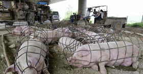
The grid as a cage or trap is something that I have long been fascinated by. A cage or trap can easily be read as a 3D drawing and a 2D grid can just as easily be read as a cage or trap. Look at these images of cages and traps below, they are already iconic forms, you don't need to do anything with them, as they have such a powerful image presence. Because of this many artists have made use of the associations grids have with cages and traps.  


Above 3D cages and traps, below 2D perspective grids, they have a very clear visual relationship.


An early example of the perspective grid being used to define a space for humans

Sir Edwin Henry Landseer, the Victorian painter, depicted animals and people behind the bars of a cage several times. The image below is though of special interest as it plays with the flatness of the painting. An image that was probably itself gridded to transfer it to canvas, is seen through a totally flat grid, (the bars of the cage) and the only intimation of space outside of the frame are the few objects placed on the shelf like space right at the bottom of the image. The objects are squeezed into the space behind the grid, the lion on the right hardly has space to exist, by giving the observer a few spatial clues such as atmospheric perspective and shadow play, Landseer tries to construct a believable space, but the flat grid works against this and we are somewhat disturbed by the 'dispute' between what is depicted and the underlying technicalities of how the space is made. 


Mr. Van Amburgh, as He Appeared with His Animals: Sir Edwin Landseer 1847


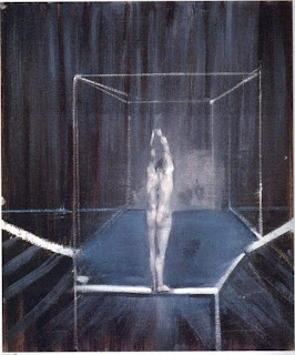
Francis Bacon used the cage format to suggest that his figures were trapped or caged in some sort of existential dilemma. The recent exhibition at the Tate Liverpool was titled 'Invisible Rooms' which is another way to think about what the perspective frame represents. 


Francis Bacon

He must have been aware of historical precedents such as the way Durer used perspective frames and the grid to measure his figures, however it is also likely that Bacon had looked at the example of Giacometti, who used the grid of measurement as a way to frame his images. He also of course looked at Eadweard Muybridge, who used grids in the backgrounds of his photographs in order to establish a frame of reference. 


Giacometti

Eadweard Muybridge


The perspective grid is often used in how to draw books to help students get an idea of how to set a body in space and when measuring by hand or with a plumb line you are in effect building an invisible perspective grid around the image as you try to measure what's there and how it is related to the space that it sits in.  


Using a plumb line and horizontal straight in a how to draw manual

Bacon and Giacometti both used the idea of the frame to express something beyond the fact that it can be used to measure a spatial volume. The frame is as much a trap or a cage, and in occupying this dual position it is able to also express emotion and conceptual questioning. 

A figure boxed in a how to draw book

Both Mona Hatoum and Louise Bourgeois have used the cage to express their feelings for the way that space or place can be both somewhere to live in and to be trapped by.  


Louise Bourgeois

Mona Hatoum

The issues that underly the use of traps and nets were beautifully articulated in Alfred Gell's famous essay 'Vogel's Net: Traps as Artworks and Artworks as Traps' which I have dealt with in detail in an earlier post.

As the grid becomes a trap, it traps not only the animal inside it, but also the mind of the trapper.

The grid is a powerful image and it runs through many areas of art practice. I shall no doubt return again to the subject, but if you want to read through some older posts there are links to them below and all refer to grids and how they can be used within drawing.

The grid 1
The grid 2
The grid 3
The grid 4


Mona Hatoum

Monday, 14 November 2016

Drawing Futures


There is a really interesting new book on drawing available free online, ‘Drawing Futures: Speculations in Contemporary Drawing for Art and Architecture’.

The book examines how the act of drawing still plays a central role as a vehicle for speculation. In particular the book discusses how drawing is changing in relation to new technologies for the production and dissemination of ideas.


Wednesday, 9 November 2016

Fine Art animation now


The Oriel Davies Gallery in Cardiff has been hosting a series of exhibitions and events to celebrate contemporary animation as being at the forefront of artistic and creative innovation. The gallery is showcasing a wide range of approaches to what is essentially moving drawing and after coming back from Berlin after seeing the large William Kentridge exhibition, I do feel that animation is one of today's key areas of drawing practice. Parts & Labour, which is part of Move It, explores animation as something that is ‘made’ – whether physically, digitally, or both. The introduction of the animated gif allows any simple set of images to be inserted into places where previously you would have put a still photographic image. Gifs allow you to use very little computer memory to animate a series of stills, this means you can drop these animations into a wide range of other programs. This trick when working with them is to think about circular visual narratives.


Dave Peel: Ice-cream


Dave Peel is an ex LCA student who went to Goldsmiths and he is making some very interesting animated gifs.

Dave Peel: animated gif

What Dave is doing is tapping into a very different aesthetic to the one we normally associate with drawing. His work is really an extension of collage, everything now of course generated directly on a computer, scissors and cut paper, now a distant ancestor. 

Of course you don't need new technology to make animation work. William Kentridge is a wonderful example of an artist using traditional drawing techniques to create animations. 


William Kentridge

Francis Alys has used traditional animation techniques to reflect on the interrelationships between rich and poor in modern city life. 

Francis Alys

Len Lye


There is a long history of fine artists using animation to get their ideas across, perhaps the most well known early pioneer was Len Lye. 


Mark Leckey

Mark Leckey was a recent Turner Prize winner with 'Made in heaven' a 3D animated recreation of a work by Jeff Koons.  Leckey uses his own room as a background for the animation, suggesting that the public profile of this very famous and very expensive work has been made very private, but then of course it is sent back out into public exhibition again. The work suggests that nothing is actually private, the reflective surfaces of Koons work perhaps acting as some sort of surveillance, in this case giving us 360 degree views of Leckey's flat.  

Some other artists using a range of animation techniques that you might find interesting.

Inger Lise Hansen House An animation of still images, exploring the breakdown of a house.

David Theobald Walking Holiday inGrindewald, An interesting take on the relationship between still life and landscape imagery, plus a range of his approaches to different genres and stereotypes.

Jordan Baseman Nasty Piece of Stuff, a speeded up photomontage, expressing the speed and energy of the city.

Katie Goodwin In Between Inception Animated images made from cuttings made from waste found footage from the 'cutting room floor' of Christopher Nolan's ‘Inception’. A more conceptual piece that references abstract animation and the process of film making itself.

Chris Shepherd World Stare OutCompetition, A drawn animation playing with the conventions of the genre. In this case the lack of animation reflects the fact that the protagonists are meant to remain still.

Lois Rowe and Patrick Rowan Filter, A montage and complex cutting sequence that reflects upon the repetitive nature of factory work in Asia.

Tadasu Takamine God Bless America, Traditional ‘claymation’ animation techniques laid over live footage to create a disorientated, disjointed commentary on the US.

James Lowne Our Relationships WillBecome Radiant, A meditation on nature using crude 3D animation techniques.

Jan Švankmajer is always worth looking at. Faust, Alice, Flora, and Food.

And everyone should be aware of the Quay Brothers. Švankmajer and the Quay Brothers carry on the Surrealist tradition into animation.
The easy accessibility and use of 3D modelling software and other computer based tools means that more and more artists are turning to this area to output their work and as drawing students working in the 21st century, you ought to consider the possibilities this area of work offers. 

Perhaps the real issue about using animation is the fact that the images move. We are hard wired to take an interest in movement, just watch how a very young baby can be captivated by an animation sequence. I have used very basic animation techniques myself to make animated gifs, and these have allowed me to deal with condensed allegorical narratives, in this case the stupidity of shifting your own mess onto others, they will just throw it straight back at you.


The boundaries between different types of practice are constantly shifting and Rachel Goodyear, an artist who made her reputation through drawing is now working in animation and performance. See:  
Goodyear uses animation in a variety of ways, sometimes she puts her work into photoframes as in Girl with a bird in her mouth, and at other times she uses back projection.


Rachael Goodyear: Dancing Devils (Back projection)

Animation is not just about how to animate, it is also about the physical presence of the work in the space where it is encountered. It may be projected, on screen, sent to mobile phones, seen on a bank of monitors inserted into an installation or inserted into a cinema pre-main feature slot. Whatever the realisation, it will be as important to test this out as it would be to test out the qualities of the animation itself.

See also:

Earlier post on drawing and film.

Video games as an art form

Computer animation

http://www.moveit.org.uk

http://www.animateprojects.org/films/by_date/2016/pig

https://hinemizushima.com/video-lake-monsters-music-by-they-might-be-giants


Friday, 4 November 2016

Mark Riddington at 18 East Parade

Check out Mark Riddington’s exhibition at 18 East Parade. ‘A Ghost of a Faded Engraving’
Mark Riddington’s work references astronomy, prehistory, and the occult. He works in dyed plaster, concrete and clay, often referencing astronomical phenomena, and celestial bodies, all of which are key issues when thinking about the history of drawing.
Stars are points in space and when we look at them we see patterns. If we could stare at the stars all night we would see that they trace linear paths across the sky. Riddington dyes plaster to create blocks of blackness, these are cut through with lines infilled in white.


By restricting the image to just one line we can concentrate on the quality of the line and at the same time focus on the work's concept.  Making the blocks out of concrete heightens the objectness of the support, and by incising the line into the concrete, the issue of surface/ground is again questioned, the line now being part of the ground, rather than something placed on it.  The precision of the line's curve suggests the geometry of the event, the fact that it is just a fragment of a much larger circle, suggesting that the work is referring to something that is itself a fragment of a much larger, perhaps universal concept. 


Stars and their movements were vital to the positioning of temples, this image below is of a stone inserted into the doorway of a temple dedicated to the God Ninlil, and is thousands of years old. The technique used is white inlay, in black stone.


Riddington's work allows us to think about some of the central issues of Modernism, (abstraction, painting as object, use of materials) and yet link these to age old concerns, (the sky as a realm of the gods, the occult, astrology etc). 

This post is also a reminder that it is also important to keep an eye of what is happening in the smaller art spaces in Leeds. This exhibition is promoted by 'Set the Controls for the Heart of the Sun', an organisation as art students you should be aware of  because they also have studio spaces as well as operating a curatorial umbrella. 

 till 
18 East Parade: LS1 2BH

Thursday, 3 November 2016

Paula Rego’s ‘Dancing Ostriches’


Paula Rego’s ‘Dancing Ostriches’ pastel drawings are on exhibition at The Marlborough Art Gallery, London until 12 November 2016.

If you have a chance to get down during the next week or so these are a wonderful set of drawings.

Pastels are dry pigments, it is as if you are drawing with coloured earth when you use them. You also use your fingers a lot when working in pastel, that trademark smudge of finger softness, being often resharpened by a mark pushed straight back into the softness. Its a medium you have to keep working with to ensure it doesn't just dissolve into a cloud of unknowing. This oscillation between smudging and re-finding an edge begins to build a dense surface, one that can in Rego's case carry the compact density and visual weight of her figures. Her 'ostriches' are very much women, but nevertheless birds too. They remind us of our animal being, of a not very far away raw nature, one that we ought to be celebrating rather than decimating. The more we are reminded of our close relationship to other creatures perhaps the more empathy we might develop towards those creatures that are not us. The act of taking a complex of coloured minerals and moving them around on a paper surface until they remind us of another connection we may well be forgetting, is an old act, one that a shaman would have been central to in times gone by. The giving of agency to other things is a powerful idea, one that involves a complex metamorphosis from one thing to another and which often also involves hybrids. Things not quite one thing or another. These ostrich women are in these terms other worldly, the operate in that gap between humans and animals, hybrid forms that have a weight and gravity that convinces us that they matter, that their physicality is very important and that the dance is always more powerful than it seems. 

Find a review of the exhibition here

See also:


Tuesday, 1 November 2016

Drawing with light 2

Because there is a neon light workshop now available for drawing students, I thought it worthwhile to just remind everyone that there is a long and continuing tradition of drawing with light. The earliest records we have of this is in the building of megalithic tombs and aligning them to the rising and setting of the sun.


The image above is of light entering a tomb in Newgrange in Ireland. Once a year, at the winter solstice, the rising sun shines directly along the long passage into the burial chamber for about 17 minutes and illuminates the floor. Many cultures and periods of art history have used light as a way to make images and define spaces, whether this is stained glass in Christian churches or the Diwali Festival of Lights, all respond to the power and spiritual associations we have when seeing light in darkness. Leeds itself has the tradition of Light Night and the 5th of November, 'Bonfire Night' is an excuse for everyone to try drawing images in the dark with fireworks.  

There are iconic images of Picasso drawing with light in his studio. I particularly like this one, because of the peculiar colour range and the way that Picasso is gradually fading away, his work becoming what replaces him.


Picasso


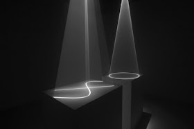
Some artists have spent their whole career drawing with light,  Anthony McCall in particular has explored the relationship between drawing, sculpture and installation with light drawings such as 'Between You and I'. His work not only draws in a space but it actually articulates how we experience space. His work Line Describing a Cone from 1973 is made from a beam of white light emitted from a film projector positioned at one end of a darkened room. Passing through the projector is an animated film of a thin, arcing line that, frame by frame, gradually joins up to become a complete circle. Over the course of thirty minutes this line of light traces the circumference of the circle as a projection on the far wall while the beam takes the form of a three-dimensional hollow cone. Mist from smoke machines gives the beam of light a greater density, making it appear almost tangible.


Anthony McCall: Between you and I

Carlo Bernardini uses laser installations to reveal the nature of architectural spaces.
Carlo Bernardini

Bernardini effects a sort of 'join the dots' sculptural experience, locating his laser driven 3D drawings between the main elements of any architectural structure. Lasers are now much more common and laser measuring devices have brought them into the home. You can use small mirrors to send beams around corners and create reasonably safe light environments. (Nb. I say reasonably safe because peoples eyes are very sensitive and you have to be vary careful that these beams are not going to take someone by surprise. Always check with H&S experts if you are going to try this).  

Annica Cuppetelli and Cristobal Mendoza have been collaborating since 2010. They work using textiles and light projections. Transposition a site-specific installation consists of elastic ropes that are illuminated by software driven video projections and asks questions as to the relationship between the real and the virtual, audiences having to interact with the elastic ropes in order to shape and transform the projections.


Annica Cuppetelli and Cristobal Mendoza
Massimo Uberti states, "I like to create architectures of light,  I employ neon tubes to build places for poetical inhabitants, trying to create dream-like spaces that allow for reflection." Again we have an artist that creates architecture within architecture, this time for poetic purposes and the creation of an image, rather than trying to explore the space and its properties as an end in its own right.
.

Dan Flavin is the artist who introduced the neon tube into art during the early 1960s, as a Minimalist sculptural device, Bruce Nauman working at a similar time realised its potential as a conceptual tool. Since this time the neon has become more readily available and more importantly for a while cheaper to produce, until it became a go to material for a wide range of artists from Tracy Emin to Martin Creed. Most of these artists were of course using neon for its textual possibilities, the fact that it had to be seen in the dark was perhaps not as important as the fact it referenced commercial signage and was part of the aesthetic of the street at night.

Most of our images of neon are photographs, we are often consumers of second hand images via the printed or on screen image. Therefore it is no surprise that several artists who draw with light, specialise in photography, the actual event of the images making, sometimes being as important as the photograph that recorded the action.

Susan Sims-Hillbrand views her work as a performance and she refers to the end result as Spiritual Landscapes. “They are like a choreographed dance, movie or play on a single frame of film. They tell a story. Still today it fascinates me to know I am in the piece yet you never see me.”  Working using film rather than digitally, Sims-Hillbrand draws her images using torches, working around the edges of people within long exposures, so that it appears that she is capturing the ghost of someone's presence.

Susan Sims-Hillbrand 

Thomas Wilfred

The video above is from the 1930s and is by Thomas Wilfred an artist who coined the term "lumia" to describe "an eighth art" where light would stand on its own as an expressive art-form. As you can see working directly with light is nothing new, and Thomas Wilfred was aware of this, siting his work within a tradition of light as a spiritual response to the world, he often referred to Theosophy as a guiding principle, thus linking him to Mondrian and Kandinsky two other leading early Modernists who also followed Theosophy.

Working with light will always be associated with a sense of wonder. Seeing the world by moonlight as you walk home at night still feels like a special experience, we are still excited by firework displays and those glowing neons over high street shops are part and parcel of what it is to live in a 24 hour city. Artists are still called in by the church to respond to the old ideas of Christian spirituality and stained glass although an ancient craft can be renewed by more contemporary languages, Marc Chagall in particular was often brought in to design new windows. When I visited Chichester Cathedral during the summer I discovered a wonderful window designed by him.

Chagall stained glass

So whether you are using traditional craft skills or the latest laser projections you will be working within a long tradition of illuminating both the physical space and the mental condition of the various audiences that might encounter the work.

For further reflections on film see:

For an interesting article on 3D drawing by John Stell that includes a section on using the recording of light in association with body movement see:

See also:

Stained glass
Drawing with light 1
Drawing with light 3
Tone and emotional value