
Jim Dine: Flowers in a vase
The use of tone or value as it is often called in the States is a vital part of any visual artist's tool kit. However recent use of it has become the provenance of film makers rather than the drawing community, so I thought it time to remind ourselves not just of how important it is, but of how thinking about light and dark can extend an understanding of our place in the world.
The reason the movement between light and dark is at the core of our image making is because of embodied thinking. Simply close your eyes and you will have reaffirmed the centrality of this to your conceptual view of the world.

The Earth spins on its axis and as it does so the line that divides day from night or light from dark, is constantly moving around the planet. Humankind's personal experience of this caused them to divide experiences into periods of day and night. We base our sense of time on this and use our waking hours in the time of light and our sleep periods at times of darkness. (Or we did do before the invention of artificial light) A lack of light causes us difficulties, unlike a cat our eyes are not designed for low light levels and unlike a dog our other senses are not acute enough to operate as substitutes when the light goes. The light from the sun is also warming and dark nights can be bitterly cold. As well as a dark/light daily reminder of the Earth's spin, the Earth orbits the sun and has seasons because it's axis of rotation is tilted at an angle of 23.5 degrees relative to it's orbital plane. We therefore experience a more gradual series of dark / light changes; winters being cold and dark, summers warm and bright. These experiences are integral to what we are as a species and we are therefore highly attuned to the various differences in our experience of light and darkness. Whether it is telling the time by looking at differences in shadow length, judging distance by using atmospheric perspective, being able to tell what the weather is going to be like because of the quality of the light or forecasting the future by gazing at the sunset, the various qualities of light or its absence are vital to our understanding of what it is to be an animal living on a spinning planet that derives its warmth from a yellow sun. The experience is both physical and emotional, the introduction of SAD lights into Glasgow coffee shops recently being a timely reminder of how Northern countries suffer from a lack of sun during the winter and how this affects our emotional well being.
The experience of living in a world that has constantly changing light / dark values is central to the use of tonal value as a form of communication to others. Communication only works if there are common points of understanding between the message sender and the receiver, therefore the control of light by a message sender will inevitably trigger associated experiences on the behalf of the receiver.
One of the most important aspects when looking at differences in tonal value is that they are closely linked to differences in the creation of emotional register. The drawing at the top of this post by Jim Dine is of a very common subject matter, flowers in a vase, and yet by using a careful handling of tone, he has created a dramatic scene of almost religious intensity. Dine has always argued that he is not a Pop artist and that his work should be looked at in relation to much older traditions, so I thought it interesting to use his drawings as examples of how differences in tonal value could effect meaning and compare his use with the way it has been used historically.
The use of controlled tonal value has a long history, and the terms used to think about how it creates effect have been around since Renaissance times, so perhaps that's the best place to start if we are to get a firm grip on how tone can be used in image making.
Sfumato, which translates from the Italian as soft, vague or blurred, is a way of describing a type of soft shading meant to produce a delicate transition between tones.

The possibilities of soft focus were revisited by 20th century film makers who realised that the soft tonal transitions that can be created by shallow focus or the smearing of Vaseline on the lens, could give an image a more emotive resonance. It was often used to heighten a sense of romance or nostalgia; to create the out of focus feeling that comes with the warm glow of being in love. William Daniels was the film Queen Christina's cinematographer, a specialist in the use of light to evoke mood, winning an academy award for his work on the 'Naked City', this time often using the high contrast of chiaroscuro, (see definition later) to highlight the drama and emotional intensity of city life.

Leonardo da Vinci's definition of sfumato was "without lines or borders, in the manner of smoke or beyond the focus plane". He was the first artist to use a soft focus gaze to heighten a feeling of homely spirituality. Compare the lighting and direction of gaze in the images of Greta Garbo and the Virgin Mary and you can see how close they are in mood and emotional register.
The reason the movement between light and dark is at the core of our image making is because of embodied thinking. Simply close your eyes and you will have reaffirmed the centrality of this to your conceptual view of the world.

The tilt of the Earth in relation to the sun
The Earth spins on its axis and as it does so the line that divides day from night or light from dark, is constantly moving around the planet. Humankind's personal experience of this caused them to divide experiences into periods of day and night. We base our sense of time on this and use our waking hours in the time of light and our sleep periods at times of darkness. (Or we did do before the invention of artificial light) A lack of light causes us difficulties, unlike a cat our eyes are not designed for low light levels and unlike a dog our other senses are not acute enough to operate as substitutes when the light goes. The light from the sun is also warming and dark nights can be bitterly cold. As well as a dark/light daily reminder of the Earth's spin, the Earth orbits the sun and has seasons because it's axis of rotation is tilted at an angle of 23.5 degrees relative to it's orbital plane. We therefore experience a more gradual series of dark / light changes; winters being cold and dark, summers warm and bright. These experiences are integral to what we are as a species and we are therefore highly attuned to the various differences in our experience of light and darkness. Whether it is telling the time by looking at differences in shadow length, judging distance by using atmospheric perspective, being able to tell what the weather is going to be like because of the quality of the light or forecasting the future by gazing at the sunset, the various qualities of light or its absence are vital to our understanding of what it is to be an animal living on a spinning planet that derives its warmth from a yellow sun. The experience is both physical and emotional, the introduction of SAD lights into Glasgow coffee shops recently being a timely reminder of how Northern countries suffer from a lack of sun during the winter and how this affects our emotional well being.
The experience of living in a world that has constantly changing light / dark values is central to the use of tonal value as a form of communication to others. Communication only works if there are common points of understanding between the message sender and the receiver, therefore the control of light by a message sender will inevitably trigger associated experiences on the behalf of the receiver.
One of the most important aspects when looking at differences in tonal value is that they are closely linked to differences in the creation of emotional register. The drawing at the top of this post by Jim Dine is of a very common subject matter, flowers in a vase, and yet by using a careful handling of tone, he has created a dramatic scene of almost religious intensity. Dine has always argued that he is not a Pop artist and that his work should be looked at in relation to much older traditions, so I thought it interesting to use his drawings as examples of how differences in tonal value could effect meaning and compare his use with the way it has been used historically.
The use of controlled tonal value has a long history, and the terms used to think about how it creates effect have been around since Renaissance times, so perhaps that's the best place to start if we are to get a firm grip on how tone can be used in image making.
Sfumato, which translates from the Italian as soft, vague or blurred, is a way of describing a type of soft shading meant to produce a delicate transition between tones.

Greta Garbo: Queen Christina 1933

William Daniels: still from the 'Naked City'
Leonardo da Vinci's definition of sfumato was "without lines or borders, in the manner of smoke or beyond the focus plane". He was the first artist to use a soft focus gaze to heighten a feeling of homely spirituality. Compare the lighting and direction of gaze in the images of Greta Garbo and the Virgin Mary and you can see how close they are in mood and emotional register.

Leonardo: Head of the Virgin Mary
The sfumato or smoke technique as it was sometimes known, is used to develop soft edges made by blending one tone into another. This use of sfumato allows Leonardo to create a statement about motherhood and love. The soft gentle forms that make up the image mean that harsh sharp edges and hard lines are avoided, our view of motherhood is in this case idyllic and myth-like, which is as it should be when creating an image of the Virgin Mary. Sfumato would also be used to emphasise a quiet sadness or interior reflection.

Jim Dine: self portrait
The self-portrait by Dine above was the closest I could find to him using the sfumato technique. Leonardo would have criticised this drawing as being too dramatic, dark and light patches swirl around the head and create drama, as in chiaroscuro, but there is a certain softness about the edge of the head that could be read as being the result of a sfumato technique and there is I would suggest a certain quiet sadness or interior reflection communicated. Very few contemporary artists use the classical techniques exactly as they were intended, but after 500 years or so ideas about drawing have changed, so it would be unlikely to find an artist working in exactly the same way. Diane Victor's smoke portraits use the idea of sfumato in a very direct way; she draws with candle smoke. Smoke drawings are very fragile; it is almost impossible to touch them without knocking the soot off the image and in this very fragility, they add an emotional layer to our engagement with them. They operate very like memento mori or vanitas images, reminders of the very temporary nature of our existence.

Diane Victor: Smoke portrait
Unione is a technique by which you achieve emotional delicacy by the
control of a tonal scheme. One way that controlled tonal gradation can be
achieved is by toning down colours by reducing their saturation, something we
have become used to because of the way 'saturation' can be easily
adjusted within computer software packages such as Photoshop. However
using the technique to adjust the emotional range in a drawing or
painting is an important discipline to learn and one often forgotten
about. Unione, or what is sometimes called 'the union of
planes', does not tend to use the softened edge that we see in
sfumato, it tends towards the use of defined edges so that it is easier to see
structure and form, but this is not to develop drama as in the
use of chiaroscuro. Dark against light and light against dark is in a
composition, used to clarify form and this is part of a wider or more
overarching concept of the breadth of tone or type of tonal
scheme. The search is for the right “tonal key” for the image, and this is
what will determine the image's mood and emotional impact. Unione is about
composing tonal values, seeking an overall feel or emotional register to an
image. The quiet solidity of the image of St. Catherine below, suggests that
she will always be there, she has totally transcended her horrific experiences
of being tortured on the wheel and now helps to cement the viewer's
relationship with God. There is no need for drama because the church is sure in
its convictions, the tonal range echoes this and the modelling of forms gives
the body a monumental stability.

Raphael: Saint Catherine of Alexandria
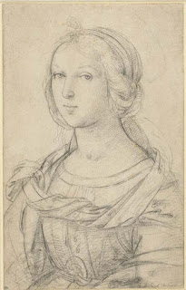
Raphael: Drawing of a female saint

Bill Viola
The video artist Bill Viola is probably
the best person to look at if you are thinking about finding an artist that
uses these techniques today. Look at Bill Viola's lighting and he is often
found trying to emulate the emotional registers found in Renaissance paintings
and in order to do this he has to control tonal value very accurately. In the
case above he has used the concept of unione to create a very low
colour saturation in order to control the image's mood and emotional
impact. By being aware of these issues Viola is able to add a far more
stringent technical control to his lighting of scenes.
Cangiante, is a method of working up dark or light patches using a different colour, for instance yellows might move into being greens when they need to be darkened, rather than moving into the mustards. This is a technique more for the use of painters, but I have used it in drawing, especially when working in pastel. The term comes from the Italian “cangiare” meaning, “to change”. It is useful when working with poor quality pastels or paints, as the amount of pigment in them can be very low and therefore in a shadow or tint the colour becomes dull. As a technique it can result in unexpected colour values, which is why the technique of cangiante was often used for painting religious drapery, the unearthly colours suggesting the spiritual nature of the subject matter.
Cangiante, is a method of working up dark or light patches using a different colour, for instance yellows might move into being greens when they need to be darkened, rather than moving into the mustards. This is a technique more for the use of painters, but I have used it in drawing, especially when working in pastel. The term comes from the Italian “cangiare” meaning, “to change”. It is useful when working with poor quality pastels or paints, as the amount of pigment in them can be very low and therefore in a shadow or tint the colour becomes dull. As a technique it can result in unexpected colour values, which is why the technique of cangiante was often used for painting religious drapery, the unearthly colours suggesting the spiritual nature of the subject matter.

Fra Angelico: Presentation of Jesus in the Temple
Film makers often use colour filters to give emotion effect. In Alfred Hitchcock's film Vertigo, Judy who’s also playing her alter-ego character Madeline has a dual evil/good nature, and her half-lit green tinted face leaves us in no doubt as to this duality. In this case the green virtually monochrome effect of the filter suggests a demonic rather than spiritual register, the strong tonal contrast however reminds me of the use of chiaroscuro.

Still from Alfred Hitchcock's Vertigo
Chiaroscuro involves strong tonal
contrasts between light and dark, often used to model three-dimensional form to powerful effect. Chiaroscuro is at the dramatic end of the emotional scale, used to emphasise
strong emotions and dynamic action. Caravaggio's St Catherine is a woman in action rather than a Saint in contemplation as in Raphael's version.


Caravaggio: St Catherine
The outward looking gaze means that we are
engaged in the drama of Caravaggio’s St. Catherine's life; the light dark contrast is
taken to extremes, it feels almost as if the scene is lit by flash light.
Rembrandt's great etching, 'Christ healing the sick', is another example of how chiaroscuro can be used to compose the drama of an event.

Jim Dine's image of a screwdriver below is a useful demonstration of how by using a technique normally reserved for showcasing the drama of human lives, an artist can give honorific value to other things. In this case the screwdriver is effectively a stand in for a human being.

Rembrandt's great etching, 'Christ healing the sick', is another example of how chiaroscuro can be used to compose the drama of an event.

Rembrandt

Jim Dine: screwdriver
The dramatic lighting of the horror movie is where we see the full potential of tonal manipulation in relation to emotional intensity, even the earliest horror movies such as 'Nosferatu' were using tone and shadow as powerful indicators of fear and anxiety.


Compare the images of tonal control using a camera above to the drawing by Stanley Spencer below and you can see where perhaps drawing technique 'wins out'. The pen and ink drawing that Spenser did of himself when very young, involved an intensity of looking over a period of time. The pen and ink strokes not only mesh together to create differences in light and shade, but suggest movement across the contours of the face and an awareness of an underlying muscle structure that gives a heightened feeling of weight and presence to the head. This coupled with the gradual fading out of the drawing as it reaches the body, means that the drawing can suggest a degree of focus that photographs with all their ability to play with focal length, do not. 
A still from F. W. Murnau's 'Nosferatu'
The control of light to effect meaning is now part of the normal day to day training of any photography student, but it is often forgotten how the language of tonal difference was once an integral part of an artist's lexicon. Lighting guides such as the ones below are freely available and any of you thinking of photographing your work, should download one and print off so that you become conversant with the camera's potential to construct tonal ideas.

Get print version from here

Photography Lighting tips

The close relationship between drawing and photography means that many contemporary artists rely on photographs or a combination of drawing and photography to inform their image making.


The romance of old ruins seems to demand a powerful lighting treatment, and our contemporary obsession with lighting buildings at night is yet another aspect of light's power to shape our emotional engagement with things.

Like so many people this year I was entranced by the 'floating' moon that appeared in Leeds dock during "light Night'. Luke Jerram's 'Museum of the Moon', perhaps being a modern day equivalent of Piranesi's prints.

So a long rambling post has moved on from thinking about the way tonal value was articulated in Renaissance times to the lighting of buildings at night, via shadow-play in horror films, photography lighting guides and the way Alfred Hitchcock tells a filmic story. But these things are all part of the same urge to control light in order to effect emotion and in developing this control we seek refinement and an ability to understand how our emotions can be engaged. It is this delicate adjustment of tonal differences and qualities that I would hope you would take away from this post, whether in drawing, making a film or building an installation.
See also:
Emma Stibbon in the image above, uses a play of light that is derived from photographic documentation but because she supplements her thinking by also making drawings from the subjects chosen, she is able to carefully chose how much to copy and how much to invent. In the case of the large woodcut print above, it relies on a drama of dark light contrast that also refers to the most memorable of works that came from an older tradition of prints made as records of the 'Grand Tour' of Europe, whereby the rich would be taken around the artistic highlights of each European country. In particular the artist Piranesi was able to rise above the 'postcard' feeling of many of his contemporaries and give to his images some of the romantic grandeur that ruins often have in the mind of a romantic traveller and it is this 'sublime' grandeur that Stibbon is looking for.

Piranesi: Arch of Constantine
The romance of old ruins seems to demand a powerful lighting treatment, and our contemporary obsession with lighting buildings at night is yet another aspect of light's power to shape our emotional engagement with things.

The Acropolis at night: Athens
Like so many people this year I was entranced by the 'floating' moon that appeared in Leeds dock during "light Night'. Luke Jerram's 'Museum of the Moon', perhaps being a modern day equivalent of Piranesi's prints.

Luke Jerram: Museum of the Moon
So a long rambling post has moved on from thinking about the way tonal value was articulated in Renaissance times to the lighting of buildings at night, via shadow-play in horror films, photography lighting guides and the way Alfred Hitchcock tells a filmic story. But these things are all part of the same urge to control light in order to effect emotion and in developing this control we seek refinement and an ability to understand how our emotions can be engaged. It is this delicate adjustment of tonal differences and qualities that I would hope you would take away from this post, whether in drawing, making a film or building an installation.
See also:
Drawing is the great art... Everyone should learn art during their lifetime...
ReplyDeleteHow to pass Nebosh IGC3
Nebosh IGC Registration
IOSH MS course in Chennai
Nebosh Course in Chennai
Safety Courses in India