Friday 24 November 2017

Collage:Part two

Frances Stark

Frances Stark is one of several artists that are returning to collage as their art form of choice. However the times have changed and contemporary collage practice seems to be purposely both politically and morally dumb. It has often been said that we get the art we deserve and artists like Stark give us a timely reminder of this. I think this is a good thing, there are times we need reminding of how stupid things are and 'serious art' can just miss the point, Stark's 'Clever' and 'Stupid' signs pointing to the fact that it is sometimes very easy in times like this to become confused and politically directionless. Perhaps today's serious art is tomorrow's poor joke. 


Frances Stark

In the time of post 'Dumb and Dumber' an image such as 'I went through my bin' has that throw away quality that suggests Stark just doesn't care and will just do something, anything to make some art. It might be inane but so what, life's like that. 


Frances Stark

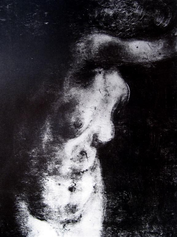
Stark uses old fashioned carbon paper to trace off images that she is interested in and will range across a wide range of both high art and low art sources, often using quotes from literature in order to make her point, which appears to be the impossibility of finding true meaning in what we do and how we look for truths in the work of famous literary figures, but fail to find it. 
There are a lot of collage artists around at the moment and in an age of the throwaway it is probably the medium of choice for artists that want to feel politically true to the zeitgeist of the day. 


Alex Daw

Alex Daw's work suggests the almost suffocating amount of stuff that is thrown away, his work is layered with collaged images, both people and environments becoming clogged up with piles of torn out possibilities. 
Craig Atkinson's irreverent take on things pitches his scraps of collage against the last vestiges of spiritual meaning, his 'God' a captain Bird's Eye of fish fingers fame, cut out shouting in the void, lost in roughly painted yellow space. In another image tiny half moon snippets of faces suspiciously avoid direct eye contact with us, as if they know something we don't, all part of Atkinson's precarious world of jumbled bits and confused juxtapositions, tales of daft punk associations and irreverent pokes at the authority of art and the old grand narratives. 
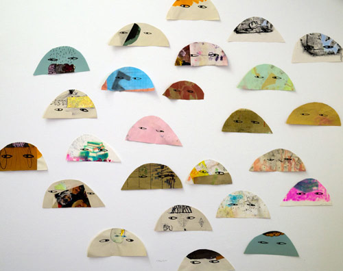


Craig Atkinson

Christian Marclay has recently been making small collages from Japanese manga comics and then has them scanned and edited before applying them to large wood panels and getting them cut out and prepared for printing using both traditional wood carving and modern laser cutting techniques. Marclay's 'the Clock' is a classic example of how collage can be used in a video format and if you have not seen it there is a link at the bottom of this post.

Christian Marclay's Screams

Christian Marclay

Marclay has had a long interest in sound and how we represent it and in comic books he found the perfect material from which to make collages. Comics have developed a very sophisticated set of word images to deal with sound and if you want to explore this in more depth see Scott McCloud's 'Understanding Comics'.

From Scott McCloud's 'Understanding Comics'

Marclay's print is based on a transcription made from a collage, that is itself constructed from a variety of comic sources. The interesting issue here is that the collage material is taken back into a print making process that brings all the separate elements together into the same world. Print making and collage have a long intertwined history, so much of the material for collage coming from the rise of print as a production process, a process that is still with us even though we were told that computers would bring in a paperless society. The fact that commercial printing processes are now readily available to everyone and that it is so much easier to scan or make a photographic image of something, has paradoxically led to a further explosion of printed matter.

Alex Rose introduces an almost ritualistic approach to collage, often using aged papers, combined with cheap printing processes to give the effect of images arriving from another time. The combination of different printing processes and the re-photographing or scanning of collaged images and then re-editing in Photoshop, has allowed artists like Rose working in this area to develop a much wider set of sensibilities. College can now be combined with drawing or assemblage, be re-positioned back into the world and photographed again, becoming either part of an on-line culture or operating as collage has always done, as a low technological reminder of the poetry and Surreal potential of the everyday to become magical or simply beautiful. 

Alex Rose

Alex Rose

A personal favourite of mine is Christiane Kowalewsky. She produces an endless stream of images and seems to singlehandedly want to ensure that the old magazines and books of this world are going to live on in her personal world of surreal encounters. 

Christiane Kowalewsky

Someone who is concerned to bring back into collage its status as a medium of political and social critique is Tariq Alvi. Tariq Alvi’s work is an interesting combination of intense highly wrought surfaces that are a result of painstaking dissection of printed materials, such as cutting out hundreds of price tags or items of jewellery and the reassembling of these things in such a way that they are re-constructed as a challenge to our notions of both form and format. Again we find collage a useful tool with which to de-contextualise consumerism, and in Alvi’s case he will also at times include references to the sexually charged hidden drivers hidden behind our desire to consume. 


Tariq Alvi

Max Ernst, Kurt Schwitters and Hannah Höch it could be argued set out the three main directions that collage would take. Ernst demonstrated the Surreal potential of composite images, his 'La femme 100 têtes' collage novel set the standard for this type of work both in imagery and in production values. Ernst created his first collages in 1919, using old scientific manuals and illustrated catalogues to make irrational images that tapped into the world of dreams and the subconscious, as well as celebrating the possibilities engendered by an image's chance encounters.

Max Ernst

Max Ernst

Kurt Schwitters saw a different potential on collage, this was the creation of beauty from detritus. He used his formalist understanding of constructivism to create compositions that have all the sophistication of a Classical painting, however he uses the most banal materials, such as used bus tickets and torn envelopes and in doing so makes us aware of how all things in this world have the potential to be beautiful.


Kurt Schwitters

Hannah Höch added a political element into the way that collage was used. From a critique of the financiers and military elite during the depression, to complex discussions around gender and identity in relation to the role of ‘New Woman’ in Weimar Germany, she produced many biting and poignant collages.

Hannah Höch

Hannah Höch

This post is a reminder that collage is an important and powerful drawing tool and in no way is it a summary of what is a huge subject, one that I shall return to several times. Hopefully it will encourage readers to begin to explore the subject much further and to try out for themselves the potential of using collage to reflect upon the society in which we live. 

References

Ades, D. (1986) Photomontage London: Thames & Hudson

Krohn, S (2013) The Age of Collage: Contemporary Collage in Modern Art Berlin: Die Gestalten Verlag


Busch, D. H. (2016) Age of Collage 2 Berlin: Die Gestalten Verlag


Brereton, R and Roberts, C (2014) Cut & Paste: 21st-Century Collage London: Laurence King        

See also

Monday 20 November 2017

Collective and collaborative drawing in contemporary practice

A detail taken from a much larger drawing, that was used for the front cover

There is a new book on drawing coming out on December 1st that followers of this blog may find interesting, if only because I have written chapter 8 and provided the illustration for the front cover. It's entitled: 'Collective and collaborative drawing in contemporary practice'. 

Chapter eight is focused on my own practice and in particular is an examination of a body of work I was making in Chapeltown, Leeds. So that you can get an idea of my contribution to the book, below is a copy of the text used by the publisher as a guide to what the chapter contains. 

Chapter Eight
Drawing as a Tool for Shaping Community Experience into Collective Allegory


This chapter offers an account of an artist using drawing to develop images of allegorical significance within an inner-city community. It highlights the ways in which a variety of drawing methodologies can be used to respond to different community concerns, considering drawings as a visualisation tool, analogy, invention, narrative and visual allegory. Barker believes that drawing can be used to develop a deeper understanding of difference and of the mutual interests of various residents within a multi-cultural community. He also argues that drawing can act as a catalyst to help the wider community approach issues of contemporary urban life and associated political and social issues.
Five related but separate drawing methodologies are examined with regard to their capacity to foster different types of visual understanding in relation to a particular community. Traditional objective drawing is examined in relation to its ability to not only document an area but as a method of conversational engagement and as a way of getting people to look at a place they think they already know well. Drawing as imaginative play and image generation, in relation to stories told and world views expressed, is explored as a way of developing a dialogue with others and as a tool for the generation of possibilities for an artist’s own practice. Architectural illustration and associated technical drawing skills are examined for their potential uses as community envisioning tools and as instruments for change and the implementation of local environmental projects. Map making is opened out as a tool for enabling effective community ownership of both real and imagined events and reflections upon large scale narrative drawings are used to illustrate how these various drawing methodologies can be brought together to create complex and transparent interconnections between concepts.
The various ways that drawing has been used as a tool to foster debate and argument are highlighted. Images are always open to interpretation and Barker argues that this is vital to a community “reading” of allegorical drawings, as “readers” have automatic ownership of their interpretations, thus avoiding the problems associated with more didactic approaches. Visualisations are also essential to community ideation. Drawing is shown to be a kernel around which images can be developed that address issues within a more universal context. Drawings produced within a local context present an opportunity for a negotiated re-imagination, providing a space for the development of a deeper understanding of shared contexts.
Other more writings by myself can be found here


Friday 17 November 2017

Jasper Johns at the Royal Academy and Paradise Lost by Pablo Auladell

From Paradise Lost by Pablo Auladell


Sometimes an artwork comes to my attention that I'm in awe of. Coming across two things in the same week is a rarity but last week was one of those weeks. I had been down to London on the weekend to see the Jasper Johns exhibition and I thought it was wonderful and then during the week I came across the illustrated version of Paradise Lost by Pablo Auladell. Both of these experiences made me think about drawing but in totally different ways. 


From Paradise Lost by Pablo Auladell

Pablo Auladell is one of those artists that straddles the divide between illustration and fine art. It's a difficult line to tread but one that I'm convinced lies very close to what makes drawing a powerful and significant art form. In some ways both Johns and Auladell tell a story. Auladell is revisiting Paradise Lost like so many artists before him, he has to reinvent the images relying on the same text that stimulated Dore and Blake, but he has to find a way to do this that makes the drawings relevant to us now, to people of the post Modern era, a time of agnosticism and little faith in religion or politics. Auladell develops an image of Satan as an ordinary man, as a man struggling to find a place for himself. The images are post-Freud, they reflect on a son who has disobeyed his father, who choses a hat to single himself out, who can fly, but who has wings that never quite seem to fit. 

Gustave Dore: Paradise Lost

William Blake: Paradise Lost

Jasper Johns is an old man now and the exhibition at the Royal Academy covers the whole range of his life's work. From his flags and numbers and on through to much more autobiographic images made as he gets older. 

Jasper Johns

The rich variations of mark making in this charcoal drawing of numbers above makes for both a beautiful drawing and a space for contemplation. Numbers are peculiarly human inventions and in drawing them with such sensitivity they are elevated in status and in effect they become portraits of humanity. Kant spoke about, "an intuition of the bare two-oneness" when reflecting on the moment numbers came into being, at some point he theorised, one individual human must have had an intuition of the idea of counting, of the difference between one and two and that two was twice one. 


Jasper Johns

As Johns gets older he begins to reflect on the stages of life that he has been through and attempts to develop metaphors from the various types of iconography that he has developed over the years.It is as if the various elements of his practice come back to haunt him and he can't let them go, they have in effect supplanted him. By trying to avoid making images of himself, and instead using objects and fragments of images from other artists he has encountered during his own career as an artist, he has in effect created another self portrait. Just as the numbers become substitutes for humanity, the images full of references to a lifetime's work become substitutes for portraits of Johns in his old age. 


Jasper Johns

The drawing of numbers above was in particular a fascinating image. It is a large drawing that drifts in and out of focus, some areas dark with heavy mark making and others faint with repeated erasures. The drawing pulses with life, it flickers between one number and another as if trying to count itself, as if trying to count for the first time and stumbling over the effort. 

Pablo Auladell

Pablo Auladell also uses the full emotional range of charcoal, he rubs out the greys of a streaky sky and his angels become black ragged birds, beings without their former power. His Satan a gangly ungainly man, who is still trying to stand up for himself even in defeat. 


Pablo Auladell

Auladell inhabits the world of the graphic novel, a tradition of comic art rather than the one of fine art. However I would argue that in these small isolated frames, he is able to make us think again of a moment in literature when for the first time Satan began to have attributes of humanity, Milton perhaps intuiting the man written figure as a product of literary invention rather than a story handed down from God, and in that intuition saw that Satan and his fall was simply yet another metaphor for all of us humans, that in effect we all fall when leaving our parents. We all have to face both a rejection and a realisation that we are both our own worse enemies and the solution to our own problems. Both Johns and Auladell using the rich possibilities of charcoal to give materiality to ideas about what it is to be a human being, to be a creature that creates its own signs and languages, to be a creature with a limited life span and one that is born into a family and to be a creature that has to at some point stand up on its own two feet, but that will at another point have to relinquish all that he or she has achieved. 

The Johns exhibition is on until the 10th of December, do try and get there if you can, Pablo Auladell's Paradise Lost is available from Jonathan Cape and was published in 2016. 


Sunday 12 November 2017

Martin Boyce at the Modern Institute

Martin Boyce

When I was up in Glasgow last weekend I managed to catch the Martin Boyce exhibition at the Modern Institute. Boyce had installed decorative wall mouldings throughout the gallery, a sort of recreation of the typical moulding you would find in a rich bourgeois apartment. His work was framed by these devices, each image  partly a colourfield painting and partly a support for a series of linear frameworks designed to look like antique lamp fittings. Each panel was covered with industrial paint built up in washes and these surfaces were covered with industrially cut out circle patterns. On each painting, Boyce positioned linear elements which were made of metal armatures and hanging chains. These were sprayed black and worked as 3D drawing elements that played off against the painting surface. Throughout the gallery space there were free standing linear forms, very like standard lamps, providing a human like presence. 
Martin Boyce

I thought the exhibition was very interesting as it took the idea of paintings in a domestic space and twisted it so that the various elements were and were not acting out their traditional roles. The paintings were of course hanging on walls, but the moulding was put in by the artist as part of the exhibition, so that the decorative feature is now on exhibition, as well as being a frame for the paintings. In a domestic space we usually see paintings hung next to various light fittings, but in this case the paintings become the support for these fake fittings. In the room stand more objects that look like standard lamps that have lost their light shades and bulbs, which are of course not really light fittings, as they are metal sculptures, bronze casts and so unusable as supports for lights. This room is asking us questions as to the role of rooms and how we think of them in relation to paintings. Do we isolate paintings and other art from the rooms we see them in, or should we see the work as part of the 'furniture'. Perhaps in many rooms paintings and other pieces of art are indeed seen as 'part of the furniture'. Boyce's work reminds us of the way that art can be 'domesticated' and that it has often been seen as just a classier interior decoration. 


Martin Boyce

Boyce's standard lamps lean against the walls and in doing so they work as a classic case of the rhetoric of metonymy. Standing for human beings, they both people the space and make us aware of how we design objects that in effect work as replacements for other people in the spaces that we live in. The overly designed interior is often cold and soulless, people are too messy, and Boyce's work touches on these difficulties. I wondered if he had in the past been to some rich person's house and looked at his own work on some expensively patterned wall and thought to himself, "what am I doing providing work for spaces like these? 
As far as drawing students are concerned the thing of interest here is 3D drawing in relation to flat images. Boyce opens out a dialogue with domestic spaces and in doing so asks us to think about what is and what is not a drawing. The 3D fittings are very easy to read as linear (drawn) objects, but could you also read the moulding as a type of drawing? These are hand-made objects, made in such a way that they look like manufactured things. Again Boyce asks us to think about the status of these objects, are they designed or thought of as art works? 
Overall a very interesting exhibition and one that reminded me of the importance of not accepting where work is exhibited and eventually displayed as being neutral things, and using an exhibition opportunity to question the very nature of what it is to hang work in a room. 

Wednesday 8 November 2017

Monoprint as a drawing process

Monoprinting can be a wonderful way of discovering new imagery and of taking your drawing process back into the primeval soup of swirling matter and energy, to that moment when bits of matter began to coalesce together and to form the something that we now call our reality. 
At the core of many monoprinting processes is a freedom of discovery that comes from simply pushing inks or paints around on a glass plate and pulling prints from that surface by laying clean paper into the still wet ink and applying pressure to the back of the paper, so that the ink on the glass is transferred to it. This is monoprinting at its most basic, but it is at this very basic level that invention can be at its highest because you are not weighed down by having to think about technique. Try this introductory method. Clean off a sheet of glass, apply some inks or oil paints and simply play in the inks with turps, rags and old brushes until you see something you like, then take a print off using some thin smooth paper. It can be really surprising what you come up with. 
Alexander Cozens long ago realised the potential of a surface of marks to generate ideas for imagery. The potential for flowing ink to be seen as recognisable shapes is harnessed by his work, we are in his case asked to look for landscapes in these amorphous surfaces, but the same technique could be used to develop ideas for faces, bodies or animals. All we need is a focus for our looking and we will be able to find things. 


Alexander Cozens:  A New Method of Assisting the Invention in Drawing Original Compositions of Landscape

This finding of imagery in a field of chaos is not that dissimilar to the process of perception itself. The world is a chaotic mass of moving stuff and we tend to pick bits out of it that make sense to us in order to find our way through it. Because of this I have always enjoyed forms of image making that allow for a vision to be discovered through the process of engaging with the flow of materials and for results that look as if they are just moments of fixed stages in a process that continues and will continue for as long as it has to.  


Degas: Monoprint

I have pointed to Degas' mono prints before as being well worth looking at, but in this context they are fascinating, because they epitomise that shift between matter and energy that stands at the centre of perception and the way the world itself is constructed. At first sight this appears to be a very solid figure of a woman, the light dark contrast (chiaroscuro) appears to show us the carefully modelled torso of a woman turning away from us. But as you look closer you realise that this is simply a surface of marks, some of which are additive and others subtractive. White scratches appear at certain points and these offer indications of both highlights and movement, moments of change, where the eyes begin to turn into the blackness of space that the figure pulls itself out of. Sometimes blobs of black appear and these seem to suggest the physicality of the mass that is becoming solidified out of the flat surface, but at the same time they are obviously simply blobs of paint or ink, simple reminders of the physical nature of the material of making; at one moment the stuff of metaphor and at the next simply stuff. 

First year students are having introductions to printmaking at the moment and mono printing is usually one of the first techniques introduced. Perhaps because this is a technique associated with first year introductions very few students revisit this set of techniques as they move on through the course, even so I have always found them invigorating and as a process it has always ensured that I work both quickly and with sensitivity to the medium. 

Jane Morris Pack has made a series of very beautiful prints in response to the Iliad and has also made a short video that describes the techniques used.


Jane Morris Pack: Prints from the Iliad series

Monoprinting can be used to give gravitas to very basic ideas, for instance this series of mono prints below by David Parfitt bare comparison with the work of George Shaw, the technique itself giving an overall coherence and sensibility to a series of images that could easily be dismissed as too 'ordinary'. 


David Parfitt: Monoprints from an old quarry

Of course once you begin using printmaking processes you might want to move on to produce much more ambitious images and to try out other processes such as woodcut.  I have suggested that if you are interested in scale and ambition Emma Stibbon's large woodcut prints are very interesting, and have found a video of Agnès Dubart at work that demonstrates how these very large woodcuts are made. 

Emma Stibbon: woodcut from two large sheets of plywood

Agnès Dubart: Woodcut