When the plaque for Pioneer 10 was designed I doubt if the designers had been thinking about communication theory, a very useful tool with which they could have analysed the possible effectiveness of its communication. Lasswell's maxim sums up what he thought communication was, “Who says what to whom, in what channel and with what effect?" Lasswell was probably thinking about verbal rhetoric when he wrote his maxim, it would probably be better if he had used the word ‘communicate’ then he would have covered all the bases. “Who communicates what to whom, in what channel and with what effect?" or if we are to extend communication out to other things it could even be, "What communicates what to what, in what channel and with what effect?"
Robert T. Craig proposed seven traditions of communication theory. The transmissional; Cybernetic or Information theory and the constitutive theories; Rhetorical, Semiotics, Phenomenological, Socio-Psycological, Socio-Cultural and Critical.
Our ideas about what we are experiencing are very powerful and they can be very different, this is why we often cant see the other person’s point of view. In order to get an idea of what that point of view might be, we can probe around the attempt to communicate and see if anything is revealed that might illuminate what's going on. Hopefully some theory might help.
The cybernetic theory of communication is perhaps the easiest to deal with because it is based on mechanical principles. Communication is seen as a flow of information and anything that blocks or stops that flow is regarded as 'noise'. Shannon and Weaver, based their idea on Alexander Graham Bell’s initial drawings of how a telephone communication system would work.
Page from Bell's notebook
The sketch in the centre of Bell's notebook page is the most important as it shows how telephone systems need both a transmitter and a receiver in order to work.
Because this was initially an idea for a mechanical device it was also a lot easier to think of it as a system that might go wrong, something that was happening far too often during the Second World War, and Shannon and Weaver wanted to make sure that if they could, they would help the military ensure that its communication systems worked well.

The model they came up with is an abstraction of Bell's initial sketch and you can easily see where problems in a communication system could go wrong. The information source needs to be working in such a way that it is decipherable by the information destination. For instance it would be useless to have a Polish speaking information source and an English speaking destination. The transmitter needs to be working effectively; if the transmitter is your voice box, and you have a sore throat, it might mean that you can't shout load enough to make your voice heard. The receiver also needs to be working and in good order, this being not just whether or not your mobile is working correctly, but also your own physical faculties, such as whether or not your hearing is good enough. This model could be applied to any situation, so in the case of a drawing an analysis of the information source would include all the specialist knowledge and skills of the drawer and the ability of the drawer to put this information into an effective shape for transmission. So let's say the information source is an electrician making a circuit diagram that has to be read by another electrician. How well does the first electrician know the conventions of electrical circuit diagrams? Has she understood the problem well enough to make an understandable drawing? What if the electrician is short sighted and hasn't got her glasses with her? Was the electrician's hand shaking because of a previous shock which makes the line drawing very difficult to read, has the paper become crumpled and therefore the drawing has to be read against crumple lines? As you can see it is pretty easy to keep adding things to the list and you very quickly begin to realise how amazing it is that any communication is made.
The central weakness of a transmission theory is however that it is not concerned with the production of meaning itself, which is a socially mediated process. This is why there are several constitutive theories.
Foss, Foss, & Griffin (1999, p. 6) remind us that
Rhetoric is the oldest tradition in communication theory. The thing about rhetoric is that it is a practical discipline. First taught to Greek and Roman senators and their families, it was initially a verbal tool designed to help develop the skills of persuasion in argument. At its core are what are called ‘rhetoric tropes’. These are the key ideas that were honed in use over many years, initially by very powerful politically motivated men, but much more recently by industries that are designed to persuade us to do things such as buy products and services.
Metaphor; when something stands for something else: such as, "The factory was a beehive of buzzing workers." It is used to help people remember things by forging an unexpected connection for the brain between two things that are not normally associated, but which when they are connected reveal something fundamental about each other. Because in some of my drawings I wanted introduce a concept of global warming as a type of vanitas, I used images of flowers, an old idea used by many cultures to remind us of the fragility of life. You could use rhetoric as a tool with which to argue the effectiveness of this.

Simile; when something is like something else: such as, "The paint was like flesh." Again I use simile in my own drawings, often in the way I make the drawing. In the image of flowers and polar bears above, it is deliberately drawn so that it appears to be emerging or disappearing in a rain of marks, suggestive of seeing things in a rain storm and also being like the trajectories of vibrating atoms in particle physics. I.e. everything seems to be breaking down, losing its identity, very like what happens at a sub-atomic level.
Metonymy; using a suggestive physical object to embody a more general idea: such as ‘crown’ for royalty; in this case I have been making some studies of the modernist architecture of Dudley zoo, I am hoping to use these in conjunction with the drawings of animals and flowers to represent an idea of the way Modernism could become a trap. The technical drawing of a bear trap, becoming an enclosure that both threatens and separates.
Technical drawing of a bear trap thought of as an enclosure
Synecdoche; using a part of something to represent the whole: Such as using an image of an eye to represent a person looking or the fist used to represent a human being in revolutionary mode.
The revolutionary fist
Personification; giving human qualities to inanimate objects: Such as; "The ground thirsts for blood” or in image construction making an inanimate thing have the characteristics of a human being, as in the drawing of mine below of a gun casting a human shadow.

The gun casts a human shadow
There are far too many tropes to go through in an introduction like this but if you look up a full list of rhetoric tropes you will recognise them; exaggeration, repetition, emphasis, reversals in expectation, paradox, etc. etc., all designed to help someone making a communication get the idea across to someone else in such a way that it sticks in their memory.
Semiotics, or the study of sign systems, was a few years ago the theory that everyone was using to explain how we communicated. Because of this situation I used to be required to introduce it to all students. See an old blog post from that time that included a guide as to how to do this.
One of the first steps you would be expected to make in a semiotic analysis would be to identify the text and this can be anything not just words. This could be a haircut or a pair of trainers, and in this case the texts we are looking at would be drawings. At the beginning of a semiotic analysis we should also describe the specific medium used, the genre to which the text belongs and the context in which it is found. All these things would be seen as signs or ways to mediate an understanding of signs. There are three main signs; 'Icons', a physical resemblance between the signal and the meaning, (a drawing of a face, representing a face), An 'index' or 'indices' where there is a physical connection with its meaning, (such as smoke indicating a fire) or 'symbols' (forms that get meaning from an agreed set of conventions, such as the Highway Code or a lightbulb used to show that someone has an idea). The reality is that most images have several or double meanings; which means that first of all we can look for what are called denotation signifiers or the literal meaning of a text and then once denotation is established, we can look for further connotations or deeper meanings. (See how this works in an actual analysis here)
Signs are also organised into codes which are very important when it comes to semiotics because they are connected to the cultural communities that share conventions. Therefore it could be argued that a definition of a culture is that of a community of shared understood codes.

Signs used by tramps or hobos
So how does this work when looking at a drawing? It is advised to always use a compare and contrast method, so we need two drawings, in this case I will choose two artists that have already been used as illustrations for different approaches to drawing in my earlier posts.
Sohan Qadri: Dyed and heavily worked handmade paper
Sohan Qadri's drawings are made directly into and with paper. He dyes papers, makes his own frames for ‘casting’ various paperpulps, scratches into surfaces, pushes holes through, lays objects into wet papers and approaches his paper as a meditative experience, as opposed to Tacita Dean's series of drawings "The Roaring Forties: Seven Boards in Seven Days' which are drawn on large blackboards using chalks and which refer to cinematic tropes based on older sea narratives.


Tacita Dean
The first thing we need to do is to describe the specific medium used. In the case of these two drawings they are very different, the paper surface used by Sohan Qadri is handmade and the artist appears to be using the making process as an experience in its own right, the meaning seeming to emerge from the engagement with the materials of making. The meaning would appear to be based in an indexical relationship between the drawings and what they signify, because their very shape, signifies what has gone into their making. The edges of the paper are like they are because of how the paper was made, (I'm afraid the photograph used has trimmed off the edges) but there could well be other layers of meaning because there are other traditions (cultures) that the artist could well be tapping into. In Modernist writings about art there is a tradition of 'truth to materials' and these images of Qadri's were first seen by myself in a Venice Biennale, an event that collects together a wide range of art practices, and that is designed to be seen by a very sophisticated international art audience. Sohan Qadri also appears to be working within a much older religious context, whereby the making of things can be seen as part of a meditative experience, therefore his care in preparing and working with his materials could be read as a meditation on the nature of existence. On the other hand Dean's drawings use white chalk on blackboards, a material combination that in Western European contexts is suggestive of school learning and a type of mark making that is associated with a chalk covered blackboard. (Denotation) This could also be read as an easily erased process, one that is now kept in a museum and frozen into a form that is indicative of an honorific status that is culturally significant. (Connotation) A further reading (second connotation) could be that Dean is operating rather like a schoolmistress and wishes to teach us a lesson. The genre under which both these artists present work is harder to pinpoint. Contemporary drawing could be an umbrella term under which both artists could fit. However within that broad definition these two artists are linked to very different traditions. Dean is tapping into a conceptual tradition of Western art, one that allows her to play with different conventions. In this case the film storyboard, that is used by film makers to think through what they need to do before they spend actual money on sets, actors and locations. She worked from old photographs of men at sea to get the images she needed and the annotations written on the drawing are ones taken directly from those usually seen on actual storyboards, but she has 'twisted' the situation, making these images huge, of a similar size to the cinema screen, and very unlike the size of actual storyboards. The title adds a further layer of potentially contradictory meaning, seven days being the self imposed time limit within which Dean made these images, and as anyone who is aware of conceptual drawing done at the time, a title that lists a time of its own making, is reminiscent of more performative works whereby endurance and time are central to the work's meaning. In Qadri's work time is also important, but in this case it is about significant time being taken to realise the potential of the materials, time taken to soak layers of paper, time taken to dye colour into the paper and time taken to repeat certain actions over and over again, such as the scoring of marks deeply into the paper in order to form a spiral. A spiral form is a very old symbol, used by many religious cultures often to indicate consciousness or spiritual growth. (Dean's blackboard and Qadri's spiral locate these images into different cultural codes, my own awareness of both is because I have experienced one code (the blackboard) and studied the other (the spiral as a religious symbol) Another two genres within contemporary drawing that these two images could be placed within are the abstract and figurative genres. Qadri's images belonging to both the Western tradition of non figurative images and an Indian Yogi tradition that also includes Hindu tantra images. We are now beginning to look at the context for these images and as with many images that arise out of a global art world, the contexts are very slippery and difficult to pin down, and this is where I would argue lies the weakness of a semiotic analysis, because it is dependent on both subjective subject knowledge on the part of the analyst and the ability of the analyst to tease out secondary narratives as connotation.

17th century Hindu tantra image
What superficially looks as if it is a very scientific method of analysing images, gradually opens out to reveal itself as being yet another narrative convention, not unlike Montaigne's essay structures. It could be quite easy at this point to begin comparing Dean's square blackboards with the black square in the Hindu tantra image, but although they have a formal similarity their contexts are so far apart that it would be a comparison too far.
The Phenomenological tradition in communication analysis is about things as they appear in our experience, thus this area of communication is about the meaning of experiences. This tradition has at times become associated with 'embodied thinking' because our body is central to a perceptual grasp of the world. This area of thinking makes us very aware that the way we are constructed deeply shapes the way we communicate. For instance most of our sense organs are located as far from the ground as possible, they are raised up, so that we can see further and catch sounds travelling at height over the ground, rather than having them muffled by tall vegetation. Many of our concepts begin with an awareness of body schemas. For instance in verbal languages words such as 'digesting' information, 'seeing' what someone means, or 'grasping' meaning, are deeply linked to how we use our bodies. Concepts such as justice, which is about right and wrong, come from our awareness of being able to stand up straight and in balance when we are fit and healthy, in comparison to how we have to lie down, bend over in pain or become off balance when things are not right and we are ill or very old. This relationship between justice and balance is why we have an image of the scales of justice set over our most prestigious law courts.
The other aspect of the phenomenological tradition is focused on the experience of self and others, and how phenomena are perceived. Subjective experiences can therefore be phenomenological data. It is an area whereby the difficulty in establishing 'authentic' relationships is explored and how person to person communication can be effected. Other people are thought about as to how they appear in our experience and how a dialogue can be established that 'confirms' the existence of the other, or which creates 'meaning' out of the dialogue with others. Heidegger is central to this approach. When thinking about how to use the phenomenological tradition to think about art, he suggests that truth and art are related in the dynamic processes of coming into the presence of and are about a bringing forth. Therefore you can use an awareness of how the maker has left traces of the process of 'bringing forth' the drawing. Art he stated, is “the happening of truth”, nature and art are seen by Heidegger as being very similar, he saw both as forms of poiesis, both being generative, the bringing forth of entities being central to art's meaning and of course nature is the site of pro-creation. He believed that if science looks to understand nature for its validation, then the processes and practices of art have another, equally valid claim to truth values.
If we look at certain types of drawing we can perhaps see how a phenomenological approach to communication analysis can be used.

Avis Newman: The day's residues V 1981
Scale is perhaps the first thing that confronts you when you see some of Avis Newman's drawings from the 1980s. Then you have the direct experience of being able to see the results of her body stretching over the canvas as she makes her marks. The coming into being of an image like this is hard to see on screen, which is why you need to look at actual drawings to use this theory effectively, but when confronting images like this because they are bigger than you are, you immediately have a bodily feeling of being able to experience their physical presence. Within the field of vision things of this size force you to engage with them because you have to scan around in order to see what is going on, and as you do you are forced to engage with your own body, stretching to one side or straining your neck, you can then trace the actions of another human being, and as you do so you become aware that your own body begins to want to move in sympathy or in harmony with the rhythms of movement that you read in the making of the image. Out of this can emerge a phenomenological reading of the experience.
The Socio-Psychological tradition is useful when you want to link an approach to thinking about drawing to ideas about the psychological profile of the artist that made the drawing, especially when we are working within the 'expressionist' tradition. It can also be used to help understand drawings by artists that deliberately set out to link the expressive mark making potential of drawing to an understanding of the psychological nature of character in other human beings.
Saul Steinberg; party
In Steinberg's drawing above, we can see how we are being led to understand these different personalities through changes in style or mark making.
De Kooning
In De Kooning's drawing above the 'expressive' style is often read as being something to do with the nature of De Kooning as an expressive artist. His abstract expressionism relies for its impact on a particular set of marks or traces of gestures that are unique to De Kooning himself. This brings up issues about 'authentic' communication and suggests that some artist's marks are more authentic than others and this 'ranking' of emotional weight can highlight a weakness in the Socio-Psychological tradition. It was this 'weakness' that was to lead to the demise of abstract expressionism as an art form. Why was one artist's 'touch' more expressive or more profound than another? Cy Twombly was an artist that made work that acknowledged this issue, his 'marks' becoming a sort of signature that stood for the sociological signs of belonging to a certain sub-group preoccupation or 'sign' for being an artist. (See further reflections on this here and here)
Cy Twombly
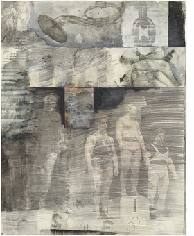
The Socio-Cultural tradition is one that you might want to use to reflect on the reproduction and production of social order.
Rauschenberg
This approach is particularly useful when looking at images that reflect the social conditions of a particular time and place. In the case of the Rauschenberg drawing above it is very much of its time and is an image designed to ask questions of the nature of American culture. In contrast Barthélémy Toguo, is a Cameroonian artist and his work can't be understood outside of Cameroonian traditions, even though he now works internationally, the images cannot be read without an awareness of a now fast slipping away African culture.
Barthélémy Toguo
Toguo's work reflects upon how traffic between the developing world and the West shapes ideas of culture, the betweenness of his approach being perhaps at its most potent in his work, “Transit” (1996), which consisted of performances in airports and train stations, in which he disrupted transit security by carrying bags carved out of wood or wearing a cartridge belt filled with candles. His watercolour drawings act as a travel diary, with human-like forms transforming into animal shapes or abstract creatures, they explore the borders of what it is to be a person, especially one that is a hybrid identity. An author such as Zygmunt Bauman, who's book “Identity” explores the shifting nature of what it is to be a human being in todays society would be an interesting lens with which to look at drawings when using the Socio-Cultural tradition.
Critical communication theory is an umbrella concept that allows you to critique the concept of drawing as an activity within society. For instance you may want to explore contemporary drawing traditions as an aspect of late capitalism and demonstrate how the Art World and its values have developed out of the trading of exclusive and expensive commodities. The social, historical, and ideological forces and structures which produce and constrain a drawing practice could all be explored within critical theory. The focus on media and technology within critical theory (especially by those writers that are associated with the Frankfurt School), can allow for approaches that demonstrate how technology shapes the way that drawing can be taken up and understood within a society dominated by mass reproduction methods. Drawing within critical theory can also be seen as interrogating the nature of representation itself.
In the monochrome painting below Tansey depicts a man painting out a classic image from the representational history of painting. (Michelangelo's Last Judgement). He has climbed the aspirational ladder and now whites out history, replacing it with a field of white abstraction, this is also, as he paints out history, also erasing the man's own shadow. Tansey is questioning the nature of contemporary painting, suggesting that the problem with abstraction is that it cannot deal with human issues, and will if allowed to, finally erase the human from art. This is an issue that at some point I would like to explore from an object orientated ontological perspective, but this post has gone on for far too long, especially as it was only put together to help put into context some of the issues raised by my post on the Pioneer 10 plaque.
To sum up:
There
are seven traditional ways within which you can approach communication theory.
Cybernetic: information processing
Rhetorical: the practical art of
discourse
Semiotic: intersubjective
mediation by signs
Phenomenological: embodied learning, experience of
otherness; dialogue
Socio-Psychological: expression,
inter-action, & influence
Socio-Cultural: (re)production of
social order
Critical: discursive reflection
Visual
communication theory can be seen as a subset of communication theory and it is
itself a multi-disciplinary area. As well as art and aesthetics, you will find
writings from mass communication (e.g. photography, advertising), film and
cinema studies, education, anthropology, psychology, philosophy, linguistics,
semiotics, architecture, and archaeology. This rich mix allows for lots of
cross fertilisation and reading can generate ideas by skimming across different
territories before diving in for a deep read.
Some
texts that you might find useful if you wanted to research the area in more depth:
Allen, N (Ed.). (2002) Working with Words and Images: New Steps in an Old Dance.
Westport, CT: Ablex.
Arnheim, R. (1974) Art and Visual Perception:
A Psychology of the Creative Eye. Berkeley, CA:
University of California Press.
Barthes, R. (1977) Image Music Text.
Trans. Heath. New York: Hill and Wang.
Barthes, R (1964)
Elements of Semiology, Barthes introduces
classifications borrowed from structural linguistics that consist of language
and speech, signified and signifier, syntagm and system, and denotation and
connotation.
Baudrillard,
J (1995) Simulacra and Simulation New York: University of
Michigan Press (The age old issue of mimesis brought into a contemporary
context)
Berger,
A. A. (2007) Seeing is Believing
London:McGraw-Hill (A semiotic approach to visual communications)
Berger,
J (1973) Ways of Seeing London:
Viking Press (Sociological/semiotic introduction)
Curtiss, D. (1987). Introduction to visual literacy. Englewood Cliffs, NJ:
Prentice-Hall (Aesthetics and learning theory)
Dondis, D. A. (1973) Primer of Visual Literacy Massachusetts: MIT Press (Artist/designer
viewpoint)
Foss, K. A. Foss, S. K. & Griffin C. L. (1999) Feminist Rhetorical Theories Sage: Thousand Oaks, CA
McLuhan, M. and Fiore, Q (1967) Q The Medium is the Massage London: Penguin (A much more playful investigation of how
media shapes what can be said. Most importantly it’s visual)
Mitchell, W. J. T. (1987) Iconology: Image, Text, Ideology Chicago: University Of Chicago Press
(All Mitchell’s texts are about visual philosophy, an extensive collection of
interesting writings)
Mitchell,
W. J. T. (1994) Picture Theory: Essays on
Verbal and Visual Representation. Chicago, IL: University of
Chicago Press.
Mitchell, W. J. T (2005) What do Pictures Want? The
Lives and Loves of Images. Chicago: University of Chicago
Press.
Moore,
D and Dwyer, F. Eds. (1994) Visual
Literacy: A Spectrum of Visual Learning Englewood Cliffs, NJ: Prentice-Hall
(Visual communication theory linked to educational theories)
Morgan,
J and Welton, P (1992) See What I Mean:
An Introduction to Visual Communication London: Hodder Arnold (Good basic
student guide to art/design and visual communication)
Petterson,
R. (1993) Visual Information New York: Educational Technology
(Information theory bias)
Tufte,
Edward. (2001) The Visual Display of
Quantitative Information, 2nd Ed. New York, Graphics Press
(Classic book on how diagrams work)
Worth,
S (1981) Studying Visual Communication
Philadelphia: University of Pennsylvania Press (A Guide to the wide range of
theories available)
Try this Handout it might help clarify things