Tuesday 27 February 2024

R.I.P. Deanna Petherbridge

Camp Covid , 2020 - Deanna Petherbridge

Deanna Petherbridge was one of those people who you could not avoid if you were interested in drawing. I met her several times and she always carried herself with great dignity and she provided a deep pool of intellectual resources from which you could tap into and draw from many different streams of thinking about drawing. I was therefore saddened to hear that she had recently died.

I first came across her large pen and ink drawings in the 1980s and was impressed by her conviction that drawing was something that could carry serious ideas. At that time drawing was still seen as an adjunct to painting or sculpture, something you did whilst you were thinking about how to compose an image or how to fit components together and it was in the world of the sketchbook or notebook that drawing belonged. This together with the demise of objective drawing as an essential tool of the artist, meant that if you drew, you were 'just' someone who did 'works on paper'. This of course meant that very few drawings were ever seen as being worth anything; unless of course they were by Leonardo or Michelangelo and oil painting seemed to reign supreme as the only form of art serious collectors wanted to invest in. As someone raised on a diet of conceptual art, I was always attracted to drawing as a form of thinking tool and often felt that too many paintings were empty gestures or examples of poor or impoverished thinking. I would often prefer a 3 by 3 inch drawn note on a scrap of paper to a 6 foot by 8 foot oil painting on linen canvas.

Deanna Petherbridge was one of a group of artists who took drawing seriously and she not only took on drawing as a serious activity in its own right, she also began to write about drawing and its effects, eventually producing the classic textbook on drawing, 'The Primacy of Drawing: Histories and Theories of Practice' (2010) and several essays and commentaries about drawing for the architecturally focused publication 'Drawing Matter'. Her own drawings use imagined architectural imagery as a metaphorical means to deal with complex subject matter about social and political issues and she strongly believed that drawing could deal with and carry the weight of big issues, just as much as any other art form.

Migration 1 , 2018 - Deanna Petherbridge

Petherbridge used images of architecture and mechanical forms often composed as metaphors for the human condition. Her representations of transparency and of other lighting conditions, were often contrasted with deep shadows; her imagery moving between abstraction and representation, in order to create dream-like worlds and sustained visual narratives.

View from Hotel Pandemia, 2020 - Deanna Petherbridge

Petherbridge said she used a straight edge for moral compass and you can see this in most of her drawings, their architecture being given validity by the use of what look like lines made using ruling pens. She will be sorely missed by all those in the drawing community that valued her intellectual rigour and energetic commitment to an often undervalued practice.

Never afraid of advancing the work of other artists who drew, she helped myself to widen the pool of practitioners that I was aware of, in particular introducing me to the work of the Australian artist Joy Hester. 
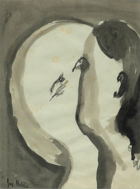

Joy Hester

Hester's work reminded me that economy of means didn't have to also mean shedding the awkward juxtaposition of image and gesture and that sometimes the two could be brought together in ways that were both poetic and emotional. 

So goodby Deanna, another person that I knew, who is now sitting on the other side of that thin membrane that stretches between life and death. I have recently had to seriously rethink what I am doing in both art making and in how I have been living my everyday life. I have decided to unravel how my past life still impacts on my present one and in doing so I have also had to consider in much more depth, the impact of day to day decisions on possible futures. This process has of course had to include a deeper awareness of mortality, not because I have some sort of immediate concerns about my health, but simply because a full awareness of life is impossible without an acceptance of its coming to an end at some point. 

Deanna Petherbridge: The Destruction of Palmyra, 2017. Pen and ink on paper, Triptych.

Deanna was slightly older than myself when she drew '
The Destruction of Palmyra', an image that is a meditation on the destruction by Islamic fundamentalist groups of ancient artefacts found in archeological sites. Whether these attacks on culture are made by religious fanatics or far right fundamentalists doesn't really matter, what does matter is that Petherbridge's drawings remind us that artistic freedom is a hard won thing and that it is so easily lost. Petherbridge's life was centred on a belief in the power of images to help us see what we sometimes don't see and in that she leaves a powerful legacy, I hope that in another hundred years what she stood for will still be something that makes sense and is recognisable as being worthwhile. 

John Berger put his take on mortality slightly differently. When remembering the comedian Harry Champion, Berger would quote his catchphrase, "Life is a very hard thing. You never come out of it alive". 

See also: 

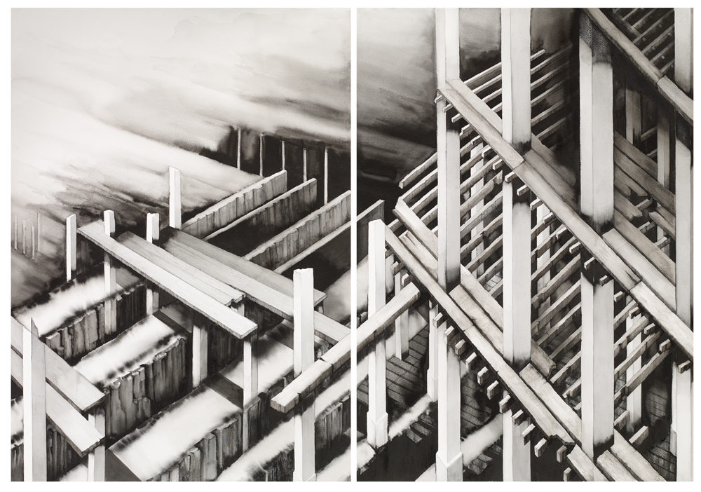
An online catalogue of the Step and Stair Exhibition at the Art Space Gallery: A memory of the only time I exhibited in an exhibition alongside Deanna Petherbridge

Friday 23 February 2024

Stained glass: The leading sessions

The workshop sessions involving leading were done as a block because I was going to take up quite a lot of room and the sessions needed to be fitted in around other classes. I was meant to do this the first week of January, but I was still in recovery mode after being knocked down by a car. When a time slot was next available I had the beginnings of a chest infection; however because slots are hard to come by, I decided to carry on anyway as the cold out of which the infection grew was hopefully well past its contagious phase. This was probably not a good idea, as I found it hard to concentrate and decisions about exactitude were hard to make as my eyesight felt slightly distorted by the infection. I managed three days and learnt a lot about leading, but then had to pack up and take the work away until another free slot could be found. 

Base board

Plywood base board: Detail of surrounding edge

I had to prepare for the sessions by making a board on which to work. I used a thick ply and screwed and glued two strips of wood onto two adjoining sides, in order to make a right-angled 'L' shaped corner, against which I would build the window. It is approximately 3 cms wider and longer than the size of the finished window. I also had to cut the zinc edging frame pieces to size with a hacksaw. (Zinc 'u' section came, 12x5mm)

The first decision is where to start and I had already made my first mistake. Usually the more complex area is where you need to start, but I had fixed the borders of my frame on the opposite side to the one needed if I was to do that. It was a 50/50 decision and at the time of making I wasn't aware it could make a difference but this meant that the complexity surrounding the heel would not be where we could start. 

The next thing was to trim off two edges of my cartoon. Cutting exactly on the line that indicated the zinc came edging, this was going to be my template to work to for the entire window, so needed to be accurate. Once cut it was placed snugly into the right-angled corner of the baseboard. 


Two sides are left uncut, so that they will not be hidden underneath the final construction. This can facilitate the cartoon removal at a later stage.

We needed to start with a border, so we first set out two lengths of the zinc came and then the thicker leading to make the border, as this would strengthen the whole window. 


The previously cut sections of glass that make up the border were checked for accuracy and a couple were rejected, so I had to cut more from existing scrap glass, this was because it's very hard to grind off a thin strip of glass and keep it straight and much easier to recut. Another lesson about accuracy. 

The inside border using the thicker leading is to be staggered rather than simply butted together.
The leading for the inside border is set out as above

The lead is cut with a lead knife. Another tool that I had not used before and which takes a bit of getting used to. 

Lead knife

Horseshoe nails are used to mark the lead for cutting, and for holding the buffers in place

A plastic and rubber headed glazing hammer
Used for nailing and tapping in hard to fit pieces of glass

The lead knife is rocked through the lead came. It is held vertically, (something I again found hard to get right), you apply downward pressure as you rock, being careful not to distort the shape of the soft lead came. Each section is held in tightly by lead came buffers that are nailed into place each time. The buffers also help you measure the length of the lead strips, as they let you know how far the glass will sit into the 'H' section of any chosen lead came. This becomes very important if you are like myself in this case, using several different thicknesses of leading. 

Because of the process of keeping everything nailed tight as you progress, you work out from a corner. 


Lead came cut to size, resting against the zinc came edge

Buffer in place

The first few pieces in place, working away from the corner.

You are constantly grinding down to make sure the glass will fit and although I thought I had by now a good grasp of glass cutting, I was quickly made to realise I was not accurate enough. The trick is to mark the glass to show what you cant see. 

How to mark the glass before grinding

Push the glass into the cane 'H' section and make sure it is in as far as it can go along the whole length of the piece. Then using a white or black Sharpie (you need tonal contrast), draw along the line made by the leading. When you take the glass out again, you will see where there are inaccuracies. Look for the thinnest bit and use that as your measure and then mark the glass edge and grind. A small inaccuracy can lead to a large difference later on, so its best to correct each piece as it is put in. This is what was taking the time when I was working on it. It took three days to complete just over half the window. 

The lead cane has to be cut accurately and must be butted up exactly to each adjoining piece. If not, when you come to solder it all together the window will have serious structural faults. You must also keep pushing the pieces tightly together and refitting the buffers. A tight fit is going to be essential, so you must keep checking this. 

Three different lead came sizes are being used. The thickest for the edges, then a medium thickness for everything else except for the complex shapes that form Sooty's body and ears. The need for tight curves in order to form the body and ears of Sooty, required the use of the thinnest lead cane available. N. b. Each time you use a buffer you must remember which size came to use and it is very easy to just pick up the wrong sized off-cut by mistake. 

Some sections required a different technique. For instance the frit made heel was circular. (See sessions 2 and 3) First of all I had to re-grind this section to make it smoother by removing any bumps from around the edge. Then using the middle grade cane leading, a length was cut just a bit longer than needed. This was pushed into the glass all the way round and a plastic fid tool was used to push it in firmly.

Plastic fid

The fid tool is extremely useful, as you use it to keep pushing the lead back into the glass, as well as using it to ensure the 'H' section is kept open enough to ensure the glass sits into it correctly. It has a variegated width, so that sometimes you use the thin point to push in hard and at others the thicker waist section in order to gradually open out 'H' sections. 

Because I was taking so long and was still suffering from the after effects of a chest infection, it was decided to take my work away from the workshop to allow classes that needed the room to be held. This means that I'm not sure when I shall be able to finish this work. Hopefully in the near future I will be able to find a gap that will allow me to finish the work. In the meantime I will invest £75.99 in a water cooled stained glass grinding machine that I found on E-Bay, so that I can finish the work in my studio. 

The process is of course already costing money for materials. For the leading and soldering the materials ordered before the session are set out in the screenshot below. 


All materials above were sourced from Kansacraft, a Barnsley based company. 

See also:

Tuesday 13 February 2024

Measuring emotions and colour

I have for a while now been looking at interoception and the importance of 'feeling' or emotional experiences. However as I look into the Citrasutras, which are important writings on Indian aesthetics, I realise that once again, western aesthetic theory is way behind the times and that emotional value has been central to the way that painting has been thought about for hundreds of years on the Indian sub-continent.

Shri S Rajam

The six limbs (shad-anga) of traditional Indian painting , as given in the Chitrasütra are the following:
Sädrusya (similarity); Pramäna (proportion); Rüpabhedä (differentiations or typologies of form);
Vvarnika-bhanga (colour differentiation); Bhäva (emotional disposition) and Lävanya yojanam (gracefulness in composition) .

In Indian art nothing is unconnected. The laws of painting (Chitra) are not understood without an understanding of the laws of image-making (Shilpa); and these are linked to knowledge of the techniques of dancing (Nrtya); that are difficult to understand without a thorough knowledge of the laws of instrumental music (vadya), and the laws of instrumental music cannot be learnt without a deep knowledge of the art of vocal music (gana). Therefore the position of figures in a painting may derive emotional disposition of their limbs from a dance form, but the emotional colour may come from an understanding of 'Rasa'. 

In Indian art theory, 'Rasa' is the quality of emotional fulfilment that a work of art produces through the personalities that are depicted in a painting, their expression and their surroundings. Rasa is a Sanskrit word that denotes the quality of emotional fulfilment that a work of art brings about. The nine types of rasa are therefore centred on emotional content, ‘Shringaram’ depicts love, attractiveness and erotic feelings. The colour green being central to this but as the erotic levels rise it becomes blue/black. ‘Hasyam’ relates to laughter, mirth and the comic; the colour white is key. ‘Raudram’: Fury, anger, warlike feelings, expressed using red and typical images include skulls and bones, weapons, and wide, circular eyes. Kāruṇyam’: Compassion, tragedy, touching or moving scenes, the colour key being dove-coloured (grey-white). ‘Bībhatasam’: Disgust, aversion, abhorrent, shocking or odious, using the colour key blue. ‘Bhayānakam’: Horror, terror, fear, the terrible. Colour: black ‘Vīram’: Bold, fearless, stout hearted a heroic sensibility. Colour: wheatish brown (yellow, ochre) ‘Adbhutam’: Wonder, amazement, wonderful, wondrous. Colour: yellow Śāntam’: Peace, tranquillity or a quiescent mood. Colour: perpetual white (silvery, the colour of the moon and of jasmine)

Shri S Rajam

These decisions as to colour will have been derived from experience, but experiences rooted in the times and places out of which the theories evolved. Therefore there may well be some strange, (to contemporary western eyes) types of effect. I would presume sometimes visual effects might have to be re-invented for the 21st century. However red images of skulls and bones and weapons, alongside wide, circular eyes still evoke anger and warlike feelings. Quality of colour is also vital, a mid blue is perhaps a soothing colour, or is used to evoke the sky but a very particular blue can mean something specific; therefore when dealing with the depiction of emotions the blue that for instance is meant to carry a feeling of disgust, will have to be a carefully chosen one. 

Delineation, shading, ornamentation and colouring are all essential aspects of a painting, however in Indian aesthetics the rekha, which are the lines that articulate the forms, are its real substance. Western aesthetics would also include the texture or feel of application and it is fascinating to think about how for instance the expressive brush marks and colours of a Van Gogh could be embraced within this type of tradition. 

What were most valued were effects best captured by the least number of lines. Simplicity of expression symbolised the maturity of the artist, who would look to capture an idea using a minimum number of lines when composing the main figures. The Ajanta cave paintings are an early form of painting using free flowing lines to delineate figures. Their proportion and disposition of body parts are used to communicate delicate inner feelings; together with use of the shading of different parts of the body to produce three dimensional effects in order to 'ground' the figures in an imaginary space. Colour is then used both as a contrast and to create magical or other worldly feelings. 

From the Ajanta caves

The emotions that revolve around love and heartache are particularly powerful and most of us will at one time or another have to deal with a situation when feelings totally dominate the embodied mind. Heartache is literally a pain that stretches across the chest. The giddiness of romantic love is a real lightheadedness. But the colours whereby we try to represent these things are often both mixed up and hard to assess. A feeling of euphoria can be quickly followed by one of loss. A sense of the warmth of love, can be butted up closely to one of a fear of loneliness. The erotic feelings that penetrate down into our loins, may in some instances be visualised by a harmonic movement of colour, but whether or not that is from a green to a blue, will again be dependent on quality. What sort of green, what sort of blue and what sort of colour field do these colours move through and in what sorts of shapes and forms? 

The term 'measuring emotions' is very much a paradox. When in the middle of an emotional storm, the very last thing we are capable of doing is measuring anything. But we can try to recreate the experience in an art object. As a form of externalised mind, an image can be used to play out various ways to represent what was felt, as well as what is still being felt, especially if the situation that is being represented is still ongoing. 

Emotions are like the currents that pass through the sea, some flowing strongly and others far less so, but all mixed up beneath the surface and usually invisible; until you actually dive in and are tossed about by the sea's reality. 

The psychologist Robert Plutchik was fascinated by the complexities of emotion. In particular he understood that they often came into our awareness via feelings of difference. He therefore posited 8 primary bipolar emotions: joy versus sadness; anger versus fear; trust versus disgust; and surprise versus anticipation. His model links the idea of an emotional circle and a colour wheel, which allows us to think of emotions being mixed with one another rather like paint colours, to express the complexity of the various ways we experience them.

Robert Plutchik: Wheel of emotions

Notice how the colours in the centre have the most saturation. Plutchik thought of his model as a three dimensional one and because of this, I am tempted to explore the complex grades of colour represented by Munsell's colour sphere and to then impose these subtle saturations on to Plutchik's cone. By doing this, much more refined emotional colour mixes ought to be possible. 


Plutchik's cone of emotions

The image above of Plutchik's cone of emotions is in my mind far too dependent on a 'natural' colour wheel, but it can be played with. 

Pensive acceptance?

Love or anger?

As soon as you give particular colour qualities to Plutchik's cone, questions arise as to what these colour qualities express. However the more particular the colour range becomes, the more they point towards 'real' emotional feelings. 

From a recent series of paintings whereby Sooty undertakes the heavy emotional lifting

The fact that I'm writing about emotion from a point of emotional distance, and that my images are doing the 'emotional heavy lifting' might be due to a failure to address actual emotional relationships. Henry Moore used to always avoid trying to find underlying meanings in his work, as he was worried that he might shine light on the dark unconscious pools whereby his images arose, and in doing so what was there would dissolve like photographic images do when a light is turned on in the darkroom and he would never be able to find those images again. There is always something to resolve and though it is impossible to unpick the entanglement of everything that causes what to happen, happen; the important thing is to move on and as you do to learn a little more about why you might do the things you do. 

Reference

The Theory of Indian Painting: the Citrasutras, their Uses and Interpretations by Isabella Nardi

See also:

Tone and emotional value

Colour and control

On naming colour

Visualising energy flow

Sanskrit Indian aesthetics

Indian aesthetics within a western tradition 

Sunday 4 February 2024

The Lamed Vavniks


The lamed vavniks or lamed vodniks are 36 people, who unknown to each other are saving the world.


The legend of the lamed-vavniks has Talmudic origins. Lamedvavnik; a Yiddish term, is derived from the Hebrew word for thirty: 'lamed' and the Hebrew word for six: 'vav'. They combine to make thirty-six, the number of righteous individuals without whom the world would not exist. 


In this time of terrible atrocities I decided that we needed to be reminded of the possibility of ordinary people doing good. Therefore I am presenting thirty-six portraits of ordinary people. Ordinary in that they have no honorific status, such as being an aristocrat, media star or sports celebrity, but of course they are also 'special' in being individual human beings, each one having the potential to save the world. Some of these portraits were made of the same person at different times, a fact that at first I wondered about, but then I realised that each time I see them they are different and the potential they have to change the world, itself changes as they do on a daily basis. 


These people are collected together simply because I have come into contact with them, I am the connection and as a self imposed condition of that connection, I made an image based on how I felt about them at the time, an image also suffused with my feelings about the issues they raised when I was in conversation with them. It is the ordinary people of this world, who keep it sane and who help it to occasionally achieve peace, and without them our world would be a much darker place. The Lamed Vavniks are always 'ordinary'. 


The original story of the Lamed Vavniks is a Jewish one and all 36 of them were men. In these days of equality, I have decided to not discriminate and am suggesting that these righteous people are just as likely to be women as men. 


In portraits the language of painterly and drawn expression can be at odds with the distribution of individual features. These images are fusions of a play with pigmented materials and responses to the flickering moments of awareness we sometimes call perception. I think this is a good thing. It reflects that fact that we are all composites and hybrids, mixes of all the influences we have received over the years, as well as being carriers of the genes of thousands of those who went before us. A decision to stop moving the pigments around is something that comes intuitively and so is a fixing of facial features as they emerge from the morass of paint and ink and other substances. Likeness, in terms of verisimilitude is not important, but accuracy of feeling tone is. 


As these faces emerge from the possibilities that the materials of their making engender, they merge into and out of a dance of pigment, water, paper, moving brushes and pens. Their story is as much a granular tale of ink and watercolour, as it is of sadness, joy, age, youth, sex or attitude. 


These images as they are read through the various lenses and filters through which each of us gaze, are seen by some as candidates for sainthood, and by others as criminal types. 


They are all potential Lamed Vavniks, their actions may be what save the world. One small gesture, made by any one of these people, like the butterfly disturbing the air in its flight, may eventually become the thing that makes the difference, the tipping point that prevented disaster.


We should never know these people, they must remain anonymous. This is their power, by being potentially anybody they are everybody and everyone must pull their weight if we are to save this world from the ravages of consumerism and myopic individualism. 


So these people are the possible Lamed Vavniks. Is one you? Is one that woman you saw yesterday waiting for a bus? Is your uncle one? Is it that person being interviewed by the news reporter? Is it the anonymous soldier in the background of an old photograph? We are all guilty, all conflicted and responsible for the damage our kind inflict upon the Earth. Whether it is 36, 36,000 or 36,000,000 people, does not really matter. Just one might be enough, just one act, one thing done that triggers another act, starts another process and in so doing leads towards a brighter future, rather than an ending. 


I'm sitting in a house in Glasgow, surrounded by the work of a painter who I used to know really well. Her portraits surround me and I wonder if I knew the people she drew. I probably did as we worked in the same city and the art community is not a very big one. Her drawings are very personal and are like many artists more touched with the mannerisms of her hand than the individuality of the sitter. No matter how hard I try, the same happens when I make drawings in response to the presence of other humans. I try to channel something unique about the person I meet, but when looked at later, each time all I see is myself. Perhaps that is the real secret of the Lamed Vavniks. They are all possible versions of ourselves. We may be good, we may be bad, we may be bold, we may be shy, we may be whatever version of ourselves we see in the eyes of others. Sometimes I feel constructed as I speak, my voice an echo of others, my body language changing as I mimic the movements of someone I respect. Sometimes I'm unconsciously mirroring the shape of a friend and at others I'm consciously blocking the movements of a person I distrust. My boundaries keep shifting, I am a permeable membrane, a hybrid form, parts of myself carried by others, just as I carry others within myself. 


Who are we? If we are Lamed Vavniks we would never know, unknownness is a condition of their existence. It is the actions taken by people who do those actions not for profit or individual gain but for the fact that they are simply 'right' actions; that lead to these people becoming Lamed Vavniks. But they don't even know they are undertaking 'right' actions; their lives unfold as possibilities, their agency in the shaping of their lives being somehow suffused with grace, a grace that emerges from the habitual character of lives created by the gift of grace from God and there but for the grace of God, go I. I'm now confusing a Christian term with a Jewish myth, perhaps a natural consequence of my upbringing. We are all possible Lamed Vavniks, which is why we should never judge the actions of others too harshly, as we may find we at the same time condemn ourselves. 


I contradict myself with these portraits, as I do with each and every portrait I make. On the one hand I try to say that human beings are not special, that they are just a part of the endless complexity we know as what is out there, or nature, or the world. But, no matter how hard I try to be aware of everything else as being just as important, I still find myself making images of the very thing that I try to suggest should not really need any more images being made of. 


So name them ink or brush or pigment. Name them sticks and stones and bones and paper, but never John or Mary, Kevin or Jean, or even Sally or Michael or Jim. Avoid Ahmad, Fatima and Amir, never use Ezra, Leah or Aaron, and stay away from Imani, Kwame, or Omari. Fang, Jing and Yan are to be avoided, just as Mehmet, Osman and Emre. The unknown soldier has no name, and in this case no number either. These are the Lamed Vavniks and in their anonymous actions they save us all. 

See also: