I have for a while now been looking at interoception and the importance of 'feeling' or emotional experiences. However as I look into the Citrasutras, which are important writings on Indian aesthetics, I realise that once again, western aesthetic theory is way behind the times and that emotional value has been central to the way that painting has been thought about for hundreds of years on the Indian sub-continent.
The six limbs (shad-anga) of traditional Indian painting , as given in the Chitrasütra are the following:
Sädrusya (similarity); Pramäna (proportion); Rüpabhedä (differentiations or typologies of form);
Vvarnika-bhanga (colour differentiation); Bhäva (emotional disposition) and Lävanya yojanam (gracefulness in composition) .
In Indian art nothing is unconnected. The laws of painting (Chitra) are not understood without an understanding of the laws of image-making (Shilpa); and these are linked to knowledge of the techniques of dancing (Nrtya); that are difficult to understand without a thorough knowledge of the laws of instrumental music (vadya), and the laws of instrumental music cannot be learnt without a deep knowledge of the art of vocal music (gana). Therefore the position of figures in a painting may derive emotional disposition of their limbs from a dance form, but the emotional colour may come from an understanding of 'Rasa'.
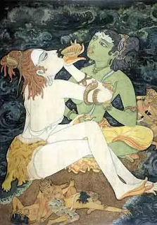
In Indian art theory, 'Rasa' is the quality of emotional fulfilment that a work of art produces through the personalities that are depicted in a painting, their expression and their surroundings. Rasa is a Sanskrit word that denotes the quality of emotional fulfilment that a work of art brings about. The nine types of rasa are therefore centred on emotional content, ‘Shringaram’ depicts love, attractiveness and erotic feelings. The colour green being central to this but as the erotic levels rise it becomes blue/black. ‘Hasyam’ relates to laughter, mirth and the comic; the colour white is key. ‘Raudram’: Fury, anger, warlike feelings, expressed using red and typical images include skulls and bones, weapons, and wide, circular eyes. ‘Kāruṇyam’: Compassion, tragedy, touching or moving scenes, the colour key being dove-coloured (grey-white). ‘Bībhatasam’: Disgust, aversion, abhorrent, shocking or odious, using the colour key blue. ‘Bhayānakam’: Horror, terror, fear, the terrible. Colour: black ‘Vīram’: Bold, fearless, stout hearted a heroic sensibility. Colour: wheatish brown (yellow, ochre) ‘Adbhutam’: Wonder, amazement, wonderful, wondrous. Colour: yellow ‘Śāntam’: Peace, tranquillity or a quiescent mood. Colour: perpetual white (silvery, the colour of the moon and of jasmine)

These decisions as to colour will have been derived from experience, but experiences rooted in the times and places out of which the theories evolved. Therefore there may well be some strange, (to contemporary western eyes) types of effect. I would presume sometimes visual effects might have to be re-invented for the 21st century. However red images of skulls and bones and weapons, alongside wide, circular eyes still evoke anger and warlike feelings. Quality of colour is also vital, a mid blue is perhaps a soothing colour, or is used to evoke the sky but a very particular blue can mean something specific; therefore when dealing with the depiction of emotions the blue that for instance is meant to carry a feeling of disgust, will have to be a carefully chosen one.
Delineation, shading, ornamentation and colouring are all essential aspects of a painting, however in Indian aesthetics the rekha, which are the lines that articulate the forms, are its real substance. Western aesthetics would also include the texture or feel of application and it is fascinating to think about how for instance the expressive brush marks and colours of a Van Gogh could be embraced within this type of tradition.What were most valued were effects best captured by the least number of lines. Simplicity of expression symbolised the maturity of the artist, who would look to capture an idea using a minimum number of lines when composing the main figures. The Ajanta cave paintings are an early form of painting using free flowing lines to delineate figures. Their proportion and disposition of body parts are used to communicate delicate inner feelings; together with use of the shading of different parts of the body to produce three dimensional effects in order to 'ground' the figures in an imaginary space. Colour is then used both as a contrast and to create magical or other worldly feelings.

The emotions that revolve around love and heartache are particularly powerful and most of us will at one time or another have to deal with a situation when feelings totally dominate the embodied mind. Heartache is literally a pain that stretches across the chest. The giddiness of romantic love is a real lightheadedness. But the colours whereby we try to represent these things are often both mixed up and hard to assess. A feeling of euphoria can be quickly followed by one of loss. A sense of the warmth of love, can be butted up closely to one of a fear of loneliness. The erotic feelings that penetrate down into our loins, may in some instances be visualised by a harmonic movement of colour, but whether or not that is from a green to a blue, will again be dependent on quality. What sort of green, what sort of blue and what sort of colour field do these colours move through and in what sorts of shapes and forms?
The term 'measuring emotions' is very much a paradox. When in the middle of an emotional storm, the very last thing we are capable of doing is measuring anything. But we can try to recreate the experience in an art object. As a form of externalised mind, an image can be used to play out various ways to represent what was felt, as well as what is still being felt, especially if the situation that is being represented is still ongoing.
Emotions are like the currents that pass through the sea, some flowing strongly and others far less so, but all mixed up beneath the surface and usually invisible; until you actually dive in and are tossed about by the sea's reality.
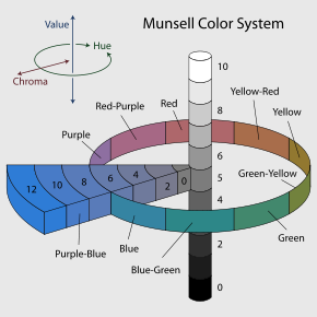
The psychologist Robert Plutchik was fascinated by the complexities of emotion. In particular he understood that they often came into our awareness via feelings of difference. He therefore posited 8 primary bipolar emotions: joy versus sadness; anger versus fear; trust versus disgust; and surprise versus anticipation. His model links the idea of an emotional circle and a colour wheel, which allows us to think of emotions being mixed with one another rather like paint colours, to express the complexity of the various ways we experience them.


Reference
The Theory of Indian Painting: the Citrasutras, their Uses and Interpretations by Isabella Nardi
See also:
No comments:
Post a Comment