Word and image
have an ancient interrelationship. The first forms of writing that we
find consist of pictograms, drawings that had been stripped down to
their essential features and which could be used to stand for a general class
of things rather than one particular instance of something. For instance barley
is similar to rye and not that different to wheat. So if we look at drawings of
individual seed heads we can see a certain similarity.
A drawing that
reduces the features of barley and other similar grasses could therefore
stand for a group of things that look like barley, the image below is the Sumerian
symbol for grain, a symbol that was first used about 5,000 years ago.
Gradually a symbol that looks
like something can begin to have a secondary use. In this case the image begins
to be used to stand for a sound. The Sumerian word for barley sounded like
'she'. So the barley sign became eventually used to represent the sound 'she'
when you wanted to visualise a spoken word.
The barley sign gradually
changed shape when the scribes began to use a writing tool with a squared-off
end instead of a point. The end of this tool was used to press wedge shapes
like these below into clay tablets. Early writings were nearly always done on clay
tablets, it's easy to draw using a sharp point, but faster to make little stamp
impressions, so gradually the stamps replace the stylus and the writing becomes
made up of lots of similar looking forms, grouped in different ways.
Sumarian pictograms
were first written and read in columns. Later, as they became cunieform symbols they were written and read in
rows.
Sumarian Pictograms
Sumarian Cuneiform script
The evolution of Sumarian pictograms into cuneiform
The point about this short history of writing being that writing has a very close relationship with drawing and in some cultures this relationship is still very close. For a brief history of Chinese characters see
Chinese domino set used to help children learn common characters
There are
several links between Eastern calligraphy and the Western tradition of Abstract
Expressionism and these links go both ways. The work of Franz Kline has long
been seen as having connections with Japanese and Chinese calligraphy and his
work has had an impact on how Chinese artists have begun to think about their
own tradition.
Franz Kline Figure 8 1952
However the
aesthetics of Chinese calligraphy are closely related to the dynamism of ink
brush writing; the running of the brush pen, the structure of the character,
and the composition of the whole work are always the primary concerns in the
construction of an image. As Chinese characters are derived from pictographs, it
is often said by the Chinese that the best “painting” must be “written”, i.e.
there is no difference between painting and writing. It has been argued that
the homology of calligraphy and painting is a significant and unique
contribution of the Chinese civilization to global art history, so we must beware of thinking that we can critique Chinese abstract calligraphy in a similar way to abstract expessionism.
Chen Guangwu
You can see the two traditions of East and West merged in the work of contemporary Chinese artists like Chen Guangwu. In particular its interesting to see Chen Guangwu now working between sculpture and painting, the gestural mark becoming something that can be peeled off and repositioned as a three dimensional experience.
One artist that seems to bridge the gap between Abstract Expressionism and more recent text based art is Cy Twombly. See also:
Cy Twombly
Cy
Twombly sits in a very interesting position being on the one hand almost too
'knowing' for an Abstract Expressionist, but on the other hand he never lets go
of his signature mark making skills. He has always used text within his work, often to refer to classical poetry or figures from Greek myths.
Twombly's 'handwriting' becomes a type of signature, his words are 'made' on canvas with the same concern for formal principles as any other mark. This 'graphology' being integral to the feeling tone of the image.
However sometimes the 'writing' in a Twombly can become just mark writing, the example below, being what is sometimes called aesmic writing. (Marks that look like writing but on cloiser inspection are simply marks that look like writing)
Cy Twombly
Drawing as text is now common practice in contemporary art in both the West and East, if we look at the work of Mekhitar Garabedian we can see it is on the one hand a type of work that acknowledges Islamic calligraphic traditions, and on the other it sits within a Western tradition of surface markmaking.
Mekhitar Garabedian
Garabedian sometimes works directly onto gallery walls, his work acknowledging the physicality achieved by artists like Fiona Banner, who transcribed an entire film into text and rewrote this on walls in an attempt to reengage with the physical impact that the original film had.
Fiona Banner
The handmade
mark in drawing has of course been challenged by the
introduction of computer drawing software. Writing has had to contend with its mechanical replacement for a much longer time, initially because of the formalised fonts used for classical architecturally sited texts, such as the familiar Roman typefaces and then because of typefaces cut for printing purposes, therefore before continuing with this post it is perhaps useful to reflect on how the
relationship between the various forms of writing and typography have been used
historically.
This is not the place to go into a full blown history of typography, there are many of these on-line and in the college library, however within the Western European tradition of typography there is a relationship between 'cursive' styles and hand drawn writing. For instance, during
the seventeenth and eighteenth century handwriting style was vital to the
social standing of an individual and writing-masters were employed by the rich,
so that the messages coming out from their places of residence were always
reflective of their social standing. Writing-masters such as George Bickham therefore
became important; their original texts were produced by a quill or metal nib which
generate thick and thin strokes as the hand moves in different directions,
their particular skill being to maintain a fluidity and regularity of movement to
their handwriting that suggested both confidence and stylishness at the same
time. Typefaces based on their handwriting were then developed and are still
used today for formal invitation cards and educational diplomas because it is
understood that this style represents elegance, learning and sophistication.

Suffice it to say that handwriting has a message about the status and mental state of the writer. In particular in a time of text messaging hand writing becomes much rarer, therefore writing by hand begins to have a new connotation, perhaps an anti technology one, or statement about the need to maintain a human touch. Meaning is always shifting and this is the case with text as much as drawing.
Look at these examples of writing and make up your own opinions as to what they might mean. See also:
Writing on walls can of course be performative. When children are growing up we often record their growth by marking a wall or doorway; Roman Ondak, in 'Measuring the Universe' undertakes the same activity with gallery audiences, and gradually a series of words and numbers create a wall texture.
I still associate writing on walls with writing in chalk, and of course writing in chalk means writing on a blackboard at school.
School writing included the writing of lines as punishment, every episode of the Simpsons opens with Bart having to write out his lines for the day; John Baldessari's, 'I Will Not Make Any More Boring Art' from 1971 being a timely reminder that I should get on with life and finish this post.
John Baldessari, 'I Will Not Make Any More Boring Art' 1971
Notes:
At some point I will put together a post on artists' signatures.
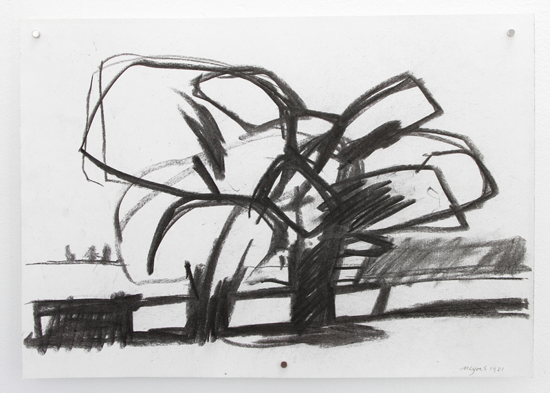
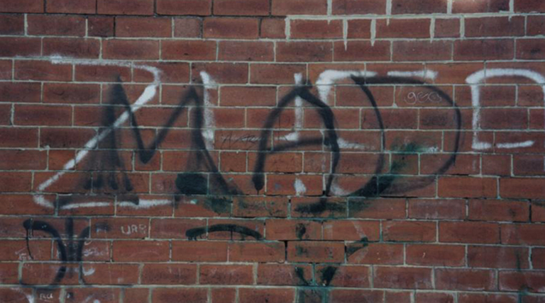
Above: Two examples of aesmic writing
Joseph Albers used to get
students to copy the look of blocks of newspaper text so that they could get a
feel of how the visual texture could be replicated. This was still being used as
a Foundation course excercise when I taught on the course. The trick was to not
'copy' the individual letters, but to squint your eyes up so that the text
became unreadable, and then to draw what you saw. See: