Tuesday 30 August 2022

Category theory and drawing


Every now and again I go back to mathematics as a visual discipline. It is fundamental to our understanding of the world and its visualisation processes can be used across all disciplines. It is usually geometry that people like myself begin with when working with mathematical ideas and in the visual arts geometry is often linked with perspective and technical drawing systems, especially as a measuring tool. For instance we use right angled verticals to assess other angles, we assess the rotation of our looking through angles of degrees, find heights of buildings by using trigonometric relationships; the rise of computer aided design cementing these relationships. However there are other aspects of visual thinking that come directly out of thinking with numbers and the one I've recently begun to appreciate is 'category theory'. Like so many things in this world, my interest began from something said to me in conversation. I was having a coffee with an ex-student of fine art, who is also a university lecturer in computing and he was helping me think though some ideas about how one thing represents another, or is like something but is not the same as something. I was trying to think around some of the work I had done representing things we don't see but can feel, such as loneliness or pain. In trying to make an equivalence I was worried that in translation I was losing particular associations that only worked in verbal languages. My associate began drawing and asked me if I had ever heard of Category Theory*, an area of mathematics that I was soon to realise had all sorts of resonance in relation to my own thought processes, especially when I found out that as a theory it could be used to get over the idea of one thing being equal to another. The escape from equality being something I decided was similar to my own worries about whether or not what I was doing represented 'reality' in the way I needed it to; I needed to escape from the problem of the noumenon or the thing-in-itself.
But what is category theory? It seems to me that it's to do with how you group things together. For instance, is there a set with 2.5 elements? As sets of things are collections of equal units, the answer would be no. But there's a "groupoid" with 2.5 elements. To get it, just take a set with 5 elements and fold it in half. The point in the middle gets folded over, and becomes half a point.

The physical and visual image here is a powerful drawing thought idea and it allows us to think in 'groupoids' as well as 'sets'. This 'trick' allows us to see that there are other possibilities of arraigning things, and in that thought lies the possibility of creating an interesting metaphor, one that suggests that things are not always as they appear to be. For instance 1 + 2 = 3 could be questioned. Only 3 can equal 3 in the sense of being exactly the same as 3. 1 + 2 being something else, it is a single thing that is being added to a double thing, not a treble thing that has always been a treble thing. In it's history a treble thing might point to a time when it was a double thing that was added to a single thing, but that is a very different history to that of a treble thing that has always been a treble thing. This is of course opening another door, because there will also be things that were first of all double and then they were added to a single, thus forming a treble thing. 
Category theory is all about possibilities and it is driven by diagrams. So if we look at the three dots in set 'G', at first sight it looks as if these could be equal to the three dots of set 'H', but then we realise that the dots could be matched up in several ways.  


Category theory diagrams

In category theory the dots are objects. The arrows as seen in the top diagram are also important because they don't just indicate possible movement or connection, they indicate a real change in the identity of the object. What has gone on before is an object's history and this history will change its nature. A thousand pounds saved up by a poor person over a lifetime might look the same as a thousand pounds used by a millionaire to pay for a night's stay in a hotel, but in reality they are totally different sums of money. 
Category theory questions the use of the equal sign, which states that things are exactly the same. There are important complexities in the way quantities are related which suggest that  there is a need to reformulate mathematics in the looser language of equivalence and into this looser language we might be able to slip in the language of art, in that it is constantly been used to find equivalences for other things. 

It is interesting to look at the relationships set out in the diagram below. The slippage between individual instances of diverse forms and universal principles is one whereby it is impossible to define where the dividing line is. In particular it is impossible to determine the exact edge between the microscopic and the macro world, all the scales from Angstroms to meters are found in a biological entity like myself, and the complex hierarchical assemblies of various building blocks that we are made of seem to follow principles of form that can be found in other systems as well. In this way we can begin to discover new metaphors, ones that rely on deep structural echoing and that Giesa, Wood, Spivak and Buehler (2011) have termed “concept webs” or “semantic networks”. 


A concept web

This diagram shows how you can think about the ways that the building blocks of protein can be connected and where possible weaknesses might be. 

Giesa et al. describe how category theory can be used to link the fundamental structural principles behind biological protein materials with entities such as social networks, by comparing both of their underlying structural principles. To do this they have constructed the term 'ologs'. An olog follows a rigorous mathematical formulation based on category theory, therefore it is suitable for sharing concepts with other ologs. They show that an olog for the protein and an olog for a certain social network feature have identical category-theoretic representations and that there is an isomorphism between them; thus demonstrating that the relationship between structure and function at different hierarchical levels, can be effectively represented by ologs. Because metaphors have always been developed by artists looking for similarities between things, I also think that although Giesa et al. indicate that this type of thinking could help engineering, life sciences, and medicine, I see no reason to not add art into the mix. It would seem to me that if biological materials evolved to perform specific biological functions, then the higher-level structures that biological entities like ourselves also evolved such as societies, may well have deep down core similarities, as certain mathematical patterns are no doubt more useful than others in the creation of structures that can survive in a hostile world. It would seem therefore that in order to reflect upon the workings of a natural system, we do not need to understand everything about it, only the principles out of which we believe the functions arise. Therefore a drawing can represent an equivalence by showing how patterns from different models of thinking can find themselves grouped together. In doing so it can also be a tool that refers to and evaluates differences in historical backgrounds, so that when rendering two similar images of a hundred pesos it does not simply make them the same, but renders them different by nature. The problem of the noumenon or the thing-in-itself is also overcome because of the concept of representing an equivalence, in this way there is never any need to reproduce the thing in itself, only equivalences and they can be many and varied and always subject to interpretation. 

Two examples of 100 peso notes

In the case of the 100 peso notes, in some ways you could think of them as being exactly the same, in the sense that in their original function as money exchange you could get goods to the value of100 pesos for either of them. In mathematical terms this would mean that note one =  note two. However if regarded as an equivalent, note one still performs the same monetary function as note two but it has other meanings as well, because its history is different. You could think of Duchamp's 'Bottle Rack' as being another type of example. 

*Category theory formalises mathematical structure and its concepts in terms of a labeled directed graph called a category, whose nodes are called objects, and whose labelled directed edges are called arrows.

References

Giesa, T., Wood, E., Spivak, D.I. and Buehler, M.J., 2011. Category Theoretic Analysis of Hierarchical Protein Materials and Social Networks. Accessed from: https://journals.plos.org/plosone/article?id=10.1371/journal.pone.0023911

Hartnett, K (2019) With Category Theory, Mathematics Escapes From Equality

Accessed from: https://www.quantamagazine.org/with-category-theory-mathematics-escapes-from-equality-20191010/

See also:

Friday 26 August 2022

Visualising energy flow: Part two

When drawing from life you are in effect visualising energy flow. However the way you approach the task is very important. Every mark you make is a captured moment of energy, the action of looking being a transfer of energy from the world via the eyes into the brain. A growing awareness that there is constant energy transfer within yourself, between yourself and the world, and between the complex of animals, vegetables and minerals that make up any surrounding environment, is central to the concept behind these drawings. Once a drawing has been used to capture various visual and invisible energy flows, it stores the energies recorded like a battery; something that can both store energy and when it is in turn looked at, release energy back out into the world. 

Trees demolish walls

Tyrannosaurus in the woods

An emerging giant

These three drawings above were made, like so many others, from situations encountered on one of my walks through Leeds, all done on the same day and made within 50 yards of each other during a walk over Sugarwell Hill. Walking is a rhythmic exercise and it is also an indication of health. It is very easy to spot someone walking who is not very well, their gait will give them away. I begin with this connection between health and rhythm, because all life has a rhythm, but sometimes it's blocked or the rhythm breaks down. When you are healthy, focused and on top of things, visual scanning and grasp of what you can see is much more insightful and observant than when you are feeling under the weather or not very well. When drawing, you can also have an insight or intuitive sense of the wellbeing or not of the environment you are observing, drawing in this case being a sort of conceptual two way health check. 
I'm particularly interested in how nature removes blocks from the energy flow, how it in effect heals itself and all three of the drawings above touch upon my feelings about that. 

Detail from 'Trees demolish walls'

The drawing 'Trees demolish walls' was made from the edge of the wood, in an area once built upon but now left for nature to reclaim. Some walls have disappeared, others remain jutting out of the ground, broken and uplifted by trees that have pushed their way out into the spaces left by the ruins of buildings broken and ravaged by the weather and ceaseless erosion by organic life. In this section of drawn wall the bricks are still held together by a very strong mortar, its surfaces are though by now severely eroded and moss and tiny plants grow from crevices. It is drawn, like the rest of the image using a dip in pen and ink, first of all the linear marks are made, small curves, made by a slightly quivering hand as the surfaces and the forms are searched for and then the 'pen' is turned around and the brush on the other end comes into play, small patches of diluted ink flicked onto the paper to indicate both a suggestion of moving shadow and surface presence. 

Brush with a nib attached to the other end

The important issue for myself as I draw are the different rhythms set up by visual encounters with the situation, for instance the brick wall itself is still, even after many years of erosion, beating its heart to the regular rhythm of carefully laid bricks and mortar. My job is to both pick this out and to embed it into the other rhythms of moving grasses, broken stones, trees etc. that surround the wall and which are working to gradually dissolve the wall rhythm back into the older rhythms of the woods. The trees are pushing vertically up, powerful forces that surge out of the ground towards the sun, the walls are in contrast now broken at angles, angles that remind myself of broken bodies. As I draw it, a nearby slab of concrete feels to me as if it could have come from a cemetery and it now becomes a tombstone for a dead building. 

Detail from 'Trees demolish walls'

The issue is again one of rhythm. It is in wave forms that rhythm emerges. Seen up close the drawing is simply marks, small lines that are made of tiny curves. However when you pull back from the surface marks coalesce into something recognisable, in this case an old wall, a concrete slab that is breaking down and being over taken by encroaching grasses and trees. These tiny marks are at times indicators of surface texture, or perhaps of a blade of grass, or a sign for the passing of a slight breeze through the surrounding vegetation or they might be a response to the movement of light as it moves from brightness into shadow.
The rhythm of marks is also a vibrational trace of my hand movements. I stand to make the drawings, so movement begins in my feet, rises up my old wobbly legs, is carried up my aching back, down my arms and into my now arthritic fingers. I am ageing just as the building that once stood here has aged. At some point, like the broken wall, I will join it in dissolving back into the world I emerged from. 

The dinosaur drawing is also about energy transfer but with a slightly different emphasis in relation to time. I was trying to get through a very overgrown part of the wood in order to draw something else, but as I broke through some undergrowth, I looked down and lying in grass on the floor was a bright red plastic tyrannosaurus. It was so incongruous that I was initially baffled as to how to deal with it, but as usual drawing sorted the problem for me. 

Detail: Tyrannosaurus in the woods

The issue I found I had with the tyrannosaurus was the power of its image. It was still pristine, its plastic surface unscratched and unsullied by dirt and grime. It felt put there on purpose. I gradually became aware that the tail was missing and that it was in fact broken and therefore probably discarded by its owner, who must have taken it into the woods and left it as some sort of ritual ending to its short toy life. As I drew it, I was able to reconcile its form with the surrounding vegetation, able to dissolve its edges into the more energetic marks that I was using to suggest the life of the flora that surrounded it. It will eventually be covered by fallen leaves and will sink gradually into the ground and become a type of fossil for future diggers to uncover. This drawing of what had been a top predator of its time, began to look as if the dinosaur had just been defeated by something far bigger than itself. It was a fallen giant, now made small; the fast drawn marks made to suggest surrounding grasses, could perhaps be indicators of giant ferns seen from far above, time collapsing in the mind's eye. The image of the dinosaur, something glanced at in a brief moment, also being a window into deep time. The dinosaur's red plastic was once a carbon fossil, then fossil fuel and as a high molecular weight organic polymer, it became morphed into a form alongside cups and saucers, other toys, medical equipment and the myriad of other plastic goods that now threaten oceans and their residues begin to live in our bodies as micro-plastics. The drawing arena is small, not more than a couple of feet to scan, I don't stay long, don't attempt to describe the light change, don't dwell on textural differences, I simply draw mark rhythms. The toy dinosaur's form had been made clear by its designer, stomach ripples looking to me like wave forms, lines of energy that I could play off against marks made to signify the forms of plastic muscles on plastic legs. Legs, that like its arms, are stuck out helplessly, now air running to the rhythms of waving grasses growing nearby. 

The third drawing 'an emerging giant' was made over a longer period of time. The tree at the centre of the image, was in my mind getting ready to take over, ready to reclaim its territory. The tree had grown out of the side of what appeared to be a mixed pile of earth and rubble. Slabs of cut stone, old bricks and other remains of a former time when this was an industrial site, poke out around the tree's base, all of which felt very inconsequential in relation to a dominant tree, that as it was drawn demanded more and more pressure to be exerted on the pen, its rhythms energised the place, so that as it pushed its root system out into and down into the world, it took up the space necessary for a powerful presence. These tree roots were alive with a muscular vitality that visually grabbed the ground and anchored the growing tree to a mound that was now part of itself. The tree's twist into space dominated the rhythmic forms of the area, other vegetation taking a very secondary role. As in a visual opera, tall grasses set up a background rhythm that could support the loud vitality of the tree. As I drew, I felt myself falling over as my feet slipped on the slope I stood on, this became confused with my attempts to depict the slope that surrounded the tree. Disorientated by being off balance, the energy I had to invest in standing upright, was channelled through my drawing hand into the way I was drawing the tree gripping onto the ground. It became more like an octopus stuck onto a rock. 

An emerging giant: Detail

The above approaches to drawing have gradually evolved from a lifetime of drawing that initially used the visual checks and balances of a William Coldstream inspired grid of looking to assess where things are in relation to each other, and which then for many years used the 'giron and fesspoint'* method of spatial drawing as an attempt to capture the flicker and movement of perception. I have spent hours looking at and thinking through the implications of the drawings of Cézanne and have nearly 50 years experience of teaching drawing and a lifetime of making drawings behind me, all of which has only led me to have an uncertain certainty about these issues. I am however still learning, every week something new occurs to me, but I would hope that these recent drawings have enough to them to convince the viewer that they are the product of serious research into how it is still possible to stand in front of the world without a camera and make an interesting drawing of it. 

How to visualise magnetism 

See also:

The oscillations of observation Learning from how to visualise magnetism 

Saturday 20 August 2022

The wave form

Representing music

Time lapse image of a bird in flight

Every now and again I like to look at those very basic visual forms that are also entoptic images, and wave forms are one of them. I have touched upon wave images before; they are like zig-zags, and are related to the way we try and depict moving water, especially the sea and they are often associated with the various ways that we try to visualise music. As I'm very interested in energy flow and how something that appears to be one thing such as a solid mass can either be converted into energy or represented as an energy field, the wave form is something that helps me to both visually and mentally weave thoughts together about these issues, so forgive me but I'm about to go on another tangental weaving run in order to find out what I am getting at. 

I first became interested in entoptic forms after reading The Mind in the Cave by David Lewis Williams. The text explores ideas in relation to the origins of image-making. He attempts to relate the foundations of art to the nature of our own consciousness and how we perceptually experience the world. In doing so he looks at Upper Palaeolithic European cave painting and he links the development of shamanic rituals with experiencing the world of the dark cave and parallels between the hidden mind and the hidden interior of the earth. A lot of Lewis Williams' text is devoted to passages between things, (energy flows), for instance the wall of the cave that is used to make images on becomes a membrane through which the world of the everyday can touch the world of the spirit. One of the key developments he picks out is that of self generated entoptic images, generated by the brain when derived of normal visual stimuli, such as when we are immersed for long times in darkness, gradually dissolving into hallucinations of remembered forms, such as animals that are vital to the survival of the tribe and becoming the starting point for a type of image making that could operate as a conduit between material and psychic states. In this process he sees the origins of abstract symbols, like dots and zig-zags and waves alongside iconic forms, images that have a physical resemblance to what is being signified, such as drawings of horses, bison and lions and this introduces other issues about representation itself and various approaches to 'realism' or 'verisimilitude' thousands of years before the camera came into being. Did our ancestors 'find' existing images in the rocks and other surfaces they used to depict things on and simply clarify them, or could they render images from scratch? Did they draw from memory or was there any form of observational drawing practice? Many depictions of animals are well observed, so did artists from this time simply have better memories of animal form, or did they take time to look so that they could bring fresh memories of recent perceptions into their cave depictions. I.e. did they actively work on being able to render these forms, or was it simply that some people were better at drawing animals than others? 


The shaman figure became central to this type of experience, being the guide who learnt how to control an environment that flickered between different states of reality and the spirit world. Shamans knew how to re-enact the stages of animism, or the entry of human minds into the lives of the landscape and its inhabitants and the entry of the world's various animal and environmental spirits into the minds and bodies of humans, by using drugs, chanting, drumming and images that would often be found flickering in tallow made lights. In a semi-dreamlike state our ancestors would enter a cave and emerge from it after a shamanic experience as if reborn. In this situation Lewis Williams feels was also born 'art' and as such it would always be associated with transformative experiences. 

The wave form is fascinating for myself because it very elegantly straddles the abstract, the abstracted and the formal issues surrounding representation. In doing so it can carry ideas about energy flow through various disciplinary areas and demonstrate that they are all in fact variations of the same idea, that everything is in reality some sort of vibration, an awareness that supports the interconnectedness of everything and the fluid nature of our experience. Flow is central to this, the continuous change that we experience, being one of constant energy and material exchanges. 

Perhaps if I start with waves in the sea and how we understand how they operate, as this very physical understanding eventually leads on to how we can think about both quantum and sound wave forms. 

Waves in the sea are partly a result of the Earth's relationship with the moon. The moon's gravity pulls the ocean water on the earth towards it. Because the moon rotates around the Earth sometimes the moon is closer to one side of the earth than another, as it changes its relationship, it pulls the ocean water towards it and this constant changing pull results in tidal waves. So the energy of gravity is transformed into the energy of water movement. This monthly cycle is one that can also be seen to affect many other aspects of our life on Earth and is therefore a powerful signifier in itself. 
Most waves are caused by wind. Wind-driven waves, or surface waves, are created by friction between wind and surface water. 
Both gravity; (gravitational energy is the potential energy associated with a gravitational field, which is converted into kinetic energy when objects fall towards each other), and friction; that can also be converted into kinetic energy, can be thought of as types of energy containers and transmitters and waves are created by these energies passing into and through water. Waves transmit energy, not water, across the ocean and that is what is interesting about them. Because this is about the fundamental idea of matter carrying, converting or transmitting energy from one place to another, wave mechanics become useful as a way to think about other forms of energy transmission. A diagram illustrates the issue clearly 

The water stays in one place, revolving on the spot as it bobs up and down, but the energy travels longitudinally, in this case from left to right.  

It is interesting to compare the propagation of waves through a cracking whip with how waves carry energy through sea water. When a whip is cracked, the whipper moves an arm up and down, which imparts energy to the handle end of the whip. This motion of the arm creates a kinetic wave in the whip. This wave propagates through the whip and by the time it reaches the tip of the whip, that tip is moving at supersonic speeds, which is why you get a loud cracking of a whip. There is no way the whip hand can move at the speed of sound but the velocity of the whip's tip as we can see becomes supersonic. It is in some ways easier to think about the whip and energy transfer, than a sea wave, because we know the material of the whip cant go anywhere, it is just moving up and down, but in the up and down movement something complicated is also going on. 

Images of a whip being cracked. 1: The initial curve given by the user's rapid back and forth motion. 2: The curve has moved out toward the end of the whip, and the portion of the whip that is on the outside of this curve has decreased. 3: This is just before the curve reaches the tip of the whip. 4: When the curve does reach the tip, supersonic velocities occur and the whip cracks.

Wow, all that energy coming from a decreasing curve. 


So how does it work? Time for another diagram. Point A represents the end of the whip held by the user and moved with force P(t) at velocity v. Point B represents the tip of the whip. X represents a fixed point on the whip toward the handle. Y represents an expanding section of the whip from X to a point that is at the same position as the tip. Z represents a shrinking section of the whip that is the size of the arc from the tip to the curve. The total length of the whip is X + Y + 2Z. As energy travels along the length of the whip, it has shorter curves to carry it, therefore eventually the short curve of the tip of the whip will move twice as fast as it moves at the loop of the whip. The energy within the big curve of the whip hand's initial movement has to be contained in the small curve of the tip and this is expressed by increased speed. The whip lines as captured in the time lapse photographs are also like drawn lines and you can feel the energy changes in a curve as you draw it. The energy from an arm movement, just like with the whip, is transmitted via the pen, that is itself subject to friction drag as it moves over the paper surface and the energy expenditure captured in the frozen mark, just as the whip energy is captured as it is released by the high speed photography. Each linear mark made can therefore be regarded as a type of wave form carrying energy. 
Energy is also about power. When power is blocked it becomes one sided because the energy cannot flow between the elements. Whip energy has its own history, the way that whips allow energy to be built up to an explosive tip, made them ideal inflictors of ritual pain. The crack that magically speaks as speeds reach supersonic levels, becoming a sound of subjugation. In England the Whipping Act of 1530 authorised the use of the whip on thieves, the insane, blasphemers, poachers as well as something to use on men and women even if only guilty of minor offences. People were tied to the end of a cart with their bare backs facing the punisher up until the 1590s, which was when a dedicated whipping post was introduced. The power of the courts to order a whipping was only finally terminated in England, Scotland, and Wales by the Criminal Justice Act of 1948. As a means of subjugation it is most commonly associated with the history of slavery; sometimes wave forms can have cruel histories. 

Drawing of a tomb, Chapel Allerton cemetery, Leeds

In the pen and ink drawing above, several energy systems are seen to converge. The energy of looking is itself translated into the pen strokes that make up the drawing. The plant life is transferring the sun's energy into starches, whilst at the same time their visual forms are energised by moving air currents, both facts represented by pen strokes that have more arm/hand energy movement in them than the marks representing the tomb. The energy of the marks in this case being more to do with the flicker of the eyes needed to see this complex form. There is also an intellectual awareness that a tomb like this represents another related idea of energy transformation, that that takes place when a body dies. Some peoples believe that at the beginning stages of death, the body's energy field starts to separate. Accounts of near death experiences have alluded to perceived changes in how the body's energy field manifests itself during the advent of death. People experiencing being drawn up, lifted, or sucked from their body. Some people remembered a sensation of their whole body going out through their head, others a sensation of a peeling away of their skin as they are being released from their body. (Peck, Corse & Lu, 2017) However on death itself, finally all the energy leaks out. 

Peck, Corse & Lu, (2017), argue that several non-western conceptual frameworks believe that electromagnetic fields underlie the pattern and organisation of biological systems, including traditional Chinese  and Indian Ayurvedic medicine. 'The putative energy “life force,” referred to as prana in Ayurvedic medicine, and qi in traditional Chinese medicine, it is believed flows through pathways called meridians in the traditional Chinese system, or nadis and chakras in the Ayurvedic system. Free flow of this “life force” through the body is thought to support health, whereas disturbances or blockages in the flow of this energy are thought to cause impaired function in organs and tissues, and ultimately illness.... Putative subtle energy centres, convert fast-moving energy obtained from the environment into slow-moving energy in the body. They serve as collection and transmission centres for both subtle and biophysical energy, interfacing with physical organs'. (Ibid) Whether or not we believe in these types of ideas, underlying them is the concept of energy conservation and transmission. I might look at the body as a chemical energy deposit, that slowly releases its energy back into the surrounding environment on death. A tomb and in this case one that is designed to look like one belonging to a Roman citizen, represents an attempt to hold onto the energy flow in order to preserve the memory of someone who has died. Part of the effect is the making of this tomb out of stone. Spirals and plant forms are carved into it, a way of freezing or solidifying things that are normally fleeting and in constant flow. The whole tomb now however beginning to weather away, as rain and wind and ice and snow expend their relative energies to erode and dissolve the stone away. By drawing the tomb in a field of open wave like rhythmic marks, it is as if all the various energy flows are gathered together in one and in doing this an image is produced that will hopefully communicate existence as more like a vibrating pattern than as a solid reality. 

Wave energy is also a central component of quantum mechanics. 

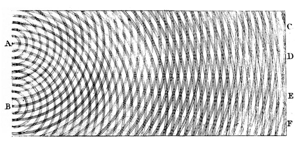
The wave-like properties of light, originally hypothesised by Christiaan Huygens, used an image derived from observations of water. Like waves in water, light waves encountering the edge of an object appear to bend around the edge and into its geometric shadow, which is a region that is not directly illuminated by a light beam. This behaviour is analogous to water waves that wrap around an object, instead of being reflected away.

The combination of an interference pattern with alternating regions of constructive (additive) and destructive (subtractive) interference is a hallmark of wave behaviour and as well as operating in water, it is seen in light and other electromagnetic energy types. However there is the dual nature of quanta to also consider, as they behave as both waves and particles depending on how you interact with them. Experiments have though revealed a wave-like behaviour for many different forms of matter, including forms that are significantly more complicated than the point-like electron. Composite particles, like protons and neutrons, display this wave-like behaviour as well. So the wave goes deep down into the structure of the universe, indeed physicists are looking to mathematically describe the wave function of the universe as a whole. A fluctuation of a quantum wave being perhaps at the heart of how everything began. 


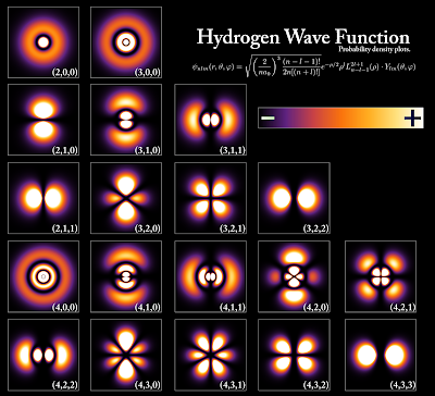
When developing a way of defining wave functions of an electron it was gradually realised that you needed three co-ordinates just as you do when defining a point using an x, y, z axis system. You need a principal quantum number that relates to the average relative distance of an electron from the nucleus and thus its energy level; the Azimuthal Quantum Number, which describes the shape of the region of space occupied by an electron, which in turn will define how the electron sits in the space it occupies and the Magnetic Quantum Number, that describes the orientation of the region of space occupied by an electron with respect to an applied magnetic field. The image above illustrates an electron in a hydrogen atom visualised at different probable energy levels. Quantum mechanics cannot predict the exact location of a particle in space, only the probability of finding it at different locations. The brighter areas represent a higher probability of finding the electron. 

The images that result from the process of visualising quantum wave functions are very similar to those we find when visualising sound or acoustic waves. A visualisation of the wave forms generated by a piano as an octave is played, being very similar to the one used to visualise the wave functions of an electron. Sound is a type of energy made by vibrations. These vibrations create sound waves which move through mediums such as air, water and wood. When an object vibrates, it causes movement in the particles of the medium. This movement is what we call a sound wave.
Sound waves like waves in the sea are longitudinal waves. This means that the propagation of vibration of particles is parallel to the energy wave propagation direction. When the atoms are set in vibration they move back and forth. This continuous back and forth motion results in high-pressure and a low-pressure regions in the medium.
Sound as such doesn't exist, however the rapid mechanical vibrations of various elastic bodies is transmitted to auditory nerves of mammals such as human beings, and are then translated by the brain into what we hear as sound as a way of understanding what is happening. Things need to be moved or struck so as to make them vibrate, and as this happens we observe another energy exchange. 
One of the best visual illustrations of how all this works is the Rubens tube sound wave visualisation, which graphically shows the relationship between sound waves and sound pressure, and which works as a type of sculptural oscilloscope.The original Rubens’ Tube used a four-meter section of pipe that had about two hundred holes across the top which were evenly spaced apart. Both ends of the tube were sealed shut, flammable gas was pumped into the pipe, and a speaker was attached to one of the ends. When the tube was filled with the flammable gas, there was only one route for the gas to escape through, thus creating a row of diffusion flames across the top of the pipe. Since the pressure inside the tube was equalised, the row of flames would stand at the same height. As soon as you play sound through the attached speaker, the height of the flames then changes. The height differences that you see are equivalent to the wavelength of the sound being played. The sounds that we hear are audible vibrations that require a medium to travel through. In the Rubens’ Tube, the sound waves that we hear from the music are traveling through the flammable gas within the tube. As the sound travels down the length of the tube, localised pressure areas will occur. When these areas of pressure are higher, the gas will escape the surrounding holes faster, creating taller flames. When the area of localised pressure is lower, the gas escaping the surrounding holes will cause shorter flames. These high and low-pressure areas are created by the sound waves traveling through the gas. In this way a spoken poem could become a fiery sculpture. 

Rubens tube: the sound wave is changing the internal gas pressure

Most of us are now used to editing sound on a computer and as we do we often see a graphic representation of the sounds we are editing in oscilloscope form. The image of three sound lines at the top of this post is a typical example. However for myself seeing a guitar string vibrating is perhaps the most fundamental idea, reminding me that the mechanical energy in a curving finger can be transferred to a taut metal string, which in turn transfers its metallic vibrational energies via the air to my ear. The fact that I cant see the air, makes the process far more magical, an unseen energy is out there and at times its propagating waves have affected me deeply. 
One of the fundamental things that art can try and do, is to visualise the invisible, be this the spirit world of an animist or the emotive feelings I have when hearing certain music and at the centre of my visual understanding of all this, is the wave form. 


If art is still capable of offering a transformative experience, I suspect it is in the making of structures that allow for the contemplation of this sort of awareness. In particular drawing as a way to make images has a breadth that allows us to communicate a scientific principle with a diagram, use materials as metaphors that reflect the way things operate out in the world, be a symbolic language that can carry ideas, as well as being able to present all these aspects together as a simultaneity; everything, the materials, the image and the way it is drawn, all these things can be seen and perceived at once, a wholeness which is in itself a deep metaphor for existence. Because of this, even at its most basic level, for instance when making an observational drawing of the perceived world around us, drawing can be a wonderful means of capturing a flow of ideas and percepts within a material framework that externalises thought and coheres it within the frame of a small sheet of paper.  


References

Saturday 13 August 2022

Thoughts on the artist's palette

3,400-Year-Old Ancient Egyptian Painting Palette

Made out of a single piece of ivory, the artist’s palette above has six oval paint wells that still contain cakes of blue, green, brown, yellow, red, and black pigments. At the top end of the palette is also the inscription of the pharaoh Amenhotep III in hieroglyphics, coupled with the phrase, “beloved of Re.” This was an important object, and the colours within it meant something special. Painting involves making images emerge from the ground up colours of the earth and as such there is something magical about the process, so no wonder the Egyptians wanted to link this palette to Re, the god who personified the sun and who was the creator god, that brought himself and the rest of the pantheon into being at the beginning of time. He was also central to the ideology of kingship and the acolytes of Amenhotep III, would have been very aware that in identifying Re on this palette, they were linking together the concept of divine creator and the protector of the pharaonic dynasty. In such a humble object the idea of the transformative power of paint is seen as mythically important. 

There are two intertwined histories of the artist's palette. The first one is a history of the materials behind pigment production and the other one is a history of the surfaces that artists have used over the years to mix pigments on in order to get the colours and consistences needed to make their various paints. You can see what I'm getting at if you look at old palettes and how the colours are set out on them. 

Constable's lime wood palette

Rembrandt's palette

I suppose you might wonder why a blog about drawing needs to reflect on this key aspect of painting, but as I have often pointed out, drawing and painting are so inextricably linked that it is hard to separate out the aspects that belong to drawing and those that belong to painting. In this case I'm wanting to talk about an idea of mixing, of taste and the development of a shape, much of which is visualised in my mind by drawing rather than painting and I am also trying to play around with a few ideas associated with drawing as disegno. Disegno, the Italian word for drawing and design that involves both the ability to make the drawing and the intellectual capacity to invent the design, so in this case the design is that of the artist's palette, but its invention, or you might say 'the design process', is where my interest lies.

Paint set out in shells

The earliest written description of palettes is in the accounts of the Duke of Burgundy in the late 1460s, they are described as 'trenchers of wood for artists to put oil colours in and to hold them in the hand.' Medieval painters at work used pigments in shallow shells or saucers, often with a range of colours, such as those set out in the nine saucers or are they shells, of a fourteenth-century illuminated capital from an English encyclopaedia above. trencher (from Old French tranchier 'to cut') was a type of tableware, and was the forerunner of the plate, a place where you cut food up. It was originally a flat round of usually stale bread used in a similar way to an absorbent plate. Those of you who have eaten Ethiopian food might have come across injera which can be used in the same way. By the end of the meal, the plate will have soaked up all the excess oil and juices, so that it would in effect be the pudding, eaten as a final part of dinner. The rich would give these soaked bread pieces to the poor as alms. The trencher gradually evolved into a small plate of metal or wood, typically circular and completely flat, without the lip or raised edge of a plate. Trenchers of this type are still used, for example, the cheeseboard or a food chopping board, which of course retains in its usage the original Old French, tranchier 'to cut'.

A contemporary cheeseboard

If you look at the wooden cheeseboard above, you will see that it is very similar to the palette in Marcia's left hand in the image below. I'm betting that in those days the same item might have been used for both purposes, and if you have ever had to cut a runny camembert with a cheese knife, I suspect the action would be virtually the same as cutting through a dollop of a stiff mix of oil pigment with a palette knife. 

The setting out of the palette, a portable surface upon which colours are arranged according to an artist's interest in particular tonal or colour ranges, has all sorts of implications for the way we think about painting and the main records we have of their use
 is from images of palettes in paintings made by artists that used them, therefore you might suppose that they were very accurate representations, as they were used by them every day. 

Marcia as both painter and sculptor

Marcia using an elongated oval palette 

Marcia using paints set out in tubs: Miniature middle 15th century

Marcia, painter: Miniature from a manuscript of Boccaccio's De Mulieribus Claris, France, early 15th century

Strangely some of the earliest depictions of palettes are in the hands of women painters. We tend to think that very few existed in western Europe until recently, so it is interesting to find women painters depicted in illustrations of various versions of Boccaccio's book 'Famous Women' of 1361, a chronological collection of biographies that includes women artists. For instance the artist Marcia, who is described thus:

'She devoted herself completely to the study of painting and sculpture; in the end, she was able to carve ivory figures and to paint with such skill and finesse that she surpassed Sopolis and Dionysius, the most famous painters of her day. Clear proof of this is the fact that the pictures she painted were sold for better prices than those of other artists. And what is still more extraordinary, our sources say that, not only did Marcia paint extremely well (a fairly common accomplishment), but she could paint more quickly than anyone else'

It is possible to guess from some palettes what medium they were using, the palette in the 15th century miniature suggesting an oil medium, a technique only just invented and unknown at the time that these women were supposed to have worked as artists. The paint on the palette of the painter in these illustrations probably has the viscosity of oil paint, which is thick and stiff, as it remains in place on an inclined surface. In this miniature, Marcia also has paints set into shells on the table next to her, their small size suggesting that they were chosen pigments decanted from a pig's bladder which was often used to store larger quantities of paint. She is perhaps using the palette more as a mixing surface than as an orderly array of colours that will help in her tonal or colour range selection, and if this was the case, the artist may have spent more time ordering the pigment filled shells when choosing their 'pallette'. Marcia is depicted as a Medieval woman but in Boccaccio's text we read that she was a Greek artist from the 1st century. The palette she uses has a long handle and she rests it against the painting she is engaged with, as she needs her free hand to hold a mirror. For myself the painting is fascinating because as well as being an early indication that women used to be taken seriously as painters, it has several layers of reality. The face in the mirror, the painted face and the side view of the artist's face, all exist at the same time, in the same reality, in effect the artist Marcia, now exists in triplicate. Marcia was also a stand in for someone else, Boccaccio based his story on a much earlier account by Pliny, who wrote about a famous female painter from ancient Greece called Iaia of Kyzikos who Pliny states, ‘painted a portrait of herself with the aid of a mirror’ which would of course have been a bronze mirror in her case. The miniature of Marcia at work from the middle of the 15th century appears to duplicate Marcia even further. The stance she paints of herself is further reflected in her sculptures, as if once she had made an image of herself, she then used it as a model for all her sculptures of women. Marcia in this way becoming an icon of reproduction, even though, or in spite of the fact that as Pliny also stated, ‘she remained single all her life’.
Boccaccio's text also celebrates the lives of two other women artists, Irene, daughter of Cratinus, who 'surpassed her master in art and fame' and Tamaris, daughter of Micon, an Athenian artist. 
Irene at work, using a similar palette to Marcia

Tamaris paints Diana

Tamaris is using a bowl to hold her paint in or a large shell, two objects that are echoes of the cupped hand. By putting our hands together we can make a hollow out of which we can scoop water up from a stream to drink. It must have been at some point very early on in human development that it was realised a shell could do this for us even more effectively and then at a much later date it would have been realised that bespoke vessels could be made out of clay. Palette's are also extensions of our bodies, in a similar way to a brush being a concept based on our fingers, which extends our capacity to paint with far more control than we could possibly achieve by smearing paint onto surfaces with our hands. I'm sure the first palette would have been the palm of the hand, I still in fact use my left palm occasionally to mix paint on when I have nothing else at hand. But our word 'palette' is derived from the French palette, which in turn comes from Old French palete, a "small shovel or blade". This in turn comes from the Latin pala "spade or shoulder blade". The shovel below was discovered during excavations at the stone circle and earthworks in Avebury, Wiltshire in 1909, and dates to between 2900 and 2600BC. It is made from the scapula (shoulder blade) of an ox.

A 5,000 year old ox shoulder blade used for digging

If you look at the palette used by Marcia in the early 15th century image, you will see it consists of a handle and a broad flat surface to lay colours out. I would suggest the form came to us as humans a while before the medieval period and at least 10,000 years before these women painters were meant to have practiced. Long before the kidney shape I'm sure the scapula was a model for the palette, a place where colours could be mixed and I'm also sure shells have been used as vessels for keeping pigments ready for use for thousands of years. 

Human scapula

I can see in the scapula the possibility of a palette and so I'm sure would early peoples. 


A contemporary kidney shaped plastic palette

This plastic palette above even has small scooped out indentations, memories of shells, set out around its perimeter. 

I have argued many times that art is inextricably grounded in the material realities of its production, an entwinement in this case twisted around 
an oval wooden board that has a hole in it for the thumb, and a shape that allows it to rest on the artist's non-painting arm and to be held in a position that allows mixing to be done easily. In the image below you can see the artist squeezing out a tube of paint onto his palette. He is surrounded by palettes of several variations of shape and size, and he is using one similar in shape to Constable's lime wood palette, whilst a kidney style palette floats above his head. I was particularly interested in the hinged palette, probably designed for the artist who has to spend a lot of time working outdoors, so would need something very portable. Notice a white palette in the selection, they had become popular in the late 19th century due to the use of white grounds for both Impressionist work and by the Pre-Raphaelites, these grounds it was agreed kept colours lighter and brighter and colours were therefore also needing to be mixed against white, so that the colour mixed on the palette looked the same as when it was laid on the white ground of the painting, hence the continuing popularity of white as a palette colour. 


Mixing on these flat boards is not that far away from cutting up and eating from a trencher. As we mix our food together with our knife and fork, we are doing something not dissimilar to the mixing of colour with a palette knife and brush. The fact that many students use disposable white paper plates as temporary palettes, showing that the plate form continues to be an ideal one for artists to use for mixing. The histories of food preparation and image making are mixed together. Charcoal would have been first sourced from fires made for cooking, the grease and fat from cooked meats would have been used as binders for early paints and as other food stuffs such as honey were introduced into diets, bee's wax would also have come into play as a pigment binder. The evolution of cooking, the mixing of different foods stuffs together in such a way that new and more interesting tastes were discovered, must have gone alongside the discovery that the berries you were eating were also a powerful colourant. A left over meal of fish that was stuck to a wooden surface used as a table to eat from, would have given someone an idea for fish glue. Once again it is in the servicing of our bodies that ideas arise and as we eat we think and digest thought as much as food. 
Think about how you lay out food around your plate. You don't just dollop it on, you carefully arrange it, often with concern for colour, but more often concern for mixing one taste with another. You will put mustard near to meat for instance, because you know a mix of the two  excites your taste buds. Is not the laying out of an artist's palette similar? As you lick the ends of your brush to ensure a fine point, perhaps you are much closer than you realise to being a colour chef or paint cook and that kidney in your hand is as much a food stuff as a mixing surface. 
The kidney with violet

Caterina Van Hemessen, Self-Portrait, 1548

Van Hemessen has an interesting palette, she holds it at an angle that makes you think she wants to show it to us. She has a very small palette with few colours on it and there is no mixing going on. In Cennini's craftsman's handbook he states that if you wanted to paint flesh you first of all painted in a green underlayer, "Take a little terre-verte and a little white lead, well tempered; and lay two coats all over the face, over the hands, over the feet, and over the nudes." The flesh tones were applied over this underpainting. You had to make up three values of flesh colour, each lighter than the other and then you would lay each flesh colour in its place on the areas of the face and to do this the flesh tones were pre-mixed in a system of three gradations, which corresponded to the three modelling planes of light, mid-tone and dark. Blending was then done on the picture surface, rather than mixing on the palette. Cennini also describes preparing colours for painting clothing or draperies and again he tells the artist to set out a series of three basic tones onto the palette and blend afterwards.

Niklaus Manuel Deutsch, Saint Luke Painting the Virgin, 1515

This is why in Niklaus Manuel Deutsch's painting of Saint Luke, the patron saint of painting, Saint Luke is using a very limited palette for painting the blue cloak of the Virgin. As in cooking, too many flavours makes it hard to get an idea of the structure of the meal, in painting too many colours could lead to a lack of formal clarity. However sometimes expression will overcome structure, and Van Gogh's palette feels more like a plate pushed aside after a hastily rushed dinner. 


Making art is about material thinking, when you use the things in this world to think with, they become extensions of your body and your mind. If you don't believe me, how do you feel if you have a minor bump in your car? You feel it directly, even though it was the car and not you that was damaged. 

Nb. A few thoughts about words. Words are interesting things in that they hold onto the edges of events and turn complex interconnected processes into simple chunks so that we can understand them, especially as nouns. But they can also develop a series of poetic associations some of which are based on homonyms. Homonyms can be homographs, (spelt the same but meaning different things) or homophones, (sounds the same but means different things) or both. Even though you know these words stand for different things, because they sound the same, your instinctive self feels that there must be some sort of connection between them. Set out below are a few palette/pallet/palate meanings.  

A “palette” as we have just seen is the flat board an artist mixes paint on, and by extension it also means a range of colours, as in, "The artist's palette consisted of reds, greens and blues" and it is associated with the tools of the artist, such as a palette knife. Derived from the French palette, which in turn comes from Old French palete, a "small shovel or blade". This in turn comes from the Latin pala "spade or shoulder blade". 


A “pallet” is a type of bed made of straw or hay, used in medieval times. Close to the ground, it was generally a linen or some other material sheet stretched over some hay or straw. The mattress might be called a palliasse, or sometimes pallet, based on the French word for straw: paille. 
A pallet is also a wooden platform used as a base for storing and shipping large items. This word is also derived, like the artist's palette, from the Middle French 'palette' (literally, “small shovel”). This small shovel has led to a variety of mixed meanings. Hence, a pallet was also a flat flexible wooden blade, an instrument with a handle used by potters for shaping. There is a related original sense in English which was medical, such as a pallet being "a flat instrument for depressing the tongue." These are now however called spatulas and are normally made of wood. However as we have seen a palette knife is designed to clean and scrape your artist palette and it has a straight blade made from metal with a wooden handle or plastic with a flexible blade. However a spatula can also be used to mix your paint and is usually described as a flat thin implement used especially for spreading or mixing soft substances. 

A spatula for tongue depression

A spatula for cooking

A spatula set, comprising of three palette knives.

A spatula is any tool with a blade that is somewhat flexible, but fairly rigid, so in effect a palette knife is a type of spatula. However a 'palette' is a “small shovel” which could look very like the wooden spatula used for cooking. Gradually 'pallet' became the spelling for a "large portable tray" like a cheese board and in extension, eventually becoming the spelling for the usually wooden flat crate like support used with a forklift truck for moving loads.

Pallet

In heraldry a pallet is a vertical stripe, half as wide as a pale. 

Pallet

Pale

The palate is divided into the hard bony palate and the fleshy soft palate. The palate is the roof of the mouth in humans and other mammals and it separates the oral cavity from the nasal cavity. This derives from the Old French palat and directly from Latin palatum "roof of the mouth," also "a vault," which is perhaps of Etruscan origin [Klein], but de Vaan suggests an IE root meaning "flat, broad, wide." It was popularly considered to be the seat of the sense of taste, hence transferred meaning "sense of taste" (late 14c.), a term also used in this way in classical Latin. 


Words begin to loosen their hold the more you play with them, and it is useful be be reminded that they are a convention for shared meaning and in no way have any relationship to reality. 

See also: