Tuesday 28 November 2023

Paper: A material conversation

I have been going through some old folders of work and came across some images I made when I used to work with Foundation students paper making. The images were from 40 years ago, but I decided that paper making could still offer interesting possibilities and that it might be something to return to once I have completed the various projects I'm now engaged in, in particular as a way of making surfaces that can have things embedded into them.

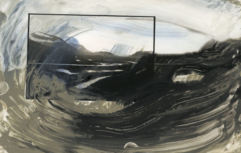
The first and possibly most important issue is the 'conversation' that it is possible to have with both the various processes involved and the materials that go into the making of a sheet of paper. Now that I am more aware of animism as an approach to making connections with the world, I'm finding it much easier to let my mind drift into the lives of things that are not human. As to the material nature of paper, the 'ur-history' of cotton rags could also include the previous lives of cotton clothing wearers, as well as rag pickers, whilst some papers may have embedded into their histories stories of mass tree planting for re-forestation. Hand made papers might include vegetable materials available locally, therefore the lives of local plants might be woven into the story. I went to an interesting exhibition in Leeds over the weekend by Invisible Flock, 'This is a Forest'; an exhibition that tells the story of the artists’ journey across sites in Leeds in an attempt to reclaim a part of the city as a forest. I could easily see how paper making could have become much more embedded into the project they were developing, especially if paper had been collected from the various sites explored and then pulped and mixed with plant fibres also available from plants now growing on the sites. There was a handout available made of handmade paper, that used sawdust made from a tree that had died in the Yorkshire Sculpture Park, something that perhaps triggered my thoughts for today's ramble, but I wanted the paper making to be more conceptually embedded into the process. However that was my own 'this is what I would do' response, and it was great to see a big space devoted to a serious attempt to get an idea across in a visual art form. In fact Leeds has been lucky lately and we have had some excellent visual art to experience, such as 'And She Built a Crooked House' by Gemma Anderson-Tempini an exhibition that is still on and which fills the rooms of Burton Grange house in Headingley, as well as the opening last weekend of Hibiscus Rising by Yinka Shonibare. I. e. art matters and if you are a student studying art in Leeds this is a great time to get out and visit these exhibitions. 

However, back to paper making.
If you are going to make a practical start and want to have some results quite quickly there is a basic set-up.
First of all you will need a mould and deckle. The mould is a frame covered with metal or nylon mesh, and the deckle is the frame that sits on top of the mould. This how to do it video suggests that you use two ready made picture frames as a simple and quick way to get these made.


How big your frame is will be vital to how you proceed. If only small you can overlap each sheet as you transfer it and gradually construct much larger sheets.


Your mould and deckle will need to be pushed down into a tub of water with suspended particles of fibre floating in it. But you can get over the need for a deep tub by pouring the paper suspension directly into the mould if you keep it in a large jug. You then need to transfer the wet paper suspension onto a flat absorbent surface, such as a felt mat. 

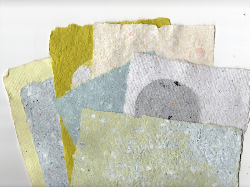
Typical papers made by recycling 


If you follow the simple steps in the guide, one thing you might consider is overlapping the small sheets as you transfer them from your frame, so that you can build larger and larger sheets. As you do this you can also embed other things into the gradually growing area of paper. This takes far more time, but much more ambitious projects can emerge from this. 

David Hockney: From the Paper Pool series

Essentially you are making what is normally thought of as a surface on which to make marks, into a substance that will make your visual communication directly. Either as in Hockney's 'Paper Pools', as a substance that carries the image directly by being 'painted' with, or as a material that can be applied as a new surface on other things, or as in papier-mâché, as a building material.

David Hockney came across the technique of working directly in paper pulp at the Tyler Graphics studios in upstate New York. This involved dyeing wet pulped rag papers, which were then applied in various ways to recently-created and still wet paper substrates, until once a satisfactory image was made, they were finally pressed flat and dried. There were opportunities for Hockney to manipulate the application of colour at all stages and the final result was a cross between paper-making, print-making and painting. I am learning new techniques in stained glass manufacture and in their very restrictions find invention. Hockney also found learning a new technique and its specific restrictions, facilitated invention. He realised the process could be very conducive to variations on a theme, in particular, swimming pools and the effects of different lights and movements on their water. In Paper Pools, Hockney addresses a formal and paradoxical problem: how do you depict the elusive, ever-changing qualities of a body of water, using a flat, stationary, two-dimensional medium? In these images, colour does not sit on the surface, it is fused and completely integrated. Like water itself, light and movement are subsumed into these works, and in doing this, Hockney is able to close a conceptual loop between what is represented and how to represent it.

Peter Gentenaar and Patricia Torley are a couple who specialise in organic paper making. Their website also gives tutorials on how they work with paper, Patricia Torley in particular offers some fascinating insights into possibilities for painting directly in paper and Peter Gentenaar uses paper to develop three dimensional structures. 

Patricia Torley

Peter Gentenaar

Hockney has a much clearer grasp of the conceptual issues surrounding this type of approach to image making, but you can learn a lot of techniques and technical approaches to paper working from specialists like Torley and Gentenaar. 


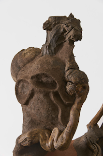
Anthony Caro: Paper sculptures

Anthony Caro used paper casting processes to work through ideas for sculpture. He would press paper pulp onto smooth plaster forms, then cut, fold, squash and join the dried sheets to create ideas for sculpture. 

The artist Wangechi Mutu, often uses paper pulp. In her case she uses an oatmeal-like mush made from a range of papers and added ingredients that are chosen to give the work specific meaning, such as particular soils or coloured dyes. Mutu first came up with her paper formula when adding the final layers to the Afrofuturist sculptures she created for the 2015 Venice Biennale, wanting to recreate the organic look of mud-brick houses traditionally built by women in Kenya. 

Wangechi Mutu: Mirror, 2016
Paper pulp, soil, wood glue, and mirrors

This is her basic recipe:

Step 1: Shred enough paper to fill a one-gallon container. Fill three-quarters full with boiling water. The paper will absorb the water. Mix contents with a wooden spoon. 

Step 2: Cover container with an airtight lid and put mixture aside for a week. (If you have a strong good quality blender, at this point you might blend) Add two cups wood glue, and stir until all shreds are soaked in water and glue. The glue will lighten and fluff the mixture. 

Step 3: After the mixture sits for a week, it will be time to strain the pulp. Place a sieve over a bowl and pour the paper mixture in.

Step 4: Press on the pulp in the sieve with a spoon to remove excess liquid; discard liquid. Add half a cup of rubbing alcohol to the remaining paper pulp to kill bacteria. The texture should be the consistency of tacky oatmeal.

Step 5: Wearing plastic gloves, take a handful of the mixture and form a ball. Knead and shape it in your hands.

Step 6: Place the ball on a flat surface and sprinkle with coffee grounds, tea leaves or paint pigment on the surface. Compress the ball and add more pigment to stain it further and form a coloured coating. Add more liquid pigment to the mixture for additional colour. It now works like paper clay.

Step 7: Shape the paper clay mixture into a sphere, a sausage or whatever shape you desire and begin to explore its formal possibilities. Some forms will work but others will not. 

Step 8: Mould the paper clay over anything you might want to cast, or simply cover, by putting cling film over objects and pressing the paper onto them and then you can link to any other forms you might have made by laying more paper clay around, over and into joint areas and once again pressing tightly to adhere the mixture. 

Step 9: Set the forms to dry (ideally outside in the sun), where the colours will change and cracks may form. As you get used to this process you may begin to add reinforcing materials such as muslin. 

Wangechi Mutu: Sentinel IV 2020: Paper pulp, wood glue, soil, emulsion paint, charcoal, ink, coconut hair, Natal Rhus (Rhus Natalensis), Silver Oak (Grevillea robusta), Croton (Croton Megalocarpus) and Jacaranda (Jacaranda Mimosifolia)

Wangechi Mutu uses paper pulp to bring together various materials, so that they have one harmonious surface. She also mixes into her pulp locally sourced earth and colourants. The materials embedded into her 'Sentinels' all have specific meanings, for instance the African tree 'croton megalocarpus' is known for its high nitrogen content, and its leaves are often therefore used for mulch. Traditional medical uses for croton include the bark, seeds, roots and leaves being used for medicinal purposes such as the cure of stomach ailments, malaria, wound clotting, and pneumonia. This Sentinel also acts as a healer, and as a harbinger of the acute imperative to improve our relationship with each other and our planet or we will have to accept that environmental destruction will inevitably decide the fate of us all.

There is so much paper around that it is a natural material to use for anyone that wants to reflect on a society that creates too much waste. I am suggesting very home made ways of working with paper, but commercial print operations take the making of paper pulp prints to high levels of technical sophistication, in particular it is fascinating to see how the artist Chuck Close used paper pulp technology to have prints made of his portrait work. 

Paper pulp printmaking processes 

Paper pulp printmaking processes: Chuck Close paper prints

See also:

Paper and sustainability
On line books on paper
Research into paper
More thoughts about paper
Paper sizesPaper: Folding and the songs of trees

Friday 24 November 2023

Stained glass: Session five

Session five was focused on cutting glass. I had to make sure that I had all my pieces cut and ready for session six as this was when the painting sessions would begin. 

I had already made some headway in cutting out the sections needed, and the only parts left to cut for the main image were slightly larger pieces of green and blue glass. This meant sorting through all the offcuts, out of which I managed to cut another five sections, and then I had to use glass from the workshop's stock, in order to finish the central section. 

Each piece of newly cut glass was put into its place on the cartoon and reattached by tape to its paper template. As each section was completed its number was ringed in red on the cartoon. 

I couldn't find a big enough piece of glass for shape 16, so I decided to re-draw the cartoon and make that section out of two pieces. 

Section 16 is now labelled 16 and 16B

In order to transfer the drawing onto the glass, I used the original template for three sides and a tracing from the cartoon for the side now making the join between the two. Finally once the glass sections were cut, I traced the new cut line from the cartoon onto the paper template and cut that out using the paper cutting sheers that take out a thin strip of paper to compensate for the leading. It might seem very pedantic all this attaching paper templates, numbering etc. but with so many pieces to put together for the final image, it is so easy to get lost. Also cut glass sections tend to look very similar, but they have to fit in exactly the right places, or the jig-saw of the window will never fit together properly. 

Earlier sections already cut are marked by red circles

Once all the central sections were cut, it was time to look at the border. I had some pink glass left over and as this was very expensive, decided to use this as part of the border. (It was also an aesthetic decision, as it brought colour from the centre out into the edges). I was then shown how to make sure all border sections were going to be the same width. 

Making sure the border is cut at a right angle. 

By using the first cut strip as a marker, you can align the wheel of the cutting tool up alongside the edge of the right angle, so that it is exactly positioned for a width that will be the same as the strip above. I managed at this point to break a couple of strips, because the pink glass is very thick and uneven. But I cut enough to get out what I needed. 

As pieces were cut they were placed on the cartoon. 

Section 72 was a continuation of the arm (82) and so broke the symmetry of the border 

The border would be too predictable if it was the same all the way round, and so by responding to the visual arc made by the arm coming in from the side, I could both give the border that needed shift to enliven the dynamics and at the same time anchor the arm idea into the edge of the design. I hope it works, but I shall have to see. A bit of a risk, but without risk you cant learn. 

The purple glass

Jo-Ann also had shown me some purple glass she had available. I had used some for the areas filling in around the leg and Sooty, so decided a little could also go into the border. I realised could use it to emphasise the slight off symmetry caused by my introducing section 72 into the design. I have yet to see it all together on the light-box, but I only have 4 border pieces to cut next week, (blues to sit between greens and pinks) and then I can check how it will all look. 

The state of the border at the end of the session. 

Homework for this week was to make studies for the painted sections, because the next few sessions focus on painting glass techniques. 

See also:

Sunday 19 November 2023

Drawing on Experience

John Dewey wrote ‘Art as Experience’ in the 1930s and set out the centrality of the communication of experience to the practice of art. I have been involved for a while with a research group associated with the university of Porto entitled 'The Observation of Perception, considered through Drawing' and my own research in relation to this has been to explore how we might visualise experiences of interoception. I have posted fairly regularly on the different aspects that I have confronted as the work around this has developed, from a consideration of 'qualia' as the phenomenal quality of experiences, how we now think about inner body perception in an age of CGI, the relative benefits of hand drawn and computer refined imagery when making representations of inner body experiences, how the body and its nervous system construct inner maps of experience, how we might use this process of visualisation for the development of a contemporary type of votive and other issues that are all related to why interoception is an important aspect of perception, especially if we want to reflect the full complexity of perceived information, that comes from both outside and inside of our bodies at the same time. However I'm also very aware that as well as making images about this, which I regard as my primary research, I'm also writing about the process and sometimes forgetting that I'm writing in English and the English language is itself a somewhat limited communication medium. This post is therefore a reminder to check out how other languages deal with issues that are similar, but in their very difference, open out conceptual alternatives. 

The word 'experience' in German can be translated as either 'erfahrung' or 'erlebnis'. 'Erfahrung' represents deep, full blooded experiences that lead to knowledge, whilst 'erlebnis' is a word that stands for more superficial experiences that are perhaps enjoyable but not necessarily profound. In English 'experience' is a thing, but in German it is a quality of perceiving. There is a diagram that might help illustrate this difference. 


In the diagram we have two very different German words for something that is another single one in English. Körper refers to the body as an object, something to which physical qualities can be attributed. Leib, by contrast, implies the body as a subject. 'Körper' represents the physical/material, objective body and 'Leib' the lived/animated, subjective body. In English of course we have the word 'corpse' to define a 'dead' body, but this is not what the German word implies. These distinctions are vital to our reading of phenomenology because the main early thinkers are German. According to Husserl and, then later, Merleau-Ponty who takes his reading from Husserl, 'Körper' is the body-object, while 'Leib' is the lived-living body. In German what it is to be a body (Leibsein) can be contrasted with what it is to have a body (Körperhaben).  Körper stems from the Latin corpus and refers to bodies as physical entities, including celestial bodies, geometrical entities, and dead bodies or corpses. Leib, by contrast, is related to the verbs leben (to live) and erleben (to experience, to go through) and the adjectives lebendig (animated, lively) and leibhaft (in person, in the flesh). As such, Leib refers to the body as it is experienced or lived, instead of the body as it can be measured or quantified. Therefore for my purposes I'm dealing with subjective experiences of the lived body, (Leib) not a set of measured physical bits of objective information that are records of the physical nature of the body, (Körper). 

A representation of stomach cramps (A subjective experience of the lived body)

If we go back to 'erfahrung' or 'erlebnis' we can then open out the two differences in meaning even further. In this October issue of Art Monthly, Matthew Bowman looks to Walter Benjamin and his understanding of the distinctions between 'erfahrung' or 'erlebnis' to open out a reflection on why we are no longer able to sustain 'erfahrung' or deeply felt experiences, and how we use 'erlebnis' as a way to protect ourselves from the constant bombardment of information that is our contemporary state of being. We in effect can only deal with shallow or superficial responses to experience because if we tried to deeply experience the constant flow of stimulus that we are now subjected to, we would seize up and be crippled by information overload. My reading of this is to keep making slow things by hand, things that you can take your time with, rather than trying to make another incursion into the world of mass media. Instead of trying to avoid confronting profound, deep feelings; to cultivate them. To use a sense of 'erfahrung' as something to strive for in your work. Colour, surface texture, tonal variation and other basic elements of image making can be deeply emotional, and we can have profound relationships with both objects and other people. Events still move us. Yes we are subjected to a constant bombardment of information, but we can still recognise the qualitative emotional differences between life changing events, such as experiences of birth, death, and of those special times of unexpected spiritual awareness that can become moments of epiphany. If not, we will become empty, emotionless husks, incapable of deep feelings. In slowing things down, we help ourselves and others to feel more, to attune ourselves to the wider cosmic wonder that we live within. 

A chest pain visualised

A meditation on the body

Sometimes thoughts can be carried in materials in ways that you don't expect. In the image above, I found myself talking in a language of pigment diluted in water. As the image emerged out of swirling liquids, it seemed to develop some sort of harmonic with my own body. This is something that can happen both within and without; can be both portrait and landscape. Finding the right material to work with can be vital, for instance, Sue Bryan's drawings of trees, mainly using charcoal, sometimes achieve a close harmony between the dry crumble of the charcoal, the texture of 'treeness' and the atmospheric emergence of the tree; the 'crumble' and soft smudge of the chosen material representing both object and the space it grows into. 

Sue Bryan

Just looking at a tree or listening to your own body can be antidotes to the constant flow of digital information. So perhaps leave off reading this blog and go outside and look at stuff. With a pencil in your hand, examine a tree and when you are ready, begin to draw it or if you are stuck inside think about what it feels like to hold a pencil, and draw that. 

See also: 

The magazine PSIAX issue 7  This link is to a PDF download of the magazine which includes my recent article on visualising interoceptual experience

Qualia

Surface and inner body perception in an age of CGI

John Dewey

Considering analogue and digital drawing processes in relation to the visualisation of inner body experience

Maps made by our nervous systems 

Drawing and healing traditions

Why interoception


Tuesday 14 November 2023

Stained glass: Session four

 Most of session four was devoted to cutting glass but an important decision had to be taken at the beginning of the session related to the fused glass section which had been fired during the week. The fused frit circular element, that I had made to represent heel pain was now finished and it posed a few issues. The first was that although it was the right thickness it was lumpy. I could have it re-fired but I decided I liked the look of it and would like to keep it as is. This will make it hard to clean when working on fitting and holding the leaded sections together later on, but I think it will be worth it. The other issue was that I made the circular shape larger than I needed it in relation to the original design, so that I could cut it down afterwards. Now that I have decided to keep the lumpiness, it is impossible to cut, so that It was decided to grind down the edges, and to smooth out the curve, but to maintain the more organic edge, as opposed to the original shape which was drawn using a compass. 

Fused glass made of various course and fine frits

You can just about see the sharp bits on the edge and the fact that sometimes the edge dips inwards, I needed to remove both sharp edges and smooth out the indentations.  

All-Star Glass Grinder

The workshop has an All-Star glass grinder, the main thing to beware of is forgetting to use goggles or to have glasses on to protect your eyes. A smooth movement is needed to keep the curves smooth. (Nb the company that makes these is no more, so replacement grinder heads will be very hard to find)
 
Once the edges had been smoothed off the new shape is placed over the cartoon 

Once in place the Black Sharpie drawn lines indicating the edges between sections of glass, are extended using a white Sharpie onto the fused frit glass circle. An arrow is also drawn so that it is easy to find the top edge. A new more organic circle shape is now drawn using the edge of the glass circle as a template. 

The new shape is drawn and the old one slightly greyed out using the white pen

The new shape cuts into the sections surrounding it, so the first thing I have to do is trace this onto the pieces of pink glass I have already cut. Then I go back into glass cutting mode, first of all recutting the pink and then using the adjusted cartoon, alongside the template sheet that I still continue to cut out, to draw up as many pieces of glass as I can, searching through the trays of glass off-cuts for pieces that are slightly bigger than the paper templates. 

Marked up glass pieces with their paper templates

Once cut I was able to place the sections on the light-box to check how the colour was working. 

Cut pieces set out on the light-box

The 'fit' between sections of cut glass can now also be checked. In this case they seemed to fit pretty well, close enough to not need any immediate grinding off, but when we come to the reality of fitting it all together with the leading, some adjustments will inevitably need to be made. I am personally reassured that I am getting better at the glass cutting and am making less mistakes. In particular I am getting better at controlling the weight of the cutter when making changes in the curve direction when scoring. 
The rest of the session was me cutting glass, including the amber range of glass for the Sooty figure and more small sections of green and blue. By the end of the session I had only 10 pieces of the main design left to cut, but these are larger and I might have to buy in glass for these. Then finally we will look at cutting out glass for the border. 

See also:


Friday 10 November 2023

The drawings of Henri Michaux

Henri Michaux: Visage

Every now and again a particular artist re-emerges as being of vital importance to me and because of my interest in visualising the body, by combining the visualisation of inner and outer perceptual experiences, the frottages and drawings of Henri Michaux have come back into focus. I was reminded of his work by a reviewer of a paper I had submitted about my own drawings, the reviewer pointed out that Michaux had explored a similar territory many years before and that I had not referred to this. Sometimes reviewers pick up things that really make you think again and in this case I must admit I realised I had not really thought through certain aspects of what I was writing about and that the paper I had submitted did indeed need some serious revision. Probably the most serious error I had made though, was that some of the particular issues I should have picked out in the paper were ones I had written about before and I had simply left them out, my mind having a 'been there, written about that' response, forgetting that I am probably the only other person to have read what I was thinking about before, and that without some precise information about how drawing can solve certain problems, the writing didn't really make sense. 

Henri Michaux: Visage

I mentioned Michaux's work in conjunction with Unica Zurn a few months ago, but he is well worth looking at as an artist in his own right. 


Henri Michaux: images

Michaux became famous for taking mescaline but his drawings were never done under the influence of the drug, in fact he said that drawing was impossible whilst under its influence. However the visions he had of the mind working, were strong and they directly influenced his approach to image finding. His idea, of finding images in the process of making a drawing is not new, but his particular take on the idea was that he was finding out about the structure of the brain itself. This has helped myself when working to sometimes just let images become what they need to be, to allow them to emerge and in that process to look for a synergy with my own inner body language, the language of feeling tone, of stomach ache and backache, of inner excitement, of breathing in and out, of feeling fine or feeling down, all perceivable embodied moments, that can be thought of as interoception. I've also now re-written that paper, 'Drawing the embodied mind' and it is available in edition 5 of the magazine PSIAX. 

The Silence of the World: Henri Michaux

The Silence of the world is one of Michaux's hallucinatory representations of faces. A half remembered image perhaps from a book on pre-history, from a police forensic investigation file or a 1950s pulp science fiction comic. It sits between readings, half a face, a single tooth protruding, as in an old battle weary smilodon. There is something about Michaux's images that take me back into the world of the half seen, half dreamed, remembered something that sits on the edge between perception and reverie. His images enter the world of magic via an oblique direction, they find their way into our brains via the root of the fetish, and engage us as awkward strangers do. 
Perhaps above all Michaux's work reminds me that you need to tune yourself into the world of things that are 'other' than yourself, if you are ever as an artist to find those images that surprise you, that come from nowhere but somewhere. If I could tap into the logic of an apple, or think with the brain of a crystal or smell with the nose of a dog, then perhaps I would be able to draw with the eyes of a bacteria. 

Reference

Barker, G. (2021). Drawing the Embodied Mind: A Project Report on Research Into Interoception. PSIAX #5 ESTUDOS E REFLEXÕES SOBRE DESENHO E IMAGEM, 5. pp. 17-24. ISSN 1647-8045.

See also:

Monday 6 November 2023

Stained glass session 3

Using paper templates to choose which off-cuts I could cut out from 

This session was mainly focused on glass cutting. I had had delivered to the glass workshop a sheet of  'Lamberts Gold Pink on Clear' glass. This was going to be the base colour for the leg and arm sections of my design and as it was hand made and very expensive, I needed to do the cutting very carefully. Because of this, before I started, I cut two sections out of much cheaper off-cuts in order to practice the techniques learnt last week. 

During the previous week I had bought my own leading sheers, so was able to cut the paper templates with my own sheers. I was now getting very used to the small repeated scissor action when cutting curves. As before these templates were used to mark up the glass for cutting. However when it came to using the pink glass, the most important issue was deciding which side of the glass to mark up and score. 

Lamberts Gold Pink on Clear is a 'flashed glass'. When scoring flashed glass you need do this on the unflashed side. If you score on the flashed side, the wheel may only penetrate the thin flashed surface leaving the thicker base glass unscored and this can cause the glass to break unpredictably. So my first job was to find which side was which. I found this very hard, as it was not easy to spot the difference.

Flashed glass is a type of specially produced mouth-blown sheet glass. Colouration is created by means of the flash technique, hence the name. The clear or tinted carrier glass is over-laid with one or two layers of coloured glass. 


Once cut you can see the thin coloured glass layer by looking at the side as in the illustration above. However my new glass sheet had 'soft' edges due to its manufacturing process, which also means that it can be thicker towards the edge where it finishes, so you also need to avoid this when marking up. 

The sheet of pink glass had been cut from a larger sheet, so had a sharp edge

My sheet had a label stuck to the flashed side, but I wasn't sure whether this was just chance and I had to look carefully for 'clear spots' in order to decide. I needed to keep checking with Jo-Ann which side was which and didn't yet feel confident. More experience with various different sheets of glass will I'm sure help, at the moment the fact that flat glass sheets are made in different ways is just part of the learning curve. 

I marked up the glass first of all by dividing it, into a strip that could then be used to cut out my shapes. This seems like a way of wasting glass, but I was assured that in this way, each section is easier to handle and therefore you get less breaks and any mistakes cant damage the whole sheet. 

Two paper templates were placed on the full sheet and it was marked for cutting and then cut
Paper templates are now drawn around and are then scored and cut out

When scoring deep curves, which some of my shapes had, I needed to do this as a series of shallow curves.  Otherwise, the glass might break off in its own direction.  A later use of a grinder will finish these off, but they need to be as precise as possible. 

Because I was new to the cutting process, I was still getting the weight right and I did tend to put too much weight on my cutter, something that Jo-Ann could pick up by listening to how loud the scoring sound was. The more I cut the more I was able to control this. Much of the learning resides in your body muscles and you cant quite describe it in words. How you hold the glass cutter, how one hand guides the other, how you twist your body to ensure the cutter follows a smooth curve, how you need to lower your body, so that your eye level coincides with the action of the scoring, and how you keep focused on the drawn line as the cutter wheel moves along it, are all essential things to do and they are seamlessly integrated in the doing. It was also important to remember between each scoring to use the dustpan and brush to remove any traces of glass splintering from the cutting surface. 

At the end of a day's cutting I had 15 sections and I need just over 80

Although working slowly I managed to get all the pink glass pieces cut out and I was able to check on how they were beginning to visually work, by placing them on the lightbox. Finally I lightly taped each cut section to its paper template, so that it was easy for me to check its number and position in relation to the cartoon and then on the cartoon circled in red all the numbers of the pieces that had been cut so far. 

During the process of cutting the pink I had made one bad mistake and this was when cutting the piece for the arm, which I had tried to do in one. The glass was broken in the wrong place, (I could now see clearly why I needed to do the scoring using smaller sections rather than trying to cut out everything from the whole sheet), I had tried to break my glass along a curved scored line by using pliers that were not placed close enough to the score. Jo-Ann pointed out that perhaps the piece was too big anyway and that I could make it in two separate sections. I had to go back to the cartoon, adjust it and number the additional piece. Then cut out a new template and find a pink off-cut out of which to cut the new addition. A useful experience as I realised that what seems like a fixed thing once the cartoon is drawn up, can still be adjusted in response to what happens. 

Course frits, fine frits and powdered frits

I then turned my attention to the fused glass section. During the week this had been fired and it had several holes in it which would make it very difficult to cut, so I needed to fill these and sort out the edges which were splayed out blobby shapes. I used various frits; course and fine as well as power to do this. As I filled the holes I was hopefully able to keep the design working. Finally I used clear frit to hold it together. The big issue here was thickness. I had to make sure it was not too thick or too thin, as this fused glass section has to fit into the same leading as all the other types of glass used. Finally I used fine frit to cover the 'mess' around the edge, so that on firing it should be less blobby. Nb before starting making these additions I placed the fused frit circle over my cartoon to check it was about 1cm bigger all round than the shape I was finally going to need. 

Fused frit circle with additional mixed frit and a layer of clear frit to make sure all holes are filled

This work was done on a kiln shelf and then other pieces were added from other people, so that there was no wasted space in the kiln. (I.e. to not just do what you want to do in the middle of a shelf, leave room for others)

Finally all my pink offcuts were put in the bottom of a plastic container, the remaining pink sheet was put away in a safe spot in the glass rack and I covered the offcuts with cardboard, so that all my cut pieces could be laid flat and one slightly longer piece that I thought was more fragile, was individually wrapped in cardboard and this container was put away for next week. 

Offcuts and cut pieces collected together in a plastic container.

See also:

Wednesday 1 November 2023

Contemporary landscape part two

Ian McKeever 1977

Ian McKeever has been working with images of landscape for a long time. However his work as a painter gradually grew out of a conceptual interest in landscape that used drawing as a vehicle to reveal time and place as moments of photographic capture. Back in the 1970s conceptualism was a powerful driver of art practice and there was a focus on the methodologies that lay behind representation. In particular photography was often used as a measure of time. For instance; focusing on a snow-laden bush of spiky branches, Douglas Huebler photographed it twelve times from a fixed position at fifteen minute intervals. He was also interested in the idea of a photograph also undergoing a material transformation, the silver gelatin printing process allowing for a very beautifully controlled set of tonal variations that reveal the role of light in relation to the underling negative-positive process of the medium in which he is working. He regarded this type of work as sculpture and had this to say about that; "The existence of each sculpture is documented by its documentation". 

Douglas Huebler: Duration Piece #11: 1969

This type of gridded documentation was very influential when I was studying sculpture in the early 1970s and you can see how 
McKeever was using it to present his own take on the documentation of the coastline. 

Ian McKeever: 1972: 'Tree painting' for grassy lowland-scape: Photography and drawing

As you can see in the image above, McKeever had been bringing together photography and drawing for a while and in the painting and construction below, he was trying to show several elements of his landscape experience.  He wants to show us the sky, the beach and the rocks all at once, but some experiences are more tactile than others so he has made textured ceramic balls to present us with the more tactile experience. 

Ian McKeever: 1971: Withernsea, Yorkshire Painting with extensions: Oil on canvases in 2 wooden boxes, with textured ceramic balls

However as McKeever progressed he became more and more interested in the relationship between photographic documentation and drawn or painted realisation. Often a photographic element was juxtaposed with a drawing or overpainted.

Ian McKeever: Studio set up

As you can see from the studio shot above, he began bringing the landscape back into the studio. Painting, drawing and photography are enmeshed together. 

Ian McKeever: Seascape with photograph

Gradually the painterly recreation begins to escape the photographic documentation. 

Ian McKeever: Assumption 

In painting such as Assumption, it is the quality of light that interests McKeever, rather than a documentation of the landscape. The manipulation of paint on canvas makes a landscape in its own right. As the paint is moved around, it is as if he is re-creating the forces of light, wind and rain and how they interact with a geologic substrata. 

Ian McKeever: Waterfall 3 1979

You can see the split between photographic documentation and painterly recreation beginning to come about if you look at McKeever's 'Waterfall' series of images from the late 1970s. He juxtaposes the photographic document with a drawn recreation of the same place. The drawings begin to 'escape' the dictates of the photograph, they make their own reality, just as the landscape does. 

Lucas Arruda

Lucas Arruda is a Brazilian painter known for the atmospheric luminosity of his landscapes. It is interesting to compare his work to McKeever's, as in a way they have both left representation behind and both are far more concerned with re-creation. Arruda states, “It’s the idea of landscape as a structure, rather than a real place.” He paints from memory, and avoids specific reference points, recalling atmospheric conditions, different types of weather or times of the day. 

These paintings are a type of abstraction, the use of a horizon line gives a sense of a landscape of distance and atmospheric space. When seen in the flesh, the materiality of the paint, combines with the brain's tendency to see landscapes, and the art historical references point to the romantic sublime. I like them because they waver between things, sitting on an edge between genres, whilst being very enjoyable paintings, that are very much about paint.

Lucas Arruda

Lucas Arruda

Christopher Prout is an artist working with the English landscape that I have often looked at as someone operating in a very interesting space between an abstract expressionist sensibility, one of making paintings that achieve their impact and expression through the way they are painted, and an observational practice, that attempts to capture the images of particular places and atmospheric conditions. While looking at his work your mind can switch between an awareness of the painting as object and the painting as a window. 

Christopher Prout

Christopher Prout

However when it comes to the drawn image, a current favourite of mine are the drawings of Sue Bryan. She works in charcoal on either handmade paper or primed wooden panel. 

Sue Bryan

Sue Bryan's drawings are always about dry materials such as charcoal and graphite, but also about certain atmospheric conditions. You feel that she really does have a deep empathy with the trees that she is depicting, these images are suffused with love. Her process of image making is one of building up tones and textures using a combination of charcoal, carbon and graphite combined, in order to achieve a beautiful range of blacks and greys, that as she puts it "vary in density and transparency as much as in tonality".  

 
In a time of global warming and an awareness of how we as a species have made such an impact on the landscape of the planet, how art can be used to raise awareness of the wonderful landscapes that we still have left, is becoming a more and more vital question. 

Nils-Udo: Beech and Rowen Berries

Artists such as Nils-Udo and Andy Goldsworthy have used the materials of nature to make their drawings and site specific installations, whilst collaborative ventures such as Red Earth have undertaken performances and have become much more directly involved in the preservation of landscapes. 

Red Earth

Whether you are trying to make people aware of the beauty and wonder of landscape by making images of it or are being much more environmentally politically active, (as in the work of Agnes Denes), doesn't matter, what is important is that you become more aware of how our future is inextricably linked to the fate of the landscapes that surround us; not just the ones we can see out of the window, or as we travel through the countryside, but also the landscapes that we cant see, but which are still effecting us everyday, such as the Amazon and the Antarctic, huge areas of land that have both been severely effected by climate change and human intervention.