Showing posts with label computer drawing. Show all posts

Monday, 4 January 2021

Surface and inner body perception in the age of CGI

I have rarely touched on the nature of CGI and yet it is through computer generated imagery that the majority of people first encounter drawings, especially as so much of children's film production uses computer supported animation. Software to run 3D drawing programs such as Maya is becoming more and more available to artists and therefore, especially as I'm trying to look at certain aspects of perception in more detail, I thought it worthwhile adding my thoughts on what it means to experience images produced by this ever growing area of practice. 

T figure: pen and ink on paper

I have no technical experience in this area of work, so the first thing I had to do when I wanted to explore the area, was to find someone who did, and Matt Clark of the Leeds Arts University animation department was the person I went to to give me an overview of what could be done. This was about five years ago and I'm sure he is now using totally different software but I'm presuming the process would be similar if I was to ask him again. I wanted to see if it was possible to create a 3D animated version of my own body and I was told that the first thing to do was to generate a T figure by hand and the drawing above was what I did at the time, pot belly included, as I attempted to be as 'realistic' as possible. Matt then took the drawings away (I think I did a back view as well but couldn't find that) and from it generated these wonderful flattened and opened out 3D grids for me, as well as the figures below it, one version without and a second one, at my insistence with genitals. 


Initial figure without genitals

Redrawn with genitals

I found the process interesting and the resultant figure was very close in terms of its proportional visual relationship to my initial drawings but I was very distant in terms of any form of control over what was going on. I knew that the figure would be constructed using some sort of software like Blender, but what I was not prepared for was the degree of 'smoothing' that was going to be used to create a surface for the figure. I felt this was totally at odds with any form of intuitive feeling or emotional engagement I might have. In effect the surface seemed to distance me from the figure, even though I knew that it was based on myself and my measurements. 


From a 'Blender' tutorial

As you can see from the 'Blender' tutorial above, a face has been constructed from a front and side view, just as in my initial experience, and the grid that has been pulled over the face to make a head has also been 'filled in' with a plastic effect, shiny surface. In effect for myself, this surface makes it feel as if the figure is made of plastic. 


From a 'Blender' tutorial showing how to use 'pins' to position a 3D net over a 2D image

The next two images are from another 'Blender' tutorial, this time of two photographs, and it is part of the tutorial that shows someone how to use 'pins' to locate significant features, such as nose width, eyebrows, chin, forehead and mouth on a frontal view and link these to the same features on a side view. You can see the 'ghost' image of the pre-existing grid on the lower image as it is pulled over the photograph of the head, interesting to see how much movement there is between the grid and the actual face, the 'ghost grid' ear for instance will need to move left to coincide with the photographic ear, whilst the back of the head grid will need to be pulled to the right to coincide with the photograph. 

I was aware that the reason Matt wanted a front and side view was that the co-ordinates for a 3D grid would need to be established. I was I thought very aware of 3D grids because I had used 3D software in the past, but I soon realised I was not as aware of what was going on as I thought. The first area of complete invisibility to myself was the use of NURBS (Non-uniform rational basis splines) or polygon modelling, both of which are used to create interactive surfaces for 3D modelling, each of which has benefits and difficulties according to how you want to go on to use the 3D model that has been created. 
I have only recently begun to understand some of this and as always as I begin to get my head around things I tend to go off on tangents, so bare with me as I ramble around, because in order for me to make sense of something to myself, I have to get a feeling for the various entanglements that something has with the rest of this world. In this way I can see it more as a process rather than as a thing. I can also attempt to resolve the relationship between what I am feeling about something and what I am thinking about. 

A recent project on perception finds me working alongside other members of a project team, including some who are working using computer generated imagery. Safa Tharib in particular has highlighted for me some aspects relating to the history of drawing in this area, and I'm hoping he will forgive me my re-rendering his Powerpoint in with my own words below. I'm trying to bridge that gap between a computer science understanding and my own very fine art, hand made understanding of these issues, i. e. attempting to answer my own self set questions as to how and why I might use computer aided drawing to make a series of images related to how the perception of our inner bodies can lead to the creation of images that can be both expressive of my own feelings about these things and be capable of communicating other people's thoughts and feelings about the same perceptions. 

Before computers technical designs were drawn using rulers, compasses and protractors, but freeform curves such as ones used to visualise a ship's bow, had to be drawn using other means. In my day when I worked in a drawing office, we used what we called a 'Flexicurve' and in earlier times they used to use flexible strips of wood, called 'splines'. The Oxford English Dictionary finds the first recorded usage of the word 'spline' in the 18th century in East Anglia, England, and suggests the term spline may be related to splinter, something that can easily happen when you bend a thin strip of wood too far. As well as to help shape the curve of a ship's prow, spline devices have been used to design shapes for pianos, violins, and other wooden instruments, and the Wright brothers used one to shape the wings of their aircraft.


A flexicurve
A spline being made


Using 'ducks' to control a thin wooden strip's curvature


I have reflected on the use of aesthetically satisfying curves in earlier posts, so perhaps at this point it might be useful to go back and look at these issues, because they highlight the interrelationship between the physical, the mathematical and the conceptual, in particular when we look at the physical way that these splines are produced and how curves are anchored in vector drawing software packages. In AutoCAD for instance, a spline is defined as " a smooth curve that passes through or near a set of fit points, or that is defined by the vertices in a control frame." This reminds me of earlier posts on euler spirals  and the Bézier Curve. Literally tangents that can be followed, but which are also concepts that entangle themselves with a wider set of concepts, including the spiralling of the winding thread as in clothoid spirals and the way human beings need to be subtlety visually controlled as they drive cars. 

How to work with splines in AutoCad

There is something really satisfying about curves that are defined by constraints, and perhaps it is because we sense those underlying physical constraints that we feel a certain visual satisfaction when we encounter them.

Ducks

Splines were held in place at a number of predetermined points by weighted objects called ‘ducks’ and between the ducks the elasticity of the spine material caused the strip to take the curvature that minimised the energy of bending, thus creating the smoothest possible constrained shape of curvature, a curve that could furthermore be tweaked by moving the ducks.

Architects are of course also very interested in these issues, and it is in architectural theory that another series of associations is opened out, in this case an association with the psychoanalytic theories of Freud, Andrew Benjaminan providing an unexpected link to a thread that gives myself an 'excuse' to draw images that reflect on that close relationship between inner feelings and external 'objective' reality. 

Andrew Benjamin lecture

In this lecture we are reminded of Robin Evans' idea that meaning is the secondary effect of the operation of geometry (plans and elevations etc.) in relation to architecture, and this idea I believe Safa suggests, could be opened out to include thoughts on how the operation of geometry in complex 3D visualisation programs in CGI software creates meaning. Andrew Benjamin in the lecture brings in the idea that drawn lines that operate as boundaries (such as on a map) are in effect 'porous', i. e. they connect both sides as well as separate them. (Unless he states, they are defining a closed shape; in which case he argues the form is read only from the side within the shape. This is an architectural theorist remember, so does a 3D modeller only read these sorts of images from the 'outside' of a shape? I would suggest not, and in my experience I was happy to switch between looking at the outside as a surface and exploring the inside as if it was a cave) He uses the example of Freud's freehand drawn diagram of the unconscious to illustrate his theory that meaning is the after effect of an operation or an event. Drawings in this case being events and in my own way of thinking, events are what make up processes that are themselves entangled into other processes. This does ask questions as to the status of a drawn image in relation to what is portrayed or presented. A diagrammatic representation, is different to a map which is different to a sketch. Benjamin asks us to think about the 'potentiality of a line', arguing that it has both a topological function, as it divides one thing from another on a plane, as well as 'presenting' a proposal. He uses Malevich's term, 'the potentiality of the abstract' to point to a separation between the line's actual physical presence and how it presents as an idea. 
In Freud's case he is looking for a language to describe a loss or change of energy, so he uses the metaphor of a wave and a wave becoming stilled. A change in modulation or frequency of an energy as it moves from one area to another is seen as what drives certain mental issues, such as melancholia. (Not that Freud really gets to grips with this idea in his diagram, but the idea of energy transfer is already helping me to think of my own recent drawings as places where energy transfer can take place between diagrams and representations) Benjamin highlights the idea of the divided self, a self that is part conscious and part unconscious, between which there is also constant movement, some things moving from conscious experience into the unconscious and some things moving from the unconscious into consciousness. We have no power over what is emerging from the unconscious, but we are able to control what emerges from conscious thought and it is in this divided but connected situation that Benjamin further argues that we need to be thinking about how a drawn line both presents a possibility and exists as a physical entity in its own right. We are once again looking at process here and indeed it could therefore be argued that what we think of as the self is really the after effect of a process. The drawing by Freud below being a static image of a dynamic process. It's lines create an order that moves around an almost Cartesian x and y axis; one thing being linked to another and this sequential system also means that we can read this drawing as a type of narrative, a type of narrative that is generative, i. e. that we can create further images that are reflections on the issues that Freud is mapping out in this and other drawings. 


Freud's drawings

Looking at the drawings above, we can easily see the differences between an early freehand diagram and later technical drawings, used by Freud to illustrate his ideas. It is fascinating to see how a difference in construction effects our understanding. The freehand drawing suggests a mind roughing out an idea, it is a drawing that presents the development of a concept that is yet to be fully decided upon. Whilst the precise geometry of the later diagrams, produces a set of drawings that present a much firmer commitment and clarity of idea. 

So what ties these things together? They are all concerned with ideas about our existence in a world that consists of both an external 'surface' reality and an inner underlying, often unconscious world of feeling and intuition. There are, I would argue, some basic elements that are needed to construct images, whether in a 3D computer programme these be NURBS or polygons, or in a human brain, where there resides image schemas, those small units of information that inform basic, automatic actions, and that create neuronal patterns, which are the abstractions that form the basis of our ability to undertake real-time actions. In relation to which, the cognitive psychologist Raymond Gibbs wrote: "Image schemas represent the essential glue that binds embodied experience, thought, and language", and I would argue that the elements that make up a net, (whether constructed as NURBS or polygons); those points and lines and planes, are the basic 'bits' that I use when I make a drawing and which I can only use because I have access to image schemas of my own, based upon the fact that I inhabit a particular type of body.

Going back to the spline, we have an idea of points of control, (consciousness) and the idea of effect (the various curves). If we look at the 'Blender' tutorial using pins to link front and side views, we can also in our minds hold two images, on the one hand it could be a NURBS defined net, of a spline being made and the ducks being points of control or if it is a polygon modelling programme, of squares and triangles being joined together at different angles. Both these images are revealed as a net, which is designed as if it is a sort of memory form of an average three dimensional face. This face is made more and more 'like' the 2D images over which it is plotted; the more pins or points put in place, the more the net can be pulled into a particular shape, and the less points are pinned the more the mesh of points, lines and shapes finds its own form. Going back to what Benjamin was talking about, the drawn line both presents a possibility and exists as a physical entity in its own right. 

So what has this got to do with perception? I would argue that it is the idea of 'potentiality' or 'possibility' that binds together the moment of perception and an attempt to represent or image it. As argued previously, the body needs to react almost instantaneously to changing stimulus, both from inside and outside itself, if it is to react in a timely manner to external change. The construction of an animated figure and the establishing of a convincing external 'skin' or surface, is dependent on the construction of forms using a geometry that can control constantly reforming nets that both describe 3D surfaces and which can eventually become them. (As when 3D printed for example). However in order that the system doesn't get too complicated we tend to use attractors, or preferred patterns to create stability within complexity. NURBS which as I have recently found out are used to create interactive surfaces for 3D modelling, would appear to work in this way. Robin Evans' idea that meaning is the secondary effect of the operation of geometry, in this case in relation to computer generated imagery, suggests to myself that it is the net itself that creates meaning in relation to the forms it makes. 

So how does it do this? First of all it would be useful to read an earlier post on cross contour drawing. In this post I suggest that this form of drawing can be a very powerful way of visualising mass and that it is also a way that touch can be visualised, i. e. that it is a synaesthetic mode of drawing capable of combining sight and touch in its realisation. This is why sculptors in particular like to use it, as it can carry information about the solidity of the experience of making things. A few years ago I made some cardboard models of fires. I took photographs from various positions and loaded them into 123DCatch, a 3D image making program that was at the time free and easy to use. (It has since been discontinued) I was interested in the image making potential of the software and wanted to explore the idea of making a solid something that was in constant movement. In effect to create a 'mountain' out of a gas, especially as I was working in one medium that had no substance beyond a mathematical code of zeros and ones and another that was seen as cheap packaging material and usually put out for recycling. 


Virtual fires

Some images I left as they emerged and others I began to process, but in all cases I saw the distorted 3D grid as the main carrier of the message. The grid was in effect what I believed gave the images 'conviction'. Then a little later because of my growing interest in CGI I began my collaboration with Matt Clark and these moving images, based on drawings of myself, were produced. 
Matt Clark: Joint retargeting test

Matt Clark (Chicken man)

I found it hard to associate with the images created, and unlike the fire images whereby I could see how the 3D grids gave a certain gravity to the forms, felt nothing beyond a certain humour in the way my surrogate body could be made to move. Matt making me laugh at what could be achieved, but like most jokes on extended play they tend to lose their potency. 

Going back to the group research on perception, hopefully this rambling post can operate as an opening gambit, that begins to explain how I might be able to link with, interject or comment on the work of the other people in the group. It also hopefully serves to illustrate another issue, that of self reflection during the process of developing new bodies of work, something that those of you who are students, are constantly being asked to do.  

Work in progress; stages in image development of perception of sexual arousal. 
(The conjunction of diagram and representation)

References:

Robin Evans (2000) The Projective Cast: Architecture and Its Three Geometrics MIT Press

Gibbs, R.W., (2005) The psychological status of image schemas. In From perception to meaning: Image schemas in cognitive linguistics29, pp.113-136. Mouton de Gruyter press

See also:

Qualia (Part one of a series of posts related to perception, of which this post is part two)


Thursday, 28 February 2019

Artificial Intelligence: Learning to see

Memo Akten: Learning to see

One of the most interesting aspects of computer aided drawing at the moment is the way that AI is being used to open up ways to think about how we think and why we do the things we do. Artificial Intelligence is inseparable from learning software and what it does as it learns, tells us a lot about why we think in the way we do. The artist Memo Akten is looking at how to visualise one of the fundamental problems we have as human beings. The problem of not being able to see another person's point of view. Akten's video of his computer simulation at work makes it clear why we have problems. On the right side of the screen we have images made by a computer program that has been 'fed' with images of the sky, sea and breaking waves. This is the world that this program has 'learnt'. It expects therefore for everything to conform to the behaviour of rocks and sea and sky. It looks for waves splashing when they meet obstacles like rocks, it expects the swell and movement of water to be contrasted with the hard immovability of rocks. It expects the moving areas to reflect light, (the sea and sky) much more readily than the fixed points, (the dark rocks). Edges between moving surfaces and static ones are seen to be where waves break up and produce foam and splashes. The rhythm of sea movement is recorded over and over again, so that the software understands the nature of these rhythms and how they work.


The way the sky gradually changes tonality is understood as a particular curve in space. After being fed thousands of images of the sea and rocks, the software can generate images that are a typical, average view of sea and rocks. This is its world and it knows it well enough to reproduce it. But what happens therefore when its camera or its information feed is trained on something different? In this case a yellow duster, hands and a piece of blue fabric, some wires, a plug and other bits and pieces.


The program can't see the dark mass as a plug, it can only see the experience as a rock. The duster is read as sea, a fold in the duster as sea breaking over a rock, the edge between one material and another the edge between the sea and the sky, a moving hand becomes a sheet of water.

The implication is that if you as a human being grew up in one particular culture/environment everything you would see after that would be 'coloured' by your initial experience. In fact it would be impossible to 'see' the world as it really is, because the world is not a series of objective things, it is a set of relationships, that are read in as many ways as there are readers. The person calling for Brexit is not going to be convinced by another's argument that we should remain, because their world view is so different. Of course gradually the camera feed would educate the right hand world and if the same amount of hours input were given relating to this new environment, dusters would become to be seen as dusters. However because viewpoints can take a lifetime to be constructed, many of us can't take that time to immerse ourselves in another person's point of view, therefore we will forever see the duster as a sea and the plug as a rock.

See more about Memo Akten's 'Learning to See' here

More on computer generated art
Making a start in machine learning


Thursday, 23 August 2018

Drawing in the space of Virtual Reality

Tilt brush in use

A few years ago I was asked to help with a project over at the University of Leeds which was concerned to look at how virtual drawing in space with 3D recognition software could be developed. The project was written up and details are available here. The sensors were clumsy but they were already adapted to differences in touch and you could make it harder or easier to move your drawing sensor in real space. I produced a few drawings but nothing really interesting, beyond an awareness that this was a technology that had serious potential. I had forgotten about the experience until the other day when I was shown a couple of videos of work using 'Tilt Brush'.   

I was particularly interested in the fact that Google had set up a project whereby several very different artists had been asked to explore the possibilities that this new software opened out. (I'm sort of wary that this is a Google project because they are so powerful and I do think that the old adage about power corrupting is often true, but I can't avoid the fact that this way of representing reality exists, so bear with me if you are also a worrier about these things) In my last post I retold a story about the Runa man that wanted to get his roof fixed. The point was that only in bringing together two very different viewpoints could a job get done, the conjunction of the viewpoints constructed a higher reality. Google are obviously very aware of this and by bringing into conjunction good artists with some of the best software designers, high levels of synergy have resulted in a program that is very sophisticated and easy to use. It's early days, but if I think about how far the technology has evolved over the last 10 years, I'm sure it will be, as one of the participant's says, a situation for artists similar to the way acrylic was thought of, initially as a very poor substitute for oil paint, but now as a type of paint that is just accepted as another medium to use, no better or worse than oil paint, just different.

I've also been looking at 3D printing recently and if you look at the way that the artist Anna Zhilyeava in the video link at the bottom of this post draws an initial 2D shape, it operates as a template or orientation around which to build her 3D image. If you look carefully at the way she works, you can see that the old x, y, z axis thinking is still there. This new technology allows you to enter into this space yourself, to surround yourself in the drawing process, something that in many ways artists have always done, but in this case it is much more palpable. There is of course the fact that seeing this on a 2D screen reduces the experience to one of having to imagine what its like, but it is a way of thinking about drawing that I believe will become more and more integrated into the way we think about space and reality, especially as virtual reality headsets become less clumsy and more easily available. At the moment I haven't seen any work out there that I could recommend as being of top quality, but that simply means that I have a very limited experience of this type of work. One aspect of this that I hadn't expected to be essential to a reception of the practice is the performative nature of it, and several artists now work in full scale theatre settings as they produce the work. 


Setting up for a performance using Tilt Brush 

In the case of the image above, an audience of 4,000 went to see Zhilyaeva's final live performance. It seemed to me somewhat of a paradox that virtual reality is watched in real space and time, but perhaps it is this acceptance of alternative or blended realities that is key to the way we have to understand our times. There are obviously a lot of people out there that are ready to experience work using this type of technology and as students of drawing you need to keep aware of how technology is moving and what possibilities it opens out for you as image makers. I thought it interesting that most online reviews of this technology were on game sites and not on art related sites. Everything has possibilities and perhaps the mixing and merging of old and new technologies will open out a space that can hold ideas in such a way that they communicate across boundaries and to audiences that would never dream of setting foot in an art gallery. 

Watch these two Tilt Brush introductory video clips:

Various artists undertaking a trial of the Tilt Brush software and responding to their experiences. 

Anna Zhilyaeva making an image using Tilt Brush

Some background information

Monday, 9 October 2017

Computer generated art and coding

Tom Betts used to work out of Leeds but moved some time ago to Brighton. During his time here he was making drawings with interactive media, specialising in generative programming techniques and computer game modifications, in particular he had made a modification of the first person shooter game Quake. At the time an old cinema space was still available in the Merrion Centre and Tom took it over so that people could play his new art games using a specially erected console.  Tom had stripped the graphics down in such a way that when you played you were bringing across the screen abstract 3D shapes, reminiscent of both forms taken from abstract art and those taken from very crude pixelated computer gameplay.

Tom Betts

Computer generated art is sometimes forgotten about, but it is a growing and continually fascinating arena of practice that overlaps the world of systems art and gaming. Coding of course is a very important element within these types of practices.  
Frederick Hammersley was one of the first artists to see the potential of computer coding as a way of generating imagery, you can see the relationship between his work and other process led work here.

Frederick Hammersley: Computer generated image 1969

In England it was probably the work of Harold Cohen that first came to the public's attention. He used a program called AARON, which drove a robotic machine that could make large drawings on sheets of paper placed on the floor.  

Harold Cohen: 1982

I have briefly touched on these issues before, in particular read the notes on the work of Corneel Cannearts. The history of this type of work is something I must admit to not being fully cognisant of. However what I can do is offer a few pointers to those of you wanting to open out your own research into the area. The work of Nam June Paik was probably what first alerted me to the importance of the electronic manipulation of imagery. Paik with technical support, developed a video synthesizer that allowed him to mix and manipulate colours and shapes from different images. He stated at the time, "This will enable us to shape the TV screen canvas as precisely as Leonardo, as freely as Picasso, as colourfully as Renoir, as profoundly as Mondrian, as violently as Pollock and as lyrically as Jasper Johns". (Edith Decker, Paik Video, S. 152.) Sometimes Paik's work can be too easily seen as simply to do with his appropriation of numerous TV sets and building them into towers or robot like sculptures. He was also deeply involved with how electronic media operated, was very interested in why electronic images were like they were, and was using theories taken from Marshall McLuhan's concept of 'the medium is the message', in order to justify his experiments. 

Artists such as John F. Simon Jr. have pointed out the similarities between concept-based and software-based art. "I see parallels between my work and works by those like Lawrence Weiner and Sol LeWitt at the end of the sixties," states Simon. "Their wall sketches especially were nothing more than a set of instructions…I believe that software and programming are a natural continuation of this concept because software is basically nothing more than a set of instructions… The ideas of some concept artists could be written as programs and could then be implemented by a computer. The art works would then simply produce themselves. Or, more simply: art does what it says. That’s the way I look at my programs." (Baumgärtel, 2001, p.103) Simon has also made the link between his work and LeWitt's in a much more direct way. See

John F. Simon Jr.: 'Combinations'

For those of you wanting to look at creative coding, I am told that 'Processing', and 'openFrameworks' an open source C++ toolkit are good places to begin. Raven Kwok is an Openprocessing user and he is worth looking at if you want to get an idea of much more contemporary work in this area. You can get an idea of Kwok and how he works from the clip below of Kwok introducing himself. 

Raven Kwok

Davidope is the pseudonym of animated GIF artist David Szakaly. Even someone as digitally challenged as myself has been able to make animated GIFs, so this area of working might be a place to start if you have never thought of making images for a computer screen before. Davidope has used GIFs to revisit concepts such as those investigated by Bridget Riley back in the 1960s. The issue about GIFs is that they take up very little computer memory and therefore they can be accessed on a wide range of devices; you also don't need to understand coding to begin making interesting things.

Davidope: Animated GIF

Florian Cramer has emphasised what has been called the 'defect paradigm' in many computer artist's interactions. This is probably due to the fact that artists are not necessarily good programers. He sees destruction or creative modification as the focus of works that specifically concentrate on using the graphic qualities of games as visual raw materials, such as Arcangel Constantini's "Atari Noise"

Arcangel Constantini's "Atari Noise"

Play Arcangel Constantini's "Atari Noise"

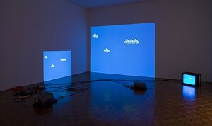
Although I understand the conceptual game being played in 'Atari Noise' and of course its relationship with mathematical variation and systems art, I personally much prefer Cory Arcangel's 'Super Mario Clouds'. Based on the Nintendo NES game; Cory Arcangel hacked the game and modified it so that all that remains of the game are the white clouds on a blue sky. Cory Arcangel had to open the cartridge, on which the game was stored, and replace the Nintendo graphics chip with a chip on which he had burned a program he had written himself. 


Cory Arcangel's 'Super Mario Clouds'

Cory Arcangel's work acknowledges the conventions of contemporary art installations and in stripping the images down to simply clouds, he creates an oblique link between the history of Modernist painting and the history of gaming. In effect performing a Greenbergian move within the conventions of computer generated art. For me this move was one that demonstrated that this area of work was now mainstream. 
Much more recently Larry Achiampong & David Blandy in 'Finding Fanon 2' which is available as a UHD video, have combined art-house cinema with machinima. It has been stated that, "their work investigates the post-colonial condition within the simulated world of Grand Theft Auto V. The result is a multi-layered narrative which raises questions about the alleged ideology-free spaces of video games". Metamakers Institute 

Larry Achiampong & David Blandy: Finding Fanon 2

The issue about Cory Arcangel or Larry Achiampong & David Blandy's work is that it is work that transcends the boundaries of computer game art, becoming simply 'art', the fact it is using computer game technologies is no longer the be all and end all issue for the work. Like Hito Stereyl they use technologies as part of the way they think about ideas. See Hito Stereyl playing with ideas associated with the technologies of video making. 

Mark Hansen and Ben Rubin: Listening Post

'Listening Post' was the first piece of computer assisted art that I thought worked as well as any other. Even though it was made way back in 2001 it still feels contemporary, therefore I would suggest it is the concept rather than the technology that carries the weight of the idea. 

See also:

The work of Rachel Ara is a good place to start if you are interested in a more feminist stance in relation to work in this field.

Machinima is not a game (an overview of contemporary practices)


Network Art: Practices and Positions edited by Tom Corby: See the chapter 'The Ludic Hack' in particular p.85 for some interesting comments on the relationship between Arcangel Constantini's "Atari Noise" and the work of Nam June Paik.