Showing posts with label computer generated art. Show all posts

Tuesday, 8 November 2022

Video games as an art form

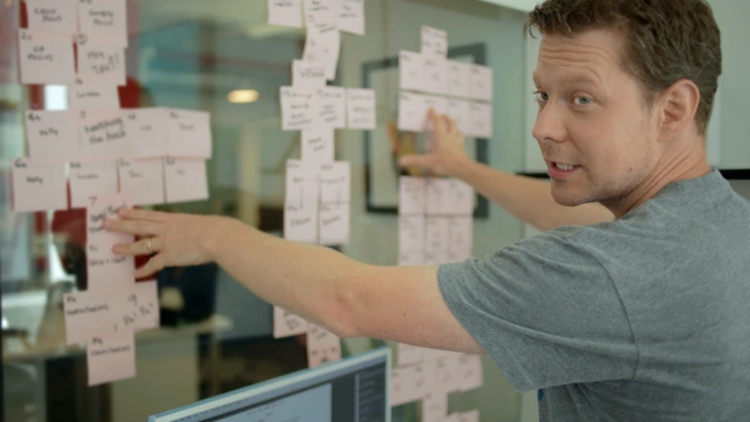
Walt Disney in front of a storyboard wall

Video games like animation often begin as drawings. Just as some artists use animation as their main communication channel, some artists use video games and video games like animations begin as storyboards. However a game storyboard is set out differently because you have different event levels or plot points that define the game world that you are devising. There will be structural issues related to how many levels and main characters or scenarios you want to develop. (A game doesn't have to have people in it) You may have more traditional animation storyboarding alongside structural diagrams, such as secondary event frames detailing dialogue, character meeting rules, or steps in a sequence. 

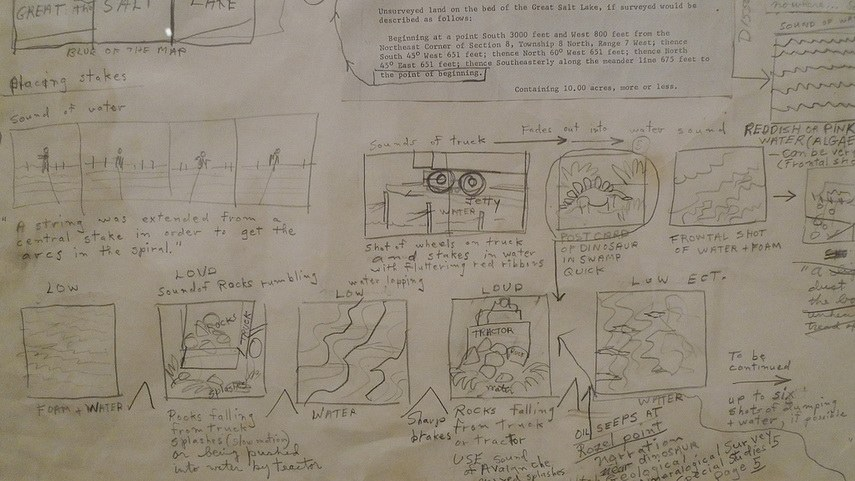
Back in the 1930s Webb Smith, an animator at Walt Disney Studios, started drawing rough sketches of frames needed for his animation drawings on different bits of paper, then he stuck them up on a wall to communicate a sequence of events. If you are wanting to undertake some visual storytelling, whether for a sequence of drawings or paintings, animation, graphic novel or in this case a game, this is a vital tool. Even sculptors such as Robert Smithson used storyboards to work out how their work would be communicated, in the case of Robert Smithson he carefully plotted out how a film of his work 'Spiral Jetty' would be made. If he was working now I'm pretty sure he would have considered the implications of making a game based on his sculptural work.

Notebook ideas for a storyboard of 'Spiral Jetty': Robert Smithson

Movie Treatment storyboard for Spiral Jetty


WALL-E storyboards

I'm interested in the Andrew Stanton directed WALL-E, because there is very little verbal dialogue, the character communicating mostly in mime using hand signals, facial expressions and body language. Even if you are not interested in animation, you can learn a lot about how to deal with non verbal communication by watching how character interaction with inanimate objects can be used to emotional effect. 
Wes Anderson is also an animation director who uses storyboarding to think with. He used the storyboard artist Jay Clarke for 'Isle of Dogs', asking Clarke to reference Akira Kurosawa films, for certain visual ideas such as silhouetted framing and dwarfing characters against a backdrop. If you look at the sequence below you can see how closely the storyboard artist has to work with an understanding of camera angle and the emotional impact of camera movement. 


Storyboarding roughs, worked up images and final animation

The interaction of human beings with non human others, such as cameras, is also something that is not mentioned enough in books on art theory. As an artist I am aware that unless I am very sensitive to these issues my work will be very poor. The skills that arrive with that of empathy with other forms of being are vital to our survival and all of these skills are used in storyboarding for games. 

Super Mario storyboard

Roller Rally storyboard concept

Design for a platform game

The art world has taken a while to accept that games can be developed as a fine art form, but over the last few years like photography and film making, video game design has become more and more accepted as an art form.  

Video games as contemporary art

Artists like Alan Butler have involved themselves directly with existing video games, in his case with 'Grand Theft Auto' a game that has detailed sections of real streets as a background against which the gameplay takes place. His work Down and Out in Los Santos (2016-ongoing) is a series of photographs that are created by exploiting a smartphone camera feature within the video game Grand Theft Auto V. Players of GTAV can take photos within the game environment. This operates in basically the same way as ‘real’ cameras do. Butler walks around a simulated three-dimensional space, finds a subject, points the camera, composes the shot and shoots it; which means that Butler is the author of the imagery.

Alan Butler: Photograph taken from Grand Theft Auto

Alan Butler talks about his work

Why video games are art

There are particular games that stand out as being personal expression. Papa y Yo a game designed by Vander Caballero, is centred on a young Brazilian boy, Quico, who while hiding from his abusive, alcoholic father, finds himself taken to a dream-like favela, where he meets a strange creature. The player, as Quico, can interact with the creature and manipulate the buildings of the favela in order to complete puzzles and progress in the game.

Papa y Yo

Sam Barlow the designer of 'Telling Lies' describes it as a "desktop thriller", where the player becomes involved in a drama that is played out through stored video clips and other information presented on a virtual computer desktop. It provides the player with numerous video segments that in the game's narrative, cover a two-year period. Like Janet Cardiff's audio walk pieces such as 'The Missing Voice: Case Study B' from 1999, this game involves you in a complex unravelling of an event. 


Sam Barlow storyboarding Telling Lies.

Scenes from 'Telling Lies' 

Steve Gaynor, Karla Zimonja, and Johnnemann Nordhagen who are collectively known as 'The Fullbright Company', developed 'Gone Home' which is a game that puts the player in the role of a young woman returning from overseas to her rural family home to find the house empty, leaving her to piece together what has happened. The player has to explore the house and determine what has transpired by examining items, journals, and other items left around the various rooms. Very like Janet Cardiff's walking audio narratives, you build up a story in your mind as you invest time trying to follow what has happened. The story unfolds as you pick up scraps of paper, notes, letters, photos, cassette tapes and other bits and pieces littering the house, which effectively makes it an environmental piece but one with echoes of an artist's work such as Sophie Calle's 'Dumped by E mail'. Each piece of found text helping to build up a picture of what really happened. It is interesting that the game had to be set in 1995 because the designers considered it the most recent year in which technology had not made the majority of communication digital in nature. Perhaps that year will in the future be seen as a watershed year in relation to how society operates. 

A scene from 'Gone Home'

The complexities of contemporary game design mean that it is done in teams but that doesn't as far as I'm concerned make it less of an art form. 

An introduction to the complex world of a video game artist

I think we will have to readjust our idea of what an artist does in the future. This sort of technology requires, like a movie, a whole bunch of people with various skill sets and it is the result of a cooperative effort rather than individual genius. However well known artists are beginning to see how they can use video gaming to extend their existing practices. For instance KAWS (Brian Donnelly) has used an augmented reality artwork at the Serpentine Gallery 

A visiter at the KAWS exhibition at the Serpentine Gallery

For one week at the beginning of 2022, 400 million existing 'Fortnite' video game followers could access a fully accurate replica of the Serpentine Gallery within the game, the artworks effectively becoming a game level that allowed a player to walk around with their avatar, and engage with the works.

Lawrence Lek, Nepenthe Zone (2021–ongoing)

In Lawrence Lek’s Nepenthe Valley (2022), the artist has created an installation inspired by the fictional medicine for memory in Greek mythology. Nepenthe Valley consists of an installation of virtual reality environments and was originally made for the virtual gallery AORA, something that is going to get more and more important, especially if Covid19 returns. The work revolves around nine “resting spots,” and it has virtual mountainous landscapes that come complete with meditation and breath-work sessions, infusing into the ethos of gaming a space for health and well-being.

LuYang
The Great Adventure of Material World, 2019, video game and video installation

In Lu Yang’s The Great Adventure of Material World (2019), players encounter a three-channel installation that, at first, appears like a typical role-playing game, with typical graphics, animations, quests, and battles. But players soon realise that the artist has changed the normal game narrative by forcing gamers to work with characters that shatter the illusion of the game’s narrative structure.

For those of you embarking on a fine art career, I think the status and relevance of art in relation to video gaming poses interesting questions as to the nature of art in the future. Many of you will play video games in your spare time, but how many of you have considered that video games could be the best art form to carry your ideas?

Most artists that want to get into working in this area begin by exploring game engines, which are the reusable components developers use to build the framework of games. By using an existing game engine you have more time to focus on the unique elements of your own idea, like character models, textures, how objects interact, etc. At the moment the Unity multi-platform game engine is free. It allows you to create interactive 3D content and I am told that a lot of indie developers use Unity for its ability to be used for pretty much any type of game. I'm also told it is very easy to master, but when I looked at it I found it a pretty steep learning curve, but that shouldn't put anyone off as I'm a pretty poor user of any software.

'Tableau Machine' created abstract images

Finally I'll leave you with an idea. 'Tableau Machine' was an AI based, interactive, visual art generator for shared living spaces. It was as its creators stated, 'an instance of...“alien presence”: an ambient, non-human, embodied, intelligent agent'. Overhead video cameras were placed in key places within someone's house, Tableau Machine interpreted its videoed environment by displaying a sequence of abstract images. At the core of the idea was an AI art generator with deep and long-term connections to its physical and social environment. 

Tableau Machine at work: Notice the abstract pink image on the monitor over the fireplace.

It seems a long time ago when this was done, and AI technology has advanced a long way since then. Perhaps it is time for a return to the ideas behind the project, but to this time turn the technology around and to use the idea to make everyone aware of the ubiquitous presence of surveillance camera technologies. You don't need to install any new cameras, they are everywhere, what I would though like to do would be to use the thousands of cameras to generate footage that would be interpreted as abstract art. The audience would be all those thousands of security guards and others who are employed to daily watch over our lives and they would have to interpret the abstract images fed to them, in order to make decisions as to whether or not to take action in response to what was seen. A wishful vision but one that hopefully encourages you all to think about possible new uses for game technology in relation to the existing technological infrastructures that surround us. Perhaps a game that might save us from climate disaster, by getting us to redirect all our energies into saving the planet. 

Coda

A recent review of the year's best video games by Lewis Gordon in ArtsReview, illustrates how far games have come as an art form and as carriers of ideas. Check out the review here. 

See also:


Context free art This is the software used within Tableau Machine to generate the art.

A recent article on video games as art Includes a rough history


Monday, 12 April 2021

Michael Hansmeyer and computational architecture

I'm looking at mathematics again, so apologies for this, but in an attempt to maintain a holistic approach to aesthetic thinking, every now and again I try to dip my toes into waters I'm deeply frightened of. In this case it's the work of Michael Hansmeyer that I'd like to highlight. This is work that uses layer upon layer of flat drawings, that when cut out of card and stacked one above the other make complex three dimensional shapes that bridge the gap between sculptural form and drawing.  

Hansmeyer often uses a finite subdivision rule as a way of repeatedly dividing a two-dimensional shape into smaller and smaller pieces. Subdivision rules in a sense are generalisations of regular geometric fractals, but instead of repeating exactly the same design over and over, they have slight variations in each stage, and this makes for a much richer structure while still maintaining an overall harmonisation of forms. These subdivision rules are often found in biologic entities, which is why structures using this way of constructing themselves remind you of natural forms. 

A finite subdivision rule applied to a polygon

Using flat forms to construct three dimensional models

As you divide regular geometric forms and you move away from symmetry you begin to achieve a nature like complexity, a complexity that can be stabilised formally by reintroducing bi-lateral symmetry.  

Two symmetrical rotations of 'time' section above

A complex made of four quadrilaterals subdivided twice.

Our lungs obey a similar principle, and the reason I've become more interested in these things is that I've been thinking more about how to envisage the things we don't normally see, such as the insides of our bodies. 

Grotesque columns based on Doric forms

Hansmeyer applies these types of rules to create variations on regular patterns. In the case of his columns above, an abstracted doric column was used as the input data to the subdivision processes.  The ornamentation is developed by controlled subdivision put together as a continuous flow. The complexity of each column is a result of changing focus on different aspects of the data input. For instance one section might be a response to the dimensions of the indentations that surround the capital, and the adjoining section could be a response to the change from a circular cross section to a square one. 

A Doric Column capital

Once the flow of change has been established, drawings are made of each move and these are then used to drive a laser cutter.

Cutting and building a column out of cardboard sheets.

I have mentioned Michael Hansmeyer's work before, but have been returning to it, to think about its generative processes of arrival and how my own process of making variations of form relates to it. Generative mathematical form does seem to be a powerful tool and has a deep connection with the way many forms in nature are generated with slight variations, such as human beings. In order to see if there was an entry point for someone as mathematically challenged as myself I have done a little research and it would seem that 'Grasshopper' is the best software to begin with. It requires no knowledge of programming or scripting, and it can help you as an artist beginning to look at this area to build your own form generators.  So if you are interested in this area, don't be put off by its apparent complexity, like most complex things, it is built from simple units. You do however need to understand what a Rhino environment is. Rhino 3D is a free form surface modeller that uses a modelling by curves technique or NURBS (Which I did look at a little while ago) The fact that it is still free to download does mean you can make a start on this without having to buy expensive software. 

More recently Hansmeyer has been using these design principles to create set designs for opera. His grotto for Mozart's Magic Flute, being a particularly successful transfer of his more sculptural ideas into operatic stage design. Not long ago I put up a post on artists, such as David Hockney, using their skills to create grand dramatic and expressionist spaces, in this case a sculptural principle now becomes a shaper of environments and it also further illustrates a point that I have been making more and more recently. Visual thinkers can move between being seen as artists, biologists, architects, or stage designers, because essentially they are problem solvers. Fine art students are just as capable of solving visual problems as students from any other discipline, with the added bonus that as an artist the problems that you set for yourself are just that, self set problems, arriving out of issues and interests that you are fascinated by. 

Michael Hansmeyer's set for the Magic Flute

This work is a form of digital morphogenesis, a type of generative art in which complex shape development is enabled by computation. Perhaps the most interesting issue is though that you can find the same formal principles of shape morphogenesis in biology, geology and geomorphology, which for myself raises an issue about the divide between organic and inorganic matter. The more that I am drawn to animism as a way of acknowledging the rest of the world that isn't me, the more I see similarities between the way matter morphs into form and the way life forms are shaped, it is perhaps more an issue of one taking longer than the other to become what it becomes. I am making a series of drawings that are meant to sit visually in that space between the organic and the inorganic, that are images of inner body sensations, feelings and awarenesses and I am thinking about how to explore their formal possibilities further, which is also why I'm personally becoming interested in shape morphogenesis.

On becoming aware of loss

The smell of fear

See also


https://www.grasshopper3d.com/ Begin here if you want to learn how to do this


Tuesday, 12 January 2021

Drawing textures


Physiography from Principles of Cartography by Erwin Raisz 1962


Texture is used to define surface difference. If you look at the textural patterns for various types of geographic landscapes as they might be rendered on a map above, you quickly get an idea of how we use texture to identify differences in physical nature or surface appearance. These differences are what we have become used to as indicators of the thingness or physical quality of objects. We are aware of metals being very different to textiles and that these are different to skin or bone. When we look at the recreation of 3D form in CGI there are three basic levels of 'realism'. The first is the wire frame construction, which I have looked at recently and which has emerged from 'cross contour' drawing practices, linked to technical drawing and perspective conventions. The second level of realism is usually the use of tone to describe form or shading. Phong shading tends to be the default in contemporary 3D computer graphics and it is a type of shading I objected to when I first became interested in 3D computer rendering, because I felt it tended to make everything look like plastic. The next level in terms of visual realism is texture mapping, usually applied alongside Phong or other types of shading software, a process that allows you to take a simple polygon and give it the appearance of something far more complex. The texture map's parametric textural information is tied to the individual polygons that form an object's surface, which means that if the surface moves or deforms the texture goes with it. This is a very convincing construct and is now the standard 'realistic' effect in CGI. You could argue it is today's equivalent of 'trompe-l'œil' painting; the English translation of which would be; “deceive the eye”, indeed its definition is 'the representation of an object with such verisimilitude as to deceive the viewer concerning the material reality of the object'. Therefore 'deception' is central to the textual mapping CGI effect. Plato warned people to be very wary of this state of affairs, he stated over 2,000 years ago that as art imitates physical things, creating in effect a copy of a copy, it leads us further and further away from truth and into a world of illusion.

CGI surface illusion

Another problematic issue in relation to these illusions is 'point of view'. In perspective everything works fine, so long as you are at the exact spot that the perspective is designed to be seen from. This issue was unpicked in detail by Panofsky, who highlighted the fact that perspective was not just a technical means to render space in a convincing way, but that it was a symbolic form. It reinforces a particular way of looking at the world, and I would argue makes the world 'commodifiable' by making objects and buildings appear graspable as things, a state totally at odds to an understanding of a world consisting of actions experienced as processes. 

A powerful illusion can be created of almost any form with a surface texture, in the case of the rooster above feathers and leather are convincingly rendered, making this fantasy cockerel appear to be very 'real'. 

We all know that fur feels soft, tree bark feels rough, and silk feels smooth, but also fur looks soft, tree bark looks rough, and silk looks smooth. This conjoined tactile/visual aspect of surface textural variation as Stephens & Hoffman (2016, p.257) pointed out, has long being used by artists and designers 'to evoke emotions and set moods'. Texture is therefore not just something that can create illusions of reality, it is essential to the development of forms that can stimulate emotion. 

Textures used by Stephens & Hoffman to test out aesthetic preference

It would seem in this case that touch and sight are again brought together in close proximity, our experience of textures being reinforced by a combination of perceptual stimuli. Synesthesia, the perceptual phenomenon in which the stimulation of one sensory or cognitive pathway leads to involuntary experiences in a second sensory or cognitive pathway, it has been argued, (Cytomic, 2002) leads to a much more heightened awareness of the perceived experience. 
Perception and feeling it would appear, are inextricably linked together. The qualia related to both experiences, I would argue reinforcing each other, because the qualia associated with emotional feeling developed as part of the interoception and associated body schema systems, would be generated at virtually the same time as the visual qualia entering the body from outside. These raw qualities of sensations, emotions and thoughts, although experienced privately, subjectively, and directly, are also what will eventually make up the building blocks from which all communication, both logical and emotive, will be effected. (Wolfe and Bell, 2007) A movement of chemical and electrical energy, is central to both perception and resultant action, the holistic nature of the process becoming more and more apparent as research into the processes associated with cognition advances. 

Computer generated textural surfaces developed from hand applied textures

In the image above certain aspects of body schemas have been used to both suggest the idea of the body as its own landscape, as well as being a place within which decisions are being made as to how the body 'thinks' and feels. Indeed it has been argued by Margaret Wilson, (2006, p. 211) that body schemas act as prediction devices, interacting with perception, cognition and behaviour in a variety of ways. These schemas can be thought of as copying devices and as such perhaps lie behind our interest in likeness or similarity as ways to develop meaning. In this way we return to metaphor as being integral to the development of our ideas. 

This close relationship between perception, illusion and emotional stimulus, was also something Plato commented on in relation to his worries about the power of art to effect people's emotional states, not only was illusion to be distrusted because it was not truthful, art's power to effect emotions, meant that for Plato illusion and emotional manipulation are often found together and this is something that we have seen to be more and more the case in this age of post truth politics, CGI and powerful media illusions. However as a process, the interrelationship between perception, illusion and emotional stimulus, would seem to be central to how we as humans devise ideas, so perhaps it is a problem deeply rooted in the very way we need to digest information. Copying, fiction and a tendency to find meaning in likeness all influencing our perceptual receptivity and responses to the world, so rather than like Plato trying to outlaw any art form that uses these tendencies, we should perhaps be seeking to observe how they operate and how we are prone to give effect and agency to perceptions that are as much inner constructions as they are responses to changing outer conditions. 
 
References

Cytowic, R.E., 2002. Synesthesia: A union of the senses. MIT press.

Panofsky, E., 2020. Perspective as symbolic form. Princeton University Press.

Stephens, K.D. and Hoffman, D.D., 2016. On Visual Texture Preference: Can an Ecological Model Explain Why People Like Some Textures More Than Others?. Perception, 45(5), pp.527-551.

Wilson, M (2006) Covert Imitation: How body schema acts as a prediction device in Knoblich, Thornton, Grosjean and Shiffrar (2006) Human Body Perception from the Inside out Oxford: Oxford University press

Wolfe, C.D. and Bell, M.A., 2007. The integration of cognition and emotion during infancy and early childhood: Regulatory processes associated with the development of working memory. Brain and Cognition, 65(1), pp.3-13.


See also:

Monday, 4 January 2021

Surface and inner body perception in the age of CGI

I have rarely touched on the nature of CGI and yet it is through computer generated imagery that the majority of people first encounter drawings, especially as so much of children's film production uses computer supported animation. Software to run 3D drawing programs such as Maya is becoming more and more available to artists and therefore, especially as I'm trying to look at certain aspects of perception in more detail, I thought it worthwhile adding my thoughts on what it means to experience images produced by this ever growing area of practice. 

T figure: pen and ink on paper

I have no technical experience in this area of work, so the first thing I had to do when I wanted to explore the area, was to find someone who did, and Matt Clark of the Leeds Arts University animation department was the person I went to to give me an overview of what could be done. This was about five years ago and I'm sure he is now using totally different software but I'm presuming the process would be similar if I was to ask him again. I wanted to see if it was possible to create a 3D animated version of my own body and I was told that the first thing to do was to generate a T figure by hand and the drawing above was what I did at the time, pot belly included, as I attempted to be as 'realistic' as possible. Matt then took the drawings away (I think I did a back view as well but couldn't find that) and from it generated these wonderful flattened and opened out 3D grids for me, as well as the figures below it, one version without and a second one, at my insistence with genitals. 


Initial figure without genitals

Redrawn with genitals

I found the process interesting and the resultant figure was very close in terms of its proportional visual relationship to my initial drawings but I was very distant in terms of any form of control over what was going on. I knew that the figure would be constructed using some sort of software like Blender, but what I was not prepared for was the degree of 'smoothing' that was going to be used to create a surface for the figure. I felt this was totally at odds with any form of intuitive feeling or emotional engagement I might have. In effect the surface seemed to distance me from the figure, even though I knew that it was based on myself and my measurements. 


From a 'Blender' tutorial

As you can see from the 'Blender' tutorial above, a face has been constructed from a front and side view, just as in my initial experience, and the grid that has been pulled over the face to make a head has also been 'filled in' with a plastic effect, shiny surface. In effect for myself, this surface makes it feel as if the figure is made of plastic. 


From a 'Blender' tutorial showing how to use 'pins' to position a 3D net over a 2D image

The next two images are from another 'Blender' tutorial, this time of two photographs, and it is part of the tutorial that shows someone how to use 'pins' to locate significant features, such as nose width, eyebrows, chin, forehead and mouth on a frontal view and link these to the same features on a side view. You can see the 'ghost' image of the pre-existing grid on the lower image as it is pulled over the photograph of the head, interesting to see how much movement there is between the grid and the actual face, the 'ghost grid' ear for instance will need to move left to coincide with the photographic ear, whilst the back of the head grid will need to be pulled to the right to coincide with the photograph. 

I was aware that the reason Matt wanted a front and side view was that the co-ordinates for a 3D grid would need to be established. I was I thought very aware of 3D grids because I had used 3D software in the past, but I soon realised I was not as aware of what was going on as I thought. The first area of complete invisibility to myself was the use of NURBS (Non-uniform rational basis splines) or polygon modelling, both of which are used to create interactive surfaces for 3D modelling, each of which has benefits and difficulties according to how you want to go on to use the 3D model that has been created. 
I have only recently begun to understand some of this and as always as I begin to get my head around things I tend to go off on tangents, so bare with me as I ramble around, because in order for me to make sense of something to myself, I have to get a feeling for the various entanglements that something has with the rest of this world. In this way I can see it more as a process rather than as a thing. I can also attempt to resolve the relationship between what I am feeling about something and what I am thinking about. 

A recent project on perception finds me working alongside other members of a project team, including some who are working using computer generated imagery. Safa Tharib in particular has highlighted for me some aspects relating to the history of drawing in this area, and I'm hoping he will forgive me my re-rendering his Powerpoint in with my own words below. I'm trying to bridge that gap between a computer science understanding and my own very fine art, hand made understanding of these issues, i. e. attempting to answer my own self set questions as to how and why I might use computer aided drawing to make a series of images related to how the perception of our inner bodies can lead to the creation of images that can be both expressive of my own feelings about these things and be capable of communicating other people's thoughts and feelings about the same perceptions. 

Before computers technical designs were drawn using rulers, compasses and protractors, but freeform curves such as ones used to visualise a ship's bow, had to be drawn using other means. In my day when I worked in a drawing office, we used what we called a 'Flexicurve' and in earlier times they used to use flexible strips of wood, called 'splines'. The Oxford English Dictionary finds the first recorded usage of the word 'spline' in the 18th century in East Anglia, England, and suggests the term spline may be related to splinter, something that can easily happen when you bend a thin strip of wood too far. As well as to help shape the curve of a ship's prow, spline devices have been used to design shapes for pianos, violins, and other wooden instruments, and the Wright brothers used one to shape the wings of their aircraft.


A flexicurve
A spline being made


Using 'ducks' to control a thin wooden strip's curvature


I have reflected on the use of aesthetically satisfying curves in earlier posts, so perhaps at this point it might be useful to go back and look at these issues, because they highlight the interrelationship between the physical, the mathematical and the conceptual, in particular when we look at the physical way that these splines are produced and how curves are anchored in vector drawing software packages. In AutoCAD for instance, a spline is defined as " a smooth curve that passes through or near a set of fit points, or that is defined by the vertices in a control frame." This reminds me of earlier posts on euler spirals  and the Bézier Curve. Literally tangents that can be followed, but which are also concepts that entangle themselves with a wider set of concepts, including the spiralling of the winding thread as in clothoid spirals and the way human beings need to be subtlety visually controlled as they drive cars. 

How to work with splines in AutoCad

There is something really satisfying about curves that are defined by constraints, and perhaps it is because we sense those underlying physical constraints that we feel a certain visual satisfaction when we encounter them.

Ducks

Splines were held in place at a number of predetermined points by weighted objects called ‘ducks’ and between the ducks the elasticity of the spine material caused the strip to take the curvature that minimised the energy of bending, thus creating the smoothest possible constrained shape of curvature, a curve that could furthermore be tweaked by moving the ducks.

Architects are of course also very interested in these issues, and it is in architectural theory that another series of associations is opened out, in this case an association with the psychoanalytic theories of Freud, Andrew Benjaminan providing an unexpected link to a thread that gives myself an 'excuse' to draw images that reflect on that close relationship between inner feelings and external 'objective' reality. 

Andrew Benjamin lecture

In this lecture we are reminded of Robin Evans' idea that meaning is the secondary effect of the operation of geometry (plans and elevations etc.) in relation to architecture, and this idea I believe Safa suggests, could be opened out to include thoughts on how the operation of geometry in complex 3D visualisation programs in CGI software creates meaning. Andrew Benjamin in the lecture brings in the idea that drawn lines that operate as boundaries (such as on a map) are in effect 'porous', i. e. they connect both sides as well as separate them. (Unless he states, they are defining a closed shape; in which case he argues the form is read only from the side within the shape. This is an architectural theorist remember, so does a 3D modeller only read these sorts of images from the 'outside' of a shape? I would suggest not, and in my experience I was happy to switch between looking at the outside as a surface and exploring the inside as if it was a cave) He uses the example of Freud's freehand drawn diagram of the unconscious to illustrate his theory that meaning is the after effect of an operation or an event. Drawings in this case being events and in my own way of thinking, events are what make up processes that are themselves entangled into other processes. This does ask questions as to the status of a drawn image in relation to what is portrayed or presented. A diagrammatic representation, is different to a map which is different to a sketch. Benjamin asks us to think about the 'potentiality of a line', arguing that it has both a topological function, as it divides one thing from another on a plane, as well as 'presenting' a proposal. He uses Malevich's term, 'the potentiality of the abstract' to point to a separation between the line's actual physical presence and how it presents as an idea. 
In Freud's case he is looking for a language to describe a loss or change of energy, so he uses the metaphor of a wave and a wave becoming stilled. A change in modulation or frequency of an energy as it moves from one area to another is seen as what drives certain mental issues, such as melancholia. (Not that Freud really gets to grips with this idea in his diagram, but the idea of energy transfer is already helping me to think of my own recent drawings as places where energy transfer can take place between diagrams and representations) Benjamin highlights the idea of the divided self, a self that is part conscious and part unconscious, between which there is also constant movement, some things moving from conscious experience into the unconscious and some things moving from the unconscious into consciousness. We have no power over what is emerging from the unconscious, but we are able to control what emerges from conscious thought and it is in this divided but connected situation that Benjamin further argues that we need to be thinking about how a drawn line both presents a possibility and exists as a physical entity in its own right. We are once again looking at process here and indeed it could therefore be argued that what we think of as the self is really the after effect of a process. The drawing by Freud below being a static image of a dynamic process. It's lines create an order that moves around an almost Cartesian x and y axis; one thing being linked to another and this sequential system also means that we can read this drawing as a type of narrative, a type of narrative that is generative, i. e. that we can create further images that are reflections on the issues that Freud is mapping out in this and other drawings. 


Freud's drawings

Looking at the drawings above, we can easily see the differences between an early freehand diagram and later technical drawings, used by Freud to illustrate his ideas. It is fascinating to see how a difference in construction effects our understanding. The freehand drawing suggests a mind roughing out an idea, it is a drawing that presents the development of a concept that is yet to be fully decided upon. Whilst the precise geometry of the later diagrams, produces a set of drawings that present a much firmer commitment and clarity of idea. 

So what ties these things together? They are all concerned with ideas about our existence in a world that consists of both an external 'surface' reality and an inner underlying, often unconscious world of feeling and intuition. There are, I would argue, some basic elements that are needed to construct images, whether in a 3D computer programme these be NURBS or polygons, or in a human brain, where there resides image schemas, those small units of information that inform basic, automatic actions, and that create neuronal patterns, which are the abstractions that form the basis of our ability to undertake real-time actions. In relation to which, the cognitive psychologist Raymond Gibbs wrote: "Image schemas represent the essential glue that binds embodied experience, thought, and language", and I would argue that the elements that make up a net, (whether constructed as NURBS or polygons); those points and lines and planes, are the basic 'bits' that I use when I make a drawing and which I can only use because I have access to image schemas of my own, based upon the fact that I inhabit a particular type of body.

Going back to the spline, we have an idea of points of control, (consciousness) and the idea of effect (the various curves). If we look at the 'Blender' tutorial using pins to link front and side views, we can also in our minds hold two images, on the one hand it could be a NURBS defined net, of a spline being made and the ducks being points of control or if it is a polygon modelling programme, of squares and triangles being joined together at different angles. Both these images are revealed as a net, which is designed as if it is a sort of memory form of an average three dimensional face. This face is made more and more 'like' the 2D images over which it is plotted; the more pins or points put in place, the more the net can be pulled into a particular shape, and the less points are pinned the more the mesh of points, lines and shapes finds its own form. Going back to what Benjamin was talking about, the drawn line both presents a possibility and exists as a physical entity in its own right. 

So what has this got to do with perception? I would argue that it is the idea of 'potentiality' or 'possibility' that binds together the moment of perception and an attempt to represent or image it. As argued previously, the body needs to react almost instantaneously to changing stimulus, both from inside and outside itself, if it is to react in a timely manner to external change. The construction of an animated figure and the establishing of a convincing external 'skin' or surface, is dependent on the construction of forms using a geometry that can control constantly reforming nets that both describe 3D surfaces and which can eventually become them. (As when 3D printed for example). However in order that the system doesn't get too complicated we tend to use attractors, or preferred patterns to create stability within complexity. NURBS which as I have recently found out are used to create interactive surfaces for 3D modelling, would appear to work in this way. Robin Evans' idea that meaning is the secondary effect of the operation of geometry, in this case in relation to computer generated imagery, suggests to myself that it is the net itself that creates meaning in relation to the forms it makes. 

So how does it do this? First of all it would be useful to read an earlier post on cross contour drawing. In this post I suggest that this form of drawing can be a very powerful way of visualising mass and that it is also a way that touch can be visualised, i. e. that it is a synaesthetic mode of drawing capable of combining sight and touch in its realisation. This is why sculptors in particular like to use it, as it can carry information about the solidity of the experience of making things. A few years ago I made some cardboard models of fires. I took photographs from various positions and loaded them into 123DCatch, a 3D image making program that was at the time free and easy to use. (It has since been discontinued) I was interested in the image making potential of the software and wanted to explore the idea of making a solid something that was in constant movement. In effect to create a 'mountain' out of a gas, especially as I was working in one medium that had no substance beyond a mathematical code of zeros and ones and another that was seen as cheap packaging material and usually put out for recycling. 


Virtual fires

Some images I left as they emerged and others I began to process, but in all cases I saw the distorted 3D grid as the main carrier of the message. The grid was in effect what I believed gave the images 'conviction'. Then a little later because of my growing interest in CGI I began my collaboration with Matt Clark and these moving images, based on drawings of myself, were produced. 
Matt Clark: Joint retargeting test

Matt Clark (Chicken man)

I found it hard to associate with the images created, and unlike the fire images whereby I could see how the 3D grids gave a certain gravity to the forms, felt nothing beyond a certain humour in the way my surrogate body could be made to move. Matt making me laugh at what could be achieved, but like most jokes on extended play they tend to lose their potency. 

Going back to the group research on perception, hopefully this rambling post can operate as an opening gambit, that begins to explain how I might be able to link with, interject or comment on the work of the other people in the group. It also hopefully serves to illustrate another issue, that of self reflection during the process of developing new bodies of work, something that those of you who are students, are constantly being asked to do.  

Work in progress; stages in image development of perception of sexual arousal. 
(The conjunction of diagram and representation)

References:

Robin Evans (2000) The Projective Cast: Architecture and Its Three Geometrics MIT Press

Gibbs, R.W., (2005) The psychological status of image schemas. In From perception to meaning: Image schemas in cognitive linguistics, 29, pp.113-136. Mouton de Gruyter press

See also:

Qualia (Part one of a series of posts related to perception, of which this post is part two)