Sunday, 19 September 2021

More drawing exercises


From insignificance to significance

Occasionally I look at drawing exercises as a way to develop a 'what to do' support program. I have always been thoughtful as to the value of these exercises but I remember as a young man looking at them and finding them really useful, especially on those days of ennui when I felt as if I couldn't and wouldn't ever be able to make anything useful ever again. So here are a few more, all designed to get visual ideas started

Same subject different moods 
(the search for a way of working with figurative images that suits you)

First of all you need to choose a subject to look at. You can pick a photograph or a view, a still life or a person you know, or an imaginative image previously made; anything that you feel comfortable drawing. 

You will now set out to draw the same thing twice but with two totally different approaches. 

You need to put aside the same amount of time for the two drawings, so if you have an hour, two 30 minute drawings will need to be made. Make the two papers you are going to draw on square and the same size. They can though be different weights and have different surfaces. 

For the first drawing, draw everything smoothly, softly and with an underlying idea of safety. Think about how you hold your pencil, pen or brush, it could be a loose hold, or further away from the drawing tip.  Work more from the elbow, think circles and Disney. Think light tones, sunlight suffusing everything, this is like a summer's day when you were a child with no worries. Make all your drawing movements smooth, and the same with any transitions from light to dark, or from one form to another. Keep drawing until your set time is up.

Once done, turn this drawing away from you so you cant see it and begin another drawing, this time thinking, harshness, threat, danger and heightened emotional intensity. Think about the way you move your body in relation to this, find your unsteady jerky inner self. Grab your drawing implement as you would a knife or weapon, stab or cut your way towards an image. Think angular shapes, sharp contrasts in tone, too hasty marks that are unfinished, fragmented imagery made by someone anguished. 

Repeat this exercise regularly with different subjects and try out other adjective ‘moods’, try 'shyness' or 'lost' for instance as emotional states somewhere in between the two extremes given. 

What you might find is that certain 'moods' suit you and that you feel more comfortable working with a particular sensibility. If so, now apply it to a range of subjects and see if there is one particular subject that also seems to sit 'right' for you. In this way you might find both a better way for you to work and a subject matter that works for you. 

--------------------------------------------

Abstraction and mood Part one

You will need a ruler and compass as well as your drawing implements.

To draw a series of 3 inch squares on a sheet of paper or on several sketchbook pages. Then using only three elements in each square; one straight line, one emotive/hand-made line and a circle or dot, you are to represent as many different moods as you can. You can vary the size of the circle/dot and the length of the lines, as well as the tonal value of either. 

Once you have finished by making as many different mood changes as you possibly can, go back through them and try and identify an exact word or combination of words that sums up each of the moods you have created. 

There are meant to be four basic moods; happiness, sadness, fear, and anger as well as combinations of these, so you could have someone with a mood that was happiness tinged with sadness or remorse. Anger can be cold, resentful or righteous as well as full blooded, vengeful or stupefying.  Remember, an image can represent what is frightening as well as representing the state of being frightened.

Once you get used to doing this, you can take any image and reduce it to three main elements and then follow a similar process. 

Abstraction and mood Part two

You will need a range of drawing materials that allow you to make marks of different qualities.  

To draw a series of 3 inch squares on a sheet of paper. Then using a range of marks that can be varied in terms of tone, energy, amount and size, you are to represent as many different moods as you can. 

Abstraction and mood Part three

To explore the implications of putting together the imagery emerging from part one and part two of this exercise. 

Finally see if you can find a verbal equivalent to all the moods explored and then identify those moods expressed that are not verbally translatable. 

If this works for you, now try the same thing again adding colour. 

Finally try selecting/abstracting a composition from more figurative images and then going through the same process. 

-----------------------------------------

Non-dominant hand drawing

Choose your drawing subject, this could be a photograph, something imagined or something seen. 

Have ready several sheets of paper, (at least 20) (or a large sketchbook with several empty pages) a drawing board or table top to work on. As well as a variety of drawing materials. 

Begin drawing with your non-dominant hand, starting to draw from the top left hand corner of your paper. Keep the paper at arm's length so that you are not tempted to rest your hand on it. Make each drawing using a different material; pencils, pen and ink, biro, felt tips, ink and brush, coloured crayons etc. and do not be tempted to 'correct' any 'errors'. 

Once at least 4 images have been made, turn them upside down and repeat the process this time using your drawings as the starting point rather than the original subject. I.e. this time you will end up with at least 16 drawings. 

Finally put up an exhibition of your images and select out the ones that intrigue or offer something new or unexpected to a reading of the original subject matter. Think about the process and see if it could be used to develop other subjects or to consider the possibility of taking an existing image on an even longer visual journey. 

--------------------------------------------

From insignificance to significance

Make a number of tiny drawings of people on small scraps of found papers or other surfaces, using any materials you can such as biro, pen and ink or felt tips. If you cant make marks on the paper or surface, try whiting out some of it first in paint. The important issue is that the tiny scraps must have had a previous life and that some form of visual information must be still operating as part of its surface quality when you draw your figures. By tiny we are talking 2cm square at the largest, so these scraps will often be torn off larger things and your drawings of people will have to be very simple, as they will be far too small to have any details. 
Once made to try and enlarge them up to A4 by using either a photocopier, or a scanner or by simply photographing them and printing off at A4 or any other means that comes to hand. (If you are doing this in a sketchbook, you may simply enlarge images by drawing them much bigger on the facing page)
Now grid up the most interesting A4 image and count the number of squares and make the grid in light pencil, on a much larger surface, such as a wall or very large sheet of paper. (If working in a sketchbook you might grid up a small section and enlarge that.) Now, choosing a drawing material, draw and transfer exactly what you find in every square, onto the large surface. Do this systematically, working from the top left, to top right, slowly working your way down until you reach the bottom right. 

Finally carefully remove the lightly drawn pencil grid and make any necessary amendments/corrections. 

The process should ensure that your drawing of a figure and whatever was on the scrap of paper beforehand are now of equal visual value. This should help you to now think about possibilities for how a human image can be morphed into new shapes and/or inserted into any image. Above all it will take something that is small and insignificant and it will make an image of it that is large and important enough to be noticed, and this of course reflects a fundamental aspect of any artist's role, the highlighting of things that most people never see or notice.

At this point you may want to work on a new drawing directly with a brush and black ink to further reinforce the form your original tiny figure now takes. If you are someone who enjoys using computer software you might want to use digital approaches to the same idea. This can be a very useful way of re-inventing and simplifying the human body. (See example at the top of this post)

--------------------------------------------

A change of viewpoint

To make a drawing of yourself from the imagined point of view of a fly walking over your body. You may think of yourself clothed or unclothed and may use any device to help you develop imaginative ideas as to how the fly might see you as it travels over your body. 
Remember for the fly you are now its landscape experience and that a single one of your hairs might be as big as a tree and a sweat gland more like a marsh. 
Your main concern is to see if you can adopt the point of view of a non-human. If you can, can you draw yourself from the point of view of an inanimate object you might encounter?

--------------------------------------------

The most important drawing exercise...ever... Draw something every day

Draw at least one thing every day. Draw anything and everything and keep doing this quickly, taking no more than 10 minutes for any one drawing. This could be the same thing drawn over and over again, each time turning it round to get a different viewpoint, it could be 10 minutes spent at the same time each day drawing whatever scene or situation you find yourself in. It could be drawing your dog, your breakfast, the garden, how water spirals as it runs out of the bath, a tree, a chair, people seen on a train, cars parked, a storm, reflections on water, a house, a cardigan hanging on the back of a chair, passing traffic, your drawing materials, a view from a window, a bottle of beer, literally anything can be drawn. Gradually your control will improve, your selection will become more thoughtful and the range of subjects drawn will help you understand yourself and your proclivities. This is wonderful way of getting used to drawing in sketchbooks, and the more drawings you make, the easier it will be for you will find a sketchbook size and format that suits you. 

See also:


An exhibition set out as a series of drawing exercises Follow this link and look at and explore the exhibition themes which were about various approaches to drawing and then choose one approach and make more variations, until you begin to feel you have made something new. 

Drawing and mindfulness (The first part of a 5 stage series of drawing meditations)

Saturday, 11 September 2021

Art, Eco-awareness and OOO


Olafur Eliasson: Ice Watch 2015

Timothy Morton has written a very interesting book on the relationship between object orientated ontology and eco-awareness. In his book 'All Art is Ecological' he suggests that one of the biggest problems facing artists when dealing with global warming and its consequences is that it is such a big issue that rather than confront it, we are tempted to simply ignore it.

Morton worked with Olafur Eliasson during the 'Ice Watch' project.  Eliasson worked with a geologist in order to understand the implications of ice melt in the Artic and in order to raise awareness of the problems associated with rapidly melting ice sheets, he then transported12 glacial ice blocks from Greenland to the centre of Paris. At the same time the 2015 UN Climate Change Conference was being held in Paris and the ice blocks were arranged in a circle to symbolise how little time was left for action. Rather than a diatribe against the inaction of global leaders, Eliasson's work was a poetic spectacle, that allowed people on the streets of Paris to touch and engage with 25,000 years of frozen water. All the data, news, and scientific papers in many ways went over people's heads, but the poetry of frozen ice blocks suddenly appearing on the streets was much more affective in raising media attention about the problem and helping people to find an image around which to develop their own thoughts about it. This was six years ago now and a new summit is about to start, many people believing that far too little has been done since then, but that doesn't mean we should all just give up and ignore the issue. 

Eliasson works in a space between design and fine art, which it is what I have in the past referred to as 'disegno'. An old term, but one that allows for a practice that uses drawing as a problem solving or planning tool and which if you go back to its original use during the Renaissance, allowed for a practice that could include painting, sculpture and architecture, which were the main visual arts of the day, and which in my mind now includes video, film and computer based technologies. The point being that behind the use of any technology there will be a thinking process and drawing, in its many guises is still a powerful thinking tool. This definition is useful to me and hopefully to others who believe that fine art practice should be be able to respond to societal change and be able to reflect on big issues such as sustainability, gender assignment, post-colonialism and eco-awareness. 

Timothy Morton was asked by Eliasson to help shape the various texts emerging from his intervention and as Morton was already known for his use of object orientated ontology (OOO) as a philosophical framework or lens through which to see what was happening, it was also understood that a particular non-human centric response might be developed. The world seen from the point of view of the ice, from the pavement, from the pigeons flying past and from various insects interacting with a change in Parisian temperature and moisture, was just as or even more important than the responses of people to an encounter they had not previously expected to have.   

Eliasson presented his work in the form of a lecture to the assembled climate change dignitaries and at the end of his presentation, he cited a passage from Lynn Margulis’s book Symbiotic Planet.

"We need honesty. We need to be freed from our species-specific arrogance. No evidence exists that we are “chosen,” the unique species for which all others were made. Nor are we the most important one because we are so numerous, powerful and dangerous. Our tenacious illusion of special dispensation belies our true status as upright mammalian weeds". 
Lynn Margulis

Lynn Margulis points out in 'Symbiotic Planet' that human beings are no more than large moving carriers designed by bacteria for bacteria, and that most of evolution can be regarded as a process led by and carried on by bacteria. The more, she points out, that we are aware of this, the more we might see ourselves as in a symbiotic relationship with nature and be more prepared to give up our search for control over nature and accept that control over nature is a dangerous illusion.

Eliasson demonstrates the need for collaborative working, he also shows us that an artist can work in a variety of ways. The artwork he points out needs to have a life of its own, one that touches on a magical thing like 'beauty' in all its strangeness and awe. He is also aware that art on its own needs to be supported by other means and ways of getting an idea across, so he also gives talks and lectures, which themselves he points out, need to be delivered more as poetry than as factual documentation and protest. 

Morton explains the way art works in a way that reminds us of much older forms. He reminds us that Plato thought art was inherently disturbing and 'demonic'. (P. 67) 
(All quotes in this section taken from Timothy Morton (2021) All Art is Ecological London: Penguin) 
An artwork Morton states, 'does something to you'. By this he means that art reminds us that non human things can also have agency. If we can be affected by a carving or coloured marks on a surface, then we should equally be affected by an animal or a rock. Communication is not, suggests Morton, all about human to human exchange, it is about the interconnected network of everything communicating to everything else. As Morton also points out, (P. 63) "A plastic bag isn't just for humans. It's for seagulls to choke on" as well. 

Morton uses the term 'thinkfeel', which is about 'grasping the ungraspability of a thing'. He refuses to separate out 'beauty' from 'usefulness', because it is 'wild, spectral, haunting, irreducible, uncanny and causal.' He scraps the art v craft v design distinctions, seeing them as political, and reminds us that we have to choose what we care for. 'You have to 'design your street knowing that, at some point, frogs are going to be crossing over it... At some other point a glint of light will reflect off a small puddle of water, blinding a driver and killing a pedestrian.' The universe we are reminded, was never going to be formatted by human desires. Because of this art should include those things we cant control, and 'must include ugliness and disgust, and haunting weirdness and a sense of unreality, as much as of reality. (P. 80). Once we start embracing difference not as a rigid separation but as uncanny affinity, ... we see that humans are more like non-humans, and non-humans are more like humans than we think'. (P. 81)

Morton reminds us that we are frightened of been regarded as objects. He turns this around and suggests that if only we could simply accept that we are just like all the other things in this universe, simply an 'object', then we would begin to finally accept our proper place in the scheme of things. Equality, he suggests, begins in recognising the purchase things have on us and how we are inseparable from our complex interconnectedness with other things. If we cant treat other people with equality, this may reflect the fact that we are too myopic to see that small on-coming bacteria filled puddle of water, that will be the end us. 

Boat drawing: Olafur Eliasson in collaboration with Elias Hjörleifsson, 1998. 

Although mainly remembered in England for his weather project tenure in the Tate Turbine Hall, Eliasson has for many years used drawing as a way to reflect upon his awareness of the world and our human place within it. This boat drawing (above) was the result of a coordinated approach to drawing that Eliasson produced in consultation with his father, Elias Hjörleifsson, who was an artist as well as a sailor. Hjörleifsson, working from instructions supplied by his son, created the drawings on the boat where he worked. He dipped a ball of about 3 cm diameter into black ink and allowed it to roll across a sheet of paper, following the motions of the boat for a time jointly agreed on by him and Eliasson. According to Eliasson, these works had cosmic attributes, as they illustrated the varied and unpredictable movement of the ocean but they also for Eliasson contained traces of the everyday, since they were created by his father Hjörleifsson during the course of a normal work day.

As a model for how to produce work that responds to our current changing world, Eliasson's practice is very interesting as it begins to break down distinctions between art and design. I strongly believe that art and its uses and as well as its definition are all being questioned at this time, and that that is a good thing, even though it might also be slightly unnerving. 

Olafur Eliasson: The weather project: Tate Modern

References:

Timothy Morton (2021) All Art is Ecological London: Penguin Green Ideas

Lynn Margulis (1999) Symbiotic Planet New York: Basic Books 

See also:


Saturday, 4 September 2021

Diagramming Dante

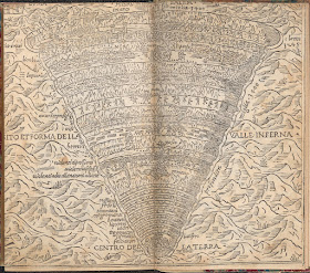
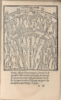
I'm sure that by now readers of this blog on drawing will have gathered that I am fascinated by diagrams, in particular by their ability to both become a point of synthesis for various approaches to drawing itself and as a way of coming to certain 'understandings' of the world. It was Kurt Vonnegut who alerted me to the fact that any literature source could be translated into diagrammatic form, as well as of course it being Vonnegut, ensuring that there was something funny about the whole idea. If there is anything in the history of literature that lends itself to being translated into a diagram it is Dante's epic three part poem The Divine Comedy. In fact diagrams lend to Dante's text a kind of imaginative materiality, and for myself they cut through the layers of historical time between the present and the time of the text's original composition in the 14th century. My personal favourite Hell diagram is the 1515 Aldo Manuzio and Andrea di Asola print. There are graphic devices being used that we now find in everyday imagery but which in its time must have been innovative and for myself somehow endearing. 

Aldo Manuzio and Andrea di Asola, 1515

Detail: Aldo Manuzio and Andrea di Asola

Dante and Virgil encounter Cerberus

Cerberus is the guardian of the third circle of Hell. Because the giant dog has three mouths, Dante used Cerberus as a symbol of the sin of Gluttony. In the original text Virgil gets them past Cerberus by throwing mud in his three mouths, temporarily choking him, in the diagram by Manuzio and di Asola, Cerberus is tamed and is more like a pet dog. I am fascinated by the simple graphic invention going on back in 1515; the heroic couple, Dante and Virgil follow a dotted line that takes them through the various layers. In this case the dots dip down towards the edge of a cliff like division and then fall to a position whereby the travellers can confront Cerberus. The marks that make up the cliff-like wall they have to drop down, also signify flames and falling stones. There is just enough detail to identify the two men, and you can tell from the drawing that they are wearing contemporary clothes, those few lines are enough to signify doublet and hose. 

16th century mid European men's clothing

The Manuzio and di Asola image is cut back into a mountain landscape. The inverse pyramid of Hell, it is suggested, sits beneath a rocky mountain. Only a thin wall separates Hell from the world of the mountain, suggesting that Hell is in fact never far away.
However it is the Florentine mathematician and architect Antonio Manetti (1423-1497) who is generally considered the founder of the study of Dantean cosmography, and is particularly noted for his investigations into the site, shape and size of Dante's Hell. 


Circles 6 and 7
All three images above are based on Antonio Manetti's 1506 descriptions

Antonio Maretti 1529 
Section, Plan and Dimensions of the Inferno

Twenty three years after 1506 Antonio Maretti takes Antonio Manetti's descriptions and produces a scaled plan and section, together with dimensions of Dante's Inferno. What interested me in this case was how the scientific mind was beginning to exert an influence and scientific thinking was now inserting itself into places where in the past 'angels would fear to tread'. Mysticism and science were strange but very interesting bedfellows during this time. 

Joannes Stradanus 1587

Jacques Callot 1612 after Barbatelli

The Jacques Callot image is taken from a now not in existent painting by Barbatelli. What is interesting is that we are seeing Hell effectively from below. Because of this the pyramid is inverted, the levels appearing to rise up towards Satan, rather than to drop down as in most images. 
Antonio Fulgoni, 1791

In Antonio Fulgoni's image a tiny Satan stands right at the bottom of the pit, sent back to his rightful place in the cosmic order of things. There are some strange scales going on in this image. Hell is dropped into what looks like some sort of cellar that has a wall composed of huge stones. On top of Hell, sitting in mountainous terrain is the city of Jerusalem, but underneath everything is this gigantic cellar like structure, an individual brick from its wall being as big as the city. I wonder if Fulgoni had seen Joannes Stradanus's 1587 version, if so he could have taken the surrounding stones idea from him.


Michelangelo Caetani 1855 

Michelangelo Caetani's cross sections are reminiscent of Antonio Manetti's descriptions, but by now you get the feeling that the mystical sense of magic geometry is becoming lost under the cold gaze of the Victorian scientist and a cross section through Hell may as well be a cross section through the trunk of a tree.

The geography of Dante’s Hell, consists of descending circles of increasing punishment.  The bottom level being inhabited by Satan.


The entrance to Purgatory is through the bottom of Hell. Accessed by crawling over Satan.
Mount Purgatory 

I have recently been down to London to see the Rodin exhibition at Tate Modern. There was a terrific exhibition of his fluid figure drawings set out next to his sculpture.  I felt that the compositional liquid rhythm of 'The Gates of Hell' demonstrated how he was able to reconcile the need for mass and plastic invention, with the need for rhythm and active surfaces. In Rodin we see the layers of Hell conjoined and interconnected. He takes the diagram, tears it up and sets it on fire. From a distance his gates look as if they are a sculpture of flickering fire, especially if you go into the grounds of the Rodin museum at certain times of the day when the sun's rays strike the doors from a low angle. 

Rodin: figure drawing

Rodin: Gates of Hell 1880 - 1917


Artists and curators continue to find the Divine Comedy a useful resource, one of the most interesting recent examples being the touring exhibition 'The Divine Comedy: Heaven, Hell, Purgatory Revisited by Contemporary African Artists' curated by Simon Njami. The exhibition opened out a new history of post-colonial ideas, and it of course asked a question as to why classic world literature is so often seen as European. Many of the artists chosen questioned the nature of Christianity as the religion of the West and its role in giving Hell to the rest of the world. In the exhibition catalogue, theorist Achille Mbembe begins his article, ‘Requiem for the Slave’, by stating, ‘Ancient Africa has no hell, no purgatory and no paradise. The idea of a unique, angry, jealous and vengeful God is an invention of monotheism.’

Jane Alexander, Frontier with Church

If there is another Christian story that has produced just as many if not more maps and diagrams it is Bunyan's 'Pilgrims Progress' but perhaps that's something for another post. 

John Wallis: The Pilgrim's Progress dissected or a complete view of Christian's travels from the city of destruction to the Holy Land. Designed as a rational amusement for youth of both sexes.

See also:

Rauschenberg's Inferno 

Paradise Lost

Kurt Vonnegut on diagramming stories 

The diagram as art and spirit guide


Wednesday, 1 September 2021

Chinese Ink drawing: A continuing tradition

Jing Hao

From Chinese ink sticks to those inks used in biros and felt tips, via traditional drawing inks such as oak gall ink to the many and various printers' inks, ink has been central to the way artists have made images on paper for hundreds of years. This post is another attempt to look at ink as a medium and how it can be used when making images.

Chinese ink drawing it could be argued is the oldest continuous drawing tradition that uses liquid ink. The Chinese term for ink and wash painting is 'shuǐ-mò' (水墨, 'water and ink'). Landscape was regarded as the highest form of this art and the tradition is well over a thousand years old. If you look carefully at the brushwork of the early practitioners, for instance in the images made by Jing Hao (c. 855-915) or Li Cheng (c. 919–967), you will find most of the mark making techniques that reoccur throughout this brush drawing tradition, already in use. This reflects on the fact that the basic implements for making ink brush images have stayed pretty much the same over the last thousand years. 

Li Cheng

The ink for Chinese ink painting as well as Japanese ink painting, is traditionally formed into 'ink sticks'. Ink sticks or ink cakes are basically solid ink made from soot and animal glue. When you are ready to use them for liquid ink, they need to be ground against an inkstone with a little water. You vary the concentration of the ink according to preference by reducing or increasing the intensity and duration of ink grinding, as well as the amount of water that the ink stick is dissolved into. The tradition of making ink sticks is very old and there is an extensive literature surrounding the significance of them in Chinese culture, and probably of all the traditional inks you could use, Chinese ink sticks are the most rich in terms of cultural meaning. There is also, because of the many years of their use, a long tradition relating to the aesthetic appreciation of them, for instance, the best inksticks make very little noise when grinding due to the fine soot used, which makes the grinding action very smooth, whereas a very loud or scratchy grinding noise indicates an ink of poor quality that has been made with a grainy soot. The inkstone is also subject to a long cultural history, as are brushes, papers, bamboo pens and the various ways that the ink can be applied. The inkstick is considered one of the Four Treasures of the Study of classical Chinese literary culture.

What is significant for myself is that a culture can take something like ink and surround it with a mythical aura. Over the years a rich tradition is built that means that you can go back and look at a drawing made in ink a thousand years ago and think about how and why it is as it is. This helps us to then think about how any ink, any material that allows us to make marks, could also become just as deeply immersed into a cultural history. For instance oak gall ink can be seen as an ink carrying a very powerful history of its own. Ball point pen ink, although in the scheme of things is very new, has managed during its short time of usage to also become culturally significant. It is in the development of 'material myths' that you can glimpse a certain type of 'animist' attachment to the physical world, these inks are not just dissolved glue and soot, they are liquid life forces, black blood that can be used to animate the artist's vision. I also know of some artists that would say the same of the ink used in their biros.

In Japan where the Chinese tradition was passed on the art is called 'sumi-e'. (Sumi 墨 = black ink, e 絵 = painting). Zen Buddhist monks from China introduced ink art to Japan in the fourteenth century. Over time the main difference that began to emerge was one of reduction and simplification. The brush strokes that were used to represent forms were reduced in number and stripped down to an essential focus and were often combined with poetry.

The tools surrounding Japanese ink brush painting were also integral to the art and various types of brushes were invented to deal with the types of marks required. Even beginners were expected to use a quality brush and they were expected to understand its construction as well as its purpose. The town of Huzhou in China is known as the 'Hometown of Ink Brush' and brushes have been made there since the 13th century. 


A sumi brush hanger

Brushes had to be cleaned immediately on use and because the fibres were held together using animal glue, only cold water could be used to remove the ink.

The ink brush was invented in China around 300 B.C and is still manufactured using traditional materials. The handles are made from bamboo and the hair can come from a variety of animals, including goats, pigs, mice, weasel, buffalo, rabbit, etc. and they have even at times been made from human hair. When buying a brush the texture, (soft, mixed or hard), the size (from big to small) and hair length (long, medium or short) are the most important considerations. 

A 'large' Chinese brush made of goat hair (the terminology would be 'wolf-hair) and the hair is regarded as 'stiff'. 

I was looking at some ideas recently whereby the world could be depicted by various combinations of simple forms, and as always I am amazed at how long similar ideas have been around, in this case the basic Chinese brush painting strokes, include: upright vertical, oblique, reverse, hidden, exposed, scatter, drag, rub and dot and out of various combinations of these strokes images of everything can be constructed. 


Notice how important the elbow to wrist relationship is when maintaining fluid control of the brush

It is perhaps in the coordination between the body and these tools that a wonderful dance can be glimpsed. Fingers 're-find' themselves as they hold a brush in the most delicate manner. The elbow begins a new set of movements parallel to the horizontal surface of the drawing. Shoulders move up and down as pressure changes and breath control becomes essential to the rhythmic continuity of a brushstroke. The brush control in making certain marks that are 'like' forms found in nature is practiced over and over again, so that as the artist becomes more proficient these forms can be combined to make hybrids, which will enable even more 'likenesses' to forms seen in nature to be visualised. 

Rat's foot marks; light to heavy brush tip touch, 5 different directions

Chrysanthemum marks; 7 to 8 radiating out in different directions from the same point, weight on the brush slightly varied

Jie marks; dropping from centre, even brush weight

Blob shapes; wet oval strokes with blurred contours

Even-headed marks; horizontal strokes applied lightly with a little more pressure at the end of the stroke than at the beginning. The brush is dragged at an angle. (Often used for depicting rock formations)

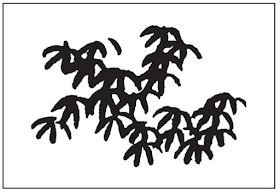
Pine leaf dots; quick, downward strokes directed toward the centre, done with the tip of an upright brush.

Wutong leaf marks; the upright brush is pressed down in units of four strokes, with the tip forming the top and the upper bristle the bottom of the stroke.

Prunus blossom marks; 5 short strokes form a unit.

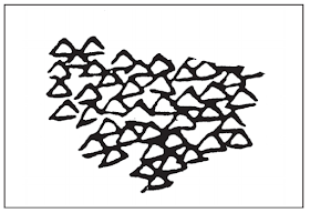
Outline marks; the triangles are outlined in black using three strokes

Pepper marks; often used for cedar leaves. Done with an upright brush quickly dabbed onto the paper using a brush tip.

Because landscape is seen as the main and most important subject matter for Chinese inkbrush painting, there are several types of brush strokes that are required learning if you are to become proficient. For myself the most interesting issue that is associated with this particular approach is the way that line and texture become synthesised within single marks. In western European drawing traditions we much more commonly use line and then add tone and texture, but here we can see that by careful controlling of brush angle, speed of movement plus ink mix and amount, one can achieve wonderful textural and tonal control using line alone. 
There are some basic approaches to working from landscape, the marks above are mainly for working with depictions of masses of plant life, the marks below are usually used for large landscape forms at a distance.

Small axe-cut marks; triangular strokes resembling cuts made by an axe; done with a slanted brush.

Long hemp-fibre marks; long, slightly wavy, relaxed strokes. Done with an upright brush held in the centre of the handle.

Short hemp-fibre marks; shorter and more ragged than the long hemp-fibre strokes, done with the brush tip.

Ravelled-rope marks; each stroke retains a twist; done with the slanted brush.

Cloud-head marks; curving strokes built up in the shapes like cumulus clouds.

Mi dot marks; extremely wet, diffuse dots or marks creating a blurry, atmospheric effect, made by laying the brush sideways and parallel to the picture horizon.

Bands dragged in mud marking; free and spontaneous, the general shape is applied in wash. Before it dries, strokes are added to produce a less clearly defined effect.

Nail-head marks; resembles the profile of a nail with a prominent beginning and ending with a sharp tip. The brush is pressed down at an angle and the stroke is finished with the brush in an upright position.

Because of the integration of landscape with calligraphy, the flow of experience that was being captured also led to the development extremely long formats, which then had to be rolled. Rolled paper formats needed to be handled carefully and as a result handscrolls were developed. A hand scroll is viewed by one, two, or maybe three people at a time. It is unrolled with the left hand and rolled with the right, thus being viewed two or three feet at a time, from left to right. (See post on Emakimono scrolls)

Wang Hui (1632 - 1717) Endless streams and mountains; handscroll, 21 x 480½ in 

The rituals associated with this form of ink drawing ensure that these images are encrusted with entanglements, they pull together perceptual memories of landscapes, ritualised hand movements, symbolic equipment, and a language of marks; as well as giving material significance to ink, surfaces (papers or silks), the body and the landscape, all woven into a dance like performance.

The tradition continues and you will find several contemporary Chinese and Japanese artists exploring the possibilities inherent in both the media itself and the cultural myths that surround its use. 

PU RU (1896-1963): Lotus & Dragonfly

Lao Dan, Chinese ink on rice paper

Several contemporary artists use ink and brush work in their performances or installations, such as Xu Bing and Yang Yongliang who both in their own ways link the contemporary world with Chinese tradition. 

Xu Bing

Yang Yongliang

See also: