Saturday, 25 February 2023

Composition within landscape drawing

Richard Diebenkorn

Contemporary landscape drawing as I have pointed out already, often involves artists embedding themselves into the various situations they find themselves in, however the tradition of 'composing' images is still with us and often landscape painters use drawing as a way to collect information that will allow them to go on and make paintings. However some of the images made are not 'studies' but are full-blown statements, made using drawing materials but made with an intensity and understanding of the materials being used, that ensures that the images as as powerful as any painting. 

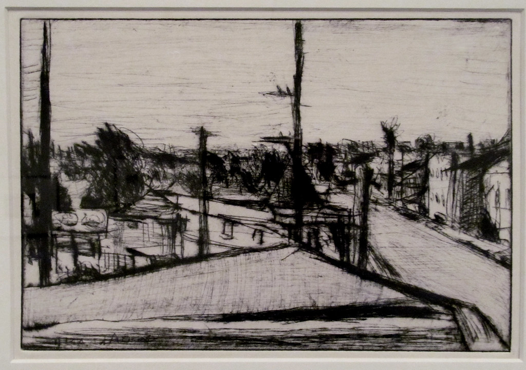
Richard Diebenkorn: Oakland cityscape; Drypoint

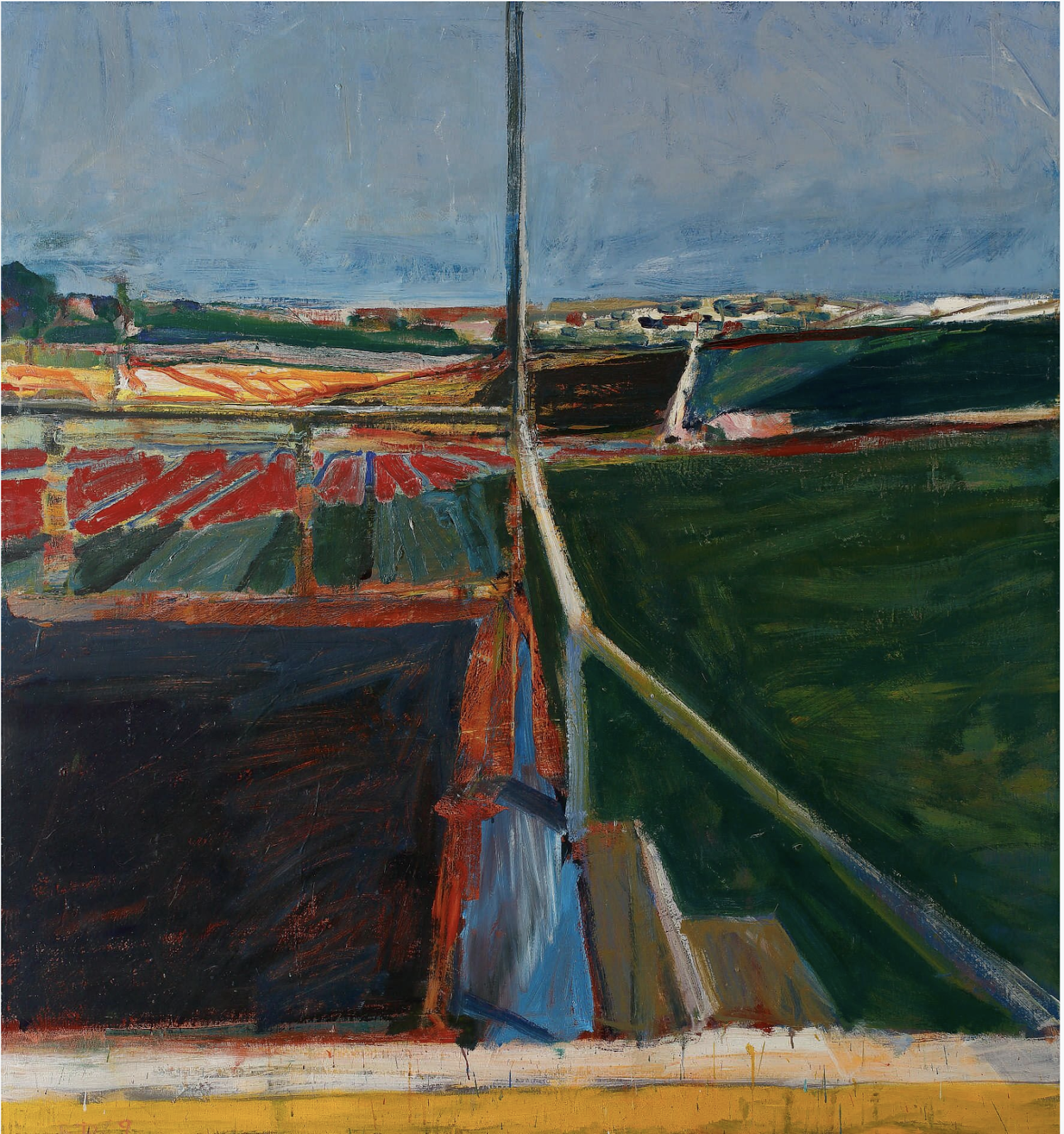
Richard Diebenkorn was a painter who was obsessed with the development of compositional ideas that would stabilise and give form to the chaos of the world. In order to do this he would be very careful and selective in his ideas generation, making several studies until he had an idea of the compositional dynamics of a painting. 

Charcoal

Watercolour

Richard Diebenkorn

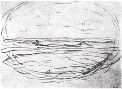
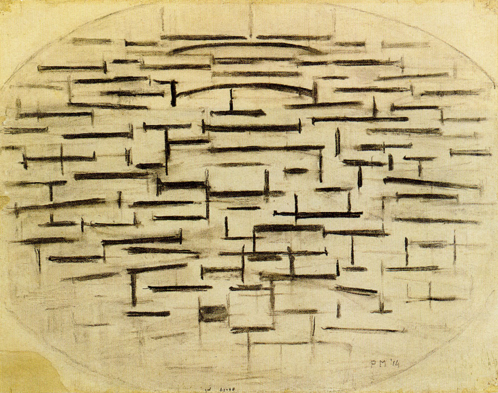
Diebenkorn's search for visual scaffolding, means that his images end up as abstractions of landscape that can almost appear to be non-figurative. He no doubt looked to Mondrian as a precursor, a painter that took the implications of abstraction as a form of reduction to its limits. 

Mondrian: Pier and ocean

Mondrian: Pier and ocean

Mondrian: Pier and ocean

Mondrian: Composition B Number 11 With Red

Mondrian's process of abstraction would eventually result in his 'Compositions' which were non figurative paintings that no longer had to be distilled from experience, but were painted 'compositions' as in the one above in black, white and red. However his drawings still have a resonance and for many people they communicate much more clearly what was going on in Mondrian's mind as he took on the process of finding geometry out in the world. 
 
Lee Newman: Forest

Lee Newman

Lee Newman's drawings are artworks in their own right. He treats charcoal in a very painterly way, the processes of erasure and re-application of the marks, being analogous to the laying down of paint and scraping it back off again. He is very concerned to recreate the space that he finds in different environments and he pushes and pulls darks against lights in order to stabilise and record his perceptual experiences.  

Sangram Majumdar

Sangram Majumdar

Sangram Majumdar is another artist that states that observation is central to his practice. He seems to be always searching for simple forms that emerge from beneath the flow of looking. His strong grasp of Platonic solids giving structure to what could easily be drawings that are over obsessed with detail, the eyes dipping in and out of an act of looking that is preparing itself for painting. 

Jan Knipe

Jan Knipe's drawings are also set in that cusp between drawing and painting. I particularly like her use of a strong vertical to stabilise the images. This is a very 'drawing' thing to do, the line as a powerful divide is central to the drawer's arsenal of compositional devices. 

Adrian Ghenie: Study for Berlin Zoo 2 2009

Adrian Ghenie uses collage together with a restricted monochromatic paint language to stimulate his visual imagination. Again he is thinking about painting and composition, images such as the study for Berlin Zoo above, helping him invent his way towards a final painting. 

Collage is a very good way of both simplifying form and adding another layer of interest into responses to landscape. 

Mark Lewis
Mark Lewis

Mark Lewis uses paper pre-stained in a range of shades of grey. Having to cut and tear these out means that he is forced to simplify the forms he sees and in doing so he creates very dynamic compositions, often with irregular edges which can add to the overall impact of the image and make it more 'object' like. There is also a halfway house. As you make painterly and drawn responses to your landscape onto your paper surface, some will simply not work. Instead to throwing these away, you can recycle your own work by tearing it up and sticking it back down into the images you are developing. This fluid way of working helps develop new ideas for forms and frees you up from thinking too much about finish. 

Lewis Noble

An artist like Lewis Noble makes sketchbooks full of these torn out and recomposed landscape 'notes' and these become very useful references for him when he is back in the studio and as a resource for finding fresh landscape images. 

Lewis Noble explaining how he uses collage techniques

I know it is still February and therefore cold and wet, but those of you with an interest in landscape should still be able to go out and collect information, winter often providing much more of a clear view of the bones of a landscape, the green of spring is of course beautiful but 'what lies beneath' is the geology of rocks and landforms that support the vegetation and these structures are much easier to see in winter. 

See also:


Saturday, 18 February 2023

Amy Sillman: Writing and Drawing

 
Amy Sillman

Metabolism is the result of chemical processes that occur within a living organism in order to maintain life. Amy Sillman uses this process as an analogy for both the making and the viewing of her drawings and paintings. Metabolism she has stated, is a process of breaking things down, which could also be a form of abstraction. In a recent essay, Sillman states: "I would call it a metabolism: the intimate and discomforting process of things changing as they go awry, as they look uncomfortable, have to be confronted, repaired, or risked, i.e. trying to figure something out while doing it." Trying to figure something out while doing it, is a good way of describing that strange process of making images. Whether you are drawing, painting or making sculptural objects, there will nearly always be a time whereby you are trying to work out what you are doing whilst you are doing it.

I have been looking for ways to approach an interoceptual understanding of the body through image making and I came across Sillman's work in Venice last year. It seemed to chime with some of the things I had been thinking about and then I discovered that she also writes about art, so I became even more interested. She also stated that, "I have really never understood myself as a painter, really I'm a drawer." I could almost say exactly the same thing, "I have really never understood myself as a sculptor, I'm really a drawer".

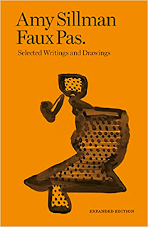
One of Amy Sillman's books

She also makes animations, so why had I never heard of her before? Her paintings are about forms and materials in flux, a process that when it operates well, allows you to work in a way that sits between one thing and another, thus avoiding that binary opposition problem, the thing/not thing issue that I have with nouns. I'm making some hybrid forms down in the studio at the moment and as I do I'm also trying to make things that visually oscillate between one thing and another.   

Like myself she is also happy to work digitally, and she uses inkjet prints of her own drawings on canvas and then paints hand-made marks on top, a process I have looked at myself, however on paper rather than canvas. Painting is for her not a final product, but is a process. Again I concur. I like finding artists that have trodden a similar path, especially if they are a similar age to myself. It is as if there is some sort of zeitgeist in the air that you pick up and run with, no matter if you are in New York, Mumbai, Beijing, Lagos or Leeds. The reality is that the work done, wherever it is made, is as likely to be as authentic and have as much cultural value if it is made in Leeds as anywhere else. Art making is now a global concern, as Marshall McLuhan stated, we are now living in a global village. 

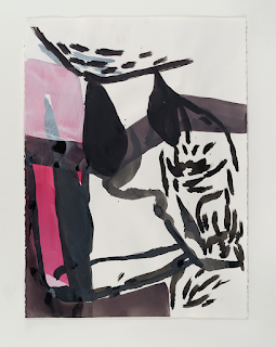
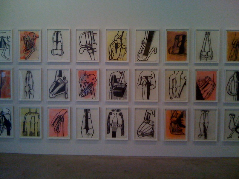
Amy Sillman: From '40 Pink Drawings', 2015-16, acrylic, charcoal, and ink on paper: 76 × 57cm

In a press release for Sillman's work it was stated that, "Sillman’s images together are like sentences that speak in the timbre of drawing but wear a light jacket of painting". I wish I had thought of saying that, it suggests that as you put on that jacket to paint, you are also putting on a painter's uniform, suggesting that painting is a more formal occupation, with a lot of culltural history behind it. When drawing you can be much more informal and open to new discoveries. Sillman however also describes her practice as being really more like writing; she likes to slip between genres. You can get a much better idea of her practice from the videos below.


Amy Sillman


Amy Sillman

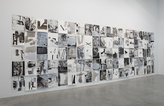
It is best to look at her work in sequences. The paintings and drawings above work like frames from an animation. I would really like to have a block of my own images framed up in a similar way, but I'm not sure whether I can afford it. I'm very aware that presentation is part and parcel of exhibiting work, but we have to also cut our cloth according to our means. Perhaps an animated sequence projected within an exhibition might deliver the idea just as powerfully as a framed set of images? I'm aware of several artists that have gone over budget when putting together exhibitions and in the long run I don't think it helps, as you end up scrimping and saving to meet the next month's bills and that often seems to put a halt to the amount of artwork being produced. It is sometimes useful to remember Maslow's hierarchy, if we are to achieve self-actualisation, we need to ensure that basic needs are in place first. 
Some frame makers have a calculator on their site, see: https://www.easyframe.co.uk/picture-frames, which helps when trying to work out whether or not commercial framing is a possibility. On the other hand if you have the time and resources you can make your own. Sorry I'm digressing again. 

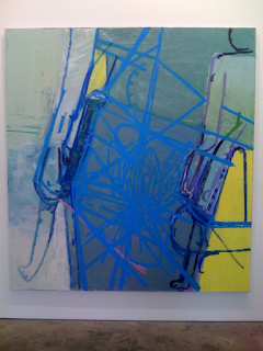
Amy Sillman: Painting

When you look at her paintings, such as the one immediately above, it is clear that she is still when painting someone that draws, but she draws with the paint. The line becomes active as a colour and thus begins another story, the one where every mark is a colour and every ground an optically active surface. Every drawing is of course a coloured drawing (there are thousands of different blacks and whites and combinations there of) and every coloured drawing is in effect a painting. This takes us back into the trouble with nouns and hopefully if drawing is understood as a verb, it releases its identity out into a process and a process has no tight boundaries, all we have is therefore a becoming, each of Sillman's images is therefore a stage in an arrival that will also at some point also become a departure.

See also:


Saturday, 11 February 2023

Rebecca Fortnum at the Henry Moore Centre

In my recent post on Gwen John I mentioned that it was unfortunate that for many years she was thought of as one of Rodin's models rather than as an artist in her own right. Just a few days later I'm reminded of this by an exhibition that focuses on Rodin's relationship with other women in his life. There is an exhibition on at the Henry Moore Centre in Leeds that is of interest to painting, drawing, sculpture and installation practitioners. Rebecca Fortnum has managed to bring all these practices together into a small one room exhibition that demonstrates how sharply focused research can be used to drive work forward. It is also a good example of how to curate a small space and with final shows on the horizon, it would be useful to go and see this exhibition if only to assess how well it uses the available space. 

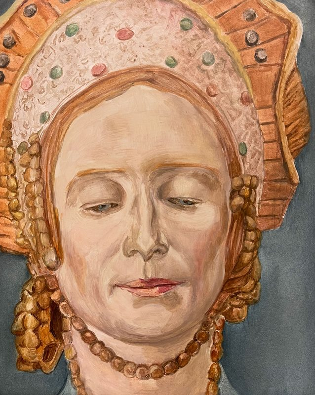
Rebecca Fortnum: 'Les Praticiennes' (Hoffman, Anna)' 2022, oil on gesso board. Painting based on original work by Malvina Hoffman, 'Mask of Anna Pavlova' 1924, tinted wax, The Metropolitan Museum of Art, New York.

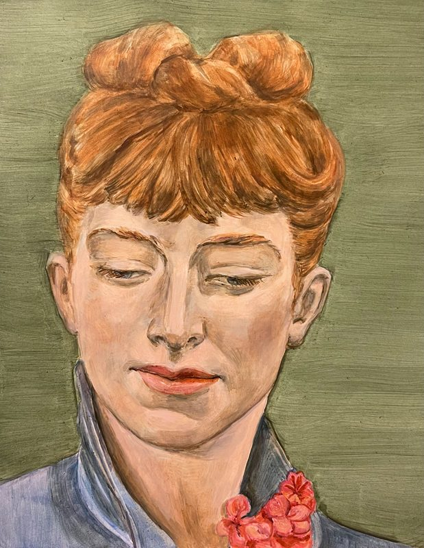
Rebecca Fortnum, 'Les Praticiennes (Bernhardt, Louise)' 2022, oil on gesso board. Painting based on original work by Sarah Bernhardt, 'Louise Abbéma' 1878, marble, Musée D’Orsay, Paris.

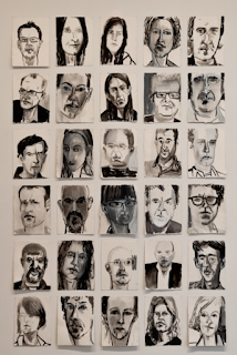
The cross fertilisation of different aspects of practice is fascinating. First of all we have Fortnum's paintings based on photographs of sculptures. All the paintings are made at a similar size and orientation, so that they fit neatly into a grid of images. The original subjects would have been sculptures made by the women that Fortnum has researched. These sculptures would have been photographed at the time using black and white film, then these images would have been rediscovered later either as original photographic images or as black and white prints of them in a book. Fortnum then makes paintings of the faces of these sculptures working from the photographs, adding colour as she does so. Therefore sculpture, photography and painting are fused together as Fortnum seeks to infuse life back into these images, in many ways making these women come back alive to us by infusing the whole of one wall of the exhibition with colour. 
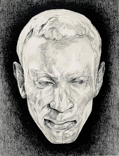
On the adjacent wall are large framed black and white drawings made from the faces of the sculptures these women worked on, most of which are of course men. These images are larger, organised in a more organic presentation and are made of a rich black chalk on paper. Thus making this wall more imposing, especially as these men mainly look directly out at you, rather than turning their gaze inwards. 

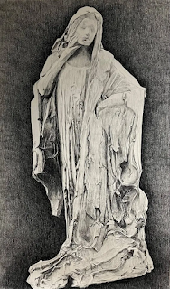
On a third wall is one large black chalk drawing of a full length statue; Bessie Vonnoh’s Sarah Bernhardt. This single image in many ways sums up the issues Fortnum is presenting. Vonnoh is presented as an artist who is capable of making full length sculptural portraits, Bernhardt is presented as a significant woman of her time and by Fortnum isolating the drawing, we are asked to think about this image's double significance. 

Rebecca Fortnum was a recent artist researcher in residence at the Henry Moore centre and had used her time as a researcher to follow the lives of women who had worked with Rodin during the time of his fame, either as studio assistants or as participants in his art classes.

Rodin devoted significant time to teaching women to sculpt, as well as employing them as studio assistants. At that time, other artists seldom worked with women and for the most part, women working in sculpture in turn-of-the-century Paris encountered demeaning prejudice. What 
Fortnum found was that all of Rodin’s female assistants had extraordinary and in most cases unpublished, life narratives and she decided to therefore make a body of work to remedy this. 

Fortnum selected sculptural works by twelve women who she had researched and found to be not just associated with Rodin’s studio, but who were making sculptures in their own right.  She has made portrait paintings from their work, and has exhibited these paintings against hand designed wallpaper, the paintings forming a regular rectangle set out against the wallpaper's gradually graded pink patterned surface. These images of women often have their eyes closed or downcast, reflecting either an inner spiritual life or a certain modesty that was expected of women at the time. 

“In my selection these women are depicting women (often a friend or peer) with their eyes downcast or closed, looking away. I enjoy the ambiguity implicit in both the signalling of empowered absorption or self-containment alongside a reading of social conformity and female modesty. The viewer may decide which.” - Rebecca Fortnum

The most intense image that sits within the 'male' wall is that drawn from Camille Claudel's Bust of Rodin. His beard is rather like a force of nature, cascading down like a waterfall, a sign of his male virility. This intensity I imagine is part and parcel of what Fortnum is trying to represent, the 'heroic' stance expected from romanticised male artists being perhaps as much as a trap as the demure downward cast stances of the women depicted, both men and women trapped within the expectations of their time and society. The rewriting of history is however always just that, it doesn't change what actually happened, it can only be for the future. By seeing the past for what it was we hopefully don't make the same traps for ourselves again, but as Margaret Atwood pointed out, 'Men are afraid that women will laugh at them. Women are afraid that men will kill them.' 
Camille Claudel: Bust of Rodin

Rebecca Fortnum, 'Les Praticiennes (Warrick Fuller, Maxwell)' 2022, carbon pencil on paper. Drawing based on original work by Meta Vaux Warrick Fuller, 'Poet (Portrait of Maxwell Nicy Hayson)' c. 1920s, painted plaster

Rebecca Fortnum, 'Bessie Vonnoh’s Sarah Bernhardt' 2022, Carbon pencil on paper.

The full list of the artists that have provided source material for Fortnum’s work includes:

Sarah Bernhardt (1844-1923)
Kühne Beveridge (1879-1944)
Camille Claudel (1864-1943)
Hilda Flodin (1877-1958)
Sigrid af Forselles (1860-1935)
Meta Vaux Warrick Fuller (1877-1968)
Anna Golubkina (1864-1927)
Malvina Hoffman (1885-1966)
Madeleine Jouvray (1862-1935)
Jessie Lipscomb (1861-1952)
Clara Rilke-Westhoff (1878-1954)
Bessie Potter Vonnoh (1872-1955)
Ottilie Maclaren Wallace (1875-1947)
Emilie Jenny Weyl (1855-1934)
Enid Yandell (1869-1934)

See also:

Whether or not to use theory Rebecca Fortnum approaches her research from a standpoint within Feminist Theory. The exhibition is a clear example of how research can drive practice, but how do you decide what sort of theory to use as a support for research? 
Rebecca Fortnum: 'Les Praticiennes'  A link to the Henry Moore Centre with details of when the exhibition is on and opening times. 


Saturday, 4 February 2023

Memory Drawing and hands

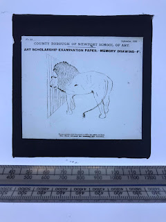
An old memory drawing test exercise

Memory drawing used to be a vital part of an artist's training. The image above is of a glass slide found in a skip in Newport recently. I would have been really interested to have seen what the rest of the slides looked like, but this found image conjures up a pretty good idea of how one particular examination worked.
Many years ago I read a biographic novel about the life of the artist Gainsborough. In the novel, (whether this was based on fact I don't know) Gainsborough had set up a still life in his cellar and had put a canvas on an easel in his attic. He hated climbing stairs, so this meant that if he was to minimise his climbing time, he would have to memorise the still life really clearly when down in the cellar, so that painting time in the attic was productive. This scenario has stayed in my head, so it must have had some use as a mnemonic. When I tried to work with the same situation myself, I found it almost impossible to carry in my head the necessary detail to make a good accurate drawing in the top floor studio. The process of climbing four flights of stairs demanded a lot of physical effort and this seemed to drain away the energy needed to hold an image in the mind. Like many things, if you are to develop the muscles, (both physical and mental) you need to train regularly.

However there are many other ways of developing memory as a useful mechanism in relation to image making, most of which involve the image maker providing helpful memory frameworks for the audience. This being the case, I would like to remind everyone who is making drawings or images of any sort, that visual memory training is a discipline with a long tradition and that it is one well worth looking at if you are to become more astute when making decisions as to how your images will become memorable.
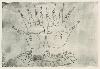

Drawing on paper from Mogao Caves

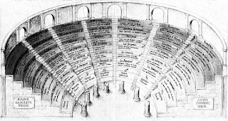
In the past our own bodies have often been used as memory machines, and they are much easier to work with than full blown memory theatres as described in Frances Yates' wonderful book, 'The Art of Memory'. A book that everyone should read, simply because it helps us to understand how our brains need structures within which to save memories and even more importantly, that memory structures need images associated with them if they are to become 'memorable'.

Guillo Camillo's Memory Theatre

Memory theatres are though huge and costly things and there are other ways to achieve similar ends, in particular our hands can be used very like mini versions of these theatres, fingers replacing the aisles that were placed between rows of information seating. The process of bringing together certain associations or particular images in order to trigger memories, quickly begins to create bizarre forms, and hands in particular seem to lend themselves to both imaginative play and to support materialised thinking in relation to numerical ideas and visual representations of structural principles. 

One of the most ambitious of hand mnemonics was presented by Girolamo Marafioti of Calabria in a 1602 treatise on the arts of memory. The system consists of a map of ninety-two manual loci; twenty-three on the front and back of each hand, each housing a different geometric symbol: a crescent moon, a chalice, a circle with horns and what looks like a lemon. To use the system, one assigns a to-be-remembered thing to each locus. One might, as Marafioti suggests, use it to remember a group of people arranged by status, age, or other characteristics. The system compresses the features of a memory palace and makes the whole edifice fit into the shape of a hand. 

From Girolamo Marafioti’s 17th-century treatise on the art of memory, De Arte Reminiscentiae, demonstrating the use of loci 

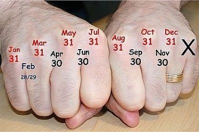
Using hands to visualise numbers of days in months

We have all played this one: 
Here's the church and there's the steeple, open the doors and there's the people

What began as a post to remind everyone of how important visual memory is, is now becoming a post about hands and how they can become the starting point for memorable image invention. So I'll save the stuff about artists' visual memory teaching for another post and look at hands and how they have been used as memory devices. Yes my mind flits around all over the place, but it's the way it operates best for me and hopefully, eventually all these diversions will make some sort of sense. 

The hands (above) of the Chinese image from the Mogao Caves were drawn over a thousand years ago and are annotated with Chinese characters on the fingertips that give a specific name to each digit; above that, on a second row we find the names of the five Buddhist elements: space, wind, fire, water and earth and a final tier, floating upwards as if on kite strings, lists the ten virtues. The drawing illustrates a mnemonic system, that helps the viewer to make connections between elements and virtues. At about the same time in England, the monk Bede came up with a treatise called 'The Reckoning of Time', in which he laid out a method for determining when Easter would fall on any given year. These two systems both deal with the issue of materialising thought. As Barbara Tyersky puts it, "When thought overwhelms the mind, the mind puts it into the world". Those of you that regularly follow this blog will be well aware of how important I believe 'materialising thought' is; without a way to externalise thought we become trapped in our own minds and making images is one of the best ways of doing this.
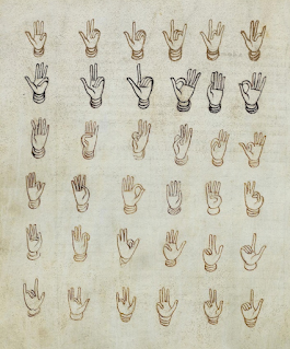
Bede. Diagram from 'The Reckoning of Time'

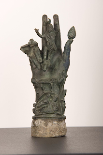
In ancient Pompeii a bronze sculpture of the Hand of Sabazius held images of protective symbols for the house owner. Sabazius, the god of vegetation and the guardian of women in labour, is often depicted in the palm of a hand, but it is the other symbols that emerge from the hand including a nursing mother, a crow, a table with offerings and a serpent, that make these hands such fascinating objects. These strange hands are memorable precisely because of the fact that they are strange, but their strangeness is one driven by a very normal desire, the need to seek divine protection. 

Hand of Sabazius

Cicero wrote about the importance of memory as an aspect of rhetoric and he introduces us to the idea of memory devices and provides a lasting image with which to remember how memory devices work. Cicero connects the training of memory with sight and like other classical rhetoricians he used the mind’s recollection of visual space to act as a guide to the memorisation of ideas. A mythic story of the invention of the art of memory by the poet Simonides, is told by Cicero and as it not just describes how the art of memory works, it is itself a memory device, I shall repeat it again. 

The poet Simonides created the art of memory when, after he was the lone survivor at a crowded banquet, he was asked to identify the bodies. During the banquet, he had been asked to step outside because he had to receive an urgent message. While taking the message, there was a rumbling sound as an earthquake shook the building, the roof then collapsed, crushing everyone inside beyond recognition. Simonides was shocked but safe. Very soon the distraught relatives of the other diners arrived at the scene and according to custom they needed to bury their dead relatives within the day, but there was a problem, the diners had been badly crushed and disfigured, so no one could tell who was who. Simonides however came to everyone's aid, he had a way of remembering the names of all the corpses by remembering who was sitting where. The shape and layout of the room and its tables and chairs were clear to him in his memory and as the people in the room were of great importance, their positions in relation to the room's layout had been sharply impressed upon his mind. 

This association with location, meant that many early memory methods involved walking around a building and things that were to be remembered were then distributed around the building in significant places and you walked through these spaces in your mind, each location triggering a memory because something was positioned that was designed to set off an association with what you were trying to memorise. The hand is like a small building and can be used in the same way. 

I have looked at hands as a way of remembering musical notation in an earlier post, but a good idea is always worth revisiting. In this hand image (below) made in response to ideas supposedly set out by the 11th-century Italian monk and music-theoretician Guido from Arezz, we can see how he uses the hand image to memorise the names of tones and their relationships by linking them to the natural divisions that we make when drawing hand images.

16th-century diagram from the manuscript of an unknown author depicting musical notes scored across a hand in the method attributed to Guido

Manuscript illustration of a 'Guidonian hand' 1274 
The solmization sequence ut-re-mi-fa-sol-la appears both on the enclosing circle and on the hand itself

In the drawing above the artist has been able to break totally away from normal conventions of spatial depiction, The near hand is big and powerful, but the far hand is gigantic, it spreads out until it is big enough to contain the idea. 


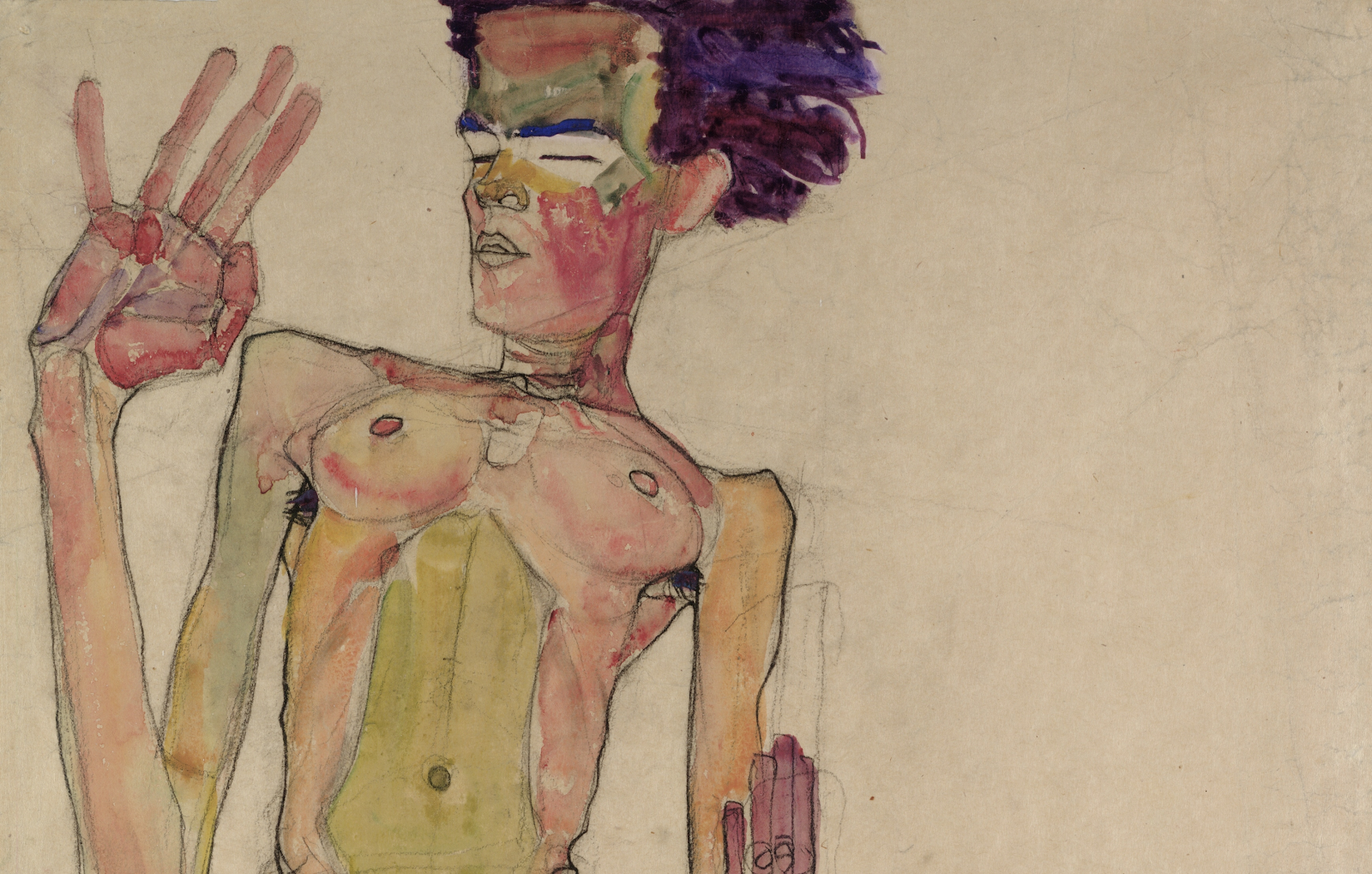
It's amazing how different hands can become. The one above also illustrating Guido's ideas could belong to an Egon Schiele of the Medieval artist world.
 
Egon Schiele

These woodcuts of chunky hands below, are totally different in sensibility. They are heavy and solid, the sort of hands that if engaged in making karate chops would do some serious damage. 

From Anianus’ Compotus cum commento (1492), an adaptation of Bede’s computus system

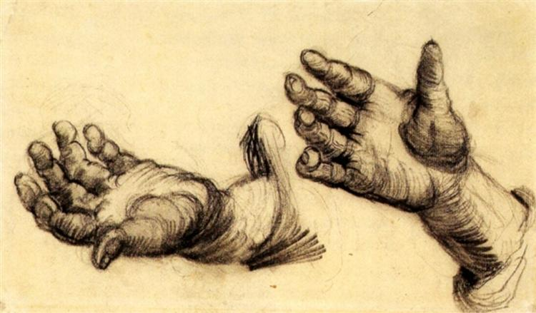
Van Gogh: Hands

Van Gogh's drawing of hands, is an image of hands that know how to do hard work; these are peasants hands. Whilst the hand below is meant to be much more spiritual. 

Hand-coloured woodcut: The Hand as the Mirror of Salvation

El Greco

El Greco's hand above, is a fascinating one. It is in fact quite strong, and yet at the same time it is sensitive and definitely a hand that has spiritual intent.  

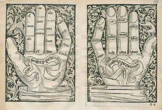
From Stephan Fridolin’s 'Treasury of the true riches of salvation': 1491 

The hands above contain numbers that correspond to meditations in the book, in effect creating a table of contents. I like these hands as the little fingers have a kink in them, and so do my own fingers, a fact that makes me think that the artist, may have like myself, had arthritic fingers. However in the same book, we have a pair of more solid hands, hands with much broader fingers that can carry busts of the apostles, saints, Mary and Christ. 

.
From Stephan Fridolin’s 'Treasury of the true riches of salvation': 1491 

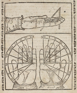
Of course we can use our hands for many other purposes, they are as versatile as we want them to be. From the shadow puppet of childhood to the fist of adulthood, the hand morphs into what we want it to be. As in the case below where the hand becomes a 'handy' sundial.

Thoinot Arbeau 1582 volume of practical astronomy: How to convert the hands into a sundial 

For the people of Michigan, the hand becomes a map.


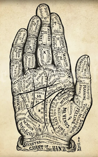
You are supposed to know something really well if you know it like the back of your hand. A phrase I never really understood. As a boy I had spent many hours with my gran who would often hold my hand and carefully trace out my lifeline or prod my Venus Mount, she seemed to know all there was to know about the palm of my hand, but she never spoke to me about the other side. 

Chart of the Hand from Dr Alesha Sivarth's Book of Life 1898


References:

The public domain review  A wonderful source of images

Tyersky, B. (2019) Mind in Motion: How action shapes thought London: Basic Civitas Books

See also: