I work on the MA programme as well as on the BA Fine
Art course at Leeds College of Art. Feedback sometimes has to be given by e mail
as the students are part-time and not physically always available. When you
write feedback you can realise after the event that what you are asking someone
to do is something that you are in reality asking yourself to do. The
italicized text below is cut and pasted from an e mail response I made to
someone’s blog posts.
“The one area I
would like you to think about is how to write about drawing. What are the kinds
of thoughts that are embedded in lithographic crayon itself? A stick of
charcoal can record the most delicate gesture and the most harsh. From the
direction and weight of a mark I can tell whether you sat or stood to make the
drawing, each mark a cast of your movements, and in some way a capturing of
your thoughts. Drawing is an unspoken dialogue, so how can you give it words?
Have you ever
tried creative writing as an entry into opening new ways of writing about things?
For instance you could try writing from the point of view of the lithographic
crayon, from the point of view of the paper etc.
As the greasy
grain of the crayon is compacted or opened out by your hand movements and
changes in pressure, how does the eye hand relationship follow a thought? As
your eye follows the contours of a rock, how does this translate to the way you
adjust your hold on the crayon, how do directional changes relate to pressure
changes? How does texture integrate with tonal difference and surface travel? A
flattening of the angle between the wrist and the hand may be accompanied by a
change in crayon hold, as this happens a larger surface of the crayon is
perhaps available to the paper, this accompanied by a greater or lesser pressure
will perhaps create more or less awareness of atmospheric space. So what does
this mean in relation to what you are trying to communicate? The growth of
seaweed amongst rocks both reflects a struggle for life and a close organic
relationship between inanimate and animate life, can a change in
application/texture suggest this? Can an introduced colour/application change
such as the one you use to suggest water, both create difference and
relationship? By using a print process this can create harmony between
different mark languages, but how does this work. For instance a lithographic
print can bring together the liquid nature of tusche born brushwork, with dry
crayon effects and a photographic transfer. In harmonizing these various
languages it in effect lays over all of the sub-group visual languages a
dominant, what you might call 'master' lithographic language. What is the tone
of this language, how does it effect what can be said?
I suppose what
I’m asking you to develop is a much more exact language with which to speak
about the various drawing/printing qualities you use. Why do you ‘like’ one
mark/drawing/selection more than another? Perhaps its because it more
accurately communicates what you were thinking, whether intuitively or from
active reasoned choice, I don’t think this matters, but what does matter is how
precise or how poetically accurate you can write about a drawing and its
marks.”
I had been looking at a series of sketchbook drawings
of rock pools and other imagery located in that area not
quite belonging to the sea and yet not firmly designated as land. The student had made some risographic prints from them. (Risographic prints use real ink, very similar to
offset litho prints, and as a printing system it is a bit like
using a photocopier that can be run back through the machine more than once,
each time printing off a different CMYK colour layer) In this case the colour
selection was allowing the student to think about some marks representing
things above and some below water.
As I re-read what I was asking, I also realised what a
challenge I had set. If there existed a clear and rich language with which to
speak about drawing, books that contained this would be on the recommended
reading list.
I have tried to write directly about the experience of
reading a drawing several times before, (for example this and this) but still
don’t feel I’ve been able to get to the heart of the issues involved.
When I make an observed drawing,
perhaps the most important aspect in terms of what I’m trying to communicate is
my own vulnerability. Sensations are fleeting, memories are vulnerable to rapid
erasure and perception is as much an emotional engagement as a phenomenological
experience. As I make marks I catch an awareness of myself as a vulnerable
entity, my very concentration on what I am looking at making me less able to
guard against sudden attack or unwanted intrusions. The marks I make are
hesitant gropings, searching for form amongst the chaos of perceptual reality.
Standing in front of the world and just looking at it, is an extremely fragile
situation. Perception takes time to experience, not at all like the split
second of a camera’s shutter opening and closing, it is not framed within a
frozen moment of chemical or electronic recording. Perception centred drawing
is interest led, something that unfolds slowly, something that as your hand
traces it, becomes an interest that begins to define itself as it arrives. What
do I mean by this? As I draw I begin to influence how and what I see. Because I
am looking at a pattern that seems to be appearing within a rock or a plant, I
will both attempt to draw this emerging feature, and in drawing it, direct more
attention to it, thus revealing more of this quality. However, conversely, as I
take an interest in one thing, other things that I might have seen, become
invisible.
Drawing from life is thus a very ‘thin’ account of
reality, a response to the ‘real’ that is always open to suggestion.
However I would argue that in this very limitation
lays its strength. There is a stage beyond the drawing of perceptions as a
document or record and this is when drawing is focused on the creation of an
image. Sometimes this is created as the drawing arrives in response to the
process of seeing and at other times it comes from reflection after the fact.
The image; it could be argued; is created by some sort of cooperation between
the real and the unreal; (Bachelard, 1992), the fusion of a visual document of the
perception of reality and the workings of the imagination. Experiences are of
course ‘lost’ as soon as they have been experienced, but in some ways they live
on in ourselves, they inhabit our internal imagination, moving from live
perceptions to the building blocks of our memories and via this route they pass
into our dreams and daydreams. This is the space of image possibility. The
bringing into being of an image, begins with an intimation of what is coming, a
‘fore-seeing of the image’. (Nancy, 2005, p. 83) The image itself arriving out
of a fusion between a concept and material, between the possibilities of a
material’s shaping and our knowledge of other things in the world. This is the
metaphorical moment. The grounding of the image in the materials of its making,
coming together with the force from which the images arises. (Nancy) By being
sensitive to the tools of making and the materials we draw with and on, in
effect giving ‘attention’ to something, we give that thing dignity, because it
has been worthy of our interest. We are both giving dignity to the wonder of
perception and the recording of it. Think of the difference between an old
frequently polished chair and one left uncared for; the cared for chair is in
effect given some of our humanity, our touch carries with it something of
ourselves. In this attention and sensitivity to material thinking, any image
discovered will hopefully also have embedded within it something of the
profound, something deeper than the more prosaic definitions of the image that
begin in representation or figuration. Because of drawing’s limitations, it
allows the unreal to inhabit the real, almost from the moment of a drawing’s inception.
The reality of the possibilities of marks made with a charcoal stick or pen and
ink, itself becomes a doorway into a new reality when brought together with the
shaping of a particular perception. This is Kantian territory, the ‘non
sensible image’ of the imagination, levers itself out into the world via the
materials of drawing. As Nancy puts it when trying to describe the image;
‘it may bring itself out of the confused and
incessantly dissolved dispersion of sensible givens in order to give itself to
be seen. In order to make something be seen.’ (2005, p.84)
Nancy suggests that the image has a way of becoming,
of arising out of the chaos of life. Bachelard however would suggest that
imagination seeps through during a recollection of reality, in this memory
borderland between personal history and collective experience, is born the
image. It is not a random affair, it has a particular poetic logic, one that is
created out of a ‘geometry of echoes’. (Bachelard, p. 1992) In the process what
happens is that a certain ‘unreality’ is given to or combined with a strong
‘reality’ and this is where the power of an image is forged. This is what you
could also term the phenomenology of the imagination, the initial experience of
an image’s birth being vital to the way in turn it can be experienced by an
audience. If an image is to be ‘alive’, fresh minted in the mind, it needs to
enter our consciousness with the authenticity of a real experience. This
authenticity comes from the ‘crafting’ of an image that feels right, that feels
as if it has simply arrived.
The long journey from sketchbook observational drawing
to constructed images is for myself where these issues play themselves out.
So how does this work in reality? In order to explore
how this process unfolds in the shaping of an image I shall take one of my own drawings and attempt to write about the stages of its becoming.

The image above is about 4 feet square,
the falling red building was at one point in the centre of a much wider
drawing, but during the early stages of composition I decided to cut off the
left side in order to focus the image more on the sea. The square is a more stable form and therefore can more firmly hold an image that seeks to play with an observer's sense of spatial 'rightness'. The image took quite some time to resolve itself and before it was started a series of studies were made.
As always with my work, the concept
grew out of drawings I had made on the street on my way to work. I had been
drawing a lot of tall buildings at the time, the ones below typical of what I
was doing. Conversations with people that I came across had during this time
been about the migrant crisis and how awful the situation was. In Chapeltown where I live the majority of people had at one time either been migrants or were the sons or daughters of immigrants. So
my thoughts were often on how this crisis was developing and how I as an artist
could possibly respond to the issues the crisis was raising. The flats drawn in the sketchbook images below are often used to house new arrivals into the city. From outside they have a certain grandeur, but as you enter their insides they often feel cheap and uncared for.


Sketchbook drawings of blocks of flats
I began to make larger studies, this time to try and open out ideas of how to make effective imagery based on tall buildings.


The initial drawings were too 'literal', but I was beginning to get some formal ideas of how I could simplify a tall building. Eventually the concept of what I began to think of as a ‘God’s eye view’ occurred to me. I had been making buildings look as if they were so tall that they had to pass through a cloud layer. Then I made some images seen through a gap
in the clouds. It is important to state here that these images just 'arrived' but once in place I was able to think about them and what they might mean to me. The God like view was important as so many refugees on being interviewed as they reached European shores said that they believed God had saved them from drowning, the same God that would send a suicide bomber to heaven or punish a woman for not wearing a headscarf; a God that
has been shaped by various religions, and one many people pray to in order to avoid their own
responsibilities.


The red blood like colour of
the building came early, I also quickly decided that by looking at the building
from below I could emphasise the fact that these buildings might be huge, but
that they were also hollow. I did try other materials such as coloured pastels (directly above), but the images in red wash had a particular 'rightness'. The process of layering
washes to achieve the necessary red was opening out new formal possibilities,
the stains of colour bled out on their edges and became another water metaphor,
what I had initially used as a technique for the rendering of clouds would
become the way that the buildings were made. Here was the point where the
‘image’ began to arrive, material (ink washes contained within a drawn
perspective border) felt right for what I wanted to say; the metaphorical blood that we had
washed our hands of now staining the very buildings that I was using to represent the West,
their perspectives of grandeur, insubstantial liquid.
The image of the falling man
had also arrived in these studies, whether to pair these or to have a single
figure was important emotionally, in the end my memory of Bruegel’s ‘Fall of
Icarus’ led me to single a lone figure out and to be confident that a small
figure in the background could still have a large emotional impact within a
composition.


The study above was vital to how I was to proceed. The quality of the red interior was now much more intense, I had made up some dark red ink washes with small additions of Paine's Grey watercolour pigment. I would apply several layers of this colour which would on drying bleed the grey back out and give an effect a little like dried blood. However the "cloud" view was now becoming a separate concept and would move off in a slightly different direction.
I had also during the summer made
several studies of the sea, and the low-lying landscape of West Wittering.


In particular I had become interested in the eroding sea defences and the traces of former constructions which had now become for me, signs of the impossibility of holding back nature. These beaches I had realised at the time would be where migrants sailing the seas would eventually be beached up. In my minds eye, these West Wittering views replaced those of refugees being washed up on the beaches of Greece, people arriving on shores occupied by holiday makers, was a particularly distressing image, the conjunction of leisure and tragic loss so hard to reconcile.


I had drawn the sea before, these images above were done using brush and ink, in a moleskin notebook with Japanese folds, I was trying to find a seascape language that worked for me and in particular I became fascinated with two elements; the way that directional clustering of marks helped develop a rhythm across the surface and how organic shapes, such as the ones in the lower drawing, could be used as symbols for waves. In this initial drawing the white lines that surround the sea swell also reminded me of some drawings I had recently done of graffiti.


I needed to develop a graphic way of drawing sea that wa rhythmically disturbed; the sea needed to be an area that the eyes couldn’t settle on; I wanted people to feel queasy when they tried to look at it. The language I developed for the sea, eventually became a fusion of the two approaches developed in the Japanese fold notebook, however I eventually dropped the brush in favour of pen and ink.


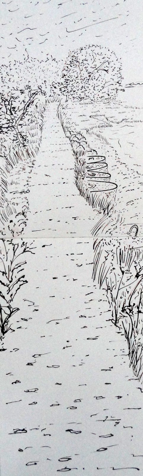

In particular I had become interested in the eroding sea defences and the traces of former constructions which had now become for me, signs of the impossibility of holding back nature. These beaches I had realised at the time would be where migrants sailing the seas would eventually be beached up. In my minds eye, these West Wittering views replaced those of refugees being washed up on the beaches of Greece, people arriving on shores occupied by holiday makers, was a particularly distressing image, the conjunction of leisure and tragic loss so hard to reconcile.


I had drawn the sea before, these images above were done using brush and ink, in a moleskin notebook with Japanese folds, I was trying to find a seascape language that worked for me and in particular I became fascinated with two elements; the way that directional clustering of marks helped develop a rhythm across the surface and how organic shapes, such as the ones in the lower drawing, could be used as symbols for waves. In this initial drawing the white lines that surround the sea swell also reminded me of some drawings I had recently done of graffiti.


A graffiti of a human on a large protruding rock in Gledhow Valley in Leeds, compared to shapes used as a symbol for sea.
I needed to develop a graphic way of drawing sea that wa rhythmically disturbed; the sea needed to be an area that the eyes couldn’t settle on; I wanted people to feel queasy when they tried to look at it. The language I developed for the sea, eventually became a fusion of the two approaches developed in the Japanese fold notebook, however I eventually dropped the brush in favour of pen and ink.
So why the dip-in pen and
not brush? This is probably because of the way I decided to draw the trees in the image. I draw trees a lot as Leeds is a very green city, on my walks most of my distant views of Leeds are vistas glimpsed through trees.



The trees are drawn in pen
and ink with grey wash modelling, thus leaving the only area not to be ‘washed’ with
liquid as the sea. As I write this I know it sounds perverse, but by treating the 'sea language' like I have, leaves enough of a medium change
to ensure that the ink washes that make up the building are seen as essential
to that area, rather than being something used throughout the image. The washes weren't structural enough either, sea is very 'muscular', as you watch it you can gradually get to 'see' its muscles. Pen and ink allowed me to sharpen this awareness.

As to the actual marks made,
each pen stroke expresses something about the hand direction and pressure. A
metal nib bends under the hand, the nib spreads and returns to its thinnest
width as pressure is put on and released, the ink being pulled from its own small
reservoir very quickly, I’m therefore having to constantly replenish the liquid
by dipping the pen back into the ink pot. However you have to keep up a very
smooth rhythm to do this. If your hand jerks you will spot or splatter the
paper with the ink. Each mark is like a wave in itself. As well as changing
thickness as the nib changes direction of travel, marks develop energy as they
thicken, and dissipate it, both as the ink runs out and as the mark thins. This
is the great expressive value of pen and ink, something that I have had with me
since childhood. We were taught to write with ink and dip-in pens in junior school
in the 1950s and were still using this method when I went to senior school. As
an implement I have used it throughout my life and feel as if it seismically
reads my mind, each hand stroke reflecting my energy levels and mental state.
The sea in effect is the entry point into the unconscious, by looking at the
pen strokes you can open the image into the ‘un-real’, once this is done, the
fact that the trees and accompanying people are floating and standing in mid
air, is totally acceptable. The pen and ink with wash that forms the tree
trunks and the people is perhaps a safe option in terms of visual language but
in its very safeness offers room for the other languages to operate, it in
effect anchors the image.
One important aspect of
working in pen and ink is that the darkness of the ink can be varied. It is
hard to see from reproductions but by using a variety of ink tones, a very
subtle atmospheric perspective can be achieved, the surface pushed backwards
and forwards as the ink darkens and lightens. This helps to develop a visual
pulse, the brain interpreting the differences in a similar way to changes in
thickness of atmosphere that we see on a misty morning, light slightly ‘hazy’
marks drifting into spaces, set off against hard sharp dark marks that sit
firmly in their particular location.
Perspective is an artificial
space, an invention that relies on a certain type of logic, this can be used in
conjunction with other types of spatial clues to create a tension between
‘realistic’ and ‘imagined’ space, Metaphysical painters such as De Chirico
understood this, the harsh light of southern Europe often used to suggest the
precision of dreamscapes. In this case the light is softer, more Northern, but
still an important factor in establishing mood.
What drawing allows me to do is to have a visual conversation. By putting thoughts into an image, I can step outside of myself. In effect each image made becomes a new thing to perceive. It is a way of thinking distributed between conception and perception. By working in this way I try and avoid too much thinking, each image made is a visualised idea and therefore becomes part of the journey towards something new, it is found rather than being an illustration of an idea. I will return at some point to this issue, because it is vital. Between illustration and fine art is a fine distinction, one that is to do with control and intention. Both are equally valid in what they do, but they are distinct disciplines.

Bachelard, G. (1992) The Poetics of Space Boston: Beacon Press.
Nancy, J. L. (2005). The Ground of the Image
New York: Fordham Univ Press.


