Martin Handford: Where's Wally?
Durer: Triumphal arch.
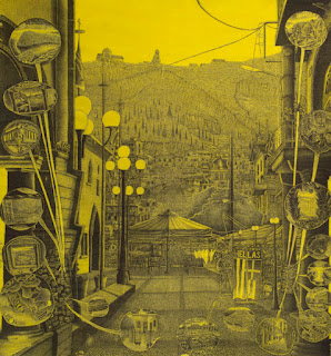
Adam Dant is a Jerwood Prize winning British artist. His work deals with the fact that he now lives in London and he seeks to reflect his concerns with living in this teaming metropolis, that has a very well known history. He obviously looks back to artists such as Hogarth for inspiration and has produced a body of work that sits on the edge between illustration and fine art. This is fine by me, but I also realise that many people will bring up the old illustration/fine art argument and argue that his work is by definition weak because of being too close to illustration. I have had to deal with this issue over and over again, because like Dant my work is figurative and deals with stories that arrive directly from my experiences of living in Leeds. I might have an argument with the way he visualises space, (I think he is at times too predictable, perhaps because he has to produce a much higher volume of work than myself and I also have this difficultly with Paul Noble's drawings), but he has ideas about the world and is trying to communicate them using visual means. His language is one of detailed pen and ink drawing and I would argue that this is just as important a language as the 'hard won' image charcoal drawings of the Borough Polytechnic School or the various systematic grid based languages of abstract modernism.
Adam Dant
Cruikshank's 'The Worship of Bacchus'
Cruikshank's painting is huge and like Durer's 'Triumphal arch' very difficult to read as an on screen image. Which brings me to an issue that I have had to grapple with myself. If you do make work of this sort it is almost impossible to represent it on a computer or mobile phone screen. This link is my own attempt to solve the problem and is of a recent drawing of mine that will be shown soon at the the Royal Cambrian Academy in Conwy, in 'Imagined Landscapes' an exhibition selected by the artist Clive Hicks-Jenkins. Because most people will see my work on a computer screen I also make work that is about the 'centralised image' and this type of work is so much easier to grasp on screen. (See below)
Eye of the Hayfield
An artist much more in tune with the relationship between the small screen and monumental image making is Emma Stibbon. She is exhibiting at the moment in an excellent printmaking show at the The Zillah Bell Art Gallery in Thirsk, North Yorkshire.
Night Navigation - Intaglio print by Emma Stibbon
The Original Print Show is curated by Norman Ackroyd and is on until until the 14th October. Stibbon often works at a monumental scale, (see earlier post) but instead of trying to put in masses of details and lots of events into her images, carefully selects compositions that will make an impact. I would suggest her way of working is much more appropriate to an age of mobile phones, because the images transfer to screen much easier. However like Martin Handford I still believe there is room for artists that work with masses of surface detail. It might be deeply unfashionable and not mobile friendly, but when an audience is confronted with the reality of the scale and the fact they have to work hard to see all the details, it becomes an experience and in being that, I think an image can be all the more memorable.
Ensor: The entry of Christ into Brussels 1889
This is an old idea and one often disparaged by the Modernists, who saw in these issues the worst aspects of narrative art. However all ideas are meant to be tested and certain aspects of the Modernist canon do not seem to stack up any more. The one thing I think working as a artist for nearly 50 years has taught me is that fashions change and that what was once argued as being the only way forwards, will at some point be seen as a backwards step. I will leave you with two images, Ensor's 'The entry of Christ into Brussels', an image that in many ways ought to be wrong and perhaps given the time when it was painted a backward step. But it in many ways opened the door to Expressionism and is still a painting that people will sit and look at for a long time.
Ensor: The entry of Christ into Brussels 1889
The other image is of Stanley Spenser's painting in the Sandham Memorial Chapel. Again an artist that it could be argued took no account of what was going on in the then current art world, but if you go to look at his paintings they have an ambition and authenticity that transcends fashion and when you visit them in situ, they become experiential and deeply communicative.
Stanley Spencer: Sandham Memorial Chapel
The current exhibition of Raqib Shaw at the Whitworth in Manchester celebrates this type of approach to making images and if you are at all interested in the type of work pointed to in this post, do go along and have a look.
Gary Lawrence won this year's Jerwood drawing prize again with another of his very detailed images.
Gary Lawrence
The British Museum have commissioned a film about the conservation of Durer's huge Triumphal Arch Print.
Manabu Ikeda is another artist that has taken on long durational drawing commissions. His 'Rebirth', a 13 x 10 foot very detailed drawing responding to Japan's recovery from earthquake disaster being typical of his work.
Manabu Ikeda
See also:The narrative drawing tradition


Nice art...
ReplyDeleteHow to pass Nebosh IGC3
Nebosh IGC Registration
IOSH MS course in Chennai
Nebosh Course in Chennai
Safety Courses in India