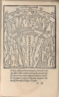
I'm sure that by now readers of this blog on drawing will have gathered that I am fascinated by diagrams, in particular by their ability to both become a point of synthesis for various approaches to drawing itself and as a way of coming to certain 'understandings' of the world. It was Kurt Vonnegut who alerted me to the fact that any literature source could be translated into diagrammatic form, as well as of course it being Vonnegut, ensuring that there was something funny about the whole idea. If there is anything in the history of literature that lends itself to being translated into a diagram it is Dante's epic three part poem The Divine Comedy. In fact diagrams lend to Dante's text a kind of imaginative materiality, and for myself they cut through the layers of historical time between the present and the time of the text's original composition in the 14th century. My personal favourite Hell diagram is the 1515 Aldo Manuzio and Andrea di Asola print. There are graphic devices being used that we now find in everyday imagery but which in its time must have been innovative and for myself somehow endearing.

Aldo Manuzio and Andrea di Asola, 1515
Detail: Aldo Manuzio and Andrea di Asola
Dante and Virgil encounter Cerberus

16th century mid European men's clothing
The Manuzio and di Asola image is cut back into a mountain landscape. The inverse pyramid of Hell, it is suggested, sits beneath a rocky mountain. Only a thin wall separates Hell from the world of the mountain, suggesting that Hell is in fact never far away.
However it is the Florentine mathematician and architect Antonio Manetti (1423-1497) who is generally considered the founder of the study of Dantean cosmography, and is particularly noted for his investigations into the site, shape and size of Dante's Hell.
Circles 6 and 7
All three images above are based on Antonio Manetti's 1506 descriptions

Antonio Maretti 1529
Section, Plan and Dimensions of the Inferno
Twenty three years after 1506 Antonio Maretti takes Antonio Manetti's descriptions and produces a scaled plan and section, together with dimensions of Dante's Inferno. What interested me in this case was how the scientific mind was beginning to exert an influence and scientific thinking was now inserting itself into places where in the past 'angels would fear to tread'. Mysticism and science were strange but very interesting bedfellows during this time.
Joannes Stradanus 1587

Jacques Callot 1612 after Barbatelli
The Jacques Callot image is taken from a now not in existent painting by Barbatelli. What is interesting is that we are seeing Hell effectively from below. Because of this the pyramid is inverted, the levels appearing to rise up towards Satan, rather than to drop down as in most images. Antonio Fulgoni, 1791
In Antonio Fulgoni's image a tiny Satan stands right at the bottom of the pit, sent back to his rightful place in the cosmic order of things. There are some strange scales going on in this image. Hell is dropped into what looks like some sort of cellar that has a wall composed of huge stones. On top of Hell, sitting in mountainous terrain is the city of Jerusalem, but underneath everything is this gigantic cellar like structure, an individual brick from its wall being as big as the city. I wonder if Fulgoni had seen Joannes Stradanus's 1587 version, if so he could have taken the surrounding stones idea from him.
Michelangelo Caetani 1855
The geography of Dante’s Hell, consists of descending circles of increasing punishment. The bottom level being inhabited by Satan.
The entrance to Purgatory is through the bottom of Hell. Accessed by crawling over Satan.I have recently been down to London to see the Rodin exhibition at Tate Modern. There was a terrific exhibition of his fluid figure drawings set out next to his sculpture. I felt that the compositional liquid rhythm of 'The Gates of Hell' demonstrated how he was able to reconcile the need for mass and plastic invention, with the need for rhythm and active surfaces. In Rodin we see the layers of Hell conjoined and interconnected. He takes the diagram, tears it up and sets it on fire. From a distance his gates look as if they are a sculpture of flickering fire, especially if you go into the grounds of the Rodin museum at certain times of the day when the sun's rays strike the doors from a low angle.
Rodin: figure drawing
Rodin: Gates of Hell 1880 - 1917
Artists and curators continue to find the Divine Comedy a useful resource, one of the most interesting recent examples being the touring exhibition 'The Divine Comedy: Heaven, Hell, Purgatory Revisited by Contemporary African Artists' curated by Simon Njami. The exhibition opened out a new history of post-colonial ideas, and it of course asked a question as to why classic world literature is so often seen as European. Many of the artists chosen questioned the nature of Christianity as the religion of the West and its role in giving Hell to the rest of the world. In the exhibition catalogue, theorist Achille Mbembe begins his article, ‘Requiem for the Slave’, by stating, ‘Ancient Africa has no hell, no purgatory and no paradise. The idea of a unique, angry, jealous and vengeful God is an invention of monotheism.’

Jane Alexander, Frontier with Church
If there is another Christian story that has produced just as many if not more maps and diagrams it is Bunyan's 'Pilgrims Progress' but perhaps that's something for another post.
John Wallis: The Pilgrim's Progress dissected or a complete view of Christian's travels from the city of destruction to the Holy Land. Designed as a rational amusement for youth of both sexes.
See also:
Rauschenberg's Inferno
Paradise Lost
Kurt Vonnegut on diagramming stories
The diagram as art and spirit guide


No comments:
Post a Comment