Showing posts with label size. Show all posts

Sunday, 28 June 2026

Scale

Rene Magritte "The Portrait of Stephy Langui"

In Magritte's image is it scale or size difference that makes an impact on the viewer? It's interesting to compare his image with one of Spiderman, drawn I think by Mark Bagley.


The image of Spiderman makes me feel small, whilst Magritte's painting makes me think about size constancy. Scale in an image it seems to me is more an embodied emotional response. I remember for the first time walking the streets of New York and being overwhelmed by the sheer scale of the buildings. My body felt awe at the dizzying heights I was seeing. Perhaps that's what I'm getting at, scale at an emotional level is embodied; yes the buildings were big but the impact was emotional, their size was making me feel small. 
Scale is another of those vital visual elements that we use to create meaning. Scale is very different to size and although related to visual proportion, I tend to think of it acting more emotionally. Size refers to the absolute, physical measurements of an object, whereas scale is the relative size of an object compared to another, usually a standard of measurement as in the 1:72 scale that Airfix model plane kits used to be when I made them as a boy or human scale, a concept that references spaces and objects designed around the physical dimensions and capabilities of the human body. Size is objective, you can measure it, while scale is both objective and relationally subjective, for instance the 1:72 scale of an Airfix model allows you to objectively work out how big the original plane would have been, but scale can also be about the fact that the situation we find ourselves in as humans overpowers us, such as when we travel into the mountains and the scale of everything is awesome. In this case scale also could relate to the sublime, some scales being beyond comprehension. Scale is therefore about how big or small something feels within a relational context, for instance we can feel as if we are the wrong scale, as in those science fiction films that explore the consequences of miniaturisation or giantism. 

Gary Mayes: Storyboard for Fantastic Voyage story for Observer TV commercial

Scene from the 1954 sci-fi classic 'Them!'

Gulliver's Travels is the classic text on relative scale. Thomas Morten illustrated the 1864 edition, whereby we find at one point Gulliver coming across giants, the Brobdingnagians, that make him feel very small, whilst at another point in the book, he finds himself of giant size in relation to the inhabitants of Lilliput.  

On first encountering the Brobdingnagians

Gulliver in Lilliput: 1864 Edition of Swift's Gulliver's Travels

My last post was on proportion and human proportion in relation to scale is about how we physically and psychologically interact with our environment. It bridges the setting of the mathematical ratio of objects to a norm (scale) and the relative size of the parts within a form (proportion). Another way to think about this is that size is used to describe something (E.g. a woman is 5 feet seven inches high) and scale to compare one size of a thing with something else that it is related to. (The model of a train is half the size of the original) Scale can emotionally overwhelm or become attached to a feeling such as vulnerability, whilst size can be big or small, but this only becomes emotionally resonant when compared to something else and once we begin comparing we move into the realm of scale. Using a low viewpoint in drawing, such as in the scene from 'Them!' image above, is an effective technique to exaggerate scale, either making subjects appear immense, monumental and heroic or small, insignificant and dominated. This approach, often called a "worm's-eye view" or "low-angle shot," is often coupled with a bird's eye view or high angle shot in films, whereby swapping positioning is used to manipulate perspective to create a drama based on changing power dynamics.

The classic superhero view

Kings always used to have their thrones mounted on a dais, preferably with steps leading up to it. This meant that they controlled their viewing angle, being able to look down on their subjects, whilst their subjects looked up to them. Scale in this instance being to do with power and authority. On a day to day basis this might be something as simple as someone putting height-increasing insoles or heel lifts inside your shoes in order to look taller than you really are. Yes you are also actually taller, but your emotional response to the situation is related to the fact that you feel taller than someone else. 

Drawing for an artist's book

We play games with scale. The small people like marks made on the drawing above are there to help give scale to the figure with a burning back. For these biro squiggles the larger figure takes on landscape proportions and they in turn can be read as both small and or normal sized humans by someone looking at the drawing. 

Cosmic scale

Cosmic scale is often used to communicate a sense of the insignificance of our human scale of measurement. But as we go down in scale at some point the spaces of the quantum world open out and they can appear as immense as the universe itself. 

Breathing

The image above of 'breathing' that I made some time ago, being an early attempt to embed cosmic scale into the everyday. 

The cosmic human

When I was reading accounts of Chinese medicine I came across the idea of the body as being both of human and cosmic scale. In response, I attempted to fuse some of my interoceptual imagery, with a more 'heavenly' view. I do though realise that my own internal image bank still  includes the figure of Eternity as visualised in 1960s Doctor Strange comics. Back as a teenager I was fascinated by Steve Ditko's invention of 'Eternity', an image that would in the late 60s be further developed by Gene Colan. The way those artists envisioned the personification of an idea like eternity, has stayed with me and as I get older, I look back on what was invented for a cheap popular medium and think that perhaps what was done then had far more significance than we ever imagined at the time. 

Steve Ditko

Gene Colan

I have to acknowledge that I still find those 1960s images powerful and that my early fascination with comics is perhaps still one of the most important influences on my own image making. A conceptual fusion of Cézanne and Steve Ditko would probably underly my idea of the perfect image. Do I dare ask an AI programme to look at that? 

What AI came up with

It is interesting to look at what a current AI system does with the question, I used ChatGPT. It's the first time I have tried to use AI as an image generator and although it makes a decent fist of a fusion between the two sources, it doesn't really touch upon what I was thinking about, which was much more an approach to image making than a fixed image. "Here you are" the software seems to say, offering a solution that at first sight appears to be rather sophisticated, but it doesn't have my own awareness of that uncertain certainty that lies behind human perception. Cézanne's struggle was not about a final 'look', it was a process of human engagement with looking and the materials of its capture. Ditko, unlike Cézanne who was trying to record a series of perceptions, was trying to illustrate a story. I had to write a script for the AI to work to and I suppose I could keep editing that script, but it would be hard to eliminate the "Here you are" firm 'answer' that is produced, even if I asked the AI to involve that uncertain certainty, I don't think it could actually 'know' what that was, because it is not embodied. In this gap lies the difference between fine art and illustration. The AI it seems to me loses the human scale, it has no touch, it has never climbed a mountain or tried to draw one from an embodied experience.
Scale is in my world an embodied emotional register. I find the cosmic scale that AI produced a bit too like wallpaper but it is an image that asks me questions. I'm not ready to use the undoubted fascinating properties of AI yet but I cant discount the fact that it is here and is rapidly changing the landscape within which my images are seen. 

Alfred Wallis

As a reminder of that human touch, I'll leave you with an image by Alfred Wallis, who when asked why the house in the middle of his painting was so small, replied that the man living in it had no soul. 
See also:

Tuesday, 15 November 2022

Drawing Grounds

I have posted several times on various drawing media and papers, but one area that is of vital importance to the final look and feel of a drawing is the ground preparation and this post is an attempt to begin to remedy this omission.

All painters are aware of the importance of their ground preparation and it is exactly the same for drawing. In fact many of the surface preparations are the same.

Oil based mark on unprimed paper

However before you begin priming any surface, you might want to consider whether or not the priming is going to support your idea. For instance in the image above you can see how on unprimed paper an oil based mark, such as from an oil stick or mark made with a brush using oil paint, will gradually separate itself out, the oil leaving the pigment as the paper absorbs the oil into itself. This capillary action is of course telling us about the nature of the paper and the nature of oils and pigments. The pigments are suspended in oil and the action of oil spreading out reveals this. It may be that this type of incident is vital to the material message that you want your work to communicate, and if so, you would be concentrating on the type of paper used and its ability to soak up oils, as well as of course on the makeup of the various oil based products that can be used for mark making. 
On the other hand you may want to investigate priming as a way to generate new ideas. By working across several different surfaces and grounds ideas sometimes emerge from the way the materials operate. But whether you have an idea of an effect you want to achieve, or whether you want to undertake a period of pure research and investigation of possibilities, you will need to use a surface of some sort and paper is for most drawers the one they begin with, so don't forget to check out previous posts on papers which can be accessed at the end of this post in the 'see also' section. 

Size

Sizing seals the support, which is why size is also called sealant. Basically size is a glue that seals the paper surface to reduce absorption. The surface sizing of watercolour paper helps watercolour sit on the surface rather than be absorbed into the fibres. This helps to preserve the luminosity of the pigments, whose reflective ability would be compromised by being partly absorbed into the mass of paper fibres.  

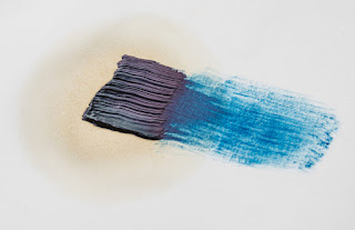
The same brush stroke on sized (left) and unsized (right) paper.

A size can be made from acrylic polymer, PVA, casein, (casein paints are ground in a solution of casein, which is a phosphoprotein of milk precipitated by heating with an acid or by lactic acid) or animal gelatine. The traditional size used by artists is rabbit skin glue, and it is the best if you are looking for a long lasting artefact, because it has a low acidic content. 

Primer

Before putting any paint on your surface you might want to use a primer. It is a glue that sticks well to your surface, better than your paint would. Then when your paint is applied, it sticks to the primer, so that it is well adhered, i.e. it isn't going to flake or crack off. Primers for acrylics are often called acrylic dispersion grounds and they are either acrylic gesso or acrylic primer and these new ones made by artist's suppliers such as Johnsons can fulfil the role of a size, primer and ground all in one. 

Gesso

Genuine Gesso is made of warmed animal glue and whiting. Gesso is a common preparation for a paper drawing base and has a range of qualities that make it very useful for surface control. You can sand back down into it and in doing so remove areas of drawing in a very subtle way, so that the drawing appears to emerge from the ground, or look as if it is sinking down into it. Genuine gesso is a hard, chalky surface built up by several thin layers. It is sensitive to water and will crack if used on a flexible surface, so to prevent cracking it must only be used on rigid substrates. Genuine gesso is extra-absorbent so it’s the best choice for painting in egg tempera or encaustic. Unless it states that it is traditional gesso, most things labelled gesso, are made with acrylic ground and are not as absorbent as true gesso, so if you can, test out both before making a decision as to which one is right for your particular approach. In drawings mixed with watercolour or dilute inks, the ability of gesso to absorb liquids again comes into its own and there is a deep, saturated look to liquids applied to true gesso surfaces that you cannot get on unprepared paper surfaces.  


Marks made on gessoed watercolour paper

The paper above was painted using a large brush that left brush strokes using an acrylic gesso. It was when dry lightly sanded to give it a grain and it was then drawn into with a sharp metal point, in order to scratch deep into the gessoed paper. A dilute black ink wash was then applied over the scratch marks and then a clean damp cloth was used to remove the ink from the surface so that it was left concentrated in the scratches. The wiping also enabled the surface to be 'softened' and a further layer of coloured watercolour was then applied and also wiped off. 

Watercolour over acrylic ground gesso.

In the image above you can see that the gesso was applied with a big brush in a straight downwards stroke and then put on slightly thicker using a palette knife using horizontal strokes. Watercolour was then applied with a large soft brush and partly removed using a dry cloth. 
 
Many acrylic primers were created to be similar to traditional gesso. You will therefore find various terms such as ‘true gesso’, ‘genuine gesso’ or ‘traditional gesso’, but to begin with just try them out and see what affects they help you achieve. All of them can be painted onto paper, and all of them can then be sanded, scratched into and variously distressed in order to give you textural control over a drawing's surface. 

If your surface needs to flex, Sinopia Casein Gesso can be used. It is very absorbent and is the next best thing to genuine gesso. You use it straight from the jar at room temperature. It is made with milk protein (casein) which is a binder in casein paints. It contains a small amount of linseed oil that has been emulsified so it can be thinned and cleaned up with water. But the oil content is actually quite minimal, just enough to make the gesso flexible and water insoluble after it has dried and cured – because it is minimal they say that the surface doesn’t need to be sized first to protect it from the oil. This also means it is not very absorbent, so intense watercolour or ink colours are harder to achieve. 

Once the gesso is applied it dries to the touch in a short amount of time so you can apply the second coat the same day when the first is touch dry, but no more than two coats a day. While the surface is stable enough for one additional layer, the oil content has to cure enough for subsequent layers to be applied. Because the recipe includes a linseed oil emulsion it will take four or five days for the surface to cure and become water insoluble. If you are working with aqueous wash techniques, which soak the surface with water, then you should wait for a complete cure. With less water or with oil techniques, the surface can be painted on after a few days.


A ground is the textured surface that all of your various drawing media have to respond to, whether these media are wet or dry. It’s the thing that you experience as 'touch'. Whether it is hard or soft, smooth or textured, absorbent or non-absorbent, coloured or white, it will directly effect the way that a mark sits on a surface.  Of course for a painter grounds are also vital, but sometimes the drawer can forget that the paper surface holds 50% of a drawing's textural potential. 

Some drawing media have grounds specially made for them, such as pastel and silverpoint. Transparent acrylic pastel primer is a ground that makes it possible to work in soft pastel on a wide variety of substrates: canvas, card, plastic, glass, paper, wood, ceramic or metal. It has a slightly gritty or toothy texture which will hold soft pastel grains. (You also have to think about fixative technology with pastel, so do follow the links at the end of the post for more thoughts on this). 

I have posted on silverpoint in the past and in order to get the metal to rub off on paper you need to apply a ground. My first use of a primer to do this was of ground-up cuttlefish mixed into gouache paint. But you can draw with a variety of metals as long as you consider the paper's surface preparation. Metalpoint drawings are made by dragging sharpened wires of soft metal (usually silver or lead, but sometimes gold) over a slightly toothy, textured surface. Particles of the metal wire are deposited on the surface, leaving ghostly grey lines which will tarnish over time to a warm brown tone. There is now a specially prepared commercial ground available, called 'Golden Silverpoint Ground' a milky acrylic ground that is designed for use on porous and flexible substrates. 

Detail from Lauren Amalia Redding, ‘De Donde Crece La Palma’ Silverpoint on panel

A good traditional ground is made from rabbit skin glue, bone ash, and pigment, but the rabbit skin glue must be kept at a constant temperature and several coats are required, this is why I used the gouache method. If you want to look at an artist that uses silverpoint grounds really well try Roy Eastland. He combines drawing on gesso grounds with scratching and sandpapering his images away, so that he gains full control of surface possibility. 

Roy Eastland

Roy Eastland

I particularly like Eastland's drawings of old toys such as the one above, the sanding back of the gesso allowing the images to ghost out of the ground, suggesting that they are emerging out of history. 

This post is simply an introduction to grounds and was prompted by the fact that several first year students are beginning to take more care over stretching papers and thinking about how they might use wooden frames to support taut drum like surfaces to draw on, but very few are exploring paper grounds and how they also affect mark making possibilities. 

See also:

Charcoal Includes a section on fixative and how to use it 
Sumi papers A reminder to explore what is out there in relation to possible surfaces to use