Sunday, 2 January 2022

Wayne Thiebaud: Drawing in colour

In order to kick off this new year, I'm afraid I'm going to talk about the end of an era. Wayne Thiebaud after a very long life has just died, he was 101 years old and being of such a grand old age his work can be seen to operate as a bridge between the artistic concerns of one century and another. As an artist and teacher he had a particularly clear vision, one that was centred on a visual celebration of life, a celebration that had its roots in both Impressionism and Post-Impressionism as well as in the academic traditions that preceded those late 19th century concerns.  Before he began each new painting, he made sketches to work out his ideas, something so basic that we sometimes forget how important this modest, often kept in the background, activity can be.

Sketches for 'Ties'

Wayne Thiebaud: Ties

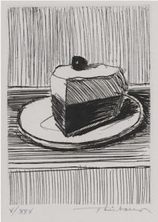
Something as simple as a hanging tie, gave Thiebaud plenty of food for thought, in fact he referred to his compositional sketches as “thinking drawings.” His compositional drawings can also be regarded as art works in their own right; his interest in visual language was always refined and very controlled, as when ordering and organising rhythms of black and white in the image of cake slices below.


If you look at his various drawings of confectionary you can see his control of formal abstract concerns very clearly. The dividing line between the table top and the wall behind is the formal fulcrum around which he organises both images below, an idea that relates to looking that I suspect he took from Cézanne. Look at the ellipse of the plate beneath the cake covered in dripping chocolate sauce; it hits the horizontal behind the cake, it is hidden, but we know it will just touch the line. This touch is a sort of invisible, hidden anchor point. However when you look again, you realise the two sides of the plate are forming slightly different ellipses, the one on the right flattens and takes a slightly different curvature to the one on the left, if this was geometry they would slightly misalign. The shadow of the confectionary falls to the right, and as it does its visual weight does two things. It makes room for itself by pushing the cake and its plate to the left, a simple compositional move, but at the same time the curve of the plate edge is flattened, suggesting that the visual weight of the shadow as it crosses the plate, is also a real weight and it is this weight that is pushing down the ellipse. 


If you look at the ellipse of the plate immediately below, once again it wont quite join with the other side of the plate's ellipse, there is a visual rupture and this spatial jump sits within the formal geometry of three rectangles, one identifying a front space and another a back space, whilst the cake sits on and in the rectangle in between. The black cherry, being a sort of focal point around which everything revolves. A classical composition, giving gravitas to a subject that had previously not been seen fit as a worthy subject to paint, an approach that at the time, was also re-vitalising the still-life tradition. 

If you look at Cézanne's work you can see a similar set of issues emerging. In Cézanne's drawing of a pear below, you can sense the looking that is going on, as the diagonal from the left moves across the image, it re-emerges to the right of the pear slightly higher. The edges of the pear are often found to be in more than one place. The more you look at this image the more your eyes become accustomed to a sort of scanning and finding mode, one where you need to become more aware of two eyes moving in unison, of a head turning as attention moves to the left and then of a neck rocking that head, as the mind seeks to begin stitching together these various points of view. Points of view taken as the body readjusts itself constantly in order to make sure the eyes have enough information to ascertain the spatial moment that the pear is happening within. This image is a recreation of the time of the looking rather than an image of a pear.

Cézanne

If we look at a more composed image of Cézanne's such as the still-life painting below, what Thiebaud was doing and how much he learnt from Cézanne becomes clearer.

Cézanne

The ellipse of the saucer is broken and bent both by the apple sitting in the space in front of it and by the cup itself as the ellipse passes behind it. Cézanne would have watched himself look at the situation and could then recreate this looking as a formal element within the composition. These points of spatial rupture are where the world of perspective or photographic space falls apart and we enter the world of experienced space. Cézanne was a phenomenologist before phenomenology had become a proper philosophical movement; this is why Merleau-Ponty wrote his seminal paper 'Cézanne's Doubt', as he was very aware that Cézanne was opening our eyes to the moment of seeing, and in doing so, made us all ask questions as to what it is to actually 'see' something. 

However Thiebaud is not Cézanne and he has a related but different agenda. Thiebaud is concerned to reactivate memory, but he uses visual tropes taken from Cézanne to do this. 

Wayne Thiebaud

If we look at the painting of the slice of tart above, as with the drawings we have already seen, Thiebaud activates the eyes by breaking the ellipse of the plate behind the tart slice. He is also in this case of course drawing in colour. He 'doubles' the edge of his plate, so that the optical buzz of blue against orange replaces the line in more than one place. Colour adds vibration to rhythmic action, shadows have the same intense colour presence as objects and the paint texture reinforces this rhythmic dynamic. This is however a painting done from memory. It is an image of Thiebaud's youth, a time when all the cakes were the best cakes, when mum's apple pie was the bee's knees and all the cake shops had perfectly organised shop displays. 
Thiebaud is tapping into the way memory clarifies and sorts out experience. The artist and illustrator Quentin Blake was on TV last week talking about his approach to drawing and he spoke of his time as a young man taking life drawing classes. Blake used to draw in response to the live situation, but then go home and re-draw the figure again from memory. His memory drawings were he stated so much better, because they eliminated all the inessentials and they were now drawings of what the essence of a figure was, or at least what Blake thought of as the boiled down core of the previous experience. These memory drawings helped him to develop a visually centred mind that could tap into a personal lexicon of human forms, a body of visualisations that he still relies on to instinctively emerge and help him find an image as he begins each new drawing.  
One problem with memory however is that it can in comparison with a live experience be a little flat, sort of slightly out of focus but Thiebaud overcomes this by reactivating the image with live colour. His control of optical dazzle is very sophisticated, often using shadows as if they are real things, he is able to release his objects into the space they are painted into. The optical 'ping' of these images is phenomenal and Thiebaud could be regarded more as an 'Op' artist, than a 'Pop' artist.

I'm still fascinated by these issues because as a maker of images I believe I have to take into account some of these fundamentals about perception. 
Of course Thiebaud didn't just make images about cakes, he took his sketchbooks with him everywhere and the same concerns emerge whether he is painting a cake sitting on a table or trying to compose an image of a road intersection. 

Wayne Thiebaud

This drawing of a crossroads is a very interesting composition. The twisting spaces of looking are set off against strong verticals, a geometry of lines tying it all together. 
Thiebaud uses the road markings as additional geometry, white lines against black lines, curves pushed against straights; the cross of the road sign, also operating as a signal for the compositional idea. 

Thiebaud's work is a reminder of some very basic things. Composition is a powerful tool and you can use drawing to try out variations before embarking on more 'finished' images. He also gives us a way into escaping the tyranny of the photograph and its fixed single point perspective. By working from memory he was able to clarify the complexity of the world and boil it down into images that relived or re-built experiences rather than trying to copy them. 

See also:

Richard McGuire's 'Here' A very different approach to dealing with visual memory


Sunday, 26 December 2021

Life lines

Michael Leunig

So why for the last post of the drawing year show the work of Michael Leunig an Australian cartoonist? Cartoonists take positions, sometimes on the left and sometimes on the right, but whichever way they lean politically, they have to put their cards on the table. Never forget the cartoonists of this world, they use drawing in ways that are direct, articulate and audience aware, i.e. they are excellent communicators. They are always putting their work on the line and because they are the artists that stick their necks out, also have to take heavy flack, sometimes literally. 
Leunig made several cartoons as a personal stand against Western involvement in the Gulf War, however at times his work simply pointed out the stupidity of all wars. Our tendency to believe situations are either right or wrong, is for myself another example of the problem with definitions. Once something is defined it exists in a particular way as a thing, rather than as a process, once it is a thing, it can also be seen to have different properties to other things, it is capable of being another.  Michael Leunig's world is the world of the holy fool, which means he sometimes puts his foot right in it, as he did with his recent anti-vaccine cartoon. As a free spirit, Leunig chided against his government telling all Australian's to get vaccinated, so he made a cartoon about it, suggesting that authoritarianism has no boundaries, at one time it is telling people to be vaccinated but then at another time it could be taking away civil liberties. As a cartoonist associated with left wing views he faced a heavy back-lash and was removed from his post as cartoonist in residence. Whether or not you agree with him, he is always putting his work on the line and this is what I wanted to get you to think about as artists. Do you put yourselves up for criticism? Are you prepared to sometimes take a difficult stance that goes against the grain? The holy fool is another stereotype that has been used in the past to allow artists to say things that other members of society would not be able to. Just like Michael Leunig, Cecil Collins saw himself as a holy fool. It allowed him to accept his role as a misunderstood mystic, an image that takes us back to medieval times, as when a king used to allow the fool to operate as a sort of escape valve, to be able to say things that no one else could, but which were necessary, if the king was ever to confront any ideas that ran counter to his own. 

Cecil Collins: Holy Fool

So as this fool continues typing, he needs to remind his readers that the year is finally coming to an end, and that it has been a year of much foolishness, doubt and argument, as well as bravery and hard fought successes in the face of poor governance and venal decision making on the part of those in power. Sometimes drawing can seem to be such an irrelevant activity. However as a thinking tool, we must not forget what Tim Ingold alerted us to. He showed us the power of lines as metaphors, and of how easily a line can become a border. One of this year's posts looked at lines as false boundaries around countries and how drawing on a map with a ruler and pencil can lead to decisions out in the real world that shape the lives of millions. This shows us that lines can be very powerful ideas indeed; lines and the drawing of them can also help us to meditate on the more philosophical issues that face us in life, they allow us to think with visual languages and help us to develop alternative understandings, ones that can take us far beyond words and numbers.

But if we combine two languages we can very quickly begin to see alternative understandings. The old northern idea of the Wyrd, was centred on an invisible lifeline that threaded its way through everyone's lives, sometimes linking them together and at other times cutting lives short. From a beginning like the one above, you could easily begin to construct a woven fabric, that told a story of our lives. 

The fact is that all our lives are intertwined in many ways, some that we see clearly and others invisible to us. A decision made in haste that we don't really think about, could well impact on a life somewhere outside of our immediate consciousness. This may be a human life, but may also be another animal life or plant species. In a recent publication by David P. Barash, 'Buddhist Biology', it is proposed that the Buddhist concepts of the not-self, impermanence, and interconnectedness are built into the deep structure of the world. This means that all living things and concepts that emerge from living things, such as humans, are also impermanent and in their impermanence, they are simply part of an ongoing process of entanglement; therefore science, in this case biology, needs a re-formatting, if it is to not to eventually find itself as yet another outdated, noun led concept. Lines in this case, weaving through both types of world views in order to create a new cloth, that is much more open and caring in its use, a cloth that weaves itself into being, and as it does so, it begins to unravel itself, even before the final pattern is revealed. 

I'll leave you with Solzhenitsyn's thoughts on a line:

“(T)he line separating good and evil passes not through states, nor between classes, nor between political parties either -- but right through every human heart -- and through all human hearts. This line shifts. Inside us, it oscillates with the years…. If only there were evil people somewhere insidiously committing evil deeds, and it were necessary only to separate them from the rest of us and destroy them. But the line dividing good and evil cuts through the heart of every human being.”

Michael Leunig

Let's hope next year will be less stressful and a little kinder and that we will all try much harder to treat others as we would like others to treat us.

See also:

Monday, 20 December 2021

Artists' Christmas Cards

 It's come round to that time of the year once again when I send out a post focused on artist's Christmas cards. A motley bunch this year that just proves how the festive season impacts on artists of all sorts, whether they are abstractionists, conceptualists or realists, nearly all artists want to celebrate the yearly ritual in some way or other. Hopefully by also pushing back into the limelight artists now often ignored or treated as second class because of their cross discipline approach, I can introduce, especially younger followers of this blog, artists that are well worth looking at, even though it could be argued that their time and approach to art making has now past. 
John Wells

John Wells was an abstract artist who was associated with the Penwith Society of Arts, he shared his Newlyn studio with fellow artist and friend Denis Mitchell and was the co-founder of the Crypt Group. His tenuous connection to the Leeds Arts University is that he worked with ex-student Barbara Hepworth from 1950 to 1951. 

John Craxton

Known as a Neo-Romantic artist he preferred to be called a "kind of Arcadian". Although he travelled widely and lived in Greece for many years, I tend to think of Craxton as a very English, Blake and Palmer influenced artist. I've always had a soft spot for any artists attempting to bring back a mythic past and trying to mythologise the present and I think he has touched a sensibility that although will at times be denigrated as being too blinkered and unaware of wider global art forms, it will at other times be praised for its ability to look backwards and draw from older traditions. In fact the older I get the more I think can see what he was getting at, and being an Arcadian was a form of ecological awareness and a pointer towards a new understanding of animism. 

Gary Hume

Gary Hume came to our attention as a YBA with a painting of a pair of hospital doors. The paintings were sized one to one with the originals and stood in a conceptually fascinating space between the readymade and abstraction and between realism and colour field painting (The Art of the Real). Hume says that he knows he's reached the end of the process when a painting "looks like it's always been there, rather than I've made it". It's a subtle distinction, and one that isn't always as obvious to the viewer as it is to the artist, but I think we know what he means. When we look at his Christmas card, it seems like it was always meant to be, better and less forced I think than the snowman sculpture that was at the Yorkshire Sculpture Park a little while ago. 

Edward Bawden

Edward Bawden is another of those English artists that straddle the border between fine art and illustration. In Bawden's case he is mainly spoken about as an illustrator, but as a master of the linocut, he raised what was seen as a very humble medium to the level of high art and he had a distinguished career as a war artist. He was a great image maker and full of invention, the old 'he was too illustrative' critique is I think redundant now and he can just be looked at for his ability to construct a well designed image. In this case I like the fact that the lion family have taken great joy in using Father Christmas as their food and plaything. The best present for a lion at Christmas being a fat Santa. 

Bruce Mclean

Bruce Mclean is probably known best for his use of art languages to mock the art world itself. However this provocative and probing approach covers up the fact that in reality he loves colour and image making, it is almost as if he cant quite accept this and has therefore always tried to appear to be a bad boy. His reference to the Christmas stocking partly irreverent but at the same time a love of the black, green and red of Christmas holly permeates the image. 

Emily Sutton

Emily Sutton has taken up the challenge left by artists like Edward Bawden and has continued to work in that pocket traditionally thought of as sitting between fine art and illustration. She had an exhibition at the Yorkshire Sculpture Park recently, see below, and she has made some very powerful animations about our need to rethink sustainability and how we think about our 'ownership' of the planet. 

Emily Sutton

Enid Marx

Enid Marx was also a contemporary of Edward Bawden but she never received her Royal College diploma because her work at the time was judged to be too "vulgar". I would argue that it reflected her interest in popular forms and that she was rejecting certain aspects of the traditional definition of fine art. She went on to have a career that incorporated fine art, illustration and various design disciplines, and she is another artist well worth researching in terms of an idea of what an artist could be and do. My post on Fine Art  perhaps pointing to the need to go back and re-think the definitions and distinctions surrounding fine art practice that we have built up. Christmas can often be a time of reflection and after a long career where I have taught across both fine art and design and still do; I strongly believe that the distinctions drawn between the various visual disciplines are a hindrance rather than a support. The tendency to 'atomise' concepts, so that in order to understand something we have to go through a very particular process of reduction, is something that has been developed from scientific thinking. However this leads to a situation where things are either one thing or another. It is either fine art or illustration, black or white, good or bad. The reality is that all is in flux, there are no defined edges between one thing and another, only the opinions of people that think that there is. It is in those strong beliefs that conflict is born, and people are punished for not belonging to one set of beliefs or another. At a time of heightened awareness of Christian charity, perhaps it's also a time to give more credence to those artists that had to make a living and still do, by developing a complex portfolio of work and like Michelangelo, having to at times follow the money, because if not they would starve. As someone from a working class background, there has always been a suspicion at the back of my mind and sometimes right at the front of it, that certain definitions and attitudes to art were driven by class. The men from the upper and middle classes that set out the perimeters and value systems of disciplines such as fine art, did not want to think about 'work' and what it actually consisted of; especially women's work. If the values of the working class had been embraced as part of the aesthetics of art practice, I'm sure crafting and manual skill would have been set much higher up on the honorific value scale and the fact that an artist had to make a living producing a much wider range of things than paintings or sculpture, would not be seen as a compromise, but as a celebration of the breadth of interests and abilities that an artist had. 

Hans Fiebusch

I have a long and enduring fondness for Hans Fiebusch because he was the man who painted the mural that filled the back of the stage of Dudley Town Hall. Every school speech day and prize giving event was held in that august building, as well as it being a venue for pop bands, (the Who played there in the mid 60s) and all sorts of other Dudley events. A European exile, he had his work displayed in the nazi "Degenerate Art" exhibition, but for myself he will always be remembered as the first artist to made me think about the business of art as a career. I would sit staring at his large painting trying to work out how he did it, a welcome diversion from whatever else was going on in the school prize giving event. I could see that there was a looseness and sureness about the way he went about depicting things, an approach that made you want to be there in his presence, I felt he had left his gestures in that painting just for me to see. Now long painted over, I wonder if it is still there under many coats of white emulsion? Hans Fiebusch's work is often to be seen at the Pallant House Gallery in Chichester and whenever I am in the area I always drop in to see if one of his paintings or prints is being exhibited and I'm always impressed at the level of his professionalism, he gives the same high levels of visual attention to the making of a Christmas card as he does to a religious painting, (there is one of his religious paintings in the nearby Chichester cathedral), and that would seem to me to be a worthy epitaph for any artist. 

Ben Nicholson

When I came to Leeds and began teaching at the college of art Nicholson was still a well respected artist, although as Patrick Oliver said, his work suffered from a certain 'thinness of line'. He was instrumental in bringing the European tradition of contemporary art into a post-war England and made it palatable to an isolated country that had had little involvement in the dynamic changes that had been taking place across the whole of the rest of Europe between the wars. His work on 'Circle' the International survey of constructive art also opened up ideas about how art could be seen as part of a much wider set of principles that could be applied across the whole of design and architecture, as well as be seen as an approach to how to live one's life. 

Barnett Freedman

A prolific commercial designer, Barnett Freedman was another of those mid 20th century British artists that straddled design and fine art. A war artist, if you look at his image of a 15-Inch Gun Turret as used on HMS Repulse from 1941, you wont see a better image to illustrate the idea of humans and their relationship with machines. He stated in 1945, "If you see a man turning a wheel, you can tell immediately whether he cares for machines or not. If he doesn’t, he looks separate. But if he understands and loves them, then he and the machine have a strange look of being one.” As someone who was many years ago trained as an overhead crane fitter, (I never did finish that apprenticeship), the feeling of being clustered around a machine and making sure it worked, can be almost religious. I know its not a Christmas card but if I did receive this image for Christmas I would treasure it. 

Barnett Freedman: 15-Inch Gun Turret: HMS Repulse

Albert Irvin 

Albert Irvin was a friend of Harry Thubron's and was influenced by a similar group of artists to those that were involved with the development of the basic design course at the old Leeds College of Art. Harry Thubron moved from Leeds to Goldsmiths which was where Irvin met him, as well as him being introduced to Peter Lanyon in the early 60s and other St Ives artists such as Terry Frost. Irvin's work was always cited as something to emulate when I began teaching at Leeds and so I took a great interest in how he was working, in particular he was often cited as someone pushing what were then the new acrylic paints to their limits. Leeds staff at one point going down to his studio and reporting on how he was using water sprinkler systems to keep his large paintings moist, so that he could overcome acrylic's tendency to dry too quickly and keep working on his images for much longer times. 

Jeremy Deller

Consistently lifting pop culture, from wrestling to raving, into fine art, Deller gave us a definitive 2020 Xmas card. We all knew it had been a bad year and in many ways as an artist he nailed it. 

curmudgeonly Xmas to you all 

As this year nears its end I'll probably put up just one more post after this one, hopefully something more positive for the new year. My Xmas greeting above being the essence of a Christmas hat being sucked down into an alien body, an image that has emerged out of my long rumination on interroception, less Christmas cheer, more Xmas seer. I do have a feeling that the whole world has become alien to me or unrecognisable at the moment, and like Jeremy Deller, don't really think a happy Christmas is really possible this year, but the new year is fast approaching so....

Thursday, 16 December 2021

In praise of the Doodle

There is an interesting difference between the activity of 'scribbling' which is defined as to draw carelessly or hurriedly and doodling, the making of drawings while a person's attention is otherwise occupied. To scribble is a word that comes to us from the mid15th century and it derives from Medieval Latin, scribillare, a diminutive of Latin scribere "to write" (from Proto-Indo-European *skribh- "to cut"). The noun, 'scribble' as in "hurried or careless writing," is from the 1570s, and was derived from the verb to scribble, gradually this came to represent careless or overly fast drawing as well as writing. But it is interesting that its history is one also associated with cutting or slashing. To doodle is also a verb, a doing word. As you look in more detail at its meaning you get, to "scrawl aimlessly," back in 1935 this use it was suggested was perhaps coming from dialect, the terms doodle and dudle were used to express an idea of "frittering away time or a trifle." It was also associated with the word dawdle (which might be the source of the dialect word). It also was a noun meaning "simple fellow" from 1620s. That link to "simple fellow" re-emerges in popular culture from time to time.
In the film, 'Mr Deeds goes to town' (1936) we have a scene in a court with the following dialogue, 
Longfellow Deeds:.....For instance, the judge here is, is an O-filler.
Judge May (H.B. Warner): A what?
Longfellow Deeds: An O-filler. You fill in all the spaces in the O's with your pencil. I was watching him. (laughter from audience in courtroom) That may make you look a little crazy, Your Honor, just, just sitting around filling in O's, but I don't see anything wrong, 'cause that helps you think. Other people are doodlers.
Judge May: "Doodlers!?"
Longfellow Deeds: Uh, that's a word we made up back home for people who make foolish designs on paper when they're thinking: it's called doodling. Almost everybody's a doodler; did you ever see a scratchpad in a telephone booth? People draw the most idiotic pictures when they're thinking. Uh, Dr. von Hallor here could probably think up a long name for it, because he doodles all the time. (laughter; he takes a sheet off the doctor's notepad) Thank you. This is a piece of paper he was scribbling on. I can't figure it out -- one minute it looks like a chimpanzee, and the next minute it looks like a picture of Mr. Cedar. You look at it, Judge. Exhibit A for the defense. Looks kind of stupid, doesn't it, Your Honor? But I guess that's all right; if Dr. von Hallor has to, uh, doodle to help him think, that's his business. Everybody does something different: some people are, are ear-pullers; some are nail-biters; that, uh, Mr. Semple over there is a nose-twitcher. (laughter) And the lady next to him is a knuckle-cracker. (laughter) So you see, everybody does silly things to help them think. Well, I play the tuba.
This scene is the result of Deeds being taken to court to see if he is sane or not, irrational behaviour being cited as a reason for him not to be able to have control of his own very valuable estate. The courtroom scene makes it plain that 'sanity' is a very contested issue, the judge eventually declaring that Deeds (the country yokel) is "the sanest man who ever walked into this courtroom". This brings me to a very personal issue that also draws out another aspect of the doodle. I was always interested in Gary Cooper films, (he plays Mr Deeds), because my mother told me I was named after him, (Gary Cooper - Garry Barker), a bit of information leading to my fascination with Cooper, something going I suspect deep down into my own psyche, and an influence emerging as I write these sentences as a sort of word doodle. As Yates said, "I made it out of a mouthful of air". In fact Yates' idea is that everything we say just emerges, we don't sit and think it up before we say it; so could it be that all our great edifice of words is constructed out of verbal doodles? 
Doodling is a word rooted in contemporary history, people in the far past had no spare time on their hands. However there is one meaning for 'doodle' that comes from the Dutch, a 'Doodle Sack' which was a bagpipe, but probably because of a bagpipe's organic form, it was also a term used for the private parts of a woman. This more sub-conscious association, is also interesting as it brings into the arena of meaning something else again, a Freudian slip perhaps, that reminds us that all meanings are capable of slippage and that doodling can be a way of channelling the unconscious and tapping into Jungian archetypes. 
Doodling is fascinating, because as you are only half attending to what you are doing, things from the back of your mind can be allowed to surface, doodling in some ways can record the body/mind's thinking when outside the framework of logic, perhaps like a map that records fragments from unlit territories of the mind. Sometimes this can also be to do with horror vacui, or fear of empty space, a need to fill a void or gap in the visual field, but it is how we fill that gap that is interesting. 

Adolf Wölfli

Adolf Wölfli, regarded as an 'outsider artist' fills every corner of his images with something, images, writing, musical notation; all having an equal visual weight. These types of images it would seem to me are extended doodles, doodles that emerge at some point into constructions that 'know' what they are becoming. They slip from one thing into another, from a horror vacui to a diagram of the mind, from an unthinking doodle to a complex world with its own laws of construction and inner logic. When stuck, I often just begin by just drawing a line, and if I trust myself to just let things happen an image will emerge. The doodle lies very close to the heart of creativity. 

Caleb Lewis, a west Yorkshire artist, has autism, he describes in detail how doodling for him became the starting point for a complex world of images, and he clearly articulates how an obsession began to lead to a particular type of image making. Although the article on his work is used to illustrate certain points about the relationship between image making and autism, it seems to me that we are all on a spectrum of autism, and that the issues raised could therefore be applicable to everyone.

Caleb Lewis: The Commonwealth’

Lewis had been doodling with a felt tip pen and when it ran out of ink he had to resort to a fine liner, and he then goes on to say,  "I finished what I had to do with dots, triggering a dormant compulsion that once awake became very difficult to control. I thought I was onto something and started stippling paper. Stippling for stippling sake rather for any broader artistic purpose- I needed to escape from my own mind and stippling lifted me off to somewhere else. I tried to do lots of dots as close together as possible with none overlapping which seemed an important rule at the time. In my mind all other anxieties were eclipsed by just one- getting the dots right. As time progressed I became happy that I could fill in circles with small dots and ventured into the great unknown"....he then goes on to state..." Stippling a line will ordinarily leave a slightly jagged edge similar to the pixels visible on a blown up computer image. Using a 0.03 nib, with a heart rate and breathing set to zero, I’ll further stipple along the outer and inner edges of the line until smoothness is achieved. Lines must taper and bend without flat spots, widths, shapes, the spaces between them and their relationships in groups and with other groups need to be perfect or else I will have failed." In fact Lewis often refers to his breathing rate when drawing, and he sometimes draws between breaths, at other times he uses his breath to carry him through much longer times, such as those needed when covering larger areas of paper. 
Read more about this in a detailed article on the art of autism. 

My recent experience of working with a range of other artists; 'The Body I am in' also touched upon breathing and its effects on drawing and I'm very aware that Zen artists take great care in relation to the integration of breathing techniques with brush control. These issues linking back into the importance of embodied thinking, the 'stupid' body being in reality the controller of all these activities. 

Henri Michaux

The art world has its own codes of acceptance in relation to doodling, because of its association with 'scrawling aimlessly', it has to be understood as something else, as a definition of this sort could undermine its value. Therefore an artist like Henri Michaux is referred to as working with Tachist ideas or belonging to Art Informel, a group of artists concerned with "a lack or absence of form itself". Art Informel was more about the absence of premeditated structure, conception or approach, another way it could be argued of doodling, except that is, that it would have to be premeditated, and doodling just happens, you don't have to stretch a canvas to encourage doodling into existence.

The delicate line between what is seen as fine art and what is seen as doodling was identified by the artist Alan Brookes a few years ago. 

Alan Brookes: Fill 183 x 183cm

I remember seeing Alan Brookes' 'Fill' painting at one of the John Moores painting exhibitions in Liverpool, I cant remember the year but I was immediately fascinated by the image, and saw it as one of those attempts to bring to our attention something little noticed and normally outside of artistic worth. Alan is an ex student from LAU, who now lives and works in London, at the time he had this to say about 'Fill'. 'It started as a found scribble on a discarded post-it note. I was attracted to its bored, absent-minded spontaneity, its author filling in time as well as the physical space of the piece of paper. I enjoyed its structure and its disciplined use of the square. By remaking the image, enlarging and magnifying its surface detail, my intention was to harness the attitude of the original and add to it a perverse, fragile peculiarity. The process and the image act as a container for managing an insane desire to make gestural marks'.
On the one hand we have a response to horror vacui, every bit of the post-it note has been filled with horizontal and vertical scribble. On the other hand we have an image that could be an example of Tachisme. By copying this image and making it large, Brookes also adds mimesis into the mix of approaches and a dollop of realism to boot. 

Doodles made by the Queen of Prussia 

Those doodles left by ordinary people in the margins of meeting notes and school books will of course all be consigned to the wastebasket of history, but occasional doodles do get preserved, often due to the fact their makers are deemed as being more worthy. Doodles made by the Queen of Prussia, Louise of Mecklenburg-Strelitz, as well as by our own queen Elizabeth, being cases in point. 

Doodles made by a very young Queen of England

In a society of the celebrity it matters as to who doodles, it's not what it is, but who did it that counts. However the 'doodles' by a young queen bring up another point, and that is, at what age does doodling begin? Are all children's drawings 'doodles'? 

However it's also about time for this verbal doodle to come to an end, as is normal with these posts I don't know what I'm going to say until I say it. Short informal pieces of writing are rather like scribbled ideas, but gradually perhaps they build up into that map that records fragments from hidden territories of the mind. My point is that doodling, something rarely taken seriously, especially within art education, may be the most important type of drawing there is. Its very informality releasing it from logocentric thought and in that release invention may well be at its greatest. 

See also:


Friday, 10 December 2021

Drawing with Tape: Part two

Colour coded electrical tape

I was interested to hear this week that an artist in Sheffield who is working with LEDs has had some research done on how to give the strings of LEDs in her work more resilience as the work has to be publicly sited. The answer was to embed the LEDS in a heat shrinking transparent electrical tape. Tape seems to be going through a technical revolution, some of its more industrial uses now looking to replace older methods such as welding and riveting, thus making much cleaner finishes and in many cases a much better waterproof bond. 

I have put up a post on drawing with tape before, but that was a few years ago and its use is perhaps even more popular as a drawing medium, so it is perhaps timely to remind you of how useful it can be, as well as how powerful and very particular the aesthetic language of tape drawing can be. 


Mark Khaisman

I've been working with brown translucent packaging tape myself recently and it is a very sensitive medium if you want to control tonal variation. It has other benefits too, such as if you cut it neatly into rectangles, eventually all the small pieces of tape begin to create a grid like structure that gives stability to images that could be rather formless.  Mark 
Khaisman's tape drawings are a useful indicator of the types of possible surfaces you can achieve and it is also useful to follow his career and look at how he has progressed his work from an aesthetic dependent on tape, to one now using more sculptural conventions. 


Aakash Nihalani

Aakash Nihalani uses tape to create optical illusions and in particular he makes use of tape's easy to use and remove quality. His work reminds me of Felice Varini and Georges Rousse; artists I looked at when discussing illusion

Joy Walker has used tape to create tightly controlled rhythmic geometric structures. Walker is an artist living and working in Toronto. Her work reflects her interest in pattern, repetition, geometry and the ephemeral, using a variety of methods including printing, photography, drawing, stitching and cutting. In the image below you see her attaching a small, very informal tape drawing to a wall. Her approach to using tape is to reveal its delicate, more sensual properties. 


Joy Walker

Maurizio Cattelan: Comedian 2019

Probably the most sensational recent use of tape was by Maurizio Cattelan. His banana taped to a wall, 'Comedian', provoked debate and discussion among audiences around the world. 
Cattelan's work initially thought of as a witty stunt, then as a self portrait, eventually morphed into an unlikely symbol of a labour movement, initiated a discussion about art and financial securities, as well as becoming a symbol for the end of conceptual art. All this with a banana and some duct tape.  ArtNet news has collected articles about the debate and made them available here.

Perhaps the Guerrilla Girls had the most succinct repost.

Guerrilla Girls: 2019

Find below a few more tapes that can be bought on line. The fact that tape can be thought of as very long drawings means that certain types of associations gravitate around this common commercial product, from miniature roads to playful games about measurement. The idea I really like, which is the screw head tape; a tape designed to stick two surfaces together but to make the join look as if it was a screw fixed joint, is a simple illusion, but in its very uselessness it becomes poetic. The same designers (Richard Shed and Sam Johnson) came up with Dovetail tape which is conceptually witty but not quite as poetic. 


Centre Tape

Tape measure tape

Screw head tape

Dovetail tape

It's not just designers that have used tape in interesting ways, the architect Bijoy Jain of Studio Mumbai, has had to use tape to draw with because of trying to make drawings in a very wet climate.

Studio Mumbai: Saat Rasta: Mahindra Unit Tape drawing, 2013. Pencil and tape on wood

Bijoy Jain explains that tape drawing is for him about ‘adapting to place’. The idea of drawing with tape on a plywood sheet originating from a response to constant, heavy rainfall and the need to find an alternative to drawings printed on paper, which could not withstand the conditions on site. The tape drawing contains information about the fabrication and workings of the unit’s roof edge, building components, layering of materials, and their proportion. The contrast in colours and grain of both the tape and wood also lends a tactile quality to the drawn section. In this modest architectural drawing, practicality and visual expression are conjoined, as line is activated by the seams between each piece of tape, in such a way that it suggests the material properties of the final building materials. Bijoy Jain goes on to state that the Saatrasta-Mahindra tape drawing also conveys a narrative of place and process and that building design needs to be rooted in a context that also includes the way in which architects design and draw.

Bijoy Jain has this to say about his design process; 'The way I practice, architecture works both on a personal as well as universal level. If we think that what fundamentally makes me, also fundamentally makes everyone else, then it means that we are all deeply connected'. 

Tape as a connecting material is something that is not too far away from the material that wrapped mummies in ancient Egypt, and of course before we forget, was also the stuff that Maurizio Cattelan used for his piece, 'A Perfect Day', the 1999 work in which he duct-taped his gallerist Massimo De Carlo to a wall.

'A Perfect Day'

See also: