A while ago I mentioned that I would put up a
post on paper sizes.
Paper size and how to express it is a
complex set of issues. For instance, when setting out sizes, in order to
indicate the grain direction it is common to put the edge that goes alongside
the direction of the grain last. E.g. 17×11 inches is short grain paper and 11×17
inches is long grain paper, alternatively the grain alignment can be indicated
with an underline (11×17 is short grain) or the letter "M" for
"machine" (11M×17 is short grain). Grain is important because paper
will crack if folded across the grain: for example, if a sheet 17×11 inches is
to be folded to divide the sheet into two 8.5×11 halves, then the grain will be
along the 11-inch side. Paper intended to be fed into a machine that will bend
the paper around rollers, such as a printing press or photocopier should be fed
grain side first so that the axis of the rollers is along the grain. All good
print companies will be able to advise on this, but you will sometimes want to
use print machinery yourself and having an idea about how grain direction will
effect the final outcome, allows you to have a better control over how you are
working.
The Wikipedia entry on paper sizes is
extensive and useful, so I will not go over the same ground. However it is
perhaps useful for you to note how paper sizes change over time and that these
changes are often to do with wider political or economic factors and that the changes
made can subtly effect the way we think about size, shape and meaning.
When I started art college in the late 60s
the standard paper size for drawing was Imperial; 22 x 30 inches. Now we tend
to use A1 which is 23.4 × 33.1, however the extra inch and a half on the width
is important because it changes the way that we carry paper around. An Imperial
portfolio would just fit under a man’s arm (and some women’s), your fingers
could support the bottom of the portfolio, but now they are bigger, they have
to be carried by a handle. A subtle difference, but one that reflects a deep
divide between old and new units of measurement. Old units tend to be taken
from the body and averaged out. You can measure a horse in hands or a length of
cloth in feet. A cubit was the length from finger-tip to elbow, an inch was in
many languages related to the thumb. E.g. Catalan: polzada inch, polze thumb; French: pouce
inch/thumb; Italian:
pollice inch/thumb; Spanish: pulgada
inch, pulgar thumb; Portuguese: polegada
inch, polegar thumb; Dutch: duim
inch/thumb; Afrikaans:
duim inch/thumb; Swedish:
tum inch, Danish and Norwegian:
tomme / tommer inch/inches and tommel thumb, tumme
thumb; Czech:
palec inch/thumb; Slovak:
palec inch/thumb; Hungarian: hüvelyk
inch/thumb. The Scottish inch was the width of an average man's thumb at the
base of the nail.
An Anglo-Saxon unit of length was the
barleycorn. After the Norman invasion in 1066, the inch was incorporated into
law, it was defined as equal to 3 barleycorn, which continued to be its legal
definition for several centuries, with the barleycorn being the base unit. One
of the earliest such definitions is that of 1324, where the legal definition of
the inch was set out in a statute of Edward II, defining it as "three
grains of barley, dry and round, placed end to end, lengthwise".
The foot has been used in England for over a
thousand years. The foot, a length of the human foot, was anything from 9 3/4
to 19 inches. However it was not until 1844 that the standard we now use was defined.
A yard is based on a single stride. Henry I
(1100-1135) decreed the lawful yard to be the distance between the tip of his
nose and the end of his thumb.
Fathoms measure depth of water. They have been in use
in England since before 1600, and derived from faethm, the Anglo Saxon
word for 'to embrace' because it is roughly the distance from one hand to the
other if your arms are out-stretched.
Units of measurement always used to be
related to things that common people would understand, this is very different
to the metre. A commission organised by the French Academy of Sciences and
charged with determining a single scale for all measures, advised the adoption
of a decimal system and suggested a basic unit of length equal to one
ten-millionth of the distance between the North Pole and the Equator to be
called mètre ("measure") (19 March 1791). The first occurrence
of metre in this sense in English dates to 1797. This rational system
would gradually replace all others, but in doing so it would also sever the
links between measurement and common experience.
The reason Imperial had become the standard
size for drawing was simply that it was the largest size that could be carried
flat under the arm. A1 is slightly too big and A2 seems ‘mean’ in comparison to
Imperial, so we adapt and work around something that no longer feels natural. I
can no longer ‘embrace’ the paper under my arm.
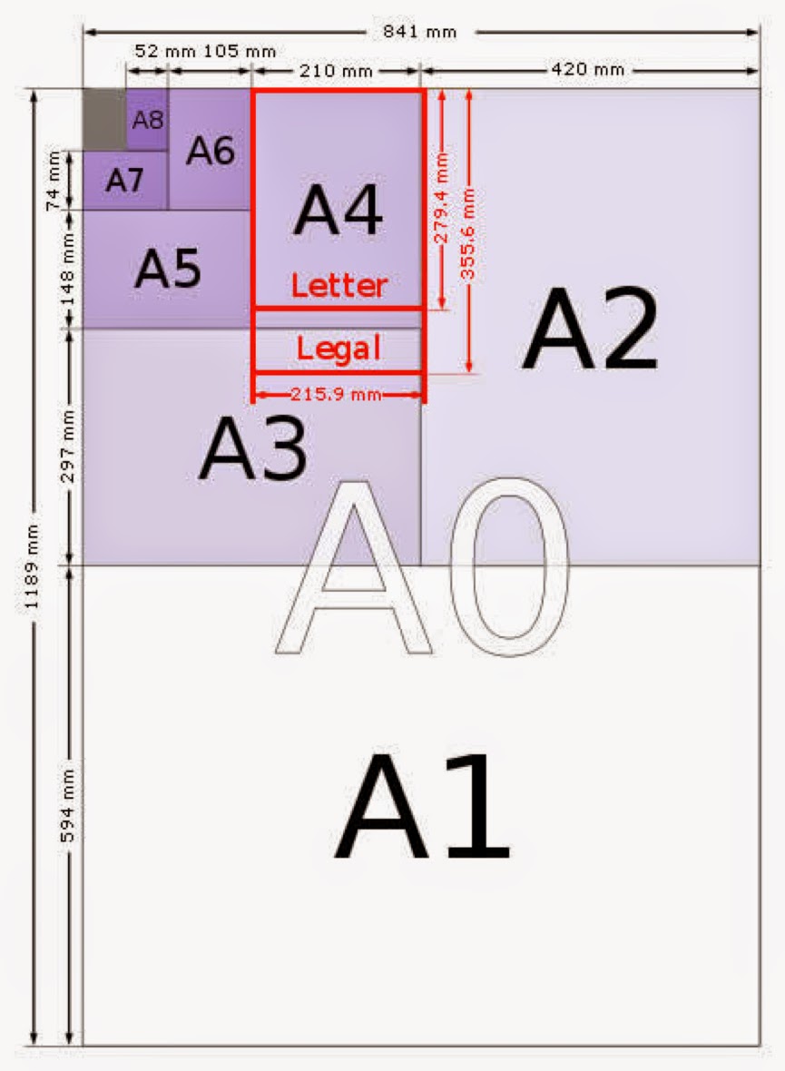
The fact is that A1 dimensions are
mathematically ‘perfect’, i.e. they are always half the size of a sheet of A0
paper when cut through the longer length. The base A0 size of paper is defined
as having an area of 1 m2. Rounded to the nearest millimetre, the A0
paper size is 841 by 1,189 millimetres (33.1 in × 46.8 in).
The significant advantage of this system is
its scaling: if a sheet with an aspect ratio of square root of 2 is divided into two equal halves parallel to
its shortest sides, then the halves will again have an aspect ratio of square root of 2 . Good for business as printing
companies will have much less waste, but perhaps not so good for artists who might want a more ‘personal’ relationship with paper size.
Working out weight to paper size, when using the
metric system, is reasonably straightforward. This calculator will help you. Grammage,
is defined as weight in grams of one sheet of paper that is one square
metre in area. It is sometimes easy to
forget how heavy paper is when you just use single sheets, but when deliveries
are made we often take paper in by packs of 500 (a ream) and these are seriously heavy. For some reason when ordering printing papers reams are often 516.
Another anomaly when looking at paper sizes
is that of newspaper sizes. If you look at the table below, you will see that
despite the introduction of ISO standards, the newspaper tabloid still
maintains a size based on a particular nation's traditional measures.
It’s
interesting that paper bags were first measured by how many pounds of sugar
they could hold.
In the USA paper grocery bags now come in a variety of
paper weights from light (30 lb.) to heavy-duty (70 lb.) and 14 stock sizes,
capable of holding 2 to 25 pounds.
If you
want to use paper bags to draw on, it costs only £3.49 for 1,000 5x5 inches white ones. (Price checked on the day of this
post).
Perhaps you could begin to
respond to these issues by building a set of personal measures. For instance a
yard could be determined by measuring the distance from your nose to fingertip, with arm straight out to side, head facing front.
This is a very useful way to measure rope and fabric. The thumb could be measured or a finger or
half finger. The palm of the hand or the hand span is another good place to
start, lengths could then be used to calculate surface area. A body surface area calculator exists here: you might find it useful to think about how much area your skin would take up if unfurled and laid out flat like paper.
Once a paper size or shape is decided on you could
think about how measures work in terms of other trades. Find a link here.
For instance Mohs scale of hardness could
be used to check on your art materials relative hardness or softness. As it is
basically a test done by rubbing one surface against another and seeing which
one is ‘rubbed off’, you could think about testing your papers and drawing materials in this way too. Graphite rubs
off on paper, so paper must be harder.
So what could you use to
determine paper size? Could it relate to the room you make your work in, should
its proportions echo those of a particular set of proportions you have researched and found belonging to an object or site that has a poetic significance? Should your paper size relate directly to your own body? What should it reference? Mathematical certainty, such as the Golden Section or found association, such as being exactly the same size and colour as a post-it note left on a fridge door that said 'WE NEED MILK'. One of the ways you can work as an artist is to find connections and significance between things and the more surprising these are the more intriguing the work can become.
See also:
Mathematics and metaphor
Research into paper


