I have recently bought a new pack of coloured pencils, and what is interesting about them is that they come as skin colours.
The fact that you can buy these coloured pencils in a skin tone selection is very interesting and at a time when the Black Lives Matters campaign seems to have reached a tipping point in terms of a global awareness of skin colour and how it has so often been a political, ethical, cultural and sociological issue, it seemed a good time to reflect on another set of entangled relationships that I hadn't previously thought enough about.
There is a project that was developed between the Leeds and Liverpool universities that aimed to collect a comprehensive skin database and to ensure that the colour reproduction of skin colours across a range of media was accurate. Human skin colour is of great importance for the cosmetic
industry and is even more important in medicine where accurate skin colour measurement
and reproduction are key factors in the spotting of certain illnesses. However, partly due to skin's multilayered structure, its non-flat surface and the uneven colour distribution over different body parts, and partly due to the fact that researchers had in the past concentrated on some skin types more than others, the current databases are patchy. Different
ethnicities and/or genders exhibit significantly different skin
colours. Tele-spectroradiometers and
spectrophotometers are used for measuring these differences in skin colour but they can give different results, something that might be annoying for the cosmetic industry, but fatal in relation to certain differences in medical diagnosis. Skin colour as a factual measurable concept is rarely thought about outside of these very specialised areas, it is usually a focus around which we look at how we construct difference. The often unconscious bias that develops because of being familiar with one skin colour does though also seep into these more technical areas of measurement, because many of the technologies for measuring skin colour were originally tested out on white or pale skins, these technologies have therefore embedded within them a cultural bias.
The advent of plasters that come in different skin tones is welcome, and long overdue, it has taken far too long for manufacturers to realise that there are a wide range of people with different skin colours worth making plasters for. It was not too long ago that if you wanted to buy plasters in 'flesh' toned colours they would always come as various types of pink, a sign that if you had a skin colour that wasn't a pale pink one, you were just not considered 'normal'.
I had intended to make this post about coloured pencils, pastels and chalks and for it to be mainly about the material differences between them and how they differ from wax crayons and oil pastels. However that pack of skin coloured crayons sent my mind off on a tangent, and I'll put up a post focused on coloured pencils, pastels and chalks another day. In developing this post I have become more aware of how societal and cultural developments are forcing technological changes as to what is available to us when it comes to reproducing skin colour and texture and that I had not thought enough about these issues before. What began as thoughts about how we use various different technologies and materials to construct images has morphed into thoughts about how as we develop reproduction technologies, we embed within them ideas about ourselves without even being aware that we are doing this.
It has for many years been recognised that film stock was calibrated using light coloured skins, therefore there were problems rendering darker skins. When a photographer was undertaking portrait images, a film stock calibrated for pale nuances, when exposed to a dark subject, would in that tonal range, produce a less differentiated series of tonal values, thus making it harder to see subtle nuances in emotion. Facial features set into a dark skin type were therefore crudely rendered and a face's emotive range was therefore reduced. This had a secondary effect which was of course that it appeared as if only pale skinned people had sensitive and therefore empathetic features. Indeed industry standard colour reference cards were at one time called 'Shirley cards' named after a woman called Shirley who's image was used as the 'standard'.
From Kodak's Shirley card
The photographers Adam Broomberg and Oliver Chanarin have explored the implications of this technological bias by producing work that reveals what happens when you use certain film stock.
From the exhibition: To Photograph the Details of a Dark Horse in Low Light
The design and chemical composition of film stock was a long running problem, so much so that in 1977 Jean-Luc Godard refused to use Kodak film on the grounds that the stock was inherently "racist". The light range was so narrow that to quote from the time, "if you exposed film for a white kid, the black kid sitting next to him would be rendered invisible except for the whites of his eyes and teeth". As a measure of how as a society we value profit over people, it was only when Kodak's two biggest clients, the confectionary and furniture industries, complained that dark chocolate and dark furniture were impossible to photograph properly, that it came up with a solution.
The title of the exhibition, 'To Photograph the Details of a Dark Horse in Low Light', refers to the coded phrase used by Kodak to describe a new film stock created in the early 1980s to address the inability of earlier films to accurately render dark skin.
I was interested to read in a recent interview with the general manager of Richard Photo Lab in Hollywood that, "Shirley wasn't really about variation, she was about, 'This is the standard,' and truthfully, in the real world, there is no standard." However as the interview went on he talked about how on computer monitors photo techs can now adjust the colours on every image and that the lab can now make custom made colour palettes for clients and it was pointed out that, "Photographers submit their own images, and we create their own Shirley for them, so we get the skin tones they like." However right at the end of the interview, we realise that things haven't changed as much as we would have hoped, and the white Shirley from the 1980s re-emerges. The manager points out that the Kodak software the lab uses from time to time has to be set back to neutral and as he says, "We all know what that neutral is, the old Shirley. She's still here," the lab manager admits. "We haven't really gotten away from her. She keeps coming back."

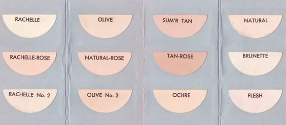
I have noticed that some paint manufacturers have now renamed what was a pinkish 'flesh' colour: 'flesh caucasian' but many others still sell flesh colour as the old 'normal' (See images above). However the issue is 'live' and Jackson's art suppliers have responded to it and have posted up a response to the issue. Jackson’s own artist oil paint known as Flesh Tint has subsequently been renamed Pale Terracotta, while its skin tones pastel set includes extra shades catering for a wider variety of ethnicities, and Winsor & Newton state that “while Flesh Tint is a historical colour name, this is not a part of our history that we will be carrying forward”, replacing it instead with Pale Rose Blush. Technology is never neutral and it has hidden within it ideas and concepts far beyond its utilitarian aspects. I well remember how the left handed at school struggled to write with italic pens and to cut with scissors designed for right handed people, simply by being in a minority of handedness they were disadvantaged. Living in a multi-cultural area of Leeds has made me very aware for instance that there are alternative cosmetic brands, such as IMAN and Black Opal, brands that have had to be developed because the big cosmetics retailers never made makeup for non-white skin tones. As different cultural groups develop economic power, the products and services they want are going to be developed to cater for their needs.
Black Opel cosmetic colour chart
A traditional Max Factor cosmetic range
The Max Factor range above is an old one, it dates from the time my mother was buying cosmetics and I well remember Max Factor being her brand of choice. It seems very strange now to see colours such as 'Flesh' and 'Natural' as pale pinks.
However, these are now the days of 'Multicultural wax crayons', in one case each crayon is titled 'Teach Me' as a reminder that skin colour is a political issue. Even Crayola has a 'colours of the world' set of skin tones as well as its own Multicultural range.
Multicultural wax crayons
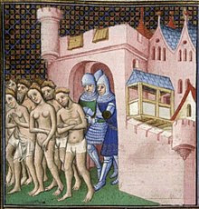
There will always be a gap between what a society has always considered 'normal', i.e. the things that the majority of people within it take for granted and a sensitivity to the needs of those in a minority or not seen as 'normal'. This gap, or division I realise could be thought of visually as a Markov Blanket. (See previous post) In order for any stable living organism to survive it needs to be able to both maintain independence and stability and be able to be porous to other things, so that it can maintain the necessary interdependence with everything else that exists around it. If it closes itself off it will fossilise and eventually die, if it allows everything to change all the time it will fall apart and lose its idea of itself. So there needs to be an area of structural hybridity, where things are allowed to move selectively from one environment into another. This can be managed peacefully and sensitively or become a battle zone and this is where I think art comes in. Artists by reflecting on these issues and others like them and by looking for symbols and analogies that might help us all think about what is going on, help to develop a more sensitive climate within which these societal changes occur. In this case by taking a scientific idea and opening it out into a wider context, hopefully someone reading this might be able to better reflect upon a situation that we are all having to confront. It is also about how we conduct our day-to-day lives and whether or not we can see purpose in the ethical stances we might have to make. In this case I would argue that in order to manage change peacefully, we need to reflect on why it is important and then if we accept that change is useful, we then need to look at how change is managed. If the situation becomes confrontational the surrounding Markov Blanket is in effect breaking down, which would mean that chaos begins to reassert itself and ordered structures collapse. My own concern as both an educator and artist is to find overarching principles to work with that can help me think about how sustainability can be theoretically embedded deep into the core of what I do. The Markov Blanket as an idea has helped me to think about how ecology works and how autopoiesis (a system capable of reproducing and maintaining itself) can only take place when a living system is sensitively embedded into other living systems, a system that allows for both independence and interdependence. The idea of the Markov Blanket has helped me to see how the concept of the Gaia principle could be integrated into how we respond to both local issues and the world as a whole, and I now find that it can help me think about other more cultural and political issues as well as environmental ones. The point here is not about whether or not this is a right or wrong approach, but whether or not the ideas I develop as an artist have some sort of moral purpose. If so, do these ideas allow for the building of deeper metaphors into the very structures and forms that I work with as an artist? I have no real answers to these issues and would worry if I did have, because it seems to me that the problem historically has been about divides between different peoples that all believe that what they think is 'right' and that other people's beliefs are heresy.
Expulsion of the Albigensian Heretics
Coda
Eugen Fischer's hair colour scale
There was something rattling around in the back of my head as I wrote this post, and then eventually it dropped into consciousness. The last time I was in Berlin I saw one of Eugen Fischer's hair colour scales. This standardised method for describing hair colour was used in the Norwegian race survey of 1920-21, and was used in the classification of racial types. So what degree of blondness do you need to be Nordic? How dark or light does your hair need to be to be outside of the 'normal' category? The hair colour scale I saw was part of an exhibition of Nazi approaches to race categorisation and hair colour was just one of many other examples of 'scientific' measurement used as 'proof' of racial difference. The book 'The Myth of Race: The Troubling Persistence of an Unscientific Idea' by Robert Wald Sussman is an excellent antidote to this type of thinking, and a reminder of how all measurement relies of ideas of difference. Once more it is an attempt to fix something down that leads us into problems, if we could only accept the constant flux of experience and be prepared to engage in the event of life, then perhaps we might not be so concerned with difference and look much more for similarities.
See also:
Paper and skin
Paul Klee and Markov Blankets
Talk given on the importance of Markov Blankets for a Drawing Dialogue symposium
Object Orientated Ontology Another attempt to find an overarching principle to work from
Drawing and the 12 principles of permaculture Working towards a manifesto
Drawing and life The aspiration
Pollution art and making pigments Another set of issues surrounding pigments
On naming colour
The artist Kabe Wilson's blog on skin tone


No comments:
Post a Comment