If structuralists are right, our perceptions of experience depend on how we have perceived all other previous experiences. When we encounter red, in order to define it or hold it in our heads as a distinct category, we contrast it with other colours, as well as compare it to entirely different perceptual categories. For instance, red is sort of like orange, but distant from blue, and nothing at all like pain or joy. Contemporary neuroscience has used this contrast and compare qualia situation to develop classification schemes of experience, often couched as abstract geometric shapes. “Our approach is to categorise all possible relationships between qualia,” says psychologist Nao Tsuchiya at Monash University and ATR Computational Neuroscience Laboratories in Kyoto, Japan, who leads the Qualia Structure Project.
The Qualia Structure Project is regarded as being fundamental to an understanding of consciousness and it has at its core a mathematical approach that uses a geometric analysis enabling researchers to boil data down to shapes. For instance, based on his experiments, Tsuchiya estimates that we experience at least seven dimensions of colour. A report on the project states that it "has turned some of the classic philosophical thought experiments into actual empirical experiments. For instance, "is my red the same as your red?" ...The project invited participants into the lab for intensive testing. Four were flagged as colour-blind on a standard screening test, four weren’t flagged but volunteered that their colour vision seemed different and three had typical colour vision. Within each group, people made the same judgements about the resemblance of colours, but between groups, these assessments diverged. By doing a geometric analysis, the researchers boiled the data down to a shape. That of the second group – the self-reported colour-blind people – had features of the shapes of the other groups. “It’s an intermediate shape,” says Tsuchiya. In the structural way of thinking, what we take to be red is defined by its position within this shape. So, people within a group were entitled to say, “My red is the same as your red.” But what was red for people in one group might effectively be green for those in another. Tsuchiya describes the intermediate, second group as a “bridge” between atypical and typical colour experience, able to grasp the colour experiences of both." (Togashi, 2026)
Recently the project has been studying emotion. They have been showing participants pairs of videos that are supposed to elicit emotional responses. The early results are that both highly sensitive people and far less emotionally literate people experience emotion interoceptually in similar ways, but some people are more able to communicate this experience than others. I thought this chimed with my own work. Most people seem to have some awareness of their interoceptual experiences but they differ in their ability to articulate this. My work is mainly to help people become aware of these experiences, whilst this scientific project seeks to measure them; a typical art/science divide.
From a series of images trying to visualise heartache
Tsuchiya says, “Experience is all about relationships,” He has used category theory to develop a descriptive language for these relationships, hoping that science will then be able to explain experience. If he is successful, he would like to build something similar to the periodic table to show how qualia work. However Loorits, in the paper 'Explanatory Relevance of Ineffable Qualia', states that the unanalysability of qualia is an important feature of human psychology. He brings in our experience of art to support this, stating that we often perceive experiences of art as unanalysable from the first-person perspective, until at a later stage we begin to adopt critical distance. I think this varies from person to person. I know some people that launch into analysis from the moment they experience art. I find that very difficult and am usually too overwhelmed by the experience to be able to break it down and analyse it, its only later, perhaps three or four days later, that I begin to think about what it might mean.
This debate goes on whilst at the same time I continue with my own visual research. I still talk to people and ask them what feelings might look like and I still draw shapes and colours and textures that are attempts to connect a feeling with a visual form and run workshops to see how people can develop their own visual language to represent internal feelings. If it is true that experiences are all relative to one another, then even one viewed by an individual differently will effect how all the others are seen by that individual. Professor Dr. Holger Lyre states that 'people with synaesthesia, taste words or smell colours and therefore perceive these connections directly, but all of us, he states make them, therefore he proposes that, “To a certain extent, we are all synaesthetes.' (In Musser, 2026) This statement by Professor Lyrereinforces my decision to use the kiki / bouba sound shape connection example as a starting point for visualising interoception workshops. I also think that it is fascinating to watch what type of geometric analysis the Qualia Structure Project will come up with, but my feeling is that it will still not be able to solve the conundrum of consciousness. I am though as an artist happy to use my conscious awareness to develop visual responses to unseen events. There is enough mystery in the processes involved in communicating the un-communicable to keep me interested for some time yet and hopefully at some point my work will be used as a sort of instinctual counterbalance to the work being conducted by the Qualia Structure Project.
A slide from one of my presentations on interoceptual awareness
Anger mask
Many years ago when I was at art college we had to look at the work of J. L. Austin, his book 'How to do things with words', was seen as seminal by my then tutor Keith Arnatt. We looked at illocutionary acts and in particular I remember being very interested in Austin's thoughts on the nature of pretence. Austin broke communication down into three parts, Locutionary Acts: The literal, physical act of communicating something, producing the sounds and constructing the words or making in our case, the art; the welding, drawing, painting processes. Illocutionary Acts: The performance of a communicative function in saying those words (e.g., using the words within the context of a warning or a promise), or presenting the artwork (framed perhaps by the gallery blurb as a warning, as an aesthetic experience or as an investment) and finally the Perlocutionary Act: The actual effect or consequence the utterance or exhibition has on the audience (e.g., persuading, comforting, alarming, or annoying them). Consciousness in Austin's terms was more to do with how we used language, but what if we were pretending? Pretending in relation to art seemed to myself to be to do with mimesis and mimesis was one of the art raft's central planks. Austin made a distinction between pretending to do and pretending to be. Pretending to be something, such as an angry person requires carrying out a string of related behaviours associated with that identity and eventually the pretence behaviour will become assimilated. I. e. you will eventually become what you pretend to be. This was the point of the anger mask. In order to think about how it feels to be angry, sometimes we need to assimilate the related behaviours associated with anger. As we do this, we can be more aware of what we are feeling. But what if you are pretending to see a colour? “Colour blindness” was not scientifically recognised until John Dalton’s seminal report in the late 18th century. (Taniguchi, et al, 2025) This delay implies that atypical colour vision may have long gone unnoticed because people communicated without difficulty using a shared colour vocabulary, grounded in largely overlapping phenomenology. An alternative possibility is that a shared linguistic system itself shapes colour experience in a way that renders their qualia similar. The act of using language to cover up the fact that you were pretending to see, being gradually assimilated, so that in effect people can see, even though they cant see what others do see. This belief that you can see what you cant see, was something I came across several times during my career teaching foundation students. I encountered several students who were colour blind but they had never realised it and had had no problems communicating colour experiences before. It was only when we were exploring colour mixing that this became evident. Once it was evident and we gave them a colour blindness test, most of these students then admitted that they had felt something was wrong, but had purposefully behaved as if their perception was the same as other people.
Perhaps all masks are like that, in wearing them we reshape our consciousness. If so an awareness of consciousness is perhaps another form of pretence behaviour, something that we hide behind, because without it we might lose our sense of self, which may itself be yet another mask.
References
Austin, J. L. (1975) How to do things with words Cambridge, Massachusetts: Harvard University Press
Musser, G (2026) The simple questions cracking the hard problem of consciousness New Scientist https://www.newscientist.com/article/2519288-the-simple-questions-cracking-the-hard-problem-of-consciousness/
Loorits, K. Explanatory Relevance of Ineffable Qualia. Acta Anal (2026). https://doi.org/10.1007/s12136-026-00682-6
In press: Robust individual alignment of color qualia structures: toward a structure-based taxonomy of divergent color experiences. Yu Togashi, Yuko Yotsumoto, Chihiro Hiramatsu, Naotsugu Tsuchiya, Masafumi Oizumi bioRxiv 2026.02.13.705699; doi: https://doi.org/10.64898/2026.02.13.705699
Taniguchi, T., Oizumi, M., Saji, N., Horii, T. & Tsuchiya, N.(2025) Constructive approach to bidirectional influence between qualia structure and language emergence. Philos. Mind Sci. 6
I’m travelling back from Glasgow after a few days visiting family, and as always if possible I went to see some artwork while I was up there. One piece on exhibition at the Gallery of Modern Art struck me as being of particular interest, especially because it brought into play several of the issues I have looked at over the course of the existence of this blog. A question I have asked several times is, “What is the relationship between an artwork and the world?” In relation to this overarching question are several others such as, does an artwork ‘model’ the world? If so how does it do so? But when we model the world are there models within models? How do moving image works relate to an expanded idea of drawing? What is the status of the storyboard within film-making, should it be regarded as being rather like a script for a play or as stage directions? Can computer generated art be looked at as a special type of drawing? When building a model, are the plans for the models an example of ‘disegno’ in operation? The movement from 2D to 3D that is proposed by making flat plans for 3D objects and working from them, can suggest a movement between dimensions, but can it also suggest a movement through time? How do we present work in such a way that the presentation itself fully realises the ideas behind the work and anchors the work into the world? If an artwork needs to be wired into the mains, what do we do with the cables and is this similar to plugging a work into reality? If an exhibition space is going to be a difficult one or one unsympathetic to the work, how do you as an artist reconcile this without compromising the work? The work of Cécile B Evans, ‘Something tactical is coming’ 2017, has allowed me to think about all of these issues and more. So perhaps I need to begin with what the work’s title had to say on the gallery wall.
The description of materials goes like so: Scale production model with chroma key paint, makibes screens, raspberry pi players, Real Game FX miniature fog machine, 3D prints, paper, wood, 3D printed mask dummy. 271cm x 138cm x 122cm. I am already asking myself a few questions just from this description, so a little research is needed. Chroma key paint is usually an acrylic based paint formulated to provide high luminance values and colour saturation for keying effects. Usually green but also blue, as it is in this case, it is a matte paint that does not reflect light, so it is much easier to ‘key’ out. If you want to make objects invisible when filming you can paint them all in the same chroma key paint, (this is often called green screen technology), so I’m already aware that this artwork has been used to create a background that was probably ‘keyed’ out in order to allow for some sort of substitution. Green screen filming is often used in fantasy or science fiction films, so I’m ready for some ‘special effects’. Makibes screens are touch screen interfaces often used for Raspberry Pis, the average size is 7in so we are talking small scale screen technology. A Raspberry Pi player is a video player specifically made to work with Raspberry Pi devices, which are manufactured as easy to access processing devices that support non Microsoft software such as Linux. Raspberry Pi devices were initially designed to help children and the everyday non tech computer user get into coding. A Real Game FX miniature fog machine is often used by gamers to add special effects to their model landscapes, such as mist to heighten atmosphere, as in the image below. Therefore I'm again presuming that at some point this fog machine was used to give a sense of enigma or mystery to any filming that was done using the set.
From Real Game FX website advertising the miniature fog machine
3D prints and the 3D printed mask dummy are both using a 3D printing technology that has seen a whole raft of start-up businesses involved in creating models, replicas, and miniatures. An aspect of current society I find very interesting and one that I have been thinking about now that I have begun my own investigation into 3D printing. Several items that are office furniture look as if have been made this way.
Detail of the office model
Most of the wood I recognise as 2 x 1 pine timber and sheets of plywood, which have been used to build what is partly a miniature stage set and partly a surface to which has been attached several small scale computer screens that are running a variety of shorts/animations both as real time footage and computer generated imagery.
Details of the wooden supports with embedded technology
This surface is also heavily annotated in order to make the viewer aware that each screen is hosting part of a complex narrative. Like scenes from a play, or episodes in a serial, the small screens are operating from the top left to the bottom right of the plywood and pine supported surface, the wires that connect all the devices are clear to see and the wooden surface facilitates their easy attachment. Nothing is hidden on this side of the object, which is the reverse of what we see on the other side.
Overall view of the back of the miniature stage set
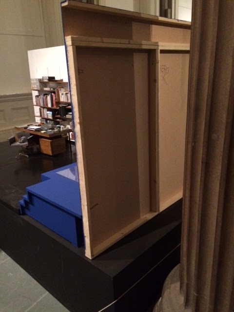
The reverse side or front, depending on which side you approach this object, is a miniature stage set, partly a highly detailed model of an office and partly a blue chroma key painted area.
The miniature stage set and blue chroma key painted area are adjacent to each other
As you walk around the art work you get to see both sides
(a classical column blocks the full view)
On a small model chair in front of a desk rests a grey 3D printed head. Tiny books are on bookshelves and miniature files some of which are labelled RIBA, are part of what appears to be a miniature architect’s office.
Model chair on which sits a 3D printed head
This text accompanies the work and is attached to the gallery wall, and it is quite complicated. “The question of the creation of new worlds, and specifically worlds created for networked living, is at the centre of Cécile B Evans’s work, ‘Something tactical is coming’; a sculptural installation developed from a scale model used in the filming of Episode two in her series called ‘Amos’ World’. The series, a fictional television show about a socially progressive housing estate, features Amos – an architect who has designed what he believes is a perfect individual–communal living structure. Throughout the three episodes and their installations (which will be shown in a major exhibition at Tramway, Glasgow in November 2018) the tenants of Amos’ “building” question their relationship to the structure that has been created for them. The architect’s office becomes a working site as his carefully constructed world, its nature and culture, begins to shift.”
We now know that the object we are looking at was developed from a scale model used for the filming of one part of an episode of a fictional television show. So what we are looking at is a model, which has then been added to and the model represents a fictional idea of an architect’s office. In the Gallery of Modern Art the model film set is raised up onto a 'plinth' for display as an object in the gallery. The plinth effectively 'makes it art' by removing it from the floor and raising the what was a working model up into a new status as metaphoric object.
The set in use
The additions would appear to be the area designed to carry the various screens and raspberry pi technology as well as a base or plinth. The blue chroma painted area is to facilitate the editing out of puppet manipulation.
The set in operation, the architect doll is being manipulated
We can see from the snippets of information on the small screens fixed to the back of the miniature stage set that special effects have been used and that the hands and arms manipulating the architect are used as part of the idea.
We also know that a major exhibition of the work being done by the artist will be held at Tramway, Glasgow in November 2018. This is therefore a spin-off from this work, perhaps a way of raising awareness that it is being constructed. Could it be that this work is being made to operate as a model for the forthcoming exhibition? Synecdoche is a rhetorical term, whereby a part can represent the whole, and I’m beginning to think that this is what is happening here. If you have ever seen the film ‘Synecdoche New York’ you will know what I mean.
Fictional ‘episodes’ are a way to hold a viewer’s attention over a long span of time. An epic adventure is usually broken down into episodes so that it can be told as a series of stories that the narrator can link together gradually over time. When my children were small I used to tell them a long on-going story, each evening you could remind them of where we had got to and then add on a next bit, it keeps attention and builds complexity because you can always be referring to things that have happened in past episodes; thus the success of soap operas.
Architects are real-life professionals; they are often concerned with creating buildings that will enhance the living conditions of ordinary people. Le Corbusier’s idea that a house is a machine for living in, suggests an idea of the architect as impersonal control freak, Ayn Rand’s architect hero of her novel the Fountainhead, foregrounds the idea of the architect as visionary, and I suspect that Cécile B Evans has these models at the back of her mind. The models (stereotypes) this time are of the way people behave, rather than imagined stories, but perhaps we are all imagined stories and that is the point.
A model stage set is very like a doll’s house. When taken out of the context of the film studio its tiny scale becomes almost fetish like. We as observers are now on a God-like scale, able to imagine ourselves moving things and people about. (Hence the blue arms manipulating the model of the architect) But this work is also real size, a support structure for a range of technologically sophisticated devices that have to be wired up and plugged in. We can however slip from one level of reality into another very quickly. We turn our TVs on, push a few buttons on our remote control devices, with an awareness that these things are part of the furniture of our room, but within moments of a film starting or a soap opera beginning, we are lost in a fictional reality and are happily suspending our disbelief. As a creature we seem to have developed a very powerful ability to respond to fiction as well as reality, something probably honed in play when we were very young. The miniature battlefields I remember building as a child were ‘real’ to myself and my friends, the stone throwing ‘explosions’ that knocked out our soldiers, created bursts of real palpable exhilaration in ourselves as we jumped with excitement if our stone throwing had resulted in a direct hit and the knocking over of a rival’s men. These muddy model battlefields were part of my learning curve and as an artist perhaps I have never outgrown them, which is perhaps why I have taken Cécile B Evans’ work so seriously.
The model film set is raised up onto a 'plinth' for display as an object in the gallery. The plinth effectively 'makes it art' by removing it from the floor and raising the what was a working model up into a new status as metaphoric object.
Evans' s work has been reviewed in several major media outlets such as the Guardian
"AMOS’ WORLD is a three-part television series that takes place in a socially progressive housing estate inspired by famous Brutalist housing complexes such as Le Corbusier’s Unités d’Habitation in Marseille, Berlin, and Nantes-Rezé (1952—57), Alison and Peter Smithson’s Robin Hood Gardens in London (1972), and Moshe Safdie’s Habitat 67 in Montreal (1967). The aim was to encourage perfect individual-communal living communes for the capitalist age—yet they nearly always failed, as people did not conform to the behaviors envisioned by the architects.
The first episode of AMOS’ WORLD introduces the title character Amos, who represents the stereotype of the frustrated, angry white man. He exudes an arrogance that belies his true, slightly pathetic nature, and he almost enjoys wallowing in the grotesqueness of his own actions. He additionally resembles a cross between Antoine de Saint-Exupéry’s fallen-to-earth Little Prince, and architects Le Corbusier and Peter Smithson, who co-designed the famous London social housing estate Robin Hood Gardens, only to later describe the tenants disparagingly as contributors to the building’s decline.
Amos is played by a three-dimensional puppet with a digitally rendered face, and the other characters—inhabitants of the estate, and the Weather, a narrative voice as well as a kind of benevolent foil to Amos—are a mixture of real and animated performers. As in all good television, the subject of the title, Amos, is never the actual subject. As the drama unfolds, what was presented as a utopian living situation becomes ever more psychologically challenging—the characters’ emotional and physical needs are revealed to be in conflict with what those who constructed this society believe to be “good.” Fissures in this carefully constructed network reveal a breakdown of person-to-person and person-to-infrastructure power dynamics, as the audience themselves look on from units nested within an architectural construction built to echo that on screen."
The architect puppet, with 3D printed face
Evans opens her work out by using all the formats available to her. The clips from Amos' world below could be seen as a trailer for the series or as another stand alone work.
A trailer for Amos' world
Media conventions overlap with artists techniques such as montage and collage in Evans' work. She mixes conventions in very interesting ways and has a lot to say about current issues of technology and the way that human feelings and emotions are changed or moulded by contact with it.
She cites 'collage' as being the technique that underlies her current approach to making art. Collage can be used to create storyboards and is an excellent medium with which to create ideas, especially ideas that reflect on our media soaked world. (See)
Collage occupies a fascinating position between reality and mimesis. Collage materials are taken from the world but can then used to create commentary on that world. Models are made with different degrees of reality in relation to the world and are then used to create ideas whereby we can play out thoughts about real world situations. The office in Amos' World is a constructed environment, certain elements of which are made and others simply collected and reused in a different situation. The small screens playing out various episodes of Amos' World are so small they appear a models themselves, models of TV screens that it is imagined on which the soap, Amos' World is screened.
Evans's work has helped me to think about how very different aspects of my own work could be brought together, as well as this particular piece helping me to think about recycling work and creating ways of presenting work so that a difficult environment can be dealt with. The classical columns of the Gallery of Modern Art are hard to work with but by having a totally contained world with its own plinth and space for video monitors, Evans has been able to still engage and intrigue her audience.
Drawing from
photographs is something I find very difficult. The problem for me is that I
end up copying rather than selecting, and therefore I always draw directly from
the world, something I find far easier as the process is very selective and it's me doing the selection. However the relationship between the camera and art is a long one,
starting with the invention of the camera obscura and continuing into the
present as artists seek to explore how a world of instant imagery and mobile
phone selfies can be reflected upon by the slower processes of painting and drawing. Check out the book, 'A Brush with the Real: Figurative Painting Today' by Valli and Dessanay, which unpicks a lot of these issues.
David Hockney has
explored the history of pre-film camera art in his book ‘Secret
Knowledge: Rediscovering the lost techniques of the Old Masters’, it’s a really
good read and his viewpoint is from that of the artist rather than the art
historian which is always refreshing.
A Hockney drawing from ‘Secret Knowledge’
So how are artists
dealing with the camera? There are vast amounts of ‘copyists’ out there and if
you Google Photorealism you will find a raft of not just past practitioners,
(apparently you have to have had exhibitions before 1970 to be a real
Photorealist) but a host of artists still painstakingly copying from
photographs. It’s skillful and hard work, but where does the art come in?
I shall try and unpick
a few issues around this and at the same time introduce a few artists that I
think are well worth looking at in relation to contemporary drawing.
Kevin Cosgrove is an
artist that I think uses photographs in a very personal way. His interest in a
particular subject matter is very powerful. He draws and paints places of work.
Old fashioned work, places of oil and metal and grind. Those small workshops
that used to at one time be everywhere but are now becoming few and far
between, as manufacturing is outsourced and people start to forget that things
can always be repaired. Perhaps the car mechanic is the most familiar figure in
this world; I get glimpses of their dark workshops when I have to leave the car
for its annual MOT. Cosgrave obviously loves the feel and texture of those workshops
and he takes photographs of these places to work from. However when he selects
from the photographs he selects aspects that he will heighten through a touch
soaked in a metaphorical dark oil. Read this review of his work.
The drawing below is charcoal on paper 108 x 150 cm, large enough to get
stuck in with a big soft lump of charcoal, the dark patches below the workbench
creating those mysterious dark spaces we all remember from childhood. Those
dark spaces where the bogyman lives. He feels for the surfaces and textures of
old paint cans and tools, their worked surfaces further worked in his drawing.
Although the drawing is done from a photograph, he re-shapes what is there,
gives additional emphasis and thus transcends the image and makes it his own.
Kevin Cosgrove
Paul Chiappes works in a very different way,
but his is also in his own way re-creating rather than just copying photographs.
This time the scale issue is reversed, he works on images that are even smaller
that the original photographs. His subject matter of old school photographs,
images from long ago parties etc. is suffused with nostalgia and it is only
when you realise the scale that we get the hook into the
work. Scale makes us move around. We have to stand back from some images, their
large size forcing us back until we are in a position to see them as totalities
rather than as a surface of marks. On the other hand tiny images force us to
examine them very closely, like those paintings reproduced on postage stamps.
Chiappes’s marks can only be seen when you look at his images from about 4 inches
away. They suggest an obsession and intense involvement with the images, but
one totally different in quality to Cosgrave’s.
Paul Chiappes
Clive Head makes paintings and drawings from
places that he visits over and over again. He takes photographs and makes small
drawings on the spot. This is how he describes his working process, “Before taking photographs I make lots of little drawings and sketches as
well. The initial construction of the painting is drawing and I always draw on
tracing paper, which is very resilient if you keep rubbing it out. Although I
make a tiny drawing at the beginning that drawing has probably gone through
30-40 different stages before the final version of the painting. The small
drawing will give me an idea of the format for the painting.”
He then goes on to draw out his images large
scale ready for painting. Personally I like his drawings more than his
paintings, the final finished images being perhaps too finished for me, all the
hard won processes and thoughts are eventually hidden beneath the paint, the
final finish of which I’m not sure about. Even so his working methods are
interesting and hard won, so I cant really criticise the man.
Clive Head
Head is particularly good at drawing curved space, which is something I've been interested in for a long time and as I also make large drawings I am very aware of how much physical effort they take. The lesson that all of these artists teach is that you need to have a clear idea about what makes an image if you are going to move beyond the photographic copy. Of course our very own Richard Baker makes images from photographic sources and you can find a book on his drawings in the college library. The print below, an etching, was printed at Workshop Press.
Resemblance is a powerful communication tool.
We have experiences and these are coming into our bodies via sense perceptions.
Therefore our initial building blocks of sense making are ‘embodied’. The
writers Johnson and Lakoff have written extensively on how this works see:
Johnson, M. & Lakoff, G (1999) Philosophy in the Flesh: The Embodied
Mind and Its Challenge to Western Thought London: Basic Books
Lakoff, G (2003) Metaphors We Live By London: University of Chicago Press
Johnson, M (1990) The Body in the Mind: The Bodily Basis Of
Meaning, Imagination, And Reason London: University of Chicago Press
The core idea that Johnson and Lakoff develop is that we make meaning by linking
things to what we know and the thing we know most about is our own body. They argue that the mind is 'embodied', i.e. that if we were a different shape or size, or if our sense organs were different, like a bat's for example, we would think very differently, therefore the old mind/body divide, as illustrated by Descartes' maxim, 'I think therefore I am', needs rethinking. Taking
a concept such as ‘justice’ Johnson and Lakoff trace this back through what
they call body schemas. We are very aware of balance because of the fact that
we stand on two legs, therefore we spend a lot of time being balanced in order
to stand, walk etc. If something goes wrong we are off balance; for instance if
we are injured or ill. Of course in extreme cases such as very old age or bad
injury, we can’t rise into a balanced position. Gradually an awareness of
balance and off balance becomes transferred to an awareness of things being right
or wrong. This gradually evolves into a sense of justice and this is why we
have a statue of justice with a pair of scales over the Old Bailey law courts. It is this type of
connection through resemblance that allows us to develop sophisticated concepts
via what can be seen as quite basic similarities.
Statue of Justice Old Bailey law courts
Our first attempts at communication would probably
have used likeness and so would therefore the earliest art forms. A stone that
perhaps looked like a body or a rockface that looked like an animal. The Grey Man of
Merrick is a typical example.
The Grey Man of Merrick
But
we have other connections to things that are much more interesting.
Look at this picture of deer tracks. The marks look nothing like a deer,
but the experience of watching a deer walk past on muddy ground tells us that
these are the marks made by their cloven hooves, therefore a more complicated
link is made. These tracks become signs that can stand for a deer. By building
on these different types of resemblances we gradually start to build
sophisticated languages. A resemblance doesnt have to look the same as
something, it simply has to have some form of connection to something.
Analogy is
another concept that is central to how ideas associated with mimesis work. An
analogy is usually defined as a
comparison between one thing and another, typically for the purpose of
explanation or clarification. Think about those ideas that are ‘more like’ and
‘less like’ something. As humans this is a game we can all participate in, but
it is also a game that relies on common experiences. If you have never seen a
river you won’t understand an analogy such as ‘time flows like a river’.
Melancholia by Albrecht Durer is an
allegory; allegory is often defined as an image
that can be interpreted to reveal a secondary meaning, typically a moral or
political one. However allegories are constructed by building upon analogies.
Melancholia by Albrecht Durer
So much
has been written about this image that I don’t really want to add any more, but
it would be interesting to trace the layers of history that lie behind Durer’s
imagery, to explore how geometric figures are slowly transformed over time into
forms that stand for concepts, how children are used to stand for various
concepts from innocence, to the idea of the tabula rasa, or in this case the
concept of the accompanying spirit or ‘genius’. Why does the central figure ‘Melancholy’ have wings and how did the keys
and money bag hanging from her belt become symbols for power and wealth? What
is interesting is perhaps the journey that these things have taken on the road
towards becoming symbols. It is a journey that starts with ‘resemblance’ and
this is why mimesis is such a rich area within which to explore ideas.
Keith Coventry: East Street Estate1994
Going
back to Keith Coventry, (see the post before last), the Tate Gallery has this to say about his work:
"Coventry’s
painting and sculpture from the 1990s use modernist conventions to reflect
abstractly on the social realities of urban life – his ‘Estate Paintings’ mark
the rupture between the aspirational aesthetic forms of postwar planning and
the failure to realise utopia on a social scale. At the same time the series
signifies an optimistic, all-encompassing value system; while falling short of
grand expectations for a new order, the ‘Estate Paintings’ commemorate a
certain moral and political conviction gradually abandoned by the dismantling
of the United Kingdom’s welfare state".
This is a contemporary allegory. Artists are still trying to make
allegories and in doing so rely on mimesis in order to build ideas through
resemblance. It is for me a key and enduring concept that links contemorary practice back to thousands of years of art history.
Texts and web-sites associated with these last three posts
Gombrich, E (2006) Art and Illusion
Kamdi, M. M. (2004) Art and Cognition: Mimesis vs. the Avant
Garde London: Routledge
Hanssen, B. (2000) Walter Benjamin's Other
History: Of Stones, Animals, Human Beings, and Angels San Francisco: Uni of
California Press
Halliwell,
S (2002) The Aesthetics of Mimesis: Ancient Texts and Modern ProblemsNew York: Princeton University
Press
Bolt, B (2007) Material Thinking and the Agency of MatterStudies in Material Thinking,Vol. 1, No. 1 (April 2007), ISSN
1177-6234, AUT University http://www.materialthinking.org/sites/default/files/papers/Barbara.pdf