Friday, 5 May 2023

A Tall Order: Touchstones Gallery Rochdale


Claudette Johnson: Woman with earring Collection of Lubaina Himid

I went over to Rochdale recently to see the Touchstones gallery exhibition, 'A Tall Order'. This was one of the best exhibitions I have seen recently and it reminded me of how important and vital a gallery's curatorial policy can be to the continuing purpose and belief of both art practitioners and the various publics that follow contemporary art. Rochdale Art Gallery under the curatorial steerage of Jill Morgan in the 1980s held some seminal exhibitions and was showcasing the work of artists whose work still resonates today. In fact many of the problems that were raising their heads in society then have continued to confront us and I thought the exhibitions revisited could have been held this year and would still be pertinent. In a letter dated 16th of March 1987 Jill Morgan the then Exhibition Officer stated; 
“Our policy is to encourage new audiences for art, particularly women, black communities, young people, those with disabilities, and to encourage cultural activity for working class communities. Broadly, to change the domination of art by a white middle class male audience and producer. A tall order!”

The focus on exhibiting artists engaged in critical and socio-political practice both gave a platform to those who were not being offered the opportunity to show their work in other high profile publicly funded institutions and provided a focus around which local issues could be reframed within wider national debates. 

The recent attempt by many of our art galleries to readdress their holdings and former curatorial stances in recognition of previous bias seems so tardy in relation to what was going on in Rochdale in the 1980s. Forty years ago a public art gallery was addressing these issues and the then curatorial team were proving that if you have vision and commitment you can make a difference. 

I was particularly fascinated to see how the exhibition had been curated because I was very aware that Dr Derek Horton, a Leeds based curator had been involved. Back in the 1990s Jill Morgan came to Leeds and it was also the time I was studying for my MA in art and design, something I did at Leeds Metropolitan University which was where both Jill Morgan and Derek Horton were then teaching. I have mentioned Jill in a past post, citing the time when she asked the question, 'why is a painting seen as more important than a jar of home made jam?'  It was those sorts of questions that opened people's eyes to the snobbery and elitism of the art world. People have always been happy to put their cakes and jams into local competitions whereby their efforts are judged and compared by other local people who have been entrusted to be fair and robust in their judgements of taste and structure, as well as of colour, texture and smell. Are these not aesthetic qualities and yet these types of activities are excluded from art galleries. Just as the best marrow, onions and potatoes are exhibited and judged in gardening competitions in church halls and local community centres up and down the country, but never in art galleries. Jill's question has still not been answered. Instead the elitist art world has maintained its grip and it could be argued that what it has done is to teach those who were outsiders how to make art that now makes them insiders. Where are all the tattoo artists, the flower arrangers, the finger nail painters, the henna artists, the graffiti writers, the cake decorators, the knitters, the wood veneer artists and all the other people who make aesthetic judgements and use high levels of craft skill in the making of their work? 

I also picked up a Harry Meadley brochure while I was there. Harry is another Leeds based artist and who has both Leeds College of Art and Leeds Metropolitan University associations. At one point he managed to negotiate the turning of the gallery spaces of Touchstones over to the people of Rochdale. Following a public call-out to schools, community groups, artists and everybody else, a programme of family events, crafts, film, wellbeing and art was devised where the boundaries between audience, artist, participant or performer were purposefully broken down, so that people could rethink what a gallery space was for. He had previously managed to get the gallery to try and show all their normally hidden holdings. His work 'But what if we tried?' being a provocation that only a gallery like Touchstones would respond to, and they took up his challenge to show everything in their archives. What is of course interesting about both Jill's question and Harry's provocations is that both of them I firmly believe, still advocate 'art' as something purposeful and life enhancing but question its formulation as an elitist occupation. The process of indoctrination into art thinking is still one I remember well. As someone who used to make small images of the steelworks while on night shifts, images that were appreciated by my fellow workers, as someone who then got into an art school in order to undertake a pre-diploma and found his whole summer's hard work of drawing as accurately as he could was held up to ridicule as being devoid of any 'proper' understanding of what drawing was about. As someone that on entering the next level of art education which was the DipAD, went out and found a disused open air lido, with much potential for image making, and then working hard to make those images, was told his work was old fashioned and that it was of no consequence and that what he should be doing was reading Clement Greenberg and making flatness an issue. Gradually I learnt the rules of the game and by my third year I was making work that pre-figured Sherrie Levine's appropriation games by several years; remaking Duchamp's 'Bottlerack' by hand, an art gesture that finally allowed me to make something hand crafted that was also seen as 'clever' and therefore worthy of praise. On leaving art college it took me several years to reboot as someone who loved drawing and who still wanted to make images that related to everyday life. But I now knew the 'tricks of the trade' and could position my work in ways that the art business found acceptable. But in that positioning I knew I was excluding my old steelwork admirers, my family and many of my oldest friends. The ideas I was being introduced to were of course also wonderful, but they could have been introduced in a very different way. Instead of dismissing my previous experiences and ways of understanding the world, they could have been introduced as also being of significance. The fact that as a young man I was prepared to spend a lot of time crafting something was ignored, but that crafting was both a celebration of labour and a love of materials. Perhaps looking back that love was suffocating the material rather than releasing it to be what it could be, but even so the making began with love and care, attributes that I still think are central to how we build our relationships with the wider world. 

So what am I saying here? I'm not saying that art has no value. I'm also not saying art cant be evaluated. What I am questioning is who controls the value system, who decides what is good and what is unworthy of attention? These are questions the exhibition in Rochdale asks and which have obviously caused me to reflect on them too. The fact that so much of the work is good is a tribute to the curatorial skills of Dr Derek Horton and his fellow curator Dr Alice Correia. Carefully threaded around a developing narrative, the curatorial team obviously knew their subject very well and were able to source images that both exemplified what was happening and that still had traction for today. 

There are several drawings in this exhibition, but also painting, photography, video and three dimensional work. In terms of drawing, I was reminded of how powerful the work of Sonia Boyce, Sutapa Biswas and Lubaina Himid was at the time, but I was also reminded that Steve Bell's drawings for the Guardian were an essential other voice and that Paul Butler was making drawings using traditional techniques that seemed to be at the same time very pertinent to what it felt like to be alive in the 1980s. 

The exhibition closes on Saturday, and if you have a chance to get there, do go.

I have a few images taken on my mobile while I was there. Every image behind glass also therefore reflects its environment. As this exhibition was as much about the gallery and its history as the work, perhaps for once these reflective images were appropriate. So bear with some of the crazy reflective images and try to look behind the glass. 

Sonia Boyce, She Ain’t Holding Them Up, She’s Holding On (Some English Rose), 1986


Sonia Boyce


Sarah-Joy Ford


Stephen Willats


Paul Butler


Sutapa Biswas

Glenys Johnson

Lesley Sanderson

Chila Kumari Burman


Benjamin Slinger

Lubaina Himid

Coda

When returning to Leeds I had to wait a while on the platform at Rochdale station. As usual when left to my own devices, I made a drawing to pass the time. What took my eye was the juxtaposition of very different architectural styles, in particular I became fascinated with how the domed building, which I later found out was a Catholic Church dedicated to John the Baptist, was set against a typical example of contemporary modernism. I could see another metaphor emerging, but perhaps a far too easy one. Inside the church there are some beautiful mosaics, and you can look at them on line. See

View from the platform Rochdale station

See also:

Feldman's model of art criticism 

Drawing and politics

Drawing as a vehicle for sexual politics 

Drawings on show at Leeds City Art Gallery


Monday, 1 May 2023

The Spirograph

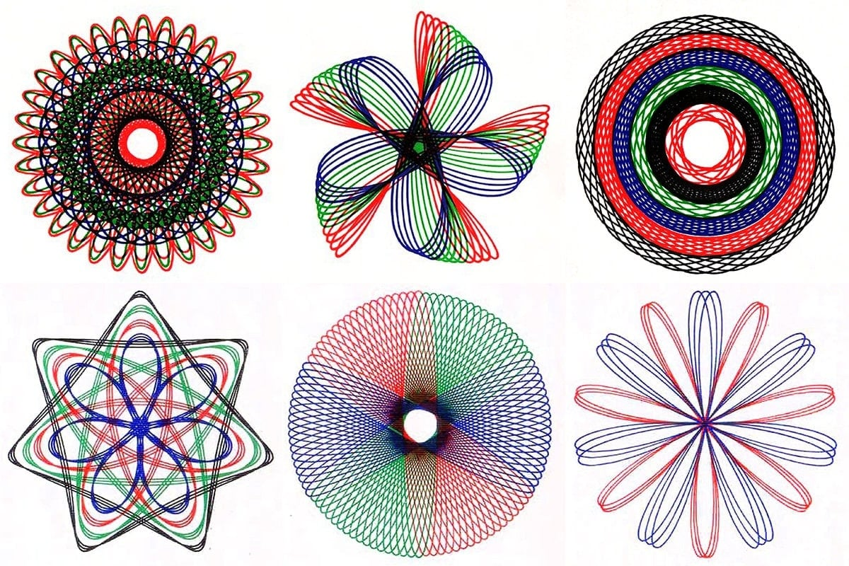
Spirograph Drawings

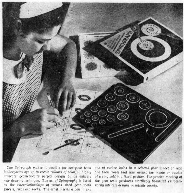
Back in the 1960s we saw the arrival of 'Sprirograph Art'. The art of 'Spirography' as it was called at the time, was based on making drawings using different coloured biros that you could insert into various holes in plastic gear wheels, one of which was then held in a fixed position, while the pen point was pushed forward to rotate the gear it was inserted into. Complicated epicyclic curves then described the interrelationships of various-sized toothed gear wheels, and by swapping the wheels but keeping the same fixed gear, you could develop very compelling geometric images. 


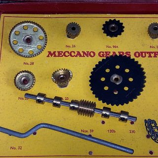
If you travel along Meanwood Road in Leeds you will pass the premises of Kingfisher (Lubrication) Ltd, a company that has been in business since the 19th century and which is mainly known for its precision made grease nipples. The Fisher family were the owners and in the 1950s their son Denys Fisher decided to go to his local university to study engineering. After leaving The University of Leeds Denys then joined the family firm, but he soon decided to set up his own company, Denys Fisher Engineering. By 1961 his company was supplying NATO with springs and precision components for its 20mm cannon and Denys Fisher had begun rethinking how to use his boyhood Meccano sets. In the early 1960s he developed drawing ideas by fitting pencils into the various holes in Meccano pieces, many of which were gear wheels, and seeing what sorts of shapes could be drawn. 


The types of wheels, connectors and gears in Meccano sets

Fisher began to realise that a combination of geared precision engineering and the geometric logic that lay behind the drawing of forms such as cardioids, could be combined to create drawing tools. As an engineer he was used to using drawing stencils when needing to make complex shapes and in the 1960s these were usually made in transparent plastic. A new fad had been around for a few years called 'nail art' and it relied on the development of geometric forms from straight lines. What this had done was to show the general public how beautiful pure geometric form could be and in a time that had a very positive view of everything scientific, geometry not only seemed beautiful, it seemed to offer a future far removed from the grim days of the second world war. Nail art brought an appreciation of maths and engineering into the living room. Simply by having one of these artworks on the wall, it was believed that children would see how beautiful geometry was and would want to be scientists and engineers when they grew up. You can imagine how a trained engineer like Fisher would have seen the potential of the circle if the straight line could be seen as such a powerful shaper of beautiful forms. 

1950s 'Nail Art'

For instance a cardioid is formed by rolling a circle's path across the circumference of another circle, all the while keeping its radius the same. The cardioid is named after the Greek word for "heart" and I suspect it would have been one of the forms made by straight lines that Fisher looked at. The important fact was that its beauty could be appreciated by people who were not also engineers or scientists and he may well have seen a string art cardioid on someone's wall. However although it looks like a Spirograph image, it isn't. 

How to draw a cardioid

A cardioid

If you look at the image on the lid of a Spirograph box you can see how it works. One large geared wheel in the form of a flat circular band has a wheel moving around its inside, a hypotrochoid and a wheel rotating around its outside, an epitrochoid. 


A Spirograph produces mathematical roulette curves of the type technically known as hypotrochoids and epitrochoids. A hypotrochoid is a roulette traced by a point attached to a circle of radius r rolling around the inside of a fixed circle of radius R.
A hypotrochoid

An epitrochoid is a roulette traced by a point attached to a circle of radius r rolling around the outside of a fixed circle of radius R, where the point is at a distance d from the centre of the exterior circle.

An epitrochoid

The Spirograph as it was called, first went on sale in Schofield's department store in Leeds in 1965. A year later, Fisher licensed Spirograph in the USA and in 1967 Spirograph was chosen as the UK Toy of the Year.

The US advertising blurb stated that 'No artistic talent is needed to create handsome decorations in black and white or colours — ranging from simple figures to fantastically intricate patterns.' 

The blurb went on to state, 'Professionals have actually used the Spirograph to design fabrics for dresses, patterns for plates, and ornaments used in printing. But for most people, it will be enough to enjoy the fun of making the designs that the set produces in fascinating, endless variety.'

So you had a product that covered both the art and design worlds and you didn't need any talent, but it was also, 'Fun for math buffs, too. You needn’t have a bent for math to enjoy the Spirograph — but if you have, it will fascinate you all the more.' This device seemed to straddle both art and science and as it was aimed at children, it could be seen to educate them in both art appreciation and science awareness at the same time. 

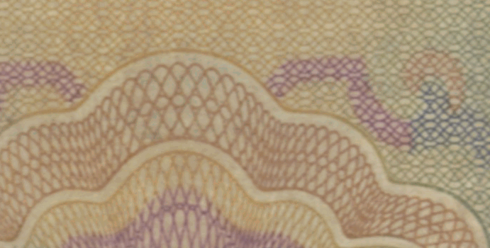
The Spirograph toy was in fact a new version of an old idea. Precision machines called rose engines had long been used to engrave ornamental designs for paper money and if you have any, (I realise this is becoming a rarity) you might want to take a close look at it and you will probably find that it still has engraved into its surface the patterned decoration produced by a rose engine lathe, which is technically called a guilloché.

Guilloché detail from a bank note

Nothing escapes politics. The UK Government has for a while now been advocating STEM (Science Technology Engineering Maths) as the focus for the school curriculum and people in the arts who are worried about the one sidedness of this approach, have been trying to get the Government to also think of STEAM (Science Technology Engineering Art Maths). The Spirograph and its more recent competitors such as the Hypnograph have therefore had a revival. The blurb for the Hypnograph states this: 'Unlike other drawing machines that have hard to understand ratios, the Hypnograph uses an easily understood set of gears. They are all based on factoring the turntable which has 60 teeth. 60 factors into 2 x 2 x 3 x 5. This lets you easily understand the greatest common factor in the set of gears. A 30 gear has a Greatest Common Factor of 30 with the 60 teeth on the turntable. This means that the 30 gear will produce a drawing with 2 curves (nodes). The instruction book provides a chart so you don’t have to do the math but there is also a good explanation of what’s going on with the gears. A couple teachers have told me that it was the best visual explanation of Greatest Common Factor that they had ever seen.'

Hypnograph drawings

Wild Gears

Wild Gears is slightly bigger than Spirograph and is designed with an adult audience in mind. It takes a high level of dexterity and control to use these gears and a fair amount of setting up. The key issue is that all of these drawing machines stress the interrelationship between art and science and assume that beauty of form is both an aspect of art and is arrived at as a result of following geometric principles. 

Tom Shannon

If we now move on and enter the art world the same ideas persist. Geometric principles now described by the artist users as 'forces of nature' but take away the paint and the mess and what you have is another visualisation of a certain type of geometrical or physical principle. In this case instead of using a Spirograph, if you want to make a beautiful drawing, fill a bag with fine sand or drippy paint, tie it to a long string, cut a small hole in the corner of the bag and set up a pendulum construction. 


Joe Kotas

Joe Kotas

Artists like Tom Shannon and Joe Kotas have linked their more painterly approaches to pendulum type drawing machines and because of the perfection of form which emerges if you use a pendulum drawing machine, they have made 'beautiful' art. Do we have to remind ourselves of the 1960s advertising blurb,  'No artistic talent is needed to create handsome decorations in black and white or colours — ranging from simple figures to fantastically intricate patterns.'? Both Shannon and Kotas would state that the reason their work is so special is that they do have artistic talent. But it is perhaps Damien Hirst that has taken this type of idea on to its logical conclusion. 

A work generated by The Beautiful Paintings by Damien Hirst

It has been hard to escape Damien Hirst's latest venture. He has collaborated with international art services company HENI to present his latest project, 'The Beautiful Paintings,' which blurs the lines between digital and physical art through the use of generative and machine learning algorithms. I quote, 'Based on the British artist’s iconic ‘Spin Paintings’ known for their energetic splashes of colour, ‘The Beautiful Paintings’ allows collectors to access an online dashboard where they can choose their combination of colours, styles, shapes, sizes, and mediums to create unique pieces as physical paintings, NFTs or both.'

Damien Hirst and a Beautiful Painting

Damien was always a smart cookie and he knows a winner when he sees one. I suspect like Denys Fisher realising that if you let a biro follow the logic of a moving point within spinning gears, Damien realised that if you put paint on a spinning flat surface something interesting will happen that follows natural laws. People like to see the result of a process where the final result reveals something about an underlying logic or law of nature, and often refer to that 'like' as 'beautiful'. But it is also no coincidence that all of these forms are based on circular movements. 

Back in 2013, an exhibition in Washington, D.C., claimed that humans have an affinity for curves. The exhibition was based on the work of scientists who had created ten sets of images, each set included 25 shapes, which were all variations on a laser scan of a sculpture by Jean Arp. Upon entering the exhibition, visitors put on a pair of 3D glasses and then, for each image set, noted their “most preferred” and “least preferred” shape. The neuroscientists then reviewed the museum-goers’ responses in conjunction with fMRI scans taken on lab study participants looking at the very same images. The scientists found that visitors liked shapes with gentle curves as opposed to sharp points and the magnetic brain imaging scans of the lab participants backed up the hypothesis. 

So it looks as if we combine geometric logic with soft curves we have 'beauty'. A while ago I looked at the Bezier curve and its attraction for the car industry, again we had a certain type of 'beauty' based on soft curves and an underlying mathematical rightness. There is a sort of satisfaction in seeing a regular form developed, especially one that is complex and still bi-laterally symmetrical or in other ways expressive of geometric order. Could it be that we recognise something of ourselves in these forms? Soft curves could easily be used to define biological entities like ourselves, but also plants and flowing forms such as water. 

For thousands of years artists have produced either geometric patterns or used geometry as an underpinning design principle. 

Islamic decorative pattern 

The harmony of these forms has been associated with the all pervading presence of God in everything and is therefore deeply embedded into Islamic culture. 


Mehandi Mandala designs

The artist Jim Gregory has even produced a Mandala Colouring Book. He states that he values the symmetry involved, and considers the experience of colouring them in, to be a spiritual and meditative one. 

There does seem to be something going on here and the various approaches to what could be seen as very similar end results, suggests that an underlying meme is at work. I'm very interested in ways of thinking or ideas that become popular and therefore belong to popular culture and which also seem to pervade 'high art' or religious cultures. They can tend to be dismissed as kitsch, but the fact that they seem to rise up in so many different contexts, makes them for myself, powerful inter-cultural forms of communication. 

Pakistani Mehendi Design

What is also interesting though is how certain artists and engineers have tried to appropriate something that seems to be universal. 


The spin art toys above are no different to Damien Hirst's spin paintings, except of course his are much bigger, on canvas and stretched onto frames. More importantly he would like us to believe that his ability to pour paint is more attuned to his artistic sensibility, and that his spin paintings are better than the ones made by various children over the years. 

It was Picasso that said "It took me four years to paint like Raphael, but a lifetime to paint like a child." In this case it takes a simple purchase on Amazon to allow a child to paint like Damien Hirst. But these mandala shaped images will always fascinate us, they hold our attention perhaps because the source of all life is spherical and within its contours there are constantly changing and reforging rhythms of energies of unimaginable power and complexity. 

The sun

What was a child's toy, is also perhaps a reminder of deep hidden laws of form that pervade the universe. 

See also 

Drawing together science and myth
The biro (Without the introduction of the biro into everyday use the Spirograph would not have taken off as it did. The roller ball technology of a biro enables it to move equally smoothly in any direction.