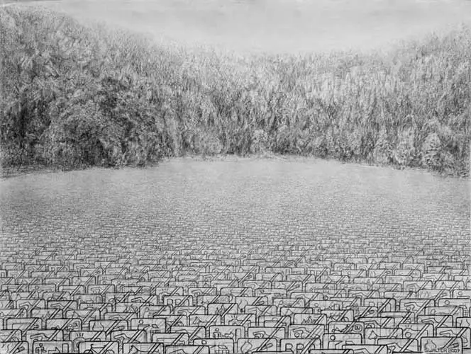
Borges takes on Carroll's idea in his short story, 'On exactitude in Science', whereby he imagines an empire where the science of cartography becomes so exact that only a map on the same scale as the empire itself is good enough for the emperor. Stephen Walter in a related fashion creates landscapes where objects are slowly taken over by their symbolic representations. He is also obsessed by detail.
Stephen Walter: Detail of one of his maps of London
Artists have had a variety of
approaches to map making, Stephen Walter's of London are very subjective, and full of details, whilst the Fluxus artist Toshi Ichiyanagi’s Music for Electric Metronome from 1960 is a sort of map for a choreographer.
Toshi Ichiyanagi Music for Electric Metronome
Dance diagrams are essentially maps of the dancefloor, this time incorporating directions for movement. Think of a standard map with actions added in.
In fact maps can be very like musical scores. Yasunao Tone’s Anagram for Strings, 1961 has the
familiar grid of measurement we usually find around the edges of a map. The measurement of time in music perhaps could be seen as similar to distance when walking through a landscape.
Yasunao Tone Anagram for Strings
John Cage obviously saw the connection between musical scores and landscapes, his scores for imaginary landscapes illustrate that exact point.
John Cage: Score for imaginary landscape number 5
Gwen
MacGregor and Sandra Rechico’s 'Maps in Doubt' series track
journeys they have had to make in order to develop careers in the now global
art world. They calculated the total distance that each of them
traveled whilst in Kassel in 2007. These distances were drawn
on sheets of paper, one of them making curved and the other straight lines.
Gwen MacGregor and Sandra Rechico
They also produced more 'conventional' linear maps, this time making 3 dimensional constructions that worked across walls and floors.
Gwen MacGregor and Sandra Rechico
The important issue here is that maps reflect a point of view. As has been pointed out earlier maps are often made because of strategic military importance, this view of
Annan (below) from a topographical and military account of the state of the Marches,
1569, was made because the town commanded an important defensive position on the estuary of the
River Annan, and it was therefore important for the military to map its
position. It fuses flat symbolic imagery with attempts at representation in a fascinating way.
Similarly in this plan of
Dover Castle from 1752, the positions of batteries of cannon are detailed as well
as individual big guns. The 'legend" on the left is another typical feature of map design and it can be used by an artist to add textual information into an already complex visual mix of languages.
Drawing was a skill taught to many people of all ranks and professions, once again though it is a drawing done by a serving officer which helps us to understand how information was brought back home pre camera. This image (below) by Lieutenant Archibald Campbell of Fort Royal on Guadeloupe in the West Indies drawn during the 1760s was engraved on his return to England and prints kept in the War Office records.

Precision
measurement of a baseline would be of little use in a trigonmetrical survey
without an instrument capable of measuring the angles between it and distant
points with comparable accuracy. The instrument designed to do this, a
theodolite, is essentially a rotating telescope mounted on a circular
scale.
The 'Great Theoldite' was eventually delivered to the Board of Ordnance
in July of 1787. Three feet in diameter, it weighed 200 pounds and was
transported in its own four-wheeled horse-drawn carriage. The magnificent brass
and wood instrument is seen here in an illustration drawn by Lieutenant Thomas
Vincent Reynolds for a presentation to the Royal Society by William Roy in
1790.
Drawing was a key tool often used as it still is today very technically. That technical precision was what Duchamp called 'dry' drawing. Compare his technical ideas for artworks with the image above and a more contemporary engineering drawing below.
Duchamp drawings for the large glass
A technical drawing printed off using a 'blueprint' process
Duchamp: Network of Stoppages
Network of Stoppages contrasts three representational systems: traditional figuration, chance operations, and the diagram, mapping the world without picturing it. Duchamp pointed to what he called the casting of "Pataphysical doubt" on the viewer. Duchamp introduces the idea of working conceptually, and all maps are conceptual representations, which is why he is so interested in them, as well as other more scientific means of representation, such as technical drawing.
Royal support for the advancement of science was vital during the 17th and 18th century, these three views below of the Royal Observatory in Paris, 1705 demonstrating how important scientific measurement was becoming at the time. Of course as images they are very interesting too and they remind me of the contemporary work of Alexander Brodsky and Ilya Utkin the paper architects.
Alexander Brodsky and Ilya Utkin
Brodsky and Utkin had an exhibition at Tate Modern recently and their large scale etchings use many of the conventions of scientific illustration from the 18th century. By looking backwards at older traditions artists can re-ignite a fresh engagement with the world. In this case Brodsky and Utkin are able to give conviction to a contemporary fantasy by using a language that used to be used for scientific purposes. (See)
The precision and control that early map makers used to embed within their development process is demonstrated in this image below of the 4 stages of development of an OS map.
Ordnance
Survey maps were produced in four stages. From their field notebooks, surveyors
made a rough or 'foul' plan. This first draft was followed by an intermediate
or 'proof' plan, which was carefully checked for accuracy.
A 'fair plan was
then made at the reduced scale of one inch to the mile, sometimes with
colouring. From this fair plan, a copper plate was engraved printing the
finished map.
I'm fascinated myself with the relationship between maps, direct observation and memory, some of my own drawings (below) being an attempt to fuse together these very different ways of seeing.
Marking territory is of course something all animals do and one way to begin thinking about mapping an area is to simply begin by making marks that sign that you are here. The images below are the marks of bears doing the same thing. This takes us back to a much earlier post on traces and marks of passage. This is perhaps where all drawing languages begin, making a sign that 'I was here'. See post on mimesis, and how drawing languages evolve.
Is this so different to a bear marking out territory?
On Kawara used to mark out on a map where he went everyday, in a similar way to how he dealt with recording time. These simple ink on photocopy drawings began to have more gravitas the more he did. This sequence was of nearly 4,000 drawings.
On Kawara: New York from 1968 to 79
Ink on photocopy
Useful links
-1.jpg)
.jpg)
.jpg)
.jpg)




.jpg)