Saturday 29 October 2022

Angles: Vision and Sound

The components of an angle

The angle, or the shape made at the conjunction of two straight lines gives us the letter 'V' and the letter 'L'. I have looked at angles before under their collective title of the zig-zag, and in their classic formal three line arrangement as the triangle but as they have such a vital role to play in our understanding of visual communication, I thought it time to look at them on their own. 'At a tight angle' suggests something hard to get at, a right angle is regarded as something upright and 'true'; not only have angles influenced he way we think visually, they have penetrated our verbal languages as well. An angle suggests an approach, as in 'what angle are you taking' and when we encounter a steep angle on road signs, whether it is going up or down, the approach is always from the left.


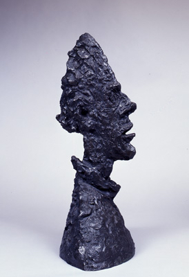
Angles can be harsh, the angle of naked pain was an angle that we used to ask Foundation students to find and draw when we were advocating working on that edge between logic and nonsense; 'l'angle mort', is the common French term for the "blind spot" that you often find involved in traffic accidents. 

However it is in pictorial composition that we find the angle most often used in visual languages. 

Charles Henry: Aesthetic Protractor 

Mathematical harmony based on certain divine proportions is an old concept but it was revived in the 19th century by Charles Henry, the French “psychobiophysicist”. In 1888 he published a colour circle and an associated aesthetic protractor, so that artists could decide on colour selection based on Henry's psychophysiological principles of dynamogeny and inhibition. A theory of rhythm was also added by Henry related to prime numbers or their reciprocal fractions. I have highlighted before in posts on 19th century approaches to visualising invisible forces, that these now 'discredited theories', had an impact on artists and how they went about their trade and in doing so they left a legacy of thinking that still lingers around the edges of Modernism. 

In visual perception, it has been argued that angles not only convey information, but that they also produce emotional 
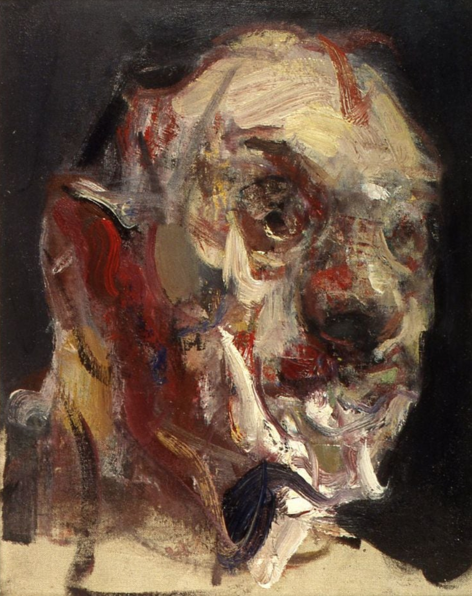
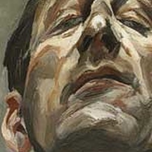
responses. In the 17th century Charles Le Brun (1619-1690) developed an inventory of 24 emotions in his 'Expressions of the Passions of the Soul'.  

Charles Le Brun: Surprise and Admiration

He wanted trainee painters who belonged to the French royal academy to more precisely describe emotions and this inventory of expressions has been central to the reproduction of facial emotions in visual images ever since. However, in the late 19th century Georges Seurat who had received French royal academy training, had become aware of the emergence of physiological optics, and it became increasingly clear to him that perception was not a matter of a passive reception of a fixed image, but that there was a dynamic interrelationship between image and observer, that together contributed to the making of emotional perception. Charles Henry's physiological research into visual perception was focused on  concepts of dynamogeny and inhibition or as Edouard Brown-Sequard (1817-1894) described them, 'the transformation or displacement of forces'. (Crary, 2001, p.164). This very closely relates to my own interests in how artists might visualise invisible energies and although Brown-Sequard's and other's ideas of invisible forces and their actions during this time period are now discredited, I still feel that there is something about them that needs exploring, even if only the need to give balance with current scientific theories, which I am sure will be overturned in the next half of this century as new approaches are taken in our attempts to understand the invisible energies that surround us. 

Charles Henry proposed that angles could stimulate the perception of emotion. For instance by using angles of 24, 30, 45, 60 and 72 degrees he stated dynamogenic effects would be aroused that represented an energetic and joyful atmosphere. (Smith, 1997, p.143). If you for instance use a Dutch angle in photography, which is about 20 degrees, you take the image off its vertical, or right angled stability and in doing so create a certain emotional unease.  

Creating a sense of unease in a photograph

In this case 'Dutch' isn't Dutch, as the name is a corruption of Deutsch, (German) and it came about because of the consistent use of angled shots on German expressionist films. By avoiding the stability of the right angled vertical it feels as if reality has been knocked off its axis. 

Typical German expressionist film scene

Scene flipped horizontally 

German expressionist cinema employed several scene builders who had backgrounds in painting and they were very aware of how angle effected emotion. By simply flipping the image above, it is interesting to see how an angle rising from the left changes our feeling tone as we sense that we in this case have to climb the street off balance as apposed to an angle falling down the street from the left, whereby we feel in even greater danger, the danger of falling off the edge. 

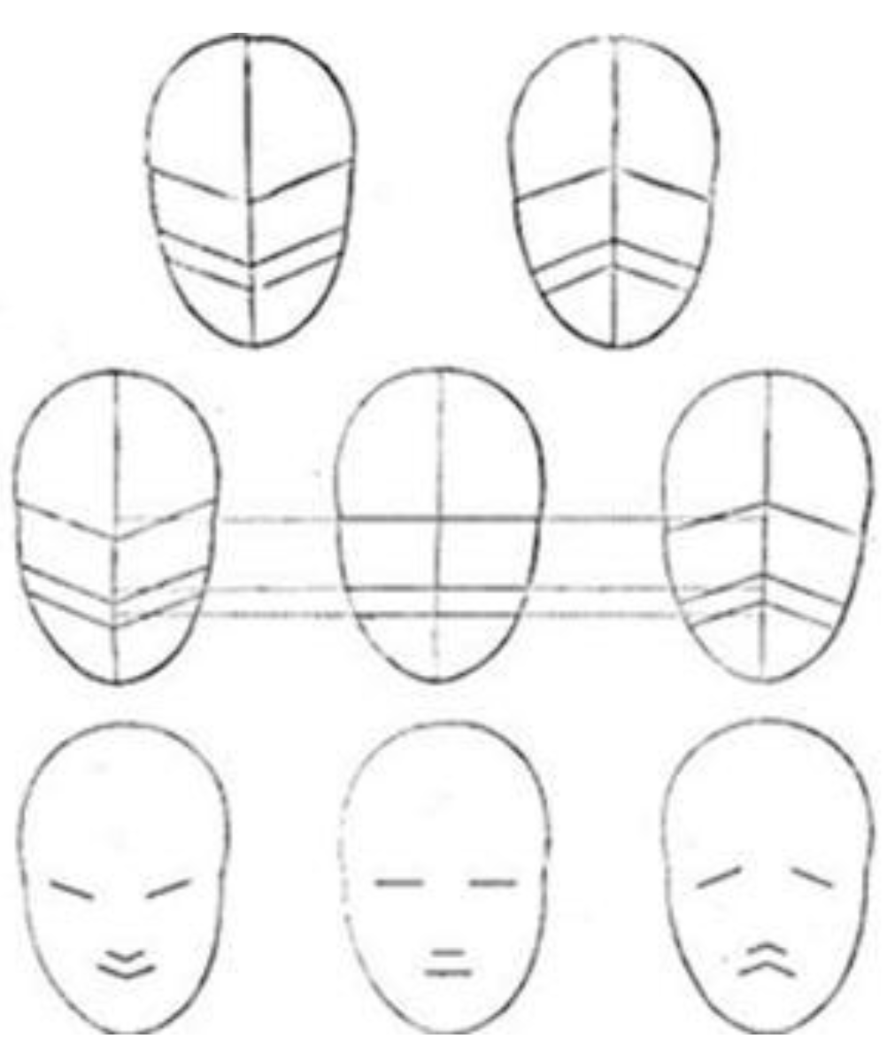
Henry had looked at the earlier work of Humbert de Superville who had his own three line scheme for expression; 'expansive, horizontal, and convergent', a scheme that he believed affected the fundamental emotions. These were based on facial expressions, rising diagonals signifying a smile, convergent diagonals indicating sadness.


I personally thought de Superville's work very superficial in comparison with Le Brun's, but Seurat was impressed enough to try and use the angles proposed by Henry in several of his later paintings, such as the Circus.

Le Brun's facial expressions

De Superville had like Le Brun before him, based his ideas on studies of classical art, and he praised the Apollo Belvedere as embodying the mystery of art, studying the sculpture from several angles, and illustrating his lectures with drawings meant to demonstrate the ideal proportions of the statue.

Humbert de Superville: Sketch of the Apollo Belvedere

De Superville: The intrinsic meaning of shapes colours and lines

Kandinsky: Colour shape questionnaire

It is Kandinsky that brings this discussion into the 20th century. He had very clear views as to which colours fitted which angles. A sharp angle, such as one at 30% is he stated an aggressive angle, and best matches the colour yellow. A straight upright right angle of 90˚ is red. As the angle opens out it turns bluer as it has less aggression, and eventually at 180 degrees the right colour becomes a black horizontal line. He even put out colour/shape questionnaires to test his theory, if you got it right, the triangle would be yellow, the square red and the circle blue. Kandinsky, like Mondrian was interested in Theosophy a movement that was a complex belief system, which included a belief that colours affected spiritual harmony. 

Morgan Russell and Stanton MacDonald-Wright, founders of the Synchromism movement were also influenced by Theosophy, and they developed colour and keyboard relationship diagrams. They were also testing out other theories, such as those associated with the concept of 'elan vital' and as you can see in the title of the image below, colour composition and life forces were in 1914, as in Theosophy, entangled. 

Morgan Russell: 
'Synchromy in Orange: the creation of man conceived as a result of a natural generative force' 1914

As Russell developed his Eidos and his ideas for a light machine, Macdonald-Wright, then living in California, was equally preoccupied with developing a kinetic light machine and nurtured an accompanying interest in film and theatre. In 1927, he began working with a theatrical group in Santa Monica and called his work "Synchromist Theater." The Christian Science Monitor described how "the action of the play takes place in nowhere, at no time, therefore to have other than a purely abstract setting would not only be incongruous but ridiculous. The mood induced by the use of these Synchromist settings is definite, and together with the use of Wright's color organ, which can throw any or all of the colors of the spectrum...evoke an illusion and atmosphere of a fresh sort." He successfully built what he called a Synchrome Kaleidoscope in 1959 and this as an idea would help others in the search for a synthesis between the emotional languages of sound and light. 

Wolfgang Köhler had in 1929 developed what he called the bouba/kiki effect and this pointed to another way of developing sound symbolism within visual languages.

Kiki and Bouba shapes

It was discovered that right across the world if you showed these two shapes above to people and asked them which is Kiki and which is Bouba, virtually everybody pointed to the sharp angled image as 'Kiki' and the rounded curved image as 'Bouba'. By the time I entered into this sound / image conundrum it was late in the day, but still there was a lot to learn. In the mid to late 1970s I was teaching on the foundation course in art and design at Leeds. It was a course that had its roots in Bauhaus thinking and exercises using sound and vision were often used with students to make them aware of the possibilities of sound and vision interaction. One thing as staff we would do was to 'sound' a drawing. I used to enjoy the intuitive responses to shape and colour this would engender. Making vocalised sounds and varying their pitch as students presented various shapes and surfaces for critique. The structure of Steve Reich's 'Come Out' often being used as an example of how overlaying and serial repetition could give rise to visual as well as aural compositions. 

However by the 1970s a new way of thinking about these issues was coming in to play. Because of the introduction of computers, programmers began getting interested in algorithms, and they began to see that these could be used to predict things or give shape to possibilities. One of the earliest attempts at this was Stiny and Gips' 'shape grammar'. 

From 'shape grammar' by Stiny and Gips (1978)

Stiny and Gips proposed in 1971 that by using their algorithms sets of non representational, geometric art could be generated. Aesthetics as a concept was boiled down and considered in terms of 'specificational simplicity and visual complexity'. But things have changed, and aesthetics linked to algorithmic possibilities has developed far beyond the simple idea of this being a way to create variations of abstract images. By using 'like' as an information gathering tool, this social media practice has allowed companies to see in almost real time how virtually anything, can be used to influence audiences' emotions, not just shape and colour. Kandinsky's colour shape questionnaire looks so naive in comparison. 


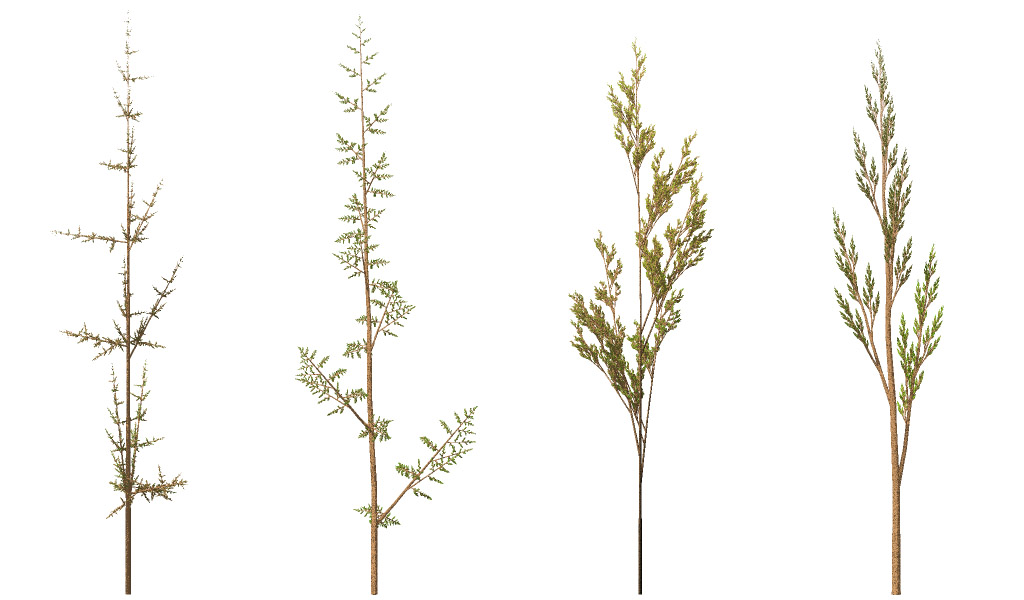
Grasses drawn by a computer using L-systems

At the same time that Stiny and Gips were developing algorithms that could generate geometric forms, Aristid Lindenmayer was devising 'L'-systems to describe the behaviour of plant cells and to model the growth processes of plant development. The angle was now part of a decision making process that was becoming more and more embedded into computer software development, one that was eventually to lead to uses within the growing field of artificial intelligence. As computers were able to crunch bigger and bigger number sets, more and more complex behaviours could be modelled, perhaps the most significant of these early models being 'Boids' an artificial life program, developed by Craig Reynolds in 1986, which simulated the flocking behaviour of birds.

Boids

Boids as a way of visualising complex flows of information would eventually be used to visualise how a virus might spread. You can probably see where all this is going, but one development in particular went right back to that association Kandinsky and other artists had made between colour, shape and sound and this development is something you see as soon as you open a sound recording or editing program on your computer, it will show the peaks and troughs of the sound you are dealing with, using oscilloscope and similar sound visualiser systems. 

Oskar Fischinger with a “sound scroll” used in the optical soundtrack of one of his films.

Oskar Fischinger was an early pioneer of abstract film and for his soundtracks he developed visual scrolls, the language of which as you can see from the example above was developed from the idea of repeated angles or triangular divisions of time and space. While Fischinger drew each individual waveform by hand, the animator Norman McLaren, developed template based methods to do the same thing. Eventually coming up with the idea of index cards, each painted with a pattern whose spacings produced notes in the chromatic scale. The idea of an optical soundtrack seems quite complex but it could at the time be very easily constructed.
The sound artist would take a strip of black film, or film with a black soundtrack area, two or three feet long. Make a single scratch on it, join the film into a loop and run it on a moviola or projector. The scratch would give a click with a certain quality. The splice in the loop would also make a click. but you need to discount that. The next step was to take the loop off the projector and make another type of scratch with a different size and shape, at least 4, 6 or 8 frames away from the first scratch. Then you would run the loop again, and you would hear two clicks, each with a different quality; one may have a hard sound and the other a soft sound, or one may be loud and the other quiet, by adding various types of scratches one by one, and by identifying them, the artist would learn what kind of scratch gives what kind of sound. By doing this a direct link between sound and vision was made. The story of these events is told in detail in an article by Golan Levin 'Painterly Interfaces for Audiovisual Performance', and what interested me was when computer real time visualisations became possible, such as in Pete Rice’s work, how similar the forms generated were to the ones visualised as 'thought forms' by Besant and Leadbeater back in the early 20th century.

Stretchable music

A screen capture from Pete Rice’s Stretchable Music system in use


Charles Webster Leadbeater & Annie Besant 'Thought Forms 1905

By moving backwards and forwards in time what we can do is sense the physical reality that underpins the seeming 'magic' of current computer realisations. For myself this makes things more graspable and I can see these things as material languages again. As a student of fine art, you may feel that computer aided art is not for you, but the fact is that everything is grounded in the interconnectedness of everything else and that by unravelling the threads that tie it all together, an artist can begin to both play with and open out the situation for new and hopefully fascinating re-interpretations and avenues for material thinking. 

Recording of the sounds in Hyde Park London

During the Covid pandemic MIT’s Senseable City Lab looked at park environments in five cities – San Francisco, New York, London, Milan, and Singapore. It was an attempt to see how collective sound environments were changing due to the fact that people were altering their patterns of behaviour. The project simply accepts that there is a direct relationship between sound and vision, but I think it misses an artist's involvement, one that could have been used to create a more physical response to what was happening. 

Lines: Anders Lind 

'Lines' by Anders Lind, reminds us of how musical notations rely on the use of visual lines to make sense of them, thus closing the loop between lines as abstract forms and sound as an abstract language. The fact that you have to physically engage with the piece means that you begin to know this in your body and not just in your mind. 

Signs of a sound emerging from our mouths also often use angles, the sign below is a stock image for a shout, we imagine the angles emerging from the mouth as an indicator of the loudness of the shout.


References:

Crary, J. (2001). Suspension of Perception : Attention, Spectacle, and Modern Culture. Cambridge, Mass.: MIT Press


Moritz, W. (1986) Abstract Film and Colour Music, in: The Spiritual in Art, Abstract Painting 1890 – 1985 New York: Abbeville Press, 

Smith, P. (1997). Seurat and the Avant-garde. New Haven: Yale University Press.

Stiny, G., & Gips, J. (1971). Shape Grammars and the Generative Specification of Painting and SculptureIFIP Congress.

See also:

The zig-zag

The triangle

Eye music

Drawing sound

Steve Reich Rhythm and colour constructions


Saturday 22 October 2022

Portraits: Mass and Time

Lucien Freud

Before the invention of photography artists had no other option when making portraits but to work directly from another human being. This being so, a portrait was a study of mass in spacetime. A sitter would have to 'sit', i. e. would have to engage in close contact and collaboration with an artist. In fact, because as a process it took so long, sometimes substitute sitters were employed or models that sat in for kings and queens because important people were always busy. This person of high status, would then re-appear at opportune moments to have their features recorded in more detail. 

However since the invention of photography, many portraits have been made by copying photographs and these are no longer studies of mass in space and time, they are about the transfer of a flat image recorded in an instant, to another surface, using much slower methods. The grid is often used to trap or capture one image and is then used to transfer it to another grid, thus ensuring that nothing has moved out of place during the transfer. 

The older method was about confronting reality and re-creating it, so that as someone looked at a portrait something of the struggle to comprehend existence was revealed, the copying of photographs simply reveals the ability to invest time in a reproduction process. It is therefore about the personal interest of the copyist and little about a confrontation with another being. 

The National Gallery is hosting the exhibition 'Lucian Freud: New Perspectives' at the moment and it is on until the 22nd of January, if any of you are interested in portraiture, this is a must see exhibition. When Freud had no one else to paint he would use himself as the model and that of course involves looking into a mirror. The image that opens this post being a good example of how you can surprise yourself when catching a view of your image in a mirror leaning against a wall. This is Freud's attempt to escape the trap of the mirror/window, instead of looking out to a passive view, the mirror is made more active, it looks back and in turn Freud appears to activate the mirror through some sort of extramission vision. 

Lucien Freud: Detail

It is useful to look at a detail of Freud's painting. Look at how everything is slightly off balance. The mouth tilts to the left, the chin juts out and bends very slightly off the horizontal, patches of paint find their way over an envisioned mass, you can feel his solid grasp of form as his paintbrush lays down each mark, he is in effect constructing this head as a mass or lumpen thing, even though it is a solid that is always slightly moving. In doing this he re-created an experience and for myself as an observer I have to take a much slower time to read his marks, time that is divided up by his planar aware paint patches.

This type of approach begins with a grasp of the head's mass. 

Lucien Freud: Etching

It is easier to see how Freud worked if you look at one of his etchings. The process of etching means he had to clarify his marks and as you can see from the image above he feels for the mass of the head by using marks that make changes in response to planar direction. This is what makes us so certain that this individual was drawn from life and not copied from a photograph. A photograph is flat and there is no mass to grasp. These planes or surface directions are though never quite still, they overlap and interpenetrate, because no matter how still the sitter, they will always be in movement because the artist is himself having to look and it is in the looking that movement is generated. As you look to one side of the nose your gaze becomes active in assessing the planar movements towards an eye, but in order to assess these you need to drop your gaze down towards the cheek. These constantly roaming eye movements allow you to eventually stitch together a solid idea of the head. Within this complexity of looking is something we call 'accuracy' or 'likeness' and an ability to also catch this at the same time as the experience of the looking, is what makes Freud such as powerful painter. 

So how can someone starting off on the journey to become a portrait painter begin the process of learning the skills of looking at a head and a grasp of the mass/space complexity of experiencing someone over a long time period? There are methods that can help wean you off photographs and make you more aware of how to record the process of looking at solid objects but these usually demand of a would be portrait painter time spent investing in the skills of three dimensional construction. 

Artist's studios used to always have classical busts from which apprentices were meant to begin developing their drawing skills.  The issue about drawing from sculpture is that the sculptor has already simplified the form for you. This can be a useful experience, because it helps the drawer to 'see' how forms can be drawn, the sculpture in effect clarifies the complexity of life. However classical busts are expensive and so many artists rely on purpose made 'planar heads'. 

You can buy them ready made, and some have even been designed by other artists specifically for the purpose of helping artists become more aware of the planes that underpin a three dimensional grasp of the head's mass. 

A planar head

An Asaro Head

The Asaro planar head was developed by the artist John Asaro, the left side of the model head is a simpler variant of the right side, this allows you to explore how a growing complexity can carry different levels of emotional effects. 
Most students will begin by simply using cardboard to make a model. If you need a support to construct one over, you can buy cheap polystyrene display heads for wigs from Amazon for £1.99 and then using ideas of planar simplification you can construct your own heads to work from. 


polystyrene display head for a wig

Using a polystyrene display head to support cardboard faceting 

Once you have made or otherwise acquired a planar head, then you can draw it from every angle and get used to the fact that the head consists of solid surfaces made of skin and muscle stretched over a boney skull. 

From Burne Hogarth: Drawing the human head

The drawings made from planar heads are though very crude and the next step is to practice drawing from life, this may be from your own head seen in a mirror or much more usefully from other people prepared to sit for you. But try and keep in mind the understanding of planes that you now have. The drawing above is from Burne Hogarth's classical 'how to' drawing book, and you can see the influence of the planar thinking. Hogarth's book is a typical example of teaching  constructive drawing where you start by creating simple shapes or abstractions to represent elements of the subject you are drawing
It might seem a long way from a master such as Freud and a 'how to' drawing book but if you place two images side by side you can see their relationship. 

Two approaches to drawing mass

The difference is that Freud's drawing is much subtler, he relies on looking and feeling for the form more than using a planar formula to establish the solidity of the head. But remember the drawing on the right is for students. The nose and mouth feel stuck on rather than being understood as gradual changes in surface direction, but I hope you can see how working in this way you begin with a firm grasp of the mass and solidity of the head. In technical terms this is the constructional method. The constructional method allows you to think in terms of shapes, tone and line; this degree of abstraction helps you overcome your brain’s pre-conceptions about what things look like. For instance when drawing a leg that is very foreshortened it is very hard to get it to look right, but if reduced to simple forms it becomes much easier.  You can also get things in the right place before you add detail. This is a vital lesson, likeness in a portrait often comes at the very end not at the beginning. You can also get a clear idea of the most important areas of light and dark on the face. Instead of infinite gradients of tone, you have created planes that are facing or not facing the light source. This means you can quickly establish the key elements around which you will build a portrait and more importantly in your own mind you can picture the head's physical reality as a graspable entity and not the slippery, hard to understand flat thing that emerges from a photograph. 

If however as a student you still feel that you want to work from photographs, my advice is to convert the photograph into a solid object and to then begin trying to make a portrait. 
A very simple way is to begin folding the photograph. Within a few seconds you have a more three dimensional object that can even be put on a shelf.

Joseph Parra

Once folded the image can be drawn from and this will give you a process or way forward that at least will change your relationship with the photograph. Another way is to go back to your cardboard head and after taking lots of close up photographs from all around the head of the person you want to portray, to print them off at a size that works in relation to the planes of your cardboard, then to cut the photographs out and glue them carefully onto each facet of the planar head. In this way you can bring together multi-photographic viewpoints, into one solid form. This can now be drawn from, but it will also be a intriguing object in its own right. 

However there is also a very traditional way of working that can be very valuable. This requires you to make an armature around which to build a clay model. Of course this takes much more time, but think of this as another opportunity to learn new skills. You will need a wooden base and an upright, so why not use the opportunity to practice making wood joints? 


Once you have made a wooden base, you will need to give the clay something to stick on to. 


Wire, tape and even some string and newspaper can be used to make an armature

Once you have an armature in place it needs to be measured because you will be building a head from two photographs that will need to be printed off at the same size as the 3D head you are going to make. You can draw lines across the two images to make sure they are correctly lined up, as in the image below. 


Because of your experience in making a planar head, you might try laying some tracing paper over a photograph and making it more three dimensional, this will help you decide on where planes begin and end.

You will need to grid your photographs so that you can take measurements 

Callipers

You will also need some callipers so that you can transfer measurements from your photographs

Look at this video on how to block out a form for making a portrait bust

In the video the sculptor uses her own head to take measurements, but you will use the two photographs, the problem being that you have to think 3D, and there is a halfway house, what you might call two and a half D. 
Giacometti

You can use Giacometti as a model, simply begin thin, start with making a profile out of clay, practice transferring the measurements and once you have something you are happy with extend the face out sideways by taking measurements from the frontal view. As you do this keep an awareness of the grid, its a good idea to mark it over your emerging clay head as it arrives, so that you can keep checking that everything is where it should be.

Measuring lines can be incised deeply into the clay and linked directly to measurements taken from the flat images.

Once you have a model that you are satisfied with, or dissatisfied with it can be drawn from in the same way as the Asaro Head or your cardboard version and this should give you a feel for the solidity of reality rather than the flatness of the photograph, the translation of 2D information into 3D information allowing you to have a much better grasp of mass potential in any future construction of a portrait. 

This sense of three dimensional reality is often when looking at paintings first glimpsed with how the painter deals with edges between masses and spaces. 

Velasquez: detail

If you look closely at Velasquez you will notice that his figures emerge out of the spaces they occupy in such a way that there is a sort of hesitant line or edge between the figure and the space it occupies. This oscillating moment is a reminder of the time spent recording what was seen, of extracting information from the nerve patterns that cross a screen of looking. 

Velasquez: Queen Mariana of Austria

Even though Velasquez is intoxicated by re-creating the textures of various surfaces, he never forgets that each and every human being occupies a mass that sits dynamically in space and it is this re-creation that gives such vibrant life to his portraits, they are never static. 
Rembrandt is similar, the eyes below are situated within a solid mass, the brush lays paint in directions that reveal his mind feeling its way over the forms of the face. 

Rembrandt: detail

Look at how Rembrandt feels for the direction of the form with the paint

Rembrandt: Etching

Like Freud, Rembrandt uses etching as an extension of drawing. Look at how the marks of the etching caress the planes of the face. This woman is a mountain captured within a few square inches of paper, he knows her as a rock, a solid reality that is part of his awareness of his own existence.  Again there are no sharp edges, a moving, roving set of eyes, will always be seeing something just past an edge. As the artist looks and records, their eyes are always looking into space and over mass. The one is always emerging from the other. The act of looking reveals an exchange of mass into space and space into mass. Science now tells us that everything consists of a never ending oscillation of energy fields. These portraits, like the quarks, neutrinos and muons beneath them, continue to dance into existence and as they do they remind us of how powerful portraiture can be and that at its best it can re-create the life essence of human experience. 

Etching: Lee Newman

Robin Cook by Lee Newman

The contemporary artist Lee Newman is someone that clearly understands the link between observation through time and portraiture. His drawings, prints and paintings testify to a life long concern to capture life's energy and weight within the fragile thin surface of image making. His etched lines caress the face and as he moves on into painting, you really do feel that each paint stroke acknowledges the mass beneath. 

Drawing is something that underpins painting and as this blog is very much focused on drawing I shall leave this rumination on how to begin thinking about portraiture here. 
I would hope that as students you don't forget that skills take many hours of practice and that whichever way you decide to approach something like portraiture, only many hours of trial and error will enable you to build the necessary skills. I'm also aware that if you are a frustrated painter that you just need to begin painting, but that shouldn't stop you taking on board some of the activities that have been suggested, in fact mixing in painting alongside and onto the things you are making can lead to interesting hybrid objects that open out even more possibilities for formal investigation. 

Lucien Freud: Self portrait

See also:

Drawing and philosophy This post includes links to the remaining art schools that still teach traditional methods. 

The Paul Neagu: Palpable Sculpture

LIfe drawing

Portraits and time

Cross contour drawing 

Drawing and photography  An alternative view on how an artist could work with photographs

How to make a cardboard head

What is a portrait?