Tuesday 28 June 2022

Paper and sustainability

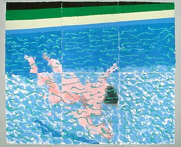
David Hockney: From the 'Paper Pool' series

Nearly all drawing practices use paper in one form or another and the choice of what type to use has always been a central issue for the drawer. If you are also a printmaker you will be also be involved in having to make decisions as to what sorts of papers to use, as paper surfaces directly impact on the final image. We now of course have to also consider sustainability. The positive thing is that when produced from wood sourced from sustainably managed forests, paper is a renewable material. Healthy forests act as carbon sinks, binding CO2 from the atmosphere and helping to mitigate climate change. With responsible sourcing and sustainable manufacturing processes, paper is a material that could become part of a future circular economy, whereby there is no waste because of the sensitive handling of a mixed economy of both trees and related guild* planting, which together would support sustainable forest management.
*Starting with a large tree, you might encourage understory trees, nitrogen-fixers, bug repelling plants, and various forms of ground cover. A Guild is in effect a plant community that is self sustaining. 

Making papers specifically for drawing and painting is a specific area of paper production and it has its own eco-climate. Different art papers have different effects on the environment due to their varying production processes. Paper production is also linked to different cultural traditions, Japanese papers having a very different aesthetic and manufacturing ethos to European paper production, which is again very different to Indian traditions. 

Traditional paper making is mainly driven by processes associated with cotton or wood based materials.

Cotton Paper

Cotton plants require vast amounts of water, and in some places around the world, have been known to exhaust local water access. However the fibres used in cotton paper production are usually a by-product of the textile industry and the clothing it is made from would most likely otherwise go to landfill. Handmade cotton rag papers are made from what is in the trade called post consumer fibres, i.e. items such as old t-shirts. They have the potential to achieve the lowest carbon footprint during production. For instance, pulp can be dried slowly in the sun, and the water used to turn the rags into pulp can be run off to irrigate neighbouring fields. Because cotton paper pulp is naturally pH neutral the water does not have a negative impact upon the surrounding environment.

Wood Paper

It does seem that the majority of trees that are used in Western Europe, the US and Canada to make paper are sustainably farmed. However this is not the case everywhere. In England fine art paper mills mainly use virgin pulp imported from Western Europe because the quality of the fibres means that the resulting paper can withstand heavy treatment, such as being scrubbed or laden with watercolour washes. Trees for papermaking are usually grown specifically for that purpose, to ensure consistency, and countries such as Finland, Sweden, Canada and the US all at the moment grow trees for papermaking faster than they are felling them. This is obviously a good thing, but there are issues related to mono species economies. M
ultispecies plantations have a higher yield, quicker growth rates, and a better overall economic return than monocultures but this fact doesn't seem to have been understood by the sector as a whole and like so many areas of mass agricultural production too many companies rely on single species growing policies, which is unsustainable in the long term. 

Recycled Paper

The existing paper manufacturers that specialise in art papers believe that it is not possible to use entirely recycled pulp for fine art use, because the re-pulping process necessary when recycling shortens the fibres, reducing the strength of the end product. Additionally, when making recycled paper, it is very hard to know what sort of chemicals might be present in any pulp produced from used papers. Paper that has had a previous life serving non-fine art purposes is likely to contain lignins or bleaches which will prevent the resulting paper from being archival. Therefore when recycled fibres are used to make drawing paper, some virgin pulp has to be added to compensate for the fibres that are no longer usable, as this minimises the percentage of impurities. Recycled paper also requires additional processes such as de-inking, degreasing and the removal of additives. Each of these comes with its own set of challenges, whether it’s the toxic sludge accumulated from de-inking or the undermining of the strength of the end product as a result of grease in the pulp. At the moment these problems have solutions that often require a prohibitive amount of energy and the use of even more toxic chemicals. Therefore recycled paper isn’t always the most environmentally friendly choice. I wanted to flag this up because several companies state that they produce recycled papers, but they rarely break down for their customers the issues involved. 

Water

Water is a vital component in nearly all stages of papermaking. If water is to be returned to source it needs to be carefully filtered to remove any additives that may be harmful to local plant and river life. Wastewater treatment is categorised into primary, secondary, and tertiary treatments. Primary treatment uses sedimentation to remove suspended solids from wastewater, forming sludge. Secondary treatment removes organic matter using biological processes. Tertiary treatment removes any other contaminants required before discharge into the receiving environment. Those three standard steps are altered or augmented depending on the nature of the facility and its processes. In the UK, paper mills associated with the making of fine art papers need to be looked at on an individual basis in terms of their sustainable water use. Good examples are Two Rivers (Exmoor Water) and St Cuthberts (River Axe) both being situated by a source of fresh flowing, naturally filtered water. These mills return the water they use to the river, free from any papermaking additives, often purer than when it was first extracted from the source. The thriving population of freshwater trout in the Rive Axe are testament to the cleanliness of the water that is issued by the 
St Cuthberts mill

Energy

The principal source of energy for paper mills is natural gas and electricity, although coal, oil, biomass and solar energy are sometimes also used. The production of most fine art paper is not as energy efficient as the production of other papers for general use. This is because the mould made processes are much slower. Fine art paper mills favour this slower process because it allows heavier weights of paper to be made, and it also successfully ensures that the paper made is robust and has a surface suited to artwork. There are only three mills making fine art paper, out of nearly 70 mills in total in the UK, so while it may not be a very energy efficient industry, the net energy usage accounted for by fine art paper manufacture is comparatively very low.

In Japan making traditional art papers is a human centred tradition and it uses far less machinery than European methods, most of the equipment being hand made and operated using human labour.
In India there are other traditions the best of which use run-off from the papermaking processes as a fertiliser, so that in certain instances the environmental impact can be positive.
Traditional Nepalese paper moulds use a wooden frame with a thin cotton cloth stretched over its surface. The paper is dried on the frame which is propped up and angled towards the sun. This is one of the oldest ways of making paper, unchanged for over 1000 years and it is also one of the most environmentally safe.


Bleaching

Bleaching is used in the whitening process of paper, but this has a significant environmental impact, particularly for the aquatic environment, due to the harmful emissions that are released when using chlorine based bleaches. For this reason, look for papers that are elemental chlorine free (ECF) as a minimum standard. The three main classifications to look out for are totally chlorine free (TCF), elemental chlorine free (ECF) and process chlorine free (PCF). You can of course choose to not use white paper, a tonal standard that itself has a history as well as associations with Modernism and an idea of purity. The association of paper with purity and whiteness is a 19th century one that has somehow stuck and is very much a product of the advance of the medico-chemical industries and how they have for instance marketed ideas about the need for sterilisation in order to avoid hidden germs and the chemical advances behind o
ptical brightening agents, things for which there is no real need, except to advance the myth of cleanliness being next to godliness, as the manufacturers of Pear's soap would have it.  

If you want to look into the issues that surround the association of whiteness with purity in more depth read:  
Berthold, D (2010) Tidy Whiteness: A Genealogy of Race, Purity, and Hygiene The Journal of Ethics and the Environment Vol. 15, No. 1 (Spring), pp. 1-26 (26 pages) Published By: Indiana University Press
and 
The Myth of Race: The Troubling Persistence of an Unscientific Idea New York: Harvard University Press

The myth of whiteness in operation

The need for sustainability in this case overlaps with the need for racial justice. 
It is no accident that climate action and reduced inequality are both seen as vital to the attainment of the United Nations' sustainable development goals

Perhaps if you are worried about the sustainability issues surrounding the making of paper you could investigate making your own paper and once you do that this opens out all sorts of paper possibilities both as a building material and as a surface to work upon. In some cases artists use paper to fuse both these aspects together, building out from sheets of paper using pulp and folding techniques, so that complex structures can be envisioned. 

The artists Barbara Landes and Paul Sullivan use a variety of paper making techniques
to produce their own handmade paper, which is then used to fabricate sculpture.


Barbara Landes and Paul Sullivan

There are vast amounts of paper and cardboard out there to be recycled, so before beginning to use yet another clean, white sheet, do at least think about whether or not you could re-use some of the papers you will I'm sure be able to find in your near vicinity. However if you conduct a little research you may well find that a local company has large amounts of off-cuts or ends of rolls that they would be happy to let you have. 

See also:

Japanese papermaking  (use the links at the end of this post to explore more paper issues)

Key statistics: The European Pulp and Paper industry


Rendering skin colour

Pulp It  A site dedicated to the advantages of using paper as a building material

Wednesday 22 June 2022

On naming colour

Werner's Nomenclature of Colours

Werner's Nomenclature of Colours - Adapted to Zoology, Botany, Chemistry, Mineralogy, Anatomy, and the Arts was first published in 1814, it is a taxonomic guide to the colours of the natural world and it is no surprise that it was produced at the same time as many western countries were setting out on global exploration and colonisation. Werner was a geologist and as part of his work on mineral classification he decided he needed  a comprehensive colour scheme to help in his description and classification of minerals, so of course he produced one. He was a highly educated, white, male, western European and therefore had the confidence to do this. His idea was a product of a particular way of thinking, a process that had led to Carolus Linnaeus (1707–1778) developing 'Species Plantarum' in which Linnaeus applied an integrated system of classifying, naming and describing plants to account for all those then known to western science or Lamarck's 'Philosophie Zoologique' whereby the animals of this world are classified in a manner that fixes them down in a clear 'phyla'. 

Werner’s work was translated into English by Thomas Weaver in 1805 and in 1814 Patrick Syme, a flower painter who worked for the Wernerian and Horticultural Societies of Edinburgh, published a revised version, as entitled above. Syme used the actual minerals described by Werner to create the colour charts in the book, enhancing them with examples from flora and fauna. In pre-photographic times visual details could only be captured by drawing and painting, therefore because only trained experts had these skills, scientists put far more importance on verbal description, and scientific observers could not afford ambiguity in their descriptions. Werner's handbook became an invaluable resource for naturalists and anthropologists, including Charles Darwin, who used it to identify colours in nature during his seminal voyage on the HMS Beagle. Werner's terminology lent both precision and because of the words chosen, a certain lyricism to Darwin's writings, enabling his readers to envision a world they would never see.


Of course this had many benefits and it enabled great scientific advances, however there was a darker side to this process. Because they are now able to fix colours, (I'm using fix in a similar way to how fix operates when developing a photograph in a wet darkroom) nouns were able to take over colour experiences, nail them down and in effect own them. Something that had always been integrated within the wholeness of light, that was constantly in flux was now pinned down, so that the scientifically minded collector could own yet another part of a world that should never be owned. It is also but a small step to move from owning and fixing down a particular colour, to owning and fixing down a person of a different colour to yourself. 

You might think this harsh of me, and only see Werner's work as an extension of the Enlightenment project, whereby 'mankind' sought to understand the workings of the world in order to achieve mastery over it. But in developing a mindset that presumes mastery over things, that mindset begins to see the world in terms of control and one way of controlling this is by breaking it down into small pieces so that you can examine it. Foucault was a writer that spent most of his life trying to detail this, paradoxically using the very techniques of observational research to try to understand how our modern disciplinary society emerged by closely observing and detailing how control had been achieved. He pointed out that there were three primary techniques of control: hierarchical observation, normalising judgment, and examination, and that control over people (power), can be achieved merely by observing them. For myself my disquiet emerges from the fact that these systems can easily lead to a righteous belief in the self ownership of power, and a use of words such as 'logical' and 'scientific' to justify the most heinous crimes. As an artist perhaps my job is also to point out that even within the most rigorous classification system there is poetry and that no matter how hard humans try to eradicate this in their attempts to become 'objective' they will always fail, because they cant escape the fact that all those ideas emerge from a body that will always be blood and bone and snot and mucus and most importantly of all be made up of over 50% bacteria, a life form that has used humans as hosts for as long as humans have been around, a life form that used other animals as hosts for millions of years before we emerged as a separate species and that will I presume carry on using big lumps of moving animal substances as hosts for millions of more years. To bacteria hosts are all the same, simply bags of warm sea water with lots of added nutrients. The fact that the bag has evolved skills in using rulers and statistics, is in fact beside the point, the bacteria inside  you will be far more interested in where your last meal came from and what it consisted of. This fact, I would hope, reminds us of our inconsequence in the real grand order of things and that when we think we have control, we are always in reality being controlled, and perhaps by the very things we have often totally ignored. 

The naming of colour does have though another side to it. Instead of using the process to classify and control the world we can use it to develop a much more intimate relationship with it and it is in that process that a sort of poetry emerges. 


Details of pages from Werner's Nomenclature of Colours

As Patrick Syme lays out Werner's system you cant escape the fact that he is a flower painter and from chosen names you also cant escape the fact that Werner was German. This is where the poetry comes from. I will leave you as a reader to imagine 'Berlin Blue', I wonder how it sits in the colour classification of cities, perhaps between 'Shanghai Cerulean' and 'Tokyo Turquoise'.  In my minds eye I see Syme's poetic number 51, a Bluish Green, a colour shining through the undergrowth, a glimpse of the egg of a thrush, a vision seen under a disk of wild rose leaves, a hint of the colour of beryl, a reminder of its close relationship with a wild emerald green, an emerald as yet uncut and waiting to be set into nature's crown. 

The naming of colours continues and every paint manufacturer has its own particular proclivities. Farrell and Ball for instance are supposed to cater for the more sophisticated colour consumer and their nomenclature is not without humour. Here are a few. 


I particularly like 'Pale Hound' I wonder if this relates to someone's Labrador? Yonder has to be a pale blue. 

Sarcoline, although not a Farrell and Ball colour, sounds as if it should be, it is in fact one of the 'skin' colours. 

The full Sarcoline tonal range

An interesting range and much better than those pink ranges for skin that used to be called 'flesh', I would though suggest ringing the doctor if you meet anyone with skin sitting in the yellow range as it will probably be a sign of jaundice. Webster's dictionary just says 'flesh coloured' when describing 'sarcoline' but when you see a Pantone swatch like the one above you realise this definition includes a very wide range of possibilities. However I have a sneaking suspicion that the first use of the colour as a flesh tone was the large slab of it at the top. 

'Sarcoline' skin enhancer

In fact if you type in 'sarcoline' as a colour this is what you get, the rectangular block that I have placed right up against the various skin types below, which is very similar to the large swatch further above. What is meant by sarcoline as a 'flesh colour', is another colour that some would point to a being similar to caucasian skin.  

Checking out sarcoline as a flesh colour

We enter deep and very dangerous waters here. As we know racial classification was often done using skin colour. Von Luschan's chromatic scale is the one set out below, which used 36 opaque glass tiles, that were compared to the subject's skin, ideally in a place which would not be exposed to the sun (such as under the arm). It was used in the early 20th century and is of course associated with the policies of Nazi Germany during the second world war. 


Fitzpatrick Scale for the classification of the skin type of individuals was introduced in 1975 by Harvard dermatologist Thomas Fitzpatrick and it was used to describe sun tanning behaviour.

  1. Ivory
  2. Beige
  3. Light brown
  4. Medium brown
  5. Dark brown
  6. Very dark brown
Colour is a very emotive subject. Our relationship with it can begin in the colour of the very skin we inhabit. By giving things names, by measuring them, we replace experience with fixed attributes; we nail things down and in effect exercise power over them. Colours that were constantly in flux, are like butterflies in a Victorian collector's case, pinned down. We all need to be vigilant, because it is but a small step to move from owning and fixing down a particular colour, to owning and fixing down a person of a different skin colour to yourself. What's in a name? Sometimes things we don't want to name. 

Coda
Since posting a few days ago I have become aware of a related and for myself very worrying issue; the trademarking of colours.

In the 1950s Owens-Corning, a fibreglass insulation maker was facing steep competition from other companies. At the time, insulation material was all “naturally tan” so to distinguish itself, Owens-Corning decided to dye their insulation material pink. Using 'pink' as an insulation marketing tool; it adopted the slogan “think pink."
In 1985 Owens-Corning became the first company in American history to successfully trademark a colour. In the decades since, a number of companies have successfully trademarked single colours and below are set out a few. As I pointed out, once you can measure something, someone else can own it. In this case the measuring system is that of the 2,139 Pantone Spot Colours.
brand colors


See also:


Tuesday 14 June 2022

Drawing: Analogue and digital processes

Rauschenberg: Image transfer drawing

I'm often questioned as to whether or not I see digital image development as being less authentic or of less value than a hand made image. I work between the two so perhaps I ought to unpick my thoughts on the issue in relation to the work I'm currently involved with. 

I am of an age whereby the computer came into my life quite late. I had already been working as an artist and teaching art for a while, and when they emerged as a possible tool for making art, because I was a printmaking tutor, the first two AppleMac Classics that the college brought came to me and I began to use them as printmaking tools. Because of this, I have always regarded the two dimensional possibilities that various computer hardware and softwares provide as being simply technical processes, just like etching or silkscreen and have never worried about whether these are images for screen or for final print output. As a printmaker I was very aware that changing paper stock changed how a colour would read and the fact that screen colour would sometimes need to be re-calibrated, meant that just like paper, screens could affect how a colour was read. If you are a printmaker you are always interested in how a shift in technology shapes outputs. For instance a change in acid will affect the bite of an aquatint or a different mesh size the way the ink sits on a silkscreen print.  The images below are all from recent work, all of which I regard as an extension of the print process, but because they have a digital form, I also see them as being made for screen viewing. These images have been processed by various technologies and most importantly as far as i am concerned, the imagery relies on my ability to draw and make certain marks using pens and inks, brushes and paints and a variety of other tools to create forms and textures. By grounding my work in these analogue processes I'm very aware that my body and its traces are central to how images develop. However I also see computer hardware and software as being extensions of our bodies, but these extensions are harder to grasp in terms of physical traces. It is very easy to see the mark of an artist's hand movement in the way a drawing is made with charcoal on paper, but much harder to see traces of the human in the proportions of a screen or the invisible code written to form a colour-shape. But these things are all the product of humans, just as much as an arm swinging an ax. The computer allows me in particular to explore colour possibilities. I can develop very controlled palettes for  an image, and in doing so find an unexplored colour sensibility, which can surprise and offer totally new thoughts as to the emotional range that colour can produce. The computer aided images below come from two related but different groups of artworks. The top two are reflections on different feelings or sensations that I have had within my own body, my somatic awareness or interoception of an event and the bottom two are concerned with how perception and interoception are inseparable and they all began by making drawings in response to a series of visual encounters with other people, (rather in the mode of traditional portraits, but done over time and never from a still or frozen moment) and then the images were reworked in response to extended conversations that opened out my awareness of these people's internal feelings and so they became more to do with representations of an inner psyche or the layering of interoception into a previous visually focused perceptual experience. I. e. how we think visually about inner sensations is helped along by making analogies with things we have seen out there in the external world. These images all begin on paper, with lots of flowing liquids and the use of various applicators. Once they are made, the images are then photographed under moving natural light, so that colour and texture are embedded into tonal movement.  This procedure allows me to develop two bodies of work, that can then be compared and contrasted as to how well they allow me to reflect on and adjust formal qualities in relation to their ability to communicate inner feelings or somatically driven sensations. Sometimes the computer allowed for more distancing, and more reflection; the screen operating in a similar way to the mirror in a painter' studio, it allowing me to see something again and to make very different types of decisions to ones that were made in the immanent moments of the actual experience. The analogue experience of material fluidity allowed for immediate responses to a situation, but the screen based work allowed for a necessary distancing in order to control what was being communicated. The freshness and immediacy of an experience, is very hard to capture but as a challenge it is exciting and hopefully as I continue making these images the process will lead to the development of a coherent language that can be understood by others. 

An inner growth

The covid lung

Portrait of a human with a worry

Portrait of a human with a cough

All the images above were first of all constructed as hand made surfaces, often begun as felt-tip pen drawings, because these water soluble drawings are easily suffused into the layers of inks and other pigmented liquids that I make the drawings with. I can sharpen a form using pen and ink or soften it with a rag or soft brush and then it is finally photographed rather than scanned in and edited in Photoshop. The software allows you to work in layers and control transparency, processes that are vital to image development. You can view very subtle changes being made, as a transparency can be as subtle as one percent, you can turn layers on and off and make decisions as to whether or not to add something in or take something out, and you can take steps backwards and reverse a series of decisions, if they seem to be going in the wrong direction. These things are unique to this method of working and are part of a computer aided artwork's media specificity. What I am not doing is trying to imitate what the analogue working methods can do, each method and process has its own value, and like all encounters with other things, you need to be sensitive to their needs just as much as your own. Whilst on the computer I can work towards print outputs or screen; testing papers by printing off on different types of surface and looking at how images appear on other screens, to ensure that the resultant image is able to be translated across both screen and paper outlets. This method also allows me to open the work out in other directions and I have at times animated the images and added sound to them, once digital, all forms belong to the same world and they can be combined in ways previously unthought of. 

I strongly believe that it is collage that sits in the space between analogue and digital drawing. In particular Rauschenberg's use of image transfer techniques back in the late 1950s, demonstrated how printing technologies and drawing technologies could be fused together. All I am doing is following in his footsteps and fusing the handmade mark with a new technical process. Recent images have used collage techniques alongside drawing processes fusing them together by layering, in a very similar way to how Rauschenberg used the pencil rubbling techniques to both transfer images and draw directly into the surface of his monoprints. 


Recent images linking the architecture of the external world with that of the human body

As to whether or not I see digital image development as being less authentic or of less value than a hand made image? I don't see any difference. But in the world of art and investment I'm sure there will be other very different opinions.

See also:

Computer generated art

Drawing and printmaking

Rauschenberg

Authenticity and Blockchain

Qualia

The problem with data storage


Sunday 5 June 2022

Lacan and drawing as an external self

Jockum Nordström: Family Trait: collage on paper, 2006

In my last post on the void I mentioned Dave Edgar's reference to Alain Badiou, who was in turn writing a piece for the magazine 'Lacanian Ink'. While I'm ruminating on perception, I'm afraid I'm going to continue to unpick some ideas about how drawing can sit in that gap between perception and reality, especially because I've been asked to make a series of drawings that communicate what it's like to have tinnitus. 
Tinnitus is a condition whereby we constantly hallucinate sound. These hallucinations interfere with our ability to respond to the real perceived needs of our body and as such can be a real problem for the sufferer. But as these 'sounds' have no grounding in external events, they are very hard to communicate to others who of course cannot hear them. So my problem is, how can drawing help in communicating the issue? The fact that it can externalise an inner feeling or sensation is central to my understanding of drawing's possibility as a conduit between two people, so I'm interested in any ideas that suggest ways that drawing can operate as an extended mind or how our visual imagination can be put to use as a communication tool. 
Lacan helps us to think about how personality could extend beyond the limits of our bodies. In showing how personality is extended and constituted within a social network he indicated how our identities could include elements outside the boundaries of ourselves. For instance I might measure myself against another person and judge myself and my actions in relation to what I thought that person represented to myself, their existence then eventually becomes part of my own. If there is something I find difficult in other people it is lack of self doubt. But in the confidence of others, I find my own identity, one that over the years I have come to accept as riddled with worries, a condition framed in a composition that includes both myself and all those others who I have used to help shape my somewhat damaged ego.
This type of thinking and Lacan's long association with the Surrealist movement, was a catalyst for the development of ideas about how art could itself embody the extended personality of the artist and in turn affect other people.
His argument in relation to the mirror phase is one aspect of this ability to identify with things or images outside of oneself. This type of identification allows us to move on beyond our former selves. A child sees an older child doing something it cant and so it tries to mirror the older child's behaviour and in doing so gradually becomes able to do something it could not do before. Again this idea was taken up by artists and theorists because it helped to explain how an object like an artwork that is external to other humans, could begin to have an affect on others. Indeed Lacan's term the 'imaginary' emphasised the importance of vision and how we achieve mastery over ourselves and our abilities by imaginative appropriation of the skills or abilities of others. We are born incomplete, a baby with no abilities and Lacan argued that the process of acquiring the skills we need to become an adult was what eventually would constitute the ego.
In using the imaginary as a process of growth or realisation, Lacan opens the door to a reading of art-making as being a process that is also to do with self realisation.

Originally appearing in lacanian ink 28, Alain Badiou wrote a piece on drawing, that used a work by Jockum Nordström as an illustration of his ideas. Nordström's works on paper, in particular, read like storyboards, and he has often referred to them as "stills," and I presume his work was chosen as an illustration of Lacanian thought because it can be read as encounters of humans with others, the elements of which float on a paper's white surface, almost like islands, a situation which Badiou regards as a fragile non space. 

Jockum Nordström

Badiou proposed a short definition of Drawing one that drew its inspiration from a Wallace Stevens poem,  “Description without Place.”

He states; 'This is my definition of art : Every work of art, especially every work in contemporary arts, is a description without place.' He asks, ...'what is a Drawing?' and answers himself thus,  'A Drawing is a complex of marks. These marks have no place. Why? Because in a true Drawing, a creative one, the marks, the traces, the lines, are not included or closeted in the background. On the contrary, the marks, the lines—the forms, if you will—create the background as an open space. They create what Mallarmé names, “the empty paper which is protected by its whiteness.” ' It's interesting that Badiou then chooses a collage artist to illustrate the writing, because we then have to read the collage as a complex of marks, the cutting out and placing bits of paper being seen as a process very similar to the marking of paper with a pencil or charcoal. 
Nordström as an artist can easily be read as a maker of marks with paper, as he obviously prepares his paper surfaces carefully before cutting them out and in the cutting always maintains a very particular and apparently simple, formal set of principles.

Badiou goes on to tell us that in a drawing some marks create an inexistent place. (non-existent) and as a result, 'we have a description without place'. ...'There is a Drawing when some trace without place creates as its place an empty surface.'

He then goes on to quote from Wallace Stevens

It is possible that to seem—it is to be,
As the sun is something seeming and it is.

The sun is an example. What it seems
It is and in such seeming all things are.

Badiou takes from these few lines an idea that is about perception and consciousness. 

So the artistic idea of a description without place is in a close relationship with the old philosophical question of being and seeming. Or of being qua being and appearing—to be and to appear—appearing precisely in a place, in a tangible world. The sun is, and it is something seeming, and in Poetry, we must name “sun” neither the fact that the sun is, nor the fact that the sun seems, or appears, but we must name “sun” the equivalence of seeming and being, the inseparability of being and appearing. And finally, the equivalence of to exist and not to exist.

This fascinated me, because I have been looking at perception and interoception and how to visualise things that when you think about them begin to slip away from reality. Anil Seth in his book 'Being You' attempts to explain this situation in another way. He asks, 'What if perception was a controlled hallucination?' (2021, p. 84) Hallucinations are internally generated perceptions, but so are interoceptions. I cant see a pain, but my body feels it and relays sensations about it to the brain. However at the same time a sound idea generated by the brain as in tinnitus, is also relayed as sensations to the brain. Normal perceptions are supposed to be reflections of things that actually exist in the world. However all of these types of perceptions, involve internally generated predictions about the causes of sensory inputs and all use the same set of chemical and electrical mechanisms. Imagine you are in a submarine using an echo sounding device as your perceptual apparatus. You read a series of beeps as changes in the depth of the sea floor or the sudden approach of a whale or another submarine. But what if there is a form of static that causes other bleeps to occur? The beeps are just bleeps but it is your suppositional reading of them that turns them into ideas of a sea bottom shape, or a whale or a shoal of fish. These are all best guesses based on previous experiences, which is very similar to the situation we are in. Our brain receives lots of constantly changing signals and we do our best to imagine what these signals represent. But just as the bleeps picked up by the echo sounding equipment are not the reality of the sea floor, the chemical and electrical signals received by our brains are not the same as the 'real' world. 

Jockum Nordström puts his collaged figures into mobile non space

Badiou has this to say about drawing. 'That is exactly the problem of Drawing. In one sense, the paper exists, as a material support, as a closed totality; and the marks, or the lines, do not exist by themselves: they have to compose something inside the paper. But in an other and more crucial sense, the paper as a background does not exist, because it is created as such, as an open surface, by the marks. It is that sort of movable reciprocity between existence and inexistence which constitutes the very essence of Drawing. The question of Drawing is very different from the question in Hamlet. It is not “to be or not to be,” it is “to be and not to be.” And that is the reason for the fundamental fragility of Drawing: not a clear alternative, to be or not to be, but an obscure and paradoxical conjunction, to be and not to be. Or, as Deleuze would say: a disjunctive synthesis.

This space between things is I think one that is very like Plato's thoughts on the cave of perception, whereby he says that we only see of reality the equivalent to shadows cast on a cave wall by the light of a fire. His shadows are the echo sounding device's bleeps. From them we deduct ideas about what we think the world is like. 

Badiou then goes on to state that, 'The work of art is a description which has no immediate relationship with a real that would be outside the description.' and then later,...'The pure Drawing is the material visibility of invisibility.'

He then sums up;

1. The best definition for a work of art is: description without place.
2. This description is always a link between real being and seeming, or appearing.
3. This link is not purely symbolic. We do not need to go beyond appearances to find the Real. The description is not a sign for something that lays outside its form.
4. This link is not a pure revelation. It is not the coming down of the absolute Idea, or of the infinite, in a beautiful form. Appearing is not like a formal body of being. It is therefore necessary to consider a new link between appearing and being.


From this summery 
Badiou sets out an action plan:

'Our new task is to explain four features of the work of art as a description without place:
1. The description is “artificial thing that exists.” Artificiality. Drawing is something which is composed. It is the question of technology. Today the background can be a screen, and not a piece of paper, and the marks can be the visible projection of immaterial numbers.
2. The description is “in its own seeming.” There is an independent existence in appearances. Drawing must exist without any external explanation. And without external references.
3. But the description is not “too closely the double of our lives.” A true Drawing is not a copy of something. It is a constructive deconstruction of something, and much more real than the initial thing.
4. The description is “intenser than any actual life.” A Drawing is fragile. But it creates a very intense fragility. In short:
—First, being is purely a mathematical abstraction. It is, in any thing, the multiple without any quality or determination. Drawing seizes this definition by reducing any thing to a system of marks.
—Second, when a thing appears as a degree of intensity, we have nothing else than the existence of the thing in a world. A thing exists more or less, and the intensity has no relation with being, but only with the concrete world in which the thing appears. In Drawing, the world is symbolized by the background, pages, screen, or wall.
—Third, there is no question of imitation or of representation. The existence of a multiplicity is directly its appearing in a world, with a new measure of the intensity of this appearing.

Within this framework, we can reconstruct our theory of a work of art as a point where appearing and being are indiscernible.'

Of course we could argue with several of the points he makes but as a way of opening out ways of thinking about drawing and its relationship to how we perceive the world it is very useful. In particular if we remember the context of the initial writing, which was in 'Lacanian Ink', a publication devoted to opening out thinking in relation to the psychological writings of Lacan. My own reading of this is as another example of 
how our thinking could extend beyond the limits of our bodies and of how drawing could be thought of as an external self. In my recent conversations about tinnitus I have discovered that some sufferers 'hear' the imaginary sounds as if they exist outside of the head, sometimes more on one side than another. Sometimes these sounds exist as if they are spaces that the head passes through and for other people it all goes on inside the head. 
An image beginning to be constructed in response to a series of conversations attempting to find an image that would as accurately as possible reflect an individual's felt experience of dealing with tinnitus.

See also:

For an alternative approach to Lacan try:
BRIAN GROSSKURTH, Drawing on Lacan, Oxford Art Journal, Volume 17, Issue 2, 1994, Pages 138–142, 

Wednesday 1 June 2022

Drawing the void

David Edgar

David Edgar in his paper about encountering the void in drawing, reminds us that Alain Badiou regards drawing as a type of ‘seeming’ (Badiou 2014, p. 76). He suggests that Badiou believes that drawing transforms things by giving form to a particular type of understanding of the world, pointing to the relationship between imagining things in the mind, and the evolution of an image on a piece of paper. Badiou points to two ways of thinking about the sun; the real sun and the  sun as it is poetically manufactured within art. (An interesting way of saying making an image of something). I would however suggest that Edgar could have made more of the fact that between the two there is a space that you could call the perceived sun, the strange set of sense impressions that indicate to the brain that a controlled hallucination of sun-ness is occurring and which then stimulates a what to do action in response to this encounter. Today I will put on sun cream, yesterday I would have taken my shirt off and lay down to bask in its warmth. Fight or flight, is a product of the imagination and mine is now skewed by stories of global warming and ozone layer depletion. As Timothy Morton argues, global warming is a hyper-object, an almost impossible concept for one individual to conceive of, something beyond our everyday comprehension. However I am changing my behaviour in response to it, or in response to my imaginative interpretation of what I think it is. In the gap between the actuality of global warming and my inner feeling tone that has been constructed by myself in response to what I have understood of its existence, is a space, a void. These thoughts about a space between are called kū or sora in Japanese, and refer to those things beyond and yet also within our everyday comprehension, particularly those things composed of pure energy and the emptiness that the energy is made up of and which it comes from. Kū is an embodied term, in that it sits within us, and it represents spirit, thought and creative energy as well as the creation of phenomena. It can also be associated with the potential of creativity, spontaneity and inventiveness. Out of nothing, emerges something. If you are properly attuned to the void you can sense your surroundings and act without using your mind. However we are rarely attuned, because we think too much about the things of this world. Perhaps it is better to follow the example of a small bird when flying through a thick set hedge. Somehow it flies through the continuous space that sits between branches and twigs. Thought about the hedge would get in the way of its flight through the void. If it became self aware it would crash. This small bird one could imagine is a reincarnated Buddhist, it intuitively knows that in Buddhism the emptiness of the void is the ultimate reality. However the void is also a place of infinite potential. It is an “emptiness” related to the glass being half empty or half full, it is an idea, perhaps more than a thing.  The void is a space where ideas arise, which is similar to how the Zen concept of interbeing is described, which we might also think of as an aspect of non-attachment or the letting go of the self. Our western obsession with self is critiqued by the Buddhist concept of dependent originationEarly Buddhist texts associate dependent arising with emptiness and not-self. The Buddha (Choong, 2000) stated that we mistakenly depend on the dual notions of existence and non-existence, a binary reality, and that the right view was that, 'when you truly see the origin of the world with right understanding, you won’t have the notion of non-existence regarding the world. And when you truly see the cessation of the world with right understanding, you won’t have the notion of existence regarding the world.' (Sutta Central) Attraction, grasping, mental fixation, insistence, and other forms of self centred thinking are all just suffering arising, and what ceases in the emptiness is just suffering. 

Last year the UCCA Centre for Contemporary Art hosted the exhibition “Silent Thunder,” an examination of the links between Buddhism and contemporary art. The exhibition highlighted the influence of D.T. Suzuki and his teachings during the 1950s which did much to spread Zen ideas amongst post-war artists and intellectuals such as John Cage, Arthur Danto, and Robert Rauschenberg. In fact Zen visual aesthetics as reinterpreted by modern art; minimalism, austerity, and the acceptance of chance as a compositional tool, have since been re-imported into East Asia, this imposition of an aesthetic as to how Buddhism can engage with contemporary art and visual culture, being something that non western artists now have to deal with. 

Liao Fei: A straight line extended

Liao Fei's 'A straight line extended' is a classical Zen idea and as a physical drawing in space helps us to understand how the extended drawing canon has evolved to include sculptural practices. When you truly see the idea of drawing with a right understanding, you won’t have the notion of non-drawing regarding the world. And when you truly see the cessation of non- drawing with right understanding, you won’t have the notion of drawing regarding the world. 

Shao Yi

Shao’s sculpture series, Totem Producing, represents the interrelationship of his Buddhist beliefs and art practice. “Before someone studies Zen, mountains are mountains and waters are waters; after the person gets an insight into the truth of Zen through the instruction of a good master, mountains are not mountains and waters are not waters; but after this when the abode of rest is attained, mountains are once more mountains and waters are waters.” (Excerpt from Universal Lamp Records of the Jiatai Era, translated by D. T. Suzuki, Essays in Zen Buddhism, 1926) Shao's 'totems' are wooden industrial moulds, negatives involved in the forming of objects that we can only imagine. The emptiness of the mould providing the substance of the idea. These moulds are not moulds but are now totems, these totems are not totems but are now moulds. 

Of course the classical Zen drawing image is the ensō or circle form. An image that express a moment when the mind is free to let the body create. It is also an image of 'Mu', the void. Some artists draw ensō with an opening in the circle, while others close the circle. If the circle is incomplete, this allows for movement and development as well as representing the beauty of imperfection.  

Mugaku Sōen (1720-1791) 

When the circle is closed, it represents perfection, but also strength.

Ensō (c. 2000) by Kanjuro Shibata

Some years ago I tried to build this idea into a series of images I was making about the myth of the cowboy. This is the only image I have left of the sequence, but I guess the idea is still there.


The void will have many interpretations and approaches, some of which I have touched upon before, but whether it is Rachael Whiteread's negative casts, or Robert Rauschenberg's erased De Kooning, these are all ideas of negation, emptiness and space. It is what is not there that defines what is there.
Miyamoto Musashi's book 'Go Rin No Sho', the Book of Five Rings, says of the void, “By knowing things that exist, you can know that which does not exist. That is the void.
Humanity has wiped out 60% of mammals, birds, fish and reptiles since 1970, that is the hyper-void.

References