Friday 23 October 2020

Seeing patterns in random events

Seeing recognisable objects in otherwise random or unrelated objects or patterns is called pareidolia. It's a form of apophenia, which is a more general term for the human tendency to seek images or patterns in random information. You must have experienced this phenomena lots of times, seeing faces in an old tree or just mistaking something for something else because you have only a partial sight of it. 

I have been thinking more and more about this recently and rather than it being just an odd fact about what could be read as a weaknesses in our perceptual apparatus, I begin to wonder if as a neurological mechanism it is central to our survival and in some ways allows us to be immersed into the world in a far deeper way than we have realised. 

Apophenia and pareidolia are argued by certain theorists to be the result of natural selection. If so it would be the result of favouring people most able to quickly identify something out in the world that was either favourable or threatening to them. To do things at speeds beyond the normal ability of humans to process information, means to operate sub-cortically or subconsciously, before information is passed on to the rest of the brain for processing and decision making. This ability, is also thought to be something possessed by other animals. Interestingly pareidolia is not confined to animals. Scientists have for years taught computers to use visual clues to "see" faces and other images and these recognition systems are also prone to mistakes or the seeing of something in a situation where in reality it isn't there. (Rosen, 2012)

It has been argued for over 2,000 years (Fotinis, 1980, p. 417) that a sensible life is not exclusively a human trait, and that sensation gives form to reality. Coccia (2016, p.3) also points out that images are central to the existence of the sensible. Coccia goes on to explore an idea of what he calls, 'an anthropology of the sensible' (ibid p.5) which is the study of how the image and the sensible together give active life to human beings. The world of the sensible, or sensible life is made up of images. These are the sounds we hear, the touch sensations we feel, the light that we see, but they are not things in themselves or 'the real'. The world itself is not sensible, it only becomes sensible 'outside of itself' . (Ibid, p.11) However the sensible also does not coincide with the perceiving being. It sits therefore in the gap between 'reality' and 'phenomenon', or as Aristotle puts it, an intermediary place between us and objects, a space in which the object becomes sensible. (Philoponus, p. viii) On Aristotle On the Soul 2.7-12. Bloomsbury Publishing, 2014. 

It is in the space between 'reality' and 'perceived perceptions' that the image gives shape to those perceptions so that they can be perceived. They need to take a form that is both recognisable by the perceiver and sensible of the reality from which they are derived. Their becoming is seeded in reality, and in this shaping, images are formed that are recognisable by the perceiver. It is these images that a human or animal body reacts to and because they are images they are 'open to interpretation' and this interpretation will always be dependent on the proclivities and cultural matrix from within which any animal has emerged. Because these are images, by definition they will also have a certain format, one which gives a shape to the image and prevents it becoming simply 'noise' or unreadable perceptual information. 

This is where I believe pareidolia and apophenia come in. The process of interpretation has to often be done very quickly, in order for good fight or flight decisions to be made. A guess based on intuition being better because of speed, than a logical answer based on reasoning. Because the sensible is based on images the image recognition aspects of perception need to be key in the decoding process, and a range of possible choices can be built out of similarities in image construction. I.e. we are programmed to look for images before we become aware of anything else. 

I have been thinking about my maternal grandmother again recently. She lived in a village and I used to stay with my grandparents for weeks on end when I was very young. She was the woman you went to when you needed your tealeaves read, and I spent many a fascinated hour listening to her read people's fortunes in the various cups and saucers that she used to develop her art. I have therefore decided that I would like to retrace her route into prophesy and have begun to find out as much as I can about tea leaf reading, beginning by moving away from tea in tea bags and now only drinking cups made from lose tea. 

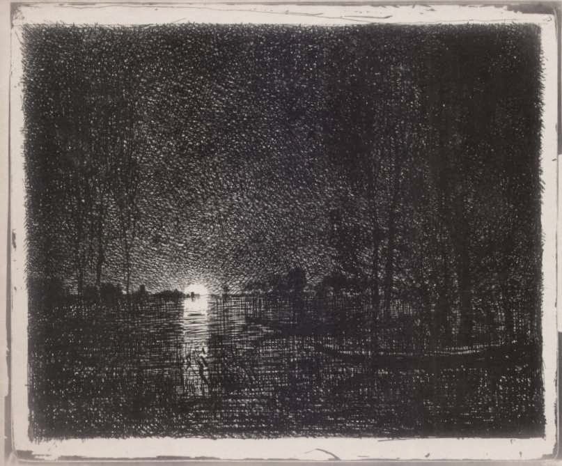
I have begun to research how it was done and the general principles reminded me of the principles behind the work of the artist Cozens. This quote from 'TEA-CUP READING AND FORTUNE-TELLING BY TEA LEAVES' by A Highland Seer, sums up the concept. 

'GENERAL PRINCIPLES TO BE OBSERVED IN READING THE CUP

The interior of the tea-cup when it is ready to be consulted will exhibit the leaves scattered apparently in a fortuitous and accidental manner, but really in accordance with the muscular action of the left arm as controlled by the mind at whose bidding it has worked. These scattered leaves will form lines and circles of dots or small leaves and dust combined with stems, and groups of leaves in larger or smaller patches: apparently in meaningless confusion.

Careful notice should now be taken of all the shapes and figures formed inside the cup. These should be viewed front different positions, so that their meaning becomes clear. It is not very easy at first to see what the shapes really are, but after looking at them carefully they become plainer. The different shapes and figures in the cup must be taken together in a general reading. Bad indications will be balanced by good ones; some good ones will be strengthened by others, and so on.

It is now the business of the seer—whether the consultant or some adept to whom he has handed the cup to be read—to find some fairly close resemblance between the groups formed by the leaves and various natural or artificial objects. This part of the performance resembles the looking for 'pictures in the fire' as practised by children in nurseries and school-rooms and occasionally by people of a larger growth. Actual representations of such things as trees, animals, birds, anchors, crowns, coffins, flowers, and so forth may by the exercise of the powers of observation and imagination be discerned, as well as squares, triangles, and crosses. Each of these possesses, as a symbol, some fortunate or unfortunate signification.'

Later on we find a comprehensive list of things that we might 'see' in the tealeaves. This is a selection from 'A'. 

ACORN, improvement in health, continued health, strength, and good fortune.

AIRCRAFT, unsuccessful projects.

ANCHOR, a lucky sign; success in business and constancy in love; if cloudy, the reverse must be read.

ANGEL, good news, especially good fortune in love.

APES, secret enemies.

APPLES, long life; gain by commerce.

APPLE-TREE, change for the better.

ARCH, a journey abroad.

ARROW, a disagreeable letter from the direction in which it comes.

ASS, misfortune overcome by patience; or a legacy.

AXE, difficulties overcome.

BADGER, long life and prosperity as a bachelor.

BASKET, an addition to the family.

BAT, fruitless journeys or tasks.

There are also images in this wonderful book that are a guide as to how to go about reading the leaves. 


I was very taken with the illustrations of 'random events'; the cup, still possessing its handle and an indication of its circular base, is elevated to a cosmic circle, the tea leaves could be galaxies as read by a God. 
So there was my gran, back in the 1950s operating as some sort of divine interpreter for the village and it was normal. But if she had been making abstract paintings at that time and telling people that they were full of meaning she would have been laughed at. 

This search for images with meaning appears to be vital to the way we deal with perception. It is also used in psychology as a test to examine a person's personality characteristics and emotional functioning.

Rorschach inkblot

The Rorschach test uses inkblots to obtain information from subjects as to their responses to something that is designed to be 'suggestive' of many possibilities. It has been employed to detect underlying thought disorders especially in cases where patients are reluctant to describe their thinking processes openly. It being basically a psychometric examination of pareidolia.  

I think we have an interesting power reversal here. My grandmother who was not a professional, used her skills in seeing things in random patterns to help guide people through life, whilst the psychologist, a professional, looks at how others see things in random patterns in order to diagnose their problems. I am much more inclined to follow by grandmother's example and so have begun to include an element of collaborative storytelling in the artwork I am making. 

Here are the basics of how to read tea leaves

1. Start with a white or translucent rounded teacup and saucer. This is a very important aesthetic decision and will shape the event. 
2. High quality loose-leaf tea with full-shaped leaves is essential. Try Darjeeling, Earl Gray, Jasmine, Gyokuro or just plain old builder's tea. 
3. Once the tea is poured it should be drunk while in conversation with whoever is going to read the leaves. In this way a degree of empathy is ensured before the reading takes place. 
4. Once there approximately 2 teaspoons of tea left in the cup, the drinker is asked to swirl the tea leaves around.
5. Then the drinker should place the saucer on top of the cup, and flip over the cup and saucer as a unit so that the cup is bottom-up on top of the saucer. This will remove any remaining liquid and allow the leaves to spread out.
6. With the cup handle facing the drinker, they should use their non-dominant hand to turn the cup three times in the direction that seems less natural. 
7. The reader can then turn the cup right side up and begin analysing the leaves. Start from the outer edge of the cup, and moving inwards in a clockwise motion to the bottom centre. The portion of the leaves closest to the handle's edge represents the immediate future, and the leaves closer to the centre represent several months into the future.
8. The analysis of symbols or messages found in the cup will of course be based on the powers of intuition and life experience of the reader. 

You may well ask me at this juncture what has this got to do with art and drawing? My answer is that I believe that it is central to the way all images come into being. 

See also:

Cozens and his ideas are explored in this post on clouds

More on making patterns out of random dots

Other ways of reading stains and blobs

References

TEA-CUP READING AND FORTUNE-TELLING BY TEA LEAVES' by A Highland Seer

Coccia, E. (2016)  Sensible Life: A Micro-ontology of the Image New York: Fordham University Press

Fotinis, A.P.(1980) The De Anima of Alexander of Aphrodiasias: A Translation and Commentary. Lanham: University press of America

Rosen, R. J. (2012) Pareidolia: A Bizarre Bug of the Human Mind Emerges in Computers The Atlantic. August 7

Philoponus, (2014) Aristotle: On the Soul  London: Bloomsbury Publishing


Friday 16 October 2020

Chalks, dry crayons and coloured pencils

Red chalk drawing: Michelangelo 

When you draw or work with chalks and other similar materials you are in effect making marks with the very rocks that compose the earth. White chalks in particular are very common on the south coast of England, (the White Cliffs of Dover), and lumps of it are everywhere you walk, often they are sea eroded and exactly the right fit for the hand. Chalk is soft and other rocks harder, so it is very easy to find a surface on which to make chalk drawings.
Sometimes when I think about what I am doing when I make a chalk drawing I can get a little shiver down my spine. Chalk is a limestone deposit. It is made by plankton concentrating calcium in their bodies when alive and then after they die, the calcium leaches out of their tiny bodies as they settle onto ocean floors. Over millions of years very thick deposits can be laid down, then as the earth morphs into new forms, seas recede and some areas of land are raised up, these areas of uplifted chalk deposits are what we see as the white cliffs of 'Albion', a name the Romans gave to what we now call England, a place name based on the Latin word 'albus' or 'white'. As I draw with chalk, I'm eroding it away, it's deposits now collecting on a new surface, one often made of paper, another organic substance, this time usually made from plants. This 'geological attrition' can be seen to be an essential part of the meaning of the activity of drawing with chalk. But the connection goes very deep. Back in the depths of time and in the depths of the sea there was an evolutionary step taken that was very significant for us humans. The need to leach out calcium carbonate was partly to ensure that a living organism was of the right acid/alkaline balance. Too much of either and life couldn't survive, and a transference out of the body of calcium carbonate as a 'shell' became a solution to the problem.  Very quickly in evolutionary terms, what was something initially done to preserve life from too much alkaline present in the system, became something that operated as armour, encasing the animal as a protective shell. This process of using deposits of calcium carbonate to build with at some point much later turned itself inside out. Instead of building shells on the outside, it was used to build 'bones' on the inside and the history of vertebrates began, initially with fish like creatures and at some point long after fish had climbed out of the seas, the concept of a backbone was passed on as being essential to the idea of mammals. 
So the chalk I'm drawing with in many ways shares a history with the bones that make up my fingers and which allow me to hold the chalk tightly as I use it. 

Most people when you talk to them about chalk as a drawing substance are reminded of that time at school when teachers wrote on the blackboard with sticks of it. Weirdly blackboard chalk isn't chalk, it's usually made of gypsum another of those materials us artists are very fond of. 

Tacita Dean

Tacita Dean's blackboard drawings use the classroom association in two ways, the first as a reminder that one aspect of art is to teach us something. Dean could be seen to be operating as a schoolmistress, telling us a tale of daring do. Her stories embrace the notion of struggle over the elements, which explains the recurrence of the sea as a major element in her work. The other issue about chalk drawings on blackboards is erasure, they always look impermanent, the erasures of the blackboard rubber being integral to the look. 

Chalk (calcium carbonate) has been found in cave paintings that date back to 40,000 BC, while gypsum (calcium sulfate) has been used as a mortar for construction as far back as in the Egyptian pyramids. Chalk is an alkali that neutralizes acids, it is composed of calcium and oxygen combined with carbon (CaCO3), while gypsum is a salt (the product of a base and acid reacting and both becoming neutralised), made up of calcium and oxygen combined with sulphur. Gypsum’s origins are similar to chalk's, but in addition to being comprised of the calcium produced by the deaths of millions of plankton, gypsum also contains some of the salt that was left behind as the ocean evaporated. 

Gypsum is a fantastic material mainly because it is the only mineral that can be restored to its original rock-like state by the addition of water alone. Common applications therefore include, the making of moulds and the making of sculpture (as Plaster of Paris) and as an ingredient in cement. 
When making chalks, gypsum is dehydrated in a process that involves high temperatures to reduce its water content from nearly 21% to about 5-6%; then to make those various colours of classroom chalks, the crushed material is mixed with water and coloured pigments to produce those familiar blackboard chalk faded colours.  But different mixes of pigments as well as clays or oils can also also added to produce pastels, and other art materials for drawing on paper. However these mixes don't have to be baked, because they are much softer, designed to be used on paper rather than blackboards. 

If course plaster can be used to draw with. On the one hand it can simply be scratched into either when wet or dry, (as below) but it can also be used as a casting process to create drawings more like frottage. 

The scratched lines incised into the plaster above are done to allow a top coat of smooth plaster to be laid down, the scratched surface allowing the next layer to be attached firmly. However it is also a drawing technique, called sgraffito, which is basically scratching through plaster to reveal the surface below. 

Sgraffito used to decorate the outside of a building in Prague

Rachel Dein: Plaster relief drawing.
Flowers pushed into clay and a plaster mould made directly from the clay imprint

Although not as abundant as white, chalk can be found in various forms of red and in black. It is not easy to find deposits of such material because the chalk must be uniform enough for consistent colour and texture, dense and cohesive enough to be cut, but also soft and friable enough to make a mark on paper. Giorgio Vasari said that natural red chalk came primarily from Germany. There were also deposits in Italy, Spain, France, and Flanders. Black chalk was apparently more easily found. Natural black chalks make lines that are usually not as dark as charcoal. When looking at an old drawing, you can tell if it is done in chalk because chalk lines are neater and not as broken as charcoal lines, because chalks are not as crumbly. Increased pressure on the chalk can produce a darker line and lines can be broad and soft as well as sharp. A stick of chalk can be sharpened to a fine point for a thin line and Michelangelo talks about wetting chalk with his spittle in order to make it even darker. A chalk line also has a transparency to it that allows the light of the paper to show through and even though it is nearly impossible to erase chalk lines, they can be rubbed and blended to create subtle shading effects. Natural red chalk has a warm and vital colour that the French call sanguine (blood-red). The red derives from iron oxide, which occurs in the form of hematite. Red chalk is though rarely found naturally in a state soft enough to draw with and the hematite coloured chalk has to be diffused with fine clay in order to be soft enough for drawing. Different deposits produce different kinds of red. Natural red chalk is usually a pale blood-red, but the red can also be warm, cool, or neutral (that is, red-orange, red-violet, or red-brown). 

Nathan Hawkes, an Australian artist makes large scale pastel and dry pigment drawings, working with anything from a vacuum cleaner to sharp metal points to scratch the paper in order to get the surfaces he requires. Hawkes reminds us that an old tradition can always be revisited and re-worked and in his case he also reminds us that we don't have to look far for exciting subject matter. Most of his images begin within the chaos of an ordinary life, and they evolve out of his experiences of domesticity, something that is being enforced on many of us at the moment, which is why I think artists like Nathan Hawkes deserve a fresh look. 


Nathan Hawkes

Because red chalk is water soluble, it allows the making of a counterproof, a softer, reversed version of an image transferred by pressing it to another, dampened sheet of paper. Loosened by moisture, a portion of the ink, chalk, or graphite transfers to the new support, forming a mirror image of its source. Counterproofs are recognisable by their relative faintness and the direction of an artist's hatching. Lines created by right-handed artists tend to slope upward from left to right, but are reversed in counterproofs. This rudimentary form of replication helped artists to alter compositions or to simply see their work in reverse. I can remember when being trained as a printmaker, because an etching was a mirror image of the plate used to create it, we made counterproofs of soft pencil or felt tip pen drawing ideas, so that we were able to think about how the images would look in reverse.

Edme Bouchardon: The Sense of Smell: Counterproof

When a blood-red chalk is moistened to produce a stronger, darker, more solid line, it produces a cooler hue. Watteau sometimes wet his chalk for accents around the eyes, nose and mouth. By rubbing his natural red chalk lines lightly or smudging them slightly, Watteau was able to add very subtle accents within what were mainly monochrome drawings, as in the cheeks below. 

Watteau
In this drawing by Watteau you can also see the difference between the sharp marks made by the red chalk and the rougher bolder marks that charcoal produces. Watteau was though an expert chalk user and he used several mixes of black chalk ground with clay, so I suspect the black lines on the checkered bodice are chalk and the hat charcoal.
Guercino
Guercino often used red chalk and in this drawing of a boy above you can see the traditional use of 'laid' paper as a surface for chalk drawings. 'Laid' paper has a good 'tooth' to it and in some ways it is like working on canvas, the texture of its surface can be used as an integral part of a drawing's feeling tone. 
Laid paper
Seurat: Black conté crayon on Michallet, a handmade french 'laid' paper. 

If you look closely at Seurat's drawing above, you can see the lines of the laid paper emerging from beneath the black marks of his sfumato technique. Laid papers such as those used by Guercino were still being used, but this time much more for their textural 'bite', but artists now had a new drawing tool with which to lay down granular dry pigment effects.  During the late 18th century conté crayons were developed.  Initially made of compressed powdered graphite or charcoal, they were, in a similar way to how red and black chalks had been made in previous times, mixed with a clay base, a base that Nicholas Conté realised could at times have small quantities of wax put into it to adjust the hardness of the crayon. This development was like cartridge paper another product of war. The British navel blockade of France during the Napoleonic War meant there was a shortage of graphite because what was available was being used for the war effort. The graphite deposit in Borrowdale in northern England was the only source at the time of pure solid graphite and Nicholas Conté discovered that he could mix together clay and powdered graphite, of which there was a supply in France, to form graphite rods. This also allowed for the production of varying darknesses, and as well as conté crayons, it led to the development of the pencil as we know it, including the HB hardness and softness system we use today. Now made using natural pigments, clay and a binder, conté crayons are usually found in black, white, sanguine (blood red), grey and other usually 'earth' colours. They are often used as a first layer before building up strong pastel colours. This is because pastels are so crumbly that you can often waste their intensity trying to build up the surface colour, and conté crayons are tougher than pastels but mix better on paper than many other hard pastel products.

The best papers to use for this are rough ones, these hold pigment grains well. The sticks' square profile also make conté crayons more suitable for detailed hatched work as opposed to the bolder painterly approach demanded by soft pastels. It is probably this aspect of conté crayons that led to them being used by Seurat. If you compare his use of pen and ink techniques to his use of crayon you can see why he might have preferred the harder crayons to softer pastels. 

Seurat: Pen and ink drawing

In comparison you can see how Degas uses a very different handling that is much more suited to pastels. 

Degas

I'm very fond of this Degas drawing, its subject, the hand trying to find an exact spot to scratch, and the relief that gives, being something that I think is key to the human condition. Scratching to relieve an itch, is a sensation that we can share with many other animals. You have only to watch a dog scratching itself to feel a direct empathy between yourself and a different creature, both yourself and the dog at one time or another needing to scratch that itch. 
David Hockney: Portrait of Shinro Ohtake: Pencil and coloured crayons on white paper
Children's crayons, or art materials made specifically for children are relatively new things. Before the 19th century you would not have given children art materials to play with, they were far too expensive and would be seen as essential craft tools for working people. However since the 19th century the idea of fostering play through creative education has become more and more important as an aspect of child development and because of this we now associate childhood with a time of being able to use coloured crayons to 'express' ourselves. This has given coloured crayons, (both dry and waxy) an association some artists are anxious about, as the use of these materials they feel, can suggest that an artist is yet to let go of childish things. Personally I think that every material is wonderful and you just have to explore what it can do in order to open doors into new relationships between yourself and a material. This being something that is about 'letting go' of the human ego and opening yourself out to a proper 'material' conversation. In David Hockney's portrait drawing above you can see how he 'loves' his crayons, approaching them like all his materials with respect and giving himself time to adjust to them and their particular proclivities. 
I began this post with an observation that when you draw or work with chalks and other similar materials you are in effect making marks with the very rocks that compose the earth. This is an ancient idea, for instance Buddhist sand painting is essentially drawing directly with dry pigments. The video below also demonstrates the use of chalked string to draw geometrical relations a process that links Renaissance perspective construction with the building trades. 
Buddhist mandala creation 

The artist 
Yusuke Asai uses the earth as a medium because he can find dirt anywhere in the world. He loves the idea that seeds grow in it and that it is home to many insects and microorganisms. He regards earth as a “living” medium.


Yusuke Asai 

Chalks, dry crayons and coloured pencils are in effect simply ways of making certain materials easier to handle by creatures with hands. However long before humans evolved, these materials were being moved around and were rubbing off against each other as the earth was in effect 'drawing itself'. Natural phenomena such as Uluru or Ayres Rock in Australia, being part of a constantly evolving process of 'worlding' that we as humans echo rather than shape. 
Uluru
A cave painting at the base of Uluru 

The image above is over 10,000 years old, made with the red earth of Uluru. The image below is one local to Leeds, a sandstone carving also made over 10,000 years ago on Ilkley moor. 

Ilkley moor stone carving

The earth is our home, it is our pigment, just as we are the earth's pigment. We stain the earth red with our bodies in times of war, times that we will remember in our histories as vital to our species, times that the earth's soils and rocks will however never notice. Each time you pick up a crayon, use an earth pigment or simply leave your footprints in the sand, perhaps it is also a time to give thanks to the earth out of which we emerged and back into which we will at some point all return. 
See also:

Saturday 10 October 2020

Drawing with a camera

You can use a camera to draw with, just as you can use so many other things that you don't normally think of as drawing tools. But in order to use a camera more like a drawing implement I like to think of the old northern European definition of drawing, a definition that suggests that you need to 'drag' the images out of the world.

The verb 'to draw' comes from the same linguistic root as in a horse 'drawing' a cart. It means to drag, pull, or bear weight.  The Middle English word was “drawen,” the Old English “dragan” and the Old Norse, “draga,” meaning of course to drag.  The German word is “tragen,” meaning to bear or carry.  Just as in an earlier post we looked at a hypothetical Indo-European base, for the word 'art' which was 'rt', in proto Indo-European, we have the word “dherach-,” meaning to pull or draw along.  In this case to draw means to act upon something and make it move.  

By thinking of your camera as a drawing tool, you can perhaps see it as something that you can move through the world, and as it is moved it leaves traces of its movement. 

The first ‘camera’ I ever thought of using in this way was an A4 size flat bed scanner. It was one of those that you could remove the lid, so you could place it directly on a surface and scan whilst dragging the scanner over the surface it was scanning. Things have moved on technically since then and there are now some reasonably cheap hand-held scanners, that when used for image-making can connect a physical, embodied gesture with an industrial, mechanical process. The artist Lewis Chaplin ‘draws’ with hand-held scanners, ‘by manipulating their direction, speed and position ’ he says they... 'compresses the performance of photography into something very dense’. He goes on to state, ‘A scanner is really just another type of camera and so I began to use the hand-held scanner like it was one, trying to give it some agency. I took it out onto the streets and started to use it as an image-making tool, recording the surfaces around me’.

Lewis Chaplin: scanner image

You can also use your mobile phone camera like a scanner. Just hover it over a surface and keep pressing the exposure button. 

The beginning of a self portrait using a smartphone

The continuation of a self portrait using a hand held scanner

Another way to think of the idea of drawing is simply to act upon something and make it move. This could be as simple as using your camera or smartphone as you walk past or through an environment. 
Walking through grass

The idea of recording from a low viewpoint begins to connect the process of dragging with that of passing through. 

But how do you give the environment more traction? One way is to make whatever is being recorded much more difficult to see. For instance if light levels are very low, or so high that images are bleached out. It could be that you are so close to the subject that it becomes unrecognisable, or only a small part ever becomes visible. Perhaps there are barriers between you and the thing seen, such as frosted glass or translucent perspex, An old mirror with silver removed would perhaps only reflect fragments of reality, could the world be photographed through this mirror?

Eugenia Raskopoulos Diglossia 2009

Jacky Redgate Light Throw (Mirrors) I 2009

We tend to think of the world as always being 'in focus' but what if it is not? When you look through an Argos catalogue, every object photographed in it is something to possess, so each one is always in focus. But what would be the opposite of a catalogue of things that we might want to possess? 

John Hilliard

Hilliard uses two different shutter speeds to establish a time difference between two images of the same people, the slow speed creating an ambiguity that allows the audience to conjecture what might have happened in terms of the relationship established in the left hand frame. 

Shop window: Eugène Atget 1910

Reflective surfaces confuse the eye and slow down the read as two images combine. Atget was one of the earliest photographers to become fascinated by complexity and distortion, rather than the power of photography to document the world. 

Perhaps the biggest issue at the centre of all this is how we see the world. Is it something to own or possess? If so, we will develop a way of recording it that singles out things in such a way that we can 'own' them or frame them for possession. However if we understand the world as something we are immersed in, something that we are interconnected with, or locked into its systems and processes, then we need a different way of recording a situation rather than preserving a selected moment, or standing outside of the world and framing it. 

If I go back to the etymological root of the word 'draw', we can perhaps use it to help us open out a different way of using photography. When a field is ploughed the plow is dragged through the ground and as it is dragged it pulls things up from under the ground, things that were 'in the dark' and brings them back to the surface, back into light. Farmers sometimes finding old Roman coins or other treasures as they drag their plows through the soil. 
The plants that will be grown in the prepared 'broken' soil will live two lives. One through their roots, whereby they sense out a relationship between the elements and creatures of the earth, where they interconnect with fungal message systems, find a home alongside earthworms and form an intermingling with bacteria and other micro-organisms, so that the mineral nutrients that they are embedded into can be shape shifted into food stuffs; the other life will be in the light.
The elements that compose your camera or smartphone were once embedded into the ground, but at some point they were dug out or pulled up into the air by what would have been a far more destructive process. Metals such as copper, gold and silver for wiring, lithium and cobalt for the battery, and aluminium, silicon, oxygen and potassium for the glass screen, would all have been mined. Oil is extracted by deeply inserted into the earth pipelines before it is used to make the plastic for a smartphone case and rare earth elements, such as yttrium, terbium and dysprosium, are used to ensure that screen vibration produces the beautiful colours that are now required. The elements that compose your smartphone were also once in the dark. As you use it you are 'bringing it out into the light', you can now unearth its possibility, but what 'possibility' will you reveal? 
Can you re-insert this light sensitive machine back into the world in some way? The word 'photography' literally means to draw with light. To draw is to drag, to pull out; so can you 'pull out' of the world an awareness of itself? Can the smartphone become a tool for enlightenment? 
A plant lives two lives, one underground and the other one in the air. It breathes in carbon dioxide, and interacts with light to produce energy and oxygen, this photosynthesis creating food for all the creatures of the world. A plant's leaf is its camera, leave something on the lawn for a few days and then pick it up and you will have made a photograph. Whatever was left on the lawn, becoming a negative, a negative revealed as a yellowed form because it is not exposed to the energy of the sun's rays. That familiar green is there because chlorophyll is green, a pigment that absorbs blue and red light. Pigments absorb some wavelengths of light and reflect others. A green pigment is therefore one that absorbs all of the wavelengths of light except green. So plants are green because chlorophyll reflects green light, or another way of putting it is that green light is the only wavelength the leaf isn't using to store energy or make sugar.

Grass is very sensitive to electrical charge and if present during the time when lightening hits the ground, the electrical discharge will leave a tree like ghost of itself. 

A lightening 'drawing' in grass

The lightening drawing is simply a ghost image of a process, but what it does reveal is how certain forms of interconnectedness appear over and over again. This could be a drawing of a tree, its branches dividing in a 'dendritic' system like tree root patterns or river systems. 

A river system in Tibet

So can the camera be re-inserted back into the earth from which it came from? Can it operate more like its precursor, the leaf, can its 'photosynthesis' produce new life, create an awareness of possibilities that are not so much about ownership as about revealing processes and interconnectedness? Can it be dragged along and drawn into a new life in the light? 

See also:


Tuesday 6 October 2020

Ben Shahn: Commercial v Fine Art

Ben Shahn: Liberation 1945

Ben Shahn: Illustration

Ben Shahn: French workers

One of the most difficult areas to negotiate as an artist is that territory between fine art and commercial art and there has been a lot of snobbery, elitism, and much hoo-ha about the differences between high art and low art. Indeed there has been enough verbiage to weigh the heart down of any artist who aspires to cross boundaries. So it was of great relief to me when I came across Ben Shahn’s approach to this subject in an old discarded library copy of his work. His article ‘Some revaluations of commercial and fine art’ was written in 1950 and formed the core subject of a talk he gave to the students of the Franklin School in New York during that same year. The year incidentally that I was born, so although it might appear to be something from another era, for myself it is a voice that still echoes down the art valley and even though now very faint, makes good sense. He sets off to admit that he has, “a foot in the stirrups of both horses.” (p. 121, 1972) He then goes on to state that he finds the distinction confusing, and wishes to sow a similar confusion in the ranks of art students attending his lecture. I know exactly what he meant and why he believed that good work was being done in both disciplines and that commercial work could be just as valid a statement about the human condition as fine art work.
His image of children swinging in front of bombed out buildings, is a wonderful summation of what it must have felt like to witness the end of a destructive world wide conflict. The children are thin, almost wretched but they still have the energy and vitality to play with great abandon. They are a wonderful image of the optimism of 'liberation', as Europe was released from the occupying forces of Nazi rule. In another image French workers show their hands, weighty hands that confirm their status as people that value hand skills and hard work. Manual labour is just that, labour that uses 'les mains'. Shahn's images were direct and designed to communicate his socialist values, and they still continue to do so. 
When 'Liberation' was shown at the Tate Gallery in the early 1950s Shahn came over to London and gave a lecture, warning us all of the latest tendency to categorise art, in this case into various types of abstraction. In particular he was referring to Alfred Barr's famous diagram of abstract art.
Alfred Barr: The Development of Abstract Art

Shahn's words were however not heeded and Clement Greenberg and his ideas on abstraction and media specificity would soon hold sway over many English fine art departments. Atomisation and categorisation somehow swaying opinion for many years, and only with the rise of post-modernism and following that, an appreciation of complexity and entanglement, did these old worn out theories lose their grip.
Here I am still working in an art institution 70 years after Shahn’s admonition and the division between fine art and the other visual art disciplines is still there. When you enter my institution you have to choose to do illustration or fine art, they are two totally different pathways. You can also do comic book art, graphic design or animation. All of which are visual subjects that demand a set of visual skills in order to solve different problems. I have really never understood the divide. I have taught fine art, illustration and graphic design, as well as drawing for interior design and fashion. Once any superficial differences are overcome, you work with the fact that each area is focused on communicating ideas in response to various aspects of human lives. You are sending messages between different humans and creating new images to carry these messages as you do so. Embedded into these messages is always something above and beyond what the artist thinks they are saying. It is only years later that that extra something begins to be seen. The distancing that time gives to something, allows us to see what was always there, but which was invisible, because like the water in which fish swim, it was taken for granted. 
Clothes design can be used to help people feel better about themselves; people can be made to feel taller, more empowered or sophisticated. An environment can be made to feel more comforting or to project a sense of power, graffiti (an area you don’t need to go to art college to learn about) can move you, and make street kings of its makers and illustrators have as much right to tell stories as anybody else. Who says what to whom and in what medium and to what effect? That’s the core story, that’s what the whole thing revolves around. Something I well remember having to teach when communication theory was seen to be a vital tool in the armory of every graphic designer. 

I have always admired the versatility of English artists such as John Piper, who could create images of pure fine art painting, design sets for the theatre, turn his hand to textile design as well as produce stained glass windows for various churches. His work has dipped in and out of fashion, but whether you like it or not, his key facility, which was to recognise and be able to sum up the most salient visual features of a place or building, led him to be able to design images that were very interdisciplinary translatable. 

John Piper: Screenprint

John Piper: fabric design
John piper: Set design

Human beings have developed some pretty sophisticated communication tools, but once again we get confused between things and processes. Nouns in particular are tricky things, they categorise the world in ways that sometimes help, but at other times they don’t help at all. Words like art, craft and design suggest that they are very different things, but the reality is when you see these things as belonging to a process, you will find that they are totally interconnected. You cant make a sculpture without craft, you cant paint a painting without understanding how to fit colour and shape together; they are core elements of the design process. Process goes right down, deep down into the soil or sea from which we emerged. 

Semaphore

Humans are extensions of the environment out of which they emerged, they are an on-going process and their various attempts to communicate between themselves are also processes that are products of these environments. Waving flags as signals was a communication process that emerged as a result of humans developing sailing ships and making it difficult for themselves to maintain close intimate forms of communication. Speaking, one of our most precious forms of communication, is unthinkable with out the idea of ‘air’. As Yates said when asked where his poetry came from, “I made it out of a mouthful of air.” What was contained within him escapes out into the container within which Yates himself grew. The container is contained in its container. In ancient texts ‘pneuma’, was both the ‘breath’ inside us, and the ‘air’ that surrounds us. As Emanuele Coccia puts it, “To breathe means to be immersed in a medium that penetrates us with the same intensity that we penetrate it.” (p.11, 2019) So the debate about whether or not something is art would appear to me to be not one worth pursuing or wasting energy on, of more importance is the gradual raising of awareness of the way humans are interpenetrated by everything else, and of how the processes of interaction are what enable life to be maintained. As we myopically engage in definitions, we lose sight of the reality of our existence and like Nero, fiddle around whilst the city burns down around us. 

References: 

Morse, J. D. (1972) Ben Shahn London: Secker and Warburg
Coccia, E (2019) The Life of Plants Cambridge: Polity
Piper, J (1968) Stained glass: Art or anti-art New York: Sterling

Note:

The Ben Shahn drawing on the cover of Ralph Ellison's 'The Invisible Man' Penguin modern classics book, was originally for a suite of illustrations for a proposed film Ambassador Satchmo, commissioned for the film by Edward R. Murrow and Fred W. Friendly in 1956. The film was never made and the illustrations eventually repurposed. 

See also: