Saturday 21 March 2020

Shadow drawing

Intersections: Anila Quayyum Agha

This installation by the Pakistani/American artist Anila Quayyum Agha, uses a central light source that casts a shadow over an entire room, to create a wonderful immersive environment that heightens a feeling of spiritual contemplation. This beautiful resolution of what is a very old idea, is something all of us can think about using and is not the property of any one artist or designer.

Hilden and Diaz

The designers Hilden and Diaz market Ernst Heinrich Haeckel inspired chandeliers; when you illuminate them they cast shadows around your room that turn it into a forest. A very similar idea to Anila Quayyum Agha's and more affordable and available to ordinary people. It also asks some questions as to the relationship between art and design. The reality is that the idea belongs to nature, i.e. to us all. 

Shadow of a plum tree cast by moonlight: David M Porter 

The sun and moon cast shadows for free and we can all benefit from the idea. Because so many of us are having to self isolate perhaps a project whereby we investigate the potential of a different way of making images would be both useful and distracting, as well as reminding us that we don't need expensive materials and equipment to make interesting images. 

This very basic video shows how you could begin a project.

The problem with working in this way is how to give your shadows sharp edges, so here is a short tutorial on how lighting works.

Hard and soft light and shadow tutorial

Using some tape, wire, scissors, a cutting knife and whatever else you might have at hand, try and transform materials you might normally throw away into something that can be used to create shadows of images related to the work you are already doing. Noble and Webster even managed accurate shadow portraits, so it literally can be images of anything. 

Noble and Webster

Make sure your light source is not a hot one, the last thing you need to do is burn the house down and that you have camera ready to record anything that looks interesting. Then try and follow the implications of what you have done. Try and film the process as well as record it as a series of static images. Then review your footage and begin the process again, this time relating what you are doing to the potential you have unearthed in the review. In this way you can begin to reveal for yourself what the project might lead to. Remember Jasper Johns and his mantra, "do something and when that's done, do something to that". 

I shall try and mix these blog posts up during these days of self isolation, sometimes putting up a practical project and at other times things to generate ideas. But remember, it is in doing things that ideas emerge, so don't think for too long about what all this might mean, just have fun playing with shadows. 

See also:

The vignette (Includes links to other information about shadows) 


Wednesday 18 March 2020

Drawing the corona virus


It looks as if the Leeds Arts University will close its doors to students in the near future and if so, on-line resources will become more and more important. If you are a student and are in self-isolation, then you can use this blog as a way of keeping in touch with ideas about art practice.  I am still available to message, either via the comments boxes or via e mail and hopefully this emergency situation will be over in the near future. 
Those of you that follow this blog who are not students, again feel free to message me if there are any questions. 

As someone interested in drawing things, it is interesting to look at how the virus has been visualised. I have already made some drawings of it for a card game I’m designing in relation to an idea I have about contemporary votives, (see image above) and have therefore had to think about the relationship between images taken from electron microscopes and the processes of simplification for illustration purposes. 

Transmission electron microscope (TEM) from the centres of disease control and prevention (CDC) C S Goldsmith and T G Ksiazek (left) and NIAID (right) Arrowhead = corona/ halo around a viron 

This first image makes the virus look very amorphous, it looks alive but very indistinct, every virus also seems to be an individual, and its hard to sort out one from another, are they all examples of the same virus or is this the virus amongst other microscopic elements, such as blood cells? 

Image of corona virus in scientific paper that has been drawn on a CAD program

The CAD version above is very like a flower or arrangement of flowers erupting from an arid planet. Gone is all the indeterminacy of the photograph, the artist has given the virus a clear form and what was in the photograph a halo around a viron, is now a series of tufts surrounding a sphere. 

A more 'organic' image of the virus

The 'tufts' are in this image now more like organic tubes and the image appears much more transparent, suggestive of life more than the previous image, especially as the sphere is not uniform and it deviates from a circle. 

A more schematic CAD drawing

The CAD drawing above reinforces the 'flower' shape emerging from out of the sphere. 

Corona virus electron microscope photography

Looking again at an electron microscope image, we can 'see' what we are looking at a little clearer now, but just like the early drawings of the moon, there is room for a lot of invention. 

Needle tip, printed full-stop and razor’s edge: Robert Hooke’s Micrographia (1665).

These images of the corona virus reminded me of the first drawings done through a hand held, lens focused microscope by Robert Hooke. In particular his drawing of a full stop, which looks like a planet with hairy extensions erupting out of it. This type of situation is key to an understanding of how images develop. The thing that sits in your mind is very different to the reality that is invading your body, but you can't think clearly about something that you can't see, so you need someone to produce an image to allow you to get your head around it. However these images are a product of imagination and our imaginations are often led into making intuitive leaps, usually based on one thing being like something else. 

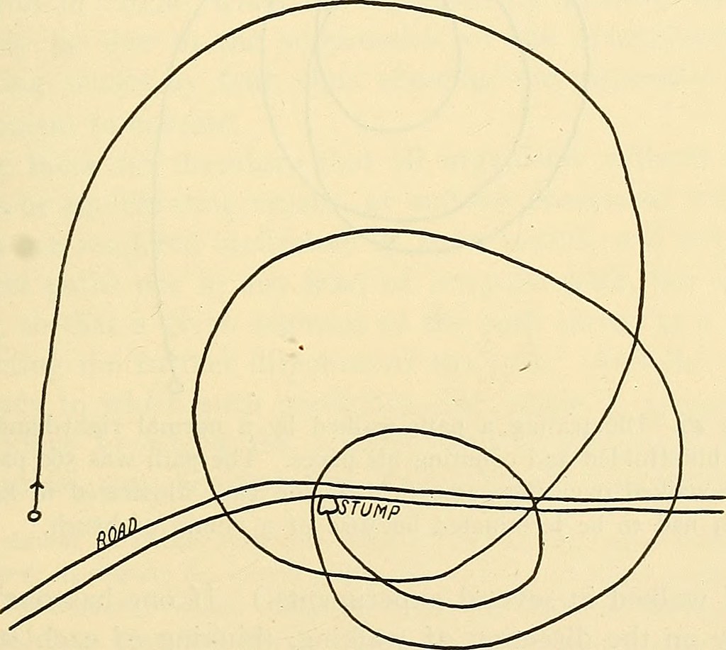
I thought I'd seen these images before and realised it was in Salford when I went to see Karina Smigla-Bobinski's 'Ada' installation. Smigla-Bobinski was making an image based on a Platonic ideal of geometric form, but once let loose in a room, it made its mark by leaving traces of its contact on walls ceiling and floor using its charcoal tips. I can now see it as a metaphor for a virus, a new one that has come out of recent experience.

Karina Smigla-Bobinski: 'Ada' 

There is another series of associations that can be made with the corona virus and its depictions. Looking at the early electron microscope photograph of the virus above, it is described as ‘a corona / halo around a viron’.  (The infective, extracellular (outside the cell) form of a virus is called the viron) Coronas and halos are metrological terms for certain atmospheric phenomena and these terms are themselves derived from religious iconography. 

Virgin Mary with halo

The earliest form of what we now call a halo, was something that surrounded the whole body and was called the aureola. This was the concept of a surrounding aura, glow or irradiation used in Christian and other religions to single out figures that had first of all God like status, and then later other elevated beings such as saints or the virgin Mary. 
The aureola, is often in the form of an ellipse that surrounds the whole body, while the halo or nimbus usually takes the form of a luminous disk surrounding the back of the head.

Two examples of mandorlas in Eastern Orthodox Church imagery

I think the most interesting form of the aureola is the mandorla, as used in Eastern Orthodox Church icons. It is used to depict sacred moments which transcend time and space, such as the resurrection, transfiguration or the ascension These oval or sometimes circular figure surrounds are painted in several concentric patterns of colour that grow darker as they come close to the centre, or figure of Christ. This is in keeping with the church's use at the time of apophatic or negative theology, which was an attempt to approach any descriptions of God by negation. The theory was that to speak only in terms of what may not be said about the perfect goodness that is God, was the only way to get an idea across that God was beyond perfection. Therefore, paradoxically, in these images, as holiness increases, there is no way to depict its brightness, except by darkness. This idea of negative depiction is an interesting concept that can perhaps be used to illuminate ideas about what a corona virus looks like. 

Buddha with halo

The halo is seen in Christian, Greek and Buddhist art, as a circular form surrounding the head that appears to have light radiating from it. It is used to enable audiences to pick out the more spiritual players in complex religious images.  In more secular imagery, Roman emperors are sometimes depicted with rays of the sun emanating from their head, although this was probably related to their interest in Sol Invictus, a later Roman religion whereby sun worship was being returned to. 

Sol Invictus

In all cases the halo signifies importance and it is the sun that is the most important thing to us on Earth; we are both derived from it and sustained by it. Depictions of the sun god Ra in Egyptian carvings reflecting the fact that this image has a long tradition. 


Images of Ra

The nimbus, a term often used instead of halo, constitutes the idea of a crown modified by the emanation of light from the head of a superior being. The crown of course has long been used to identify superior beings. 


Corona is of course defined as, resembling or likened to a crown. The sun's corona is normally visible only during a total solar eclipse, when it is seen as an irregularly shaped glowing nimbus surrounding the darkened disc of the moon. 

Sun's corona seen during an eclipse by the moon

Once again we begin to see a negative being used to allow us to see something positive. It is the moon’s removing from our sight the centre of the image of the sun that allows us to appreciate the sun’s corona. 
So by a convoluted path we can return to images of the virus and perhaps see them as part of a long tradition of trying to visualise those things that cant be seen and in particular those things that by their very nature are beyond our comprehension. 

Disneyfication of a corona virus

Disneyfication is defined as: the transformation of something real or unsettling into something perfectly safe or into a carefully controlled and safe entertainment. By trying to represent something that is so feared, (like god or in this case the devil) in a way that resembles the way we draw cartoon characters, perhaps its harsh nature is also softened in the mind. 

The corona halo

When you push all the metaphors together, what you get is a corona sitting within a halo. The virus becomes a sun god.

Shrine to St. Corona

Saint Corona was often called upon by gamblers and treasure hunters as well as those seeking good fortune when dealing with money. 

Money as good fortune sun god

Thinking about art and what it helps us to think about may at least form some sort of distraction. 

Take care everyone and I shall try to keep posting from isolation. 

See also:


Friday 13 March 2020

Between art, geometry, emotion and science

Nikolaus Gansterer

Geometry has been central to the way human beings have visualised ideas for thousands of years. However most users of geometry don't understand the mathematical principles that lie behind its success, they operate, especially if they are artists like myself, somewhere between maths and instinct. Those that don't normally use geometry will of course still make images and often powerfully emotive ones, but it is when the two approaches combine, that I think unique and fascinating images can arise.

For instance, Gaussian probability field graph paper is manufactured for the use of visualising mathematical statistics and graphing the appearances of random variables, but it is also used by the artist Nikolaus Gansterer to draw on. Nikolaus Gansterer's work is typical of artists that sit in that field that sits between art and science, his working processes are informed by logic and an idea of experimental research, but his working process is also informed by instinct and an artist's logic.


He also uses various drawing devices which operate rather like a scientist's apparatus, (see an earlier post on this) and by doing this his work begins to take on a degree of authenticity that stems from the rigor of adherence to the processes that he has evolved. He talks about these drawings as 'interrogating the relationship between empiric and subjective truth', and uses both hands to draw them with. The 'right' hand being the one in control, the 'other' or less used hand being the one that expresses a degree of 'un-control' or expression.
You can download probability field graph paper from here. You don't have to understand how it is used, but as soon as you print it off, it exudes an aura of mathematical and scientific 'knowing'. 
These rough drawings of ideas (above) seemed to take on a certain 'reality' or 'conviction' as soon as they were done on graph paper. 


Kate Hammersley: Helium drawing

Kate Hammersley has a particular interest in materials and materiality, in particular in the way flow and flux is exhibited when materials come together. She was the first artist-in-residence at the University of Oxford Department of Engineering Science and in these drawings she is exploring both the material quality of helium and how balloons can be repurposed as drawing tools. Her apparatus in this case being the balloon environment she has constructed to enable the drawing. The final piece is usually shown as a video as the idea is durational rather than being about a fixed, static image.

Kate Hammersley: Helium drawing: detail

Karina Smigla-Bobinski: Ada

Interacting with other materials such as lighter than air gases can lead to some very interesting experimental situations. Karina Smigla-Bobinski's 'Ada' installation is a gradually developing drawing made by a sphere filled with helium and covered with precisely located and firmly attached charcoal sticks. She has taken on the idea implied by Hammersley and pushed it on much further. It is though at its core still a basic experiment using three dimensional geometry. What would happen if I made a plastic sphere, attached charcoal in a regular geometric pattern over its surface and filled it with helium? 

Some artists sit in that gap between science and art, whereby an experimental approach is associated with the open ended 'I wonder what will happen if ?', attitude. An attitude that I believe should belong all scientist and the fine art practitioners. 

The geometric opposite of a sphere is a hyperbolic surface. A flat, or Euclidean, plane has zero curvature. A sphere has positive curvature. A hyperbolic plane has negative curvature; it may thus be understood as a geometric analogue of a negative number. Negative spaces have intrigued artists as much as scientists and mathematicians, therefore it is no surprise to find this area rich in possibilities for crossovers between disciplines. 


Structures that have emerged from the Coral Reef Project

The Crochet Coral Reef project has its roots equally in handicraft, marine science, community art practice, feminism, environmental consciousness raising and mathematics. The crenellated forms of corals, kelps, sponges and nudibranchs are biological manifestations of hyperbolic surfaces. These structures are ideal for maximising nutrient intake in filter-feeding organisms and they are clear 'demonstrations' by nature of how mathematical principles can be used. The project emerged from the beautifully named, 'the Institute For Figuring'. The Institute For Figuring is an organisation dedicated to the poetic and aesthetic dimensions of science, mathematics and engineering. As it states on its website, 'the Institute’s interests are twofold: the manifestation of figures in the world around us and the figurative technologies that humans have developed through the ages. From the physics of snowflakes and the hyperbolic geometry of sea slugs, to the mathematics of paper folding, the tiling patterns of Islamic mosaics and graphical models of the human mind, the Institute takes as its purview a complex ecology of figuring'.
Folding paper is one of the institutes interests. The Hindu mathematician T. Sundara Row's 'Geometric exercises in paper folding' is the classic text on this and is another of those examples of someone devoting nearly all their energies to exploring a very particular field in order to extract new thinking. 


The artist Dorothea Rockburne has said that, “I came to realise that a piece of paper is a metaphysical object. You write on it, you draw on it, you fold it.” She is interested in paper not just as the ground for a drawing but as an active material, its inherent qualities determining the form of the artwork. Rockburne studied with the mathematician, Max Dehn, in the early 1950s, and his teachings on the underlying geometries in nature and art affected her profoundly. 

Dorothea Rockburne 

What began as an investigation of geometrical possibility with T. Sundara Row, has gradually evolved into an art form. Rockburne gradually begins to develop free form inventions based on the principles developed by Row and passed on to her by Dehn. This is very like jazz improvisation and as Rockburne's work evolves it gradually opens out into a more lyrical space. 
Dorothea Rockburne: Drawing that makes itself

The very formal investigations undertaken by artists such as Rockburne can be compared to more political work of artists, who nevertheless can also be influenced by concepts or images that derive from maths and science.
Ruth Cuthand: Bubonic plague

Ruth Cuthand: Typhoid

Ruth Cuthand is an American aboriginal Indian. She used the same type of beads traded by European settlers for furs, to make representations of the diseases brought to America by European settlers. These images of viruses which are based on electron microscope representations reflect a continuing power difference between the people of the Indian nations, and those people from more recent immigrant stock. Many Indians still make items for sale using these beads, beads which have over the years become associated with their culture because of their use in decorating both clothes and objects. However the immigrant WASP community is the one that possesses the powerful electronic microscopes, high levels of technological sophistication and more importantly a tradition of university education and connections that allow their children to aspire to lifestyles unavailable to poorly educated indigenous children. This white anglo saxon protestant community now regards its own people as owning these lands that once belonged to North American Indian tribes and tales of past atrocities are fast fading; Ruth's work being an attempt to remind everyone of how these two worlds are in fact still closely intertwined. 

The 'myth' of science is a very powerful one and for those that sit outside it, uneducated in its concepts and structures it can take on an almost religious aura.
Daniel Martin Diaz
Daniel Martin Diaz is a fine artist based in Tucson, who represents the mysteries of life using geometry to construct scientific seeming diagrams. Immersed in scientific and philosophical concepts, Diaz has constructed a series of images that appear to come from another world, one that understands and uses both physical and metaphysical concepts in a similar manner to a science fiction novel such as 'Hyperion' by Dan Simmons. In his novels, Simmons fuses concepts of ancient religions with a future science that allows for travel between the stars. You could imagine Diaz's drawings as being used as illustrations for some of the chapters of Simmons' books. 


Daniel Martin Diaz

Daniel Martin Diaz's work reminds me of Luboš Plný's drawings; drawings that combine his own very personal ideas about anatomy and psychology with actual anatomic structures taken from medical textbooks. His hybrid images deriving their conviction from both the intensity of the emotional engagement and the diagrammatic approach that he borrows from the science of medicine. Sometimes he gets so lost in his image making that it is hard to work out which way up these images should be. The bottom one of these three below being one of those drawings that record him working over a long period of time and from a variety of positions as he has worked his way around the image as it has developed. 


Luboš Plný
Nikolaus Gansterer's probability fields don't seem too far away from Luboš Plný's anatomical diagrams, even though these artists are coming from totally different fields of art practice. Their images are neither one thing or another, and the slippage between logic and instinct gives them that indefinable 'edge' and keeps us thinking about whether or not we understand the world through the application of logic or through engaging with our emotions. 


Asa Schaeffer: Spiral path of a blindfolded man

The drawing above by Asa Schaeffer was made in 1920 and shows the path of a blindfolded man walking through a field of wheat. Although done by a scientist to illustrate how we would walk in spirals if we couldn't use our eyes to locate ourselves spatially, the drawing also operates as an analogy for the human condition, we go on blindly until we are brought up short by an immovable object, in this case a tree stump. 

In the field of data visualisation the Stamen company has begun to look at how to geometrically visualise emotions. This work overlaps some of the issues I have looked at before such as the relationship between music and visual forms, but it is interesting to see how they have progressed this area. Their 'Atlas of Emotions' icons go back to several older tropes of emotional geometry, finding the angle of perceived pain being a foundation course exercise from back in the 1970s, which itself was based in readings of Kandinsky's work. 


From the 'Atlas of Emotions'

The interweaving of art and science is I do believe going to be very necessary if we are to embrace the full implications of living and being properly connected to this world. Without science we would have no hope for a future solution to the fast approaching climate crisis but without art we could be in a position of not being able to emotionally engage with a fast approaching future. Stories and beliefs, inner as well as outer worlds, will have to be harnessed and used to enable us to shape positive world views instead of the often found fatalism of those that have given up. As well as practical mechanical solutions to physical problems, we will need responses to our many and various emotional dilemmas.  Hopefully we will eventually find ourselves woven back into the entangled fabric of everything, and as this happens we might finally realise that we belong. 

See also:

Patterning, knots and entanglements: Includes more thoughts on hyperbolic surfaces.