Saturday 28 October 2017

Drawing on transparent drafting film

Jasper Johns: Ink on Plastic

When I went to the Jasper Johns exhibition at the Royal Academy the other week I was reminded of how pleasurable it is to draw on drafting film. I often use 'Truegrain' for doing this, which I buy in rolls. 'Truegrain' is a textured polyester drafting film, that I first used when I was teaching printmaking. It is a wonderful surface to draw on if you want to make a photo-exposure for a silkscreen. The grain of the surface and its high level of transparency mean that you can get a wide range of textural effects using charcoal, litho crayon, graphite, acrylic, pen & ink, gouache, oil pastel and other drawing and painting materials. In particular the grain allows you to get 'drag' on your brushstrokes and more 'pull' or 'lift' off a litho or similar crayon. Without the grain the marks are too smooth, less responsive. 
You can of course also use it to make drawings on,  just think of it another surface to respond to. However it comes into its own when you have some form of light coming through from the back. Jasper Johns simply uses very white paper behind his ink drawings on plastic film, this being enough to reveal the rich textual possibilities. 


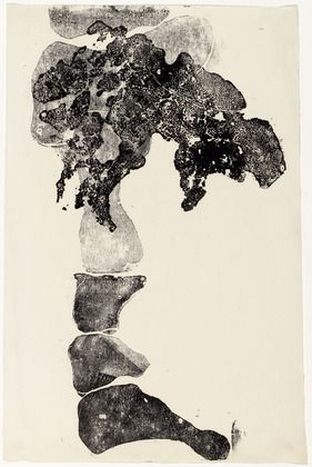
Jasper Johns: 'Regrets' ink on plastic

If you look closely at the image above you can see the way that dilute ink coagulates and has a tendency to thicken and thin in unpredictable ways, thus keeping the surface active and ensuring that what could become 'empty' shapes always have a textual energy about them. 
Of course you can also use these transparent sheets of plastic to trace images through and Johns has availed himself of this possibility with his tracings of Cezanne's 'Bathers'. 


Jasper Johns: Tracing of Cezanne

The use of brown ink is suggestive of a historical mode and once again the ink's tendency to clot and blob has been used to help transform what could easily have been an uneventful tracing into an image that now sits easily within Johns' concern with the status of the surface and its problematic relationship with the image. 

The artist Hadi Tabatabai has used acrylic polyester sheets in a totally different way, relying on the thickness of the sheets to give a sense of depth to his very tightly controlled non figurative constructions. 


Hadi Tabatabai

By drawing on both the back and front of a sheet of acrylic film, Tabatabai can construct a both in and out of focus perception of the image, our eyes therefore begin to attempt to refocus on what our brain has decided is a layer either closer or further away. This activates the space in a totally different way to Jasper Johns' surface treatment. 

Jim Dine: Charcoal on mylar transparent sheet

Jim Dine had a rich drawing centred practice and at one time he focused directly on making what he called heliogravure prints, which were made directly from drawings made on different transparent surfaces. He used three different categories of supports: clear plastic sheets, frosted plastic sheets, and translucent paper. The Morgan Museum has a very good account of this and their blog post on Dine includes some excellent close-ups of his techniques here. Dine would scratch into the surface, fix the bits of rubbed out charcoal onto the surface with acrylic spray,  wipe surfaces down with cloths etc. Anything to get the required effect. 
Because these transparent surfaces have a direct association with printmaking, working on them can be a very good way of bridging the gap between the two disciplines. There is a very large light box at the back of the drawing studio and it is often underused, why not get some polyester film and just work up some of your drawings onto it, and then take the most interesting ones along to the print room and see how they translate into silkscreen prints. 


The black lines drawn on the image above are where Dine wanted the edges of the resulting print to be. At the time Dine was drawing from Greek and Roman antiquities in The Glyptothek in Munich, and I have mentioned before how useful this can be.  


You can find out more about 'Truegrain' here It is about £16 a sheet, which might seem expensive, but when compared to canvas and the need to make stretchers it might not seem too bad. 

See also:

Monoprinting
Monoprints and lithographs
Drawing and printmaking More on Jasper Johns
More on Jim Dine
SKETCH

Friday 20 October 2017

Alina Szapocznikow: From drawing to sculpture

Alina Szapocznikow
Coming to the Hepworth in Wakefield is an Alina Szapocznikow exhibition; 'Human Landscapes', it is open from the 21st October 2017 to the 28th January 2018

Although mainly thought of as a sculptor Szapocznikow was an artist that thought very much through drawing, the book Alina Szapocznikow: From Drawing into Sculpture with a text by Annette Messager, is a wonderful introduction to her work and thinking process.


She was one of the first artists to use modern materials such as polyurethane foam and polyester resin, and she reflects this wide ranging use of materials in her drawings, using felt-tip, ballpoint, crayons, ink, watercolor and monoprinting to visualise her ideas.  Focusing on the body as a site for humor, sexuality and exuberance, Szapocznikow can be seen as someone who worked across several boundaries, aware of Surrealism, Pop Art and other Modernist movements she was though I believe in reality part of a much older tradition, one that artists such as Klara Kristalova belong to. 


Klara Kristalova

There is a North Eastern European tradition that includes the tales of the Baba Yaga and other stories from Slavic folklore. These folk images although not referred to directly by artists such as Szapocznikow or Kristalova, have an image bank associated with them that runs deeply through the unconscious of many artists. From Mark Chagall to Russian lubok prints, there is a particular Slavic imagination that I have always responded to, one that I now realise, I am inextricably linked to. 

Lubok print of Baba Yaga

Mark Chagall

This interest of mine may be because my grandmother was of Polish Jewish heritage, or it may simply be that these are good working Jungian archetypes, it doesn’t really matter, but what I will be doing is going to see Szapocznikow’s exhibition and would recommend her work to any of you interested in how drawing can be used as a way to help visualise ideas in sculpture.


Alina Szapocznikow

I'm returning to this post after actually visiting the exhibition. The work itself is stunning and for those of you interested in drawing there is much to think about. One aspect of her work is the formal invention she takes it through and the move from being a very traditional stone carver to working in new plastic materials is clearly illustrated. Her early drawings demonstrate this formal invention and are interesting as a way of exploring how someone thinking about form in sculpture can save time by drawing. However it was her late drawings that I found the most powerful. They are very simple, and yet in their very simplicity I found great affect. 


The four drawings above are small, about A4 size, made with a red marker. You can see the old creases in the paper from when these drawings were dropped to the floor or simply left somewhere as she moved on. They are not drawings made for display, they are thinking drawings and Szapocznikow is thinking about how cancer has begun to spread in her body. The masses of cells are part of her body and are also taking over the body. They have already invaded her breasts and are now dropping down into her womb. They live in her, like some child of death. I mentioned in my first draft of this post that I suspected that Szapocznikow's Slavic heritage may also be an influence on her work, I'm not sure any more about this, but the fact that when peasants made dolls of the Goddess of Winter, Morana, these were often ritually destroyed, seemed to me to fit perfectly with the broken, destroyed bodies that were found at the core of this exhibition. 

Alina Szapocznikow: Chewing gum sculpture

The making of things formed in the mouth is somehow elemental. There is a section devoted to Szapocznikow's chewing gum sculptures. The bringing of these small chewed mouth casts into the open and having them photographed so beautifully, is a life affirming act, one that shows how much Szapocznikow was aware of the body's life as a sculptural process in its own right. 

From the malleability of the flesh to the sculptural impermanence of bone, Szapocznikow's work is a deep meditation on mortality and as such I would really urge you to visit the exhibition while it is here in West Yorkshire. 


Monday 16 October 2017

Chad McCail


Chad McCail

Chad McCail has this to say about his work, "I make drawings, paintings and prints working in a figurative, illustrative manner. It is my intention that there should be no question as to what is represented but that the viewer’s attention should be focused on why it is and what is happening and that if this is successful, important questions should be raised. The pictures usually carry a short text that provides a lens through which the image can be seen. My interest is in examining those forces that enable us to take pleasure in one another, to empathise and co-exist peacefully and those which alienate and cultivate antagonism and mistrust.
Recently I have been looking at the history of compulsory education and this had led to an interest in how we treat children at puberty. In other cultures it is an event often contained by a public ritual which binds the adolescent to the community. That no such thing exists for most of us testifies to our emotional incompetence. Our general denial and failure to acknowledge or preserve the significance of this event, has particular consequences".
From the Edinburgh printmakers website

Chad McCail's paintings and prints adapt the type of visual language you might find located on the back of your seat in a plane as you are waiting to take off. He wants to make a point and to make it as simply and clearly as possible, therefore he uses graphic languages designed to do just that, when you have to think about your safety on a plane the language used must be both clear and universally applicable.


The language of air safety


His recent work 'Compulsory Education' looks at the three-tier education system that has resulted in comprehensive, grammar and public schools. He puts forward speculative arguments about the origins of 'compulsory education' in the conflicts between the European 'great powers' in the nineteenth century and is fascinated by the fact that..."pupils whose parents have paid for their schooling are four times as likely as state school peers to get a place at one of the top ten universities."


Chad McCail: images from various projects

McCail's work is about highlighting the mechanisms that are used for social control  'Most children learn enough to obey orders, some learn more so they can transmit commands' one of his images reads. 'A few learn to dictate'.


As you can see from the range of images above, McCail varies his style to fit the idea. Sometimes he is dealing with issues that need a more open ambiguous response and at others he uses text to solidly ground or anchor his images to a particular issue. 'Wealth is shared', is for instance a title many would aspire to, but the reality is that Capitalism as a system is not about sharing. The images therefore can seen as naive but on second reading you realise that their simplicity is intentional. If it seems very appropriate to talk to children about sharing, why is it so hard to broach the same subject with adults? In our heart of hearts we are socialists but in our minds we are often capitalists. McCail asks us to rethink and go back to the essential truths that we thought were right when we were young.  Often drawn on a computer, McCail's work is digitally printed or made into silkscreens. He also works as a mural artist, his accessible style being very useful if there is a need for an idea to be communicated to a wide variety of people. 

Chad McCail: The Becontree Mural

See also:


Saturday 14 October 2017

Beuys and Cotman at Leeds City Art Gallery

Leeds City Art Gallery has finally opened after refurbishing and the new rooms are superb. In particular the central upstairs space is bathed in natural light and is a wonderful space for showing sculpture. 
Two of the opening exhibitions are of particular interest for the drawing community, the staging of a large show of the gallery's Cotman holdings and the Joseph Beuys 'Artist's Rooms' display. 
If you have never looked at Cotman before you will be surprised at how modern he can seem. He breaks the landscape down into abstracted chunks and eliminates details and in doing so prefigures the way artist's of the 20th century would begin to select out forms from nature. However what really interested me was the display of his pencil drawings.


Cotman

The drawings were located on shelves, simply leaning against the wall, 4 or 5 to a row, still attached to their supporting card backing. A glass sheet was then fixed over the lengths of wood shelving in order to protect the drawings from the public. A very neat method of presenting a diverse range of small shapes and sizes. 


By displaying the drawings in this way it meant that I could get up really close and look at how the images were made. 


Cotman

I was immediately taken with a drawing of some weeds. I suppose it was because drawings like this are ones I have done many times, usually thinking "this will come in handy at some point", made when wandering the streets collecting visual information for some future foreground detail. Because I have drawn this type of situation myself I can also empathise with the selection of the composition. Cotman is keen to locate the plants selected in a space, a few marks indicating other grasses and plants are enough to ground his image. Looking back on the sketchbook drawing (1) below, taken from one of my old sketchbooks, my effort looks very isolated and because the sense of space is poor, the drawing lacks life. I can remember at the time not wanting to get down on my knees to sort out the visual entanglement of other plants around the base and this is probably why the drawing is lacking in attention to a specific experience. 

Sketchbook drawing 1

Sketchbook drawing 2

My sketchbook drawing (2) in retrospect seems a much better record of an experience, the few brushed in indications of other plants create a sense of space that (1) doesn't have.  
As I stood looking at these small drawings of Cotman's, I was becoming more and more aware of the embodied nature of their understanding. Because these are things I have drawn, I begin to re-enact their making in my body. Each stroke Cotman makes is meaningful to me intellectually and physically. The hand is still holding the pencil, the arm is still moving, the elbow tracing a smooth curve as it pushes and pulls the lower arm across the paper, the shoulder now aware of a change of pressure as the hand is pulled off the paper and dropped down again as a leaf is found in space next to a rising plant stalk. I'm in Cotman's body, I inhabit his mind, his hand and his eyes. I'm affected by the plants he drew, their presence still echoing through time, their effect still potent after all these years. I know this, I know I am both Cotman and the small weeds he once perceived on a day when he had his paper and drawing implements with him. We are drawn together as I re-animate the artist and the stimulus for his perceptions, the old drawing's agency is powerful, taking a strong hold of me. 
Most of the drawings in this display are in pencil. Like many artists I draw with pencil to capture ideas and images as they either come to me perceptually or via the inner workings of my imagination. In the morning before going to the art gallery I had been working on another image of an eye in the corn. 

Eye in the corn

The image above would not have come to me without in the past standing next to a wheat field and drawing it. (Sketchbook drawing 3). 

Sketchbook drawing 3

The Cotman drawings are collected together in an area adjacent to a much larger gallery in which a comprehensive display of his finished watercolours is on exhibition. That connection between what you are aiming for as an artist and what you need to collect from your experiences is very important. In this case it was for myself interesting to see how he had at times been on a very similar journey. Tiny drawings of horizon lines were of particular interest for me as they made me very aware of the importance of linear rhythm, especially on that line that separates the land from the sky. 


Cotman: studies of the horizon

Again I'm both reminded of my own drawing experiences and taken over by these little scraps of information. The way that you look across a landscape is determined by how the experience is punctuated by events. Once again I am engrossed by these indications and quickly aware of how Cotman would have been engaged in the experience. For him a windmill stands out, for myself a mosque. But for both of us the edge between sky and land is a linear experience, an experience that reflects the material presence of the world and the way that it shapes us. 


Detail of Leeds horizon from a large drawing


In the main gallery devoted to Cotman's watercolours is a drawing on which he had spent a much longer time. Titled, "An effect of Parhelion seen from Hunstanton Lighthouse on July 6 1816", Cotman had obviously been deeply impressed by a powerful natural phenomenon. 


Cotman: An effect of Parhelion...

Cotman both writes about and draws an image of the event, a rare occurrence and one which is centred on light and our perception of it. Here we see his response to the 'effect' of the world, his being acted upon by world events, shaped and in turn shaping the experience. 
An effect of Parhelion... is an image we might well place as one of those belonging to the tradition of the sublime. Cotman is also an artist that uses his drawing materials in a much more expressive manner, the drawing of a road disappearing into the mist below, demonstrating that he isn't always about sharply defined areas and flat shapes.  

Cotman

On the ground floor of the art gallery there are also three rooms devoted to the work of Joseph Beuys. It may at first appear as if Beuys and Cotman are worlds apart in both sensibility and effect, but as I wondered through the galleries I began to feel that they were in fact very similar. 
Beuys: Pregnant woman with swan

Drawing is for both these artists central to their practice. Both are happy to work ideas out on scraps of paper or card and they both have an instinct for abstraction. The profile of a pregnant woman above being as much as a simplification as any of Cotman's abstracted landscapes. 

Beuys: Energy Field

Beuys' drawings are also records of performances and he often uses a particular brown coloured floor paint for his later drawings. These images feel as if they are about traces of events and so did Cotman's drawings. Both artists are offering us records of their material engagement with the world, Beuys is much more aware of this, often talking about the meaning of fat and felt and other materials, but Cotman is obviously aware himself that his ideas are being shaped by the properties of the materials he chooses to use. Both artists abstract elements out of the process of their complex entanglement with experience and the matter that shapes that experience. The consequence of these experiences is relayed to me and as an entity made of similar stuff to both artists, I am 'tuned' into the way materials are being shaped to form ideas. Beuys is though a 20th century creature, he is aware of a post quantum world, a world of relativity and the atomic bomb, so is therefore much more attuned to energy flows and the transmutation of matter. Beuys has a type of political awareness that Cotman doesn't have, but there are politics of the picturesque that Cotman would have had to deal with that we are perhaps not as aware of as we should be. 
I have on purpose spent more time writing about Cotman than Beuys, even though Beuys as an artist was much more influential on my own practice and was one of those artists that I was fortunate enough to actually meet. My point is that the act itself of drawing is such a special one in that it carries with it a material value, a physical entanglement with the world that writing never does. In those small pieces of paper I could sense the reality of experiences, in a way that the words on this screen never could. I am asking the reader to go and look at some actual 'real' drawings and to open themselves out to their own embodied world. To try and feel that invisible but palpable pencil or pen in their hand and to re-trace the time of a drawing's making. No matter how tiny and ephemeral a drawing may be it is a physical, material idea and as such is a reminder of our own and the world's material agency. 

Both these exhibitions are well worth visiting and there is of course the added bonus of being able to visit the new displays upstairs in the gallery. 

Find more information on the Leeds City art gallery here