
Every year students and staff debate over the hanging of work. So, before we hit exhibition season some things to consider.
Hanging drawings and paintings is about the construction of a very shallow space for thin objects to be experienced within. Central to an understanding of this space, is the fact that physically and perceptually all our earth bound experiential spaces are 'anisotropic'. I.e. these spaces exhibit properties with different values when measured in different directions. For those of us that inhabit a giant physical object such as the planet Earth, this means that the experiences we have of upwardness are very different to the experiences we have of downwardness, mainly because of the effects of gravity. Most exhibition spaces will depend on walls, thin objects, designed to be able to combat the effects of gravity and it is therefore the wall itself that will be of initial concern. *
If you are ever concerned with running a professional gallery space you will at one time or another probably have an argument about the need for a 'shadow gap' and the shadow gap is all about how we think about visual weight. So what is this about?
Bauhaus teaching was based on a return to fundamental principles of visual language. Artists such as Paul Klee made diagrams to clarify what was happening and then later theorists such as Rudolf Arnheim, attempted to take these ideas and refine them further.


A wall with no visual break between itself and the floor is phenomenologically more 'real' than without. It exerts its 'presence' and it has 'weight'. If you add a skirting board, this brings to the situation as Klee puts it, 'a freer movement and dynamism'. The skirting board can be thought of as the cuff at the end of your shirt sleeve, it visually finishes off a length of material, it zips around the edge and forms a visual stop to a vertical fall. However in order to do this it includes an extra physical element and in doing so, adds visual clutter.
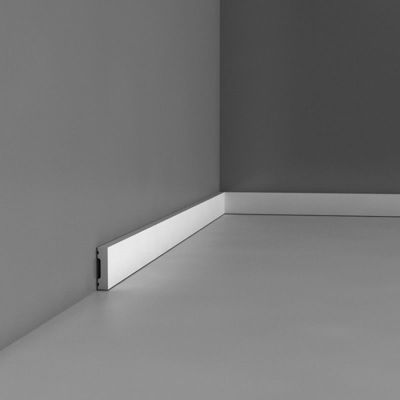
If you are a sculptor, the wall meeting the floor without a gap is fine, especially if your work is about the reality of the materials used and their relation to gravity. In sculptural terms, the skirting board looks naff because it is trying to hide the reality of the situation. However in a decorative interior, where the walls are often thought of as a decorative fantasy, the skirting and as it extends itself, the dado, may well be essential. The modernist ideal begins with a horror of decoration, (places where germs can hide), and it espouses a truth to material aesthetic, a sort of 'what you see is what you get' aesthetic sensibility. However, the 'White Cube' of an exhibition space, we were all taught by Brian O'Doherty is not neutral, so even before we get to hang anything on these walls, we enter a contested space, one that the shadow gap debate highlights as an oscillating physical and spiritual drama. Without it a wall exerts its full visual weight, with it the wall is 'floated' into a more aesthetic or contemplative space. Some artists regard their work as communicating initially via a certain 'objectness' or a physical presence, some regard their work more as a window within which they would like an audience to contemplate an idea. Choice of wall and where an object goes on that wall, is therefore vital to their aesthetic sensibility.

If you are to regard the wall as both a physical reality and also as a special space within which other 'aesthetic' rules apply, the shadow gap can facilitate this. On the one hand it introduces no new physical element into the situation, except 'a gap'. This gap visually separates the wall from the floor and the only other time we see this happen is when weight is supported by other things.


Fields of attractive force around a square figure


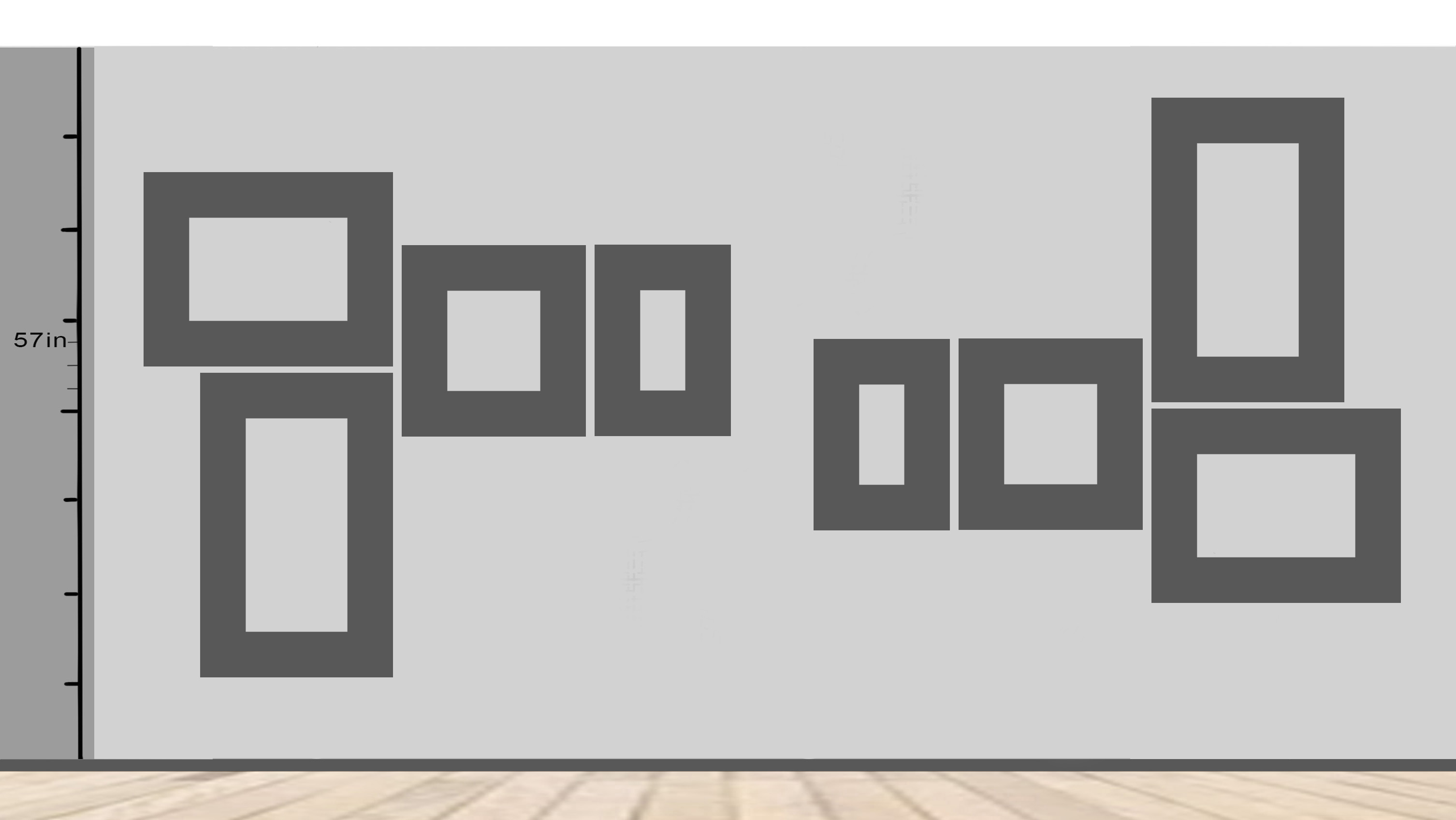
The extra height gives the exhibition space the potential to become psychologically spiritually uplifting, at 8ft it is still firmly rooted into our human space, Sultan Kösen would for instance find it level with his eyes. At 12 feet the walls are tall enough to visually and therefore mentally, release us from gravity's attraction. I.e. if you have any control over the situation, make sure the walls you show on are of a decent height. On a smaller scale, if you are framing an image, think about lifting it visually by giving more space below the image than above.


The fact is at Leeds Arts University the majority of people looking at the walls will be female, so should the height for eye level be 5 feet? Or is eye level the wrong way to think about a chosen height? If you go online you will find that the golden rule for hanging a picture is to have the centre of the image at 57 inches. The website I looked at goes on to say, "this reflects the standard eye-height of the average person, and is used as a standard in most art galleries and museums." Which is an interesting claim as it suggests average height is only 60 inches or 5 feet tall. For a variety of reasons 57 inches is often the museum standard and a measuring stick cut to 57 inches was at one time always available for use in the studio whenever we were hanging work and any deviation from that as a centre had to be carefully argued for.


You could of course instead of an invisible shelf, put a real thin shelf along the gallery wall and lean the work against it, just as how Laercio Redondo has done above. When I used to run the Workshop Press Gallery, for his exhibition Benedict Phillips erected one continuous narrow shelf of a similar design to Redondo's, that went right around the four gallery walls. Visitors were allowed to then curate their own walls by simply carrying the work from one wall to another, sliding works to one side and placing new work in the gaps. This works for paintings or images on boards, but doesn't work so well for works on canvas.


By sinking the images into the wall Mulleady is able to get away from the 'objectness' of the paintings and in doing so seeks to gain a narrative unity in a similar way to how a series of wordless graphic novel images might work together. I wasn't convinced though and if she wanted to emulate graphic novels, perhaps she could have had the work printed and pasted up. This was for me all about technicians proving that they could make a great finish and that then people would spend lots of time looking closely to see if they could spot how it was done. I.e. I remembered the form of display rather than the nature of the work.


The Main Room of the International Surrealist Exhibition of 1938 was designed by Marcel Duchamp and Wolfgang Paalen. It took the form of a grotto or womb, a dark space with a ceiling lowered by hanging 1200 scrunched up newspaper filled coal bags from the ceiling and it was partly lit by burning braziers. (Health and safety didn't come into the picture at that time)
Bingham, P. (1993) Picture Framing New York: Stackpole Books
Burns, J. T. (1978) Framing Pictures New York: Scribner
Frank, V. (1991) An Introduction to Picture Framing London: Chartwell House
See also:
Lina Bo Bardis and architectural presentation methods * A way of presenting work without walls
The frame blog A great blog to get you thinking about the frame itself as an idea


