The Shadow Gap
Every year students and staff debate over the hanging of work. So, before we hit exhibition season some things to consider.
Hanging drawings and paintings is about the construction of a very shallow space for thin objects to be experienced within. Central to an understanding of this space, is the fact that physically and perceptually all our earth bound experiential spaces are 'anisotropic'. I.e. these spaces exhibit properties with different values when measured in different directions. For those of us that inhabit a giant physical object such as the planet Earth, this means that the experiences we have of upwardness are very different to the experiences we have of downwardness, mainly because of the effects of gravity. Most exhibition spaces will depend on walls, thin objects, designed to be able to combat the effects of gravity and it is therefore the wall itself that will be of initial concern. *
If you are ever concerned with running a professional gallery space you will at one time or another probably have an argument about the need for a 'shadow gap' and the shadow gap is all about how we think about visual weight. So what is this about?
Bauhaus teaching was based on a return to fundamental principles of visual language. Artists such as Paul Klee made diagrams to clarify what was happening and then later theorists such as Rudolf Arnheim, attempted to take these ideas and refine them further.
Paul Klee
As you can see from Klee's drawing above, all our experiences are first of all experiences that have to respond to a force that drags everything towards the centre of the Earth. (Plummet and balance). However, as Klee points out there are also areas of freer movement and dynamism. Rudolf Arnheim wrote several books trying to explain in detail how this works, but before we look at what he had to say, perhaps we need to re-look at our wall.
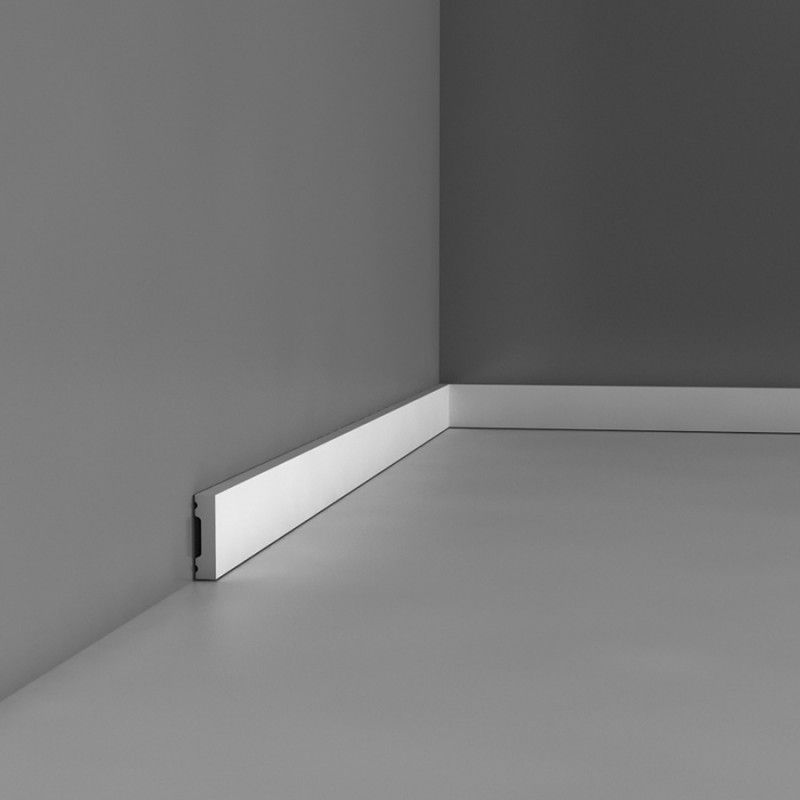
Wall with shadow gap
A wall with no visual break between itself and the floor is phenomenologically more 'real' than without. It exerts its 'presence' and it has 'weight'. If you add a skirting board, this brings to the situation as Klee puts it, 'a freer movement and dynamism'. The skirting board can be thought of as the cuff at the end of your shirt sleeve, it visually finishes off a length of material, it zips around the edge and forms a visual stop to a vertical fall. However in order to do this it includes an extra physical element and in doing so, adds visual clutter.
Wall with and without skirting.
If you are a sculptor, the wall meeting the floor without a gap is fine, especially if your work is about the reality of the materials used and their relation to gravity. In sculptural terms, the skirting board looks naff because it is trying to hide the reality of the situation. However in a decorative interior, where the walls are often thought of as a decorative fantasy, the skirting and as it extends itself, the dado, may well be essential. The modernist ideal begins with a horror of decoration, (places where germs can hide), and it espouses a truth to material aesthetic, a sort of 'what you see is what you get' aesthetic sensibility. However, the 'White Cube' of an exhibition space, we were all taught by Brian O'Doherty is not neutral, so even before we get to hang anything on these walls, we enter a contested space, one that the shadow gap debate highlights as an oscillating physical and spiritual drama. Without it a wall exerts its full visual weight, with it the wall is 'floated' into a more aesthetic or contemplative space. Some artists regard their work as communicating initially via a certain 'objectness' or a physical presence, some regard their work more as a window within which they would like an audience to contemplate an idea. Choice of wall and where an object goes on that wall, is therefore vital to their aesthetic sensibility.
The skirting board 'framing' the wall.
If you are to regard the wall as both a physical reality and also as a special space within which other 'aesthetic' rules apply, the shadow gap can facilitate this. On the one hand it introduces no new physical element into the situation, except 'a gap'. This gap visually separates the wall from the floor and the only other time we see this happen is when weight is supported by other things.
A large object with shadow gaps between the edges of a pallet's wooden supports
Normally if we removed the wooden blocks that hold up the box it will drop down, but if we do and it doesn't drop, we have a situation whereby something invisible is holding it up and this is important as it opens a question in the mind, perhaps a small one, but one that questions gravity and weight and our perceptual awareness. "Could it be", our brain asks of the shadow gap, "that this wall is floating?" A question that is both a physical one and a metaphysical one, which is why sometimes the shadow gap can work for both types of work. It is a very contested thing and no one has ever come up with a definitive solution.
You have probably already worked out that different types of images or paintings, need to be constructed on different types of surface and that you can assert or undermine the physicality of the work you are showing, by first of all giving attention to the wall against which the work will sit. But what sort of attention? Surface texture, lighting, dimensions, colour, proportion or edge quality, all of these things will visually shape our experience. For Rudolf Arnheim everything seen is part of a visual field of forces and these forces are attractors that force us to look in certain ways. Therefore all the formal elements that underpin visual thinking can be bundled together as the various elements that make up fields of visual force dynamics.
Rudolf Arnheim believed that perception and thought act reciprocally. If he was looking at our wall he would probably direct our attention to the diagram below of the visual forces at play.
Fields of attractive force around a square figure
If we are faced with just a square wall with nothing attached to it, Arnheim would first of all visualise the forces working as concentric circles emanating out from the centre. However he would point out that at the same time we have an awareness of verticality, hence a series of vertical lines of force operate in relation to the vertical edges of the wall and horizontal ones in relation to top and bottom. Thus energy both radiates from a centre and moves horizontally and vertically. New centres begin to radiate out when new moments of awareness come into focus. For instance the corners of the wall are dynamic spots because a strong horizontal meets a strong vertical. These are the wall's radiating forces and are what we disturb when we begin hanging work. We in effect puncture the dynamics by causing changes in visual weight as we bring in work to put onto the wall.
As soon as you began putting anything onto the wall, Arnheim would probably direct your attention to the gestalt theory of visual balance.
Gestalt theory of visual balance
As you can see from this, Arnheim if hanging images on the wall, would look at balance in relation to an invisible fulcrum. If applied to a wall and its hang, you might have a situation such as the one below. The larger tall rectangle is closer to the centre because it has more visual weight and therefore it can be balanced by a smaller square further off centre.
The invisible fulcrum is central to the width of the wall
However if the smaller square begins to exhibit an extra visual quality, such as a colour, this changes its visual weight. In order to balance this, the larger rectangle has to move to the right.
A less colour saturated larger rectangle balancing a highly colour saturated smaller square
However this does not take into account our intuitive awareness of gravity or the full vector effect in relation to the fields of attractive force in the diagram further above.
Looking at our intuitive awareness of gravity first; the spacing of a frame around an image often takes that into account. In "Framing Pictures" by J.T. Burns, it states that a margin around a picture should be 7.5 cms at the top and sides and 8.8 cms at the base. The reason for not having the margin equal on all four sides is explained like so: "The extra width at the bottom creates an optical balance without which the base appears to be narrower than it really is." (p.40) In 'An Introduction to Picture Framing' by Vivien Frank, the suggested dimensions of the sides and top are given as 8 cms, and the bottom 9 cms. (p. 30) and Peter Bingham's "Picture Framing" states, 'if a mat is cut with all its borders equal in width, the bottom border will appear narrower than the top. This is an optical illusion, but one that needs to be compensated for.' (p.34) Non of these books on framing try to explain how or why this 'optical illusion' exists.
Because everything on the planet has a deep relation to gravity, particular forms have come about. In order to rise up against gravity, rather than crawl along the ground, human beings, like so many moving animals have evolved with bi-lateral symmetry. If you want to stand erect, you need to align yourself to the plumb-line of gravity. Imagine a wall trying to keep standing if it was built off vertical. If a wall is built upright or on flat ground, the centre of gravity (blue dot) is directly above the centre point of the wall's foundations (yellow dot), so the wall is stable. But if a wall is built on sloping ground, the centre of gravity is no longer above the centre of the base. Now gravity (red arrow) creates a movement (green arrow) that tips the wall over. The higher the wall, the greater the mass above the centre of gravity, the greater the turning force and the more chance the wall will collapse. Bilateral symmetry allows the wall and ourselves to stand up tall without having to have a wide base.
We know this right down to our bones, because this is why we are the shape we are and all that effort to rise up, has also resulted to our main sense organs being located as far up as they could be.
A six foot high human in relation to a 12 foot high wall
However, because of the power of gravity, all the bone engineering evolution that has been undertaken over millions of years has only allowed us to raise our sense organs up a few feet. Very good diet has seen the average height increase recently, but even so the average male height in the UK is only 5ft 9in and the average female height is now 5ft 3in. Therefore the figure in the diagram above is slightly too tall even for a male, but the big issue doesn't change. Even if we were looking at the world's tallest man, Sultan Kösen, who is 8 ft 2.82 in tall, his eyes cannot be higher above the ground than 8 feet. Our main visual awareness of gravity influenced indications is in that area below the eyes, and as we look up, and up and up, we will of course eventually be able to see as far as the sun or the stars, an almost in comparison, infinite distance. We look down and there are limits, and within those limits we are also used to looking for things that might effect us. Because of gravity, a large part of the active world lies close to the ground and here we might find snakes.
Psychologically this has shaped the way we think. The amount of blue sky we can see can be related to our moods. We can feel oppressed or fenced in on dark days with low cloud cover. It is conversely exhilarating to climb to the top of a hill and look down upon the world. When we feel down or depressed we can tend to walk with our heads down, but when excited and happy we keep our heads up.
All of this relates back to the wall that we are about to hang work on and why framers like to leave slightly more space at the bottom of the image. I remember going to Glasgow School of Art for one of their degree shows back when the Macintosh Building hadn't burnt down. One of the first things I noticed was that the walls that had been erected for the show were 12 feet high. I had only seen this once before for a degree show and this was at Chelsea back in the late 70s. Two vertical 8 by 4 ft boards, had been topped by a horizontal one. Both Chelsea and Glasgow prided themselves on the professionalism of their presentation and the extra height changed everything when it came to the actual experience of the work.
Increasing the height of the wall
I understand that it is not always realistic or affordable to increase wall height, but if you can include wall height in with your presentation thinking, such as stipulating that you need to show on a wall of at least x feet high, make sure you do so.
The extra height gives the exhibition space the potential to become psychologically spiritually uplifting, at 8ft it is still firmly rooted into our human space, Sultan Kösen would for instance find it level with his eyes. At 12 feet the walls are tall enough to visually and therefore mentally, release us from gravity's attraction. I.e. if you have any control over the situation, make sure the walls you show on are of a decent height. On a smaller scale, if you are framing an image, think about lifting it visually by giving more space below the image than above.
The new position of the two rectangles makes us more aware of the lower part of the wall, which may or may not be appropriate to the work; which now brings us back to those 'fields of attractive force'.
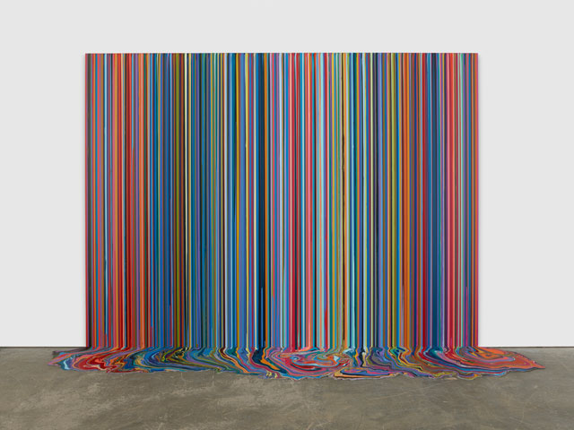
Ian Davenport
Starting at the bottom of the wall, work such as Ian Davenport's is so gravity conscious that the wall against which it can be shown cannot have shadow gaps. The verticality of the paint stripes literally runs downwards, because that is the way the paint runs. The visual dynamics of the work are compressed into a rectangle with a broken bottom edge. The painting, in effect is treated as you would a sculpture.
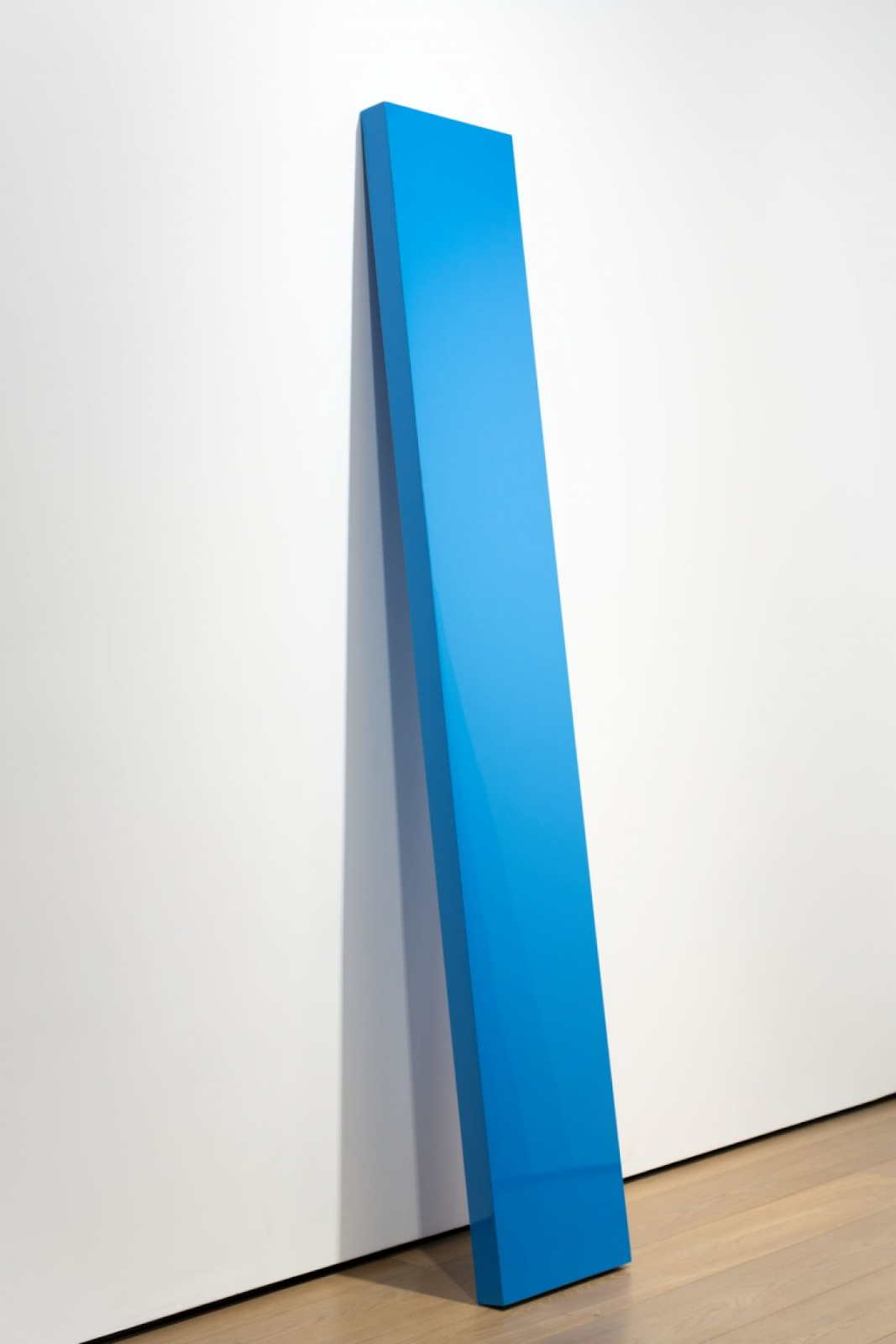
John McCracken
I first saw John McCracken's work in the 'Art of the Real' exhibition at the Tate Gallery in the late 1960s. His paintings were solid blocks of colour and he simply lent them against the wall. Notice in the image above the gallery has given the wall against which the work rests a shadow gap. This allows the work two contradictory readings. It has reasserted its 'objectness' by becoming like a plank lent against a wall, but this is not just any wall, this is a gallery wall, more weightless than a normal one, subject to aesthetic regard, thus elevating the blue into the realm of colour field painting and other 'painterly' considerations. McCracken put it like this, "I see the plank as existing between two worlds, the floor representing the physical world of standing objects, trees, cars, buildings, [and] human bodies, ... and the wall representing the world of the imagination, illusionist painting space, [and] human mental space."
It is very useful to compare McCracken's use of the wall/floor angle with Chris Ofili's. Ofili often used to rest his images on hard dried elephant dung that had a varnish applied over it. This was of course symbolically important, but by raising the work from the floor in this way the paintings were given a gap or space between themselves and the floor, therefore although the dung gives the paintings associated earthy weight, they claim affinity to the wall, as McCracken put it, to "the world of the imagination, illusionist painting space, the human mental space."
However Ofili's work is figurative, 'No Woman, No Cry' is a portrait of a real mother, and although the artist has only painted the top half of her body, the rest of her can in the mind be seen as extending down into the ground beneath the two balls of elephant dung; balls that claim the ground for a uniquely African animal, a ground from which historically this woman could make a claim as coming from.
The compositional effect of incomplete figures within an image, complicates the lever system that is used by the gestalt theory of visual balance. As Arnheim puts it, 'the balancing of weights within a painting does not depend simply on the purely quantitative extent of the areas....but rather on the weight and location of the centres supplied by the visual objects....If, however, the given parts of an object point compellingly toward a centre outside the frame, that centre, although not seen, will participate with its weight and location in the play of compositional forces.' (Arnheim, 2009, P.62) Arnheim was writing about composition within a painting, but exactly the same thing applies to the balancing of images when constructing the composition of a wall of paintings.
Perhaps before we begin to move our painting onto the wall, we should return to the idea of the height of human beings. The three paintings we have just looked at all had a clear relationship with the floor as well as the wall. They made us aware of our feet as well as our heads. When we look at a free floating image, whether its centre is above or below our centre of vision, is going to be an important part of the experience. So, going back to the height statistics, the average male 5ft 9in and average female 5ft 3in, average height is therefore 5ft 6in and average eye level is approximately 3 inches below that at 5ft 3in. Which means that anything above 5ft 3 inches requires a person of average height to be looking upwards. This, it seems to me causes an immediate problem. We are not all of average height and if my personal experience is related to my height, an experience designed for someone not my height will be wrong for me.
Athena Cooper exhibits work in 'Can You See Us Vancouver?'
The hanging height was decided upon by the featured artists, who were all wheelchair users
The fact is at Leeds Arts University the majority of people looking at the walls will be female, so should the height for eye level be 5 feet? Or is eye level the wrong way to think about a chosen height? If you go online you will find that the golden rule for hanging a picture is to have the centre of the image at 57 inches. The website I looked at goes on to say, "this reflects the standard eye-height of the average person, and is used as a standard in most art galleries and museums." Which is an interesting claim as it suggests average height is only 60 inches or 5 feet tall. For a variety of reasons 57 inches is often the museum standard and a measuring stick cut to 57 inches was at one time always available for use in the studio whenever we were hanging work and any deviation from that as a centre had to be carefully argued for.
Centre hang at 57 inches on an 8 feet high wall
By using the 57 inch rule and centring everything we get what I call an interior designer's hang. It looks nice and doesn't make anything stand out, i.e. all the work 'fits in'. This is often the hang of consensus because it sort of is ok.
Lets compare it to a horizontal rule, whereby we hang along a line.
The invisible shelf
The invisible washing line
Setting images against an invisible line suggests some sort of invisible resistance and therefore allows you to give more weight to the images.
Laercio Redondo
You could of course instead of an invisible shelf, put a real thin shelf along the gallery wall and lean the work against it, just as how
Laercio Redondo has done above. When I used to run the Workshop Press Gallery, for his exhibition Benedict Phillips erected one continuous narrow shelf of a similar design to Redondo's, that went right around the four gallery walls. Visitors were allowed to then curate their own walls by simply carrying the work from one wall to another, sliding works to one side and placing new work in the gaps. This works for paintings or images on boards, but doesn't work so well for works on canvas.
Or in the case of Amy Sillman she has made real the invisible washing line. This can work for un-stretched canvas or works on paper, but again, not so good for works on stretched canvas.
Both these approaches work well if you want to give more physical presence to the work. Conversely when Jill Mulleady was being shown at the Arsenale in a recent Venice Biennale her canvases were set into the wall and made flush with their surrounding surface.
Jill Mulleady
By sinking the images into the wall Mulleady
is able to get away from the 'objectness' of the paintings and in doing so seeks to gain a narrative unity in a similar way to how a series of wordless graphic novel images might work together. I wasn't convinced though and if she wanted to emulate graphic novels, perhaps she could have had the work printed and pasted up. This was for me all about technicians proving that they could make a great finish and that then people would spend lots of time looking closely to see if they could spot how it was done. I.e. I remembered the form of display rather than the nature of the work. Colour and its saturation
As soon as we begin to add other elements, visual weight and associated dynamics change.
Goya and El Greco: St Peter
A not to scale comparison of Goya and El Greco. Both artists require an awareness of gravity for us to understand their images. Goya to support the grounding of St Peter as the rock on which the church is built; El Greco to support an awareness of St Peter's spiritual arising. By placing the two on the invisible shelf, Goya gets the required weight and El Greco rises appropriately. You could perhaps adjust the spacing but not by much. Arnheim's method of using an invisible central fulcrum means we are not tempted to even the gaps out, this creates a much more dynamic composition, allowing both images space and an off centre rhythm within which they can be what they need to be.
So what if we don't hang to a horizontal?
Klara Kristalova
The dynamics of more diffused centres
Without a horizontal, each hung object becomes a radiating centre around which visual dynamics come into play. If the objects hung are within a certain size range then we can create a very active space, especially if it is a space that we want to link directly into the wider gallery space. See how Kristalova stands one of her ceramics on the floor and faces it into a mirror hung on the wall.
Klara Kristalova: Human moth with mirror
Another way of dealing with the need to hang a lot of images is to cluster them as islands.
Kara Walker
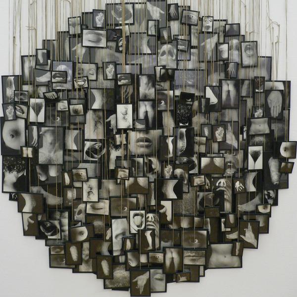
Clustering eliminates difference and makes the individual pieces work together as a unit. There is though a distinct difference between Kara Walker's cluster of images and Annette Messager's 'My Vows'.
My Vows (1988 – 99)
'My Vows' is composed of lots of small framed photographs, but we don't feel as if this is a way of presenting them as a collective exhibition, by hanging them in this dense configuration they become a new object, effectively a low relief sculpture.
Hew Lock: Nameless
Hew Lock uses beads and their response to gravity to give vertical structure to his wall based drawing. 'Nameless' is a drawing made of bead and cord glue-gunned onto the wall. As Lock states, "It is simple: You send somebody drawings and instructions, they project the image onto the wall, trace over in pencil, and then they work the image in beads and cord over that." In effect the hanging materials now become the drawing materials. This is perhaps why I would call the centre hang at 57 inches an interior designer's hang, it is just too safe. An opportunity to hang work is also an opportunity to make new responses to what you have already made.
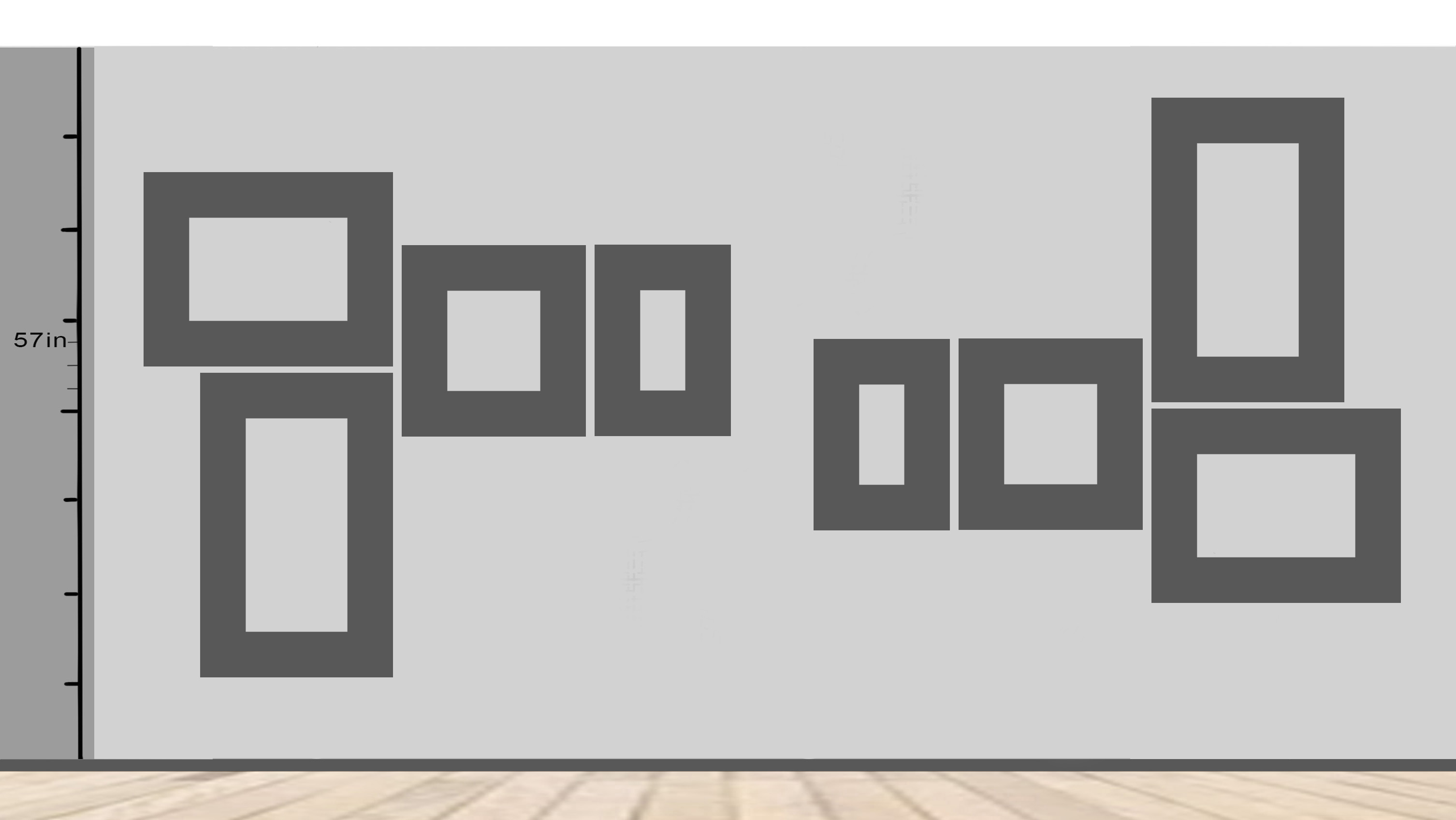
Two clusters, one the upside down version of the other
However, the 57 rule can be used more subtlety. The left cluster sets the 57 inch central to the two small rectangles together on the right side and the right hand cluster sits the 57 line exactly along the top edge of the two rectangles now on the left side. This gives an underlying harmony to both groupings.
But what if you do this?
Lining up each painting's horizon line
Or this?
Making an island object along a diagonal
It's only by playing around with possibilities that you will find out. Hang just one image at an oblique angle and the rest at right angles and it will stand out. What if an image was hung upside down? Georg Baselitz has spent over 40 years pondering that question.
So before setting off to hang your final show or exhibition out in the city, do remember that presentation has endless possibilities and that how you approach this could deeply shape the way your work is received.
International Surrealist Exhibition 1938
The Main Room of the International Surrealist Exhibition of 1938 was designed by Marcel Duchamp and Wolfgang Paalen. It took the form of a grotto or womb, a dark space with a ceiling lowered by hanging 1200 scrunched up newspaper filled coal bags from the ceiling and it was partly lit by burning braziers. (Health and safety didn't come into the picture at that time)
References:
Arnheim, R., (1969) Art and visual perception: A psychology of the creative eye. London: Univ of California Press.
Arnheim, R. (2009) The Power of the Centre London: Univ of California Press
Klee, P. and Moholy-Nagy, S., (1953) Pedagogical sketchbook London: Faber & Faber.
Bingham, P. (1993) Picture Framing New York: Stackpole Books
Burns, J. T. (1978) Framing Pictures New York: Scribner
Frank, V. (1991) An Introduction to Picture Framing London: Chartwell House
See also:
More on framing and hanging
Drawing and installation
Thinking about the salon hang
Lina Bo Bardis and architectural presentation methods * A way of presenting work without walls
The frame blog A great blog to get you thinking about the frame itself as an idea
Fixings and fittings


No comments:
Post a Comment