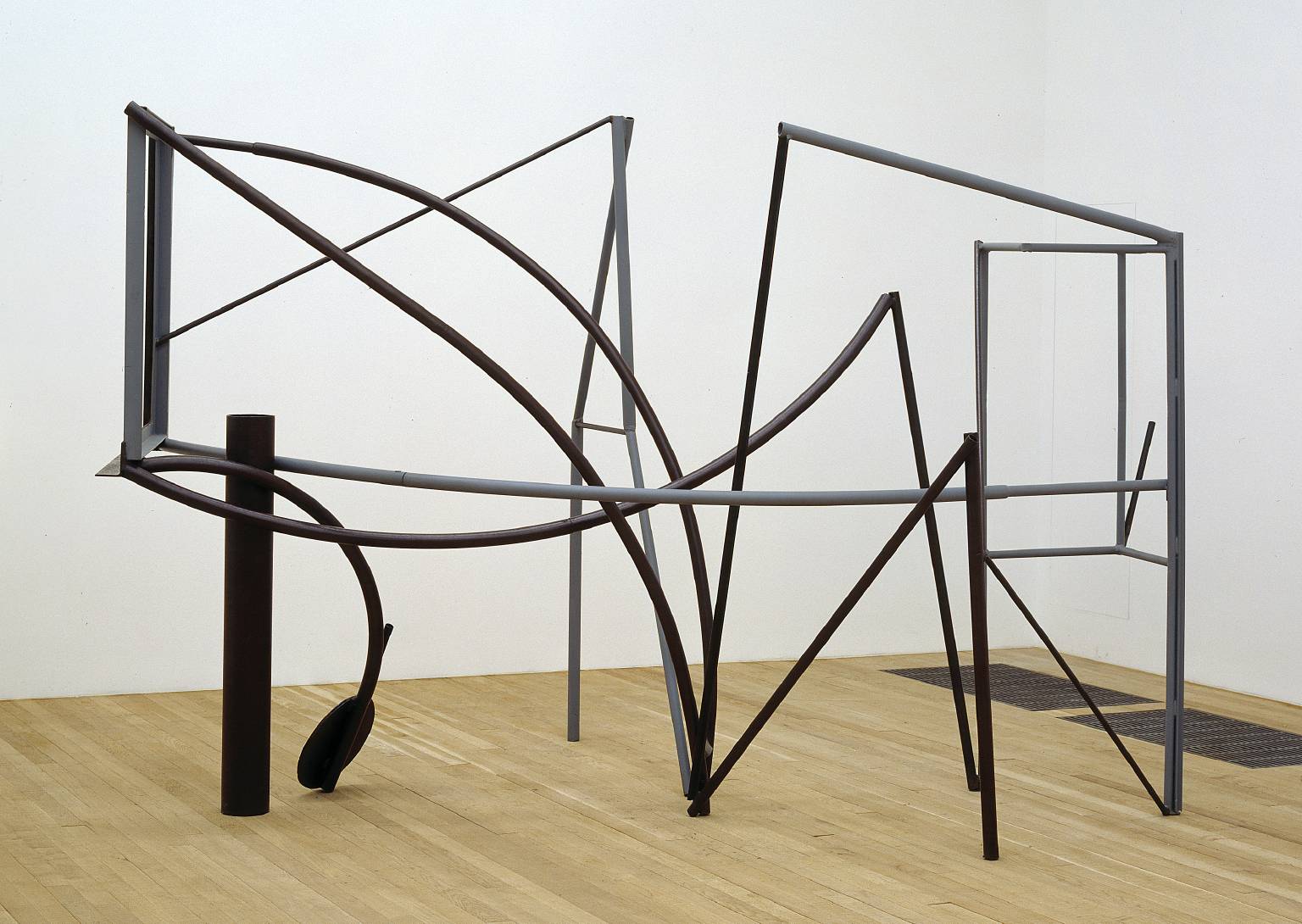
I was at the Yorkshire Sculpture Park today and as well as going to see the marvellous Bill Viola exhibition, spent some time looking at Anthony Caro's maquettes for sculptures. Some of them can be read as 3D drawings. Caro was influenced by the american sculptor David Smith. Smith's Hudson River sculpture is a 3D line drawing of a journey, and many of Caro's early linear sculptures have a landscape feel to them as well.
David Smith: Hudson River
Anthony Caro: Emma Dipper
These (below) are a few of Caro's maquettes for sculptures photographed at the YSP. The small scale makes them much more accessible and above all achievable on a small budget.
All the Caro maquettes above are no more than 3 or 4 inches wide. What makes them interesting is the use of various thicknesses of metal to ensure a constantly changing rhythm for the eyes. The less linear sections operate as punctuation points, giving the eyes focus points that can be used for orientation as you look through and around the forms.
I've mentioned artists who draw in space before, and it looks as if there is a small revival of the practice, but with the added element of a more environmental approach, artists using the ability of the space frame format when used on a large scale to house other elements such as flat TV screens in amongst the framework.
Neil Beloufa's The Office (2015) at the Mendes Wood DM booth at Frieze London
Beloufa has created a structure that allows the artist to include media outputs, connecting wires becoming part of the linear nature of the whole piece. Picasso was as always prepared to experiment with different modes of drawing, his memorial to Apollinaire was designed to reflect a line of Apollinaire's writing, “the statue made of nothing, of vacancy” which he wrote when thinking of a monument to a poet. The sculpture represents this nothing-ness. Made with iron rods these pieces at one moment appear 3D but then revert to a perceptually flat image as the light changes and the black lines separate themselves out from their background.
The last but one Fine Art
module, Context of Practice 3 is now upon us. The third year are once again
embroiled upon the writing of a text that is meant to create a deeper
understanding of an individual’s art work and lead to a synthesis between
theory and practice.
I believe that it is a
useful process to go through but there are so many ghosts in the educational
machine that it is a very hard thing to do. The biggest and most potent ghost
is of course the educational system itself. It rewards the obtaining of
learning outcomes, but these are often written in such a way that they remove
the poetry from the practice. They for instance ask you to demonstrate
research, however some art practices needs lots of research and other practices
can be made as Yates said, “Out of a mouthful of air”.
If anyone was to ask me,
(and it’s unlikely that they will) to write the key learning outcome for the
written element of this module I would say it should be: “The student can write
in such a way that it communicates what they are trying to get at”.
If I was to have a model for
how to do this I would recommend Ted Hughes’‘Poetry in the Making’, which was a book he wrote for 10 year olds.
This brings me to another
‘ghost in the art education machine’, that of referencing other artists. A
ghost that persists in the structure of what in COP3 is now called ‘the case
study’.
In my mind the last thing
you need is a close model to follow when developing your own work. I don’t think you can justify your work by pointing to another artist that does something similar.
This way of thinking is a left over from the art academies and has found its
way into how art is taught in schools. At one time within the art academies
only certain artists were deemed worthy of study, ‘Raphael, Murillo, the
Carracci’s’ etc. That time has gone. Yes look at art, look at it in depth,
explore its vast history and immerse yourself in its possibilities, but not to
provide justification for your own practice. Try to look at other art as a
symptom for the human condition. Try to work out how and why artists might have
done the things they have done, why different cultures may have come up with
the images they have, and why materials available might have shaped making in
the ways that they have. Use your looking to sharpen your eyes and visual
appreciation of possibilities, but don’t go searching for models, avoid the “I
make art like…” trap.
This however is not a plea
for anything goes. There are things you can learn from other art. What makes
for a successful resolution? What types of working processes are used that seem
to be able to reconcile research with visual concept?How has truth to material been reconciled
with craft invention? These are however questions of purpose not questions of
style.
When writing COP3 you are
asked to first of all write a positioning statement. This is about
self-knowledge. Hopefully it helps solve the question, “how can I make art
without becoming false to myself?There
is no best way or answer to this. But Hughes’ ‘Poetry in the Making’ does
suggest possible directions to take. He asks us to re-discover our passionate
interests. He points to survival, being fed and warm as central, then posits
relationships with others as our initial concerns. However as we get older he
suggests that our interests spread out and become too easily superficial, an
artist though, he further suggests, has to learn to differentiate between what
is just of interest and what has the possibility of being an obsession. This
fascination with something does though take time to develop and it can be as
much a fascination with art, as with the world itself. (Art cannot of course
detach itself from the world)
When you are thinking about
the case study and are looking to search for ‘art friends’, make sure that
these are not people who make things that look just like the work that you
make, but people that have resolved issues in their work that you empathise
with. Because I’m trying to deal with narrative and politics in my work at the
moment, I look at how other artists might have resolved these two issues.
Perhaps one artist might help me to think through one particular part of the
problem and a very different artist another aspect. Often it’s to do with
approach. I might look at Duchamp, but not for his ready-mades, in my case it
would be for the narrative complexity behind the ‘Large Glass’ and the fact
that he had in some ways created a contemporary allegory of sex in the city. I’m not however going to make something that
looks like the ‘Large Glass’.I might
look at the work of Chris Ware in order to think about how time can be
expressed in a visual narrative and compare that with 13th century
Chinese landscape painting. I might use a David Hockney video as a guide to how
to think about how complex visual narratives were constructed in Chinese scrolls. See which is a short clip from ‘A day on the grand canal with the emperor of china’
by Hockney.
At the end of the day my own work does not look like Duchamp’s or
Hockney’s but may well have taken on board issues that both artists have at one
time or another dealt with. It’s not a case of not looking at other art, it’s
about learning from looking and thinking about what you are looking at.
Ted Hughes says that there
is no one way to write, only to make what you write interesting. It’s the same
with fine art. Hughes goes on to say that you write interestingly only about
the things that genuinely interest you. This he says is an infallible rule.
Again I would say this applies to fine art as well.
How to try to say what you
mean is part of a search for self-knowledge, Ted Hughes goes further and
suggests that as you refine that voice, as you develop and hone the languages
you use, eventually you might in your work develop something that he calls,
“grace”.
Although a poet, Hughes has some wonderful advice for
the young artist.
“See it and live it. Do not think it up laboriously,
as if you were working out mental arithmetic. Just look at it, touch it, smell
it, listen to it, turn yourself into it. When you do this, the words look after
themselves, like magic.”
“What’s writing really about? It’s about trying to
take fuller possession of the reality of your life.”
You can learn a lot from this small book written for
children, in particular Hughes points to how we struggle to possess our own
experiences and express something about them. “Something of the almighty
importance of it and something of the utter meaninglessness”.
I realise that you should not change the original
words of a text, but with a slight change, ‘Poetry in the Making’ could easily
become ‘Art in the Making’, and would thus end so:
…And when a visual language can manage something of
this, and manage it in a moment of time, and in that same moment make out of it
the vital signature of a human being – not of an atom, or of a geometrical
diagram, or of a heap of lenses – but a human being, we call it art.
The artist Sol LeWitt once wrote to Eva Hesse, urging her to stop getting entangled with worry about meaning and he urged her to just get on an do it. This letter was much later picked up by the actor Benedict Cumberbatch and read out beautifully. As an end note to this 'trying to take fuller possession of the reality of your life'.
Caroline Denervaud has developed a really interesting
practice that brings together performance, drawing and abstraction. Richard Baker introduced me to her work and I
have spent some time the last few days going through the videos she has on her
web-site. She has managed to hold a very fine line between how the body can be
represented and classic processes of abstraction. She also uses collage to
create biomorphic forms, using a Victor Pasmore like visual language. As an
artist she makes seamless links between the abstract concerns of the mid 50s
and current performative work.
The Paul Neagu: Palpable Sculpture show which is on at the Henry Moore Centre includes a wonderful presentation of his drawings. He is a great example of a sculptor who thinks through drawing. Another example is Carl Plackman, both artists drew detailed images of possibilities before actually making objects. Neagu is a useful artist to look at if you are thinking about ways to divide up the human form. He chops it into slices, makes it appear to be made up of little boxes and constructs what could be called body architecture. Sections of the body appear extruded, or made of scaffolding. He also draws interiors, objects not unlike some sort of old scientific implements and basic forms like stars and cubes. He is obviously searching round for forms that fit and evolve into new sculptural formulations. However the drawings stand on their own as art works in their own right and are really worth going to see. If you do go, don't forget to walk over the bridge that connects the Henry Moore centre to the art gallery, because the exhibition continues over there.
This drawing above is made from lots of small sheets taped together, look at it closely to see how using tracing paper can add extra quality to a composite image. The tracing of sections, repositioning and annotating them and layering them over other sections of the drawing gives a sense of scientific or engineering authenticity to the image.
The compartmentalised drawings together with their annotations, suggest the work of some lost 16th century architect. It's interesting to compare Neagu's drawings with those of Erhard Schön. Schön was a 16th century artist working in a similar way to Durer, both artists were fascinated by the possibilities of dividing the human body down into basic units.
Erhard Schön
The artist Avery Singer has continued this tradition with her huge monochrome paintings of idealised sculptures and monuments. The drawings of Schön are an obvious direct influence on her work but so are early 3D computer visualisations. Singer uses Google SketchUp to visualise her paintings. This is really a tool for architectural visualisations, and so helps continue the body as architecture metaphor.
Avery Singer
Of course lots of how to draw books still recommend beginners to simplify the figure by making it out of basic cubic forms. The images below are from a contemporary drawing manual.
The collision of soft biomorphic body with hard edged architectural forms has a lot of possibilities.
Careful selection of shape and angle can create quite expressive form, such as this standing figure, which is a 3D visualisation of a computer drawing.
The geometric simplification of form can also be seen in many other visualisations of the human body, the creation of comic book heroes such as Iron Man or the Thing, were perhaps due to comic book artists beginning their sketch-ups by using basic geometric forms to render the body.
These types of drawings were often supported by using planar or Asaro heads. These 3D simplifications of the human head into planes help artists to get used to tonal modelling and they ensure that artists have a strong grasp of the head's mass in relation to changes in light values.
Asaro heads
A crossover between the possibilities generated by computer drawing programmes and what could be done with hand drawn marks and paper layering, such as used by Neagu would be an interesting one to explore. We are entering a period when human/machine hybrids will become more and more evident, artists such as Stelarc have already begun to explore the possibilities, I'm sure we will find this area of human/machine possibility as an arena for drawing ideas something that will continue to be very fertile.
There has always been an ambivalent relationship between lens based imagery and the drawn, in particular because of the relationship between drawing and the camera obscura.
We tend to forget that most of the early camera obscuras were room sized, thus making the experience of watching the images seen very similar to that of watching a film. Except of course that the world was upside down, as of course it is for all of us all of the time, our brains simply inverting the image that falls on the back of our own eyes.
Animated film is also historically closely linked to processes of drawing, most of us will have made a small flicker book at one time or another by making tiny drawings on the corners of an old novel's pages, thumbing them through to create a short animation. William Kentridge revisits these first principles of animation to produce an extensive and powerful body of drawing led work. He features strongly in the Tate cinematic drawing article but he is also a very good explainer of his own processes. In this video he talks about animation as transformation, and he explains his working processes. He is very good at positioning his practice and in this video he explains the relationships that he feels link drawing with theatre and film and how a cross fertilisation between different mediums can be a wonderful way of enriching and opening out possibilities for practice.
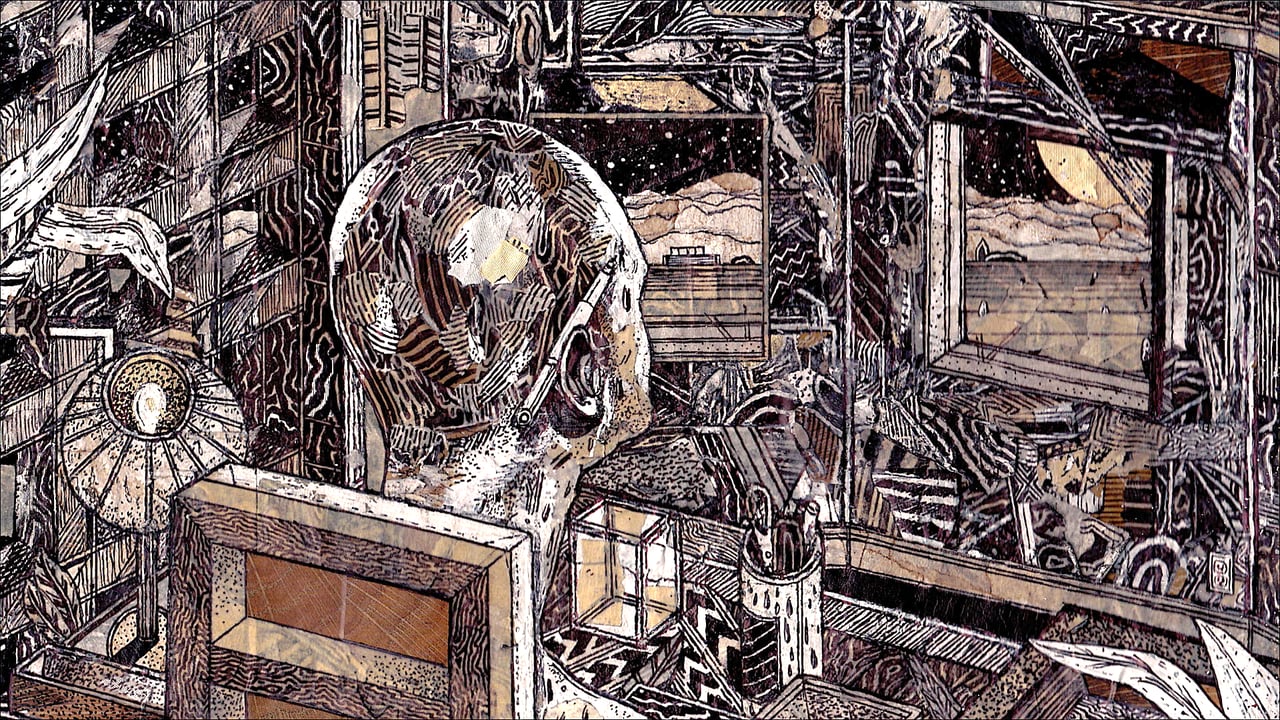
A very different artist that uses animated drawings to develop ideas is Jack Fried. He uses stop motion techniques with collage. He makes initial drawings in such a way that they can be easily cut up or sections painted out and replaced.
Look at this animated drawing "Brain Lapse" to get an idea of how the technique works.
He uses ink, gouache, white-out and coffee to get the particular effects he wants. (It's interesting how many artists find some sort of domestic products to supplement their art materials, some using bleach to draw with, others tea to stain or clothes dyes to get particular colours).
Jack Fried
Jake Fried began his artistic career as a painter, but as he went through the process of layering and modifying images, he realized what truly interested him was the way the images metamorphosed in the course of making a painting and he changed track to become an animator and in the process began to focus on drawing rather than painterly effects. He modifies and shoots the images over and over again to create these fast changing animations that are all about how images can evolve.
Tacita Dean "The Roaring Forties: Seven Boards in Seven Days'
However some artists think of their drawings as frames from films that might never be made. This is how Tacita Dean conceived her large chalk drawings "The Roaring Forties: Seven Boards in Seven Days'. (See theCinematic Drawing in a Digital Age article), conversely Robert Longo has long been interested in making large charcoal drawings of the opening credits of existing movies.
Robert Longo, Study of Bruce, 2013
The relationship between film and drawing is fascinating. Storyboard artists visualise the film often before any shooting is done, not only in the old days did it save film, but drawing was the only way for set designers to be told what to build and for camera operators to get an idea of how to prepare for any particular shot. So it could be argued that a film is actually a chemical and now digital realisation of a series of drawings. However film is also an immersive experience and its scale has influenced a whole generation of artists, not least the Abstract Expressionists, who made their large scale canvasses in response to the way cinema's huge scale could draw its audiences in.
David Lynch was an artist who went into film making, look at his early attempts, they are really someone trying to animate a painting. This article on Lynch opens the issues out. See his early short films here.
It's hard to unravel the relationships between painting, drawing and film because they are so intertwined, and what is happening in so many current practices is that artists simply accept that there is a connection between the two and don't worry about it.
Finally, I don't think it was an accident that Karolina Glusiec won the Jerwood drawing prize in 2012 with her animated film Velocity. I would suggest that more and more people are tuned to animation because of their expose to so much of it during childhood. It's language is clear and deeply learnt because of all those hours sat in front of the TV. If artists can appropriate that, they have a very powerful tool.