Showing posts with label abstraction. Show all posts

Tuesday, 22 February 2022

Abstract comics

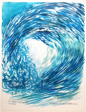
I've pointed out the relationship between the world of comic book art and contemporary fine art drawing several times, but one crossover I haven't brought to everyone's attention is the world of abstract comics. The comic book world has heavily influenced contemporary practice, Raymond Pettibon's work in particular being a clear example of an artist moving from one world into another, his early work for Black Flag  being the springboard for his gallery images.


Raymond Pettibon
However abstract comics is not such a widely known and understood area of practice, so perhaps a little history. 


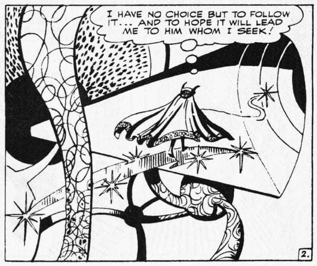
Steve Ditko: Doctor Strange

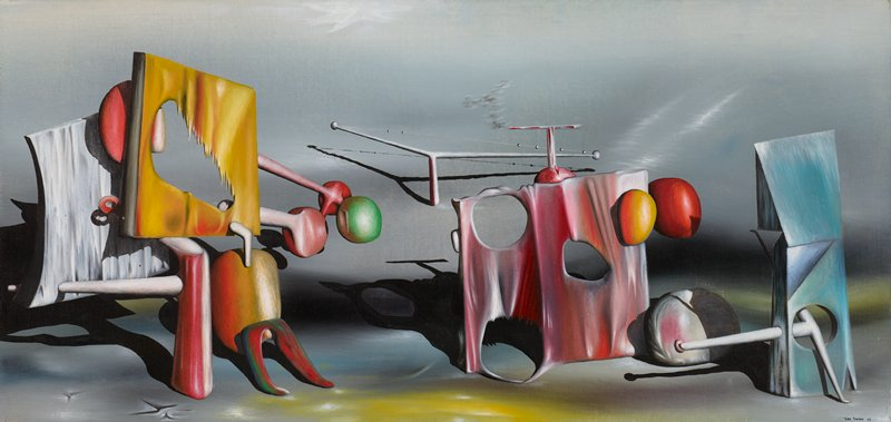
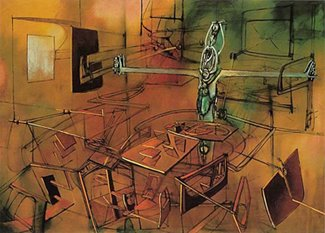
In 1963 Steve Ditko co-created Doctor Strange.  In the comic he developed a series of 'mystic worlds' for Doctor Strange to inhabit. These worlds were pictured as surreal abstract universes, biomorphic forms were rendered in comic book style, using a series of formulas not that dissimilar to those described by Alfred H. Barr, who in the catalogue for the the Cubism and Abstract Art exhibition of 1936 at MoMA defined biomorphic abstract art as, “Curvilinear rather than rectilinear, decorative rather than structural and romantic rather than classical in its exaltation of mystical, the spontaneous and the irrational.” Barr had come up with 'biomorphism' to explain the nature of a certain type of abstraction, such as that made by Yves Tanguy, Matta and Miró

Yves Tanguy

Matta

Miró

I can remember collecting the Ditko illustrated issues of Doctor Strange as they came out in the mid 1960s and clearly seeing a link between the mystic universes being portrayed and the work of artists like Tanguy and Matta. Ditko's images were also influenced by the psychedelic art of the time, an art form that was as influential in France as it was in the States and the UK. 
It was the French graphic novelist Moebius, in his attempts to push the abstract language of his cartoon strips further and further into his own personal graphic language, that was perhaps one of the first cartoon artists to undertake totally abstract sequences as part of his visual narratives.
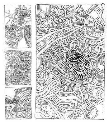
Moebius: Chaos, 1991

Abstract comics tend to highlight the formal mechanisms that underlie all comics. For instance the relationship between image and word is highlighted in Gary Panter's 'Zomoid'. 


Gary Panter: Zomoid

Zomoid takes us into the expressionist world of manic markmaking. Like Ditko's Strange backgrounds, Panter's world is one made from a graphic language but this time one dependent on the languages of expressionism, such as that used by Lovis Corinth or Rainer Fetting. 

Lovis Corinth

Rainer Fetting 1984 Wolf

Zomoid is still however grounded in text but in Lewis Trondheim's 'Bleu' we have blobs and dots passing, intersecting, overlapping, and transforming on a blue background (the paper itself is a bright blue), a very extreme example of abstraction in a comic format, and one that owes a lot to Miró as an early pioneer of biomorphic abstraction. 


Lewis Trondheim's 'Bleu'

Miró: Blue 1961

Like other artists, cartoonists, when they sit down to create, wrestle with form, whether consciously or not: they have to be aware of the page (or screen) ratio where their work will eventually appear; they tend to use grids of panels to give structure and flow to their pages; they make decisions about what kind of marks they will make, they think a lot about gutters: all of these choices have an impact on the mood, rhythm, and content of their work.
In France there is a long history of artists responding to formal issues related to the constraints of a particular media; for instance the group 'Oulipo', short for 'Ouvroir de littérature potentielle' or "workshop of potential literature", often written OuLiPo, which is a loose gathering of (mainly) French-speaking writers and mathematicians who seek to create works using constrained writing techniques. My favourite is 'A Void' by Georges Perec, which is a 300-page novel written in 1969 entirely without using the letter 'E', an exercise following typical Oulipo constraints.

Oubapo, another French group, founded in 1992, focuses on the inherent format restrictions of making comic books. The way they do that is by adding even more arbitrary rules and structures that artists can follow in order to make new comics. Workshop for Potential Comics is in fact a sanctioned offshoot of Oulipo, part of an ever-growing list of "ou-X-pos" ranging from Oupolipo (Workshop for Potential Crime Novels) to Oucuipo (Workshop for Potential Cooking). Oubapo, however, is arguably the most active and increasingly visible of these groups. The setting of rules within which to invent and explore possibilities is something many of us have done in the past, mainly just to see how inventive we can be, but it is a system that has also been used to explore the edges and limitations of art forms and as such can be used to rattle the cages of any establishment that thinks it can run the rule over any creative oeuvre that they feel sits beneath or under their remit. 
From 'OuPi' volume 5

Contemporary abstract comics continue to be produced. 

Universe A: Andrei Molotiu 

In fact Andrei Molotiu is the author of the key academic text on this; Abstract Comics: The Anthology (Fantagraphics Books, 2009) and if you want a proper academic history of this area this would be where to begin. 

Peter Draws

Peter Deligdisch or Peter Draws as he is more often known on line is another abstract comic maker, in his case it is more about an obsessive need to cover a page with a constantly evolving biomorphic imagery but my own favourite abstract comic is 'Garden' by Yuichi Yokoyama. It is perhaps not abstract enough for Molotiu's anthology, but the thing about abstraction is there are no rules that state how much has to be abstracted from reality in order for abstraction to be realised.  


Strange characters step into a garden on the first page, they are visually abstracted themselves and appear to be wearing masks, so we are in many ways prepared for an entry into an Alice in Wonderland type world as they move through a gap from one space into another. (Remember you are reading from right to left, this is a Japanese art form)


Yuichi Yokoyama's 'Garden'

Entering Yuichi Yokoyama's 'Garden' is very like dropping into Dante's 'Inferno', or being in a comic book version of Borges' 'Library of Babel'. Like the characters you don't know what's going on as you pass through different levels. Once you step into this world, you are having to work within its conventions and they are conventions that you sort of get intuitively, but never quite understand. Why is the moss actually artificial grass, why are rocks on castors? Internal barriers constantly move, strange shaped openings appear at random and suggest an earlier party of travellers have left some doors open. Sometimes we are travelling underwater, at another time we are in a library, a library where some books are stored open, others packed into abstract shapes that prevent them from being pulled out from the shelves. On one shelf we find a book of cliffs and we realise that the library is itself a cliff edge. The characters at one point think they are invited to build their own world, there is a space for materials, paper, various pipes, flags and fabrics but they quickly realise they are in a photographic reality where nothing substantial really exists; even time itself, is found to be a construction of the darkroom. 
Yokoyama's 'Garden' stands several tests as a work of art in its own right. It has an integrity about itself that means that you don't need to step outside of this world in order to evaluate it, i.e. it has an internal formal consistency. It also leaves you slightly disorientated for a while, a sign that your brain has begun to operate differently and is making decisions based on 'inhabiting' an alternative world and it is now taking time to readjust to day to day reality. 
The world of graphic novels and comic book art has more recently begun to overlap with the world of film. Initially because the superhero comics of Marvel and DC were very popular franchises, but also because comic and film storyboards have a narrative and structural similarity, that suggest possible crossovers. 

Harry Everett Smith

If you are interested in that crossover space between abstract art and other media besides painting and sculpture, it is a good idea to watch Keith Griffiths' film, Abstract Cinema, which includes interviews with Stan Brakhage, Jules Engel, Malcolm le Grice and Len Lye. The abstract film work of Harry Everett Smith is also interesting, his work from the 1960s and earlier suggesting that he was influenced by comic/collage cutup techniques, another aspect of the psychedelic art of the 1960s, as well as influences from what was called in the 1960s the 'Expanded Cinema', when artists began interacting with cinema as a much more sculptural medium. Scott Bartlett's work being typical of the type of abstract film making that was done during the late 60s early 70s.

Scott Bartlett: Off On

A contemporary artist dealing with these issues in video is Takeshi Murata, whose 'Untitled (Pink Dot)' transforms footage from the 1982 Sylvester Stallone film 'Rambo: First Blood' into an electronic abstraction. 
I seem to have wondered off track again and have ended up commenting on the expanded forms of cinema that grew out of 1960s counter culture. However there are always cross overs between art forms and I have personally always been suspicious about media specificity, especially in the Greenbergian sense; sometimes you need to push ideas out into different media just to see how they will travel. So if making a drawing on paper, why not see if it could be animated, test out whether or not it could be a template for a sculpture, or perhaps a score for music or dance; as artists we are hard wired to deal in possibilities. 

See also:

Monday, 17 December 2018

Collage part four: Mark Bradford


Mark Bradford's Venice Biennale USA pavilion

Mark Bradford's collages at first sight don't look like collages. The elements he collects from the streets around him are fused into huge shapes that can feel more animal like than a collaged collection of bits of paper and other street found materials. By welding together disparate elements with a rubberised solution and then sanding down the surface, the urban environment is sunk down into his abstract compositions and becomes the sinews of his work. The necessary tensions that are set up between the desire for compositional simplicity and using a process that is able to hold together masses of complicated stuff, creates a level of cognitive dissonance; his work has been described as having 'informal formalism, raw elegance and intricate boldness' as both emotional and restrained. The many layers and fragments of his collage, its patterns and dislocations, produces a practice that reflects the complex experience of city life, in many ways the built-up layers of materials also seem to echo the way the evolution of a city is reflected in its final shape. These images are exquisitely detailed, and have very distinctive shapes and patterns, compositions that have been described as like the aerial view of a city at night.
Mark Bradford in front of his work

Bradford’s huge collages are often compared to Modernist abstract painting. Yet his is an abstraction that comes more from the urban sprawl of his native Los Angeles than from art history: As Mark Bradford has stated, ‘There is an abstraction that happens in the city... a dislocation of reality when you have the Mexican taqueria next to the black wig shop across the street from the Korean nail shop’.
Los Moscos


Bradford's huge collage Los Moscos (2006) explores the structures of a city, its histories, cultures and economic systems. (The title translates as ‘the flies’, a derogatory term applied to migrant labourers in the San Francisco Bay area.) Composed from the signage of South Central LA, an area colonised by the entertainment industry, the work consists of hundreds of fragments of torn printed paper – posters, flyers, packaging – found by the artist in the streets surrounding his studio. Words and phrases appear and disappear throughout the picture surface, they emerge in a way analogous to the textural change as you walk through the area, the embedded materials that are revealed by sanding back the layers, capture the area’s cultural and historical multiplicity. 

Remnants of found posters and billboards, graffitied stencils and logos, and hairdresser’s permanent endpapers he’s collected from his other profession as a stylist, are all embedded into his dense surfaces. In this way personal history is intertwined with the on-going cultural interchange of commerce and social interaction. An old post-it note from an office computer screen, finding itself butted up against the remains of an AIDS awareness poster, that is itself sandwiched between a torn left over political slogan and a poster advert for the latest Mercedes car.


The devil is beating his wife

In 'The Devil is Beating His Wife', Bradford consolidates all these materials into a gridded composition of cultural cross-referencing. Built up on plywood, his 'painterly' collages can also be appreciated for their sensuous qualities, which can range from silky and skin-like to oily and singed.

Bradford uses a process of machine-sanding layers of street posters to make his abstract surfaces. However looking more closely at these surfaces made me think that he is also either rubbing into them bitumen or linseed oil, or changing the materials he is using to cement the layers together, so that as he sands down his collaged pieces alternative textual surfaces are revealed. When you walk up to these surfaces of Bradford's images, various secondary patterns come into view. The process of sanding through layers or peeling them off can reveal order in the chaos of collected street detritus. Sometimes these surfaces can look cellular and at other times they look as if they are star systems ripped out of a rubbish tip. He states: “I go between the micro and the macro, where the macro is policy change the micro is the local level. I go between helping one person and trying to change the policy.” The patterns of his images, echoing the patterns of his exchanges in his local community.

But he doesn't just make large abstract images. He is expanding his practice into a social direction by working with foster children and other at-risk communities. Two weeks before his Venice Biennial official opening, Bradford helped launch a new pop-up retail center in Venice stocked with handiwork by local female prisoners and a limited-edition bag he designed. He funded the pop-up, all proceeds from which go to Rio Terà dei Pensieri, a non-profit organisation that employs incarcerated women. “I don’t know if we’ve seen someone with the dexterity of De Kooning who is also committed to activism,” Christopher Bedford, co-curator of the U.S. Pavilion, told the LA Times, when the U.S. State Department announced that Bradford would represent the country. “That is unique to art,” he continued, echoing a widely-held artworld assumption that abstractionists are typically not socially conscientious.


Mark Bradford


Speak Birdman

The image 'Speak Birdman' is map-like in its structure, the 'Bird-man' in the title hovering over the city and seeing it as a vibrant map of pulsating life. The surfaces of images like these are wonderful to explore as you get close to them. I'm never sure as to how they are made, but they do suggest that he builds his collages up into a very thick initial layer, which is then I suspect 'filled' with some sort of grouting or filler, something that will harden as well as stick all the layers together; but what that is I'm not sure, you would have to do lots of testing to find out, but that in itself might lead to some interesting new surface possibilities. Once solid and dry he must use everything from an industrial sander to hand scrapers and simply pulling off layers with his hands to shape the surface and it's these processes that make the work so beautiful, so unexpected and which ties his work into a history of modernism. Modernism's concerns with surface and flatness are both embedded into the conceptual framework within which his work is theorised. Warhol's work was able to theorised as being both flat and about images. Warhol's work was 'painted' using silkscreen print processes and therefore all painterly gestures were rendered flat, his images were not illustrational because they were actual physical manifestations of photographic processes. Bradford's collages contain the 'matter' from which the city is made and therefore he is both able to represent a type of abstraction, one that is very flat, (but thick) and represent the all over compositional devices of artists like Jackson Pollock. He is able to hold within the work real content about the city, the collage elements and advance the cause of Modernism by demonstrating how colour and surface can be yet again re-energised and another formal game added to the Modernist project. Perhaps above all he has been able to restore an idea of the beautiful to the cannon of contemporary art. 

 Mark Bradford video 1


 Mark Bradford video 2
Collage: part three

Collage part five

Articulated collage

Tuesday, 29 August 2017

Venice Biennale part 4 Continuing traditions

Although I'm reviewing the 2017 Venice biennale, the themes and technologies I'm looking at often reach far back into history. For instance abstraction has a long history, Tantric art in particular having an ancient abstract lineage and research into abstract entoptic forms can take us all the way back to pre-history.
Abstraction in this year's biennale was represented by several artists, it obviously still has an important place within contemporary fine art practice. The two artists I have chosen to represent abstract practices however come from opposite ends of the aesthetic spectrum. Dan Miller is autistic and drawing is his main means of communication. He draws words and images over and over again. Each drawing is gradually lost under a surface of marks as new drawings replace it. Superficially these drawings look like Abstract Expressionist works, but they are not, they are records of someone's life, a life that is perhaps hard for us to understand, but by the sheer perseverance of Miller trying to communicate, we are presented with powerful images that seem to have been 'abstracted' out of his various attempts to communicate, each surface becoming a palimpsest of seismic energy, which itself is more powerful than words. 

Dan Miller: detail


Close-up of the framing of one of Dan Miller's drawings

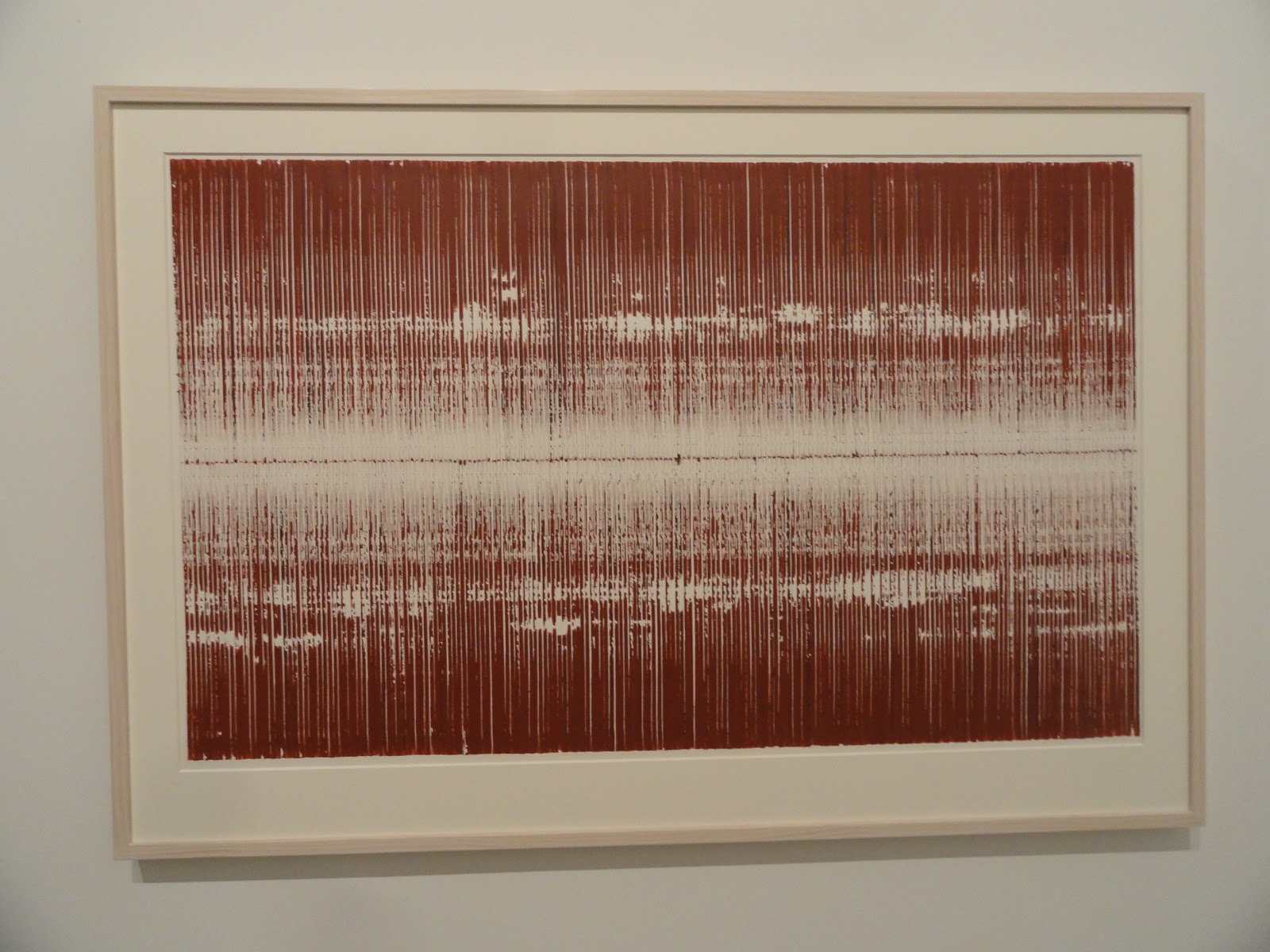
Sopheap Pich sits at the other end of the abstraction spectrum. His drawings are meditative responses to particular processes that he has set up. The drawings on exhibition were made by systematically pressing a stick of pigmented bamboo onto a sheet of watercolour paper. As each print is made more or less pigment is deposited, the process always being done to ensure a bi-lateral symmetry is maintained, carefully and systematically working a way out from the centre to the edges. 

Sopheap Pich

Sopheap Pich: Window mounted drawing 

It is interesting to compare how Miller's work is framed to Pich's. Miller's drawings float off their backing board behind a shallow box frame. The edges of the paper can be clearly seen and you get a sense that Miller works around his paper in such as way that the edge is very important. The paper in this case is presented as a physical object. In contrast Pich's work is window mounted, this heightens a sense of separation from the world, we are given a space within which to meditate on the process. 

Several artists were using textile materials and I have posted before on the stitched line and the relationship between drawing, grids and weaving. Of the artists using textiles I was particularly drawn to Maria Lai's work. 

Maria Lai


Maria Lai: detail of stitched writing


Maria Lai 

Maria Lai was given a posthumous retrospective, her stitched maps and books coming across as still being relevant and aesthetically potent when viewed at a time of international disruption, when there is a great need for empathy, but little coming from our world leaders. Sewing gathers threads together and her books which at first sight appear readable, dissolve back into a language of fits and starts, black blobs of caught cotton, standing for the words on a page, becoming the texts of forgotten languages of appeasement; as people babble and misinterpret each other’s languages as possible threats or aggressive sounds. Her books are soft; their unspoken words soft whispers for weary minds worried about world events, and a welcome distraction from the newspapers. 

Compared to Lai's work I found Achraf Touloub's textile hangings overly mannered and portentous, and although I could get the chain references, I wasn't really convinced. However as a way of furthering ideas in relation to the stitched line the work occupies that territory between 2D and 3D, the stitched lines incised into the surrounding padding, making these pieces into relief sculptures. 


Achraf Touloub

His small drawings, that were sort of Futurist in feel, were much more convincing and when I  looked at some of his other earlier work, decided that his drawings were nearly always more sensitive and concise. 


Achraf Touloub


Sparse and sensuous drawings by Huguette Caland were presented alongside three costume and mannequin works the artist made during the 1970s and 80s. The drawings were of particular interest as they demonstrated how minimal you can be and yet still be very sensual. 


Huguette Caland
Huguette Caland: Mannequin

I spent quite a long time in the Chinese pavilion, one of the reasons being the juxtaposition between old and new technologies. 


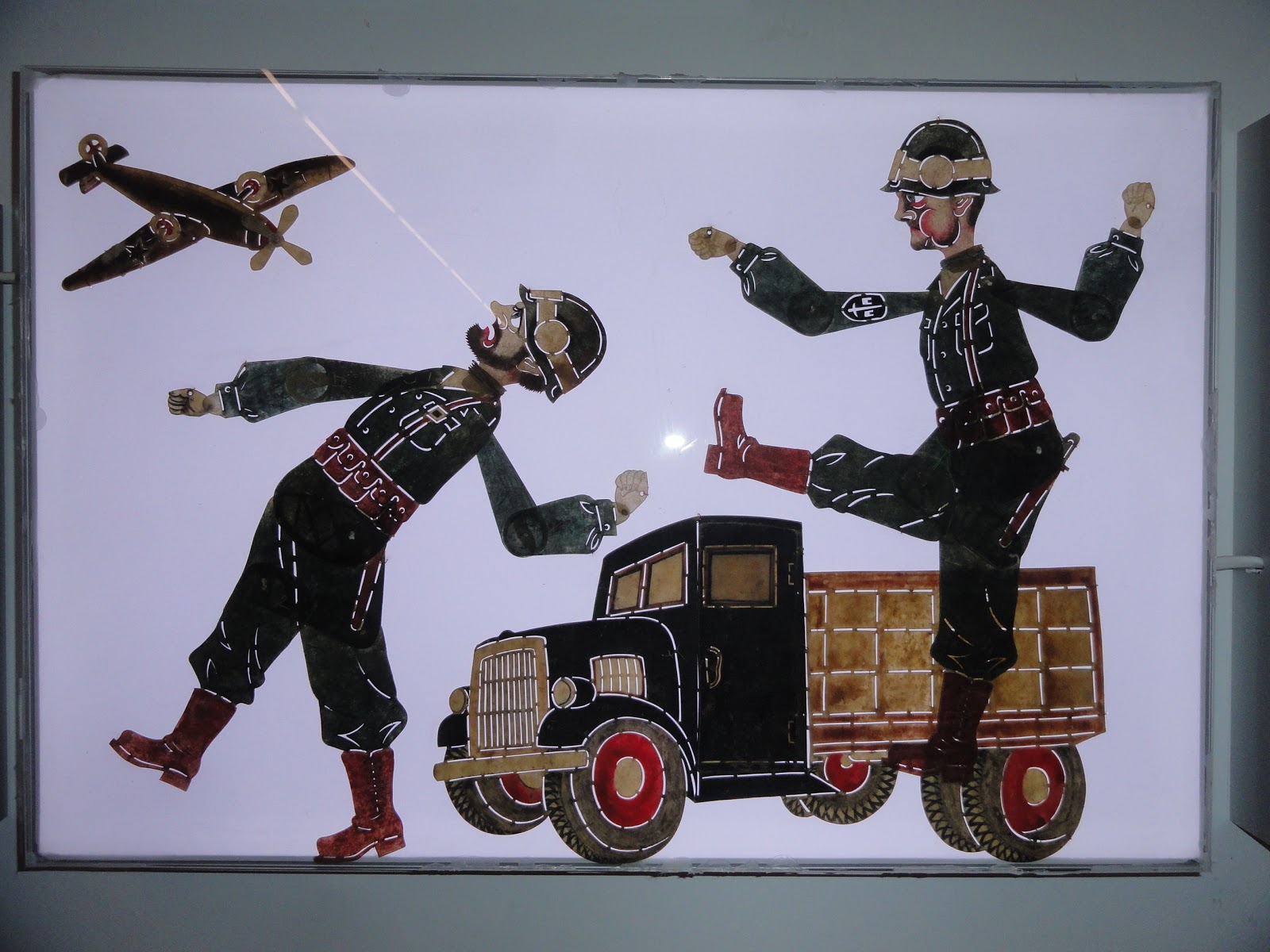
Wang Tianwen, Wu Jian’an and  Tang Nanan, Continuum – Removing the Mountains and Filling the Sea, shadow theatre performance, front and back views


Wang Tianwen, Wu Jian’an and Tang Nanan's 'Continuum' was a fascinating mix of technologies, using old shadow play techniques with contemporary animatronics. You could watch both sides of the installation with equal interest, the animatronics were easy to see and all the workings were 'open', so that as the bird flew across the sky, you could watch the mechanical arm and joints moving in order to activate the bird. You were of course reminded of how sophisticated we are as humans, and how hard it is to duplicate our actions with robots. By mixing the telling of an old story and an old shadow technology with contemporary robotics, 'Continuum' asked questions about the nature of our future relationship with technologies. 

A collaborative work had been developed by Tang Nannan, ‘what’s the sea’ with school children. This began with stories about the sea and workshops whereby the artist supported the children in making images about the sea. These images were then collected together and storyboarded so than an animation could be made, children sometimes then asked to return to their images so that they could draw the in-between frames. I should perhaps have put this post in with the one about relational practices, but because of the nature of the Chinese pavilion, this felt more about passing on a continuing cultural tradition than an artist acting as a catalyst for the development of a relational practice.


Tang Nannan, ‘what’s the sea’ workshop


The whole point of the Chinese pavilion was the interconnection between the past and the present. Old craft techniques and ancient stories, combining with new technologies and people both from inside and outside what could be called the 'fine art' bubble. Crafts people were working using traditional materials alongside fine artists, both equally valued. This attempt to demonstrate a continuing aesthetic tradition was I presume also a political statement about the coherence of Chinese culture, even so I thought it a powerful statement and one that had a lot of resonance for myself. I have often thought that if my own work is to have any traction, I need to make sure it sits within a tradition that makes it accessible and understandable to a wider public than the 'art cognoscente'. But what that is, is difficult to define. Because I'm interested in narrative, I tend to look at a tradition that goes via William Blake and Hogarth, via Rowlandson, 'folk' prints, comic book art and Steve Bell, and has its roots in Pieter Bruegel.  


Qiu Zhijie, The Map of Continuum.


I'm always drawn to maps as images and Qiu Zhijie's map of “Mountain/Sea” and “Ancient/New” representing “Yin/Yang” was presented as the framework around which the exhibition was built. Two well-known Chinese fables, The Foolish Old Man Removes the Mountains and Jingwei Filling the Sea, provide the imagery for the exhibition and the concept of “Bu Xi” (continuing tradition) is used to give coherence to the idea of bringing together two folk artists and two contemporary artists to convey the meaning of the narrative. 
I really enjoyed the presentation of traditional 'light box' images, these worked in a very similar way to stained glass and relied on the simplification of images and their articulation in a similar way to shadow puppetry. You could make very similar figures out of stained acrylic sheet.


A traditional animated story, presented as a video with English text overlaid


This complex cutout was used in exactly the same way as a stained glass window


Detail from the window above


Another detail from the window above


The point I am trying to get across is that as an artist you can use both old and new technologies, the one will often refresh the other and in their juxtaposition or combination you can often find a new way of pushing forward those perennial ideas that will always surface, ideas that each generation of artists will have to redefine in their own terms, but will be about life and how it is experienced. 


Nevin Aladağ: Traces


Finally I would like to recommend Nevin Aladağ's playful sound video, 'Traces'. She had edited together a series of short takes of various ways of getting things to play their own sounds. See this a how it was made documentary.  You might wonder what this has to do with drawing, but I would argue that the editing process is itself a type of drawing. Aladağ would have had to storyboard the idea and organise each shoot so that eventually all would fit together and in doing this I believe she would have had some sort of overall plan or map to work to.  You can see how Traces worked as a three screen installation here


Nevin Aladağ: Traces


In 'Traces' the city of Stuttgart plays itself. This review of Aladağ's work by Andreas Schlaegel in Frieze explains the work much better than I could.
"The action unfolds in public playgrounds and urban pedestrian areas: in one sequence, a cello rotates on a toy carousel; with each turn, it hits a stationary bow fixed to the ground, producing a note that elongates as the carousel slows. Aladağ has skilfully edited the scenes to create an ambitious musical and visual composition, at turns operatic and slapstick. As soon as a musical thread establishes itself, however, it is quickly interrupted or concluded, as when an accordion hanging from a lamppost slowly submits to gravity, emitting a final, fading moan. Traces, ultimately, is a composition of continuities and ruptures that resists readily identifiable melodies and harmonies, as well as all-too-easy politically correct readings. Aladağ’s ambivalence toward a finite meaning is tangible in the deceptively simple musical devices she creates. Traces is not only a theatre of animated matter, but of cultural references in motion – dynamic and quirky, but more often idling, aimless and melancholic. If the town plays itself, it is moody".
Andreas Schlaegel 

Nevin Aladağ talks about her work, she talks about one aspect being 'a drawing of the sounds'. 
See also: