Friday, 13 September 2019

Drawing elephants and other animals

Elephants fighting: 17th Century, Rajput: the Hada Master

If you told me I could own one drawing from all of the drawing collections in the world, I might well chose this one of fighting elephants from 17th century India. It is a wonderful drawing, has such rich content, is embedded in a real moment, uses the page in such an interesting way and above all is drawn so sensitively that the elephants are as alive and responsive now as they were 400 years ago. The dynamic writhing forms in the centre could almost be fighting squids. The straight spears of the soldiers/elephant controllers, stand on the edges of the square and take up the same visual weight as the geometrically drawn architecture. These spiky triangles of spears and architecture visually play off against the human protagonists who desperately try to keep the elephants in the frame. As a counterpoint, one of the drivers is leaping out of harms way while the other sits centrally in the composition as everything whirls around him. There is an economical use of colour too. Most of the paper is left uncoloured, but selected elements are carefully coloured in. Small patches of red and white pick out clothes and tusks and establish a secondary rhythm that riffs with the main one of swirling curves and helps us work our way to the edges of the composition and the straight edged brittle rhythm of the spears and building edges. It feels as if the elephants have knocked the buildings over; the architecture being so very insubstantial in comparison to the dynamic mass of the elephants; the construction lines of towers and walls falling away from each other, as the artist attempts to fit architectural space into the flat dynamic of elephant energy. Fine lines and dots mark out the elephant's texture, their skins are drawn lovingly as if the artist wanted to caress them, their bodies adorned in bands of red and white, as if they were dressed for a dance and not being prodded into mortal combat. The image below is another wonderful drawing from the same elephant series by the Hada master and within the Indian Rajput tradition these drawings have been very influential. 

17th Century, Rajput Drawing: the Hada Master

If you look at this drawing below from the early 18th century you can see how the influence was passed on. 

Elephants running: The Kota Master 1720

Artists like the Hada Master had a major influence on the development of painting in Kota, in both style and content, in particular the concept that that nature in many ways echoes human passion. In the drawing immediately above, the abstract shapes of the architecture are even more abstracted, but this time one elephant goes through a gateway, thus effectively being cut off at the knee. This time the elephant handlers have what appear to be burning torches on the ends of their poles rather than sharp prongs. The rhythm traverses the image from left to right and doesn't revolve around the centre as was the case in the Hada Master's more square image. Even so a life energy runs through the image and there is a sort of exhilaration in our recognition of what an animal of this size must be like when moving at speed.

An elephant combat: Black ink and charcoal with yellow highlights and white chalk on pounced paper 17th century


You can see the artist at work in the drawing above, the chalk drawing is reinforced by the ink drawing. As the image is found, it is sharped up and made ready for the next stage, which would be adding highlights and touches of colour, in a similar way to the images further above, but for whatever reason this never happened. 
Elephants would have been a common sight for Indian Rajput artists but would be a rare animal as far as western European artists were concerned.

While the Hada Master was making his drawings, it is fascinating to think about the fact that Rembrandt encountered elephants for the first time, however for him they must have been much more exotic. In my mind I like to think of these two artists working at exactly the same time, both watching their images arriving out of their hands' movements as much as out of their minds. 


Rembrandt 

The Hada Master knows what elephants look like, and is able to engage much more inventively with action and composition, but Rembrandt is still searching for form. He won't have seen elephants before and he needs to add them to his visual vocabulary. Rembrandt sensitively feels for the elephants' forms by touch. You can feel him tracing each individual elephant's mass as he mentally moves his hands over their various surfaces. These elephants feel as if they have minds of their own, there is something about the way Rembrandt has concentrated on the drawing around the elephants' eyes that makes these creatures almost human in their appeal. 

So what is it about these two different bodies of drawing that is so appealing to me? I think it's about empathy and love. These two qualities unite all these drawings, and whether the animals are part of a common cultural heritage or are new to the artist, they have been responded to with great respect, with a feeling for their 'animalness' and a sense of belonging to the same world as the artist. We feel that both the Hada Master and Rembrandt are also animals, animals that are looking at other animals and in that looking they recognise a similar sentient being. It is in these moments of recognition that philosophies are born and people decide that they are animist in belief. Because these drawings are made by hand on small sheets of paper, they are also gentle reminders of how humans create compacts with inanimate things such as inks and chalks and paper, an empathy with their materials that helps to communicate their feelings to others like myself 400 years into the future.

Joanna Bourke had this to say about the relationship that we have with animals; "In complex and sometimes contradictory ways, the ideas, values and practices used to justify the sovereignty of a particular understanding of ‘the human’ over the rest of sentient life are what create society and social life. Perhaps the very concept of ‘culture’ is an attempt to differentiate ourselves from our ‘creatureliness,’ our fleshly vulnerability". It is perhaps time to remind ourselves that we are animals, and one way of doing this is to spend more time in their company. 

Probably the most ubiquitous drawings of animals are those of cats and dogs. They are so common that we can forget how close the relationship is between ourselves and these domesticated creatures. Below are a couple of drawings by Gericault, a man who was obsessed with the problem of how to animate flesh and how to give to his drawings and paintings a living reality, something he could only accomplish by spending time in the company of animals. 


Gericault a sleeping dog and cat studies

Our observations of animals have become more and more lens based and when thinking about looking at animals we tend to turn to filmed documentary as the medium of choice. This format can however be approached in new ways and with interesting consequences. In 2004 Francis Alÿs made the video 'Nightwatch', which followed the movement of a fox through the National Portrait Gallery. By bringing the static images of dead people together with the live movements of a fox, Alÿs allows us to meditate on our relationship with nature. The fox is so alive and the art on the walls is so 'dead', nature invades culture and as it does it reminds us of how wonderful every creature is. This is perhaps the paradox of all art, in making it we struggle to recreate our experience of life, but as Pygmalion (especially in Edward Burne-Jones' vision below) discovered, art is never quite like life, always at one remove.  


Francis Alÿ: The Nightwatch

Edward Burne-Jones: Pygmalion 

The drawing by Burne-Jones above is a very poor one, it is so lifeless, the artist Pygmalion rests his chisel on a totally inert figure of the sculpture that is to become Galatea, a figure that in this drawing you don't feel could ever come to life no matter how magical the situation or how supportive the Goddess Venus was being and if it did, it could never have wit or humanity. 

See also:

Why draw animals
Indian aesthetics 
Monkey, pig, dog, rabbit and horse

References

Steve Baker (2000) The Postmodern Animal  London: Reaktion Books
Joanna Bourke (2011) What it means to be human London: Counterpoint press

Sunday, 8 September 2019

The struggle for life: when money becomes paper to draw on

Ral Veroni

Because paper is the default surface for an artist to draw on we can forget how charged with meaning certain papers can be. In Ral Veroni's drawings on paper money, “Lucha Por La Vida or Struggle For Life”, he responded on the devaluing of bank notes during periods of hyper inflation in Argentina, a time when the country was in a recession and money was practically worthless. Initially drawing on banknotes in ink and brush, he then made the drawings into screen prints, the bank notes once printed on being worth more than their face value. He was in effect, arguing that money is only paper with an agreement, a drawing on one particular piece of paper being a particular type of agreement about ideas exchange and the image of the queen printed on another piece of paper in another country being part of another type of agreement about the promise to pay the bearer of this image a certain amount of hard cash. 
A skeletal “day of the dead” head stares out of the cover of his small artist's book, which consisted of a collection of his printed bank notes, with a written explanation.


Ral Veroni

Hanna von Goeler has also used money as a surface on which to make comments about the world, in her case this is something not driven by dire necessity but by an interest in the aesthetic potential of banknotes and how this is suffused with political possibility.


Hanna von Goeler

Sometimes whiting out to reveal underlying elements in the design and at others applying a lot more attention to various elements by reversing and/or copying and adding text; von Goeler reveals how much of an impact these things have on the visual narratives of our lives. As a child I remember being fascinated by the complexity of the designs of banknotes, their intricate patterns could suck me into them until I become totally lost in their contemplation. 

As images they are very powerful, this one below for a trillion dollars could be made to stand for the consequences of misrule. 

Bank of Zimbabwe: Trillion dollar note

The present conservative government is seen as carrying on the heritage of Margaret Thatcher in this series if prints by 'Wefail'

Wefail

In Leeds I have been involved with the development of the Leeds Creative Timebank. This is another response to the issues surrounding money and how it has become so central to our understanding of our relationships with each other and the world as a whole. There have of course been similar initiatives elsewhere and they have nearly always resulted in the design of an alternative currency, in Carolina Caycado's case she defaces existing notes. 

Carolina Caycado: cash for an artrists' timebank

Bank notes were not always the main form of exchange. And Hew Locke reminds us of the important role of share certificates in the development of the capitalist economies and their role in supporting the development of slavery as a capitalist economic venture. 

Hew Locke: Share Certificate

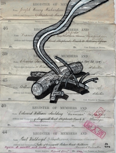
We are moving towards a time when all money transactions will be paperless, money will be virtual and banknotes will become things of the past, just like written out book ledgers, their formats will remind us of ways of doing things that no longer exist. The artist Edward Allington used those old ledgers and other outdated legal documents; which can be thought of as conceptually and aesthetically related to outdated bank notes, on which to make his drawings. 


Edward Allington

Allington would white out the area he was going to draw on and then use a style of drawing heavily influenced by engravings, 1950s illustrational drawing styles and 17th century technical drawings, to visualise ideas for sculpture.  


Detail of an engraving

17th century technical drawing

1950s illustration 

After the 1950s printing techniques became much more sophisticated and the need for black and white drawn illustrations was gone, Allington's drawings brought together various forms of visual redundancy and in doing so created something new that was a result of the dialogue set up between the different visual languages of paper surface and the mark making involved in creating the image. Ledgers would once have been vital to the regular ordering of society, recording the transfer of funds and ensuring that no one could cheat or forfeit on a payment. However in time the hand written records of these transfers become worthless and like Veroni, Allington gave new value to what had lost its use. Creative capital, replacing economic capital or former use value.


What worth are these? 

I have in the past put up several blog posts on different ways to think about paper, the key issue being that the surface on which you make your images has potentially as much to say as the images you put upon it. 

See also:

The languages of paper and cardboard

Research into paper


Interesting on-line books on paper

Drawing in or with paper

More thoughts about paper

Paper folding and the songs of trees


The related videos below illustrate a performative aspect to working with paper, you could say that the elephant in the room is not the elephant at all, it is how any collaborative venture can become an artwork if it is seen as a relational practice. 

Sunday, 1 September 2019

The Frame and the Banner: Venice 2019 a coda

As always as I walked around the Arsenale I was interested in how work had been hung or presented. In particular I was looking at the way 2D work had been framed or not framed and how this was helping to shape the meaning or audience relationship with it.  So my final post on Venice looks at this and then wanders off away from Venice into more general thoughts about the frame as a type of frame within a frame, or physical Venn diagram. 

Jill Mulleady

When looking at the work of Jill Mulleady I was as much as anything fascinated by how she had had her images presented. I have put up the occasional post on framing and if you read my previous posts you will be aware of how irritating I can sometimes find works framed inappropriately. It is perhaps hard to see from the image of her work above, but she had had every painting she exhibited in the Venice Arsenale sunk back into the wall, so that the images were flush with the wall's surface. The wall was also painted matt black, so that the 'washed out' or watercolour feel to her paintings was emphasised. 

Jill Mulleady 

It's interesting to hear her talk about the narratives that she uses, she is very aware of the changes in emotional intensity between urban and rural subjects. I presume the black was for her a way of heightening the difference between the two moods she was dealing with. By sinking the images into the wall she is also able to get away from the 'objectness' of the paintings and in doing so seeks to gain a narrative unity in a similar way to how a series of wordless graphic novel images might work together. 
The Japanese artist Mari Katayama often uses very elaborate frames for her photographs of herself and her ongoing elaborate scenarios that reflect on her own disabilities. Katayama had both legs amputated when she was a girl and has since had to use a range of ever changing prosthetics. She photographs herself in various elaborate stagings, herself and her prosthetic legs, usually being centre stage. Investigating issues of beauty, frailty, sensuality, femininity, vulnerability and characterisations of her physicality as being less than able bodied. Katayama confronts society's obsession and anxieties about bodily appearance. Her adjusted frames work to support the ideas going on in the images. Elaborate gilt frames, (seen in the past as symbols of classical beauty) have added inserts, sometimes very obviously screwed into them, suggesting that they are somehow made less whole by the additions or in several cases lots of empty shells made into a decorative line. Shells can in some ways be thought of as cast offs, empty forms that the creature that inhabited them no longer needs. Katayama's old prosthetics are also cast off as she grows or as she changes her personal sensibilities. 


Mari Katayama: Framing details 

Martine Gutierrez’s photographs were initially produced for a multi-page spread in Gutierrez’s Indigenous Woman magazine – a glossy magazine with its own beauty advertisements, fashion spreads and a letter from the editor all featuring the very same model, stylist, photographer, writer, and editor. Each of the frames had been painted on so that the frame sat in the same colour range and quality of aesthetic values determined by the image. The exotic nature of the subject matter echoed by the way the frames had themselves been exoticized. 


Martine Gutierrez

Framing is a form of presentation and I would suggest that hanging is a powerful alternative possibility when it comes to presenting flat images. Ricardo Garcia's huge drawings in the Venezuelan Pavilion hang as banners cutting into the space, the red lighting further creating an atmosphere tense with expectation. 

Ricardo Garcia

Banners have a long history, one that evokes belonging to a membership of something or militancy, from miners' banners to those used in Nazi rallies or they can belong to folk traditions, such as the fantastic work of Jonny Meah, who made banners for the circus and travelling freak shows.


Jonny Meah

Jonny Meah

Jonny Meah always works out his images through drawing, the one below being his solution to the problem of a boy/girl. I find his work really powerful and think it would be interesting to see his work alongside that of artists that are seen as part of the high art canon. On the other hand of course the societal attitudes that he was reflecting upon when he was working have changed, what was at one time seen as freakish, is now seen as simply part of the human condition, we are far more prepared to accept difference, his work can now disturb as much as intrigue, but I still feel that if you have not come across artists like him before, it is worthwhile doing some research on how and why they operated in the way they did. 

Jonny Meah

The banner can be a sophisticated tool of the establishment or something used within a people's 'folk' tradition, and artists have responded to both ends of the spectrum.


Does form follow function?

I find it slightly disconcerting that the banner format has more lately been appropriated by my local art gallery, as well as other art galleries throughout the world. The hanging banner within an architectural setting is about the making of public messages and only those powerful enough to have access to and ownership of public buildings can usually use them.


However street protest also uses a banner format, some old formats such as the miners' banners, clearly themselves imitating earlier religious conventions.


The banner tradition continues, in particular it has become associated with feminist protest movements and because of the present political climate in the UK I would suggest that the banner will be making a comeback. 

Contemporary UK street protest

Mark Wallanger has made work about these public displays of protest, his 'State Britain' installation, being a faithful reproduction of Brian Haw's own one man protest placards and banners. 

Mark Wallanger: State Britain: 2007

Brian Haw

The Nordic Pavilion in Venice was hosting an exhibition entitled 'Weather Report: Forecasting futures'. It was an attempt to put together a group of artists that were concerned to work in a territory that used to be called science fiction or speculative fiction, therefore when framing an idea it had to evoke a certain futurity. Ane Graff presented an image of genetically modified wheat framed in such a way that it appeared to be emerging from some sort of isolation tank. The frame in this case now becoming an extension of the idea into the surrounding architecture. 

Ane Graff: Nordic Pavilion Venice

Drawing a frame around something is a basic conceptual idea. It separates one thing from another. 
By drawing a line around something we separate it out, the red circle around a word is in many ways very similar to the frame around an image. In the same way that the circle separates the word from its context within the sentence, a frame separates an image from its context within the wider world. As a concept it is a very powerful one, one that in mathematics is called set theory and as a way of illustrating certain aspects of set theory we have Venn diagrams. I could argue that all frames are in essence physical Venn diagrams and they help us think about how ideas can belong to the world or be a reflection on the world. 

Thinking of frames within frames reminds me of what happened to the Venezuelan Pavilion this year. You could think of each pavilion in Venice as a type of frame, in the terms of the diagrams above each pavilion would be a disjoint set, separate from each other. (In mathematics, two sets are said to be disjoint sets if they have no element in common) Within each pavilion Set (A) there would be framed individual works. These would be subsets (B) of set (A). We normally don't think of the power of the pavilion as a frame, we simply walk through the entrance to get in to see the work on show. But because of economic and political unrest in Venezuela, on the opening of this year's biennale the Venezuelan Pavilion remained closed, the doors padlocked shut. Suddenly the focus of the art world was on the locked doors, in effect the framing (the pavilion) was now operating as the main carrier of meaning. 
An intersection of politics, mathematics and art is something that often occurs, if only because they are three fundamental ways for human beings to make sense of the world. They are glued together within art as metaphor. See this earlier post. 

A rambling post again but hopefully within the ramble there are some points of interest. Don't forget when visiting exhibitions to look at how the work is presented, you will have to present your own work in end of year shows, outside exhibitions and to a wide range of people via on line formats. each time presentation will be an issue, so he more you look at how other people are doing it and the more you consider the contextual implications of the various approaches to it, the better choices you will make. 

Sometimes though framing is simply a physical job to do, this earlier post shows one way to make a frame: Framing a large drawing. The cutting and sawing and the thinking through how all the elements fit together involve a lot of basic geometry, a discipline that would have evolved out of physical actions that demanded a certain amount of precision, like planning for a building or deciding where boundaries are. Doing, always comes before theory. 

A frame can also be part of the conceptual thinking about edge; see this post. 

See also:

The banner
Framing
From drawing to installation