Tuesday, 10 November 2015

Michael Craig-Martin and line drawing


In the late 70’s Michael Craig-Martin began to make line drawings of ordinary objects. Over the years these drawings have been refined and developed so that they can be applied to both architectural surfaces as well as operating as stand alone drawings. What is interesting about these drawings is that the 'styleless' nature of them is now seen as a style, and that what were everyday objects in the late 1970s are now seen as objects of a particular moment in time. For instance the cassette in the drawing below now becomes a reminder of an old technology.  He is very articulate about what line drawing means to him, his book 'On Being an Artist' is a very good read and gives a fascinating insight into how he has engaged with the art world over a long period of time, both as an educator and artist. In particular it has an excellent section on line drawing and what it means to him.


‘For these drawings there are no “originals” in the usual sense. In the early days I drew each object in pencil on paper and traced it in fine tape on acetate. I then destroyed the pencil drawings. Since the mid-’90s I have drawn directly on a computer using the mouse as pencil. No hard copy exists unless I print or paint one. In the beginning I intended my drawings to look as styleless as possible, without any hint of my personal intervention, but after making hundreds over the years it became clear that they did have a style, which is now recognisable as my style.’ Michael Craig-Martin


This speeded up video will give you an idea of how he creates his wall drawings using tape.

Michael Craig-Martin: Wall Drawing


 "I thought the objects we value least because they were ubiquitous were actually the most extraordinary." Michael Craig-Martin


There are several important issues that you can take from Craig-Martin’s work. Perhaps the most important is that nothing is boring or ordinary. If you isolate anything from the world it is suddenly a fascinating object. Another issue is ‘style’, Craig-Martin attempted to create ‘style-less’ drawings, however the process of simplification itself led to a ‘style’, perhaps the real lesson here is that ‘style’ comes not by trying to create ‘effect’ but by having a concept and trying to apply it.

The other big issue is about line drawing itself. On the one hand it is the most ‘abstract’ of all drawing approaches and yet it is also a method of drawing that most clearly creates an ‘iconic’ image of the thing represented. It’s very abstraction, clearing away all other visual ‘noise’ and thus getting closer to the essence of what an image can be.
'I try to make images that have the immediate presence we take for granted in objects - a chair, a shoe, a book, a Judd - and compose them like sentences'. Michael Craig-Martin

See also:

Monday, 2 November 2015

Life Drawing

Life drawing sessions have started again but I'm very aware that I can only provide a basic introduction in the time we have.

These are very basic introductions to life drawing' half day sessions that concentrate on measurement and how to capture movement. I have though put up various posts before on my feelings on this e. g. and I did put up a post on the issues that lie behind measured drawing, see.  I have also looked at how art school drawing exercises were practiced when I began teaching in the 1970s, see:

However the Tate Gallery have been hosting a series of life drawing master classes, so if you want to look at further possibilities why not visit their website and look at some of the videos that were made.
Here are a few of them.
Michael Sandle:

Eileen Hogan:

Bill Woodrow:

As to finding a way to push perceptual measurement beyond an excercise perhaps look at the work of Ann Gale. She is able to use the measurement grid as an integral part of the process of searching for form, the resultant images floating between formal perceptual investigation and intimate personal reflection.

Ann Gale

Ann Gale

However in a short 3 hour life drawing session it is unlikely that anything beyond an image that testifies to the struggle of looking can be produced. That's fine, just dont expect a 'finished' image to come from these sessions. Hopefully though they will give you an approach and starting point from which to build your own drawing languages.


Saturday, 31 October 2015

Drawing on Photographs


The prevalence of large-scale digital printers and the, (in comparison), lower printing costs of large scale images on good quality paper, has seen a rapid rise in drawings on top of photographic imagery. This practice has a particular history; you could trace the combination of drawing and photographic collage back to early cubist collages and the fascinating issue of how artists deal with bits of reality within an image stems from that time.

Picasso

Gris


The issue is one of separation and combination. A piece of collage exists both as a slice or piece of the ‘real’ world and as a formal element within an image. For instance Gris uses actual pieces of material from decorative surfaces, and then integrates drawing onto their surfaces. A mark or line exists as a physical thing made of chalk or graphite or paint, but it also operates as a conceptual idea. For instance a drawn line can represent something else, it operates metaphorically; the artist could draw an image of a beer bottle label as a representation, or the artist could stick a real beer bottle label into the image, in which case it represents itself. It operates as a slice of reality within and amongst a representation of reality. A photograph operates within a similar territory and of course many of our collage materials have photographs embedded within them. Newspapers, magazines, product wrappings and advertising flyers all rely on a photographic ‘texture’ to provide verification for their contents. Rauschenberg was particularly adept at playing with this duality when using image transfer techniques. (see earlier post) He is able to lock his mark making techniques into the way he transfers images, pencil rubbings directly removing print surfaces onto paper, silk screen print applying paint to canvas within a photographic format, the image now made of paint is thus transferred into the language of gestural marks.


Rauschenberg 

There is both an intellectual tension and an emotional friction here. For instance, Plato complained about artists creating false illusions, using trickery to deceive the public. Both photography and collage it could be argued break that illusion. A photograph has a ‘direct’ correlation with reality, (this is why you can only use a photographic image of yourself on your passport), and collage elements are of course taken directly out of the ‘real’ world. One passes smoothly into the other, a photographic print could be both exhibited as art and/or found on the floor as yet another discarded piece of paper based rubbish. The issue begins to develop a further complexity when the writings of Greenberg are added into the mix. Greenberg argued that any form of illusion in painting was in effect working against the specificity of the medium. Artists therefore, he argued should be only looking at paint's qualities of surface effect and colour to develop meaning, not seeking to represent reality. Abstract Expressionism, the movement particularly associated with his ideas, concentrated on separating out painting's representational ability from its physical properties. Photography   replacing painting as the only legitimate tool for making representations of the visual world. 

So what happens when you use a photograph as a surface to draw on? Both languages are read at the same time, one is though operating as a ground, (the photograph), the other as ‘the mark', however a mark laid on top of a photograph defiles or damages the image, and establishes another reality, the language of mark and gesture. Photographic languages tend to operate as if the photograph is a form of verification, but as to its deeper semiotic meaning, it is often a free floating signifier, just as any real object in the world awaits our giving it a use value, the mark or drawn text provides an additional emotional or annotational signifier that can be used to 'anchor' a photograph's meaning. What we seek is closure, which can be thought of as the glue holding these different elements together. It’s about the human tendency to seek and find patterns, and to apply meaning to these patterns. In psychology we would call this gestalt theory. The key to closure is providing enough information so the eye/brain can fill in the rest. If too much is missing, the elements will be seen as separate parts instead of a whole. If too much information is provided, there’s no need for closure to occur.

Typical of the images that deal with these issues are the gestural marks on photographs in the work of Huma Bhabha. The scale is typical of images printed using a digital laser printer such as the ones we now have in college, these images are about 6 feet high; human sized. In her re-worked photographs, taken by Bhabha in her native Karachi in southern Pakistan, the artist undermines the documentary tradition of the photograph with a darker, personal vision that is carried by the gestural marks applied across the surface. The photographic document is obliterated or defiled, in effect graffitied over. 


 Huma Bhabha

An artist that makes a powerful drama out of the conjunction of the photograph and drawing on its surface is A
rnulf Rainer. He keeps a fine balance between the photograph as document and marks as signs of emotion. The tradition of Expressionism taken to its logical conclusion by separating out and yet at the same time joining the emotive image and the emotive mark.


Arnulf Rainer: After Messerschmidt. “Der Heftige Geruch” – “The Strong Smell”

Arnulf Rainer

Arnulf Rainer

Rainer's images derive their psychological power from the visual reinforcement that operates between gestural mark and the underlying image. Lines extend or emphasise what is in the underlying image and because the subjects appear to be in heightened states of emotion, we read the marks as a type of nervous graphology, as if the subjects of these photographs were able to defile their own images, the marks 'interpreting' the photographs below. 

In an analogous way to Rainer, Maurizio Anzeri makes his portraits by sewing directly into found vintage photographs. His embroidered patterns garnish the figures like elaborate costumes, but also suggest a psychological aura, as if revealing the person’s thoughts or feelings. The antique appearance of the photographs is often at odds with the sharp lines and silky shimmer of the threads. The combined media can suggest a dimension where history and future converge. Separation and combination again giving rise to a powerful new form. 


Maurizio Anzeri 

Because of a photograph's indexical relationship with the world, the distinction between image and reality has been blurred. By adding a further mark made layer we further conflict the distinction and it could be argued now open a portal into a new semiotic dimension. 
The complexity of these issues suggests that there is much to pursue here and I would suggest that there is still considerably more milage in the area. 

See also:

Sunday, 25 October 2015

Drawing in wire and iron rod

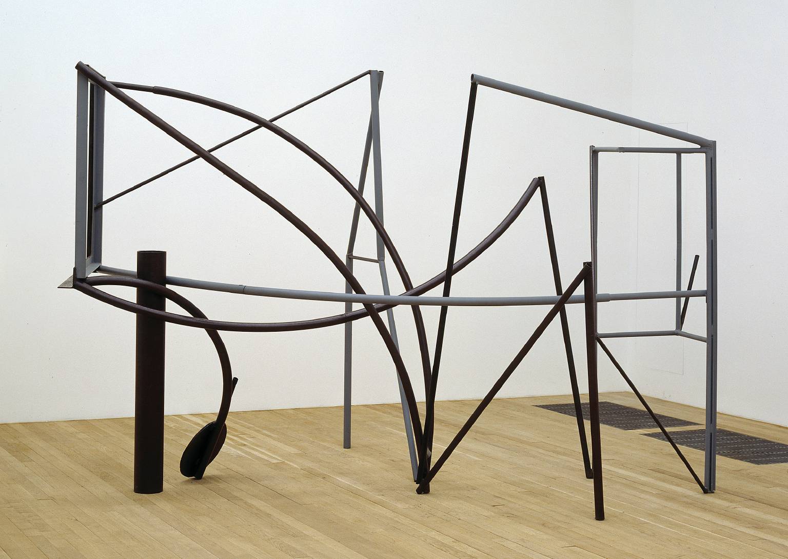
I was at the Yorkshire Sculpture Park today and as well as going to see the marvellous Bill Viola exhibition, spent some time looking at Anthony Caro's maquettes for sculptures. Some of them can be read as 3D drawings. Caro was influenced by the american sculptor David Smith. Smith's Hudson River sculpture is a 3D line drawing of a journey, and many of Caro's early linear sculptures have a landscape feel to them as well. 

David Smith: Hudson River

Anthony Caro: Emma Dipper

These (below) are a few of Caro's maquettes for sculptures photographed at the YSP. The small scale makes them much more accessible and above all achievable on a small budget. 


All the Caro maquettes above are no more than 3 or 4 inches wide. What makes them interesting is the use of various thicknesses of metal to ensure a constantly changing rhythm for the eyes. The less linear sections operate as punctuation points, giving the eyes focus points that can be used for orientation as you look through and around the forms. 


I've mentioned artists who draw in space before, and it looks as if there is a small revival of the practice, but with the added element of a more environmental approach, artists using the ability of the space frame format when used on a large scale to house other elements such as flat TV screens in amongst the framework. 


Neil Beloufa's The Office (2015) at the Mendes Wood DM booth at Frieze London


Beloufa has created a structure that allows the artist to include media outputs, connecting wires becoming part of the linear nature of the whole piece.


Picasso was as always prepared to experiment with different modes of drawing, his memorial to Apollinaire was designed to reflect a line of Apollinaire's writing, “the statue made of nothing, of vacancy” which he wrote when thinking of a monument to a poet. The sculpture represents this nothing-ness. Made with iron rods these pieces at one moment appear 3D but then revert to a perceptually flat image as the light changes and the black lines separate themselves out from their background.  


Picasso: Maquette for a memorial to Apollinaire

See also posts on Gego and Sara Barker  

If you get a chance to go to London, try and catch the Calder exhibition at the Tate.  See

Sara Barker who I have mentioned before in relation to 3D line drawing talks about her more recent work here:

There was an excellent exhibition at &model back in 2015 of the work of Nicola Ellis. See

Nicola Ellis