Thursday, 2 November 2017

RIP John Selway

From the Peter Pan series Digital Print


I have just learnt of the death of John Selway. It's always salutary to be reminded of the fact that we are all getting older and John who was one of Wales' most eminent contemporary artists, was only 79. He studied at the Royal College of Art from 1959 - 62 alongside David Hockney, Derek Boshier, Kitaj and Alan Jones and he taught at Newport College of Art from 1964-91, which was where I first came across his work when I was there as a student during the period 1970-73.
 
He had recently begun to explore the possibilities that working digitally offered him. Initially making a series of self-portraits, images that were a response to his on-going struggle with cancer.
John Selway: Self portraits with throat cancer
 
This year saw him exhibit his last group of works, 'The Peter Pan Series'. He had 11 images on the Oriel Q gallery exhibition that were made on a Samsung tablet and which were printed on Hanna Muller archival digital paper. A testament to his continuing exploration of the possibilities offered by new technologies to him as an ever inventive and resourceful artist.
From the Peter Pan series: Digital Print

This was what he had to say about his work in his final exhibition:
 
‘This exhibition comprises work made over the last 10 years or so, contents of which are recent works inspired by J.M.Barrie’s book of Peter Pan and earlier work inspired by my own early childhood and the poems of Dylan Thomas’s own childhood such as Fern Hill. You may gather from this that the general emphasis of the exhibition is my use of the written narrative as a springboard for the visual image. I have written in the past of my concern for the written word and the way in which it continues to inform my work.’

He will be missed.
John Selway The Rhune Sunset: Oil on canvas. 2009

Wednesday, 1 November 2017

Hardeep Pandhal: The Beano and Viz

Artists influenced by British graphic traditions continue to emerge and as they do more and more complex interrelationships are revealed. In a multicultural society like the United Kingdom it is sometimes hard to realise how powerful children's culture is, especially for the children of different ethnic minorities, who will have had to reconcile the culture of their family with that of the place they find themselves growing up in.
I believe that there is a comic centred graphic culture that stretches from the Beano through to Viz that has had a particularly powerful influence on the visual imagination of British children. Leo Baxendale created an iconic visual language for The Bash Street Kids, Minnie the Minx, Little Plum, the Three Bears and other DC Thompson owned comics. Generations of British children would have the Beano or the Dandy brought for them every week and the surreal playful inventiveness of the imagery has engrained itself into many an artist's psyche; including I must say my own.


Leo Baxendale

As children we were brought up on these images of anarchy and inventive disruption. I still remember the visual complexity of Baxendale's ideas, the double page spread above being typical of his inventive style. I can still remember how my mind inhabited these scenes and how I loved looking at them over and over again. In particular the protagonists were often children versus authority figures such as the teacher, and the children were nearly always succeeding in their anarchistic ambitions by sheer inventive destruction. In the drawing below, I love the way the pocket naturally grows to accommodate the cascade of pop being poured into it. Arms can come from anywhere, nostrils can accommodate rockets and mashed potato can become a weapon of choice in this surreal world designed for growing children. 


Detail of a Leo Baxendale drawing

The Beano style was the dominant look for children's comics for years, so much so that when the satirical magazine Viz started up in 1979, it used the visual language associated with the Beano and the Dandy as a parody; Viz's diet of misogynistic toilet humour, surreal black comedy, and violent sexual storylines would instantly be appreciated by teenagers and young men who as boys had grown up with The Bash Street Kids, Denis the Menace and Desperate Dan. 


From Viz

For youngsters of the post 1979 Viz generation the Beano's comic style was now deeply associated with hard core satire and sexual violence that was the staple diet of Viz and it is no surprise therefore that as a new generation of artists emerged steeped in that tradition that they would reflect it in the work they did.


Viz

Viz was a comic that specialised in taking on and subverting stereotypes of British society. For youngsters coming from very conservative cultural traditions the anarchistic core of both the Beano and Viz must have been particularly powerful models. In the hands of Hardeep Pandhal this comic book tradition confronts and is merged with visual cultures from the Indian sub-continent. Hardeep takes on the language of Viz and pushes it further, embracing other narrative traditions and in the anarchistic spirit of his influences takes on elements of Sikh, Mughal and Rajput miniature painting and incorporates them into his own irreverent stories. 


Sikh miniature


Hardeep Pandhal

Hardeep was at one time working in Leeds and then moved to Glasgow; as soon as I saw his work I recognised the Beano/Viz linage of his visual languages and because these languages have a wide currency I would suspect his work will be accessible to people outside of the contemporary art world as well as his images re-invigorating the more traditional languages of fine art drawing.
Personally I'm not sure about the way the images work on a larger scale, I can see the need to appropriate the language of the gallery and more contemporary installation practices, but I feel that the smaller images on paper work much better for me. I can see the connection with the comics easier, their grubby creased surfaces, coloured in bits and passed around feel, seem so much closer to Hardeep's deformation of his Leeds Met BA certificate. Not that I'm advocating that you all to deface your hard earned certificates as soon as you get them, but there is a necessary irreverence when working in this territory.


Hardeep Pandhal

The sensibility of someone like Hardeep Pandhal is totally different to Shahzia Sikander. Sikander grew up in Pakistan, developed a contemporary miniature style whilst still living there, but then moved to New York. 


Click on this Shahzia Sikander image to enlarge 

Shahzia Sikander: Projection

When Sikander moved to New York she became immersed in the contemporary art world. Gradually her work developed a hybrid style of contemporary art practices mixed with the tropes she had brought with her from Islamic miniature painting. I personally feel that the 'art' style of the West has in this case overwhelmed her personal sensibility, but it could also be argued that in embracing contemporary art practices she has been able to demonstrate the continuing relevance of world wide cultural traditions within modern society. 

At its best art that works in the gaps between two cultures can shine an illuminating light on the sociological complexity of cultural hybridity in such a way that people from both cultures are asked to think again about themselves; Salman Rushdie's 'Midnight's Children' being one of the most insightful and imaginative books of the 20th Century, a book that shines a light on post-colonial history and in doing so establishes a type of writing that is both polemical and fantastic. Homi K. Bhabba's 'The Location of Culture' is the classic text if you want to read more around these issues in order to develop a more theoretical understanding. 

See also:


Saturday, 28 October 2017

Drawing on transparent drafting film

Jasper Johns: Ink on Plastic

When I went to the Jasper Johns exhibition at the Royal Academy the other week I was reminded of how pleasurable it is to draw on drafting film. I often use 'Truegrain' for doing this, which I buy in rolls. 'Truegrain' is a textured polyester drafting film, that I first used when I was teaching printmaking. It is a wonderful surface to draw on if you want to make a photo-exposure for a silkscreen. The grain of the surface and its high level of transparency mean that you can get a wide range of textural effects using charcoal, litho crayon, graphite, acrylic, pen & ink, gouache, oil pastel and other drawing and painting materials. In particular the grain allows you to get 'drag' on your brushstrokes and more 'pull' or 'lift' off a litho or similar crayon. Without the grain the marks are too smooth, less responsive. 
You can of course also use it to make drawings on,  just think of it another surface to respond to. However it comes into its own when you have some form of light coming through from the back. Jasper Johns simply uses very white paper behind his ink drawings on plastic film, this being enough to reveal the rich textual possibilities. 


Jasper Johns: 'Regrets' ink on plastic

If you look closely at the image above you can see the way that dilute ink coagulates and has a tendency to thicken and thin in unpredictable ways, thus keeping the surface active and ensuring that what could become 'empty' shapes always have a textual energy about them. 
Of course you can also use these transparent sheets of plastic to trace images through and Johns has availed himself of this possibility with his tracings of Cezanne's 'Bathers'. 


Jasper Johns: Tracing of Cezanne

The use of brown ink is suggestive of a historical mode and once again the ink's tendency to clot and blob has been used to help transform what could easily have been an uneventful tracing into an image that now sits easily within Johns' concern with the status of the surface and its problematic relationship with the image. 

The artist Hadi Tabatabai has used acrylic polyester sheets in a totally different way, relying on the thickness of the sheets to give a sense of depth to his very tightly controlled non figurative constructions. 


Hadi Tabatabai

By drawing on both the back and front of a sheet of acrylic film, Tabatabai can construct a both in and out of focus perception of the image, our eyes therefore begin to attempt to refocus on what our brain has decided is a layer either closer or further away. This activates the space in a totally different way to Jasper Johns' surface treatment. 

Jim Dine: Charcoal on mylar transparent sheet

Jim Dine had a rich drawing centred practice and at one time he focused directly on making what he called heliogravure prints, which were made directly from drawings made on different transparent surfaces. He used three different categories of supports: clear plastic sheets, frosted plastic sheets, and translucent paper. The Morgan Museum has a very good account of this and their blog post on Dine includes some excellent close-ups of his techniques here. Dine would scratch into the surface, fix the bits of rubbed out charcoal onto the surface with acrylic spray,  wipe surfaces down with cloths etc. Anything to get the required effect. 
Because these transparent surfaces have a direct association with printmaking, working on them can be a very good way of bridging the gap between the two disciplines. There is a very large light box at the back of the drawing studio and it is often underused, why not get some polyester film and just work up some of your drawings onto it, and then take the most interesting ones along to the print room and see how they translate into silkscreen prints. 


The black lines drawn on the image above are where Dine wanted the edges of the resulting print to be. At the time Dine was drawing from Greek and Roman antiquities in The Glyptothek in Munich, and I have mentioned before how useful this can be.  


You can find out more about 'Truegrain' here It is about £16 a sheet, which might seem expensive, but when compared to canvas and the need to make stretchers it might not seem too bad. 

See also:

Monoprinting
Monoprints and lithographs
Drawing and printmaking More on Jasper Johns
More on Jim Dine
SKETCH

Friday, 20 October 2017

Alina Szapocznikow: From drawing to sculpture

Alina Szapocznikow
Coming to the Hepworth in Wakefield is an Alina Szapocznikow exhibition; 'Human Landscapes', it is open from the 21st October 2017 to the 28th January 2018

Although mainly thought of as a sculptor Szapocznikow was an artist that thought very much through drawing, the book Alina Szapocznikow: From Drawing into Sculpture with a text by Annette Messager, is a wonderful introduction to her work and thinking process.


She was one of the first artists to use modern materials such as polyurethane foam and polyester resin, and she reflects this wide ranging use of materials in her drawings, using felt-tip, ballpoint, crayons, ink, watercolor and monoprinting to visualise her ideas.  Focusing on the body as a site for humor, sexuality and exuberance, Szapocznikow can be seen as someone who worked across several boundaries, aware of Surrealism, Pop Art and other Modernist movements she was though I believe in reality part of a much older tradition, one that artists such as Klara Kristalova belong to. 


Klara Kristalova

There is a North Eastern European tradition that includes the tales of the Baba Yaga and other stories from Slavic folklore. These folk images although not referred to directly by artists such as Szapocznikow or Kristalova, have an image bank associated with them that runs deeply through the unconscious of many artists. From Mark Chagall to Russian lubok prints, there is a particular Slavic imagination that I have always responded to, one that I now realise, I am inextricably linked to. 

Lubok print of Baba Yaga

Mark Chagall

This interest of mine may be because my grandmother was of Polish Jewish heritage, or it may simply be that these are good working Jungian archetypes, it doesn’t really matter, but what I will be doing is going to see Szapocznikow’s exhibition and would recommend her work to any of you interested in how drawing can be used as a way to help visualise ideas in sculpture.


Alina Szapocznikow

I'm returning to this post after actually visiting the exhibition. The work itself is stunning and for those of you interested in drawing there is much to think about. One aspect of her work is the formal invention she takes it through and the move from being a very traditional stone carver to working in new plastic materials is clearly illustrated. Her early drawings demonstrate this formal invention and are interesting as a way of exploring how someone thinking about form in sculpture can save time by drawing. However it was her late drawings that I found the most powerful. They are very simple, and yet in their very simplicity I found great affect. 


The four drawings above are small, about A4 size, made with a red marker. You can see the old creases in the paper from when these drawings were dropped to the floor or simply left somewhere as she moved on. They are not drawings made for display, they are thinking drawings and Szapocznikow is thinking about how cancer has begun to spread in her body. The masses of cells are part of her body and are also taking over the body. They have already invaded her breasts and are now dropping down into her womb. They live in her, like some child of death. I mentioned in my first draft of this post that I suspected that Szapocznikow's Slavic heritage may also be an influence on her work, I'm not sure any more about this, but the fact that when peasants made dolls of the Goddess of Winter, Morana, these were often ritually destroyed, seemed to me to fit perfectly with the broken, destroyed bodies that were found at the core of this exhibition. 

Alina Szapocznikow: Chewing gum sculpture

The making of things formed in the mouth is somehow elemental. There is a section devoted to Szapocznikow's chewing gum sculptures. The bringing of these small chewed mouth casts into the open and having them photographed so beautifully, is a life affirming act, one that shows how much Szapocznikow was aware of the body's life as a sculptural process in its own right. 

From the malleability of the flesh to the sculptural impermanence of bone, Szapocznikow's work is a deep meditation on mortality and as such I would really urge you to visit the exhibition while it is here in West Yorkshire. 


Monday, 16 October 2017

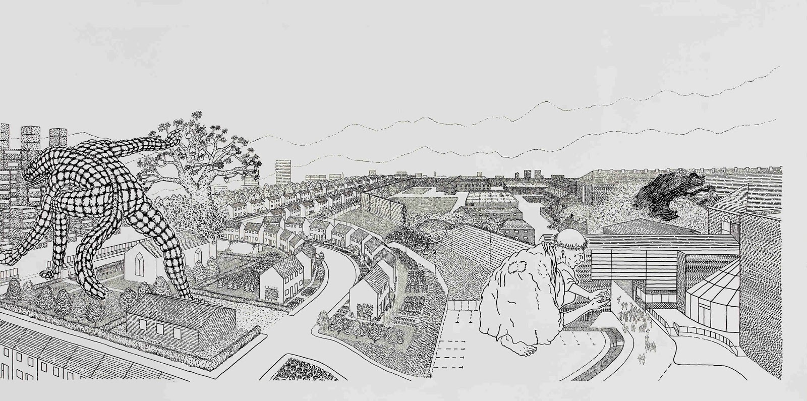
Chad McCail


Chad McCail

Chad McCail has this to say about his work, "I make drawings, paintings and prints working in a figurative, illustrative manner. It is my intention that there should be no question as to what is represented but that the viewer’s attention should be focused on why it is and what is happening and that if this is successful, important questions should be raised. The pictures usually carry a short text that provides a lens through which the image can be seen. My interest is in examining those forces that enable us to take pleasure in one another, to empathise and co-exist peacefully and those which alienate and cultivate antagonism and mistrust.
Recently I have been looking at the history of compulsory education and this had led to an interest in how we treat children at puberty. In other cultures it is an event often contained by a public ritual which binds the adolescent to the community. That no such thing exists for most of us testifies to our emotional incompetence. Our general denial and failure to acknowledge or preserve the significance of this event, has particular consequences".
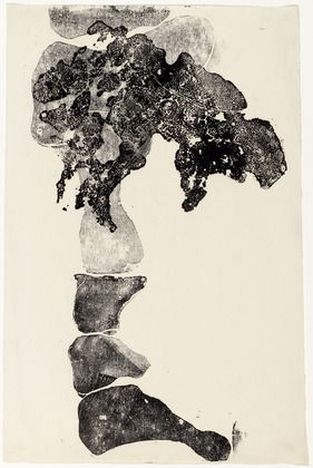
From the Edinburgh printmakers website

Chad McCail's paintings and prints adapt the type of visual language you might find located on the back of your seat in a plane as you are waiting to take off. He wants to make a point and to make it as simply and clearly as possible, therefore he uses graphic languages designed to do just that, when you have to think about your safety on a plane the language used must be both clear and universally applicable.


The language of air safety


His recent work 'Compulsory Education' looks at the three-tier education system that has resulted in comprehensive, grammar and public schools. He puts forward speculative arguments about the origins of 'compulsory education' in the conflicts between the European 'great powers' in the nineteenth century and is fascinated by the fact that..."pupils whose parents have paid for their schooling are four times as likely as state school peers to get a place at one of the top ten universities."


Chad McCail: images from various projects

McCail's work is about highlighting the mechanisms that are used for social control  'Most children learn enough to obey orders, some learn more so they can transmit commands' one of his images reads. 'A few learn to dictate'.


As you can see from the range of images above, McCail varies his style to fit the idea. Sometimes he is dealing with issues that need a more open ambiguous response and at others he uses text to solidly ground or anchor his images to a particular issue. 'Wealth is shared', is for instance a title many would aspire to, but the reality is that Capitalism as a system is not about sharing. The images therefore can seen as naive but on second reading you realise that their simplicity is intentional. If it seems very appropriate to talk to children about sharing, why is it so hard to broach the same subject with adults? In our heart of hearts we are socialists but in our minds we are often capitalists. McCail asks us to rethink and go back to the essential truths that we thought were right when we were young.  Often drawn on a computer, McCail's work is digitally printed or made into silkscreens. He also works as a mural artist, his accessible style being very useful if there is a need for an idea to be communicated to a wide variety of people. 

Chad McCail: The Becontree Mural

See also: