If you look at the presentation of drawings by the ceramic artist Klara Kristalova below you can see what I mean. She also attaches some of her flatter ceramics to the wall, which further reinforces the idea. She pins some drawings, others are framed in what look like junk shop frames and a few items of jewellery are attached beneath a couple of images.
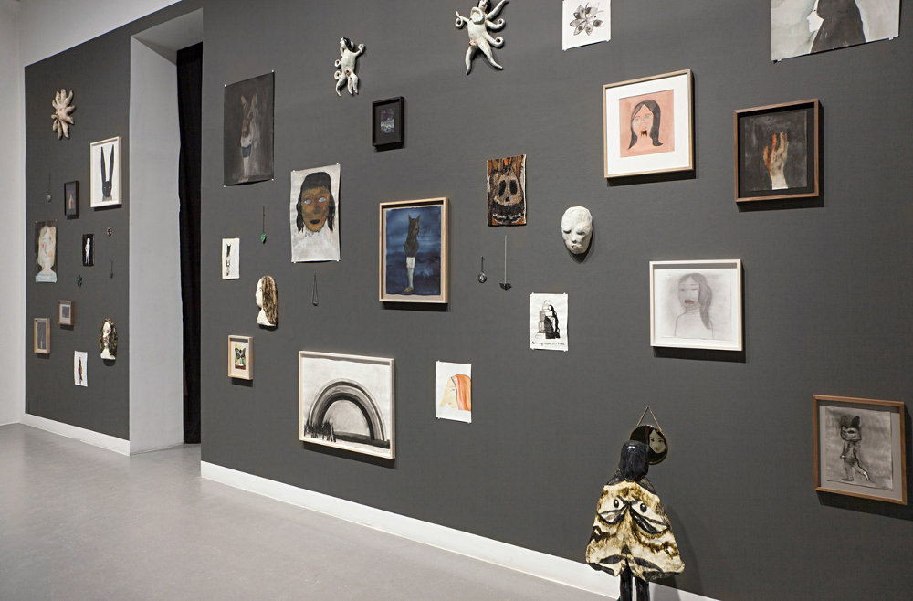
Klara Kristalova

Klara Kristalova
Ida Applebroog has taken this idea on a step further, she arranges and stacks her images in gallery spaces. It feels as if she is much more interested in how comic book pages work, images are cut and stacked one on top of each other, but in this case literally stacked, because her images are constructed on the sides of shallow box type frames.

Ida Applebroog
Sometimes the work is held up by a supporting bar such as in the image on the right below, again this reinforces the idea of the image as object.

In the exhibition view below you can see that very few of Applebroog's images are wall mounted, some are simply leant against the walls and one is laid flat on the floor.

Applebroog has also used large open frames to make supports for her drawings. Sometimes she puts a light source inside, once again this adds to the objectness of the situation. These frames are often added to by drawings attached to ladder type supports, or stand alone single frames, the work becoming more sculptural as each additional element is added.

This sculptural approach has been used by Applebroog to build a house of drawings, the images now becoming part of the texture of the building's surface.


Ida Applebroog
Applebroog is an artist well worth investigating as an image maker, and not just because of her presentation skills. She uses composition in a very physical way. As you can see in the drawing of the boy with the Pinocchio nose below, when wanting to extend the image she very straightforwardly simply adds an area on.


Applebroog uses a range of styles but always seeks to capture the dramatic potential of the image. The yellow childlike figure with the sophisticated shoes is a good example of her use of separate sheets of paper to develop the image, two sheets make the simple split between child and adult and the third reinforces the idea by allowing her to establish the woman's shoe. As an exercise in composition, look at the difference between the two images of the couple kissing. The landscape format allows them to be about to gently kiss, the portrait format squeezes them together much more urgently, but both images rely on the noses as their 'punctum'. As the noses touch they also make you much more aware of the space between the two heads, the noses effectively separating the faces in such a way that they will never be able to touch lips. A moment of tenderness, stopped by the awkward interjection of noses. (In the work of the philosopher Roland Barthes the 'punctum' is a touching detail or a small aspect of an image that allows the reader to understand the whole image in a particular way).
I think the first time I saw a show hung with images splattered across the walls was a Raymond Pettibon exhibition in Berlin, his images were both drawn directly on the walls and attached to them within frames. Pettibon also added text into the mix which in effect turned the walls of the gallery into giant comic book pages.


Ida Applebroog
I think the first time I saw a show hung with images splattered across the walls was a Raymond Pettibon exhibition in Berlin, his images were both drawn directly on the walls and attached to them within frames. Pettibon also added text into the mix which in effect turned the walls of the gallery into giant comic book pages.


Raymond Pettibon

Marcel Dzama and Raymond Pettibon
This desire to get away from the nicely framed image and escape the formal need for a regulation height for framed work* is perhaps a response to Sol Lewitt's work. Lewitt by working directly on the wall, in effect took us back to drawing's earliest manifestation on the wall of a cave.
Constructing a Sol Lewitt wall drawing

Cave painting from Kimberley Australia thought to be even older than Lascaux.
By integrating images into the fabric of a structure, whether this is a cave or a room, artists effectively embed their ideas into the very foundations of the environment. The wall can be thought of as a sensitive membrane, and when it is drawn on it is as if it has been tattooed. Think of the difference between having a body tattoo and wearing an image on a 'T' shirt, the tattoo is just so much more authentic.

'Tribal' 'T' Shirt

'Tribal' Tattoo
*The regulation height for framed work is often set at 57 inches. This distance is measured from the middle of the image, so that all the images in an exhibition share a midline. Some galleries state a 60 inch midline and the highest I have seen is a 62 inch midline. What they all have in common is the idea of a midline. However I have always thought that sticking to an average means that no one is then at the right height, people are either too tall or too short, so having a variety of heights means that at least some work will be for some people hung at the right height. Most gallery directors would argue that the one thing about a consistent height is that it gives coherence to their exhibitions, so if you do want to approach hanging your work in a much more informal way, make sure you have a good argument for it.

Wow... Nice tatoo
ReplyDeleteHow to pass Nebosh IGC3
Nebosh IGC Registration
IOSH MS course in Chennai
Nebosh Course in Chennai
Safety Courses in India
china Smart mirror manufacturer
ReplyDelete