
I still draw using pen and ink. You may ask why? It does seem rather anachronistic to still be making images with a dip-in pen and ink. Next to my work table I have a wide range of felt-tips, Sharpies, biros, technical and ruling pens, so it's not as if I'm unaware of the possibilities offered by other types of drawing implements. I also make my own drawing tools from bamboo and other sticks, as well as mark making tools from sponges, crumpled papers, cardboard, cut plastic and anything else that comes to hand, so I'm not stuck for implements that offer a wide range of linear, textural and mark making possibilities. But I still keep drawing with a basic dip in pen and ink. Recently many of the drawings have being about bodily feelings, such as these two about having a constantly itching skin.


Scratching an itch
But I also draw the world around me in sketchbooks.
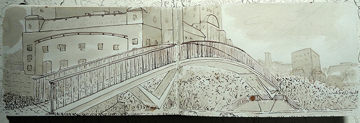
A footbridge over York Road

A structure being built in the Gledhow Valley woods

Typical pen and ink drawing gear, including small metal ink and water reservoirs

Typical pen nibs
The other reason I work using pen and ink is the nature of ink. Most people will start drawing with India ink, a waterproof liquid that has a glossy finish and a tendency towards being 'sticky' or to congeal easily. This means that it is not a great ink to use if you want to keep your lines flowing, but is very useful for short, stabbing marks and textural work.
Japanese Sumi ink dries with a more matte appearance. It won’t congeal over time like the India ink, and has a much better flow consistency because it was designed to work with the capillary action of long haired brushes. Both ink stick and bottled ink have uses and getting used to both enables you to think how pigment saturation effects tonal values.
Calligraphy inks are much thinner in consistency, are not waterproof and tend to bleed when using papers with little size in them, but they flow very easily and for fast sketching they are perhaps the most sensitive.
Acrylic inks are multi-purpose, normally on drying water-resistant and can be used in combination with all of the above to make inks that suit your purpose much more precisely.
It is in the mixing of various inks and other colour carrying vehicles such as gum arabic that I find much pleasure and a space for conceptual play. What goes into the various inks I use and make is vital to the meaning of my work. I am aware that nobody but myself will ever know what went into each ink before it was taken up and applied to the paper, but I spend hours and hours just testing different mixes and thinking about what it might mean if a particular substance was added into the mix. Because of flow issues some inks become unusable with a dip in metal pen and then I combine pen with brush work, but the natural affinity between the two applicators means that they sit with each other very easily and you can integrate their mark-making qualities into the same surface. Dyes and stains can be combined with inks, whilst wax resists and other surface protectors can be integrated into textural manipulation alongside applicators such as sponges, tjantings and homemade tools. The line between pen and ink work and work with other applicators, stainers and paints was never a fixed one and for myself liquid materials are a metaphor for how meaning is made, forms arriving out of unpredictable fluid interactions, that can gradually be coaxed into other forms that carry associations, that can themselves begin to trigger some sort of material understanding.

An image based on somatic feelings using stains and various watercolour mixes
Painters will point to the specifics of their various mediums, oils, acrylics, temperas etc. but as someone that sees themselves primarily as a drawer, I tend to see all these areas as involving pigments suspended in liquids that can then be applied to various surfaces. The game is to watch what happens as the chemistry of interaction unfolds and reveals itself as physical form, as if each image was in itself a landscape that was gradually coming into being as various elements interacted with each other.


Sometimes it's drawing something remembered or trying to work out how you can make a shape represent something, in the case of the drawings above they are pen, brush and ink, from a series of drawings done from memory after spending a day looking at the sea.
These drawings of the sea and a rocky coast, remind me that I'm also drawn to pen and ink work because as a boy I read lots of comics and these were in the 1950s mainly drawn with pen and ink. In the marks and shapes I was inventing for water, I can see the marks and shapes that made up a Black Bob image. I still have dreams about myself as a boy, wandering the slag-heaps, wastelands and grassed over bomb sites of Dudley, with Scamp my dog in tow, as we lived out our own versions of Black Bob's adventures.

A fantastic Black Bob textural landscape

A typical scene from Black Bob drawn by Jack Prout
Black Bob was a particular favourite, the stories were set alongside other Dandy characters such as Desperate Dan and Korky the Cat, but were drawn with an attention to detail that made you very aware of the Scottish landscape that the action was set into.

Black Bob in action
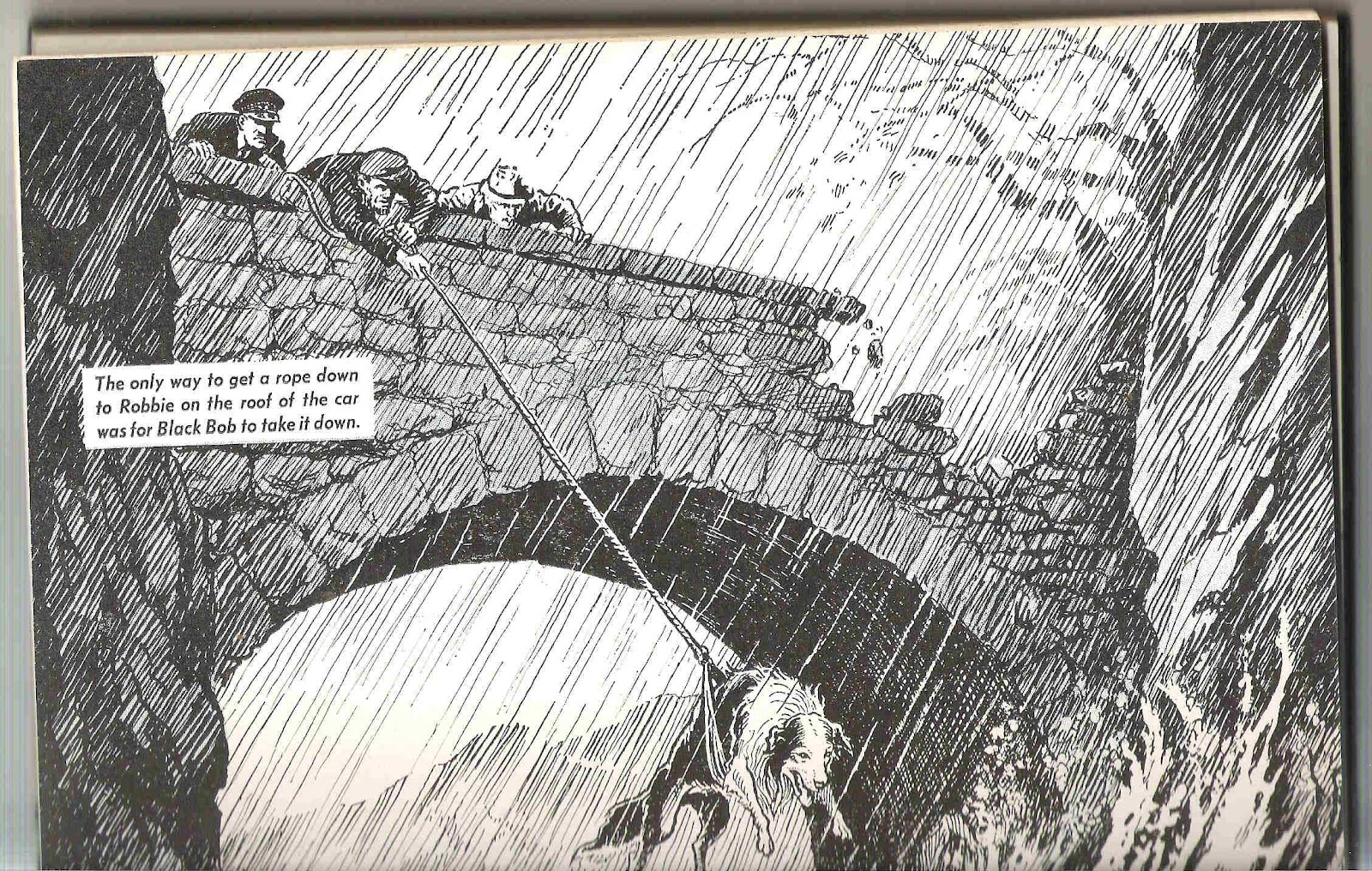
Scottish weather was often in evidence and Prout was very good at getting across that feeling of dampness, rain and the cold that you often have when out in the hills. Black Bob's adventures were set in a landscape as epic as Thomas Hardy's Wessex, the dog's outdoor world formed the stage upon which was acted out animal feats of heroism. It was only later when I had to read Thomas Hardy as a teenager that I realised how Black Bob had been imprinted in my head as the definitive model for this type of landscape romance, but as a character Black Bob seemed etched far more deeply into my brain than Hardy's protagonists.
I also avidly read the Topper, a comic that reprinted Nancy strips, images that were in effect the other end of a conceptual drawing scale for a yet to be artist.

Nancy by Ernie Bushmiller
At the time I never really understood Nancy, the visual puzzle was however not really to be understood, it was more about the dawning of the pleasure of visual relationships, such as the pawn broker's three balls and Nancy's three ice cream scoops. The issue was that nothing else was needed in order for the gags to work, the visual world was itself enough of a conundrum. Both Prout and Bushmiller are in my mind wonderful artists. The fact that they could draw these strips every week and still maintain a constant level of invention and visual rigour, (Bushmiller is a conceptual abstractionist, whilst Prout is a romantic landscape impressionist) is amazing and I have never been able to forget that first exposure to the world of sequential visual narrative, a world all made possible by pen and ink.
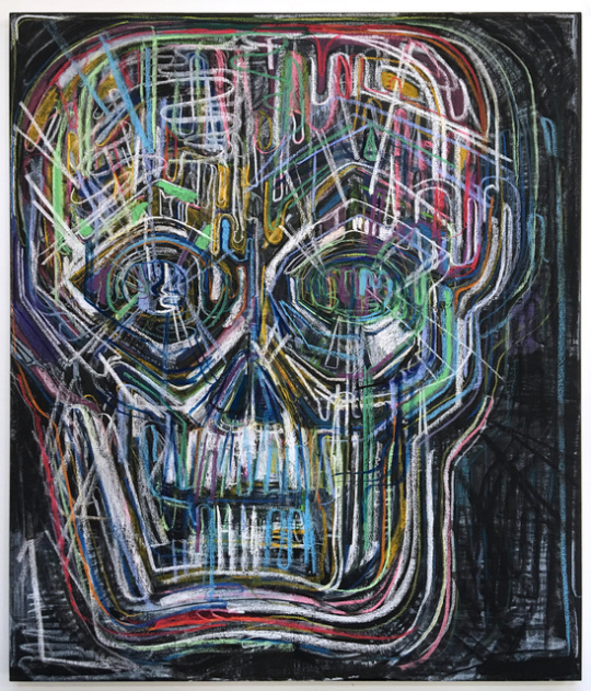
Pen and ink drawing is probably most at home in comic book art. Some time back I mentioned that I would put up a post on Basil Wolverton and how his work was central to the development of a particular type of 1960s visual imagination, such as seen in the work of Robert Crumb or Gilbert Shelton. After the solid landscape based romanticism of Jack Prout's Black Bob drawings the two artists that captured the imagination of myself as a teenager were Jack Kirby and Basil Wolverton. Greg Rozeboom described Wolverton's work like this: "A self-taught master of pen and ink, the vibratory sizzle of Wolverton’s hatching fills his backgrounds, sometimes with gradually spaced straight lines, sometimes with radiating circular waves, at times recalling Pointillism and the layered swirls of Van Gogh. In his skies, pen strokes give phantom form to the invisible: bursts of emotion, waves of radiation, and the merciless will of the Almighty. Within his human figures, the visual code of dots, dashes, and scratches morphs seamlessly from the sacred to the profane, from beams of light and energy to dirt, hair, wrinkles, cuts, scars, acne, boils, and beads of sweat". Rozeboom makes Wolverton out to be some sort of latter day Van Gogh, but I see what he's getting at.
Wolverton’s affinity for twisted organic shapes found its true home in horror magazines. Many of his horror and sci-fi stories deal with body transference or distortion in some way. When human bodies aren’t being swapped for alien or monstrous ones, they’re being taken over or corrupted in horrible ways.

Basil Wolverton: George: 1955

Wolverton in Mad

Basil Wolverton
At the time as a teenager I was interested in the relationship between Wolverton, ceremonial masks and Picasso, because we had been introduced to Cubism as part of our 'O' level art course, what interested me was how far the human head could be distorted and yet still be read as a head and the Wolverton images were my secret, my under the bed almost erotic pleasure, copies of Mad magazine and his crazy images being just as important to me as those Skira books on modern art.


Dan people, ceremonial mask


Body distortion and shape shifting still interests me, but the metaphors have evolved as society changes and new challenges as to what forms our human identity come into focus.
So perhaps look around you and think back to a time when you were 5 or 6 or 7 or 13, 14 or 15 and think about what images you were fascinated with, it may well be that there are influences that you could revisit and in that revisiting re-find yourself. A while ago I went for a dinner with ex Leeds College of Art student Thomas Houseago, he was visiting Leeds on the occasion of his exhibition at the Yorkshire Sculpture Park and the accompanying siting of one of his huge sculptures outside the Leeds City Art Gallery. During the dinner I asked him what he thought the most powerful influence on his sculptural language had been, he thought for a moment and said, "Sesame Street".
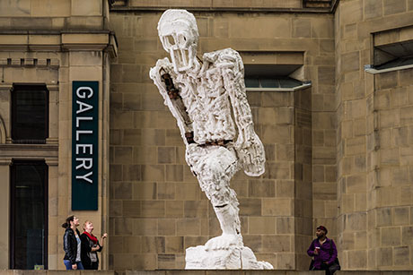
Thomas Houseago

Grouch from Sesame Street
My personal 1950s puppet hero was Sooty, he still re-emerges occasionally as a central character in my own pen and ink drawings.


Sooty at the movies
When I was about 6 or 7 I used to have a Sooty puppet and I used to make him watch the movies that were too scary or just too old for me, while I waited for my mum to finish her afternoon usherette shift. Now, 65 years later, my mind still drifts back to that time, but when it does it has its image making hat on; young and old brains conjoining in the play of making pictures, something I have never tired of. As this was an idea that started when I was a boy watching a cinema screen it seems appropriate to go back to projection as an idea so I am starting an animation of Sooty's adventures. The most frightening film I watched back in the 1950s was 'The Day the Earth Stood Still' and Gort the robot still lives in my brain.

Many contemporary artists still use pen and ink to create powerful images. A few of them are set out below, all of whom are worth investigating as doorways into an area of art practice that overlaps fine art and illustration and in doing so is able to harness both traditions.
At the beginning of this post I inserted an image of a 'how to' book, Drawing in pen and ink by Arthur L. Guptill and these 'how to' books are still popular and never to be dismissed because they will always contain something of value. Alphonso Dunn's 'Drawing in Pen and Ink' books and videos are a contemporary version, and he gives very sound advice in how to apply the techniques covered to draw a variety of objects with different textures. He is very good at helping a new drawer to visualise the structure of objects in terms of simple forms. Then once this is done he shows how textures can be developed in stages starting with how it changes the contour, followed by how it can be used to change the look and feeling of the interior of a form. He also draws himself and in the image of a ball of string below you can see him practicing what he suggests his students should do.

Alphonso Dunn
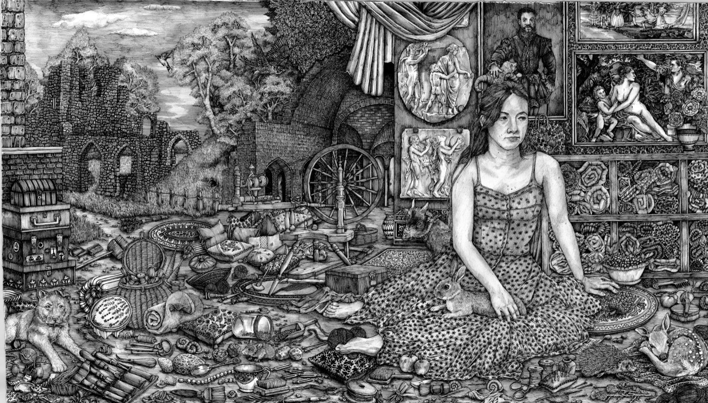
Laura Footes says that she hid her West Midlands accent when she started out in the art world, adopting different mannerisms and cultural tastes as she sought to become more socially mobile. Now her work has been widely exhibited and she is a graduate of the Royal Drawing School, so she feels much more confident in herself and her abilities. I warmed to her work partly due to her background, facing a similar thing myself on entering the art world, my West Midlands accent was also not seen as very 'educated', so I hid it and learnt to speak with a more educated voice. I'm also drawn to the rich detail she manages to build into her visual narratives, something I feel is often the result of coming from a working class background, its as if you need to prove that there is a lot of work in something, that crafting is involved and that there is no arty con trick in there. Her drawings are the sort that reward long time staring at, and they are almost impossible to understand as digital images.
Laura Footes
Laura Footes
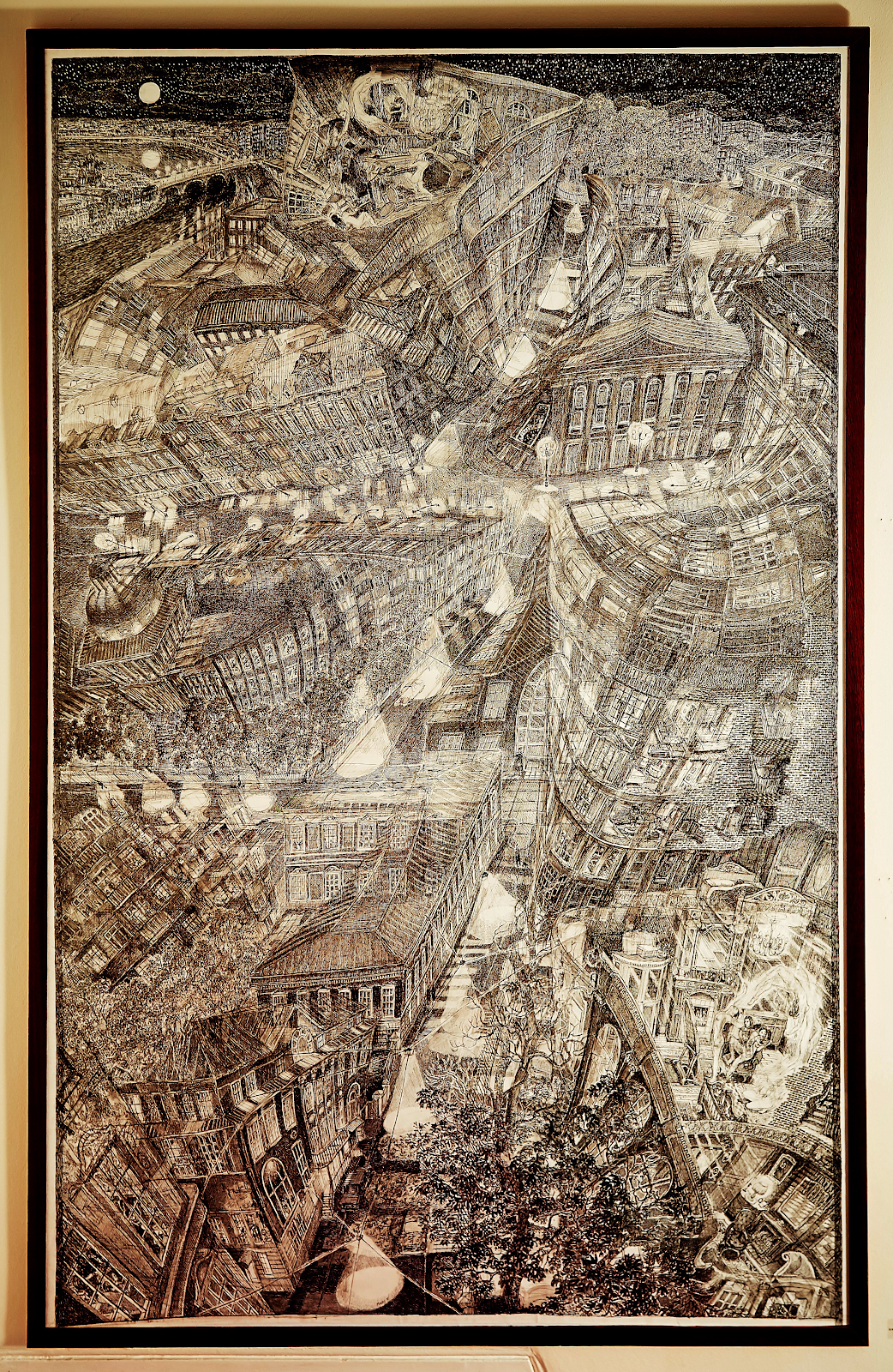
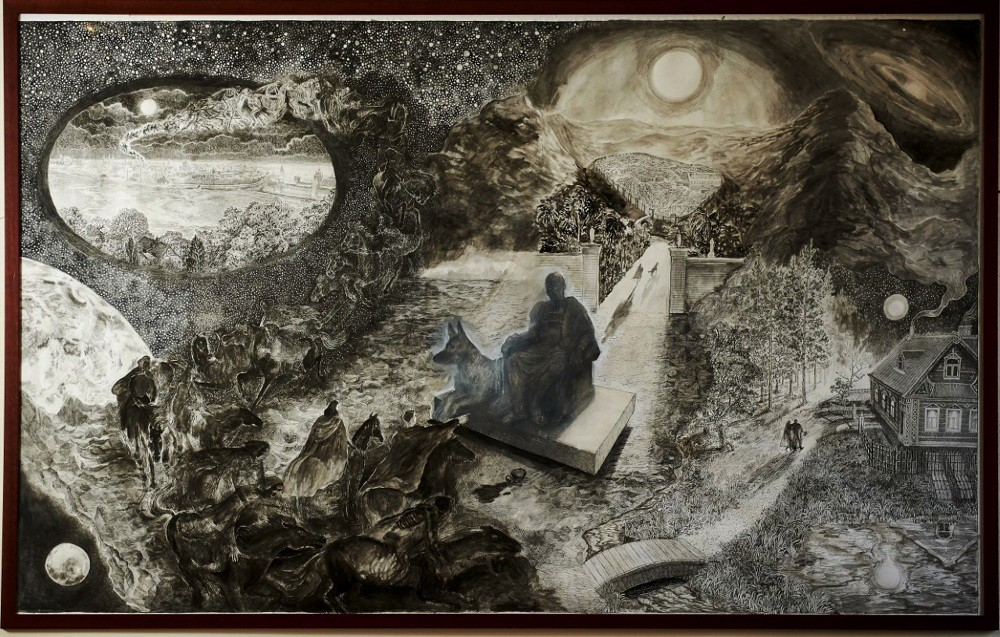
A similar type of obsessive pen and ink drawer is Olivia Kemp, who is a world builder rather than a world observer, she invents everything needed to inhabit her incredibly detailed drawn realities; the people, the buildings, landscapes, plants, animals etc. She is another of those artists that appear to me to have a horror of empty spaces, filling every inch of a paper's surface with information. I would rather leave some space for the viewer to inhabit, an entry point for their own thoughts, but I cant avoid the fact of Kemp's total conviction in the world she is making.
Olivia Kemp
Miles Yoshida has developed a practice that revives the use of tinted papers, using a style derived very clearly from Durer, he focuses on the decorative edges of life, reminding us that a cuff or a piece of ornate jewellery might be the 'punctum' around which meaning might enter into an image, just as much as the body itself.

Miles Yoshida
Finally I'll leave you with an image of Rick Shaefer at work, mainly to suggest the type of ambition that is possible using this ancient medium. Pen and ink has been such a central component of the illustrator's tool kit that it has been sometimes forgotten that it has its own transformative powers and that it is still worth investigating as a medium and that new metaphors will always be possible even when using old techniques.
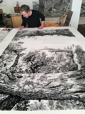
Rick Shaefer
See also:
Very interesting! Can you please share more about it!
ReplyDeletePortrait drawing for beginners | Freehand Face drawing
eumaxindia - We are no.1 Mobile van advertising agency in Chennai
ReplyDeleteMobile van advertising in Chennai