Friday, 29 November 2024

AI and drawing

I have just found a new AI application for drawing. The promotion for this application begins by stating, 'around 10,000 hours of practice are needed to be able to become proficient with a pencil and paper and most of us don't have the time (or the patience).' The promotion goes on to say that, 'However we will all be pleased to know that Google has released a free web-app that allows for terrible digital drawings to be turned into recognisable objects, it is called Autodraw.'

It turns images such as the hand drawn one on the left into smoothed out Disneyesque versions such as the one on the right. I tried it and drew a lion, a not bad version, I thought it had spring in its step, but Autodraw then replaced it with a flat image of a Tiger drawn from the front. It works by having an image bank of 'recognisable' things, all drawn in a similar way. When you draw it assesses what type of thing your drawing is a representation of, it then decides it could be one of several things, then you click on a scroll of small images consisting of what might be what you think you are trying to achieve. It's 'clever' AI technology obviously brings up these images in a similar way to how Amazon brings up new books for you to read based on 'like', but it can only deal in stereotypes. How horrid. The anodyne rhino has nothing interesting about it at all, whilst the image it replaces has all sorts of ambiguities about it that make it an interesting read. Not least is the fact that it is a generic 'animal'; a beast on four legs that only has two, coupled with the issue that it might have an ear or a horn, which makes it far more intriguing. I find this all part and parcel of a syndrome that includes a standardisation of how fruit and vegetables should look, the ones you get in supermarkets are becoming more and more like the photographs of perfect versions of themselves, and the fact that people don't just want to look like the versions of human beings they find on magazine covers and in films, that they are now prepared to have themselves operated upon to become clones of these models. It is as if the whole world has been infected by Plato's idea that underneath everyday reality there is a perfect ideal version of everything and these versions are what everyone now aspires to. Aristotle would have been appalled to see the rise of such a culture and would argue that it needs a good dose of reality. 

Adobe has released a new AI Feature in Photoshop. It can seem to do almost anything that an experienced Photoshop artist can do and "often do it better". Other types of AI generated image manipulation software are also coming onto the market and everyone now has the opportunity to produce a huge range of images to add to the millions already available on the web, which have now in turn all become AI collage fodder. Here are just a few image generation tools, alongside their various marketing blurbs.

Imagen: Analyzes your previous photo edits to create your Personal AI Profile. You can then apply the profile to your Lightroom Classic catalog at a less than 1/2 second per photo.
Photoleap: Transform your landscape and interior photos into works of art. A mobile app. DALL·E 2 for an easy-to-use AI image generator
Artiphoria: Create thousands of images with just one click
Midjourney for the best quality AI image results
DreamStudio (Stable Diffusion) for customisation and control of your AI images
AI Image Generator By Fotor - Fotor, an online photo editor with millions of users worldwide
NightCafe is one of the most popular AI text-to-image generators on the market
Dream by WOMBO was created by a Canadian artificial intelligence startup WOMBO
Craiyon was formerly called DALL-E mini. Simply type a text description and it will generate 9 different images
Deep Dream is a popular online AI art generator tool. It’s very easy to use and comes with a set of AI tools for creating visual content
StarryAI is an automatic AI image generator that turns images into NFT
Artbreeder creates creative and unique images by remixing images. You can use it to create landscapes, animated characters, portraits, and various other images
Photosonic is a web-based AI image generator tool that lets you create realistic or artistic images from any text
DeepAI This is an AI Text-to-image generator. Its AI model is based on Stable DIffusion

AAAAGH!!!

Reading the available literature it would seem that DALL·E 2, Midjourney, and Stable Diffusion are the top three to try. So I will and as I'm working on images that attempt to visualise interoception and have been generating these by having conversations with people, I shall try and build in the same process of holding a conversation, but this time with a software program. 

DALL·E 2: 
The way it works is if you type in a phrase—such as “a photo of an astronaut riding a horse”, it will generate an image based on its understanding of what “astronaut,” “riding,” and “horse” mean. It will  fill in details based on its ability to associate related concepts; astronauts, for instance, tend to appear against a backdrop of stars.

DALL-E 2’s interpretation of “A photo of an astronaut riding a horse.”

The results for myself were very poor. Because it deals in stereotypes it was a total failure when dealing with actual invention. 

Midjourney. It costs just to run a trial and you can suddenly find yourself paying a lot of money every month for this software, but it is very good at what it does, especially if you can find the right words. Nick St. Pierre has obviously spent a lot of time practicing how to get the right words together, and when you do the results are very convincing. However to get what you want, you need to be very articulate in AI speak in order to construct the right prompt. 


The image above is an AI-generated image created using the prompt: “Cinematic, off-centre, two-shot, 35mm film still of a 30-year-old french man, curly brown hair and a stained beige polo sweater, reading a book to his adorable 5-year-old daughter, wearing fuzzy pink pyjamas, sitting in a cozy corner nook, sunny natural lighting, sun shining through the glass of the window, warm morning glow, sharp focus, heavenly illumination, unconditional love,”
 A prompt written by Nick St. Pierre for Midjourney V5.

This is I suppose a type of collaged drawing, the software being designed to use photographic imagery rather than drawn imagery. Once again:

AAAAGH!!!

It's such a knowing lie. The soft warmth of Nick St. Pierre's Midjourney image ticks all our family buttons but has nothing to do with family dynamics, only a constructed idea of what we would all like to think a father/daughter relationship should be like. Oh dear, I dread to think about where this constructed reality will eventually lead us. We know what old fashioned photographic retouching methods led to when in the hands of totalitarian regimes. 


Leon Trotsky and Lev Borisovich Kamenev were airbrushed out of history

Although similar to all the others Stable Diffusion is open source and therefore you feel that at least the code is something that you can freely explore and add to. 

You can generate images with Stable Diffusion by using the Dreamstudio web app. To use Dreamstudio.ai: You need to navigate to the Dreamstudio site and create an account.
Once you are in, input your text into the textbox at the bottom, next to the Dream button.
Click on the Dream button once you have given your input to create the image.
Your image will be generated within 5 seconds.
You can download the image you created by clicking the download icon in the middle of the generated image.

Again I thought the images very clichéd, but I was beginning to realise that this was the point. Everyone wants to look the same, the lip pout in selfies is now universal and anything seemingly not about what everyone else 'likes' is useless. The paradox being that this is all sold as being about 'freedom' and 'creativity' but it is really about statistical averages and stereotyping. 

Stomach ache

The image above of stomach ache is typical of the AI generated products I was able to access when I began the process, but I did ask for a drawn image. Yes it does communicate a pain in the belly, but the image is more akin to a road sign and there is no complexity of feeling, which you get when someone is trying to communicate how pain feels or how the pain might be visualised as an experience. However as I began to get the hang of things, key words became more important and whether I wanted to use it or not, I realised that photo-realism was the style of preference for this technology. Backache is in particular in the field of describing pain, an area that is richly illustrated and which can lead to quite powerful results. 

Backache, back, pain, backbone, muscle, anatomy, spine, human, bone, science, health, injury, medicine, inflammation, ache, torso are all related words that help in a search and these words added to, 'show back body glow with dark background', can get you images such as the one below:

AI generated image of back pain

The image above is though for all its anatomical conviction, still a cliché, but I can see why people would use it, as it has gathered together several visual tropes, and in order to operate rhetorically it has put them together to offer an almost superhuman image. The man's face needs a tweak, perhaps to add 'painful expression', and the body structure is of someone in the best of health, this man is plainly an athlete and it could be more effective if the body language was that of an ageing body or if responses to a severely slipped disc were visualised.

Stomach pain

The image above is one of my own, generated from a mix of hand drawn images and their computer manipulation in Photoshop once they were scanned and was made over several weeks in response to a one to one conversation that at one point focused on an awareness of peristaltic waves and at another the feeling of compaction that you get with constipation. I'm not adverse to using computers and have been using them as part of a printmaking process since their introduction, so I ought to embrace the new possibilities offered. My image was an attempt to convey the complexity of body awareness and how a somatic feeling is a moveable, live thing and not an object, as well as it being not the only inner body sensation that you are aware of; in this case the compacted feeling of a need to relieve oneself when you cant, was not about a pain, it was more about a feeling of 'stuckness' and it had a visual nod towards more geological representations. I'm not very experienced in using AI image generating tools, so perhaps I need more training in how to use them. 

Now that the gates are open to AI use, these is no way they will be closed unless some catastrophic event is caused by it. As artists we will have to accept that it is available and either use it as best we can or carry on using what we already understand as our go to media. Personally I'm of an age where I had to respond to the introduction of the computer as an image generating tool because I was an art teacher and had to keep abreast of technical innovation. I began learning how to write code for a BBC computer, so that i could draw a circle on a screen, I learnt AutoCad in a PC, I made animations in Hypercard on a Mac and put together multimedia interactive art pieces using various types of software that is now all out of date and saved on floppy disks that are redundant and like the computers these things used to run on, now mostly buried in landfill sites. There became a time when I decided that I just couldn't keep up with the rate of change and I returned to hand made image making, with some occasional computer manipulation when I felt it was useful. Knowing one bit of software, (Photoshop) seemed to be enough to get me by, but I was very aware of younger artists, designers and illustrators around me using more and more complex software packages and even more aware that their technological learning curves were becoming never ending; they were constantly having to attend training on a new this or that. All of which is very expensive and there seems to me to be an ever widening digital divide between those who can afford the constant need for training, the rent of ever more expensive software, as well as computers with the memory and processing power to cope with new software and those who have no access to the required funds.

As the digital divide widens there will be more and more people who have no idea of how images are made. Media literacy is falling, and as it does the rhetoric used by those that own the media will become more and more unquestioned. How will someone unversed in the capabilities of AI to generate convincing images be able to choose between what are real and what are constructed images of events? As everything becomes a potential fiction I just have to hope that the stories that have most traction are those that take us all towards a future that embraces sustainability and respects this planet and all the life on it. As an artist who has also always been a teacher, even though I have now retired, my role has to embrace the fact that the story I would like us all to contribute to, is that one of sensitivity to the planet's needs and an accommodation of difference, so that a future harmony is aimed for, one that embraces the interconnectedness of everything. We need to remember that all images are fictions, they are narrated into being and the reality is that they always were. But some stories are more wholesome than others, some stories help us to heal the world and others will harm it, the most important issue being how we respond to them.
How many thousands of megawatt hours of electricity, it takes to run this type of machine thinking I don't know, but I suspect it costs the Earth in energy terms far more than we think. 

See also:

Friday, 22 November 2024

Hopper, Seurat and the study

A study is a drawing done in preparation for a finished piece, either as a sort of visual note taking exercise or as a form of practice, so that when you come to make the actual artwork, you get it right.

Studies can be used to understand the problems involved in rendering subjects and to plan the elements to be used in finished works, and written notes alongside visual images can allow the viewer to share the artist's process of getting to know the subject. In a recent post I looked at the studies made by David Reed for his paintings; his annotated drawings are central to his creative process, helping not only with the development of his ideas, they also document the creative process itself.

Sketches are typically drawn quickly to capture basic information, to rough out compositions or put down an idea before it is forgotten. Studies are more finished pieces made to get a deeper understanding of a specific aspect of the work, such as colour, tonal range, or how things are shaped, they are much more deliberate and bare a close relationship with the intended finished work. A relationship between Seurat's and Edward Hopper's work can help to give us a clearer idea of the difference between a study and a sketch.

The studies below for Hopper's 'Nighthawks' and 'Office at night' tell us about composition and tonal value, the light sources are all in place and shadow as an essential part of composition is clear. All that is missing is the colour.

Edward Hopper: Study for Nighthawks

Edward Hopper: Study for office at night

However with Hopper there is never a clear dividing line between the sketch and the study. In the image directly below, it is slight enough to be a sketch, but it is also a study of the main light source and the basic forms of the overall composition. 

Edward Hopper: Sketch: Nighthawks

Hopper: A sketch that has become a study of shadow and composition 

You often find in Hopper's drawings that what might start out as a sketched out idea, very soon becomes a meditation on something. In the case of the drawing above, he reminds us that in our perceived reality, shadows are just as substantial as walls and floors or seas and skies. By looking at these preparatory drawings, we can see his mind working. Each drawing works as a layer of meaning, one that can help you to think about how Hopper's visual language creates meaning for you as an individual. 
This is why his painting are things you can come back to over and over again, because each time you do, you can sense another layer of material thinking. You might visit his work and become fascinated by the underlying geometry of forms, then at another time the way he composes uses mass, by using forms that push themselves across his two dimensional surfaces as if they were tectonic plates. Light and shadow are for Hopper key signifiers, they allow exterior and interior spaces to interpenetrate each other and help to build an emotional world for his people to inhabit. Placement is vital, not just in terms of geometrical relationships but in terms of emotional presence. Each human figure occupying a solid space that says 'I'm here' and yet at the same time they are placed with such internal firmness that although a body position may indicate awareness of others, their internal world seems to be wrapped up in themselves. In a Hopper you get a sense that although others are in the room, and even if it appears that they might be speaking to each other, they are not really listening. This is where hopper's layers begin to kick in, as it is at this point that he offers us a view of the human condition. One whereby we know, no matter how hard we try, we can never know what others are thinking of us and that there are moments when we realise that everything is staged. His painting are staged by going through a process of being sketched and then these sketches become studies, studies that are really rehearsals, in the same way that each encounter we have with others in life, can become a rehearsal for the performance of who we think we are.

Seurat:: Young Woman: study for 'Un Dimanche à la Grande Jatte'

The Kröller-Müller Museum has within its collection one of Seurat's charcoal studies of a young woman, that he used to think about the essence of someone. He tries to sum up the presence of this young woman in the simplest terms possible, she is reduced and yet not reduced, to a mass, a mass that is also as you look at it dissolving back into the paper surface that it is constructed within. There is something eerily beautiful about this image. It is definitely not a sketch, it is a study of the human condition. 


The people in Seurat's painting are 'on parade' they are not just out for a stroll in the park, they are presenting images of themselves that they wish others to see. Roles are again being played out, but Seurat visualises these roles in a different way to Hopper. He senses that the roles are ephemeral, that beneath the posing and fashion lies something much more fundamental. He is like Hopper seeking the frozen moment when we become aware that the curved arc of a dog's tail, is as important to an experience as the shadow of a tree or the shape of a hat, but at the same time what is captured in that frozen moment, is a reminder of the insubstantial nature of everything. It is as if the clouds we watch were to one day form themselves into a vision of a day in our life, a moment that would be gone as soon as it arrived. 


We can date both Hopper and Seurat's images by examining the clothes people wear. But we are not time bound by these details. Just as we are not time bound by the details of clothing carved into a Egyptian statue, in all these cases we are overpowered by the timelessness of the image. Seurat's seated figures are always seated, their forms are emanations that flow out of the shadows they sit within. 
Like Hopper, Seurat also produces studies of the space he is going to people with figures. He probably went to the park early in the morning when long shadows are cast by the rising sun, a time when a lone dog was let out to exercise. The shadows help him to think about structure and the relationship between light, mass and space. Shadows hold for all artists some sort of wonderment, they impose themselves on the visual field, with the same force as the objects that cast them. The insubstantial ghost of an object which is its shadow, being in perception as solid as a rock. 


Seurat's trees are like ghosts of trees, his monkey is the ghost of a monkey, or one seen through the early morning mist. All of the information Seurat was deriving from these drawings will be brought together with his colour studies in his monumental painting 'Un Dimanche à la Grande Jatte'. However for myself, as someone who holds drawing as central to the way I try to understand the world, it is the studies on paper that move me far more than the final painting. 


If you look closely at Seurat's drawing of a monkey above, you can see a texture formed partly by the ridged lines of the paper running through the image. This tells us that Seurat was using a laid paper. This type of paper was made by hand, using a wire sieve stretched across a rectangular mould. A papermaker would dip the mould into a vat containing a diluted pulp of fibrous material, then lift it out, tilt it to spread the pulp evenly over the sieve and, as the water drained out between the wires, shake the mould to lock the fibres together. In the process, the pattern of the sieve's wires was imparted to the paper sheet. The laid pattern itself consists of a series of wide-spaced 'chain' lines lines parallel to the shorter sides of the sheet and more narrowly spaced 'laid' lines, at right angles to them. In effect the paper sheet is a thin cast of the mould, a ghost of an activity involving workers who endured often very poor working conditions, whereby paper fibres were breathed in all through the long working day and which therefore brought on various and serious lung illnesses. These workers would also need a break on a Sunday from their hard labour, and perhaps, just one of them was out first thing in the morning walking their dog when Seurat made is first study of that space in the park that would eventually become the such a celebrated painting. 

See also:

Drawing hands More thoughts on Seurat


Saturday, 16 November 2024

A history of drawing as thinking

In my position as a research fellow, I'm embedded into the Leeds Arts University's research department. My activities do though resonate out from there into the rest of the institution. My interest in drawing, therefore has a sort of mnemonic effect on other people, a reminder that drawing as a thinking tool is not just the property of art and design professionals, but that it is a fundamental tool in any human being's toolkit, as well as being something that other animals can use too.

I was reminded of this when Gary Embury and Lucy Ward were talking about 'Drawing Review' during the recent conference in Porto. At the end of their presentation they spoke about the forthcoming 'Bloomsbury Handbook on Drawing'. This will be a manual designed to reflect on drawing as it is used across disciplinary boundaries and cultures, in my mind it will be a survey of best practice throughout the world and as I began to think about what that might mean from my position, I began to ruminate on what I would include in it.

Perhaps I would start by looking at animal drawings, ones that use materials found in the world, markings made for instance to delineate boundaries. I've mentioned before how animals mark territorial boundaries, and that this is one of the most basic forms of drawing. Bears mark out the boundaries of their territory to communicate with other bears and to establish dominance. They do this in a variety of ways, some visual and some olfactory. This combination of approaches is actually the norm amongst animals and when we want to do something similar we will also use a multi sensory approach. Bears use scent glands and urine to define a boundary, but they will also use their own tracks to communicate their presence, in a similar way to how we might make a line in the sand by digging in our heels, or creating desire lines by taking the same path through a field every day. They are deliberate about where and how often they mark and they can do this to the same tree year after year, sometimes by biting and at other times by clawing through the bark.

Bear claw marks

Various sensory sign-posts are used by animals; olfactory, auditory (loud calls etc.) as well as visual, often used in combination in order to communicate their presence to a possible territorial intruder. The rhinoceros is an interesting example of an animal that uses visual 'deposits' to mark out boundaries. It uses dung, laid in well defined piles to signal that it has occupied a particular territory. Another method rhinos have of visually marking their territory is by wiping their horns on bushes or the ground and scraping with their feet.

Various types of rhino dung deposits: C is a territorial male dung pile with scrape marks

An ancient boundary using rocks to make a line

Some of the first drawings made by humans would have been simply markings that defined the edges of a territory, whether these marks were made by scraping or digging into another material, such as a line drawn in the sand by using a stick, or by digging a channel around the edge of your territory or a line made by the laying down of things one after another, such as stones or branches. These early drawing held a one to one relationship with reality, and they could be thought of as some of the first materialised ideas.

A contemporary example would be the way we use painted lines to mark out a road system. A dashed line down the middle of the road tells drivers to keep to one side, a double dashed line tells drivers to stop and that drivers on the road they are approaching have priority. These are all aspects of territorial signalling and they work so well because as animals we intuitively recognise how boundary lines work. 'Do not cross this line of marks, if you do you will face danger!' We also use a multi sensory series of signals on the roads, for instance we will sound our horn if someone gets too close.


The fact that the road marking lines are dashed means that they are permeable and that they can be crossed when it is safe to do so. This permeability is another useful animal learnt activity, as it allows for flexibility, whilst still maintaining enough space between each actant to allow them to proceed in some way. 

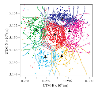
A territorial model of coyote populations. 

Coyotes move in packs whilst avoiding scent markings laid down by members of other packs, as they do they define separate territories but there is always a slight overlap between them, if not there would be constant strife and fighting. Animals intuitively understand the need for negotiated space.

Once it is accepted that a series of marks can become a line that can be used to define a boundary, then the idea can be extended. For instance we can think about possible future boundaries.

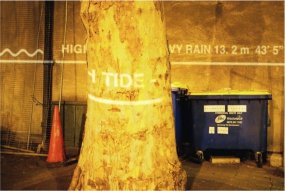
Watermarks Project

Watermarks was a public art project that used a series of projections of flood level marks on to the sides of buildings, showing how high water levels could potentially rise as global warming increases. 


The Egyptians were used to the Nile flooding and they used lines strung out across the Nile valley to measure where fields might be best placed and more importantly the boundaries between each field and therefore they could also signify 'ownership'. From this stringing using a one to one correspondence with reality, was developed an early form of geometry and this included proportionality. I.e. that you could make a drawing to represent the size and shape of a field, it did not have to hold a one to one correspondence with the field. This must have been a mind blowing idea, as it meant you could go away and design ideas and make plans, for things like pyramids. 


Use of a diagonal to show how a rectangle can keep its proportions at different sizes

The architectural plan view, or map of a territory would therefore have been a very early thinking tool, that allowed people to represent spatial possibility. The fact that you can see the stars and their relative positions more easily because you are a long way from them, also meant that star maps would also have been developed very early on in the history of drawing.
 It has been argued that the oldest image that has been discovered of a star pattern, that of Orion, is 32,500 years old. A slice of mammoth tusk is carved with a man-like figure with arms and legs outstretched in the same pose as the stars of Orion.


The carved tusk fragment also has notches cut into it. It has also been argued that these could represent a "pregnancy calendar" and if so it makes us very aware of how early complex ideas could be communicated through externally visualising thought processes. 

Magdalenian hunter-gatherers at some point engraved a stone's surface in the Abauntz Lamizulo cave in Spain and represented the location of animals such as red deer and ibex.


The full abstract of the paper, "A palaeolithic map from 13,660 calBP: engraved stone blocks from the Late Magdalenian in Abauntz Cave (Navarra, Spain)." by P. Utrilla, C. Mazo, M.C. Sopen, M. Martínez-Bea, and R. Domingo, which was published in the Journal of Human Evolution, 57 (2009) 99-111 is copied out below.

"An engraved block from the cave of Abauntz is interpreted as a Magdalenian map in which the actual surrounding landscape, including mountains, rivers, and ponds, is represented. Some possible routes or avenues of access to different parts of the geography are also engraved on the landscape. The engraving seems to reproduce the meandering course of a river crossing the upper part of side A of the block, joined by two tributaries near two mountains. One of these is identical to the mountain that can be seen from the cave, with herds of ibex depicted on its hillsides, on both sides of the gorge in front of which the cave of Abauntz is strategically located. In the southern part of the gorge, there is a completely flat area where the watercourses slow down, forming meanders and flooding in springtime. The following elements are also represented on the block: tangles of concentric strokes and bundles of lines forming very marked meanders. In short, all of these engravings could be a sketch or a simple map of the area around the cave. It could represent the plan for a coming hunt or perhaps a narrative story of one that had already happened. This paper is provided in the context of recent discussions on early modern human capacities of spatial awareness, planning, and organised hunting."


This immediately reminded me of the indigenous peoples of Australia and their maps, which are designed to tell stories about the land. A map-painting can tell a variety of stories, all interwoven with thoughts about where events took place. They might be guides to hunting practises, a snake myth to remind people which ones are deadly and where they live, or where to get good witchetty grubs. They are about the lakes and hills of the local landscape and in one case ancient underground waterways formed 30,000 years ago after a series of Ice Ages started drying out the continent. These below ground waterways feed springs that emerge in a huge desert, one so large that the UK could be set very comfortably inside it, but these people have a map that tells the story. These maps are therefore about survival they pass on knowledge and as far as we know these types of painted maps have been made for the past 40,000 years. 

Rabbit Proof Fence, Acrylic on Linen, Judith Anya Samson.

I realise encounters with the Western art world have shifted the use value of these traditional practices, but even so they still remind us of some of the first uses of drawing as a boundary making and mapping tool. 

Drawing helps us to locate ourselves in the world, it then allows us to embed thoughts about this world into its structures. The fact that a dot, could be a star, a point on a pregnancy calendar, a place to hit an animal when you shoot off an arrow, as well as a point within a map that indicates where something is, shows us not just how sophisticated drawing is as a thinking tool, but how wonderful it can be as a carrier of poetic ideas, whereby wider and deeper meanings about how all these things are interconnected, are played out, in order to help people find their own psychic connection with the world around them. This rich loam of meaning can be embedded within what could at first appear to outsiders as a very simple mark making system and we need to ask ourselves, do we have anything better than these early drawing systems? In our world of amazing media technology, is the mobile phone helping us to find our way through life as psychically well adjusted creatures, as well as I suspect those early maps did? 

See also:


Sunday, 10 November 2024

Curtis Holder at Leeds City Art Gallery

Seki Lynch, coloured pencil on paper, 150 × 123 cm, 2024

An exhibition of Curtis Holder's drawings, ‘Silent Echoes, Spoken Truths' has opened at Leeds City Art Gallery. Curtis has been an artist in residence at the gallery and the exhibition documents his time in Leeds meeting and drawing people. 

On his website Curtis states about the exhibition; "The title of the exhibition reflects the deep – yet often unspoken or overlooked – past histories and emotions of people of the Global Majority in Leeds. It highlights the process of bringing their voices to light with the sharing and revealing of personal stories through dialogue and drawing. "

The sitters for him have also chosen works to accompany the exhibition they felt emotional towards or saw themselves reflected within. I was particularly interested in the exhibition because not only have I followed his work for a while, but one of his 8 sitters is a friend of Sue and myself, so I can get a sense of how as a person someone has been 'captured' by Curtis' work.

As I walked into the main exhibition space I was immediately taken by the portrait of Professor Emily Zobel Marshall. She is an expert on the trickster figure in folklore, and she has also established a Caribbean Carnival Cultures research platform, which I was fascinated by as I am a long term Chapeltown resident, the area of Leeds that hosts a West Indian carnival every summer.  
The media Curtis Holder is using is central to how these portraits communicate. His main material choice is coloured pencil on paper and sometimes acrylic gouache is used to give solidity to certain colour areas, drawing therefore being central to his visual thinking.
These drawings although made of thin eel like crayon lines, also feel as if they are woven out of fine threads. The fine lines of crayon colour spread out across the white paper and gradually they find form and as they do so they mass together and as the mass comes into being, the colour range begins to optically blend and what was a quivering network of open lines, gradually becomes a soft mass, a quivering entity that is very slightly out of focus. The process of finding the figure also means that we are given alternative possibilities, hands are in several places, a profile might be suggested and then a more frontal image pursued and pushed further towards a particular identity. Earlier or alternative suggestions are usually made in red crayon, which suggests that all of the images start that way, and indeed there is a red shift in the final colour range. The coloured pencils are kept pretty sharp, and the weight of his hand is such that he can keep that sharpness for a long time, i. e. that he is not pressing very hard, thus allowing his hand to sweep across the paper with a sensitivity to the paper grain. I was reminded of Cézanne's struggle to depict his 'petit sensations' and Curtis Holder I suspect is also fascinated by those small shifts in perception that are constantly happening.  If he is to become sensitised to the situation he is looking at, he needs to keep his crayons active, all is therefore rhythmic movement and to capture this, the hand needs to dance with the eyes. 
He is.a past winner of 'Portrait Artist of the Year' and I did ask him about some participants use of cameras and iPads, a practice that he also finds very strange, it feels on the one hand disrespectful, the artists rarely looking at their subject and on the other hand, what the artists are doing is making images of images, rather than having to deal with the reality of getting to know another human being over a period of time. Portraits should be about intimate connections and listening to the feeling tone of others, not copying a mechanical image.

Professor Emily Zobel Marshall

It's interesting to look at how Holder's approach is then realised within individual portraits. The portrait of Professor Emily Zobel Marshall is a particularly sensitive combination of the sitter's chosen stance, (hands on hips, staring out into the space she occupies, body very erect and alive with potential) and his application of drawing technique to capture this. Her hair and its interwoven relationship with Holder's approach to the seeking line, became for myself a 'punctum'. (I'm thinking here of Roland Barthes use of the word, whereby he would become attracted to a specific detail in a photograph and this would have a powerful impact on his reaction to the rest of the image.) The fine searching lines of crayon become strands of hair. There is a wonderful synergy between the massing of individual lines and the massing of hair, the one effectively becomes the other, the open energy of the mark making becomes the slightly unruly face framing hairstyle. I am what I am, says both the hair and the crayon mass that represents it. What is then fascinating is how these marks then go on to construct the face. 


Rembrandt: Margaretha de Geer 

If we look at a Rembrandt portrait, we can see how he treats facial detail, in such a way that we are given a fluidity of emotional engagement, interwoven with a fluidity of paint. Bone structure is clearly in place, but the paint flows over it, in effect therefore forever animating our relationship with the sitter, who is always coming into being, the paint never settling down and therefore remaining alive. The dark space of Rembrandt takes us into an awareness of the sitter's deep psychological inner world, while the interlacing lines of Holder's drawings emerge out of white paper and vibrate with an energy that suggests a more lively inner state, one that in the professor's case is reflected in her stance, suggestive of action, and a confrontation with the light of day, rather than an interiority moving back into the dark. 


Background detail: Professor Emily Zobel Marshall

In the space around Emily Zobel Marshall flowers are growing. These echo the ones on her dress, which have been reinforced by the use of acrylic gouache. By being liberated from the dress fabric they appear to grow out of her body, perhaps ghosts of an idea she might once have had. they are made out of the same red crayon lines that she emerges from, an earlier form that like a fossil tells us much about the past. As my gaze flits back to the face, the line of a cheek bone reasserts itself, a sign of a firm skull underneath the soft woven texture of line mass. Her dress has red flower heads painted into the line matrix, this change of media, changing the speed of read, making this fabric more of a holding frame for a body standing proud. Her lips are firm but perhaps, because of the moving lines within which they sit, they are also on the edge of a tremble, after all, the lines of dancing rhythm, like all tricksters, never do quite stand still, they never do create unyielding solids, and as they search the figure out, they perhaps also reveal something of a person's fragility as much as their solidity. 

Because I know Doctor Rommi Smith the poet, performer and writer, I wanted to see how Curtis had managed to depict such a dynamic character. 

Doctor Rommi Smith

The first thing you notice is that she has many hands. Constantly moving hands create waves of flowing energy around her. In the drawing she has three heads and all revolve around the yellow V of her shirt front, or is it a blouse? Unlike the Emily Zobel Marshall portrait, Rommi's body does not extend down to the bottom of the image, it dissolves in a swirl of marks, as if the waving hands are also breaking her image apart, wiping it away as they gesticulate her thoughts, or try to reinforce an utterance. The hands become like birds about to fly away and have their own independent lives, an idea that could only emerge from a drawing technique that uses marks that flow so fluidly over and through the spaces of the white paper. These intermeshing lines opening out the types of spaces perhaps only seen by birds as they fly through a thick set hedge. 


In the portrait of Rommi, arising out of the mazy energy of the crayons' application, there is a strong suggestion of spirituality. This is reinforced by the slightly upwards gazing head, a gaze that looks inwards as much as out. There is a tap on the chest given by the one hand framed in black, a tap that says, "Yes its me, I'm here", the central figure trying to reassure us that she is the one we need to listen to, not those others half formed in the background, not those ghosts of past selves.


In this portrait the punctum for myself was the one line that dropped down from the drawing to touch its bottom edge. A spindly line that the whole drawing is balanced on. Suddenly I became aware that underneath all Rommi's swirling energy, fierce pride and powerful intelligence, there was a thin line that somehow held it all together and that she was more fragile than I had thought. 

Rommi Smith: detail

It is Holder's technique that lends itself to these types of narrative. The flickering marks will always suggest a certain fragility, their smoke like haziness can so easily be read with some sort of spiritual implication, but therein lies the fascination of the technique and its need for careful control. The drawer has to finally establish enough coherence within the matrix of lines to convince the audience that some sort of likeness is emerging, not perhaps a fixed likeness, but one that still looks how the sitter appears. This is a likeness as a verb rather than as a noun, a capturing of moments, rather than a moment, which for myself is far more incisive than a photographic copy. It is only in conversation that we get to know someone. In my own work I prioritise conversations as a way to find out what others think and feel, and sometimes these conversations also become portraits, very different in feel and ability to the work of Curtis Holder, but they have given me enough of a similar experience to know how important the one to one experience is to the creation of a necessary empathy if a portrait is to have any real conviction. 
Alongside the room of large scale 'finished' portraits which were excellently framed and set off against a wonderful dark blue is a room devoted to Holder's small studies. This room is essential viewing if you are to get a feel for the full range of his ability. 

Curtis Holder: Study

I was particularly taken by a small study of a seated man. It reminded me of my old colleague Peter. He has recently had a wonderful exhibition of his photographs, some of which occupied the same space as the drawing I was looking at. Whether it was of him or not doesn't really matter, because the drawing says things about the human condition as a whole, which is why I think Curtis is such an important artist. His drawings go beyond portraiture, they signify something in their very nervous search for truth, that says things about how fragile and yet full of energy life is. The image of a seated man tells us that whoever it was sat for a while had a very particular life force, one expressed through their face, their hands and their body as much as their words. My only reservation about the display was the use of the square magnets, a device that stops holes being put into the paper, but which visually intrudes into the paper space. Such fragile and sensitive marks need to be read unimpeded by any other visual interference. On the other hand it was a brave act to not put these drawings under the cover of perspex sheets and by doing this I really appreciated the close proximity this gave to the act of their making. 

The exhibition is open from 08 November, 2024 until 13 April, 2025 and if you can get there don't miss the Stuart Croft exhibition that is on at the same time, the films are extraordinary and deeply thought provoking, this is an excellent time to visit.

See also: