Showing posts with label curved space. Show all posts

Wednesday, 6 January 2021

Drawing and perception: the curved surface

To prove that it is not possible to draw and paint as the eye sees.

One of the first issues to confront anyone trying to draw what they are looking at is the conundrum of being a creature with two eyes, both of which operate as if they are at the centre of a sphere. As you can see from the drawing above, any vertical looked at by an observer is closer to the eyes at eye level and is further away from the eyes as it rises above or falls below eye level. This is exactly the same issue if you look to the right or left and is behind the classic drawing problem as was set for students on the foundation course at Leeds when I first began teaching. 


Students were asked to set themselves up in a situation similar to that in the drawing above. They would be looking at a floorboard or the line where a wall meets the floor, represented by the line AB. Using a ruler and plumb-line they would be asked to check that the line was at rightangles to them all along its full length. They would also be given string and chalk and be asked to measure the distance of the centre of the straight line from their fixed centre of vision, and then from that same point to positions A and B. They were then set the task of drawing this perceived situation as accurately as possible. Read Drawing a straight line and giron and fesspoint drawing to get a feel for the pedagogic history associated with these issues. 

The final drawings looked very like these drawings below and they reflected different levels of perceptual awareness. 
A continuous experience of looking at a straight line

The line AB appears continuous, and as students measured distance, most of them decided that the point nearest to them would also be the point on their drawing that would be nearest the bottom edge of their drawing paper. The dashed line CD often actually existed as a drawn line on the floor, because a student could use chalk and string to produce a semi-circle with themselves at the centre, and which would therefore in effect if drawn, be drawn as a straight line. An interesting reversal that some students would find very hard to grasp. 
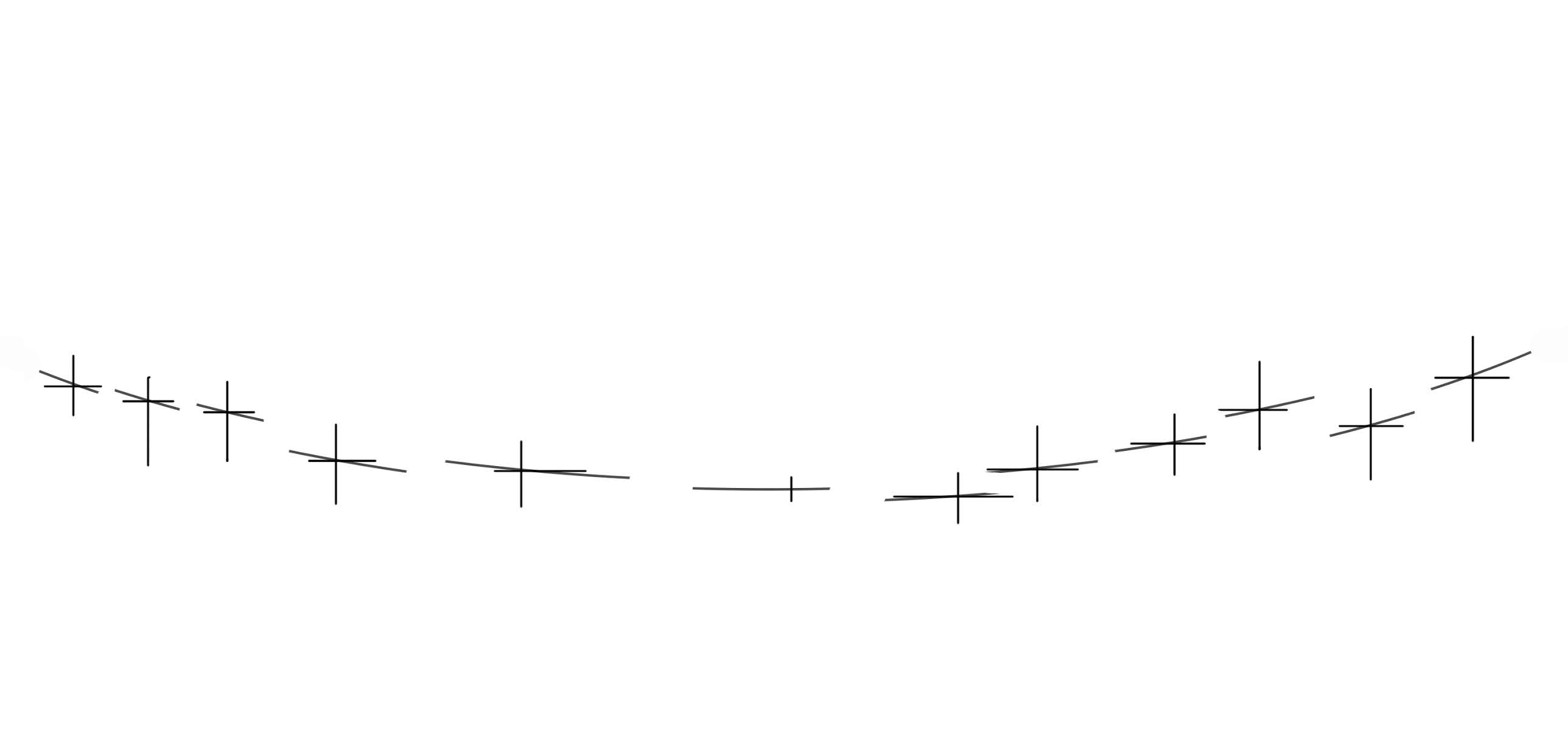
A discontinuous experience of looking at a straight line

However some students produced drawings looking much more like the second one. They realised that between each measurement their body moved, if only slightly, and that each perception was a discrete event and that it was only in their imagination that the individual moments of perception were joined together as a line. This was in effect bringing in the issue of time in addition to that of relational space. Some students could never draw the line AB as anything else but a straight line. They knew from previous experience that it was straight, therefore they couldn't accept that what they were actually seeing was a curve. In effect the image schema they had in their head was so powerful that it would override any other evidence. 

I wanted to go back to these experiences because I am very aware that another member of the perceptual drawing research team, Mike Croft, has referred to these issues in relation to his own research into how to record a growing awareness of a perceptual event. See this earlier post when Mike was operating as a guest blogger. 

My particular interest in this is though political. As recent events have shown us, even given clear evidence to the contrary, if some people believe in a certain situation, they will continue to believe in that situation because if they were not to, it would destabilise their belief system. They literally cant see the situation in any other way. Perception is I would argue therefore tightly bound up with belief and the type of personality of the observer. 

Belief systems it would appear to me, are also in operation when we begin to look at the way 3D visualisations are developed. In Matthew Kaplan and Elaine Cohen's paper 'Producing Models From Drawings of Curved Surfaces', they state the following, 'Few sketch based modelling systems allow the artist to draw naturally. Typically, designers are forced to learn a set of drawing operators that are used as an interface to an underlying CAD system. Alternatively, previous methods that analyze existing drawings typically limit the type of drawings/models that can be reconstructed to a subset of models useful in CAD. The goal of this research is to allow the artist to draw as naturally as possible, placing minimal restrictions on the structure and process of the input drawing and the form of the output model.' (2006) The idea of what artists draw naturally, is reflected in the images we see at the end of the paper, it is presumed that artists draw in a very 'cliched' manner, that the old rules of perspective and consistent shading etc. are what artists are trying to work with. Drawing that questions perception, will it could be argued, very rarely be integrated into CGI visualisation systems. But there are some very interesting half way houses. 

The Oakes twins have been working for several years making drawings using devices designed to reflect the problem of curvature and the idea of vision being something that originates from a spherical experience of visual perception. 
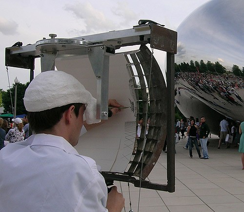

The Oakes twins at work

At first sight it would appear as if the twins have 'cracked it'. Their curved devices allow them to look at the world and record it from locations clearly within a spherical context. However if you look at how their images are then reconstructed from the drawings produced within the individual strips of vision, you can see that they are in fact still using the idea of a continuous link between all the elements of the drawing, like those foundation students who produced a continuous curve, the oscillation of constant checking, that moves back and forth from inner to outer experiences is not taken into account. Their drawings are though really interesting and in particular their method of drawing as a series of radiating centres that overlap each other to develop a surface, is a very interesting response to the problem of the knitting together of experiences into coherent wholes. 
The Oakes twins: Ocean Texture 2 

The Oakes twins are quoted as saying; “Our eyes are only able to gather the light rays that happen to be aimed straight toward them. Collectively, any group of light rays that happen to converge onto one’s pupil are, altogether, fanned out radially from the pupil, with each light ray traveling perpendicular to the surface of an implied sphere. The surrounding objects of the world may be irregular and varied, but perceptually we live neatly at the centre of a sphere of incoming photons that carry information about the irregular surround to our eyes.” Because of this, the brothers create images on concave surfaces, which they state “is in harmony with the shape of light rays and makes more sense than a flat picture plane.” 

A diagram of the theoretical situation set up by the Oakes twins

I'm not entirely convinced by this because it presumes the moment of perception can be located at a single static point, and this fixed point in my mind pulls the perceptual experience out of its ongoing process of renewal. However their approach does enrich the debate. 
The Oakes twins exhibition view

It has been a useful experience to revisit and reflect upon perception and how it shapes our thinking. It is central to our ability to make images that have a relationship with the world and how we perceive it, and at one time this used to be central to most visual arts practices, including my own, but over the years I have like many other artists been more influenced by conceptual developments rather than perceptual investigation. This experience has been a welcome reminder that whatever I make as an artist it is going to be experienced by others as a perceptual phenomena and if I am not dealing with my awareness of this, I won't have control of the situation. We shall see where this new research takes me. 

Foot-pain

Monday, 15 August 2016

Mathematical shapes of interest

I have reflected upon the way that drawing and mathematics converge several times, in particular my reflections on the grid and the way that certain artists, such as Kenneth Martin used to use certain geometric formulas to drive their decision making. An underlying need for order has emerged over and over again within different visual cultures and this need for mathematical order is a fascinating area to explore, so I have decided to collect together a few key starting points for anyone deciding to set out to research these issues in more depth and at the bottom of this post to put in links to various other posts where I have commented on similar issues.

Egyptian images were often designed using a grid that measured 18 units to the top of the head. Using this system they were able to achieve a visual harmony and consistency of image making over many years. The fact that they applied this grid was very influential in the development of canons for Greek sculpture. The Egyptians measured their figures in cubits and cubits were the length from the elbow to the tip of the thumb. Therefore there is a close correspondence with the human body and its natural proportions. The other units of measure were the palm, or hand width and the finger, again cementing ideas of body proportions into the way things were measured. This relationship of course still exists, our current measure of the 'foot' being an obvious example.


The 18:11 ratio as used between 2650BC and 2181BC
     
An Egyptian figure measured in cubits

The Greeks developed two competing canons of proportion:  the original, developed by the sculptor Polykleitos in the 5th century BC and later in the 4th century by Lysippos. The Greek use of modes (ratios or measures) were designed to give the viewer a sense of harmony by making sure that ratios for parts of the body were both relative to each other and to the whole.

Comparison of the the Canons of Polykleitos and Lysippos

As you can see in the illustration above there was some debate as to whether the head should fit into the body 7 or 8 times. The reality is that head to body ratio changes from a ratio of about one to four for a small child to about one to eight for an adult. A five-year-old is likely to have a head to body ratio of about one to six. 
This Greek concept of ratios that give the viewer a sense of harmony by ensuring that all parts of the body were both relative to each other and to the whole, would be of vital importance to Renaissance art. 


Leonardo: Vitruvian Man

Leonardo's drawing of the Vitruvian Man is based on his understanding of the writings of the Roman architect Vitruvius and Vitruvius took his ideas from the Greeks. In Leonardo's drawing the head measured from the forehead to the chin is exactly one tenth of the total height, and the outstretched arms are as wide as the body is tall. Vitruvius linked ideal human proportions to geometry in Book III of his treatise De Architecture, describing the human figure as being the principal source of proportion among Classical orders of architecture. Interestingly Vitruvius set out the ideal body as being be 8 heads high, agreeing with Lysippos rather than Polykleitos. 

These are the actual measures as set out by Vitruvius.
A palm = four fingers
A foot = four palms
A cubit = six palms
Four cubits make a man
A pace is four cubits
A man is 24 palms

As you can see the measures set out by 
Vitruvius are directly related to the Egyptian measurements that were laid down over 2,000 years before. He had to work hard to make some of these relationships work, in De Architecture he advocates a particularly difficult set of movements in order to make the theory fit, "If you open your legs enough that your head is lowered by one-fourteenth of your height and raise your hands enough that your extended fingers touch the line of the top of your head, know that the centre of the extended limbs will be the navel, and the space between the legs will be an equilateral triangle". These could be the directions for a contemporary dance piece or instructions given to an artist for a performative drawing.

These are the proportions that Vitruvius sets out as being ideal.
the length of the outspread arms is equal to the height of a man
from the hairline to the bottom of the chin is one-tenth of the height of a man
from below the chin to the top of the head is one-eighth of the height of a man
from above the chest to the top of the head is one-sixth of the height of a man
from above the chest to the hairline is one-seventh of the height of a man.
the maximum width of the shoulders is a quarter of the height of a man.
from the breasts to the top of the head is a quarter of the height of a man.
the distance from the elbow to the tip of the hand is a quarter of the height of a man.
the distance from the elbow to the armpit is one-eighth of the height of a man.
the length of the hand is one-tenth of the height of a man.
the root of the penis is at half the height of a man.
the foot is one-seventh of the height of a man.
from below the foot to below the knee is a quarter of the height of a man.
from below the knee to the root of the penis is a quarter of the height of a man.
the distances from below the chin to the nose and the eyebrows and the hairline are equal to the ears and to one-third of the face.
The concept of ratios has endured and the modern architect Le Corbusier came up with his own version of these types of measurements.

Corbusier's modular man

Le Corbusier developed his version as a visual bridge between two incompatible scales, the imperial and the metric and it was based on the height of a man with his arm raised. This long running relationship between the proportions of the human body and architecture could be symbolised by this drawing below of a design for the floor plan of a church by Francesco di Giorgio Martini.

Francesco di Giorgio Martini

As an artist your work when it is shown will nearly always be shown in a gallery and that gallery will be part of an architectural complex. The architect may well have used a software program to help design the building and that program will have been developed around a grid, or series of grids based along the x, y and z axes. If as an artist you want to respond to the situation the work finds itself in, then you may want to measure the walls and think about the ratios set up by the architect. The doors and windows will have certain proportions and these will intrude on the space your work will be shown in. How might you reflect upon these issues? Would you go as far as contacting the architect and asking to see the original drawings? How would you develop a series of works that are both site specific and conceptually related to these ideas of measurement, ratio, harmony and proportion?
Robert Morris's 'Location Piece' is the first work I ever came across that raised this issue. You hang the work and then set the dials that indicate its position in relation to walls, ceiling and floor. As far as I know it is the only work of his in the Leeds City Art Gallery collection. 

Robert Morris: Location Piece 1973

Occasionally I have tried to use computer modelling programs to develop ideas and of course if you do, you are immediately faced with having to think about how a grid can be used as a structural device. What interested me about this was that you could flatten out any 3D grids as nets, in doing this I was able to find a close association both with Egyptian images from thousands of years ago and Renaissance artists such as Uccello. 


The image above is one made by developing a 3D wire mesh model in Maya from three 'T' position drawings I made of my own body. The various sections were then set out as flat grids and printed off.

If you want to look at a basic way of turning a 3D object into a net you could try using 123D Catch, a free downloadable bit of software. Simply make a model, take about 60 photographs of it from different angles and load into the software. (Since writing this post 123D Catch has been discontinued)

Every screen is also a grid and every grid has an aspect ratio, which is the ratio of the width to the height. 
Thinking of working on computers reminds me of the one area of aspect ratio we are all faced with; the computer screen. However we tend to just accept it as given. I clearly remember having to learn programming on BBC computers in the early 1980s, which like so many computers before 2003 had a 4:3 aspect ratio screen. I remember also having an Apple Mac Classic in the late 1980s, the almost square screen meant that you had to think about images with that proportion, and this was difficult for someone used to paper proportions. Of course the dynamics of fast scrolling game play were unthinkable in those days. Even so I still managed to use Hypercard stacks to create some basic animations. Monitors with a 16:10 aspect then began to appear in the early 2000s as the first laptop computers came in, this meant if you were working on page layouts you could put two pages side by side. By 2010, virtually all computer monitor and laptop manufacturers had moved to the 16:9 aspect ratio because of the demand for screening movies on computers. Having recently made animations that are tall and thin and then attempting to show them on screens, I began to realise yet again how much the aspect ratio of computer screens was shaping ideas. 

Climbing man animation

I needed a tall shape for the animation, but I either have to turn a monitor on its side or place a black shape around the animation to make the total image ratio fit a 16:9 screen ratio. What I really needed was a contemporary version of Magnascope technology. This was a very short lived projection technique that coincided with the release of the 1933 film 'King Kong', it allowed the scene where Kong breaks through the huge tall gates, to be projected vertically.

The grid is though a pretty basic mathematical form and sometimes it's useful to get away from it and explore other forms that are less static.

I at one point looked at some basic visual exercises related to the relationship between squares and circles and the mathematics of the super ellipse extends these ideas further.

Variations of the Super ellipse
Piet Hein used the shape of the super-elapse to design a road roundabout, this was a wonderful way of calming traffic and allowing for a smooth transition from cars moving in straight lines into tight curves. Piet Hein explained the need for this shape very eloquently and I see no need to add anything.
"Man is the animal that draws lines which he himself then stumbles over. In the whole pattern of civilization there have been two tendencies, one toward straight lines and rectangular patterns and one toward circular lines. There are reasons, mechanical and psychological, for both tendencies. Things made with straight lines fit well together and save space. And we can move easily — physically or mentally — around things made with round lines. But we are in a straitjacket, having to accept one or the other, when often some intermediate form would be better. To draw something freehand — such as the patchwork traffic circle they tried in Stockholm — will not do. It isn't fixed, isn't definite like a circle or square. You don't know what it is. It isn't esthetically satisfying. The super-ellipse solved the problem. It is neither round nor rectangular, but in between. Yet it is fixed, it is definite — it has a unity". Piet Hein
One variation of the forms above is called the 'squircle'.
Squircles

The point about these shapes is that they lie between one form and another, therefore they are visually unstable. For an artist looking for 'life' within abstract imagery, these types of shapes are fascinating. As well as operating between geometric 'mechanical' form and biologically 'soft' forms, they can be arrived at by inductive means as well as by mathematical formula.

There is however something more fundamental about an interest in forms that are ‘off grid’ so to speak. When your eyes receive information, that information is collected at the focal point of a lens, and each lens forms part of a spherical object. As you look you revolve your head to follow what is interesting, so looking tends to take place within a perceptually curved environment. Our life experience is not about flat grids, but about overlapping curvatures of perceptions. Therefore locking images into flat grids could be seen as trapping them into intellectual nets, or cages and more curved formats perhaps suggest that you are meant to have a more phenomenological experience of the image. I.e. you are to have a heightened physical confrontation with what you are looking at. For instance, I sometimes curve the space through 180 degrees in my drawings, so that an observer has to in their mind, envisage physically travelling through the bent spaces constructed.


In this detail from one of my own large drawings above, you can see the space being gradually curved, which causes the horizon line to eventually become re-positioned as the edge of a hole in space.

As you pull back from the drawing you can see how the hole/sky works

This is another drawing, using a similar concept

Stepping back you can begin to see how the idea of up or down can be challenged 

A flat space can be described by Euclidean geometry, but as Einstein pointed out space, energy and matter are intertwined and the descriptions of gravity that he produced were effectively diagrams of curved space, or, more specifically, the curvature or warpage of four dimensional space-time. On a curved surface, the shortest distance between two points is actually a curve, technically known as a geodesic. When undertaking measured drawing, because you are at the centre of the measuring process, effectively you are measuring from the centre point of a huge sphere. The issues surrounding this have been explored in earlier blog posts related to how drawing used to be taught in the college; see how to draw a line and drawing a straight line .
What I’m suggesting is that opening out any research into underlying mathematical relationships and forms, is a possibility that should be taken seriously. Maps and how they relate to the flat rectangular nature of drawing papers, contradicts my experience that spatial understanding doesn’t come neatly contained within flat grids. It is in trying to reconcile the two ideas that for myself, an interesting drawing arises. The 'Squircle', may seem a long way from the sky holes in my drawings, but it is still hanging in there as an idea about how my eyes might move around a shape, even if that shape is now a curved horizon. 

See also:
The maths of road design