Showing posts with label Conceptual art. Show all posts

Tuesday, 6 December 2022

William Anastasi and conceptual drawing

William Anastasi: Pocket Drawings

In 1969 William Anastasi folded a sheet of paper into eight rectangles, making them the same size as his back trouser pocket. As he walked, he held a tiny, soft pencil against the exposed paper inside the cramped space of his pocket; the resulting marks on the unfolded sheet of paper graphed the activity. When he decided a drawing on one section was finished, he refolded the sheet, creating a new blank surface, and the process began again until all eight rectangles had been used. 
He was the first artist I ever came across to suggest that walking was good for thinking, something I still believe is true. “I love walking,” he said, “I find that walking does something to my thinking, to my mental process, that is different from sitting or lying down.” 

When I was an art student in the late 60s and early 70s undertaking my DipAD, conceptual art was a very powerful shaper of possibilities and the musician John Cage and the artists associated with his practices were vital to the milieu that these ideas were emerging from. One of the artists central to these practices was William Anastasi and I thought it would be useful to remind both myself and those of you that read this blog, how influential at the time his work was. 
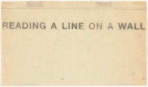
William Anastasi: Reading a Line on a wall: 1967
READING A LINE ON A WALL is one of those art pieces that seems almost about nothing and appears devoid of any content aside from the fact of its own legibility. However just like Joseph Kosuth's 'One and Three Chairs' of 1965, it opened up debate as to what was actually going on when we encountered an artwork. Kosuth like Anastasi belived that “art is making meaning,” and like the theorist Greenberg, he believed that most of the art of the Western canon was about artists trying to make responses to what it was to make art. For instance Gombrich's 'Art and Illusion' was a very important text at the time and it was centred on the history of the 
psychology of pictorial representation, suggesting that each new generation of artists was concerned to push the possibilities of visual representation, and that art history could be seen as an ever unfolding set of approaches to getting us to 'see'. 

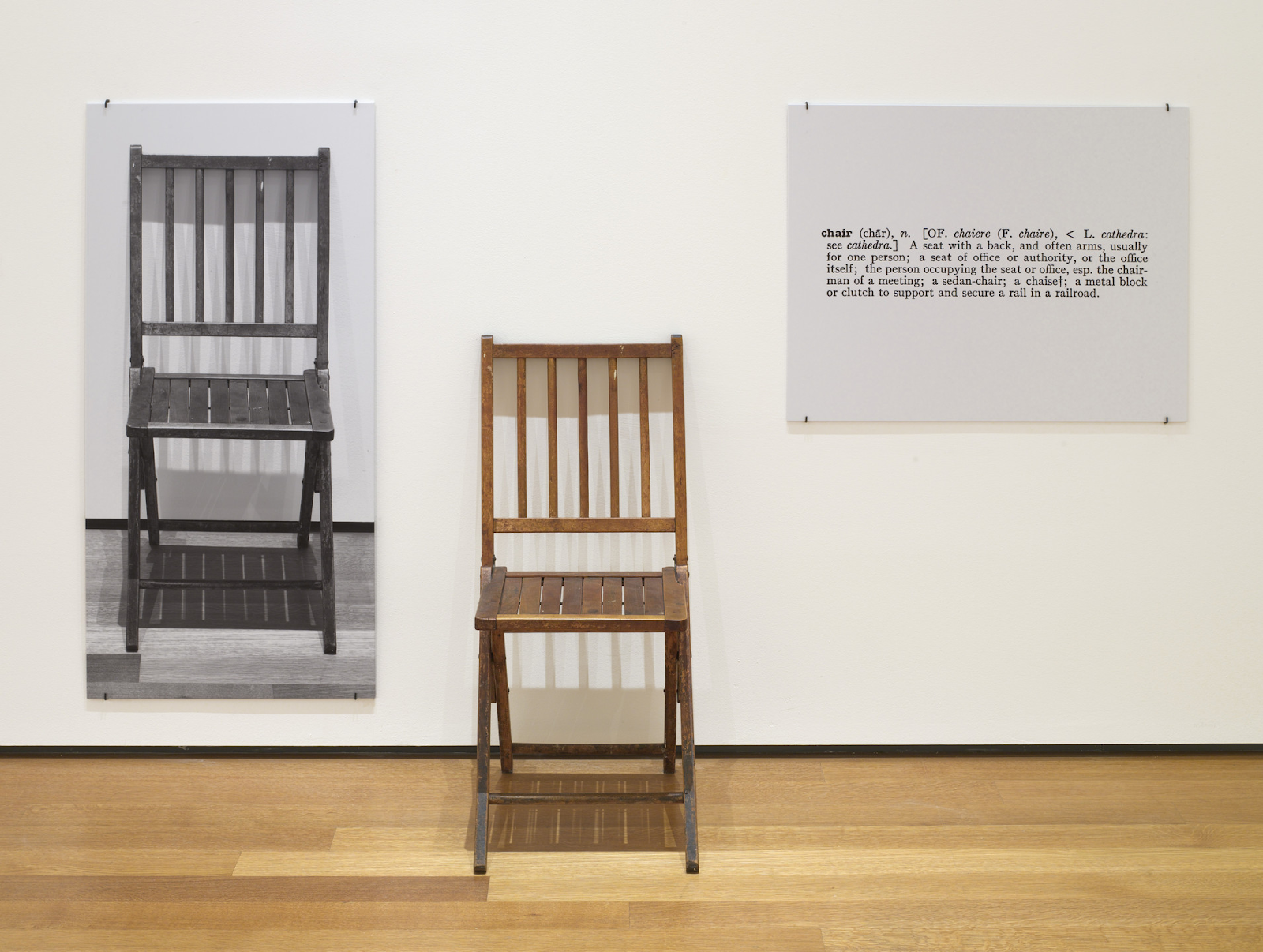
Joseph Kosuth 'One and Three Chairs' 1965,

In Kosuth's case, by assembling three alternative representations of a wooden chair, he constructs a platform for exploring representational meaning or how we come to determine what things are; he asks the question, "What are the differences between a 'real' thing, its representation and its definition?" In Anastasi's case, the work's content is also about definitions, and it is also firmly in the present tense, as it refers directly to our reflective sense that during the moment when we read 'READING A LINE ON A WALL', we are reading and all distinctions between the content of the work and the activity of the beholder dissolve into a state of self-awareness, immediacy and a truth statement. It is what it is or a 'what you see is what you get' moment, a type of position that also reflects Frank Stella’s famous statement ‘What you see is what you see’, that became the mantra of Minimalism.

As a viewer you are 'asked' to reflect on the implications of reading the word 'reading', an activity fraught with intellectual pitfalls. It is easy to forget but this was a time of complex aesthetic yet conceptual but also semiotic and philosophical niceties, as unpicked very astutely by Tom Wolfe in his essay 'The painted Word'. As a student in the late 1960s I was quickly made aware of the need to 'read' a work of art as a text. Because of the still heavy influence of Clement Greenberg these 'texts' also had to be self referential, Greenberg's 'Towards a New Laocoon'* advocating a development of Lessing's position that different types of art could only carry certain types of content. For instance according to Greenberg painting could only carry messages about paint, surface and colour and that any additional 'narrative' was false and would be an additional interference. Therefore the most highly regarded paintings and sculptures of the day were those that most thoroughly manifested the essence of their own means of expression through various modes of self-referential production. These might be certain types of brushstrokes, or ways of dividing the canvas into areas of colour, or the artist leaving traces of painterly actions, (Abstract expressionism, the abstract sublime and minimalism were all movements influenced by these theories). Like many of the most conceptually rigorous works from the late 1960s, Anastasi’s drawing confronts the criteria of that narrow aesthetic paradigm in a way that is meant to demonstrate some of the flaws in the argument. For instance the sparse white wall in the drawing is an illusion of a white wall. Typical art galleries now hung art against large clean white walls, which was an idea that will soon be picked apart by Brian O'Doherty in his essay, 'Inside the White Cube, The Ideology of the Gallery Space'. What seems very non figurative is in fact a very highly figurative image, of a gallery wall, therefore a dreaded illusion. In fact it is a drawing of a particular gallery wall, the arrangement of air vents, electrical sockets and moulding corresponding precisely to one particular wall of the Virginia Dwan Gallery in New York. The physical flatness of the sheet of paper itself participates fully in the imitation of the wall that the drawing depicts, its size for size correspondence with the actual gallery wall, adding to the conundrum, especially when exhibited on an even larger gallery wall, such as those at MOMA.
But which line are we reading? The line that suggests moulding or the line of text? The drawn line or the written line? Both lines are central to their relevant disciplines. Lines are the bedrock of both drawing and writing. However the words 'READING A LINE ON A WALL' are in upper case blocked letter forms and as such they are solid forms rather than lines, which they could have been if Anastasi had used a lower case cursive text. Upper case or capital letters suggest something important, like the capital letters surrounding Roman civic buildings, they are authoritative. As you can see by now, 'READING A LINE ON A WALL' takes a fair bit of reading and for a young lad like myself this set of readings within readings was quite liberating and it opened a door to what is known as 'hermeneutics', the branch of knowledge that deals with interpretation, especially of the Bible, where various interpretations are often found surrounding earlier texts. Layers of meaning nested with layers of meanings. 

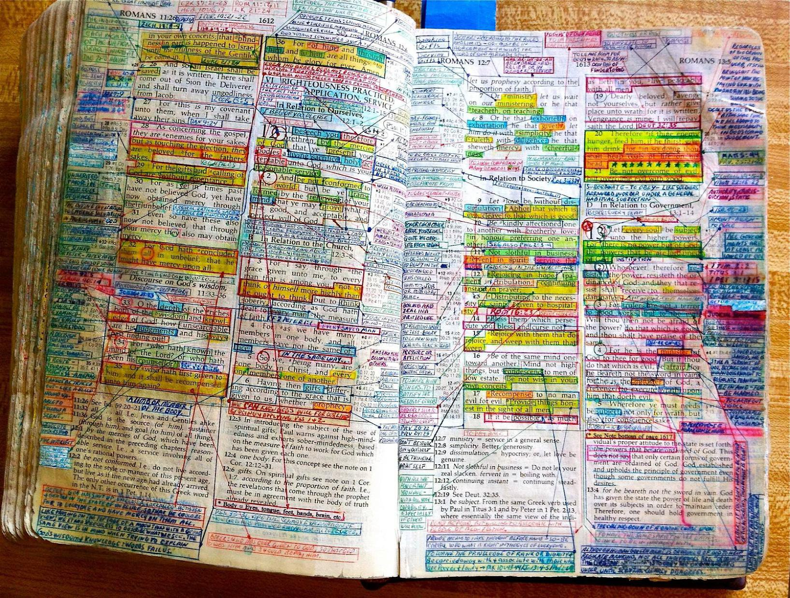
An annotated Bible 

You can find some old Bibles with already printed 
hermeneutic annotations and when these include the individual annotations made by the Bible's owner the reflective layers begin to get more and more fascinating as you begin to realise how as human beings we strive for the 'right' interpretation. However what we only ever arrive at are interpretations, never answers. This is perhaps the central meaning if there is one to Anastasi's 'Reading a Line on a wall'. No matter how carefully a text is read, even with expert guidance it will always remain unknowable. It is easy to forget the powerful role of critics at that time in determining what was good and bad art. In a post-modern world there are as many answers to what is good or bad as there are questions, but back in a time when people still went to Sunday school and were made to read and make sense of their Bible, it didn't seem so strange that someone in 'authority' might try to lay down a definitive interpretation of art. 

Garry Barker: Handmade Bottle Rack: 1972
This type of self referential art was very popular when I was a student and I was at the time sucked into the game, making several pieces of art that 'cleverly' commented (or so I thought at the time) on the activity of art making. I was bamboozled by theory and persuaded that all good and interesting art was always to some extent a reflection on the nature of art itself, by the staff that taught me at that time, Keith Arnatt in particular. It was not until I read Tom Wolfe's text 'The Painted Word' in 1975 that I was able to get past the what had become a block on my own ability to use art to reflect on the wider issues that I had begun to see as being much more worthy of taking up my time. Gradually I began to see that art's spectrum of human awareness included everything from philosophical debates as to how many angels could be found dancing on the head of a pin, to stories about leaving the washing up until tomorrow. In fact the older I got the more I began to realise that the best and most important stories weren't even told by humans, it was just that we like to hear the sound of our own voices. The 'Handmade Bottle Rack' was very much a response to my own history at the time. I had come to art college directly from working in a steel works and I decided to make Duchamp's readymade by hand. I was trying to make a comment about the way his intellectual achievement, had negated the achievement of the 'workers', those who laboured in factories to produce objects like the bottle-rack and who's labour was usually forgotten especially by the sort of people who would use a bottle-rack. (At that time wine drinking was seen as a very middle-class thing to do, working class people drank beer). I was also making a point about the artist's labour and that 'Judd's dictum', "That anything is art as long as somebody calls it art", was another middle class attempt to take away the meaning of labour, skill and craft from those who worked with their hands. Looking back on the work, perhaps its most important aspect was the fact that I made it in such a way that all the materials could be recycled. After exhibition and it being photographed, it was taken apart, and all the materials given back to the workshop where it was made, so that next year's students could use them. If the job of an artwork was to communicate an idea, then once done, like yesterday's newspaper, it was redundant, and the idea of keeping work for posterity was I argued, a middle class idea about the creation of an elite culture and a way of supporting an evil capitalist art world economy that relied on the monetisation of curated ideas. 

As a young man I was far more 'militant' in my thinking and found a harsh conflict between what I was being taught and how I felt as someone coming from a working class background. For instance my parents loved 'tranculments', (a Black Country word for ornaments) or as I had begun to think of them, small scale domestic sculptures. They carried ideas such as memories of places visited, (souvenir porcelain miniatures carrying names of seaside towns), reminders of old traditions, (horse brasses), a love of animals, (miniature ceramic dogs) and reminders of war (polished and engraved brass shell cases), but I was quickly educated to see these things as kitsch objects. They were I was told cheesy or tacky, this was apparently not art, these were objects that appealed to popular or uncultivated tastes because they were overly sentimental, and I was being taught to see these things as ugly, without style, false, or in poor taste. But in order to fight back I had to learn the language of middle class art and of course in doing so I received the approval of my tutors, who thought my work at that time was good. I had moved over to the other side and become middle class,  my 'educated' stance was understood by other middle class people as clever and the work I did was totally incomprehensible to the rest of my family who still collected souvenirs and polished the horse brasses on weekends. 

As contemporary students you may well have similar experiences. What I found as I got older was that all these things are simply aspects of a human condition that is a reflection of how we make sense of the world around us. The problem is that at certain times you will find gatekeepers to the profession that you want to enter. Whether this is your tutor, Clement Greenberg or your local arts council officer, people will have ideas about what art is and what it is for, and you will have to form your own beliefs and set of convictions if you are to practice art on your own terms. 

* 'Towards a Newer Laocoön' by Clement Greenberg, was a very influential critical text, the title refers both to Gotthold Lessing's Laocoön: An Essay upon the Limits of Poetry and Painting, of 1766, and to Irving Babbitt's The New Laokoön: An Essay on Confusion of the Arts, of 1910. Greenberg is interested in the existence of limits or boundaries that distinguished the differences between the various arts.  According to Greenberg's argument, it is a truth value characteristic of modern art that each type of art had to define itself in terms of the limitations of its 'proper' medium, or in other words to preserve a 'truth to the materials' involved in the practice of the various art forms. 

See also:

The Painted Word by Tom Wolfe

Who's afraid of Tom Wolfe: Judith Goldman's repost to the Painted Word

Walking and drawing More reflections on the influence of Keith Arnatt but also an introduction to the work of Stanley Brouwn another late 1960s conceptual artist who drew. 

Drawing and measurement Another Keith Arnatt reflection

Drawing and philosophy

Facing a blank sheet of paper One of my own attempts to make work that reflects on similar issues

The word 'art' and its history


Sunday, 29 November 2020

Cornelia Parker: Mythic conceptualism

Cornelia Parker is one of our most fascinating artists and it's because of the way her mind works. Her work always makes you think, but not in a straightforward logical way. She begins the process of putting an idea together by letting her subconscious dictate the direction that her artwork will take. It’s only later that she contextualizes it and gives it meaning. Because of this process she allows the subliminal to operate and therefore as your own mind works its way through to its not so well used neural pathways, when the penny does drop there is a great deal of satisfaction. 
So how does her approach help to make us think or feel? Perhaps it's got something to do with Jung's idea of the collective archetype, by allowing the subconscious to dictate some aspects of the creative process, the end result enmeshes both rational and irrational impulses.  


Poison and Antidote Drawing: 2009 
Rattle-snake venom and black ink, anti-venom and white ink on card: 6 x 4 in. 

Parker often includes culturally significant materials in her work, which both heightens our emotional response to what she is doing and helps us to memorise the experience. However you get the sense that she chooses these materials because of some sort of 'feeling' that they are right, thus beginning a process that fuses subconscious awareness with a sort of inductive reasoning. Parker also gives us the interconnections that help to bind memories for us. In 'The Art of Memory' by Frances Yates, you will find detailed descriptions of how memory was understood as a part of the skills of rhetoric, and the conjunction of different concepts or things that have unexpected associations or correspondences, is a technique often used to stimulate the brain to hold on to an idea. I suspect that at one time or another Parker has read Frances Yates and that she has herself recognised the importance of making visual imagery that asks questions of the viewer, especially because of an initial illogical or odd appearance.
In the case of the venom / anti venom concept, first of all it is important that it is 'rattlesnake' venom. She could possibly have used cobra venom as both snakes are culturally significant, but the 'rattlesnake' is of course more closely identified with an idea of the USA, and in this case it also makes far more sense in relation to Christian concepts of good and evil and the awareness we have of possessed preachers and the dark side of the American south. Black is an 'evil' colour, with an association with death and white is culturally associated with purity and goodness. Bringing these things together with the Rorschach blot taps into Freud and the unconscious and allows for a 'read' of the final image in the same way that any other Rorschach blot would be read, as a way to understand someone's unconscious motivation. The fact that many of these blots are either read as skulls or butterflies, reminding us of the nature of bi-lateral symmetry, a formal principle underlying both folding paper in half and the development of most life forms, especially if they have backbones. Parker describes what she did in a very straightforward way, ‘ I’ve made poison and antidote drawings using snake venom from a rattlesnake farm in Texas mixed with black ink, and anti-venom with white ink, to make Rorschach blots. The resulting drawings are a combination of 'good and 'evil'. (Maslen and Southern, 2014:54) She also states ‘For me the conscious part of making a drawing is deciding on a process, what the process then releases is something else.’ The 'something else' I presume is dependent on the unconscious. The fact that the process of interconnection releases certain metaphorical 'triggers' in the mind of the viewer, therefore creates questions, rather than direct 'answers' or clear 'meanings' is important here. Parker again; “I began with the idea of different sorts of oppositional things. I was thinking of Hitler and Freud, for example, in terms of how they seem to personify contrasting parts of the psyche. I also wanted to make something physically dangerous.” (Drawing, 2000). Opposites exist because we are fascinated by them; black is only identifiable as the opposite of white because our mental picture of these two concepts is set up in a particular way. In reality there are no opposites only continually morphing and changing relationships. What was once part of a helium atom inside a star might now be part of a calcium atom inside you. What you eat this morning might well have been part of a dinosaur sixty million years ago or a weathered rock from the same era. At a quantum level everything is transferrable to everything else. At one point Parker was using black Quink ink as a carrier for the poison and white correction fluid as the carrier of its antidote. The correction fluid is very viscous and the resultant texture when you fold the card over and print off the painted surface opposite is quite organic, almost hair like, reinforcing the fact that the blot could look both like a skull or a human being wearing a fur coat. Again as Parker states, ‘The material is often where my thinking starts.’ (Aesthetica Magazine, 2016) So the material can have two types of metaphoric operation, the first, its whiteness, signifying purity, the second, its tendency to be thicker and stickier, enabling it to make a texture that is similar to that of bone, or fur, or sick or semen. Signifying perhaps death in life or the comforts of a return to our furry animal nature, or the fact that sex and death are always close bedfellows. Hopefully you are beginning to get the idea of how her work can be used to build interconnections between things.

Cold Dark Matter: An exploded view
Cold dark matter consists of the contents of a garden shed exploded at her request by the British Army. The contents and bits of the shed itself are then collected together and are hung by fine threads from a metal grid situated above the installation, which is illuminated by a single lightbulb that hangs down into the centre of the suspended components, casting dramatic shadows onto the walls. It appears as if a moment during which the explosion took place has been frozen, and you can walk around the hanging pieces of shed and examine in detail,  what is there and where each piece is in relation to every other piece. We in effect come to inhabit a different time zone or we speed move so fast that things around us appear to become still. This device is also used in films, witness how the Quicksilver character moves in the X-Men film franchise. 

Quicksilver in the kitchen

This association with comic culture could be taken even further. Before developing 'Cold Dark Matter' as a project, Parker had been working on a series of ideas that looked at creation coming out of destruction. Some of her images appeared to be very like orchestrated cartoon deaths, the invention in a cartoon like Wile E. Coyote, being often at its highest in the various ways that the animators could think of bringing an end to the central character. 


Wile E. Coyote

Cornelia Parker has steamrollered brass band instruments and you suspect really likes the ‘exploded view’ images you used to get with Airfix construction kits. 

Exploded view of a tank, lower section

You also get a sense that she is enjoying the idea of inventing forms of destruction in order to be able to reconstruct the objects in new formulations. She kills things off in order to resurrect them, an idea that we have also seen at the core of some religions. An religious icon for instance could be described as a living image of a dead God. 

Breathless

The idea that art could be seen as ‘the living image of a dead thing’ is something that would have appealed to Roland Barthes. This was exactly how Barthes described the photograph, something that he argued it had in common with all portrait paintings and ancient Egyptian funerary objects; all those things were eventually going to result in living portraits of the dead. However for Barthes, what was unique to the photograph, was its punctum, which he defined as the sensory, subjective effect of a photograph on the viewer; as he states, ‘The punctum of a photograph is that accident which pricks me (but also bruises me, is poignant to me).’ Barthes contrasted the punctum with the studium, which he described as denoting a more rational approach to the understanding of a photograph, one that is conditioned by historical and cultural experiences and is not categorically different from how other art forms are approached. However a sensory, intensely subjective effect of an image on the viewer, is something I would argue is a possibility for all sorts of images, not just photographs. What is unique about any experience is the encounter and how it is perceived. Because all encounters are initially brief and fleeting perceptual events, (we are hardwired to respond immediately to perceptions so that we either fight or flee) their initial reading has to be instinctive, it is only when we have more leisure time that we can begin to rationalize what went on and work out meaning. A sensation or emanation that carries an image, is essentially in an image form, so on the point of its reception it is also received as a type of pattern. Therefore we could associate the ‘punctum’ in Barthes definition with how we instinctively react in any initial moment in an encounter with an image. A reflection on the nature of the studium comes later. 

Evolution has hardwired our pattern recognition abilities to be instinctive and involuntary, however for them to go into operation at the speed they do, the thing we lose is a consistent ability to make the right call. Therefore we can begin to detect patterns that aren't really there. As James Geary (2011, p. 36) puts it, "The brain evolved to detect patterns of immediate significance, in do or die, fight or flight situations." Geary (p.38) goes on to describe McCulloch's experiments, that show how a frog is hardwired to try to eat anything that is about the size of an insect and that moves around in jerky movements. This automatic response to a certain type of pattern will sometimes mean the frog gets to eat inedible things that have simply drifted into its field of vision, however, the frog's chance of catching flies is greatly increased if it doesn't take time to think about where a fly might be and 9 times out of 10 that moving shape will be food and not just a scientist trying to fool it. We are not unlike frogs, and if we see something like a food pattern we decide it must be a food pattern. This process tends to make us create object agency, it can also lead to the giving of the characteristics of living things to inanimate objects. The behaviour patterns, or look of inanimate things, can be like the behaviour patterns or look of living things. Because of the bi-lateral symmetry created by folding a sheet of ink stained paper in half, at first glance it might be an animal, simply because most animals are bi-laterally symmetric. (Humans are of course animals with backbones, so we are hardwired to see that pattern). As Geary notes, "That swaying in the trees may be just a breeze or it could be a wild beast, coiled and ready to strike. You can misperceive the breeze as a beast or the beast as a breeze. Which mistake would you rather make? And if you were an early hominoid, which mistake would be more likely to ensure that you would survive long enough to reproduce?" (2011, p. 41)
This ability to give agency to things is at the core of how we produce metaphor, things are similar to each other, so one thing might be like another in other ways too. For instance we see images of human faces in old gnarled trees, in burnt toast and in the moon. We use a metaphorical technique called personification as an extension of this, something in advertising that is called 'brand personality', which is why a company might for instance strive to develop a 'sincere' image.  Associations begin alongside perception, whether we want them to or not, prompting behaviours that can be totally outside our conscious control. These representations, or perceptual/pattern recognition combinations, also come with affects. Finucane, Alhakami, Slovic, & Johnson (2000) suggest that as we perceive, the representations we arrive at come out of what is called an 'affective pool' and as we pull them up into consciousness and judgement making, they come with what could be called unconscious bias. 
In psychology unconscious bias is explored by using the techniques of free association as first initiated by Freud. He would ask people to tell him what the first thing was that came into their minds when he gave them a word to respond to. His pupil Rorschach, began to use inkblots to initiate the same process. People see different things in the same ambiguous inkblot image and as they tell what they see, an analyst will record their thoughts and then determine the significance of the associations made. 
Something that evolved as a super fast response to flight or fight situations, now sits deep down in the amphibian brain, located at the centre of an activity that Johnson and Lakoff would argue was the creation of body schema metaphors. A typical body metaphor would be to be feeling centred or the opposite, of feeling off balance. These associations could be triggered by an awareness that well and healthy people stand up straight, but ill or dying people tend to lie down, or stagger about. Our concept of Justice holding her scales, is a metaphorical personification that stems from this idea. 
Cornelia Parker's thinking process is centred around the nature of metaphor. Her art is about destruction, resurrection and reconfiguration. Demonstrating the importance of process, she frequently transforms objects by using seemingly violent techniques such as shooting, exploding, squashing, cutting and burning. Through these actions she physically alters the object and she herself becomes an active participant in the development of its story. In order for Parker to engage with her subject she often has to destroy it. She might melt it down, blow it up, squash it flat, burn it or cut it up, but in the process she reveals something new about the possible meaning of something, the process of destruction leading towards various metaphorical readings. Hence in 'Breathless'; we associate brass band instruments with the 'blow', the deep intake of breath needed to exhale with pressure in order to sound them. If these instruments are squashed it is as if the breath was squeezed out of them.  The process of finding new meaning often involves a resurrection or rebuilding from the parts of the initial deconstruction. Her reconfigurations often involve variations of or associations with the original subject and/or its process of destruction. She states that, 'a squashed object is much more interesting than an intact one and I think brokenness is very much a part of society. Civilisations fall, for instance, or a very recognisable object can become mysterious and more open to interpretation when it’s in pieces. To me, that’s more interesting than what is whole. I use a lot of clichéd objects: a pearl necklace, a silver spoon, a hat for church, a window or the instruments from a brass band – things that are kind of commonplace and that are so ubiquitous everyone understands what they are. I take very simple things and use them to achieve the abstract'. Of much more importance is I think her interest in The Golden Bough by Frazer, a book that outlines the structures of various ancient religions, a book that states that some societies “had to kill something off every time they wanted something to be regenerated." 

Anti-Mass

Anti-Mass is made from the charred remains of a Southern Baptist church with an African American congregation, that was burnt down by racists.  She has used the timbers of the burned church to reconstruct a replacement, that is on the one hand an illustration of atomic forces, of a mass/energy configuration and on the other it is a resurrection of the church's charred remains, so that they can in effect perform their own catholic mass. Science and religion are brought together, these burnt fragments defying gravity and floating without weight, escaping their earth bound life to become a monument to an act of barbarity. As parker has stated, "For every death you get a resurrection.”

The most successful metaphors are those that you remember because of a new or unexpected connection.They are about rethinking the familiar, but with a conceptual link that binds the source to the connection. Without this conceptual tie, what you get when you bring two unlike things together, is as Geary states, "mere Surrealism." (2011, p149)

See also:


References

Geary, J (2011) I is an other: The secret life of metaphor and how it shapes the way we see the world  London: Harper

Lakoff, G., & Johnson, M. (2008). Metaphors we live by. London: University of Chicago press

Maslen, M. and Southern, J. (2014) Drawing Projects: An Exploration of the Language of Drawing London: Black Dog     Cornelia Parker talks about her work in this book of projects
Finucane, M. L., Alhakami, A., Slovic, P., & Johnson, S. M. (2000). The affect heuristic in judgments of risks and benefits. Journal of behavioral decision making13(1), 1-17.

Friday, 5 June 2020

Drawing, measuring and the body

When I was at art college during the early 1970s I became very interested in conceptual art and in particular how it was related to performance. My tutor Keith Arnatt was heavily involved in this area and his seminars and teaching methods were designed to help you organise your thoughts around such issues as whether or not certain philosophical or intellectual propositions could be realised as art works. 

Keith Arnatt: 'Trouser word piece' 

In this case his photograph was positioned alongside a text taken from John Austin about the slippery nature of 'the real' or 'reality'. He used Austin's analysis as a satirical meditation on the nature of a real artist, a term often used at the time to put down those people who were seen as amateur artists. Art then as now often suffered from snobbery. 
In the case of 'I'm a Real Artist'  Arnatt measures art against himself but in the early 70s it was two Dutch artists that seemed to exemplify this area of work, Stanley Brouwn and Bas Jan Ader.


Stanley Brouwn

During the 1970s, Brouwn produced work developed from thinking about his own unit of measurement based on various parts of his body, such as the ‘Stanley Brouwn foot’, which measured approximately 26 cm long. Brouwn would often record the numbers of steps he needed to take to get to and circumnavigate various cities, collecting his accountings on numerous filing cards, that would be collected together and placed in filing cabinets. For example, his exhibit for Documenta 5 was of several grey filing cabinets; one of which held 1000 cards, an outline of a 3000-step walk and measurements of the length of strides between 840 and 890 millimetres. I was very taken with this type of work at the time and made my own body rulers, as well as a set of scales calibrated in relation to myself, that were used to weigh art. Well at the time it seemed a good idea. Looking back I realise it was the work of a young artist that was still working through the implications of what was going on around me and one of the things going on was the advancement of data collection, something that at the time I was aware of but not yet worried by it. 


The idea of measurement is something I have put up blog posts about several times before. We all know our own bodies as something to measure other things against, things are either bigger than us, smaller than us or of a similar size to us, and we tend to think of scale, as something calibrated against a human measure. Therefore it is to be expected that various approaches to the idea have come up over and over again during human history. But Bas Jan Ader had very different ideas about measurement.  He set sail alone in July 1975 in a 12½ foot dinghy called Ocean Wave from the coast of Massachusetts intending he said, to cross the Atlantic, aiming to reach Falmouth in Cornwall. However he was never seen again, disappearing into an idea that was also a stark reality. Bas Jan Ader was measuring himself against the immeasurable. The Atlantic Ocean is immense, far too big to really imagine, something was going on in Bas Jan Ader's head that meant in setting out to sail it in a 12½ foot dinghy, he was testing himself out against the ineffable. When it comes down to it we are small frail creatures, and our obsession to gain control over nature is both foolish and hubristic. Numbers have always given us some sort of false idea of control and we need to guard against the idea that in collecting data, we are in some way able to use it to control the world. It will when it wants to, swallow us up, just as it did Bas Jan Ader. 

Nearly a year after his departure, in April 1976, a Spanish fishing crew found his empty boat off the coast of Ireland.


Humankind as the centre and measure of all things was a Renaissance concept. Leonardo's drawing above represents ideal human body proportions and illustrates an idea of human-beings as a standard against which everything else could to be measured against. Its inscription in a square and a circle comes from a description by the ancient Roman architect Vitruvius in Book III of his treatise De architectura. However, look at how Leonardo positions the square in relation to the circle. He sits the circle on the bottom edge of the square, thus dropping the square off centre, and the corners of the square project through the edges of the circle. This allows him to square the circle of how to fit a human body into the two geometric figures without too much distortion. It feels to me that he drew the geometry to fit the figure, as much as fitting the figure to the geometry, something that if true resonates with other ways of thinking about humans as part of nature. Rather than being some sort of pinnacle or controller, human beings are things that are in constant interaction with nature, being shaped by their immersion in the world and their interaction with it. I would like to think that Leonardo had intuitively recognised this, realising that humans need to fit in, and that they did not have to try and shape the world in their own image.


This issue of how we interact with the world is illustrated by one of the medical problems  set out by Daoist thinkers of the 15th century. In the illustration of 'Problem 18' preserved in the Zhengtong daozang, we have the following 'Problem'. The male faces south; he turns his back on yang (Active) and faces towards yin, (Receptive) like the heavens above. The three yang channels issue from the earth; therefore the chi is described as 'floating' in the male. The female faces north; she turns her back on yin and faces towards yang, like the earth beneath. The three yin channels issue from the heavens; therefore the chi is described as 'floating' in the female. These conditions can be recognised by feeling for the pulse rate. The radial lines surrounding the wrist indicating where this problem can be recognised. If the body is not in tune with its environment things go wrong and pulse rate is an early sign of this. Daoists believed that we need a balance between earth and heaven, nature and humankind, body and mind, as well as a need to achieve harmony between male and female elements. In contrast we often find ourselves working with contrasts or opposing forces, (black or white, wrong or right, male or female, good or bad) but the Daoist forces are complementary and they interact in a dynamic system that is constantly in movement as it seeks to achieve balance. This is more like a moving body, you constantly readjust your body's relationship with the ground as you walk, by taking care to be in harmony with where you are you have far less chance of falling over.  

How to read the pulse

The woodblock illustration above from Waike xinfa zhenyan zhinan  was published in 1887, 400 years after the Zhengtong daozang.  It sets out correspondences between the three sectors of the pulse -- cun (Inch), guan (Pass) and chi (Foot).  These differences in pulse rate can be linked to internal organs of the body. The left arm cun pulse corresponds to the heart, the left arm guan pulse corresponds to the gall bladder and liver, and the left chi pulse corresponds to the bladder and small intestine and kidney; the right cun pulse corresponds to the centre of the chest and the lung, the right guan pulse corresponds to the stomach and spleen, and the left chi pulse corresponds to the large intestine and kidney. This set of correspondences is not however as closely knit into a need to achieve harmony as the Daoist text. As advancements are made, sometimes we lose awareness as well as gain new insights. We are in our present age very used to the doctor feeling our pulse, the measurement of which we tend to think of as either regular or irregular, rapid or slow, strong or weak, any deviation from a norm being a sign that something could be going wrong. However if we simply link the data to a machine, we may well find ourselves controlled rather than advised as to what is best for us. A weak or too rapid pulse may simply mean we need to restore some sort of harmony with our environment. 
The artist collaborative team Nora Ligorano and Marshall Reese, LIGORANOREESE, have used FitBit data to develop work that visually presents signs of the body's ongoing changes. This helps grow awareness rather than leading to control, something that is an essential difference between how art and science tend to operate in our present society.

LigoranoReese: IAMI, 2014 Woven fibre optic thread, plexiglass, metal and custom software

Looking at LigoranoReese's work, I am reminded that the Leeds Arts University is literally over the road from the University of Leeds and that the university is very involved in materials science and the investigation of possibilities of interaction between disciplines is something that is not thought about as much as it should be. This situation is often duplicated in other cities, whereby art departments and institutions have become separated from the various science departments. Measurement is central to both scientists and artists and perhaps it is an idea around which both groups of thinkers and makers could forge a new collaborative future. The fact that they have become such separate disciplines is indicative of something going wrong in our society and just as we need to become more and more sensitive to our environment, we also need to foster communication between ourselves and nature and all the various approaches to working with the world. We are not separate from nature we are part of it, just as the arts are not separate from the sciences, it is just that words tend to create difference. Science is simply looking at stuff and exploring what it can do, and art is simply looking at stuff and exploring what it can mean, but if people forget what things mean, they can make poor decisions and fail to see outside of their own world view.  

I am particularly worried at the moment about how statistics and science are used to try and control us. Every morning we are told the government is 'following the science' when it comes to justifying decision making and this is usually followed by a set of statistics to explain why one decision is better than another. Of course by the afternoon some other interest group will have another set of statistics to set against the ones we were given in the morning. Both interest groups are though now becoming slaves to a 'technic' view of reality, one that sees data, science and statistical information as central to their world view. Data it would seem now replaces religion, as something we are supposed to put our trust in. Art because of its amorphous unpredictable form, may be able to put a fault into the data stream, and if it can just lever that fault-line open a little, perhaps it could give us an escape route, back into a life not governed by numbers, one that allows us to live our lives with a degree of quality, a quality of life that is about watching moonlit shadows in the woods at night, feeling the richness of the soil in our fingers and smelling the air as we listen to the sound of wind in the trees. 

The lesson being that we are all linked together by a common reality and unless we begin to work together to see how we can harmonise with that reality, we will gradually find ourselves more and more isolated from the reality that we inhabit. We are part of our environment, not separate from it. The more that we can understand that the more we might realise that we are a collective force and not a set of isolated individuals. A collective that includes those that we tend to think are unlike us, as well as those things we don't think of as human at all. As various shamans have stated when asked to define what humans are, sometimes certain rocks are humans and sometimes other animals are humans, it just depends on the situation; non of us though; people, animals, plants or materials should have our reality reduced to data and statistics. 

See also:

Reading matter
If you want to read about some of the issues surrounding a 'technic' dominated society try:
Technic and Magic by Federico Campagna

Sunday, 24 May 2020

Writing about drawing

There are as many ways of writing about drawing as there are drawings. Recently 'Soanyway' the online magazine had a call for entries for their LIQUIDITY >|< VESSEL issue, so I put something forward. It wasn't accepted but by writing the submission I had to formally organise some thoughts, which is always a useful exercise. The activity of writing a submission is nearly always rewarding and if it is rejected you can always use whatever it is you have written in another context, in this case as today's blog post. As a student it can be a good exercise and sometimes you find you have written something that you never expected yourself to write. 

Submission title: ‘An Oak Tree’

How the submission related to the set theme.

‘An Oak Tree’ is a short story that reflects upon the drawing of a glass of water, using a dip in pen and oak gall ink on paper, a technique that has been used by artists for many years. Drawing using liquids is very different to drawing using solids, the act of shaping a drawing being as much a product of material possibilities as of the drawer’s intention. Exhibited at the Rowan Gallery in 1974, Michael Craig-Martin’s ‘An Oak Tree’; a glass of water on a high shelf, was a conceptual art piece. Drawing at the time had seemingly become redundant as an art form; contemporary art ideas appeared to have separated themselves from material making. 


Michael Craig-Martin: ‘An Oak Tree’

An oak tree

Encounters between things are always interesting, especially if things can never touch each other in reality. There are events that we as human beings think about as encounters. However this is because our thoughts are structured in an encountering manner in order for us to operate in particular ways. Ways that in relation to other things and how they commingle and become entangled with the world, are strange and materially confusing. I'll try and explain what I, (as a moving bag of water with hard bits inside), mean in relation to what something that isn't me might experience. 
As part of the act of making a drawing, I am holding in my hand a half full glass of water, looking at its particular ability to refract light and cause a slight distortion of the world that passes behind it. I dip my finger into the water and feel its cool dampness, and as I place the glass back down onto the table I hear a reassuring quiet thud. However, all of these actions are a complex and very convincing fiction, played out for my benefit by my own brain.
There is no such thing as a direct encounter between myself and this glass; the colours I see refracted across its surface are my own invention, photons of light have no colour, just as sound waves have no sound, coldness has no temperature and chemical molecules no odour or taste. But it does seem to me that I am touching this glass, how else could it be defying gravity and floating above my drawing table? Most of the mass of the atoms that make up my finger ends is concentrated into various nuclei and the same situation exists for the glass I’m holding. Surrounding these many and various nuclei is empty space, except for where electrons orbit around protons and neutrons. As they do so we can count them. The number of electrons surrounding a nucleus depends on the element and here are two shells of spinning bodies, one consisting of four electrons and another with two, a sign of the element carbon. Each carbon atom can form bonds with up to four other atoms simultaneously and is ripe for joining in with the development of complex molecules such as those that fingers are made up of. But silicon is also present in this situation and it is much more commonly available than carbon, so perhaps we are looking at a nascent life form, as well as a developed one. These subatomic particles also have a negative charge; stubborn by nature, they are only attracted to particles with an opposite charge, and are repelled by similarity.  This prevents electrons from ever coming in direct contact with each other. It could be argued that their wave packets can overlap, but they can never touch; the electrons in these fingers repel and are repelled by the electrons in the glass. This glass is actually levitating using a wonderful conjuring trick designed by the glass and the human's fingers in conjunction with each other, a collective mind / body mass, engineering a moment of fantasy. Touch is something else’s repulsion, a repulsion from an electromagnetic field permeating local spacetime is psychologically perhaps difficult to cope with, especially that Pauli’s Exclusion Principle is also at work. Electrons know where every other electron is, and they try to avoid each other as much as possible. Pauli, a standoffish individual, was responsible for the fact that some humans think they know why ordinary lumps of matter are stable. He suggested that atoms occupy a volume and cannot be squeezed too closely together, which could have been related to the fact that he had problems with his own body image and had no friends. However attracted these fingers are to this glass, I’m not sure they want to be responsible for its collapse; all I can say is, it does seem to me to be a reasonable presumption that in my world two solid objects cannot be in the same place at the same time. I usually think of other things as being separate from me. I like the distance perception and consciousness appear to offer me, they make me feel special, a distinct being that can have encounters with other things, I like to think I have agency.

I’m pretty old fashioned and still use the same type of dip-in pen and ink to write and especially draw with, that I was introduced to at my junior school. I intuitively feel as if there is a sensitive and yet straightforward encounter between the ink and the paper as I put my thoughts down. Today I am using water-based ink on paper as my preferred drawing material. I categorise my mark making materials into those that flow in water as if in a primordial sea and those that are scraped off of hard surfaces like some form of geological attrition. When I choose ink as my medium, it can feel as if I am working with something akin to my own life-blood. However I am aware that I can use metaphor to fool myself and that illusion is very much to do with relative scale.

In order for the ink I use to ‘stick’ to the paper, or at least appear to be attached to it, certain things need to align, such as polarity. For instance I am using water based or hydrophilic ink; a polar ink, not to be confused with Noodler's Polar inks, of which I am very fond of the brown.  I choose certain types of paper because the surface is smooth enough to allow me to move the nib across the paper without it getting caught in the grain, but textured and thick enough to allow me to add further diluted ink, if I feel the need to embellish the drawing with a tonal wash. However my thoughts about why I choose paper are very different to the ink’s affinities.
If you pour mercury over paper it will not wet it, mercury's surface tension is so great it adheres to itself. But if you pour water-based ink onto paper it will wet it, because the surface tension of water is much less than that of mercury.  But this is not always the case. For instance, if water soluble ink comes into contact with lipids, (organic compounds that are insoluble in water, such as fatty acids or grease), the water molecules become more attracted to each other than the lipids, and will therefore, like mercury run off the paper and leave it dry. When ink is drawn onto a surface that it doesn't like, it aggregates, clumping together to avoid all interaction with the surface. In this case the term ‘like’ being both a foster parent of metaphor and feeling.
The ink has a certain flexibility of movement, is mobile in its solvent, and will remain so until the solvent evaporates. Whilst its mobility is active one can engage with the ink via a mediator, which is in this case a nib made of a 14 carat gold alloy, a substance that like glass, will not chemically interact with it. Water allows the ink to form in solution, it acts as a carrier and when its job is done it evaporates away. Water is a life-enhancing medium, as the carrier for blood, it not only gets nutrients and oxygen to cells and transports waste products away; it also carries the white cells that protect us from diseases. Water supports the making of the complex molecular bonds that are needed to create amino acids within an animal body, the chemistry of which being not that dissimilar to that which allows ink to stick to paper after the water evaporates. It is in the spaces between surfaces where we will find ink's direct encounter with paper, but human eyes will never be able to see it. When ink does favour the substrate or surface that it has been applied to, it will attach via inter-molecular forces, such as h-bonding, London dispersion, and most interestingly, van der Waals forces. Johannes Diderik Van der Waals, a human with a large family network, realised that forces arise from interactions between uncharged atoms or molecules, leading not only to such phenomena as the physical absorption of gases, but also to a particular understanding of universal forces of attraction between macroscopic bodies. Indeed it has been argued recently that gravitational force is actually van der Waals force; gravitational force being related directly to quantum mechanics, the networks of quantum fluctuations of electron clouds in atoms both holding everything together and creating space-time. The behaviour of sub-atomic forces and the fact that these are shaping everything we do is  unseen because our viewpoint is focused on a human scale. Just as our eyes are only tuned to a certain part of the electromagnetic spectrum, all our other senses are operating within very narrow perimeters. The fingertips holding this pen can feel the difference between a smooth surface and one with a pattern embedded into it of only 13 nanometres deep. However the edge of our ability to judge surface change is nowhere near the diameter of an atom, which ranges from about 0.1 to 0.5 nanometres, a scale far beyond our perceptual abilities. Therefore the idea of an encounter that includes direct contact is just that, only an idea, one that has been developed by our brain’s idea of a sense of touch. Touch is only understandable in the space between the smallest thing we can grasp and the largest, we are all though touched by the sun and its chemical processing continues here on Earth.

The fact that we can think of ink as being like blood is not too far-fetched, iron gall ink, a brown-black ink made from iron salts and vegetable sourced tannic acids was the standard drawing ink used in Europe from the 5th century to the 19th century, and has remained in use by many artists. The ink flows well, dilutes to give a very subtly coloured brown wash, and most importantly adheres firmly to a wide variety of paper and velum surfaces. Iron sulphate added to tannic acid has a very strong chemical affinity with cellulose fibres; this affinity operating both at a molecular level and as a narrative arc. The oak galls that are used to obtain the tannic acid, being a result of animal/vegetable interaction; wasps leaving the galls behind on being able to fly. The wasp larvae on hatching modify the oak leaf to develop the gall form, a structure that protects the developing larvae up until their metamorphosis into adults. The tannins produced by this animal/vegetable interaction, combined with inorganic iron oxide then come back into contact with another animal at the drawing stage. A dipped into ink gold alloy nib, holding onto liquid via surface tension and moved across the surface of the paper in conjunction with organic matter creates new forms as it does so. As these forms are realised, so is a physical bond between the paper and the ink, an attachment so strong, that the only way to erase a mark once this ink is dry, is to sand the whole surface down. At a sub-atomic level intermolecular bonding between electron rich donor atoms and electron poor receptors has taken place, this alongside a van der Waals interaction is a model that can result in both new inorganic and organic molecules, but in particular is at the heart if the building of drawings, DNA and proteins.


The nib begins its journey across the paper, the eyes guide the hand and the hand holds its nerve. The glass is half full, its shadow falls softly, a sfumato over the edge of the paper, as morning sunlight glides through the window and shadows the nib’s movement. The lines are thin, they are a tentative trace of a very delicate set of individual instances of a human's interest, a subjective, conscious experience. 


See also:

Why ink sticks to paper
Uncertain certainty 
More on writing about drawing