Day three began again with parallel sessions, I attended the four sessions presented under the umbrella of HYBRID KNOWING SPACES BETWEEN ART & SCIENCE. 1. Felicity Clear: Drawing the atmosphere
Felicity Clear was based in Ireland and had been studying tides, winds and other elements that go towards our understanding of weather. The interrelationship between all these elements was very fluid and there were particular visual rhythms that could be discovered to underpin these relationships. In order to further her interest in this area she had signed up for scientific courses on the weather and weather systems. We were introduced to the Coriolis effect, a force that causes the deflection of circulating air due to the Earth's rotation. This major factor in weather patterns, controls the direction of winds and causes them to deflect to the right in the Northern Hemisphere and to the left in the Southern Hemisphere.
She had become fascinated by the various ways that weather could be visualised. One particular archive she had been looking at, held the beautiful watercolour images drawn up by a French meteorologist/artist, of clouds, which were produced during the time of the first world war. Weather forecasting was at the time vital to the prediction of how poison gas would disperse, or of how troops could move. Wind direction and its speed, as well as knowing whether or not rain was due, would influence strategic command decisions as to future actions. This was also the case in relation to the British army. I by chance also found a wonderful weather resource that could be used here. The resources Felicity was uncovering, combined observational visualisation techniques with data visualisation, in effect fusing art and science into one discipline.
She had even constructed her own weather observation station, in order to look at how the measurements could be both collected and visualised.
I was very taken by a simple way to measure degrees along a horizon line. You simply use your extended arm's clenched fist as a sextant, and you can use it to measure the height of the moon, star, or planet above the horizon. A clenched fist, when held at yours arm's full extension will roughly measure off 10-degrees; you can therefore use your fist to make a reasonable guesstimate of degrees either horizontally or vertically.
All the various ways to visualise weather data rely on the concept that you need to simplify a complex phenomena, in order to be able to measure it. Which is interesting, in that it presupposes that in the process of simplification, there are no important changes. In fact approaches to measurement can be read as a media specificity issue, because as you measure you are actually shaping what is being measured. Felicity then pointed out that the interesting issue here was that art could be used to render visible that which was not normally visible. This phrase had now been used several times by various speakers, including myself when I introduced the purpose of my workshop and I wondered if as we began to sum up what we had discovered during the conference, whether this aspect of drawing, as a tool for revealing the invisible forces that surround us, would be foregrounded.
She then went on to show how her own work used this type of data and its representation.
Wind speed and direction data on a stick plot
For instance she had used charcoal to plot wind speed and direction using a stick plot, similar to the one above. The charcoal of course adding a soft sensibility as it was worked, something that begins to change the plotting into something that reflects the hand in action, rather than a machine measuring data. Long lengths of tracing paper had been drawn on to visualise certain flows of weather movement and these drawings were then hung in a space that had air movements that made the drawings slightly quiver whilst they were being exhibited.
Felicity Clear: Exhibition view
In another exhibition elastic tape was used to extend drawings out into the space within which they were being exhibited, so that the work began to move between diagrammatic form and 3D installations. She began adding imaginary marks to drawings that also included observational data, fusing the two ways of being into one totality. Folding, flow and contour were now all becoming central to the way she was thinking about moving the work forward, the imaginary and the measured were now fused together in one understanding, something that seemed to echo what had happened in the world of quantum mechanics, whereby it was well understood that observation itself could affect results. The old divide between scientific objectivity and artistic subjectivity being something that drawing seems to be able to step right across. What had begun as a movement towards a more scientific way of thinking about visualising the weather, was now moving into a poetic phase.
2. Lúcia Antunes: Scientific illustration: A learning journey through drawing
Lúcia Antunes: Scientific illustrations of a bat
Lúcia is a scientific illustrator and communication designer and this fusion of professions was vital. Her work could not exist without the full collaboration of scientists and other specialists and she described it as, 'the visual representation of science' and that she was always concerned with helping to explain. It was pointed out that Pedro Salgado had raised the profile of scientific illustration in Portugal and that he, like all other important scientific illustrators was involved in establishing the conventions of visual communication within the discipline. These were needed in order to maintain a uniformity of presentation and a mutual understanding. For instance the orientation of subjects or way to display anatomical parts are often standardised, or the use of an outline for clarification purposes even though there isn’t a line around an actual subject, or the removal of certain anatomical parts for simplification, or to make the shading of drawings concurrent with an imaginary principal light source placed at the upper left corner. These principles, (some of which I have remembered from when I was having to do some work in a related area), can though from my experience, also become a straightjacket and I was interested to hear that she felt my workshop session had been of value, as it highlighted both the need for focus groups in order to test out communication, and the fact that working together with others can be a way to re-inject visual invention into the process.
This did raise an issue for me in terms of ownership of copyright. If an image is truly a joint development, who owns the copyright, should it be a joint ownership, or because the artist would have the final say over how the image would look, should it always be the artist? I well remember my time working as an illustrator and the client would often make sure the copyright stayed with them, even though what I finally produced for them was an original piece of visual thinking. The client's argument was both that they were paying for my work and that I was working to illustrate their concept.
Lúcia pointed to the need for continuous testing to allow for dialogue between all parties, as well as the need to observe and not merely see.
She produced both illustration and design work, which was for her a continuous or seamless strategy, as it allowed for knowledge exchange to lie at the centre of her practice. She was involved with a programme that was centred around literacy in science and health. Again this chimed with the work I had been doing and I thought the images she showed us were excellent examples of communication design as well as of scientific illustration. I was also interested in the fact that she used a far greater graphic freedom when designing book covers or materials for certain pamphlets. This layering of approach in relation to audiences was intriguing, especially as I was beginning to think about how I could work with a medical illustrator. At this point I began thinking about two plant leaves, sitting where the lungs are in the body, thinking that the image could be used as an illustration of how closely linked plants and people are in terms of their genetic code and their respective needs to breathe.
Lúcia finally reminded us of how the processes involved in visual communication allowed us to pass on knowledge in a structured way, and she asked us a question; how do we search for knowledge using visual communication tools?
I was left reflecting on the fact that so many of us working in the visual field are siloed. Fine artists rarely working with graphic designers to clarify their ideas, communication designers always working to communicate various clients needs, but rarely being commissioned to use their skills to help other artists. Having worked as an industrial interior designer, illustrator, printmaker, sculptor and as a drawing led fine artist, I am happy to use skills developed in my various areas of previous work, but I think we could all become far more strategic in the way our various visualisation skills could be harnessed and how we could perhaps work more in collaboration. Perhaps if we were simply called visualisation specialists and that we were seen as visual problem solving professionals, then our skills might be appreciated more by other professions. What Lúcia's work demonstrates is that she has the skills to on the one hand clarify for science professionals what they are looking at and at the same time have the skills to develop a communication strategy to enable general principles to be understood by non science audiences. I'm sure she also has the skills to open out the poetic possibilities of the situation as well.
3. Maria Strecht Almeida: Abel Salazar's explorations of the Golgi area in mammalian cells, or when staining and drawing converge
We were introduced to the work of Abel Salazar, a man who stated, "The one who only knows about Medicine, does not even know about Medicine." Which sort of summed up his approach to the integration of art and science. Stain technology was used by Salazar as a method to help understand both structure and function of cellular life. Maria's presentation was again visually very interesting and my notes are perhaps more visually informative than textually clear.
The small drawing above from my notebook was an attempt to note down the structure of the Golgi area, it was actually presented as an image more like the one immediately below.
I was fascinated by this image, which was why I had made a drawn note of it, and have since looked into it again, as it reminded me of Ruyler's diagrams in his book 'The Genesis of Living Forms'. The folding of the Alps was compared with the folding of flat metal sheet, which was in turn compared to the folding of cells during the process of embryogenesis. This appeared to be another example of this process.
Excerpts from my notebook
Maria showed us a very neat diagram, (in the image directly above), that showed a circular form divided into 4. It demonstrated a movement from a photographic representation, bottom right to a drawn clarification. As you moved around the circle, the next three images after the photograph, each represented a further layer of clarification, and they were all drawings. The clockwise moving arrow I drew represents a move towards greater and greater abstraction. She talked about the power of images to convince us of reality and that a move away from the image as product (ownership) to the image as process (understanding) was required.
This presentation reminded me of the gradual development of the media's public image of the corona virus and of how important a sequencing of images was to the understanding of process.
4. Mariana Sousa: Understanding the inside to draw the outside: The history of artistic anatomy in Lisbon
Mariana explained that there has been a long partnership between the Medical-Surgical School and the Royal Academy of Fine Arts in Lisbon. Students from both schools came together in the Anatomical Theatre of Lisbon for the observation, study, and copying of the human cadaver. From this collaboration arose the University of Lisbon's collection of anatomical drawings, dating from the first half of the 20th century.
An image from the collection
As we looked at anatomical drawings I was reminded that the flow of muscles over bones, was similar in structure to the flow of water over rocks, or air around solid objects. The revealing of the inside of the body is of course sometimes associated with flaying and I couldn't get that image of a flayed man holding his own skin out of my head.
This image wasn't shown
We were reminded of the need for the body to be prepared for dissection and that there was a need for the drawing of the expressive nature of the body as well as its internal structure. (In this case I was reminded of the work of Messerschmidt.)
There is a painting by Carlos Bonvalot entitled 'The Master' (1914), The painting depicts an Anatomy lesson taught by Professor Henrique de Vilhena, at the Faculty of Medicine of the University of Lisbon. His presence ensured the traditional training in anatomy continued for many years but on his retirement, there was no one to replace him.
Finally we were left with a sort of question, Mariana stated that there had been a "removal of harmful elements from the collection," and I wanted to know what this meant. Bad drawings? Incorrect drawing? Drawings with pornographic potential? Perhaps a more intriguing question than its possible answer.
Junuka Deshpande: A drawing hangs in the middle
To get to this session we walked down to the 'pink house', a short walk that took us past the huge fallen tree that occupied the space outside of the studios in which we had been working. This tree had been preserved as it had been the tree around which the building we were in had been designed. It was now host to a wonderful variety of fungi and was a spectacular and wonderful thing to have been preserved.
Junuka's practice had developed out of work she was doing with Indian women and was a project that explored the observation of a crossroad/underpass through drawings. We were told that in India the flyover under which they were working, was a symbol for modernity. The drawings are made from the same place over 30 days.
A sequence of Junuka's images demonstrating a move towards greater abstraction
The drawings began as very figurative reportage, but gradually they became more abstract as they began to use the materials of the site as elements in the drawings' own making. The drawings made becoming an embodied exercise. We were presented with examples of the drawings made, as well as small piles of earth, samples of rubble, sand etc. The drawings were collected together in format type, ranging from observations to material responses. We were also shown a film, which had a soundtrack composed of sounds recorded from the streets where the work was being done. This was particularly evocative.
The last section of drawings documented examples of close observations of micro spaces and crevices and it felt as if the drawings needed to finally be placed back into the ground out of which they emerged. As Junuka was also a filmmaker, I thought there was much potential in the moving of the idea on into either a filmed installation, animation or even a more comprehensive film that documented the whole process.
Junuka's presence was in this case essential to the reception of the work and I would have liked to have seen her 'leading' the idea, perhaps as a talking head, in a film.
After lunch the keynote session for the day was held.
Gemma Anderson-Tempini: Interdisciplinary methods:Artistic research and public art
Gemma presented two projects, the first was focused on the representation of biology as process (2017-21) and the second was focused on 'And she built a crooked house', which was a project that I had seen when it was shown in Leeds.
The first block of research was focused on drawing the processes of life. She was looking at processes such as mitosis, protein folding and embryogenesis. In order to move her practice on from drawing substances to drawing processes she listed associated 'doing' words; tense, grow, align, bundle, burst etc. something that reminded me of Richard Serra's verb list for sculptural production. She needed to extract salient features from complexity. Again working with scientists in collaboration seemed to be very rewarding.
She would use drawing to be able to ask the scientists in the lab questions. She decided that at one point she was devising a 3D score for mitosis. Working on graph paper helped, as well as folding the flat images out into 3D space.
A series of drawings that expressed a move from fine granularity to course granularity had worked very well using the fine grid of graph paper. This was expressed in an almost dendritic form, thick lines made by joining graph paper squares, gradually got thinner and could be drawn using the next size down graph paper squares.
The work was question and process led, but at the same time, allowing different processes to merge and diverge.
She looked at the life cycle of haemoglobin, and collaborated with 4 scientists, using colour to represent different energy levels. Trying to follow the life of a haemoglobin molecule as it binds and unbinds with oxygen. These drawings were folded into cones and she saw a possibility of linking the forms with dance structures. She was drawing the processes of life. There is an excellent website that documents all of the work.
The crooked house project had evolved in a very different way, but was still related to her interests in visualising scientific thinking.
She then stated that drawing shows what we know and what we don't know. Now that she had a body of work that proved that she could work in collaboration with scientists, she decided to get more involvement and sent her images to a particular scientist working in the area she was interested in, to see if he was interested in a collaboration. (This was a way of working I hadn't considered before and I began to wonder if I could do something similar)
He was interested and the two of them clicked and they made models together, as they tried to envision types of hyper-spaces, which were made of paper, so that sections could be slotted together. They looked at 'inverse vision'? and the liberation of form through this use of joining papers together. This process eventually brought her to consider knotting as a structural principle.
She had thought about drawing as a form of proof, for example a 3, 4, 5 triangle must be at right angles, and she had also seen a relationship between pregnancy and string theory. (She has twins and the experience was resulting in some very interesting decisions being made in relation to her practice) The 10 dimensions of string theory got her thinking about models of space. In particular hypercubes. The forth dimension and non linear geometry have long been influences on modern art and one of the implications of looking out from the forth dimension is that you can see the insides of things, as if they are turned 'inside out', in a similar way to how a two dimensional object can be looked at by a three dimensional one. The implications are all played out in Abbott's 'Flatland', but her take on this was also one of a mother birthing twins.
I had experienced the result of all this thinking as I live in Leeds and had visited the Victorian house in which was located her installation 'And she built a crooked house' twice. Each room unpacked various approaches to her thinking, from a seance being held on the top floor, via a mirror room that made you experience infinite reflections of yourself and piles of dirty washing, to a room for contemplation, whereby you could listen to a discussion on quantum theory, to a shadow room, whereby shadows of 3D hypercubes were projected on the walls. There was also hypercube wall paper and an exhibition of her drawings, whereby she had attempted to visualise the types of spaces she had been researching.
The house was a wonderful experience and as you entered and left, in the garden you passed a climbing frame built using the principles of construction she had taken from the research. The house was a very excellent example of public art at its best.
View of the climbing frame
Following the keynote and coffee, were the final workshop sessions. I attended a 'Drawing between' workshop.
Jasminka Letzas: Somatic drawing as boundary object
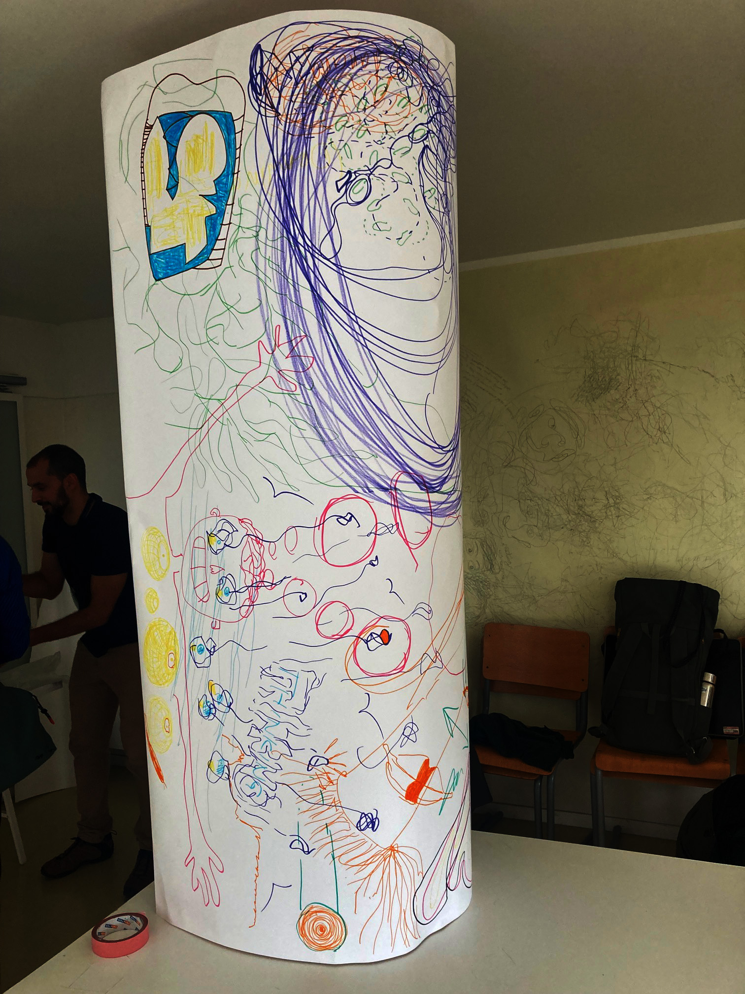
This workshop was held around a large sheet of drawing paper, that had been taped onto the top surface of a set of tables, that had been pushed together in the centre of the room. As we entered the room, we were asked to stand next to the table, gradually filling spaces around all four sides, until we stood shoulder to shoulder all the way around it.
Jasminka then introduced herself and her background working in therapy and began the session by getting us all to relax by scrunching our shoulders up towards our ears and then relaxing, then pulling ourselves up straight and shaking ourselves, making ourselves aware of feet and knees and how we were standing etc. Using a variety of basic exercises to remove the tension of the last three days. Everyone seemed to appreciate this approach, as it had been a very full-on conference, with one event after the other and little time to soak it all up.
We were then all asked to write a short statement on the paper in front of us that represented what we were going to do next with what we had learnt. I wrote 'Have more conversations'. I was very aware that when I returned to England one of my first meetings was with a nurse and an anatomical illustrator from the Leeds Teaching Hospital and that it would be work that could emerge from this conversation that might indicate my next direction for practice.
After doing this we responded to our text and had to draw what came into our minds. We were then asked to move around the table. When we stopped we had someone else's drawing in front of us and we were asked to take it a step further, in any way we chose. After doing this a few times the table top became a maze of drawings.
We were then asked to respond to what we had done and eventually one section of the drawing was rolled and stood on its end, in order to emphasise its objectness.
The session reminded me of how important collaboration is and that as a group we were very supportive of each other. Jasminka's workshop was also a reminder of how important drawing is in the alleviation of stress and as an approach to mental well being.
We finally reconvened and Paulo asked us all to think about how as a group we could move things forward. I asked if everyone's details could be circulated, perhaps with a small biography, so that we could be reminded of all the interesting people we had met and be tempted to contact them to develop new initiatives.
It was announced that on the Saturday there would be a final seminar to help draw out the implications of the conference, but I had to travel back to Leeds.
We were left with some questions, that would hopefully be addressed during the next day's seminar.
Can the drawing skills acquired within practice-based research in the arts be transferable to other ways of knowledge production?
Can the visualisation strategies of STEM environments be transferable to artistic research as a field in its own right?
What drawing skills are transferable, meaning that we can apply them in different fields and sectors of society?
What is the potential for transferability or transformation of drawing research between STEM and Art and which drawing skills can enhance knowledge, insight, understanding and competencies?
We have skills in observation and visual recording, skills in the visualisation of the invisible, skills in the abstraction of complexity, skills in the communication of emotion and of the representation of objects in space, all of which can be applied to any area of knowledge as tools to both help with communication and to problem solve. I'm sure as a field these skills can be clustered together under the drawing umbrella. I look forward to the next steps to be taken.
See also:
Day one
Day two
Where stains and traces meet
Stains and blots
Oak gall ink
Embodiment
Drawing dialogue symposium