Diagrams can be used to demonstrate concepts as well as make data more understandable. Some abstract images such as Peter Halley's paintings were designed to function as diagrams, his work illustrating for example Foucault's ideas of the panopticon or how power works.
Peter Halley: Prisons
Two Cells with Conduit
In response to Baudrillard’s exploration of postindustrial culture, in particular its reliance on information systems, media representation, and an economy that privileges images, Halley moved on from prison diagrams to schematised depictions of enclosed spaces, linked to the world through a network of electronic and fiberoptic conduits. The division of Two Cells with Conduit into two rectangles suggests an architectural division as in two flats next to each other; the line below indicates the hidden, technological underworld of pipes, cables, and wires connecting them.
Patricia Reed has recently produced a body of work designed to be diagrammatic representations of capitalist networks. I mentioned Hans Haacke and Mark Lombardi in a recent post and Reed has in effect picked up their approach and moved it on as she looks at more overall conceptual issues rather than the very specific examples of networks that Haacke and Lombardi researched. She has also hosted a series of gallery talks whereby questions are asked of invited speakers, who are asked to open out and explore problems in an open ended way, much in the same way that her diagrammatic drawings do. Her practice therefore opens out beyond the diagrammatic and includes performative and relational practices.
Although the sound is of poor quality this video is a good introduction to the way Patricia Reed works.
Patricia Reed
Reed's work reminds me of the way several contemporary thinkers use diagrams to communicate their ideas. Compare her work to Kate Raworth's 'Donut Economics'.
Kate Raworth wants to effect change, and so does Patricia Reed. The fact that Raworth is called an economist and Reed an artist doesn't matter to me, both use images to communicate ideas.
Beat the Whites with the Red Wedge: El Lissitzky 1919
Beat the Whites with the Red WedgebyEl Lissitzky is a Constructivist abstract work that is set out like a diagram, representing communist forces attacking the forces of reactionary white Russia. It could be argued that Patricia Reed's work has a historical lineage that could be traced back to Constructivism.
Minjeong An: Self portrait as a diagram
Minjeong An uses the conventions of technical drawing to create complex layered images of herself. (If you are looking at this on a large computer screen, it is well worth clicking on the image to blow it up in size, so that you can explore its complexity) These are representations containing both symbolic and real references to her life. It is interesting to compare her images with those of Luboš Plný, who uses anatomical diagrams as references for his own complex images. What Minjeong An reminds me of however is the importance of annotation and how it is done.
Matthew Rangel
Matthew Rangel uses annotation within diagrammatic forms to add information to his landscape images, the diagram demonstrating its versatility and ability to become entangled in with other forms of representation.
I have also made use of diagrams in some of my recent work.
Life Hacks for a Limited Future
The diagram immediately above is based very loosely on an idea of a scarab beetle, and it attempts to help the Life Hacks group think about the opportunities and threats that face a group of people getting older. Sometimes the problem is to find a more 'mythic' or emotionally loaded image for my artwork as I'm attempting to communicate how people feel about things, but at other times when I'm working with a group of people to help sort out an idea, its more about trying to help people think. Neither is more important than the other, when I'm image making sometimes it has a more practical outcome and at other times the process of making images is more about opening up ideas.
Diagram of a slave ship
Some diagrams are more emotive than others. The diagram of a slave ship above is a straightforward, plan, elevation and cross section, but it was images like this that were central to the abolition of the slave trade. The lack of emotion somehow seemed far more powerful as ammunition, it being hard to escape the reality of what life must have been like on boats of this sort, when you see clearly how much room each person had for the duration of a trans-Atlantic sea crossing. The meaning is the use.
To go with the image above here is some data: The image above is of a partial map of the Internet based on the January 15, 2005 data found on opte.org. Each line is drawn between two nodes, representing two IP addresses. The length of the lines are indicative of the delay between those two nodes. This graph represents less than 30% of the Class C networks reachable by the data collection program in early 2005. Lines are color-coded according to their corresponding RFC 1918allocation as follows: Dark blue: net, ca, us Green: com, org Red: mil, gov, edu Yellow: jp, cn, tw, au, de Magenta: uk, it, pl, fr Gold: br, kr, nl White: unknown. Notice how quickly we find ourselves having to research around the information just to get a basic handle on what is going on. For instance if I want to find out what is the RFC 1918 allocation? This is the answer: Request for Comment 1918 (RFC 1918), “Address Allocation for Private Internets,” is the Internet Engineering Task Force (IETF) memorandum on methods of assigning of private IP addresses on TCP/IPnetworks. Along with NAT (network address tunneling), RFC 1918 facilitates expansion of the usable number of IP addresses available under IPV4, as a stopgap solution to prevent the exhaustion of public IPs available before the adoption of IPV6. It’s not necessary to register private IPs with a Regional Internet Registry (RIR), which simplifies setting up private networks. RFC 1918 was used to create the standards by which networking equipment assigns IP addresses in a private network. A private network can use a single public IP address. The RFC reserves the following ranges of IP addresses that cannot be routed on the Internet:
10.0.0.0 - 10.255.255.255 (10/8 prefix)
172.16.0.0 - 172.31.255.255 (172.16/12 prefix)
192.168.0.0 - 192.168.255.255 (192.168/16 prefix)
IP addresses within these ranges can be assigned within a private network; each address will be unique on that network but not outside of it. Private IP addresses can't be communicated with directly by external computers because they are not globally unique and, as such, not addressable on the public Internet.
Computers on the inside of the network can communicate with the Internet through NAT. NAT translates an IP address used within one network to a different IP address known within another network. Typically, a company maps its local inside network addresses to one or more global outside IP addresses and unmaps the global IP addresses on incoming packets back into local IP addresses.
From: https://whatis.techtarget.com/definition/RFC-1918 Each element of the explanation has another area of information attached or linked to it, so that if I wanted to I could mine more and more information and have more and more data available to me. But in doing this do I actually 'know' anything more? The image that accompanies the text is a now archaic map of only part of what was then the Internet. But it was already so complex that it began to resemble the way both a brain is interconnected and the way that a fungal network can connect a forest into its soil system.
How a fungal network works.
As complexity increases there are underlying mathematical laws that will direct the maximum number of connections possible within a given possible space. This means that certain forms will become apparent when certain types of processes are in evidence. Data mapping is central to our ideas of connectivity and the forms that data mapping take are reflections of how we organise information. Timothy Morton calls these huge complex things when they get too big to hold in the head, 'hyper-objects' and reminds us that even though these things are too big to understand we can grasp certain bits of them as they open out into our small area of action, so do not despair, there will always be things we can act upon. How interesting that these forms are often similar to an animal's central nervous system. The body is again a reference point and we are reminded that whether we are looking at how brain synapses communicate or how the Internet develops complexity, there will be an underlying mathematical beauty. The way that data quickly makes things appear as if they are lost in a network of connections was something Mark Lombardi found fascinating and he was excited by the challenge of how to reveal what lay behind the complexity.
Mark Lombardi, Bill Clinton, The Lippo Group, and Jackson Stephens of Little Rock, Arkansas (5th Version), 1999 (found at artcritical.com)
Mark Lombardi highlighted the way that data could be both informative and aesthetically beautiful. Lombardi, who died in 2000, researched and then diagrammed the interrelationships that he found existed between those murky international agents and financial institutions that we sort of know are somehow linked up, but have never had the time or energy to find out for ourselves. His drawings trace out the complex paths of shadowy deals and transactions between the world’s power brokers. Part-data visualisation/part-investigative reporting, Lombardi’s practice illuminated the networks that often lie hidden but which facilitate the operation of complex aspects of human society. Just as mycorrhizal fungal networks are necessary for the facilitation of natural ecosystems, certain types of financial game players are necessary for the construction of Capitalist systems. By looking at Lombardi's drawings as if they are 'not just human' i.e. a result of a particular set of interactions, you can read them as an aspect of the material semiotic, and question notions of intentionality. So instead of worrying about global conspiracy theories, you could read his drawings as complex networks of human and nonhuman agents. (This way of thinking about his work allows us to link his work to the theories of people like Karen Barad and other object orientated ontological theorists) As Meredith Kooi states; 'Barad writes in Meeting the Universe Halfway that “the very nature of intentionality needs to be rethought” because “intentions are not pre-existing determinate mental states of individual human beings”. Rather, we need to see that “intentionality might better be understood as attributable to a complex network of human and nonhuman agents”. See Kooi's full article here.
Click on image to enlarge
Lombardi's diagrams rarely if ever include non human actants. They reflect the fact that as Timothy Morton puts it, "Quite a long time ago humans severed their social, philosophical and psychic ties with non-humans." (Being Ecological, p.67)
Above and below ground
Similar to the diagram immediately above, Lombardi's work reveals what we suspect must be there but that we don't really 'see'. We are ourselves interconnected in very complex ways, but our place within everything else is exponentially more complexly interconnected.
Much of Lombardi’s practice was research-based, with the information he sourced written down on index cards. There is an overlap therefore between work of this sort and artwork that is focused on documentation. The frayed edges between different disciplines and approaches to art making perhaps being where the real 'friction' and 'heat' is being generated by contemporary artists.
As an artist that uses narrative I also like the fact that Lombardi’s drawings are “narrative structures” each network drawn conveying a story. The gallerist Deven Golden had this to say about how Lombardi got started:
[He was] talking to a friend of his, a lawyer, in California. Mark was telling him about a couple of banks that had closed in Texas, and the lawyer said, “Yeah, and because of that, these Savings and Loans closed in California.” And his friend proceeded to tell him how a series of byzantine corporate connections tied the various financial institutions together. It was very convoluted, and so Mark made some notes—he obviously was predisposed to thinking about this sort of thing. As Mark told it to me, it was kind of like how some artists . . . do the New York Times crossword puzzle in their studios to help them clear their minds. Anyway, every couple of days, after going over his notes and diagrams, he would call his friend back and ask him more questions, which would lead him to make more diagrams. Then, one day, after what I understood to be a couple of months of working on these diagrams to “relax,” Mark had this “aha!” moment . . . The diagrams were more visually interesting than his paintings. And, perhaps just as importantly, they pulled together everything Mark was interested in—drawing, social/commercial interactions and their hierarchies, and politics—into a single pursuit.
I really liked this quote, because it reaffirmed for myself how many things begin simply by having a chance conversation with someone. The difference of course is that Lombardi was both prepared to put time into making the initial diagrams and had enough experience to recognise that what he was doing was more interesting than the paintings he was making.
Click on image to enlarge
Lombardi developed his work in a time before computer generated imagery became the norm. We now have a heightened awareness of how data is mined and shaped in order to manipulate us. I have suggested a few times above that the complexity that really exists lies far beyond how humans interact with each other but how to demonstrate this in the form of made objects is much harder. I will therefore end this post with looking at one example of building complexity from a very simple starting point and ask you to think about the implications of using this type of approach to visualising your own research.
Michael Hansmeyer
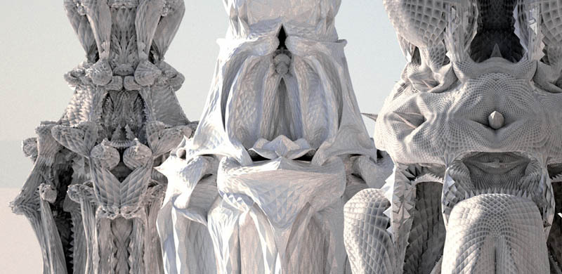
Architect and programmer Michael Hansmeyer has made beautiful complex columns that can be laser cut from stacked cardboard sheets. Although this project is now several years old, (it was from back in 2011), the implications of making forms based on growing complexity in a similar way are still relevant. His project was centred on the conception and visualisation of a new architectural column order based on subdivision processes. What interested me was first of all his choice of a column. The column is central to the architectural imagination and identifying types of columns were one of the ways that you could identify the ages of buildings.
Classical column types
However the first columns would have been trees cut down to make buildings and their memory is still engrained in the forms taken by the stone carvings. This interrelationship between biology and architecture being at one time something that would have been vital and now I believe being something that we need to revisit if we are to remind ourselves how interconnected we are with everything.
The backbone column
Our backbone allows us to stand and takes huge strains in doing so. It has evolved over millions of years and in its own internal structure reveals how complexity can evolve out of simple divisions.
Internal structure of bone
Hansmeyer's work creates images that both work as columns and work as triggers for our imaginations, reminding us of how we are like columns too, as well as showing how complexity can be arrived at simply by creating subdivisions.
An abstracted doric column was used as the input form (data) to the subdivision processes. Data about the proportions of the the column’s shaft, capital, base fluting and entasis was entered into a computer program. The input forms were tagged to allow the subdivision process to distinguish between individual components. This allowed a diversity to be developed but certain factors such as overall proportions and sizes were kept to ensure an overall coherency and continuity. The ornament developed by controlled subdivision is in a continuous flow, yet it consists of very distinct local formations. The complexity of each column contrasting with the simplicity of the subdivision generative process.
Cutting the layers from cardboard sheets
Each subdivision takes place within a two-dimensional plane which gives a constantly changing drawn cross-section of the evolving column and like a 3D print, as each section is made it can be added to the next in order to create a column.
2D sections of an evolving column
Once the process begins it reveals the organic nature of branching complexity based on sub-dividing column dimensions, something that we can intuitively understand as being akin to how natural evolution might work.
Computer visualisations of column possibilities
Finally we have a series of structures not unlike the imaginative organic structures envisioned by Gaudi.
Gaudi: Sagrada Familia
Stuttgart airport
The principle of subdivision and the idea of the tree as a column and support structure is seen here again in the biomimicry of the internal construction of Stuttgart airport.
I'm ending up in a territory between design and fine art and once more I would like to make an appeal for the removal of sharp divisions between disciplines, divisions that I feel strongly are artificial and lead to confusion and the compartmentalisation of experience. If we are to ever repair the severed social, philosophical and psychic ties with non-humans, perhaps we ought to begin with repairing the severed connections between art and design and begin the process of healing the old art and science divide.
References: Barad, K (2007) Meeting the universe half-way New York: Duke Press Morton, T (2018) Being Ecological London: Pelican Morton, T (2013) Hyperobjects London: University of Minnesota Press