
Bertin: A separation of semantic elements
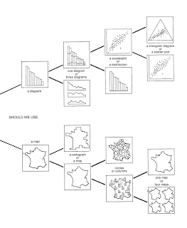
Bertin has some wonderful diagrams in his seminal text. For instance he sets out the rules for how to construct a graphic diagram. He states that every mark in the image is significant, as well as any absence of a mark. (This is rather like a musician pointing out that silence is what makes sound intelligible). He then uses a diagram to illustrate how the six visual variables that we can apply can work: size, value, pattern, colour, orientation, and shape. (Nb value in this context is tone, or tonal value).
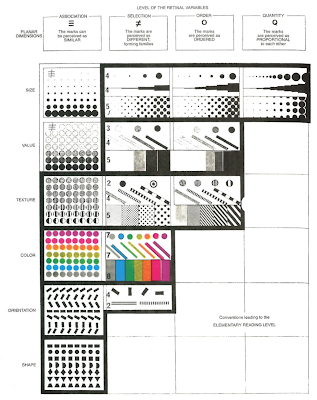
The six visual variables
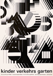
Typical 1960s design
So was Bertin analysing how diagrams and graphic images worked, or was he simply reflecting the visual mood of the times? It was a time when in England and I suspect across Europe and the USA, many of the tenets of Bauhaus teaching were central to how design and fine art were taught. We are all whether we like it or not products of our time, even so, when Bertin highlights some important concepts that need to be born in mind when designing information graphics, we can still look at them and think about how they can be used.
- Relative size is the most widely useful and easily perceived visual variable, no matter what information is visualised.
- Size and planar position are the only variables that can accurately communicate quantitative information.
- For communicating order, tone or value (from light to dark) is far superior to colour (from one colour to another).
- Colour, orientation, and shape function best when creating visual associations and building visual groups.
- Ideally, the graphic should balance white space with 5%-10% ink.
- Focusing on fewer components in a graph aids memorisation and allows freedom to use more exotic graphic forms.
Bertin then goes on to look at how you evaluate the image in terms of its ability to communicate.
- External: From all the information that exists in the world, what information is represented in the image?
- Internal: What visual variables are used to represent the components in the graphic?
- Relationships: How are the components related? What questions can I ask of this image? What can I learn?
- He then describes the three types of questions he thinks you should be asking.
- Elementary: An elementary question focuses on a specific element of the graphic. For instance by using the two axes to pinpoint a specific thing, where a dot is for instance, or to focus on any annotation, or a work's title.
- Intermediate: An intermediate question focuses on a group of elements and usually illuminates a trend, idea or implication.
- Overall: The overall question seeks an answer to the general message of the image.
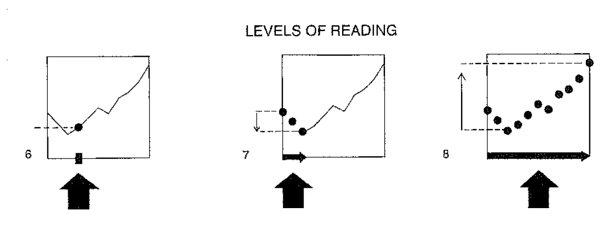
Left to right: Elementary, Intermediate, and Overall Reading Levels
Bertin analysing how a diagram works
You could relate these stages of evaluation to those used by Edmund Burke Feldman in his model of art criticism. However I'm attempting to use Bertin's approach to critiquing a draft novel that I have been sent to appraise. It's an interesting task and one that needs some sort of structure to help build a critique, so I have decided that Bertin's approach might help. It is interesting to see how it translates, for instance, 'External': the novel could be about anything, but it isn't, it is a sort of pilgrimage and is set in the 1930s. 'Internal' the visual variables seem to be very much to do with setting, landscapes, and events such as floods etc. 'Relationships': These seem to be mainly about people and settings and how they interact. 'Elementary': seems to translate to individual words in sentences, are they appropriate, do they feel right and offer the right texture for the internal mouth? 'Intermediate' can I see where an idea is going? 'Overall', where does it all head to, what is the message?
Every now and again it is useful to see how a particular way of evaluating things can be applied to something that it wasn't designed to evaluate. In science this would be seen as wilfully wrong, as measuring instruments tend to be very specific and to measure the force of magnetism by using a wind scale would be regarded as foolish. But art isn't science and as a way of thinking it can reconcile opposites and embrace paradox. However it is also for fine art students very useful to think about the tools of the graphic designer as they are often about clear communication and as such can be very useful to any fine artist worried about whether or not their idea is getting through to others.
References

No comments:
Post a Comment