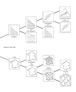
If you have been following these posts you may well have realised that I'm fascinated by the ability of the diagram to communicate information visually. A key book when it comes to an understanding of diagrams is the 1967 text 'The Semiology of Graphics' by Jacques Bertin, but because most of my readers will be English speaking the first and often only diagram theorist and text that people tend look at is Edward Tufte and his 'Visual Display of Quantitative Information', which is a wonderful book if you have never come across it, but Bertin was there first and his book set the standard for our thinking on how diagramming worked.
Bertin: A separation of semantic elements
Bertin had a particular formalist understanding of diagrams, and he began each analysis of a graphic by looking at two critical issues: 1. the visual mark or what he called 'implantation' (E.g. a dot on a scatter plot graph) and its position on the plane (where the dot is placed relative to the x-axis and y-axis that can be seen to bisect any flat image). 2. The idea that lay behind or unified that was being diagrammed, which he called the 'invariant'. Bertin called the variable features that constitute the invariant 'components' and the 'components' themselves were made up of different parts called 'elements'.
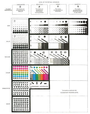
Bertin has some wonderful diagrams in his seminal text. For instance he sets out the rules for how to construct a graphic diagram. He states that every mark in the image is significant, as well as any absence of a mark. (This is rather like a musician pointing out that silence is what makes sound intelligible). He then uses a diagram to illustrate how the six visual variables that we can apply can work: size, value, pattern, colour, orientation, and shape. (Nb value in this context is tone, or tonal value).
The six visual variables
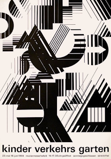
What I thought was interesting about his diagram was that it looked as if it still belonged to the 1960s. The 'touch' or 'feel' of the layout, the visual weight given to each element reminded me of many book covers and posters of the time.
Typical 1960s design
So was Bertin analysing how diagrams and graphic images worked, or was he simply reflecting the visual mood of the times? It was a time when in England and I suspect across Europe and the USA, many of the tenets of Bauhaus teaching were central to how design and fine art were taught. We are all whether we like it or not products of our time, even so, when Bertin highlights some important concepts that need to be born in mind when designing information graphics, we can still look at them and think about how they can be used.
Relative size is the most widely useful and easily perceived visual variable, no matter what information is visualised.
Size and planar position are the only variables that can accurately communicate quantitative information.
For communicating order, tone or value (from light to dark) is far superior to colour (from one colour to another).
Colour, orientation, and shape function best when creating visual associations and building visual groups.
Ideally, the graphic should balance white space with 5%-10% ink.
Focusing on fewer components in a graph aids memorisation and allows freedom to use more exotic graphic forms.
Bertin then goes on to look at how you evaluate the image in terms of its ability to communicate.
External: From all the information that exists in the world, what information is represented in the image?
Internal: What visual variables are used to represent the components in the graphic?
Relationships: How are the components related? What questions can I ask of this image? What can I learn?
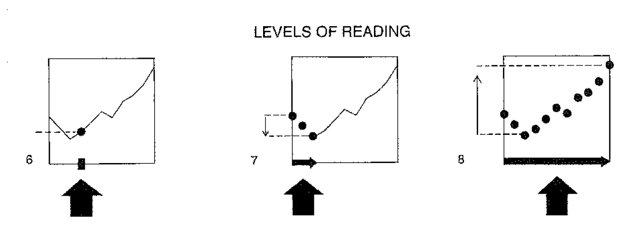
He then describes the three types of questions he thinks you should be asking.
Elementary: An elementary question focuses on a specific element of the graphic. For instance by using the two axes to pinpoint a specific thing, where a dot is for instance, or to focus on any annotation, or a work's title.
Intermediate: An intermediate question focuses on a group of elements and usually illuminates a trend, idea or implication.
Overall: The overall question seeks an answer to the general message of the image.
Left to right: Elementary, Intermediate, and Overall Reading Levels
Bertin analysing how a diagram works
You could relate these stages of evaluation to those used by Edmund Burke Feldman in his model of art criticism. However I'm attempting to use Bertin's approach to critiquing a draft novel that I have been sent to appraise. It's an interesting task and one that needs some sort of structure to help build a critique, so I have decided that Bertin's approach might help. It is interesting to see how it translates, for instance, 'External': the novel could be about anything, but it isn't, it is a sort of pilgrimage and is set in the 1930s. 'Internal' the visual variables seem to be very much to do with setting, landscapes, and events such as floods etc. 'Relationships': These seem to be mainly about people and settings and how they interact. 'Elementary': seems to translate to individual words in sentences, are they appropriate, do they feel right and offer the right texture for the internal mouth? 'Intermediate' can I see where an idea is going? 'Overall', where does it all head to, what is the message?
Every now and again it is useful to see how a particular way of evaluating things can be applied to something that it wasn't designed to evaluate. In science this would be seen as wilfully wrong, as measuring instruments tend to be very specific and to measure the force of magnetism by using a wind scale would be regarded as foolish. But art isn't science and as a way of thinking it can reconcile opposites and embrace paradox. However it is also for fine art students very useful to think about the tools of the graphic designer as they are often about clear communication and as such can be very useful to any fine artist worried about whether or not their idea is getting through to others.
References
Few, S (2009) Now You See It: Simple Visualisation Techniques for Quantitative Analysis London: Analytics Press
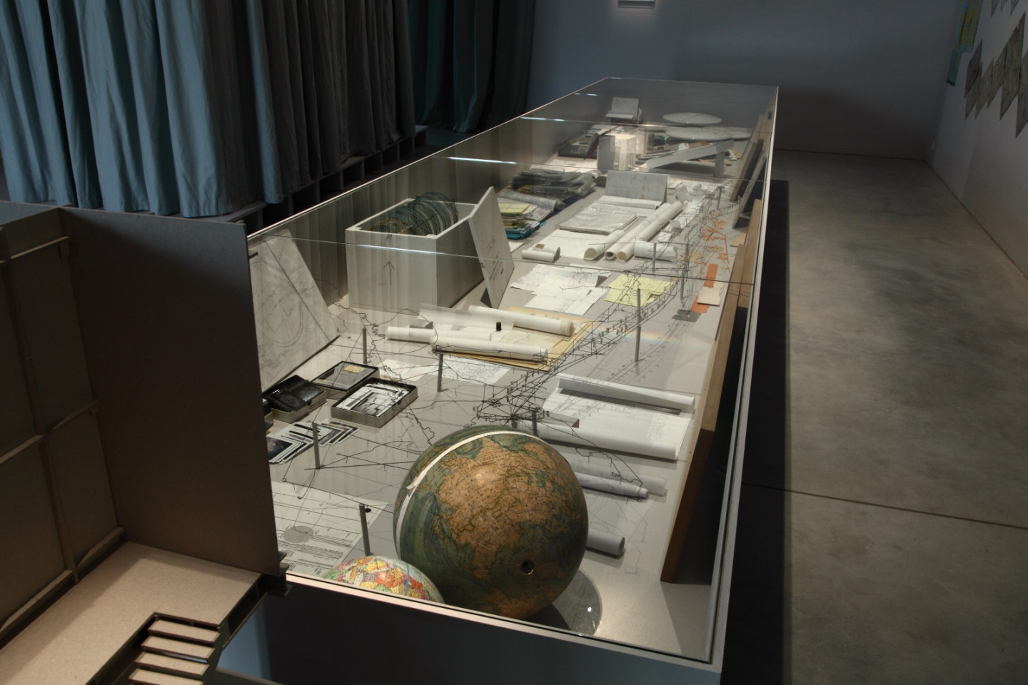
Christoph Fink has a body of work entitled 'Atlas of Movements'. It is centred on how our bodies interact with our surroundings, and how we map out the interactions we have with the environments we pass though, as both cartographic and acoustic constructions. These 'mappings' consist of drawings, diagrams, tables and layers of sound, and they rely on the detailed annotations that Fink makes as he explores his situated-ness within the world.
Fink's notes
Fink has this to say about his work:
My notation method is a means of bringing a degree of structure or order from which to reflect further; or rather, it allows me to enrich the experience of time and space. .... my whole oeuvre is an archive, a sort of poetical databank. ...I picked out specific aspects of my work: my analogous visual archive (with some of my 85 000 slides), sources of inspiration, drawings I did as a child, a part of my video archive, sketches, marginal notes, etcetera. I show something of the origin of my work, my passion for space and time, for exploring in-depth our understanding of and views on landscape and man’s place in the scheme of things.
Movement #85 The Montreal Walks and the History of Istanbul ceramic discs
Christoph Fink: detail of a vitrine including notebooks and ceramic disks
Fink keeps precise records of his journeys (notes, photos, sound recordings, videos etc), which he works into drawings, timelines, graphs, sculptures, slideshows and soundscapes. He records the complex movements made by himself and how this passing through is entangled with the various situations he has to confront as he travels. He then gradually puts together objective recordings with subjective observations, so for instance, the timed patterns of movements of aircraft across the world may be made to intersect with historical facts about a city and much older facts about geological periods relating to the earth he is travelling over, all of which are then displayed in exhibitions and often as diagrams embedded into ceramic discs, that then sit alongside his other findings that will be recorded using more traditional formats. .
He states:
'From my first trip, I understood the importance of noting the coordinates of space and time. To literally inscribe oneself in space and time has great poetic potential for me. This is how I developed a method of working that is first and foremost “chrono-geographical.” It’s only later that I named and numbered each trip as a “movement.” Regardless of whether the journey is undertaken on foot, by bike, train or plane, the route is often a way to develop mathematical diagrams based on what I drew beforehand on the maps. I am fascinated by the way in which these diagrams are transformed or deformed by circumstances. For example, in Istanbul, I crossed the Bosporus diagonally and then crisscrossed the city, moving concentrically, walking through unplanned urban zones.....my primary interest is in the physical landscape (mountains, rivers, valleys, plains…) and how this shapes the city. I try to understand and sense why a city is in a precise place, where the tension points are, how people think and how things are done. To sum up, what interests me is something I could call the city’s rhythm'.
Fink believes that cartography is a widely underestimated form of conceptual art. My interest in his work is though centred on his work in ceramics; the three dimensional forms that carry his stripped down diagrams have a format that sits between sculpture and drawing. These forms allow him to produce hand held objects with drawings on them that as you move them around operate like complex compasses that can be used to orientate the person holding the piece. As you rotate them you read them in relation to where you believe you are. Then there is a second stage of engagement, that with the diagrammatic drawings made over the surfaces of these cast ceramic objects and your attempts to read them. Their combination of spatial and sound notation, intimated a process of engagement that I immediately thought of as if I was trying to read a type of alethiometer, the compass-like device that was used to communicate with a higher reality in Philip Pullman's 'His Dark Materials' books.
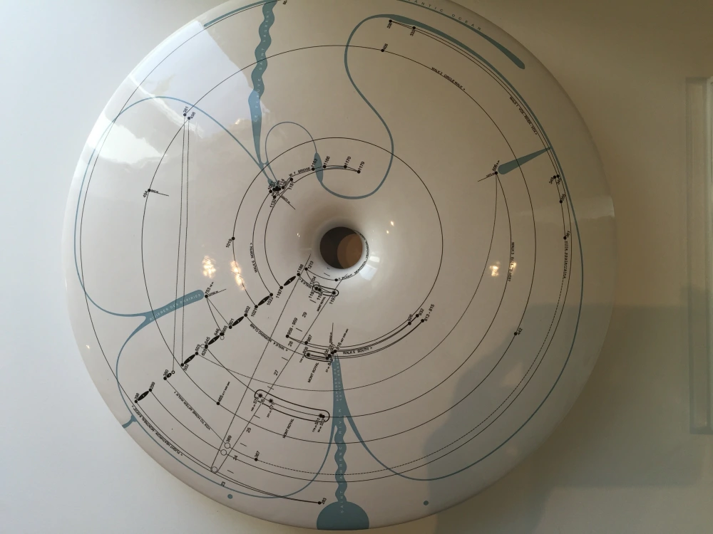
Christoph Fink, The Montreal Walks (12 254,94 km, 195 h 30’51"),
space and time disc, 2008. Ceramics, diameter 47cm.
Fink developed three dimensional representations of the Earth's space-time as reflections of his awareness of the Earth as a rotating globe within a gravitational space time curvature. (See Faraday's lines of force post to get an idea of this)
His circular diagrams have a central void that embodies the hollow space that emerges alongside continuously emerging space-time, as in the diagram above. These ceramic objects involve detailed calculations, and are engraved with what he calls ‘moments of knowledge’. The complex information he details in his notes are reduced to very minimal linear forms and Fink's experience of the world is reduced to a map, rather like those we see on the weather forecast. In a form similar to the European weather map below, Fink's personal experiences of the physical reality of the world can sometimes be reduced to a few isobars.
European weather map
Fink as an artist gets a lot of residencies, which is very understandable as he brings an intensely focused way of researching a place or situation to a residency, and the organisers know that his work will produce both an aesthetically interesting series of objects and a way of getting audiences to look again at a place they have perhaps always thought of as something familiar.
Like all maps that a traveller carries on a journey, they mediate between the real world and the person travelling through it, but they not only suggest that we are passing through a physical three dimensional landscape, but that as we do certain sounds are heard and composed by the brain into a soundtrack for the landscape we traverse. These objects are for myself as an artist further examples of externalised thoughts, physical manifestations of imagined ideas and as such they are affirmations of the unique nature of the art object as something that sits balanced on a knife edge between materiality and intellectual concept.
When I was at art college during the early 1970s I became very interested in conceptual art and in particular how it was related to performance. My tutor Keith Arnatt was heavily involved in this area and his seminars and teaching methods were designed to help you organise your thoughts around such issues as whether or not certain philosophical or intellectual propositions could be realised as art works.
Keith Arnatt: 'Trouser word piece'
In this case his photograph was positioned alongside a text taken from John Austin about the slippery nature of 'the real' or 'reality'. He used Austin's analysis as a satirical meditation on the nature of a real artist, a term often used at the time to put down those people who were seen as amateur artists. Art then as now often suffered from snobbery. In the case of 'I'm a Real Artist' Arnatt measures art against himself but in the early 70s it was two Dutch artists that seemed to exemplify this area of work, Stanley Brouwn and Bas Jan Ader.
Stanley Brouwn
During the 1970s, Brouwn produced work developed from thinking about his own unit of measurement based on various parts of his body, such as the ‘Stanley Brouwn foot’, which measured approximately 26 cm long. Brouwn would often record the numbers of steps he needed to take to get to and circumnavigate various cities, collecting his accountings on numerous filing cards, that would be collected together and placed in filing cabinets. For example, his exhibit for Documenta 5 was of several grey filing cabinets; one of which held 1000 cards, an outline of a 3000-step walk and measurements of the length of strides between 840 and 890 millimetres. I was very taken with this type of work at the time and made my own body rulers, as well as a set of scales calibrated in relation to myself, that were used to weigh art. Well at the time it seemed a good idea. Looking back I realise it was the work of a young artist that was still working through the implications of what was going on around me and one of the things going on was the advancement of data collection, something that at the time I was aware of but not yet worried by it.
The idea of measurement is something I have put up blog posts about several times before. We all know our own bodies as something to measure other things against, things are either bigger than us, smaller than us or of a similar size to us, and we tend to think of scale, as something calibrated against a human measure. Therefore it is to be expected that various approaches to the idea have come up over and over again during human history. But Bas Jan Ader had very different ideas about measurement. He set sail alone in July 1975 in a 12½ foot dinghy called Ocean Wave from the coast of Massachusetts intending he said, to cross the Atlantic, aiming to reach Falmouth in Cornwall. However he was never seen again, disappearing into an idea that was also a stark reality. Bas Jan Ader was measuring himself against the immeasurable. The Atlantic Ocean is immense, far too big to really imagine, something was going on in Bas Jan Ader's head that meant in setting out to sail it in a 12½ foot dinghy, he was testing himself out against the ineffable. When it comes down to it we are small frail creatures, and our obsession to gain control over nature is both foolish and hubristic. Numbers have always given us some sort of false idea of control and we need to guard against the idea that in collecting data, we are in some way able to use it to control the world. It will when it wants to, swallow us up, just as it did Bas Jan Ader.
Nearly a year after his departure, in April 1976, a Spanish fishing crew found his empty boat off the coast of Ireland.
Humankind as the centre and measure of all things was a Renaissance concept. Leonardo's drawing above represents ideal human body proportions and illustrates an idea of human-beings as a standard against which everything else could to be measured against. Its inscription in a square and a circle comes from a description by the ancient Roman architect Vitruvius in Book III of his treatise De architectura. However, look at how Leonardo positions the square in relation to the circle. He sits the circle on the bottom edge of the square, thus dropping the square off centre, and the corners of the square project through the edges of the circle. This allows him to square the circle of how to fit a human body into the two geometric figures without too much distortion. It feels to me that he drew the geometry to fit the figure, as much as fitting the figure to the geometry, something that if true resonates with other ways of thinking about humans as part of nature. Rather than being some sort of pinnacle or controller, human beings are things that are in constant interaction with nature, being shaped by their immersion in the world and their interaction with it. I would like to think that Leonardo had intuitively recognised this, realising that humans need to fit in, and that they did not have to try and shape the world in their own image.
This issue of how we interact with the world is illustrated by one of the medical problems set out by Daoist thinkers of the 15th century. In the illustration of 'Problem 18' preserved in the Zhengtong daozang, we have the following 'Problem'. The male faces south; he turns his back on yang (Active) and faces towards yin, (Receptive) like the heavens above. The three yang channels issue from the earth; therefore the chi is described as 'floating' in the male. The female faces north; she turns her back on yin and faces towards yang, like the earth beneath. The three yin channels issue from the heavens; therefore the chi is described as 'floating' in the female. These conditions can be recognised by feeling for the pulse rate. The radial lines surrounding the wrist indicating where this problem can be recognised. If the body is not in tune with its environment things go wrong and pulse rate is an early sign of this. Daoists believed that we need a balance between earth and heaven, nature and humankind, body and mind, as well as a need to achieve harmony between male and female elements. In contrast we often find ourselves working with contrasts or opposing forces, (black or white, wrong or right, male or female, good or bad) but the Daoist forces are complementary and they interact in a dynamic system that is constantly in movement as it seeks to achieve balance. This is more like a moving body, you constantly readjust your body's relationship with the ground as you walk, by taking care to be in harmony with where you are you have far less chance of falling over.
How to read the pulse
The woodblock illustration above from Waike xinfa zhenyan zhinan was published in 1887, 400 years after the Zhengtong daozang. It sets out correspondences between the three sectors of the pulse -- cun (Inch), guan (Pass) and chi (Foot). These differences in pulse rate can be linked to internal organs of the body. The left arm cun pulse corresponds to the heart, the left arm guan pulse corresponds to the gall bladder and liver, and the left chi pulse corresponds to the bladder and small intestine and kidney; the right cun pulse corresponds to the centre of the chest and the lung, the right guan pulse corresponds to the stomach and spleen, and the left chi pulse corresponds to the large intestine and kidney. This set of correspondences is not however as closely knit into a need to achieve harmony as the Daoist text. As advancements are made, sometimes we lose awareness as well as gain new insights. We are in our present age very used to the doctor feeling our pulse, the measurement of which we tend to think of as either regular or irregular, rapid or slow, strong or weak, any deviation from a norm being a sign that something could be going wrong. However if we simply link the data to a machine, we may well find ourselves controlled rather than advised as to what is best for us. A weak or too rapid pulse may simply mean we need to restore some sort of harmony with our environment.
The artist collaborative team Nora Ligorano and Marshall Reese, LIGORANOREESE, have used FitBit data to develop work that visually presents signs of the body's ongoing changes. This helps grow awareness rather than leading to control, something that is an essential difference between how art and science tend to operate in our present society.
LigoranoReese: IAMI, 2014 Woven fibre optic thread, plexiglass, metal and custom software
Looking at LigoranoReese's work, I am reminded that the Leeds Arts University is literally over the road from the University of Leeds and that the university is very involved in materials science and the investigation of possibilities of interaction between disciplines is something that is not thought about as much as it should be. This situation is often duplicated in other cities, whereby art departments and institutions have become separated from the various science departments. Measurement is central to both scientists and artists and perhaps it is an idea around which both groups of thinkers and makers could forge a new collaborative future. The fact that they have become such separate disciplines is indicative of something going wrong in our society and just as we need to become more and more sensitive to our environment, we also need to foster communication between ourselves and nature and all the various approaches to working with the world. We are not separate from nature we are part of it, just as the arts are not separate from the sciences, it is just that words tend to create difference. Science is simply looking at stuff and exploring what it can do, and art is simply looking at stuff and exploring what it can mean, but if people forget what things mean, they can make poor decisions and fail to see outside of their own world view.
I am particularly worried at the moment about how statistics and science are used to try and control us. Every morning we are told the government is 'following the science' when it comes to justifying decision making and this is usually followed by a set of statistics to explain why one decision is better than another. Of course by the afternoon some other interest group will have another set of statistics to set against the ones we were given in the morning. Both interest groups are though now becoming slaves to a 'technic' view of reality, one that sees data, science and statistical information as central to their world view. Data it would seem now replaces religion, as something we are supposed to put our trust in. Art because of its amorphous unpredictable form, may be able to put a fault into the data stream, and if it can just lever that fault-line open a little, perhaps it could give us an escape route, back into a life not governed by numbers, one that allows us to live our lives with a degree of quality, a quality of life that is about watching moonlit shadows in the woods at night, feeling the richness of the soil in our fingers and smelling the air as we listen to the sound of wind in the trees.
The lesson being that we are all linked together by a common reality and unless we begin to work together to see how we can harmonise with that reality, we will gradually find ourselves more and more isolated from the reality that we inhabit. We are part of our environment, not separate from it. The more that we can understand that the more we might realise that we are a collective force and not a set of isolated individuals. A collective that includes those that we tend to think are unlike us, as well as those things we don't think of as human at all. As various shamans have stated when asked to define what humans are, sometimes certain rocks are humans and sometimes other animals are humans, it just depends on the situation; non of us though; people, animals, plants or materials should have our reality reduced to data and statistics.
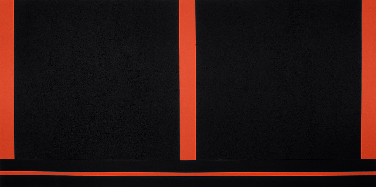
Diagrams can be used to demonstrate concepts as well as make data more understandable. Some abstract images such as Peter Halley's paintings were designed to function as diagrams, his work illustrating for example Foucault's ideas of the panopticon or how power works.
Peter Halley: Prisons
Two Cells with Conduit
In response to Baudrillard’s exploration of postindustrial culture, in particular its reliance on information systems, media representation, and an economy that privileges images, Halley moved on from prison diagrams to schematised depictions of enclosed spaces, linked to the world through a network of electronic and fiberoptic conduits. The division of Two Cells with Conduit into two rectangles suggests an architectural division as in two flats next to each other; the line below indicates the hidden, technological underworld of pipes, cables, and wires connecting them.
Patricia Reed has recently produced a body of work designed to be diagrammatic representations of capitalist networks. I mentioned Hans Haacke and Mark Lombardi in a recent post and Reed has in effect picked up their approach and moved it on as she looks at more overall conceptual issues rather than the very specific examples of networks that Haacke and Lombardi researched. She has also hosted a series of gallery talks whereby questions are asked of invited speakers, who are asked to open out and explore problems in an open ended way, much in the same way that her diagrammatic drawings do. Her practice therefore opens out beyond the diagrammatic and includes performative and relational practices.
Although the sound is of poor quality this video is a good introduction to the way Patricia Reed works.
Patricia Reed
Reed's work reminds me of the way several contemporary thinkers use diagrams to communicate their ideas. Compare her work to Kate Raworth's 'Donut Economics'.
Kate Raworth wants to effect change, and so does Patricia Reed. The fact that Raworth is called an economist and Reed an artist doesn't matter to me, both use images to communicate ideas.
Beat the Whites with the Red Wedge: El Lissitzky 1919
Beat the Whites with the Red WedgebyEl Lissitzky is a Constructivist abstract work that is set out like a diagram, representing communist forces attacking the forces of reactionary white Russia. It could be argued that Patricia Reed's work has a historical lineage that could be traced back to Constructivism.
Minjeong An: Self portrait as a diagram
Minjeong An uses the conventions of technical drawing to create complex layered images of herself. (If you are looking at this on a large computer screen, it is well worth clicking on the image to blow it up in size, so that you can explore its complexity) These are representations containing both symbolic and real references to her life. It is interesting to compare her images with those of Luboš Plný, who uses anatomical diagrams as references for his own complex images. What Minjeong An reminds me of however is the importance of annotation and how it is done.
Matthew Rangel
Matthew Rangel uses annotation within diagrammatic forms to add information to his landscape images, the diagram demonstrating its versatility and ability to become entangled in with other forms of representation.
I have also made use of diagrams in some of my recent work.
Life Hacks for a Limited Future
The diagram immediately above is based very loosely on an idea of a scarab beetle, and it attempts to help the Life Hacks group think about the opportunities and threats that face a group of people getting older. Sometimes the problem is to find a more 'mythic' or emotionally loaded image for my artwork as I'm attempting to communicate how people feel about things, but at other times when I'm working with a group of people to help sort out an idea, its more about trying to help people think. Neither is more important than the other, when I'm image making sometimes it has a more practical outcome and at other times the process of making images is more about opening up ideas.
Diagram of a slave ship
Some diagrams are more emotive than others. The diagram of a slave ship above is a straightforward, plan, elevation and cross section, but it was images like this that were central to the abolition of the slave trade. The lack of emotion somehow seemed far more powerful as ammunition, it being hard to escape the reality of what life must have been like on boats of this sort, when you see clearly how much room each person had for the duration of a trans-Atlantic sea crossing. The meaning is the use.
To go with the image above here is some data: The image above is of a partial map of the Internet based on the January 15, 2005 data found on opte.org. Each line is drawn between two nodes, representing two IP addresses. The length of the lines are indicative of the delay between those two nodes. This graph represents less than 30% of the Class C networks reachable by the data collection program in early 2005. Lines are color-coded according to their corresponding RFC 1918allocation as follows: Dark blue: net, ca, us Green: com, org Red: mil, gov, edu Yellow: jp, cn, tw, au, de Magenta: uk, it, pl, fr Gold: br, kr, nl White: unknown. Notice how quickly we find ourselves having to research around the information just to get a basic handle on what is going on. For instance if I want to find out what is the RFC 1918 allocation? This is the answer: Request for Comment 1918 (RFC 1918), “Address Allocation for Private Internets,” is the Internet Engineering Task Force (IETF) memorandum on methods of assigning of private IP addresses on TCP/IPnetworks. Along with NAT (network address tunneling), RFC 1918 facilitates expansion of the usable number of IP addresses available under IPV4, as a stopgap solution to prevent the exhaustion of public IPs available before the adoption of IPV6. It’s not necessary to register private IPs with a Regional Internet Registry (RIR), which simplifies setting up private networks. RFC 1918 was used to create the standards by which networking equipment assigns IP addresses in a private network. A private network can use a single public IP address. The RFC reserves the following ranges of IP addresses that cannot be routed on the Internet:
10.0.0.0 - 10.255.255.255 (10/8 prefix)
172.16.0.0 - 172.31.255.255 (172.16/12 prefix)
192.168.0.0 - 192.168.255.255 (192.168/16 prefix)
IP addresses within these ranges can be assigned within a private network; each address will be unique on that network but not outside of it. Private IP addresses can't be communicated with directly by external computers because they are not globally unique and, as such, not addressable on the public Internet.
Computers on the inside of the network can communicate with the Internet through NAT. NAT translates an IP address used within one network to a different IP address known within another network. Typically, a company maps its local inside network addresses to one or more global outside IP addresses and unmaps the global IP addresses on incoming packets back into local IP addresses.
From: https://whatis.techtarget.com/definition/RFC-1918 Each element of the explanation has another area of information attached or linked to it, so that if I wanted to I could mine more and more information and have more and more data available to me. But in doing this do I actually 'know' anything more? The image that accompanies the text is a now archaic map of only part of what was then the Internet. But it was already so complex that it began to resemble the way both a brain is interconnected and the way that a fungal network can connect a forest into its soil system.
How a fungal network works.
As complexity increases there are underlying mathematical laws that will direct the maximum number of connections possible within a given possible space. This means that certain forms will become apparent when certain types of processes are in evidence. Data mapping is central to our ideas of connectivity and the forms that data mapping take are reflections of how we organise information. Timothy Morton calls these huge complex things when they get too big to hold in the head, 'hyper-objects' and reminds us that even though these things are too big to understand we can grasp certain bits of them as they open out into our small area of action, so do not despair, there will always be things we can act upon. How interesting that these forms are often similar to an animal's central nervous system. The body is again a reference point and we are reminded that whether we are looking at how brain synapses communicate or how the Internet develops complexity, there will be an underlying mathematical beauty. The way that data quickly makes things appear as if they are lost in a network of connections was something Mark Lombardi found fascinating and he was excited by the challenge of how to reveal what lay behind the complexity.
Mark Lombardi, Bill Clinton, The Lippo Group, and Jackson Stephens of Little Rock, Arkansas (5th Version), 1999 (found at artcritical.com)
Mark Lombardi highlighted the way that data could be both informative and aesthetically beautiful. Lombardi, who died in 2000, researched and then diagrammed the interrelationships that he found existed between those murky international agents and financial institutions that we sort of know are somehow linked up, but have never had the time or energy to find out for ourselves. His drawings trace out the complex paths of shadowy deals and transactions between the world’s power brokers. Part-data visualisation/part-investigative reporting, Lombardi’s practice illuminated the networks that often lie hidden but which facilitate the operation of complex aspects of human society. Just as mycorrhizal fungal networks are necessary for the facilitation of natural ecosystems, certain types of financial game players are necessary for the construction of Capitalist systems. By looking at Lombardi's drawings as if they are 'not just human' i.e. a result of a particular set of interactions, you can read them as an aspect of the material semiotic, and question notions of intentionality. So instead of worrying about global conspiracy theories, you could read his drawings as complex networks of human and nonhuman agents. (This way of thinking about his work allows us to link his work to the theories of people like Karen Barad and other object orientated ontological theorists) As Meredith Kooi states; 'Barad writes in Meeting the Universe Halfway that “the very nature of intentionality needs to be rethought” because “intentions are not pre-existing determinate mental states of individual human beings”. Rather, we need to see that “intentionality might better be understood as attributable to a complex network of human and nonhuman agents”. See Kooi's full article here.
Click on image to enlarge
Lombardi's diagrams rarely if ever include non human actants. They reflect the fact that as Timothy Morton puts it, "Quite a long time ago humans severed their social, philosophical and psychic ties with non-humans." (Being Ecological, p.67)
Above and below ground
Similar to the diagram immediately above, Lombardi's work reveals what we suspect must be there but that we don't really 'see'. We are ourselves interconnected in very complex ways, but our place within everything else is exponentially more complexly interconnected.
Much of Lombardi’s practice was research-based, with the information he sourced written down on index cards. There is an overlap therefore between work of this sort and artwork that is focused on documentation. The frayed edges between different disciplines and approaches to art making perhaps being where the real 'friction' and 'heat' is being generated by contemporary artists.
As an artist that uses narrative I also like the fact that Lombardi’s drawings are “narrative structures” each network drawn conveying a story. The gallerist Deven Golden had this to say about how Lombardi got started:
[He was] talking to a friend of his, a lawyer, in California. Mark was telling him about a couple of banks that had closed in Texas, and the lawyer said, “Yeah, and because of that, these Savings and Loans closed in California.” And his friend proceeded to tell him how a series of byzantine corporate connections tied the various financial institutions together. It was very convoluted, and so Mark made some notes—he obviously was predisposed to thinking about this sort of thing. As Mark told it to me, it was kind of like how some artists . . . do the New York Times crossword puzzle in their studios to help them clear their minds. Anyway, every couple of days, after going over his notes and diagrams, he would call his friend back and ask him more questions, which would lead him to make more diagrams. Then, one day, after what I understood to be a couple of months of working on these diagrams to “relax,” Mark had this “aha!” moment . . . The diagrams were more visually interesting than his paintings. And, perhaps just as importantly, they pulled together everything Mark was interested in—drawing, social/commercial interactions and their hierarchies, and politics—into a single pursuit.
I really liked this quote, because it reaffirmed for myself how many things begin simply by having a chance conversation with someone. The difference of course is that Lombardi was both prepared to put time into making the initial diagrams and had enough experience to recognise that what he was doing was more interesting than the paintings he was making.
Click on image to enlarge
Lombardi developed his work in a time before computer generated imagery became the norm. We now have a heightened awareness of how data is mined and shaped in order to manipulate us. I have suggested a few times above that the complexity that really exists lies far beyond how humans interact with each other but how to demonstrate this in the form of made objects is much harder. I will therefore end this post with looking at one example of building complexity from a very simple starting point and ask you to think about the implications of using this type of approach to visualising your own research.
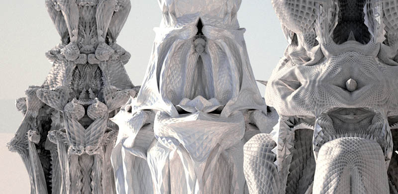
Michael Hansmeyer
Architect and programmer Michael Hansmeyer has made beautiful complex columns that can be laser cut from stacked cardboard sheets. Although this project is now several years old, (it was from back in 2011), the implications of making forms based on growing complexity in a similar way are still relevant. His project was centred on the conception and visualisation of a new architectural column order based on subdivision processes. What interested me was first of all his choice of a column. The column is central to the architectural imagination and identifying types of columns were one of the ways that you could identify the ages of buildings.
Classical column types
However the first columns would have been trees cut down to make buildings and their memory is still engrained in the forms taken by the stone carvings. This interrelationship between biology and architecture being at one time something that would have been vital and now I believe being something that we need to revisit if we are to remind ourselves how interconnected we are with everything.
The backbone column
Our backbone allows us to stand and takes huge strains in doing so. It has evolved over millions of years and in its own internal structure reveals how complexity can evolve out of simple divisions.
Internal structure of bone
Hansmeyer's work creates images that both work as columns and work as triggers for our imaginations, reminding us of how we are like columns too, as well as showing how complexity can be arrived at simply by creating subdivisions.
An abstracted doric column was used as the input form (data) to the subdivision processes. Data about the proportions of the the column’s shaft, capital, base fluting and entasis was entered into a computer program. The input forms were tagged to allow the subdivision process to distinguish between individual components. This allowed a diversity to be developed but certain factors such as overall proportions and sizes were kept to ensure an overall coherency and continuity. The ornament developed by controlled subdivision is in a continuous flow, yet it consists of very distinct local formations. The complexity of each column contrasting with the simplicity of the subdivision generative process.
Cutting the layers from cardboard sheets
Each subdivision takes place within a two-dimensional plane which gives a constantly changing drawn cross-section of the evolving column and like a 3D print, as each section is made it can be added to the next in order to create a column.
2D sections of an evolving column
Once the process begins it reveals the organic nature of branching complexity based on sub-dividing column dimensions, something that we can intuitively understand as being akin to how natural evolution might work.
Computer visualisations of column possibilities
Finally we have a series of structures not unlike the imaginative organic structures envisioned by Gaudi.
Gaudi: Sagrada Familia
Stuttgart airport
The principle of subdivision and the idea of the tree as a column and support structure is seen here again in the biomimicry of the internal construction of Stuttgart airport.
I'm ending up in a territory between design and fine art and once more I would like to make an appeal for the removal of sharp divisions between disciplines, divisions that I feel strongly are artificial and lead to confusion and the compartmentalisation of experience. If we are to ever repair the severed social, philosophical and psychic ties with non-humans, perhaps we ought to begin with repairing the severed connections between art and design and begin the process of healing the old art and science divide.
References: Barad, K (2007) Meeting the universe half-way New York: Duke Press Morton, T (2018) Being Ecological London: Pelican Morton, T (2013) Hyperobjects London: University of Minnesota Press