
Peter Halley 1981

Peter Halley: Prisons
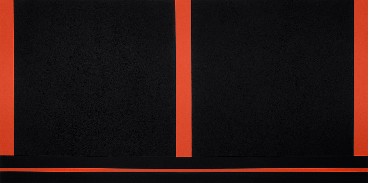
Two Cells with Conduit
In response to Baudrillard’s exploration of postindustrial culture, in particular its reliance on information systems, media representation, and an economy that privileges images, Halley moved on from prison diagrams to schematised depictions of enclosed spaces, linked to the world through a network of electronic and fiberoptic conduits. The division of Two Cells with Conduit into two rectangles suggests an architectural division as in two flats next to each other; the line below indicates the hidden, technological underworld of pipes, cables, and wires connecting them.
Patricia Reed has recently produced a body of work designed to be diagrammatic representations of capitalist networks. I mentioned Hans Haacke and Mark Lombardi in a recent post and Reed has in effect picked up their approach and moved it on as she looks at more overall conceptual issues rather than the very specific examples of networks that Haacke and Lombardi researched. She has also hosted a series of gallery talks whereby questions are asked of invited speakers, who are asked to open out and explore problems in an open ended way, much in the same way that her diagrammatic drawings do. Her practice therefore opens out beyond the diagrammatic and includes performative and relational practices.


Although the sound is of poor quality this video is a good introduction to the way Patricia Reed works.
Reed's work reminds me of the way several contemporary thinkers use diagrams to communicate their ideas. Compare her work to Kate Raworth's 'Donut Economics'.

Kate Raworth wants to effect change, and so does Patricia Reed. The fact that Raworth is called an economist and Reed an artist doesn't matter to me, both use images to communicate ideas.

Beat the Whites with the Red Wedge by El Lissitzky is a Constructivist abstract work that is set out like a diagram, representing communist forces attacking the forces of reactionary white Russia. It could be argued that Patricia Reed's work has a historical lineage that could be traced back to Constructivism.

Matthew Rangel uses annotation within diagrammatic forms to add information to his landscape images, the diagram demonstrating its versatility and ability to become entangled in with other forms of representation.


See also:


Although the sound is of poor quality this video is a good introduction to the way Patricia Reed works.
Patricia Reed

Kate Raworth wants to effect change, and so does Patricia Reed. The fact that Raworth is called an economist and Reed an artist doesn't matter to me, both use images to communicate ideas.

Beat the Whites with the Red Wedge: El Lissitzky 1919
Beat the Whites with the Red Wedge by El Lissitzky is a Constructivist abstract work that is set out like a diagram, representing communist forces attacking the forces of reactionary white Russia. It could be argued that Patricia Reed's work has a historical lineage that could be traced back to Constructivism.
Minjeong An: Self portrait as a diagram
Minjeong An uses the conventions of technical drawing to create complex layered images of herself. (If you are looking at this on a large computer screen, it is well worth clicking on the image to blow it up in size, so that you can explore its complexity) These are representations containing both symbolic and real references to her life. It is interesting to compare her images with those of Luboš Plný, who uses anatomical diagrams as references for his own complex images. What Minjeong An reminds me of however is the importance of annotation and how it is done.
Matthew Rangel
I have also made use of diagrams in some of my recent work.
Life Hacks for a Limited Future
The diagram immediately above is based very loosely on an idea of a scarab beetle, and it attempts to help the Life Hacks group think about the opportunities and threats that face a group of people getting older. Sometimes the problem is to find a more 'mythic' or emotionally loaded image for my artwork as I'm attempting to communicate how people feel about things, but at other times when I'm working with a group of people to help sort out an idea, its more about trying to help people think. Neither is more important than the other, when I'm image making sometimes it has a more practical outcome and at other times the process of making images is more about opening up ideas.
Diagram of a slave ship
Some diagrams are more emotive than others. The diagram of a slave ship above is a straightforward, plan, elevation and cross section, but it was images like this that were central to the abolition of the slave trade. The lack of emotion somehow seemed far more powerful as ammunition, it being hard to escape the reality of what life must have been like on boats of this sort, when you see clearly how much room each person had for the duration of a trans-Atlantic sea crossing. The meaning is the use.
See also:
A very good introduction to ways of thinking about data in order to make change


