Sunday, 17 March 2024

Carlfriedrich Claus and Sprachblatt


Carlfriedrich Claus's sprachblatt or speech sheets, are forms of a writing/drawing mix, whereby text is fused with texture, and as you stand away from the image, texture begins to dominate text, but as you focus in, text becomes more important. So for instance at the scale of screen reproduction texture is more immediately apparent and the image can be read as a visual sound.


The use of language in visual poetry was a specialty of Carlfriedrich Claus, who developed his work in the early 1960s. He believed that the 'naturalised individual’ ought to live in harmony with a 'humanised natural world’ and his ideas mix European philosophy with Eastern mysticism and the writings of Marx. His text-drawings, often drawn on both sides of transparent sheets, illustrate both the processual and dialectal approaches to his ideas. For instance you might get two pages that set out a thesis and antithesis in order to arrive at some sort of synthesis; however no matter how hard you try to 'read' these images, it is hard to avoid the sense that their meaning will always be hidden. 

'Aurora’ (1977)

This is how Claus wrote about his processes: "The production of speech sheets and of phoneme processes ran parallel. The speech sheets arose through my experimental use of my left hand (I am right-handed), and in doing so I noticed, first, the formation of internal blockages, like a psychological stuttering, and second, a different coloration of the content of my thought. (…) These phoneme processes or speech operations are not speaking in the sense of phonology, in which the specific scaffolding of a natural language must precede each act of speech. Here, the whole point is to break through this scaffolding, to break out of it or out of the prison of natural language, which determines in great part our relationship to the world. (…) Basically, the 'phoneme aggregate' suggests to the listener that he experiment with his own organs of speech and that he explore how various sounds, consciously articulated, affect his psychological state."

Carlfriedrich Claus: installation in the former Reichstag Building in Berlin

Carlfriedrich Claus at work

However it is in the work he did with sound that I think has the most potential to be revisited and thought about as a stimulus for students interested in contemporary drawing. Claus had been working on an installation from the 1950s to the 1990s, which addressed language as a written image and sound process. 'Lautaggregat K' used a spatial layer of sound, forming a 'sound aggregate', originally used for a WDR radio play, using a special stereophonic system; this sound material then forming the basis for a 1995 installation, in which several speech processes ran in parallel and were mixed at an editing desk. These layers of sound corresponded with the writing images, that were spatially arranged on transparent surfaces. The subject of the text dealt with philosophical themes, while the sound process itself was intended to be experienced physically. These two normally separate experiences, the intellectual and the physical being brought together.

Carlfriedrich Claus: sound processing room 1995

In his work there was a constant dialectical flip between reading, hearing and looking and he stated that his works aimed to impregnate ‘ways of seeing with lingual thinking’.  Perhaps I have been reminded of his work because Sue has begun working towards a PhD and she was looking at how work she had done in the past when curating sound artists, is now being archived. Sometimes our interests feel very different, but they also touch at sometimes unexpected points and this work of Claus's is I think an interesting case. He now has his own archive, where his acoustic work is available on 15 reel-to-reel tapes and 267 cassette tapes and it would be interesting to see what issues and problems the archive has faced in reconstructing experiences of his work for those who visit. 

The move towards a gesamtkunstwerk, whereby various elements of an artwork come together to create a totality, is something that at one point or another many artists consider, because by the nature of things artists try out various approaches to communicating related ideas. This often leaves you with a diverse body of work that only seems to make sense when the various elements are collected together. For myself the drawings Claus produced make far more sense when coupled with the sound pieces he made. I think in my own case my drawings make more sense when shown alongside my ceramics, prints and written work, but how to organise all the elements is at present something I'm not sure how to do, I need curatorial advice. 

Monday, 11 March 2024

Old and new traditions

Tenmyouya Hisashi: RX-78-2 Kabuki-mono 2005 Version

I've posted a few times on other cultures and traditions, and the posts have tended to concentrate on the past and the historical legacy that comes with being part of a different culture. However there are other stories and one of the most common is how tradition and contemporaneity coincide. The Japanese artist Tenmyouya Hisashi for instance uses tradition to reflect on contemporary life and at the same time question the notion of tradition itself. His work questions what traditional culture is, not just in relation to Japan but everywhere.

When my son was a young boy he was fascinated by Transformer toys. The Transformers toy line was created by the Japanese company Takara and was initially marketed in Japan under the names of '
Micro Change' and 'Diaclone'. In 1984, the US company Hasbro bought the distribution rights to these toys and re-branded them as 'The Transformers' for a North American audience. The designs for the original figures, all of which could transform from one thing such as a car, aircraft, gun or even a cassette into robots, were made by Japanese artists such as Shōji Kawamori, (who was probably the most well known), but also designers such as Kouzin Ohno, (Ironhide, Jazz, Starscream) and Takayoshi Doi, who designed the Dinobots. I was at the time fascinated by the Insecticons who were designed by Takashi Matsuda. I thought I could see traces of Egyptian scarab beetle sculptures in their design; a design that was constructed so that these toys could transform from insects into robots. 

Egyptian scarab 

Bombshell Insecticon 

Takashi Matsuda also came up with the form of Megatron, a robot that could also transform into a gun. All of these toys had one thing in common, they could take on more than one identity. A tiny insect could morph into a giant robot, size constancy didn't seem to be a problem for a child's imagination. 

The cultural tradition young boys were growing up with in the 1980s and 90s was definably Japanese, especially as Nintendo released their Gameboy in 1990 hot on the heels of the Transformers coming to the UK. Culture within the commercial world of capitalism is global. Hasbro needed English names and associated back stories for the characters, so that they could be marketed to English speaking customers with a narrative that was understandable in relation to Western young boys and their interests and so they approached Marvel Comics and Bob Budiansky was given the job. He conceived the names of many of the original Transformers that would be then released onto the American and European markets, such as Megatron, Ratchet, Starscream, Sideswipe and Ravage. He also wrote the vast majority of the descriptive "tech spec" biographies printed on the Transformers' toy packages, giving each figure unique personality traits in the same way that Marvel superheroes such as Spiderman were constructed. In this way two cultures were blended, the world of Japanese toy design and the superhero world of American comics. The fusion would of course result in Marvel releasing another comic title, The Transformers'.

From Transformers the comic

You can easily spot the historical references in the design of the robot forms.

Traditional samurai armour

Tenmyouya Hisashi

Tenmyouya Hisashi's images illustrate the 'mash up' of traditions that occur as hybrid global cultures emerge. In 2006 the Japanese football team had qualified for the football world cup which was held in Germany. A game originally invented in England, now belonging to a world wide culture, a game that now represented serious international money and that also wanted to celebrate the inclusion of specifically recognisable 'other' cultures as proof that the game was now global. Tenmyouya Hisashi's images were perfect illustrations of this and his work was chosen as one of the posters that celebrated the event. The use of traditional gold leaf backgrounds to his images, now also signifying the background of wealth that at the time surrounded world football. His 'RX-78-2 Kabuki-mono' image of a Transformer toy, constructed again on a gold leaf background and this time with a traditional dragon wrapping itself around the robot, fuses the old and new traditions together in such as way that we are reminded that the robot's design is based on ancient Japanese warrior costumes. 

The robot within Japanese culture is particularly fascinating. It is an object that generates meaning for its Japanese observers and participants within a tradition that is specifically Japanese. Shintoism has been followed in Japan for over a thousand years and it is a religious tradition that embraces animism. Spirits or kami, can be seen to inhabit animals, natural features like mountains and many other non-human things. Therefore the idea of a robot being able to be animated by human like attributes was more easily assimilable by Japanese culture. There had also been a long tradition of automata using clockwork mechanisms. The term 'karakuri ningyō' refers to a variety of clockwork automats created in Japan during the 17th century.
Karakuri = ‘mechanism’ or ‘trick’ / ningyō = a puppet.

Chahakobi ningyō

A chahakobi ningyō or miniature tea server, was made in the 19th century by Hisashige Tanaka, founder of the Toshiba Corporation which would eventually become a diversified enterprise involved in electronics, electrical equipment and information technology and which is still based in Minato-ku, Tokyo and they of course now make robots for industrial use. 
The Toshiba Corporation website includes video demonstrations as to how its latest robots can do the work that used to be done by humans. 

Current Toshiba Corporation video of robot use

The next step up in technology to be used to make automata after clockwork was inflatable rubber tube hydraulics. Gakutensoku, a humanoid robot built in 1928 by Nishimura Makoto, used this technology to tilt its head, move its eyes, smile, and puff up its cheeks and chest. It was also programmed to use calligraphy skills. It has recently been reconstructed and a new computer-controlled pneumatic servo system has been designed to keep it going over 90 years after it was first put into operation. What was fascinating about 
Gakutensoku, was that this was a very early attempt to give human expressions to a robot and cemented the idea into modern culture of robots often being humanoid in form. For myself, I have tended to see this as a continuing form of animism and often think of these forms as being similar to pre-historic shamanistic figures, such as the one illustrated below of a bee faced Algerian shaman figure, that has mushrooms growing all the way around it. This might of course be an indication of early drug use, something that might have helped the shaman get deeper into character. The final form is another hybrid one, an image that suggests that the sharp differences between humans and other creatures is not as sharp as we think it is. 

Gakutensoku’s head could express human affect

An ancient Algerian shaman figure

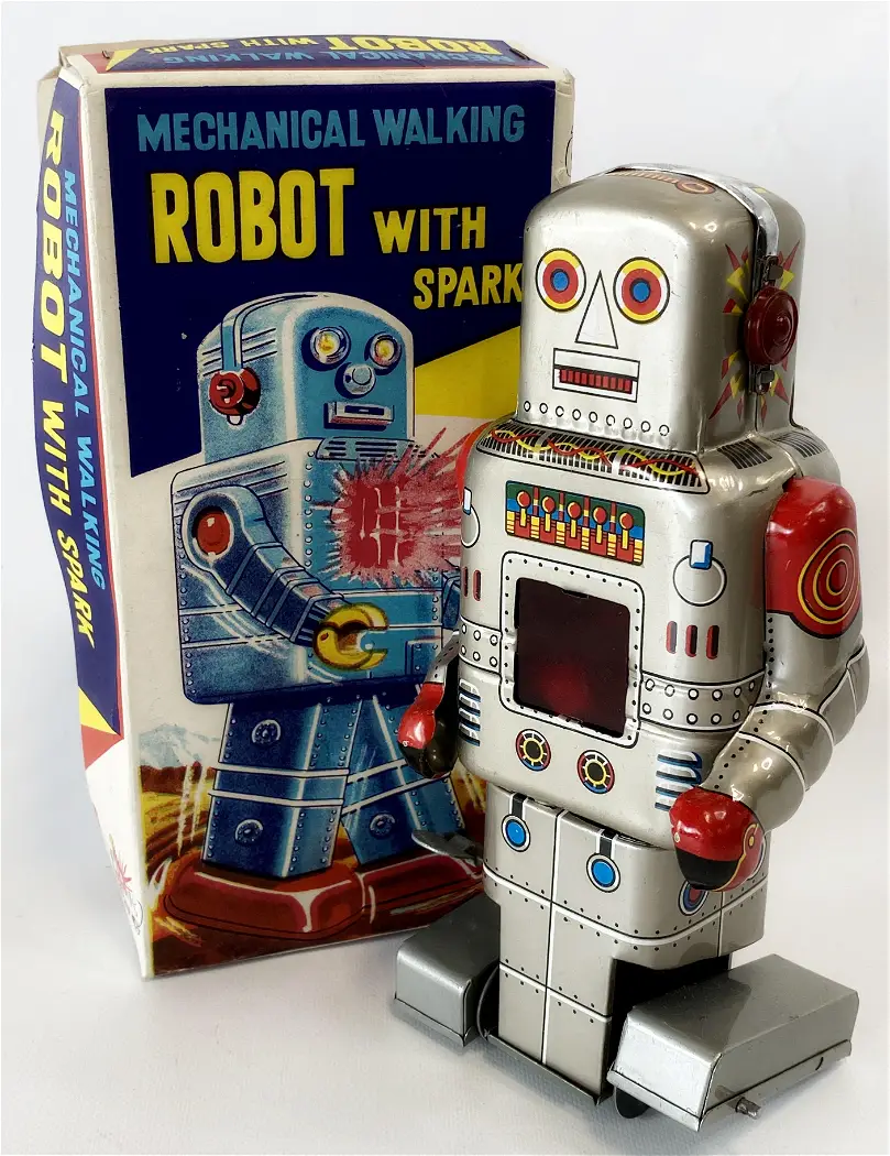
Robots had gradually entered Japanese culture, and there was less of a worry in their society about how their introduction might effect our human lives in the future. Perhaps because they had had to deal with the aftermath of the atomic age of science fiction becoming atomic bomb science fact, the society was much more open to future casting, whatever the reason, the first mass-produced mechanical toy robots were built in Japan following World War II. These wind-up robots, typically made from tin and brightly coloured, captured the world's imagination and were the first step in the development of a new hybrid culture, whereby robots took on humanoid forms. 


Samurai armour the traditional form behind the modern icon

By the time that films such as Pacific Rim came out in the 21st century, the visual idea of what a robot should be like had been fixed, its Japanese lineage now locked fast into a global idea. 

Design for a giant robot for the film Pacific Rim 

Another culture has been mixed into the hybridity in the image above, that of the engineering 'blueprint'. This is used to give 'scientific veracity' to the design. A design which itself relies heavily on the ideas that came out of Japan in the 1980s, the forms and shapes of which were rooted in traditional samurai armour. The following my nose 'logic' of this post seems to be outlining a post-modernist idea of culture, but I didn't set out to imply that this was what I thought contemporary society was about. I was simply trying to unpack a few thoughts set into motion by looking at some Tenmyouya Hisashi images. As students sometimes it is worthwhile doing the same thing and what it often reveals is the importance of children's culture on what will become an adult world. When I asked the highly regarded contemporary sculptor Thomas Houseago where he thought his main sculptural ideas came out of, he told me that Sesame Street was right up there as one of his main influences. 

Oscar the Grouch in Sesame Street 

Thomas Houseago

For myself it was perhaps Sooty and The Flowerpot Men that have stayed with me all these years, which were, it could be argued, deeply animist ideas as well. In fact at one point I tried to bring images from the two worlds of puppets and humanoid robots together, fused around a memory of when my mother worked as an usherette in the Gaumont Cinema in Dudley during the late 1950s. I found the film so frightening, I had to get my Sooty puppet to watch it instead. 

Sooty watches 'The Day the Earth Stood Still'

I'm now living in an age that recycles the remains of the culture of my youth. Little Weed from the 1950s TV series 'The Flowerpot Men' seemingly a much more threatening thing now than she was at the time; she is no longer the polite weed of yesterday. In a time of global warming and ecological disaster, the taking seriously the life of a weed, seems so much more important and her sagacious advice to the flowerpot men, now seems more like a metaphor and a parable for about how we should have been listening much more closely to nature in the past, and that if we don't in the future, all of us will find ourselves redundant not just 1950s children's puppet shows. 

Little Weed from the Flowerpot Men

Capitalism is driven by a constant need for new forms, so what is current for one generation is totally outdated by the time the next generation comes through. This is something most of human society historically would have found very strange. In the distant past change was very slow and your grandparents' culture would have been virtually the same as the one you would experience. However our propensity for an animist relationship with non human things still remains a powerful force, so I am hopeful that we might eventually begin to treat the world as a living, complex entity, rather than a resource to buy and sell. We still have to deal with our existentialist angst and buying new things never did bring happiness, but reflecting on these issues can at least bring us some sort of awareness and in awareness lies knowledge and in knowledge lies wisdom and in wisdom lies the overcoming of the sadness caused by desire.

Wednesday, 6 March 2024

Johan Creten: Ceramics and drawing


Johan Creten

Johan Creten: Exhibition view

Johan Creten was making ceramics before clay became a fashionable material for fine artists; so he commands a certain respect for working with these materials for so long. However it is his drawings that I want to showcase for this blog, especially as I'm also someone who makes ceramics and draws. However, unlike myself, he treats the drawn element of his work as a discrete area of practice. Each drawing is a stand alone image, one that often occupies the space of drawing in a similar way to how his ceramic objects occupy architectural space. But as soon as I write this, I realise that he can also occupy space in a more painterly way. Whichever way is foregrounded, I think its worth having a look at the relationship between his drawings and his ceramics, even if only to help myself think through how and why I use the same materials. 


In the drawings above it is a sense of insides shaping outsides that most interests me. They feel as if the internal marks compact together to locate the outside. In this way I personally then find these drawings excellent vehicles for carrying human form. Instead of thinking of drawing a body from the outside appearance, it helps me to think that you could draw a body by using internal analogies, some marks being bones, others muscles and others internal organs. 


Johan Creten: Drawings

There is a blunt directness about his drawing that I find very powerful and he uses the materials of drawing in such a way that they remain what they are, whilst also being able to represent ideas for ceramics. 

Johan Creten: Ceramic forms

Creten works on a scale that is a reflection of his status and now works in bronze as well as clay. I am very aware of the type of technical support and equipment needed to make ceramic and cast metal objects of this size. It is perhaps best if I therefore concentrate on presenting his drawings rather than his sculptures. In fact I find some of his sculptures overly finished and too predictable. He has achieved a high level of control over the years and I'm very aware that in my own ceramic work I don't have that control but its the surprise of not knowing that keeps things fresh for myself and I still see that in his drawings.

Ceramics Now has an article about his recent work which you can access here.

See also:


Tuesday, 27 February 2024

R.I.P. Deanna Petherbridge

Camp Covid , 2020 - Deanna Petherbridge

Deanna Petherbridge was one of those people who you could not avoid if you were interested in drawing. I met her several times and she always carried herself with great dignity and she provided a deep pool of intellectual resources from which you could tap into and draw from many different streams of thinking about drawing. I was therefore saddened to hear that she had recently died.

I first came across her large pen and ink drawings in the 1980s and was impressed by her conviction that drawing was something that could carry serious ideas. At that time drawing was still seen as an adjunct to painting or sculpture, something you did whilst you were thinking about how to compose an image or how to fit components together and it was in the world of the sketchbook or notebook that drawing belonged. This together with the demise of objective drawing as an essential tool of the artist, meant that if you drew, you were 'just' someone who did 'works on paper'. This of course meant that very few drawings were ever seen as being worth anything; unless of course they were by Leonardo or Michelangelo and oil painting seemed to reign supreme as the only form of art serious collectors wanted to invest in. As someone raised on a diet of conceptual art, I was always attracted to drawing as a form of thinking tool and often felt that too many paintings were empty gestures or examples of poor or impoverished thinking. I would often prefer a 3 by 3 inch drawn note on a scrap of paper to a 6 foot by 8 foot oil painting on linen canvas.

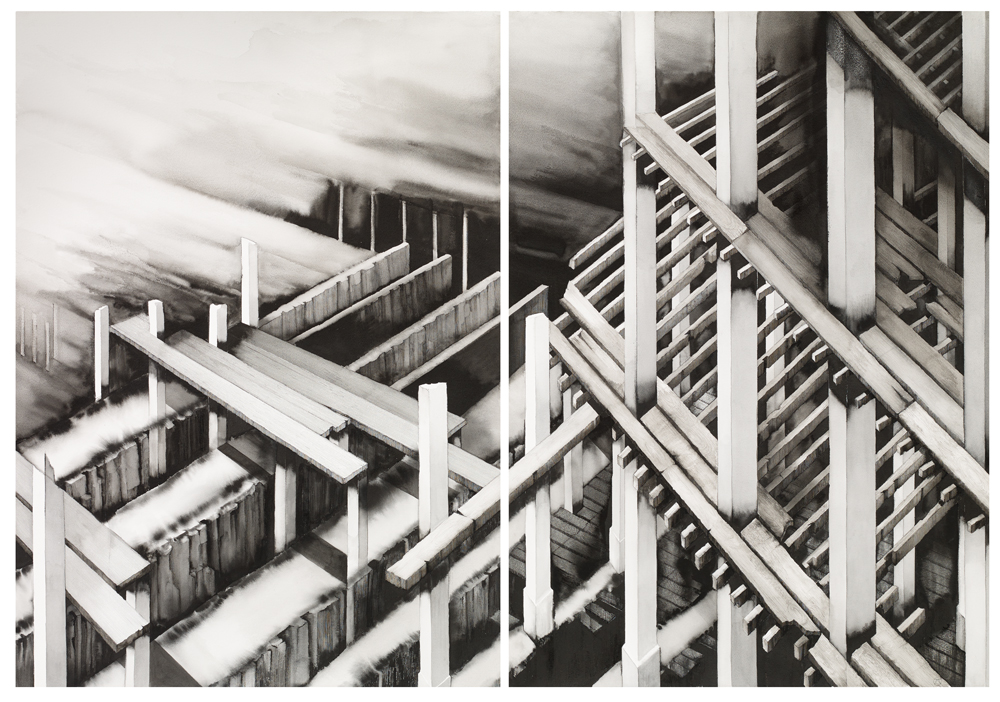
Deanna Petherbridge was one of a group of artists who took drawing seriously and she not only took on drawing as a serious activity in its own right, she also began to write about drawing and its effects, eventually producing the classic textbook on drawing, 'The Primacy of Drawing: Histories and Theories of Practice' (2010) and several essays and commentaries about drawing for the architecturally focused publication 'Drawing Matter'. Her own drawings use imagined architectural imagery as a metaphorical means to deal with complex subject matter about social and political issues and she strongly believed that drawing could deal with and carry the weight of big issues, just as much as any other art form.

Migration 1 , 2018 - Deanna Petherbridge

Petherbridge used images of architecture and mechanical forms often composed as metaphors for the human condition. Her representations of transparency and of other lighting conditions, were often contrasted with deep shadows; her imagery moving between abstraction and representation, in order to create dream-like worlds and sustained visual narratives.

View from Hotel Pandemia, 2020 - Deanna Petherbridge

Petherbridge said she used a straight edge for moral compass and you can see this in most of her drawings, their architecture being given validity by the use of what look like lines made using ruling pens. She will be sorely missed by all those in the drawing community that valued her intellectual rigour and energetic commitment to an often undervalued practice.

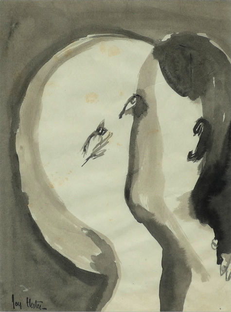
Never afraid of advancing the work of other artists who drew, she helped myself to widen the pool of practitioners that I was aware of, in particular introducing me to the work of the Australian artist Joy Hester. 


Joy Hester

Hester's work reminded me that economy of means didn't have to also mean shedding the awkward juxtaposition of image and gesture and that sometimes the two could be brought together in ways that were both poetic and emotional. 

So goodby Deanna, another person that I knew, who is now sitting on the other side of that thin membrane that stretches between life and death. I have recently had to seriously rethink what I am doing in both art making and in how I have been living my everyday life. I have decided to unravel how my past life still impacts on my present one and in doing so I have also had to consider in much more depth, the impact of day to day decisions on possible futures. This process has of course had to include a deeper awareness of mortality, not because I have some sort of immediate concerns about my health, but simply because a full awareness of life is impossible without an acceptance of its coming to an end at some point. 

Deanna Petherbridge: The Destruction of Palmyra, 2017. Pen and ink on paper, Triptych.

Deanna was slightly older than myself when she drew '
The Destruction of Palmyra', an image that is a meditation on the destruction by Islamic fundamentalist groups of ancient artefacts found in archeological sites. Whether these attacks on culture are made by religious fanatics or far right fundamentalists doesn't really matter, what does matter is that Petherbridge's drawings remind us that artistic freedom is a hard won thing and that it is so easily lost. Petherbridge's life was centred on a belief in the power of images to help us see what we sometimes don't see and in that she leaves a powerful legacy, I hope that in another hundred years what she stood for will still be something that makes sense and is recognisable as being worthwhile. 

John Berger put his take on mortality slightly differently. When remembering the comedian Harry Champion, Berger would quote his catchphrase, "Life is a very hard thing. You never come out of it alive". 

See also: 

An online catalogue of the Step and Stair Exhibition at the Art Space Gallery: A memory of the only time I exhibited in an exhibition alongside Deanna Petherbridge

Friday, 23 February 2024

Stained glass: The leading sessions

The workshop sessions involving leading were done as a block because I was going to take up quite a lot of room and the sessions needed to be fitted in around other classes. I was meant to do this the first week of January, but I was still in recovery mode after being knocked down by a car. When a time slot was next available I had the beginnings of a chest infection; however because slots are hard to come by, I decided to carry on anyway as the cold out of which the infection grew was hopefully well past its contagious phase. This was probably not a good idea, as I found it hard to concentrate and decisions about exactitude were hard to make as my eyesight felt slightly distorted by the infection. I managed three days and learnt a lot about leading, but then had to pack up and take the work away until another free slot could be found. 

Base board

Plywood base board: Detail of surrounding edge

I had to prepare for the sessions by making a board on which to work. I used a thick ply and screwed and glued two strips of wood onto two adjoining sides, in order to make a right-angled 'L' shaped corner, against which I would build the window. It is approximately 3 cms wider and longer than the size of the finished window. I also had to cut the zinc edging frame pieces to size with a hacksaw. (Zinc 'u' section came, 12x5mm)

The first decision is where to start and I had already made my first mistake. Usually the more complex area is where you need to start, but I had fixed the borders of my frame on the opposite side to the one needed if I was to do that. It was a 50/50 decision and at the time of making I wasn't aware it could make a difference but this meant that the complexity surrounding the heel would not be where we could start. 

The next thing was to trim off two edges of my cartoon. Cutting exactly on the line that indicated the zinc came edging, this was going to be my template to work to for the entire window, so needed to be accurate. Once cut it was placed snugly into the right-angled corner of the baseboard. 


Two sides are left uncut, so that they will not be hidden underneath the final construction. This can facilitate the cartoon removal at a later stage.

We needed to start with a border, so we first set out two lengths of the zinc came and then the thicker leading to make the border, as this would strengthen the whole window. 


The previously cut sections of glass that make up the border were checked for accuracy and a couple were rejected, so I had to cut more from existing scrap glass, this was because it's very hard to grind off a thin strip of glass and keep it straight and much easier to recut. Another lesson about accuracy. 

The inside border using the thicker leading is to be staggered rather than simply butted together.
The leading for the inside border is set out as above

The lead is cut with a lead knife. Another tool that I had not used before and which takes a bit of getting used to. 

Lead knife

Horseshoe nails are used to mark the lead for cutting, and for holding the buffers in place

A plastic and rubber headed glazing hammer
Used for nailing and tapping in hard to fit pieces of glass

The lead knife is rocked through the lead came. It is held vertically, (something I again found hard to get right), you apply downward pressure as you rock, being careful not to distort the shape of the soft lead came. Each section is held in tightly by lead came buffers that are nailed into place each time. The buffers also help you measure the length of the lead strips, as they let you know how far the glass will sit into the 'H' section of any chosen lead came. This becomes very important if you are like myself in this case, using several different thicknesses of leading. 

Because of the process of keeping everything nailed tight as you progress, you work out from a corner. 


Lead came cut to size, resting against the zinc came edge

Buffer in place

The first few pieces in place, working away from the corner.

You are constantly grinding down to make sure the glass will fit and although I thought I had by now a good grasp of glass cutting, I was quickly made to realise I was not accurate enough. The trick is to mark the glass to show what you cant see. 

How to mark the glass before grinding

Push the glass into the came 'H' section and make sure it is in as far as it can go along the whole length of the piece. Then using a white or black Sharpie (you need tonal contrast), draw along the line made by the leading. When you take the glass out again, you will see where there are inaccuracies. Look for the thinnest bit and use that as your measure and then mark the glass edge and grind. A small inaccuracy can lead to a large difference later on, so its best to correct each piece as it is put in. This is what was taking the time when I was working on it. It took three days to complete just over half the window. 

The lead came has to be cut accurately and must be butted up exactly to each adjoining piece. If not, when you come to solder it all together the window will have serious structural faults. You must also keep pushing the pieces tightly together and refitting the buffers. A tight fit is going to be essential, so you must keep checking this. 

Three different lead came sizes are being used. The thickest for the edges, then a medium thickness for everything else except for the complex shapes that form Sooty's body and ears. The need for tight curves in order to form the body and ears of Sooty, required the use of the thinnest lead came available. N. b. Each time you use a buffer you must remember which size came to use and it is very easy to just pick up the wrong sized off-cut by mistake. 

Some sections required a different technique. For instance the frit made heel was circular. (See sessions 2 and 3) First of all I had to re-grind this section to make it smoother by removing any bumps from around the edge. Then using the middle grade came leading, a length was cut just a bit longer than needed. This was pushed into the glass all the way round and a plastic fid tool was used to push it in firmly.

Plastic fid

The fid tool is extremely useful, as you use it to keep pushing the lead back into the glass, as well as using it to ensure the 'H' section is kept open enough to ensure the glass sits into it correctly. It has a variegated width, so that sometimes you use the thin point to push in hard and at others the thicker waist section in order to gradually open out 'H' sections. 

Because I was taking so long and was still suffering from the after effects of a chest infection, it was decided to take my work away from the workshop to allow classes that needed the room to be held. This means that I'm not sure when I shall be able to finish this work. Hopefully in the near future I will be able to find a gap that will allow me to finish the work. In the meantime I will invest £75.99 in a water cooled stained glass grinding machine that I found on E-Bay, so that I can finish the work in my studio. 

The process is of course already costing money for materials. For the leading and soldering the materials ordered before the session are set out in the screenshot below. 


All materials above were sourced from Kansacraft, a Barnsley based company. 

See also: