Wednesday, 14 August 2019

Venice Biennale 2019 Part one

I have just returned from my biannual visit to the Venice Biennale and as always have thoughts as to the role drawing is still playing within contemporary art practice. Perhaps this year drawing feels more something that lies under the surface and is less obvious as an art form, but the more I looked about me, I saw drawing as a framework through which many artists had stepped, even though by now they felt it had been left behind. This year's biennale entitled, 'May you live in interesting times' in particular being a fascinating one, because it asks the question, "what purpose can art play when there are so many environmental and political dangers facing the planet?" The lead curator, Ralph Runoff stated that the real purpose of art is that artworks are never reducible to being messages to decipher or comprehend. Art does not give us conclusions but gives us interesting points of departure. That old question, "What does it mean?" is shown to be meaningless, and the biennale sets out to "celebrate artists that work between customary categories". 

My own responses are as always driven by my present interests and therefore my reflections are not really a proper review, but are simply thoughts about things I encountered that made me think about what I am up to. 

The first issue to strike me was that the selected artists in the Arsenale were also shown in the Giardini central pavilion. The issue being that the type of work shown in the one was not necessarily like the work shown in the other venue. For instance, the work of Christian Marclay in the Arsenale was a video projection and in the Giardini large woodcut prints. The old idea of an artist being a painter or sculptor was gradually being let go of and being replaced by an idea of the artist as someone that used whatever was appropriate to get their ideas communicated. Personally I felt this reflected a position that I was very comfortable with and as someone that still uses drawing as a thinking tool, it also helped me to locate my ideas about drawing practice much more clearly. Drawing is something that does not have to be the end result, simply something that is part of a complex process of communication. Sometimes it will have a strong visual presence, but at others it may simply be the way that an artist visualised a future possibility in his or her head. 


Christian Marclay's '48 War Movies' was the first work to get me thinking as I walked around the Arsenale. There were several overlapping issues here for someone trying to think about the continuing relevance of drawing. The first thing that you become aware of is the old fashioned power of a single central point perspective. This is what in effect Marclay has made by inserting one movie inside another and then another and another, each time leaving a thin edge that still keeps running its footage, even though we can only see a tiny strip of what is going on. 


One point perspective

This reveals the tight connection between the idea of the camera and single point perspective. The compaction of 48 movies running at the same time together with the overlaid sound of them, added up to a pretty powerful effect. (If you google 'how to put one video inside another in Adobe Premiere' you will find out how to do this) I found it fascinating that you could work out all sorts of things about each movie from the small amount of information available to you, our perceptual apparatus is very sophisticated especially when it comes to reading images that we are very used to. As a genre 'War Movies' have much in common, but when seeing 48 at once, together with their overlaid soundtracks you can become disorientated, something that I'm sure Marclay wanted to happen, his projection reflecting on our continuing fascination with war and how it can never capture the reality of war's fragmentation of normality. The tiny images in the centre of the film, read as if they were trapped in the net of all the other films, your vision was drawn down into that tiny central world, a world too small to be clearly recognisable, but big enough to communicate its warlike nature. 


Detail


Christian Marclay

In the Giardini central pavilion you could see Marclay's other work, consisting of two large six foot high woodcuts which were images taken from Japanese Manga comics. I presumed the images had been transferred using CNC routing techniques, used to cut out what looked like large plywood sheets. The contrast between the cut out sections that made up the image and the way grain of the wood itself had picked up the printer's ink, was what I found most interesting, as it was the thing that highlighted the specific nature of printing off large plywood sheets. The figures in the prints were screaming but of course silently, this being the nature of the medium. No matter how big you make the prints, no matter how large the printed mouth becomes, it will never make a sound. This was of course the opposite to what was happening with his war movies, the sound in the projection room being at times almost unbearable. 

Ed Atkins was another artist that in being represented by two totally different sets of work demonstrated that he was more interested in getting an idea across than working towards a certain style or overall 'look'. In the Arsenale his computer animations and video installations were the focus and in the Giardini his drawings were spread out and mixed in with various other artists work.
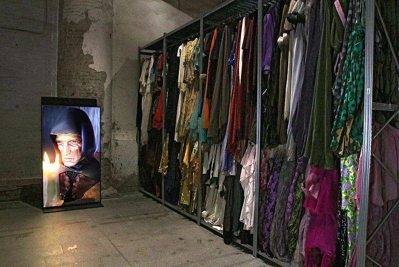


Ed Atkins: Old Food. 2017 - 2019 Video installation

The focus of the various video and installation pieces was I thought very much about role playing. From large scale clothes hangers carrying what appeared to me to be various costumes, some of which looked as if they had been worn in his videos, to the videos themselves and animations that focused sometimes on how we respond in certain cliched ways in times of grief or loss and at others on how the atmosphere of the fairy tale can be used to loop or hold time frozen. 


Ed Atkins

His drawing work as shown in the Giardini was much more traditional, each image including a giant cross spider / human, the word BLOOM emblazoned across every drawing as if it was some sort of logo. The style of drawing was very comic book derivative, suffering from a certain thinness of line I felt, but nevertheless powerful enough to hold their own when seen against various other types of work when they were placed around and about the Giardini central pavilion. The images worked as if they were escaped experiments from some film like 'the Fly'. His moving image works operated to some extent like this too. They felt as if they were brief moments cut from a fairy tale or public information animation. One animation in particular consisted of the making of various sandwiches. The images in this case being of humans making up the various sandwich fillings. Collectively I found the work compelling and spent some time sitting looking at the various video pieces and thinking about how they linked with the spaces made by the large clothes racks. Siting these various video pieces in dark spaces made by these racks was an important part of the overall effect and highlighted the importance of this type of control over the presentation of your work. 

Suki Seokyeong Kang  was using a particular formal approach to 3D drawing, that I have referenced before in the work of Sarah Sze. You link one thing to another by a formal association, such as a line being made of a length of metal at one moment and then it can be extended or linked to another line that may be a decorative element on a surface or a drawing on the floor. However her work also introduced issues related to craft and the blurred line between 'modernism' and design and painting and the found object.


Suki Seokyeong Kang  


In the Arsenale installation, (above) Suki Seokyeong Kang was able to link craft based textiles, design components from manufactured objects, and engineered elements into a flowing series of related forms. The only issue I had was with the devices used to keep the audience from getting too close to the work. They were too formally similar to the aesthetic Kang uses and so interfered with the visual read.


Suki Seokyeong Kang  

In the Giardini she exhibited objects that were more 'stand alone' highlighting the sculptural elements of her practice. However these objects were still in essence 3D drawings. Lines in space made by objects that were sometimes designed and at other times made as craft. For instance in the piece above that uses two circular elements, the top one is woven from a natural material and the object that it sits on is manufactured. The square sections below are made from metal, but with a square of hand made textile sat in the middle of it. Formal symmetry being the device to lock everything into one and differences in manufacture and use being the secondary rhythm that runs through the piece. Kang's much more gentle formal associations were for myself a welcome visual relief, such a pity that the installations had to have those grey stands with wire between in there as well, they were too much of a visual distraction.

Gabriel Rico

It is interesting to compare Kang's work with the work of Gabriel Rico who's small wall drawings made of found materials and tiny neons were on the one hand very much an extension of Paul Klee's exhortation to take a line for a walk, and on the other a celebration of the textural complexity of the city street meets a rural retreat. 


Gabriel Rico

Rico's work was also presented in installation form and in these stripped down situations the connections made between things were as much poetic as they were formal. 

Cameron Jamie first came to attention with his film Kranky Klaus, following the village ritual of Krampus through small villages high in the Austrian Alps. The film was scored by noise artists Keiji Heino and the Melvins and was centred on what is regarded as a culturally sanctioned ritual of choreographed – though apparently real – violence. His work comments on our very thin veneer of sophistication that is so easily broken through and it reflects on how close we actually can be to a time of violence and the destruction of social norms.


Cameron Jamie

Jamie's installation in the Arsenale could have been something from an anthropological exhibition, its raw approach to image making reflecting both his earlier interest in Austrian Krampus rituals and his continuing interest in American folk rituals, many of which seek to tap into Native American Indian references. In the Giardini he was exhibiting ceramic masks


Cameron Jamie

I was particularly interested in how the masks were both made and presented. By working over an actual face the interior of the masks was refined and represented a ghost of what you could call a 'normal' person, but the exterior of the mask was rough and hardly formed, almost demon like. The use of ceramic was interesting and again the change between refined elements and rough unformed surfaces was particularly fascinating, especially because of the various ways I have been handling clay myself.
You might question what his work has to do with drawing, but the more I have found myself working with found materials in conjunction with clay, the more I feel that ways of drawing, such as collage and frottage, can very easily transposed into making.

All five artists were playful in the way they were using materials. In particular it felt as if we had now moved well beyond media specificity, and artists were now simply using whatever approach or materials they decided were fit for purpose. The old hierarchy between different approaches or artists seeing themselves as painters or sculptors seemed to feel redundant and artists were able to focus on ideas, without too many art axes to grind.

As this is a university holiday period and I have several exhibitions of my own to work on, I will be taking my time and making my reflections on this year's Venice Biennale over three or four posts. The Biennale goes on until November, so there is plenty of time to fit a visit in if you have the money and the inclination.

Venice Biennale 2019 Part two
Venice Biennale 2019 Part three
Venice Biennale 2109 Part four

Reflections on other Venice Biennales

2015

Part 1
Part 2
Part 3
Part 4

2017

Venice an allegory
Part 1
Part 2
Part 3
Part 4


Monday, 12 August 2019

Where do you draw the line?

Bird and golf ball

The expression 'to draw and line' between one thing and another is something we often use to distinguish things from each other. Things like animals and humans, plants and birds or rocks and trees. But what if this line drawing is a falsity and that every line has two sides and an edge.  
So what do I mean? I'm increasingly worried about the way we are educated to see the world as being composed of discrete, separate things. This it would seem to me to be the product of the way language is taught. 


Take this seemingly innocuous image of A is for Apple. Nothing wrong with this I hear you think, but let's explore the implications of what we are looking at here. The first and most important implication is that the apple has been separated from everything else in the world. There is a tree and a human and an indication of sky and ground cover, but no attempt to link these together or show that there are processes involved here. For instance this is a red apple, therefore it is ripe and ripeness is part of a reproductive cycle, one that has implications for the way that humans interact with apples, but which also has implications for how the apple tree interacts with the wider environment that it grows within. Apple trees grow best in habitats where they are exposed to bright sunlight. Early morning sun is especially important, as it will quickly dry the dew from the leaves. Water left sitting on the leaves of apple trees can lead to fungal diseases such as leaf spot. Apple trees that are overshadowed and shaded by other trees or large structures will grow stunted and may not flower very well or even at all. Ideally an apple tree should be planted in well drained, rich, sandy loam or clay soil with a ph level of around 6.5. Most importantly the apple tree is at the heart of an eco system, a community of living and non living things. An acre of apple trees in an orchard, will extract about 15 tons of carbon dioxide from the air each year and produce six tons of oxygen. It will interact with the soil sending complex chemical messages out so that fungi and other soil inhabitants can become more attuned to its requirements and over time a community of other living things such as earthworms and pollinating insects will find themselves in some sort of ecological balance with the demands of the apple trees. From birds to squirrels and wild boar, the apple tree provides rich source of vital food substances and at every moment of the yearly cycle of growth something is happening that ensures that the sustainable interactivity and co-operative ecology of apple trees with their environment is maintained. So going back to our 'A is for Apple' perhaps we can begin to see where our problem as human beings lies. Language tends towards an atomisation of experience. It works to chop experience into easily identifiable chunks or bits. Think about how a different embodied experience of an apple might be like. First of all it would be experienced as part of an extension of an apple tree's life cycle. First of all as a flower, then as a flower's replacement as a growing nodule, colour would be vital, first of all a certain white or pink, then as a browning fading blossom that would fall and be replaced by a green nodule that would eventually grow larger and larger and turn red. This in its turn would be blown off the tree when it was ready to fall and then as it softened and was eaten by insects or whatever else encountered it, the seeds would be revealed and distributed out into the landscape of the eating. Smells would be vital, from those associated with blossom to those associated with ripening fruit, the differing creatures in the area all responding to these chemical changes. Without the word 'apple' we find ourselves more able to experience a process and in doing this we become more aware of the interconnectedness of everything. Hopefully this awareness would lead in a greater degree of caring of all the different aspects of the apple's eco cycle, it being too easy to simply buy an apple wrapped in plastic from a local supermarket, an apple that looks so like the one in the illustration. 

So where do you draw the line? 


Eco system related to a tree

Drawing diagrams can help, an awareness of other projects can too, such as this one that concerns itself with agro-ecosystem management, orchard design and associated practices

The bird and the golf ball video that opens this post is a timely reminder that we are not so different from other animals, the bird getting as much fun and entertainment out of a bouncing ball as any excitable human would. As soon as we take away the names, 'humans' and 'birds', we become more aware of similarities and connections between things and less focused on the boundaries and differences between things. 


When I was a boy we would occasionally get a drawing session from one of our junior school teachers. This would consist of him doing a drawing on the blackboard and then we would copy it. He was obviously bored with this and when making a drawing of a log cabin for us to follow he began to play with the 'logs' as he realised that it was very easy to make 'Escher' type 'mistakes' by rubbing out some log ends. He sort of discovered this as he was making the drawing. This was the only drawing lesson I ever remembered from junior school. The drawing was doing several things at once, it wasn't just a log cabin any more. This memory just welled up from nowhere and is probably not the best example of a drawing being less 'atomistic' than a word but it will do for now.


Picasso

Perhaps all I'm doing is thinking about the implications of Cubism. One thing becomes another as we move our point of view. Its just that bit more interesting if the point of view becomes that of a table or another creature that isn't me. 

See also:

John Ruskin and our relationship with nature
Sustainability
The pencil and sustainability 


Friday, 2 August 2019

Drawing it all together

There are so many different aspects and approaches to thinking about drawing that sometimes as a student it must feel as if there is no way to get your head around what drawing as a disciple is. It could be all things to all people and I have heard a lot of definitions that support that notion, such as drawing is what you want it to be or if its useful to think about it as drawing it can be drawing. I'm not sure these types of definition help, they are rather like the ones I remember first encountering in the late 60s, such as, "If the artist says it's art it's art" which was known at the time as Judd's dictum or "What you see is what you see", one of Frank Stella's retorts to his critics. Here are the two of them in conversation. 
I tend to think about drawing as something operating within life experiences, as something that has a range of uses, just like our other tools, but which if used to try and do something it's not designed to do, it might not work as well as a properly designed tool. 
Think about a typical situation whereby drawing might have been useful to two people communicating something to each other. Let's image two people standing on a beach and one of them trying to explain something to the other about where something happened. One of the people begins the conversation, "It was over there, near a tree, next to that stream that runs past the big rock", but the other person seems a little vague about the relationships, so as they are talking one of them begins to draw a map by outlining these relationships in the sand using a long stick. The map makes it easier to communicate exactly where the tree is in relation to the rock, you can make a drawing of a tree very simply, a couple of angles will do, especially with a line passing through them, a stream might be an 'S' shape running past an angular flat shape that represents the rock. In this basic drawing one thing is enough like another to enable the other person to understand that it is a representation, and unlike words, the drawing seems to bare some sort of direct relationship with the world. Drawing of this sort is still used all the time and we call these maps, or in architecture, plans, or in some other disciplines like electronics, diagrams, in every case relative positioning is important and certain recognisable and agreed signs stand for the things that relate to each other within the chosen area of investigation. In this way electricians, architects, hunters and lost car drivers can communicate where one thing is in relation to another. 


Hand drawn map

Architectural plan

Circuit diagram

Australian Aboriginal map

The issue here is that there needs to be some sort of agreement as to the conventions used. That agreement may have been a verbal one, but may just as easily been an agreement arrived at by ostensive definitions, (i.e. by pointing to things) Notice the small map to the bottom right which uses European conventions to show the same area of land, it includes a drawing of a tent showing us that this is where we might camp. These uses of drawing as 'where things are in relation to other things' visualisation tools are important to most cultures and I would suggest become one of the first ways that all of us enter into using drawing as a communication tool. I have touched in these issues before, see this post on resemblance, mimesis and communication. 
A contemporary artist using drawing to map out relationships such as Jorinde Voigt uses 'where things are in relation to other things' types of drawings to communicate a very complex unpicking of particular situations, but if you boil her work down to its essence she is making maps, diagrams, or plans of what she is experiencing. However she is also doing something else, she is layering on top of her mapping another type of information that drawing can carry, a rhythmic notation, such as when we use drawing to represent sound. it is interesting to compare her drawings with the scores of a musician such as Iannis Xenakis.

Jorinde Voigt


Iannis Xenakis Metastasis

Julie Mehretu’s painted maps partly derive their conviction from the exact plotting of plans and tracings of particular geographical areas onto perspectival grids, i.e. she is adding another point of view into the images. 

Julie Mehretu: Detail

That perspectival point of view is a powerful one and it places the participant at one remove from the situation. It makes for two distinct positions, both a subjective and an objective one, because we have to separate ourselves out of this world in order to have a point of view. In the map view everything has an equal status, we can see how it all fits together like a jigsaw puzzle. However like perspective we westerners can also take a 'God's eye view' of the situation, which again removes us from it. But not always, I can clearly remember making model layouts of situations when I was a boy and I inhabited these in my mind, just as clearly and in some ways more intensely than the 'real' world. Mehretu's images sit on an edge between two different visualisation systems, and then she adds layers and connections. For instance we can put a diagram of something on top of a map and both can be projected into perspective planes. 
The thing about maps, plans and diagrams is that they are all drawn from that God like perspective. You look down on the image and you can see in the case of the architect's drawing where everything is, you can check if the car is in the garage or not, you can see what is behind the mountain or grasp the implications of complex relationships. But most experiences are not like this and therefore other types of drawing are needed in order for us to communicate these other experiences. 
One type of experience we need to communicate is "What does it look like?"

Various images of animals found in caves from 20,000 or more years ago

In these very early images we recognise a particular skill in rendering that would have enabled a certain type of communication to be made. Whether these drawings were used to show novice hunters which animals they were supposed to hunt, or whether they were used in some sort of ritual whereby the people were perhaps entering the spirit world of the animals, we will never know, but it must have been necessary for the maker of the images to use a certain level of mimesis in order to effect whatever communication was being made at the time. 
Holbein: Lady Mary Guildford

Holbein's drawing of Lady Mary Guildford also required the artist to have certain levels dexterity in rendering what was seen. In this instance it was important for royalty to be able to communicate how beautiful certain family members were to other royal families, so that decisions such as who would marry who, could be made.  Whether Holbein made this woman slightly more attractive that she actually was who can tell? But we can easily see the use value of a portrait like this. 
If we now go back to our original drawing of a map, we are now moving on from where something is located, to what it looks like in much more detail. In a map of England we could find a castle located in a particular town and in a plan of that castle, we could find Lady Mary Guildford's room and she sits in that room having her portrait drawn by Holbein. Just as in a map of some fields at some point in one particular field there is a clump of turf, that from a human viewpoint could be constructed to look like this...

Durer: Clump of turf

But what if we want to communicate something more complex? What about how relationships illustrate different aspects of a complicated narrative? 


It's interesting to compare these two images above in relation to the question asked. One is seen from a central single point perspective and the other from above, the familiar God's eye view. I have looked at Piero's 'Flagellation of Christ' painting before in an earlier post but suffice it to say that every position taken up by the actors in his painting means something. But so do the relative positions in the aboriginal painting, a painting that covers an equally complex narrative; the Australian 'Dreamtime' as opposed to one specific moment from the story of Christ. Piero's image contains representations of what would have been at the time recognisable individuals, their roles in life would have been linked to their positions in the painting and whoever those people were (in this case we are often referred to individuals related to the coming crusades and fate of Byzantium), they would have been embedded into a narrative that the painted image was also locked into. It was part of a much larger communication, in much the same way the aboriginal painting represents a complex conjunction of geography and action, that would again have been part of a much more complex holistic communication involving various narratives and locally understood mythic histories. 
The problem for us is that many of these images are taken out of their original contexts and presented to us as works of art that stand alone, as if they were not an integral part of a much more complex communication. It is as if that drawing that was made in the sand was cast in plaster before the sea came in and was then presented to another group of people hundreds of years later in a totally different culture as an artwork. 
You could argue that I have once again strayed from my original task, which was to explain why there are such wide perimeters surrounding contemporary drawing practices, but my illustrations do allow me to refer to the Renaissance term 'disegno', a word for drawing or design, that carried a complex meaning involving both the ability to make a drawing and the intellectual capacity to invent the design. I.e. Piero's painting would have had to go through a process of 'disegno' in order to be realised. His final painting being in many ways simply a coloured in drawing. On the other hand the aboriginal image is all about patterns and symbols, it is again a coloured image, but in fact all drawings are coloured, it is just that we have become used to a certain restricted range of colours in drawings. The colours in Aboriginal art were always earth colours, but some earth colours found in Australia are much more intense than the average blacks, whites, ochres and umbers we are used to seeing being used in Western European drawings.The distinction of 'painterly' is a story that goes back to the Renaissance and is linked to the 'disegno' issue. The question as to which was more important, drawing (disegno) or colour (colorito), was answered differently at the time of the Renaissance according to whether you lived in Florence or Venice. This issue has continued within the European tradition and lies behind what I tend to think of as an artificial divide, one that reflects the atomising of the way we think about many things. The reality is that communication is a complex conjunction of several things all happening at once. We use body language as much as verbal language, and in conjunction with each other not as totally separate communication forms. So in order to make this:

Rembrandt: The Prodigal Son

You also need to do this, every drawing is partly a record of a complex set of movements.

Heather Hansen

This allows me to introduce another aspect of contemporary drawing, its performative nature. Every drawing is in some way a record of a performance, but in some cultures and at different historical times there can be an emphasis on this. For instance if we look at the sand drawings of the Vanuatu  and some Chinese calligraphic drawings we can see clearly that in the one case the drawing is something that is performed in front of an audience and in the other that the drawing's execution is seen as a performance that can be unraveled or understood by the nature of the marks made as the body went through the movements of its making. Some areas of current art practice also emphasise this performative aspect of drawing, sometimes relating contemporary practice to older traditions. 

Sand drawing often incorporates narration, song, signs and gestures alongside the drawing. 

Liang Xiao Ping Calligraphy performance

Again if we eliminate a sharp divide between one thing and another and think of all these aspects of drawings as being interconnected, we can see that 'embodied' drawing is always performative simply because we have to use our bodies to make a drawing, any drawing, even if we are writing code on a computer screen we have to use our fingers to type. At one point the sand drawing of the Vanuatu is a map, but at another point it is a timeline, at one point Liang Xiao Ping's work is a performance at another a calligraphic drawing, just as when I'm using my voice to sing and then shout and then tell a story and then whisper, it all depends on the context and purpose of the communication. 

So much of what these issues are about depends on our interest in categorisation. But if all these things are actually just aspects of process, then it could be we can dissolve them all into the processes of consciousness. The various ways that we tend to divide one type of approach to drawing from another reminds me of how we have tended to think about consciousness itself. In the 1990s philosophers and scientists of the mind began to debate 'embodied dynamism' as a concept. There had for a long time been a problem with what was termed the mind/body divide. The relationship consciousness had with the world was assumed to be one to do with abstract representation, symbolic representation in the mind/brain, standing for certain selected outside the mind domains of experience. I. e. the mind and the world were separate. Embodied dynamism blew all that away, and showed us how to understand consciousness or the act of cognition as something that is, in the words of Evan Thompson, " the exercise of skilful know-how in situated and embodied action". Which for me is a perfect description of drawing. 
You can find Thompson's reasoning in his classic book, 'Mind in Life', and he went on to argue that embodied dynamism itself had certain weaknesses as a theory, favouring eventually what he called an 'enactive approach' to understanding cognition. This is a theory that is directly related to other embodied mind theories, such as those illustrated by Johnson and Lakoff, and which I have already touched upon. In the 'enactive approach', Thompson adds what he calls a relational domain, or something that is brought forth by the experiencer's 'mode of coupling with the environment'. (Thompson, 2007, p.13). Cognition is in effect a product of experiences. His reasoning, helped my own to go off on its own journey. If cognition emerged from things experiencing each other, perhaps there were other types of cognition that were the result of similar things happening everywhere, its just that we only recognise our own type. Could a rock as it experiences erosion, contact with other things or its own formation in some way have a type of cognition? During the time I was reading Thompson's book I was also asked to contribute to an exhibition as part of the Yorkshire Sculpture International  'Index' fringe festival, this was '(im)Material Disarray' in Wakefield at the SnapArts gallery. So I decided to see if I could extend my practice into using more materials, in this case all the rubbish and bits and pieces that I don't use normally and just throw out. I wanted to see how by letting whatever forms would arise out of the interaction of myself and the materials, an idea or range of ideas could evolve. But I was also asking myself whether or not any form of cognition or consciousness could be read as belonging to the things made? I wasn't sure, but I liked the idea. The images below are from the exhibition, which is still on if anyone happens to find themselves in Wakefield over the next few days. So these are some of my drawings made with materials in a three dimensional space, placed by Paula Chambers alongside her own and other artists' work and her personal collection of domestic bric a brac. For my own practice, this in effect pushes the boundaries of drawing into the realm of sculpture and installation.


Images extracted from the (im)Material Disarray exhibition, curated by Paula Chambers

I also mentioned in my meandering ramble above that most images were made as part of a much more complex holistic communication involving various narratives and locally understood mythic histories. So in order to test this out I have also written a story to go with my now pretty solid drawings and I will be telling this material tale to an audience at the SnapArts gallery this Sunday at 2pm. This is an experiment for me but one I think is important because it is designed to help me think about those blurred edges between disciplines and to get me to test out some of my thoughts about communication theory. 

So if you are interested this is the story Click to find an online version and because this is very much an experiment, it would be great if you have any feedback. 


See also other posts related to my art practice:

When the past overhauls the present Includes link to 360 degree view of exhibition

3D thinking Trying to use a 3D printer