Showing posts with label review. Show all posts

Sunday, 17 July 2022

Venice Biennale 2022: Part one

Belkis Ayón

The Venice Biennale has returned however before reflecting on the work I ought to raise a few questions about my own decision to go there. I did wring several hands before deciding to go, because I had to fly and we all know how flying is a bad thing for the environment. But I haven't flown for three years and I decided that perhaps I could use this as a sort of last cheap travel trip and in future plan ahead much more carefully and travel by train. I did cost train travel for this year but it was far too expensive, and I only had a weekend window to go, however it was a last minute costing and I'm sure by careful planning I could have brought the costs down. So sorry about the hand wringing but it's I think going to be part and parcel of the process we will all have to go through as we develop changing travel mindsets to relation to our carbon footprints. The Venice Biennale is of course a product of the global art market and is a focus for international travel. As I wandered around looking at the art, I was also listening to the voices of people from all over the world; each one like myself deciding to travel long distances just to see what is happening in terms of art and how it reflects a certain zeitgeist of the times. How long we can afford to do this though I'm not sure and I expect there will be a global backlash against events of this sort that are put on with an expectation that people will still go, regardless of the environmental consequences. 

For those of us like myself who are interested in drawing and its position as a thinking and visualisation tool it is fascinating to see how central it seems to have become again as a shaper of representations, in particular drawing's power as a tool to help mythic imagery come forth out of the unconscious mind and its ability to give form to and shape the images that emerge from materials play. 

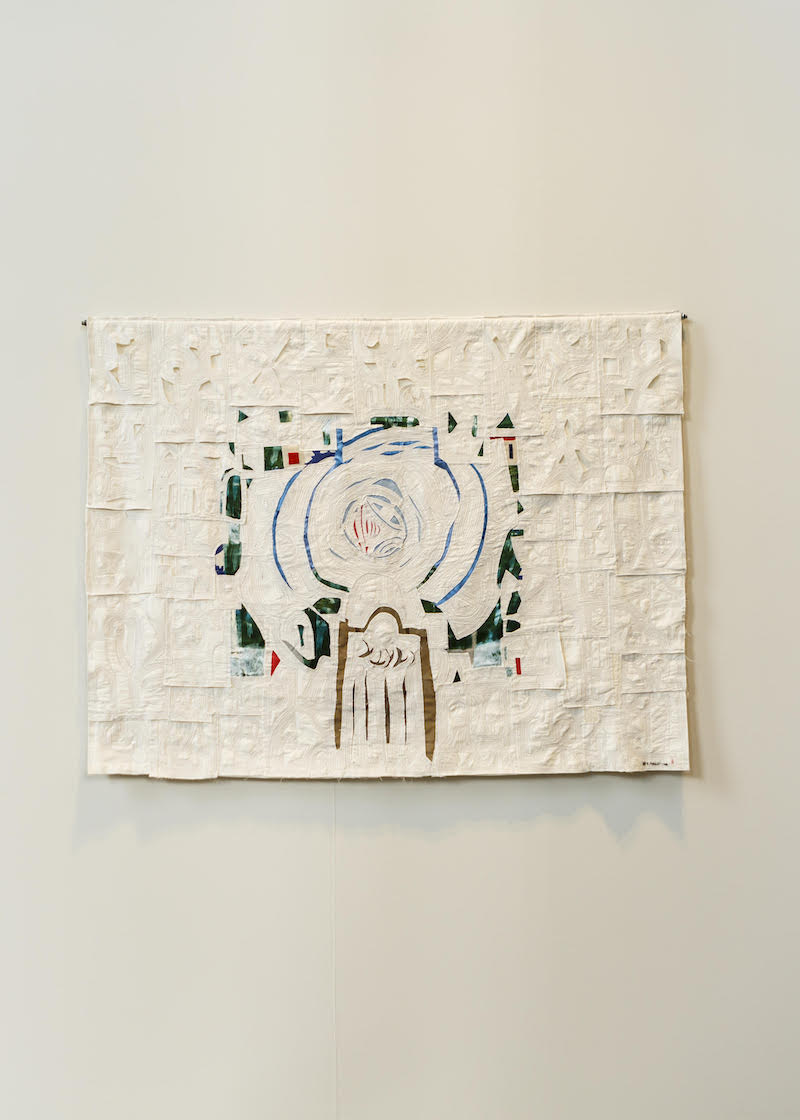
As you enter the first display in the Arsenale a huge Simone Leigh sculpture is surrounded by the visionary work of the Cuban printmaker Belkis Ayón. Her prints are collographs, a basic printmaking method that I have advocated to students many times over the years as being a wonderful way of generating powerful images, because it forces you to be very clear about the forms you use and hopefully the simplicity can also become monumental. She uses textural surfaces wonderfully and builds up her sometimes massive wall pieces by printing off images at approximately A1 size and then fitting them together to create the final composition. These sections are then tacked to the wall either as original prints or sometimes as photographs of the originals. The compositions when fitted together work very powerfully and you don't notice they are made up of sections because you are far too interested in looking at the imagery. The fact that sometimes she worked by fitting together blown up photographs of the sections reminded me about not being too precious about 'authenticity', if it works it works. Belkis Ayón was first asked to exhibit at the biennale in1993, but with limited means for the twenty-mile trip to the Havana airport, had to travel by bike with her father and they were late for the flight, however back then an anonymous Italian woman traveling from Cuba to Milan stepped in and paid for the work to be sent over. A reminder of how far things have changed in relation to air travel and the status of artists in what were often in the past called 'third world' countries. 

Collography is a collage-like approach to printing, whereby surfaces are built up by cutting out various materials and gluing them down. You can then add texture by painting surfaces with substances such as glue mixed with sand and then when all is dry, you finally coat the whole thing with some sort of sealant, often a varnish or PVA and this becomes the plate from which you print. Once made the plate is inked up and used as a surface to print from. If you dampen thick paper, when put under pressure after being laid over the collograph plate, it will press itself into the shape of the plate. The paper will both pull off ink in sometimes quite unexpected ways and become a shallow relief which adds textural interest, because light playing over the surface casts small shadows from the indentations. This gives the artist a vast range of tonal and textural possibilities. Ayón’s prints have made the most of the subtle gradations of blacks, whites, and greys that the technique makes possible, the final images having a gravitas and conviction that made them appear magical and transformative.  She represents as imagery the codes, symbols, and tales of Abakuá, an Afro-Cuban society whose foundational myth is based on a woman’s act of betrayal and in Ayón’s prints Sikán, the Abakuá princess is often depicted with no other facial features except her eyes. This gives Sikán a mythical presence, one sometimes found in religious scenes, and at other times in episodes of Ayón’s actual life, the imaginative world and the real world become fused together as darkly lit dramas. These are drawn images at their most potent, the process of cutting out images in sections for collograph construction, making each figure clear and defined and yet at the same time texturally other worldly and flat. These figures are spirits forms, made to help us find a link between the everyday reality of the present and the world of myth and legend. However collographs have another aspect to them that is often forgotten. They are usually made from what is thrown away, especially cardboard, bits of plastic, old textile materials; basically anything that when stuck down on a flat surface makes an interesting texture. Therefore as a technique it can be a useful recycling tool, but it also represents the ability of the artist to transform the left over surfaces of everyday materials into images of mythic potential. 

Sometimes Ayón's prints were basic A1 size and if so these were framed.

Seen up close you can see the textural possibilities of collogaphs, the ink when wiped off a surface collects around the edges or when rolled on, sticks only to high points. For a pure white I would sometimes keep a cutout shape away from the inked surfaces until just before printing and then just lay it into place, finally laying the dampened printing paper on top.

For larger prints the images are cut out and mounted onto foam-board and then attached to the walls by 'L' hook screws. 

This is composed of 9 roughly A1 sized collograph prints


Details showing how you can paint with glue and sawdust and other mixes to make a surface and then when dry and hardened these can then be inked up and printed off as powerful textures.


Sometimes these large images were made up of digital prints taken from photographs of originals stuck directly onto the walls

Detail of textures

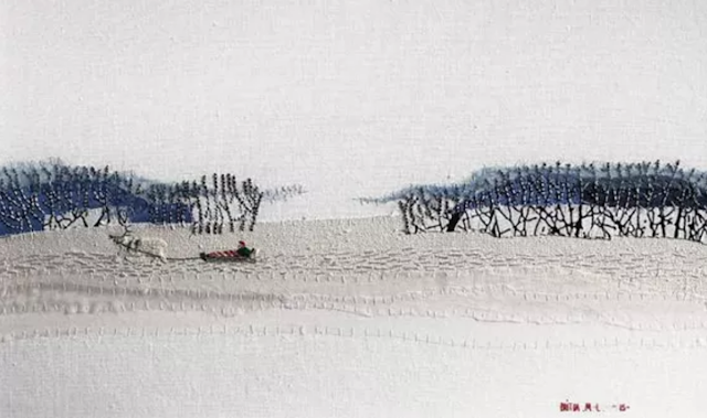
In some ways very similar but visually in direct contrast to Belkis Ayón is the work of Britta Marakatt-Labba. She is a storyteller of the Sámi People. Her work is very easy to miss, being composed of tiny textile images made in delicate embroidery. However they can draw you in as a relief to the bombast surrounding them, but you do have to make an effort to readjust your aesthetic settings. Large walls and big exhibition spaces have over the years accustomed us to work designed to hold its own in these spaces and work made for domestic settings was in many ways pushed out and regarded as amateurish. I remember being told as a young artist that I couldn't be a professional until I had a studio large enough to be able to make work that would command a large gallery wall. Part of the legacy of 'macho art' are these huge spaces and I would like to feel that the inclusion of Marakatt-Labba and other artists who work at a similar scale, questions the need for such grandeur, especially when we are so aware of finite resources and the need to be very careful about how we use the resources we have left. 

Britta Marakatt-Labba


Detail


Her embroidered snow and reindeer textures are evocative of both temperature and scale. These are tiny images but they invoke intimations of landscapes of vast size. The minuscule sledge being pulled across the image above follows in the ruts and furrows of others that have crossed this landscape before. All this of course evoked in a few threads of embroidery. Her economy of both scale and material use is extraordinary and a lesson to us all. 

Britta Marakatt-Labba

I particularly liked the image of an isolated dark figure lost in a field of snow. There hadn't been an attempt to copy the texture of snow, instead she had substituted it with a texture made from the surface she was working on.  The 'too large' texture worked very well as both an evocation. of a field of snow and as a reminder of what it feels like to be out in snow as it falls. 

Like most of the artists in this year's biennale Britta Marakatt-Labba and Belkis Ayón are both women. There has been a focused attempt to redress the balance of well over a hundred years of male dominated exhibitions and this is a welcome reminder that when the Venice Biennale was founded most women didn't even have a vote and that women's rights have been hard fought for. The biennale title, 'The Milk of Dreams' is a quote taken from the work of Leonora Carrington, a Surrealist who when I began exploring the history of art back in the 1960s was regarded as a minor figure, but who has been undergoing a period of reassessment now that we have an awareness of how patriarchal most art collections are. There is also another issue going on here, and that is an attempt to communicate something about the nature of art made by women. This I would add is contentious, because in gendering things, you have to be careful that you don't fall into the trap of repeating the old stereotypes, this time from a female perspective. This is I would have thought particularly difficult during a time of gender re-assessment and the development of non-binary attitudes towards the dialogues surrounding the representation of sexuality. On the one hand I welcome the inclusion of such wide ranging content and a focus on artists exploring the unconscious and mythical aspects of our various societies. But I don't think we should be saying that women are more spontaneous or connected to mythic roots than men. The Earth Mother figure is a powerful one, but not one that every woman is. For instance the biennale could have also reminded everyone that scientific and hard nosed investigation can also be done by women. Someone like Hanne Darboven would have been an interesting artist to put into the mix, her mathematical rigour was almost myth like in its intensity and this could have been played off against artists such as Hilma of Klint or Louise Despont, both of whom are mythical in intent, but in no way could you call them Earth Mothers. 
I just wanted a more balanced view of what it is to be a women artist. At the end of the day all artists are individuals and no matter how hard curators try to shoehorn people into categories, they will escape them simply by virtue of art being open to what Gombrich called the beholder's share. So forgive me if when I focus on certain work I do it very much from my own point of view, however as always with my reports from Venice I hope they give a flavour of what to expect and over the next couple of weeks I shall report on other artists that I was interested in. The biennale exhibitions are on until November and I'm very aware that my university will be having a trip over to Venice before it closes. So do think about going, as it does give you a chance to look at a huge collection of art in the flesh, and after three years of being restricted to looking at a screen, it was a welcome reminder of how much more interesting it is when seen in its raw, physical reality.  

See also: 

Venice Biennale 2022 Part two

Venice Biennale 2022 Part three

Venice Biennale 2022 Part four

Reflections on other Venice Biennales


2017

Venice an allegory
Part 1
Part 2
Part 3
Part 4

2015

Part 1
Part 2
Part 3
Part 4


Tuesday, 16 November 2021

Pushing paper: contemporary drawing from 1970 to now

I have just been to see the exhibition 'Pushing paper: contemporary drawing from 1970 to now', which is on at the Cooper Art Gallery in Barnsley. We rarely get to see drawing exhibitions of this quality in Yorkshire, so I would advise anyone living locally to go and see this carefully curated show. 

There are so many interesting drawings that it's hard to know where to begin, but perhaps simply because I know that every year Fine Art students at the LAU are given the opportunity to take part in the British Art Medal society's design a medal competition, I'll begin with Ellen Gallagher's 'An experiment of unusual opportunity', a drawing done as a design for a medal to raise the profile of the difficult to face life and work of Eunice Rivers. This small pencil drawing fascinated me because it was dealing with similar interests to my own, how do you communicate ideas through depictions the human body? In this case the carefully knotted hair of Rivers, is pushed right up against the ear and greatly enlarged eye, which replaces the rest of the face. In fact the eye punches the face away, its pupil a conker shaped stone at its centre, all of which works against the delicate tracing of light pencil lines that make up the hair and eyelashes. It was perhaps this conjunction that drew me in. The pencil drawing was light and airy, almost etherial, but the visual logic was of a clunky juxtaposition, a drastic short cut to bring the viewer up short. 

Ellen Gallagher: An experiment of unusual opportunity

This small drawing set the tone of the exhibition for me and I began looking for embodied moments in drawings, searching for visual ideas that I could take back into the studio where I'm working on a range of drawings that attempt to communicate various concepts about my own and others bodies. 

Hanging high on an adjacent wall to Gallagher's small image was Glenn Brown's 'Children of the Revolution' (after Rembrandt). This large image is a type of Brown drawing I had seen before in the British Museum and had remarked on in an earlier blog post, but this time I was interested in another aspect of how the body could communicate an idea. The subject is Rembrandt's etching of the goddess Diana, but Brown has left the head off. As in Gallagher's drawing, a process of removal focusses attention on the rest of the body, that has itself been elongated, Diana's solidity and human weight as given to us by Rembrandt, is now made more El Greco like, her body flickering upwards in white ink pen lines, made all the more sharp by the drawing being done on transparent polyester film and mounted on brown cardboard. Some tonal effects are introduced by playing off the white lines with black ones, and the body is being given form more by white lines acting as cross contour definers, than by tonal massing. The curve of the inner frame in effect replaces Diana's head and the sinuous lines demarcating the body, dissolve back into background supporting lines, almost as if they are drawing a rock being pulled out of flowing water. The headless figure has its arms cradled around what is in the Rembrandt etching almost a void, and which in Brown's image becomes a trapped swirl of black curled marks, as if the figure was attempting to cradle or hold on to the top of its recently lost head. Brown's reflection on an old master image intrigued me, perhaps above all because I had always loved the original's ability to bring the gods down to earth. 

Rembrandt: Diana at her bath: Etching 7 x 6 in

Glenn Brown 'Children of the Revolution'

By taking Diana's all too human head away, Brown had somehow released the idea back into a more spiritual understanding; Brown's flame flicker of body energy, releasing the image to burn itself out in an intellectual frame, whilst Rembrandt's original was still reminding me of the inescapable weight of the body as it ages, and that if the gods made humans in their image, they must themselves therefore be subject to the same ageing process that we mortals have to inhabit.

One of Claude Heath's head drawings done by touch whilst blindfolded was exhibited not too far away from Brown's. This was another meditation of what was missing, this time sight itself was taken away, and the way touch can be used to gradually inform us of what is there was indicated by changing colour each time a new inquiry took place. The artist used a cast plaster model of his brother's head to work from. Another absence; in this case the solid, intractable cold plaster cast, replacing the warm hard/soft surfaces of a real head, resulting perhaps in the more 'measured' ball point pen tracing of lines that recorded touch. I could still see the 'looking' behind the 'touching', the empty space of the drawing suggesting a 'visual knowing', so inbuilt into our awareness of what a head is, that even when blindfolded we seem to almost instinctively know what a face is. Would the drawing have been so much more 'emotional' if Heath had had to feel his brother's actual head? Would he have had to invent a much wider range of marks to cope with touching real hair, or skin or the gristle of nose cartilage or the dampness of eye corners? Even so the pouring of the drawing's lines from a single fixed point, seems to echo the movement of a waterfall as it drops from height onto rocks. Reminding me of the flowing lines surrounding Brown's drawing and my own long preoccupation with how to draw water. Water being a fluid, a fluid like the air we breathe, something that can invisibly surround us, and which when drawing we often forget to include. 

Bad photograph of Claude Heath's Drawing Head 100

Could Heath's drawing also operate as a metaphor for those intakes of breath we all need to take when rethinking. The air pouring down the throat and out into the lungs, which in turn shape the air into an invisible cast of our insides, before we push it back out again. As I think this, I am mentally drawing it, trying to nail down an image that I'm still searching for in my own drawing. I'm looking for an entry point like the mouth that takes you down into the body, a topological journey that begins on the skin's outer surface, and then continues over the mouth's lip and into the body's interior. 

Hew Lock's 'Sovereign 3' an image of the queen made from green and red eyes bunched together and fighting for space, surrounded by grinning skulls, was a timely reminder that any image, even one as familiar as the queen on my banknote can be reclaimed and reused if you have a strong enough visual language. In Lock's case, this was I felt a sort of reverse colonisation, the queen now constructed from a language 'spoken' by one of her colonial subjects, rather than the queen's English being the exported language of the coloniser. 

Hew Lock 'Sovereign 3'

Lock's colour drawing gave me an insight into the potential of the body to contain complex forces, Walt Whitman, in his 'Song of Myself' gave us the image, 'I contain multitudes', an image returned to us again much more recently in the album 'Rough and Rowdy Ways' by Bob Dylan. The refrain, "I fuss with my hair, and I fight blood feuds, I contain multitudes" reminding us that both the inconsequential and the mythic are at the end of the day, both interwoven into the cloth that makes up the fabric of our lives and that we are the consequence of all the people who have made an impact on our lives and that they continue to live within us. 

Gwen Hardie's 'untitled' charcoal drawing of a female figure was another image that drew me in; I was interested in her drawing as an example of how to conjoin interiority with exteriority. Her nailed or pinned exterior linear surface line surrounding what could be read as a vaginal/fallopian tube/breast/lung synthesis, or 'waterworks' as my mother would say, when talking about anything related to a woman's interior parts. 

Gwen Hardie 'Untitled' 

The head is in this case there, but its surface features are totally eradicated, the simplification of the body being almost pre-historic in its direct, map like deportment. 

As you can see, my initial entry into this exhibition was directed by my particular interests in making drawings about the body. This is I would argue quite normal and most artists I know would do the same and I would expect you as students to begin looking around an exhibition of this sort in a similar way. But once the initial excitement of looking at new images is over, then a secondary set of reflections begin to come through and their effect is perhaps more subtle. 

Jan Vanriet: 'Ruchia

I became interested in Jan Vanriet's 'Ruchia' after initially just giving it a cursory glance. I think I had subconsciously dismissed it as yet another portrait made from a photograph; but on re-looking found that this drawing could help me think about how you could work from a photograph and still engage with an emotional intensity worthy of the subject. Again this is something I've tried to look at before and in my review of Adam Stone's work I tried to use Lorca's term 'duende' as a way of thinking about how additionality could be added to a photographic image by working from it. In this case Jan Vanriet's images are an attempt to give back life to the victims of the Holocaust. Old black and white photographs are the source material for watercolour portraits. Jan Vanriet's portraits using watercolour's propensity for staining and bleeding past edges to suggest an alternate life. The material language of watercolour on paper speaking out in an alternative voice to that of the faded photographs that Jan Vanriet works from. I am fascinated by the idea of the stain, and how we use written or verbal language to inflect meaning on something that could be simply a darkening or colouration by one thing impinging its material presence on another by means of a liquid transfer. But we are creatures of the external body, we are animals that worry about our insides and their watery, squidgy nature and whenever we see stains we are reminded of those bed stains of vomit or blood, of those times of first menstruation, wet beds, illness or death, when we don't know what is happening and feel besieged by unknown forces from inside us. This is the flip-side of those lovely watercolour landscapes of the Yorkshire Dales, this is the stained presence of bodies, the Turin Shroud of the bodyscape and the bits we don't really want to talk about. So once again I return to the body and its possibilities as stimuli for representation. 

Finally, even though I could go on to talk about several more drawings, I ought to mention Andrzej Jackowski's watercolour, charcoal, graphite and gouache drawing on buff textured Indian paper; 'Voyage 5'. I have had along time respect for Jackowski's work, first seeing his painting 'The Beekeeper's Son' in the Walker Art Gallery in Liverpool back in the early 1990s. 

Andrzej Jackowski: The Beekeeper's Son

Andrzej Jackowski: Voyage 5

Jackowski paints how i would like to be able to draw, his images appearing to emerge out of the picture plane as if from a dream and not just any dream, an archetypal one that as Jung pointed out we all need to belong to. The drawing in this exhibition feels much more about the way everyday moments drift into mythic ones. The father perhaps comforting the child because they have had to pack away Christmas, the empty box on the side a reminder that all the presents were opened and there will be no more until next year. The boy is an echo of the father, both established by a single line that divides them in half, a line that also helps form what might be the father's long coat and the boy's shorter one. But that Christmas tree is also something else, it is one of those images that slip between things, at one moment a burning tree and at another a stylised vulva, perhaps evoking the ancient belief that exposing one’s vulva could ward off evil and defeat the devil. Are we looking at a moment in a boy's passage towards maturity where the father inducts him into some sort of ritualised maleness? Is this an image of some sort of cultural shaping of gender? By being so simply drawn the man is reduced to an upright member, but is that an escape ladder behind the two figures, and if so what are they supposed to escape from? Jackowski titles his image 'Voyage 5', is this the voyage of life? Are these two setting out on a journey into manhood? The drawing allows us to develop a variety of suggested narratives, it triggers our innate ability to discover stories in ourselves and that is something I have always valued in Jackowski's images. 

If you go to the exhibition you will find the drawings broken down into several categories, 'Systems and Process', 'Identity', 'Place and Space', 'Time and Memory' as well as 'Power and Protest', enough categories to be of interest to most people. Barnsley is easy to get to by train from Leeds and the Cooper Art Gallery is only 5 minutes away from the station, it also has a good cafe and room enough to show a variety of other art work as well as a contemporary gallery space for exhibitions upstairs. 

See also: 
Drawing from old masters for further reflections on Glenn Brown's work
Cross contour drawing
Drawing water

Drawing and photography
The Cooper Gallery for details as to opening times etc. 
More on Hew Lock

Wednesday, 27 January 2021

The Trinity Buoy Wharf Drawing Prize winners announced.

M. Lohrum: You are It.

It is always fascinating to see the final selection and winners that are picked out in the annual Trinity Buoy Wharf Drawing Prize. It works as a sort of litmus test as to the current state of drawing led practices and especially this year in a time of lockdown. My own added personal interest was that I had submitted a collaborative piece this year, that made it through the first round but no further; so I was of course fascinated to see what did win. 

Trinity Buoy Wharf Drawing Prize 2020, Installation view(s) Cooper Gallery 2020. Courtesy Cooper Gallery. Photography by Eoin Carey.

M. Lohrum’s 'You are It' was the overall prize winner and for the first time a performative drawing has won. It reminded me of Sol Lewitt drawings that were also made from written rules, his impermanent wall drawings consisting of sets of the artist's instructions, so that their actual execution could be carried out by someone else. There is though a difference. In M. Lohrum’s case the audience is engaged directly in the drawing's execution, in Lewitt's case it was usually student volunteers or gallery staff who made the drawings and when you did get to see the work it was usually already completed. 

Sol Lewitt: Wall Drawing instructions

M. Lohrum is less 'authorial' in the control of the work, and there is more an emphasis on collaboration and participation, which I think reflects a shift in attitudes that has taken place since Lewitt began producing his work in the late 60s. Lewitt came from a time when the status of the artist was more or less unquestioned, artists were the avant-garde, the romantic initiators of new ideas and as such their name was very important, as it was used to in effect 'brand' their practice. We are living in different times, the status of the artist has been questioned and in particular the role of the artist as maker of 'honorific objects' that are to be collected by rich individuals and displayed as cultural capital in museums and art galleries is perhaps coming to an end. Of course the art market still exists, but it seems to have less and less relevance to many an artist's everyday life. My own recent experience is that as an artist I have become more embroiled in interdisciplinary activities, especially those related to health and wellbeing. The artist still has a role in society, but perhaps it is one shifting away from a capitalist idea of the producer of a particularly rare cultural commodity and is moving gradually towards an idea of the artist as catalyst or instigator of alternative ways of approaching life. Artists have always been associated with raising awareness, seeing something more in the everyday than the everyday, and it would seem that in times of a lockdown we need this quality more than ever. As the selector Frances Morris stated “The invitation to members of the public to participate as anonymous makers and the work’s dependency on collaboration between strangers, felt timely and necessary, speaking to the power of art to bring people together”. It is not of course just that a work like this brings people together, it also reminds us of the central position of our bodies in the making of meaning. Every drawing that has ever been made is in one way or another a seismographic record of the person that made it. Each one of us has a different ratio of arm length to height and to hand size; we are all unique in relation to the type of heart beat we build our life's rhythm to and in the way that our nervous systems are wired up. Each person participating in this drawing, as they are instructed to draw from their shoulder will immediately be aware of the weight of their own arm and of how well it operates as it moves around in its shoulder socket. Body awareness is of course vital if we are to maintain a sense of our own well being, an awareness not just of our selves but of other people's bodies is essential to the building of empathy with others and the development of our collective sense of community care. 


Nancy Haslam-Chance: 'Caring Drawings'

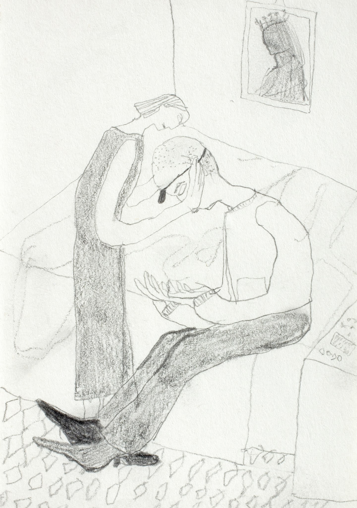
It was very interesting therefore to see that the second prize had been awarded to Nancy Haslam-Chance for her 'Caring Drawings'. These pencil drawings are a long way from the fine artist's 'signature' drawings that forefront a special touch or individuality of approach and instead these drawings document her role as a carer and support worker. These drawings are more like those we might find in a visual diary, and they focus on the physical and emotional relationships she has formed with her clients.  The daily details and practicalities of her job are drawn from memory between shifts, an important reminder that artists need to ground their practice in reality if it is to communicate to others. This type of reality has of course in a time of COVID become much more visible, but carers have always been there working to support other human beings who have fallen on hard times, we just needed a reminder and Haslam-Chance has given it to us. 

Nancy Haslam-Chance: 'Caring Drawing'

Both these artists have produced work that has emerged out of a crisis, one that will hopefully have been overcome by the time the next Trinity Buoy Wharf Drawing competition is run. I would hope though that what their work intimates is that there is a move towards a rethinking of the role of the artist in society. A role that is less to do with individualism and one much more to do with self awareness, community cohesion and spiritual well being. 

Art as an idea is always changing

Reference

LeWitt, S 1967, “Paragraphs on conceptual art”. Artforum, vol.5, no.10, p.79

See also:

More on the TBW exhibition 

Etymological root of 'art' 

Thursday, 22 August 2019

Venice Biennale 2019 Part three

Some of the work I came across in the Biennale made me think of drawing as a very physical process. For instance Shilpa Gupta's banging gate was an excellent illustration of how a drawing idea can become very physically real. A large gate is hinged on a pivot and motorised so that it swings back and forth. As it does so it bangs into the wall, bringing down layers of plaster and cement as it gradually eats its way through the wall it makes a heavy contact with. This seemed to be a powerful metaphor for ideological boundaries and their repressive functions. (Can art break down walls?) Her practice draws on the interstitial zones between nation states, ethno-religious divides and structures of surveillance. In Gupta's work everyday situations, such as the opening and shutting of a gate are distilled into allegorical gestures, and as I have struggled for many years with a self imposed task of trying to do a very similar thing, I was pleasantly surprised at how powerful an impact her work was having on the people experiencing her clanging gate.


Shilpa Gupta

Sun Yuan and Peng Yu’s installations solicit tension from spectators because of their apparent threat. The staging of what can be quite intimidating spectacles lies at the core of their working process. However it was the historical associations with drawing machines that initially interested me. I can still remember the first time I can across some of Tinguely's machines. They were big, intimidating creations that you were frightened of. They moved into your space and had a presence that made you feel that if you fell into their clutches you would be done for. Tinguely also made some spectacular drawing machines and often launched them with dramatic effect. His machines also link into that 3D drawing tradition of linearly linking one form with another, all engine parts being at one time an idea in the mind of an engineer, realised initially as a technical drawing, machines therefore have a particular set of associations with technical drawing codes.


Tinguely: Homage to New York 1960

A Tinguely machine

More on Tinguely

Sun Yuan and Peng Yu’s mechanical installations were targeted at more specific metaphorical concepts than Tinguely's. The painting machine below was built by reconfiguring a second hand robot arm, initially used in a manufacturing process. It 'paints' the floor by sweeping its 'brush' through a dark red blood like liquid, however as it makes its marks they soon disappear as the liquid gradually flows back over the sweeping gestural floor markings. The machine makes a strong impact because it is expending considerable energy on a series of tasks that are in the end pointless. (I wondered if this was also a comment on abstract painting). As an analogy it also pointed to the role of human beings in similar tasks, ones that have yet to be taken over by robots.


Sun Yuan and Peng Yu’s other installation was perhaps more ambiguous in its allegorical intent, but it was undoubtedly powerful in its effect on the audience. A marble seat, carved to resemble the base of the one that supports the statue of President Lincoln, is kept behind a protective glass wall. Every now and again a powerful blast of compressed air forces a flexible tube to strike out in all directions and as you can see from the marks on the glass in the photograph, strike the sides of the glass walls with severe force like a demented whip.

Sun Yuan and Peng Yu

Lincoln memorial

Sun Yuan and Peng Yu: 'Dear'

Was this a metaphor for the misuse of power? Was it about how slaves were treated and Lincoln's role in the abolition of the slave trade? Whatever it means, standing right next to the glass vitrine as the hose snaked about was a frightening experience, if only because of the sound made by the hose as it whipped around.  
Zhanna Kadyrova was using tiles taken from a hotel in Venice to physically draw representations of clothing hanging out to dry. I took the photograph of her 'washing line' through a window in the central pavilion exhibition space, because the work was erected outside, in a similar way to all those washing lines you see strung between buildings as you walk Venice's streets.


Zhanna Kadyrova Second Hand (2014-ongoing)

As you walk around Venice as well as seeing actual washing lines, you will also find painted images of them as tourist mementos of the city. Zhanna Kadyrova in appropriating this image and connecting it with tiles from a refurbished tourist hotel, creates a particularly complex work that operates on several levels. On the one hand representing an actual clothes line, with identifiable specific types of socks and briefs, it is a form of still-life and on the other by making a solid representation of what is normally made of soft fabrics, it is a monument to something very un-monumental. Historically, only things that were of great importance used to be the subject of the sculptural monument and we are in a historically very important city when it comes to looking at the history of art.


Venice souvenir painting

Zhanna Kadyrova is also commenting on Venice as an art capital, both as something appropriated by tourists and as a place for the high art cognoscenti. Both images of washing lines now belong to the art canon, one read as 'low-art' and the other 'fine-art'; Kadyrova asking us questions as to which one if either, will in the long run survive?

Njideka Akunyili Crosby interested me technically, both as a printmaker and as someone looking at how drawing is used. In particular it was her sophisticated use of collage techniques that drew my attention to her work. 


Njideka Akunyili Crosby

You need to look carefully at the surface of her images because she has a powerful grasp of form, which means that the texture can be secondary to the colour/form and you don't notice that the surface is composed of collaged imagery. She uses a variety of image transfer techniques, as well as stencilling, so that when you get close up to the surface of her work it is a visually exciting and intriguing experience. (The work was behind glass, so my photographs don't do justice to the experience of looking at them)


Njideka Akunyili Crosby

People that live between cultures have a rich complex of imagery to process and Crosby makes the most out of her Nigerian/USA experiences. If you read Homi K Bhabba's classic text, 'The Location of Culture' you can get a better understanding of how this process works. 

Kaari Upson

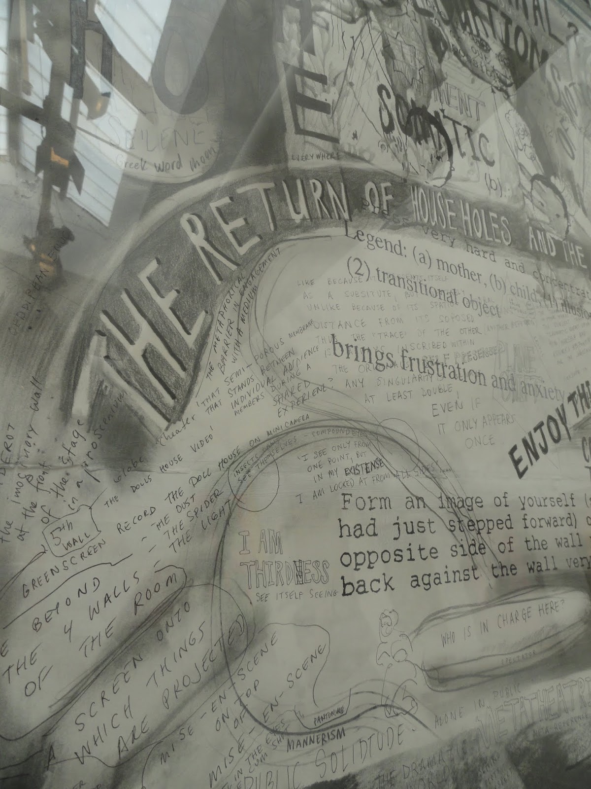
Finally for this post I'll leave you with the work of Kaari Upson. Upson layers her drawings with observations, thoughts about what she has seen, memories and anything else that can be used as a commentary on the things she is interested in. I was intrigued by the fact that these drawings often evolve over several years. They hang around the studio, and she returns to them over and over again, until their surface becomes overlaid with the complexity of making drawings over time. The great thing about Kaari Upson's drawings is that they are just that. DRAWING. She doesn't need to do anything else. Yes there is text and a lot of it, but the text is drawn into the surface, it performs a dance around the evolving imagery and at times also anchors the composition. Her work is a welcome reminder that you can still do interesting work just with a pencil and a felt tip pen, it as always depends on what you have to say and how you say it. The work in Venice was behind glass and like Njideka Akunyili Crosby's work, I did find the glass obtrusive. 


Kaari Upson

You can get a much better idea of Upson's work by looking at a video of an exhibition presentation where she does not have the work framed, simply attaching her drawings directly to the walls. She made her reputation with the Larry Project. This was a long running project that centred on her chance finding of documents belonging to someone who used to live in an abandoned house near where she lived. Her imaginative investigation of an imagined life is a powerful model for how a project can grow and evolve the more you invest time and energy into its possibilities. 

Kaari Upson

I did take quite a few photographs of the way artists were using framing and will at some point put up another post on this constantly re-occurring subject. It is an important issue and in Upson's case I really think the way it was framed made it much harder to appreciate what her work was about. By putting it behind glass you were distanced from it and her work was about direct responses to the intimate but raw connections she was making with her subject matter. 


Reflections on other Venice Biennales

2015

Part 1
Part 2
Part 3
Part 4